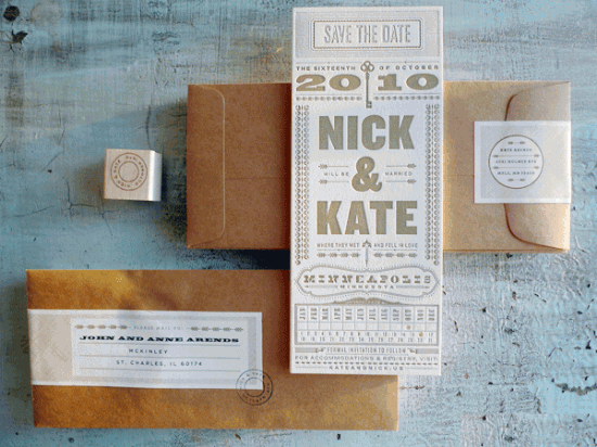
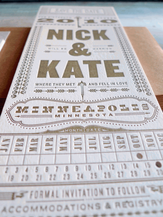
I have just one word for Kate and Nick’s typography save the dates: Gorgeous. Everything from the vertical layout to the gold metallic ink (all letterpress printed, of course) is just so perfect!
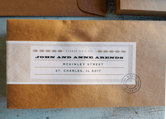
From the vertical monarch layout to the beautifully designed mailing labels, I just love the entire design, although one of my favorite details is the skeleton key silhouette at the top. Â The Save the Date was letterpress printed in a single color by Studio on Fire. Amazing. And a big thanks to Rachel for passing along the link!
Photo Credits: Kate Arends via wit + delight


These are out of control beautiful. I love everything about them!
ooooh gasp! love-ly
these are gorgeous!
Studio on Fire is incredible. If these are their save the dates, I am dying to see their wedding invitations.
Spectacular! Love the envelopes too.
Gorgeous, indeed. Bonus points for kraft paper envelopes!
absolutely gorgeous
just beautiful. I can’t get over how great these are.
Where can I get something like this in Denver Colorado, I love these and have been looking for something unique with no luck! :/
Love this! Beautiful Work!