{happy weekend!}

Happy Friday everyone!  This weekend I’m up in New Jersey helping to celebrate my dad’s 70th birthday.  Our family is scattered all over the country, so we’ve all been trickling into town over the last couple days and totally surprising my dad.  Fun!  And after a couple of really stressful weeks it’s nice to unwind, focus on a happy celebration, and relish in the company of my wonderful family.  But in the meantime…

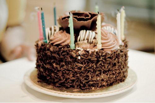
chocolate-cake

…a few links for your weekend!

This week on Oh So Beautiful Paper:

That’s it for me this week!  I hope you all have a lovely weekend, and I’ll see you back here on Monday!

Photo Credit: charxlotte

Crane & Co. Wedding Album Launch Party

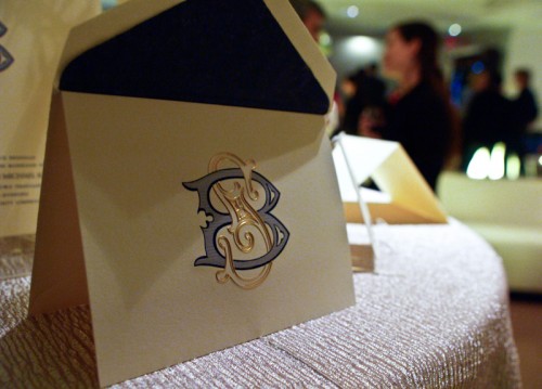
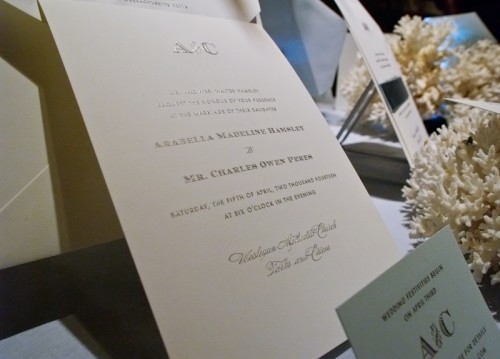
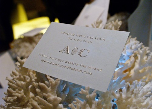
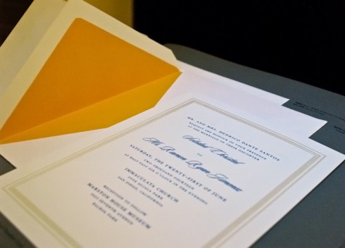
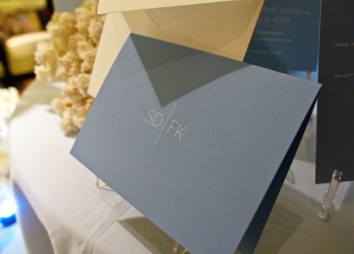
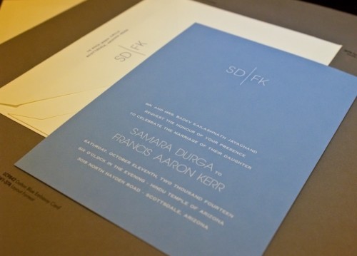
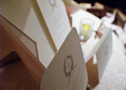
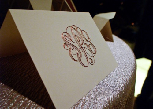
Last week I attended a party celebrating the launch of Crane & Co.‘s newest wedding invitation album.  I got a sneak peek at some of the album designs during my tour last September (which you can see here, here, here, and here), so I was really excited to see the designs in their final, printed form.  The Crane & Co. design team has worked on some cool new designs, including some more modern pieces alongside Crane’s more traditional and refined invitations.  Here are a few photos of the new collection that I took at the party:

Crane-and-Co-Monogram-Engraved-Wedding-Invitation

Crane-and-Co-Silver-Engraved-Wedding-Invitation

Crane-and-Co-Silver-Engraved-Wedding-Invitation-Reception-Card

Crane-and-Co-Modern-Yellow-Envelope-Liner-Wedding-Invitation

{the envelope liner above is a gorgeous and vivid yellow in person – so pretty!}

Crane-and-Co-Modern-Sanserif-Engraved-Wedding-Invitation

{this invitation suite features modern san-serif engraved text – quite a departure from Crane’s traditional look}

Crane-and-Co-Modern-Sanserif-Engraved-Wedding-Invitation

Crane-and-Co-Classic-Silver-Edge-Painting-Wedding-Invitation

{it’s hard to see in the photo, but this invitation has beautiful silver edge painting!}

Crane-and-Co-Calligraphy-Monogram-Engraved-Wedding-Invitation

You can check out a few more photos from the party on the Crane & Co. facebook page.  There’s a lot more where this came from, so if you’d like to see the album in person, you can find a list of Crane & Co. retailers right here!

{all photos by Oh So Beautiful Paper}

Clara’s Modern Christening Invitations

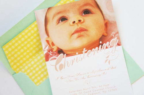
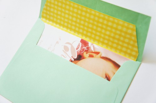
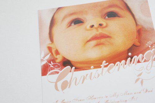
My friend Carolynn from Two Brunettes recently welcomed her first child, a beautiful baby girl named Clara.  When it came time to choose Clara’s christening invitations, Carolynn couldn’t find anything with the right balance of tradition and fun, modern design – so she decided to create her own invitations!

Baby-Girl-Baptism-Christening-Invitation

From Carolynn:  Clara will be baptised at the church I was raised in.  Everything I was seeing was very religious looking, not cutesy or fun.  I wanted a mix of both, in a fun design for the modern couple that would also be appropriate for a baptism.

Baby-Girl-Baptism-Christening-Invitation

Baby-Girl-Baptism-Christening-Invitation

So lovely!  Fabulous work Carolynn!

{image credits: two brunettes}

Caitlan + Andrew’s Black Heavy Metal Wedding Invitations

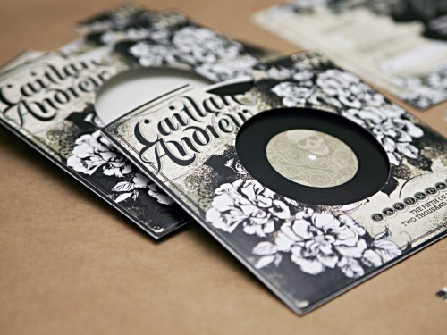
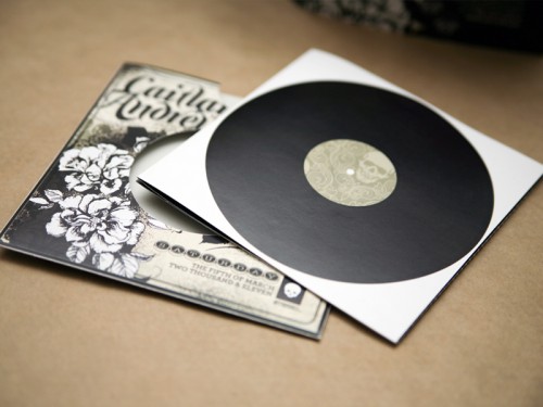
You might remember these awesome book wedding invitations that Lyndsay from It’s A Date Design created last year, and today Lyndsay is back with wedding invitations that are just as fabulous – and definitely different from anything I’ve featured here before!  This time, Lyndsay drew her inspiration from the groom’s love of heavy metal music.

black-heavy-metal-wedding-invitations-record-album

From Lyndsay: When I first spoke to Caitlan, her request for the design was that it celebrate her future husband Andrew’s interests – which were predominantly related to a love of heavy metal music.  One of their first dates was to a concert which she referred to as a “sea of fading black t-shirts!”

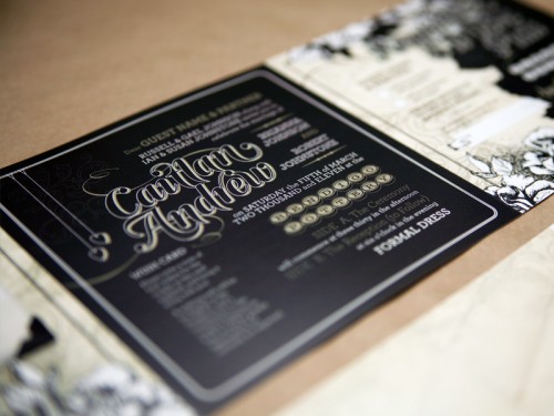
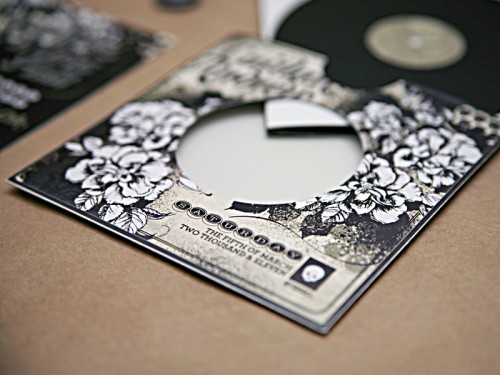
black-heavy-metal-wedding-invitations-inside

black-heavy-metal-wedding-invitations

black-heavy-metal-wedding-invitations

My first thought was, “this couple is destined for a fantastic life together” – because it is so rare that a bride will pursue something so unconventional for her wedding stationery in order to respect the groom’s passion!  We talked a lot about having some subtle references to his favourite bands (as well as hers, which included Regina Spektor and Ani DiFranco), but I also decided this would be a challenge: to make skulls cute!

black-heavy-metal-wedding-invitations-record

black-heavy-metal-wedding-invitations

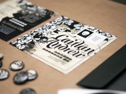
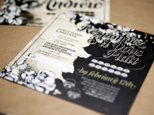
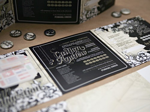
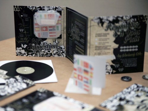
The result is somewhere between Slipknot and Florence and The Machine: a compilation of the couple’s important wedding information, folded like a mini-accordion, with a reply postcard that could be detached via perforation and sent back to the couple, all packaged within their own “LP.”  I modeled their monogram, which is used several times throughout the design, loosely on the Rolling Stone magazine masthead.

black-heavy-metal-wedding-invitations-inside

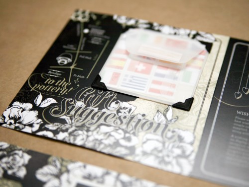
Another sweet featured: their request as a “gift” was for guests to write a little note to them in provided cards (decorated with flags of all the countries they plan to visit as a married couple) for them to keep as a memento of their day, which I pre-affixed inside each invitation with little cardboard photo corners inside vellum envelopes.  Each invitation was hand-trimmed, folded and assembled with love.

black-heavy-metal-wedding-invitations

We also made little button badges out of favourite design elements from the suite for an extra rock-concert reference.  Whilst these invitations don’t scream “wedding”, they are a reflection of a young, unconventional and fun couple who have a very bright future ahead of them.

black-heavy-metal-wedding-invitations-suite

So cool, Lyndsay!  I love the entire invitation, from the concept to the color palette.  Thanks so much for sharing these with us!

{image credits: it’s a date design}

Christina’s Cameo-Inspired Business Cards

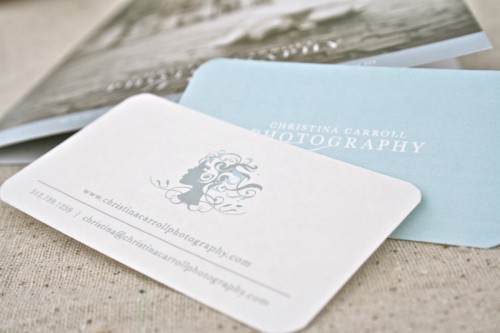
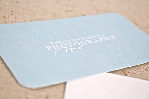
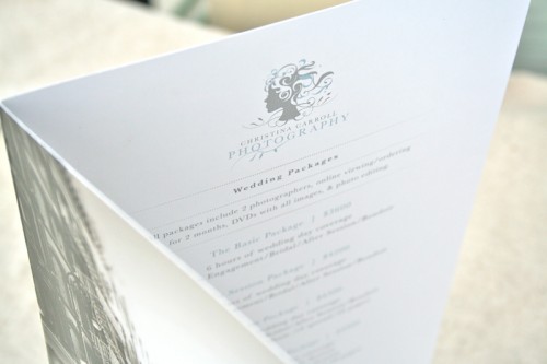
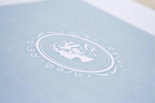
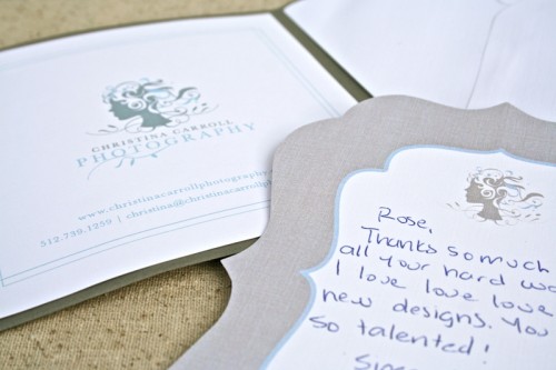
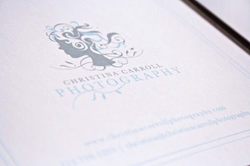
Rose from Bittersweet Design Boutique sent over some lovely business cards and identity suite that she recently created for photographer Christina Carroll.  Rose incorporated a custom illustration inspired by antique cameo jewelry in a nod both to Christina’s stylish mother and Christina’s own unique perspective as a photographer.

Blue-White-Silhouette-Business-Cards-Branding

Blue-White-Silhouette-Business-Cards-Back

From Rose:  Christina Carroll is an eclectic international wedding photographer who puts a lot of personality into her work.  I was beyond excited when Christina came to me in need of a new logo and business stationery!

Blue-White-Silhouette-Business-Cards-Branding

Blue-White-Silhouette-Business-Cards-Branding

With a mother who is very fashion-forward, Christina’s sense of style has been present since day one.  We wanted to compliment Christina’s unique eye for photography by creating a funky illustration to use as her main logo.  The text needed a little more liveliness to compliment the intricate illustration, so we added the leaves to the bottom of the letters.

Blue-White-Silhouette-Business-Cards-Branding

The cameo, which makes its appearance in Christina’s paper system, fit in perfectly with the overall feminine look that we were going for.

Blue-White-Silhouette-Business-Cards-Branding

So pretty!  Thank you so much Rose!

{image credits: rose lindo | bittersweet design boutique}