Cherry Blossoms

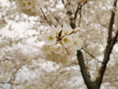
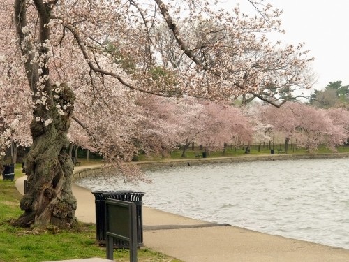
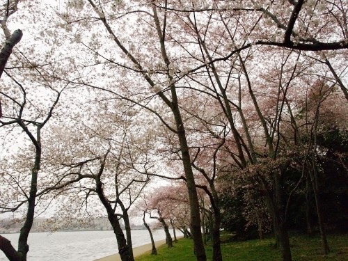
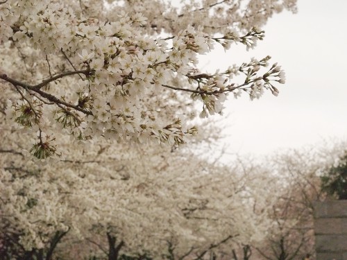
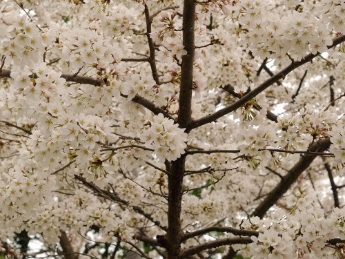
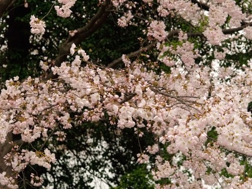
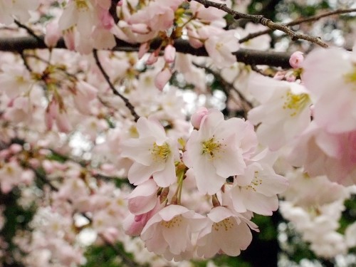
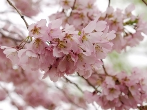
Spring!  It may have been cold and overcast yesterday here in DC, but it’s officially spring and I couldn’t be happier to finally say goodbye to winter.  Also excited for the official start of spring?  The cherry blossom trees!  They literally burst into bloom overnight a couple days ago, just in time for the official Cherry Blossom Festival that starts next week.  I couldn’t resist the opportunity to bask in the glow of my favorite pale pink blossoms before the huge tourist crowds get here, so my mom and I went down for quick a walk around the the Tidal Basin.

It’s amazing how these tiny little blossoms can make me so happy, and this even before the lilacs and peonies start to bloom!  Can you tell that spring is my favorite season of the year?

{all photos by me}

Jessica + Steven’s Retro Black and White Wedding Invitations

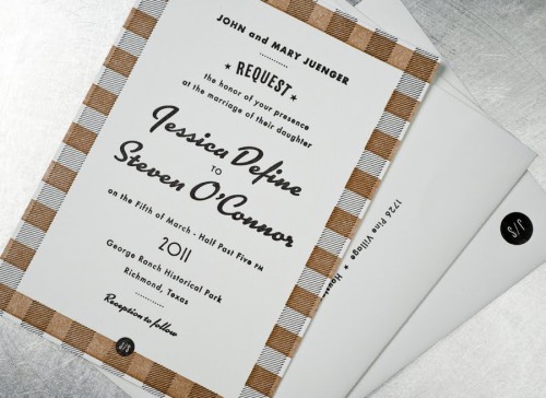
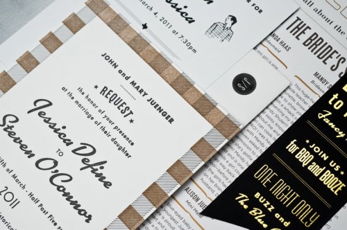
How fun are these wedding invitations from Product Superior?  John and Jenn created these invitations for a recent wedding, and I’m loving the playful retro vibe!  With the crisp black and white color palette (and a few well-placed touches of gold), the invitations and accompanying day-of pieces have lots of masculine elements designed to please both the bride and groom – all while conveying a fun and festive atmosphere to the wedding guests.

Black-White-Gold-Retro-Wedding-Invitations

Black-White-Gold-Retro-Wedding-Invitations

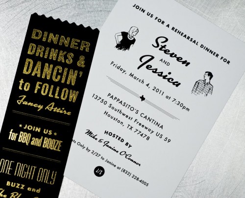
Black-White-Gold-Retro-Wedding-Rehearsal-Dinner-Invitations

{the rehearsal dinner invitations}

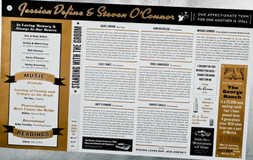
Black-White-Gold-Retro-Wedding-Ceremony-Programs

{the ceremony programs}

So cool!  Check out more details over on Product Superior!

Photo Credits: Product Superior

Business Card Ideas and Inspiration #6

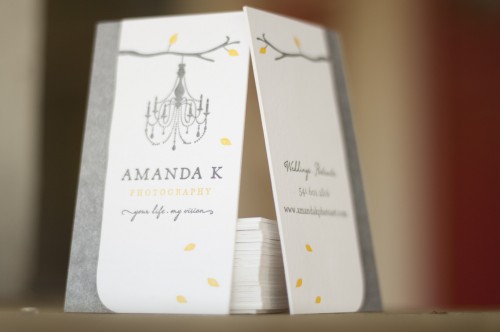
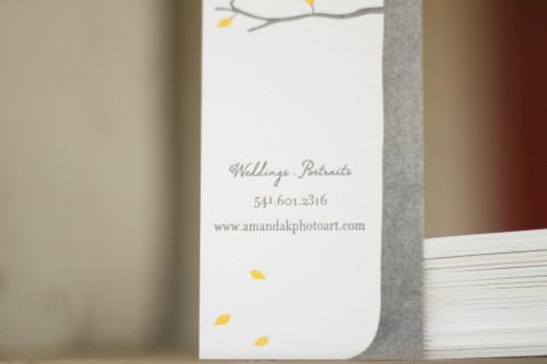
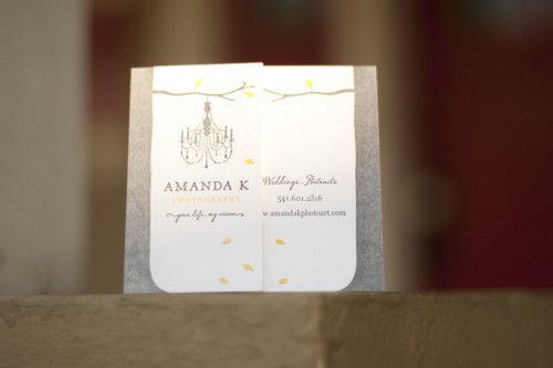
As promised, I’m back with a couple more stunning business card designs!  First up, Matthew from A Fine Press created these lovely, rustic business cards for Amanda K Photography

Rustic-Letterpress-Tree-Photographer-Business-Cards

From Matthew:  Amanda brought me the branding that the amazing Jane Johnson did for her and asked me to help her realize this beautiful branding as a show-stopping business card.  These are printed on both sides in two colors on Crane’s 220# Flourescent White Lettra.  There’s a little bit of saltiness in the ink of the tree that, in my mind, brings just the right amount of rustic texture.

Rustic-Letterpress-Business-Cards

Rustic-Letterpress-Tree-Chandelier-Photographer-Business-Cards

Photo Credit: Matthew Wengard | A Fine Press

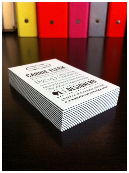
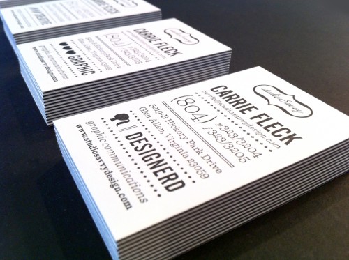
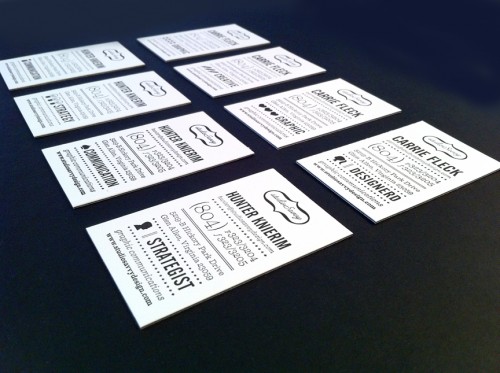
Next up, Carrie from studioSavvy sent over her super-fabulous business cards.  I’m loving the crisp black and white of the layered paper stocks (more on that below) and the mix of complementary icons used by Carrie and her business partner…

Black-White-Letterpress-Business-Cards

From Carrie: The cards were printed on a privately-owned letterpress by a friend of a friend.  We used 92# Reich Savoy for the top and bottom layers, and I had him sandwich in a 100# cover sheet of French Paper’s pop-tone in black licorice.  Overall there are 8 cards involving 4 complimentary sets of icons for my business partner and me.

Black-White-Letterpress-Business-Cards

Black-White-Letterpress-Business-Cards

Photo Credit: studioSavvy

Thanks Matthew and Carrie!

*A Fine Press is one of my fabulous sponsors; for more on my editorial policies, please click here.

Business Card Ideas and Inspiration #5

I receive a bunch of fantastic submissions after my last business card post a couple of weeks ago – so it’s time for another round of business card inspiration!

brown-silver-letterpress-business-cards

brown-silver-letterpress-business-cards

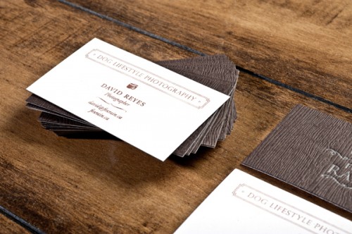
These business cards from Fox Rain combine two different printing techniques on two different papers.  The top layer was letterpress printed by Shelley Weir of Sweet Peony Press with silver ink on a dark brown woodgrain paper.  Designer Sandra Liu then adhered the top layer to a bright white cotton stock hand stamped with the company’s information.  So cool!

letterpress-calligraphy-business-card-paisley-quil

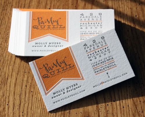
Pretty new business cards from Molly at Paisley Quill

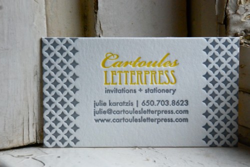
yellow-gray-letterpress-business-cards

…and Julie at Cartoules Letterpress!

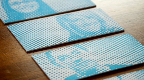
Letterpress-Halftone-Blue-Business-Cards

Letterpress-Halftone-Blue-Business-Cards

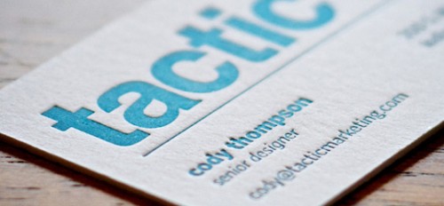
The letterpress halftone images give these cards from Tactic Marketing a bit of texture and some cool personalized detail (via Lovely Stationery and FPO).

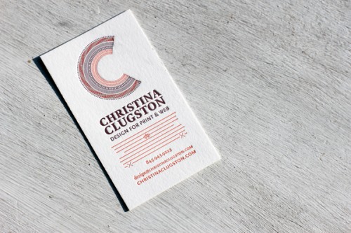
letterpress-business-cards

I can’t get over the incredible detail and fine (yet layered) lines in these letterpress business cards, printed by Boxcar Press for designer Christina Clugston.

I have a couple more business card projects to share with you a bit later, so check back soon!  And as always, if you’d like to share your own business cards or a recent business card project, you can e-mail me right here!

{images from their respective sources}

*Paisley Quill is one of my fabulous sponsors; for more on my editorial policies, please click here.

Beth and Matthew’s South African Wedding Invitations

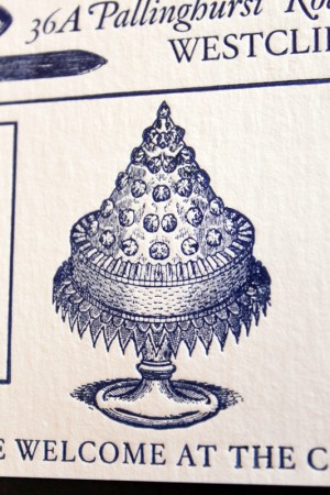
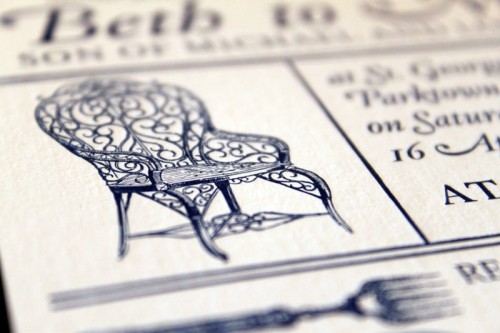
Happy first day of spring everyone!  We’re starting the week off with a set of cool letterpress wedding invitations all the way from South Africa!  Vanessa from Essie Letterpress sent over these invitations and save the dates that she recently created for the upcoming wedding of their friends Beth and Matthew.  Vanessa incorporated vintage-inspired and botanical imagery into both the invitations and save the dates to produce a design that truly represents the bride and groom.

South-Africa-Letterpress-Wedding-Invitations

From Vanessa: Beth is one of my oldest and dearest friends, so we were only too happy when she asked that we design and print their wedding invitations!  First we designed save the dates: a heart made up of images symbolizing the bride and groom.  After that, we worked closely with Beth and Matt to design their ultimate wedding invitation.

South-Africa-Letterpress-Wedding-Invitations South-Africa-Letterpress-Wedding-Invitations

{the image on the right is Beth and Matthew’s save the date!}

Beth and Matthew are getting married on a school field in the middle of Johannesburg with a wonderful view of nature.  They wanted an invitation that reflected their relaxed outdoor wedding and a sense of old-wordly charm.  Matt is obsessed with aloe plants, (they are using them as favours in the wedding) so wanted to include them in both the invitations and save the dates. The invitations are quite large (A5) and are printed on a 280gsm thick ivory card stock with navy ink to complement the wedding colour scheme.

South-Africa-Letterpress-Wedding-Invitations

Thanks Vanessa!

Photo Credits: Essie Letterpress