Behind the Stationery: Cheree Berry Paper

There’s something so incredible about seeing a small business started by one designer turn into a team of 20 employees over the course of 10 years! We’ve admired the work of Cheree from Cheree Berry Paper for every single one of those 10 years, and we’re beyond thrilled to welcome her to our newest installment of Behind the Stationery! Balancing her signature custom work with the retail stationery side of her business, Cheree shares about her team’s design process for both kinds of work and how they maintain that Cheree Berry touch. Take it away, Cheree! –Megan Soh

Behind the Stationery: Cheree Berry

From Cheree: My love of all things paper started as a child. Visiting the Hallmark store was a treasured outing –there was just never enough time to open all of those cards. Fast forward to college, I chose graphic design as my major. With a BFA in hand from Washington University, I moved to NYC for my first design job at the graphic design powerhouse, Pentagram. Shortly after, I landed a position at the fashion company Kate Spade. It was at KS that I really fostered my love for paper, helping to create the company’s wedding stationery line with Crane & Co. In 2006, I returned to the Midwest for a beau (turned husband) and upon my arrival, I quickly started Cheree Berry Paper in my apartment.

Behind the Stationery: Cheree Berry

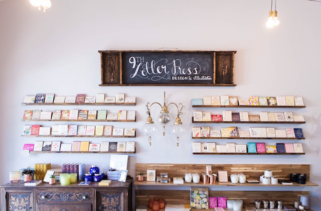
Work started coming in from across the country, and one employee has since turned into over twenty! And now that we are in our tenth year, you could say that we have two businesses camouflaged as one – the custom invitations and graphic design side that our business was built on and now the retail stationery side. Our love is the clever and unexpected. For our custom designs, our challenge is bringing stories to life on paper. For our retail stationery line, it’s creating something that is engaging and supportive of our visual voice.

Behind the Stationery: Cheree Berry

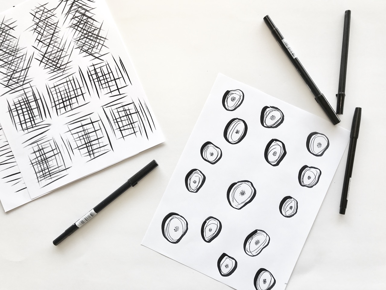
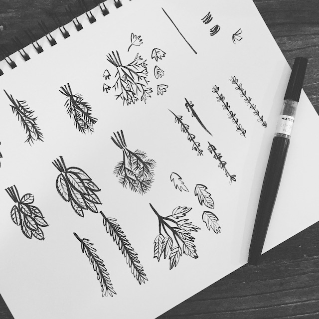
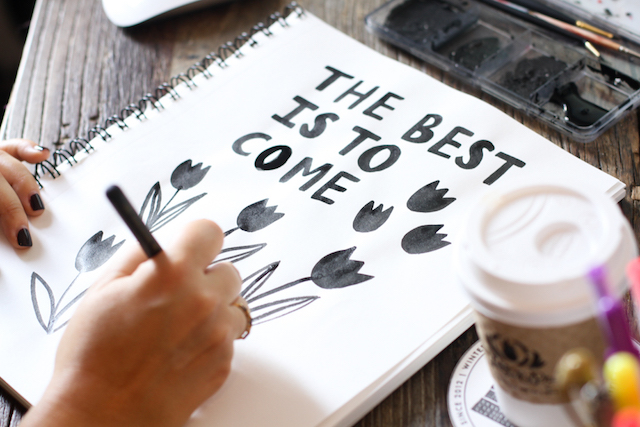
Custom: Our business was started on creating custom solutions for our clients, and this is where our passion still remains today. During the custom process, our first task at hand is to listen to the client’s story and vision. We love leaving a meeting or ending a call with lots of material, but not the exact design solution. After our client interaction, we sketch, research, and refine until we come up with two to three different design solutions to present. From there, with feedback from our clients, we work through revisions and ultimately get to the end result – it’s our job to ensure that our clients are as happy with the design as we are.

Behind the Stationery: Cheree Berry

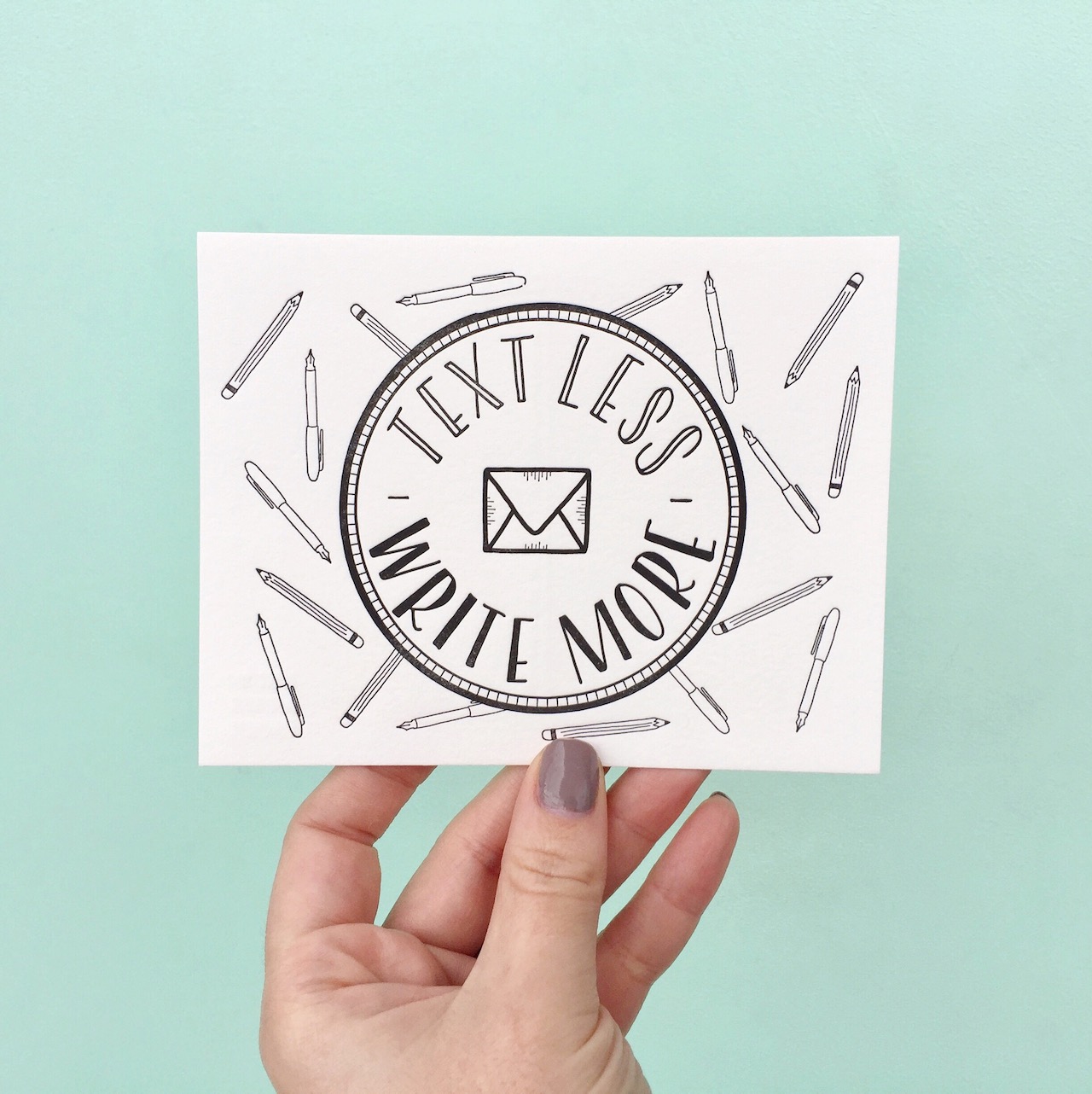
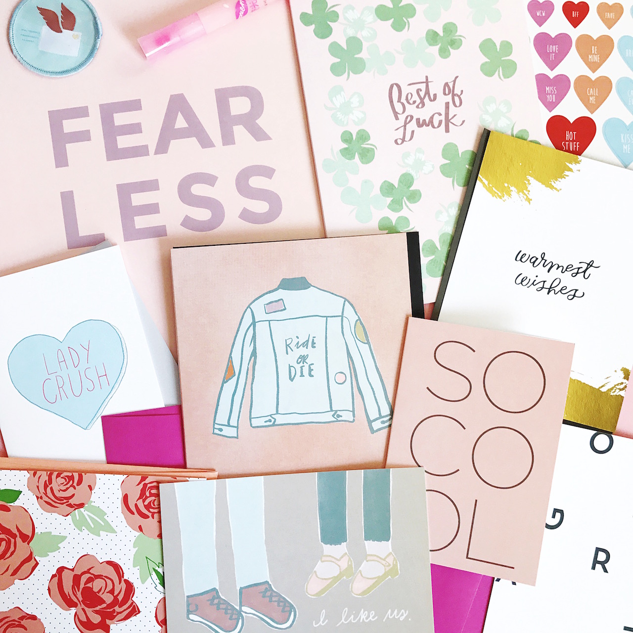
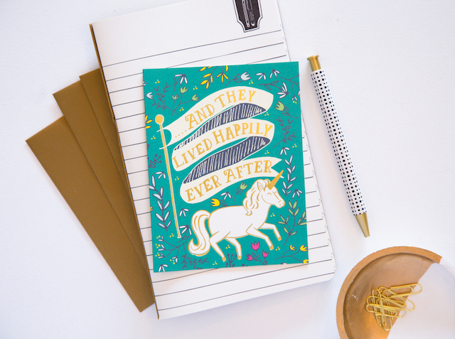
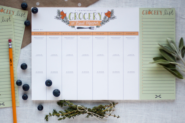
Retail: We are our very own test market. Our first mini line of stationery, produced about eight years ago, was created out of necessity in order to keep our own stationery drawers fully stocked. How do we create a line from scratch? We open our treasure chest of snail mail keeps and think about how these particular pieces made an impact. You’d be hard pressed to find a card in our retail stationery offering that is simply a rectangular card with a pretty design on the front. What you can find in our line? Unexpected formats, clever copywriting, hidden details, fun envelope touches that create anticipation, interactive moments and items that feel personalized without much DIY commitment.

Behind the Stationery: Cheree Berry

The design process typically starts with a client meeting or call including a project manager and a designer. We listen and ask questions to be able to achieve our ultimate goal – telling a personal story on paper with great design. Often the next step is mood boards or sketches to narrow a design direction. Timelines and budgets are set and then the design phase begins!

Behind the Stationery: Cheree Berry

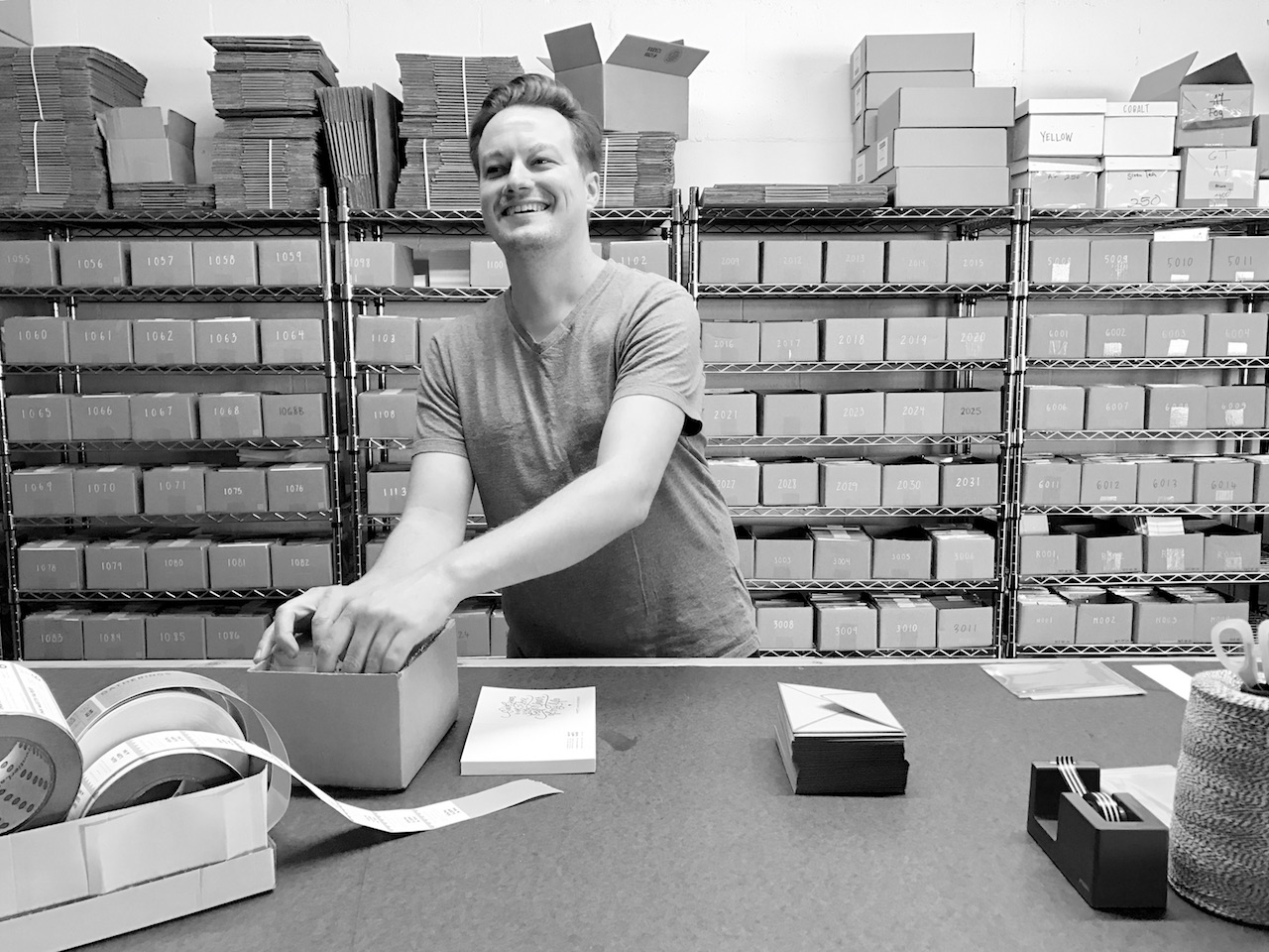
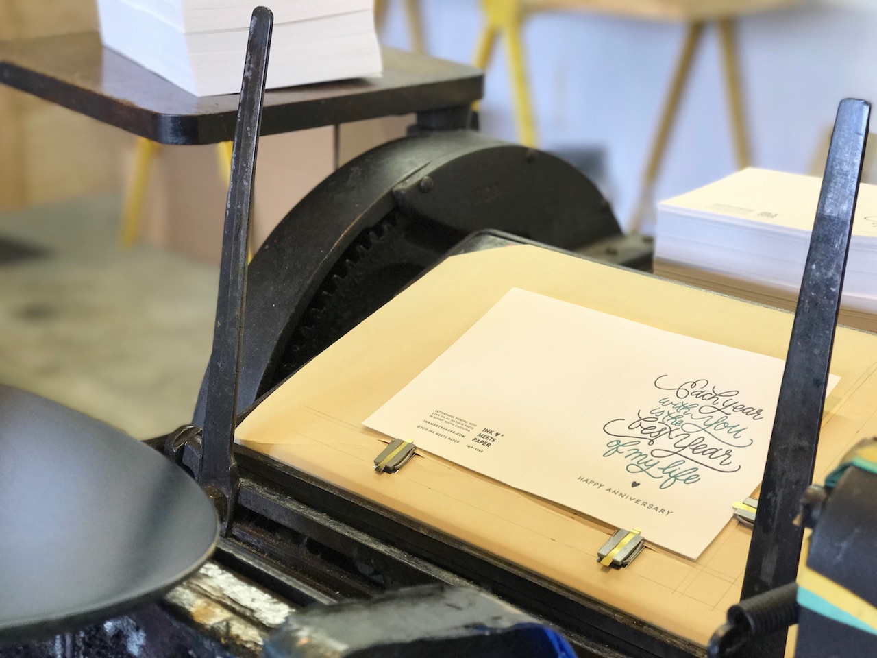
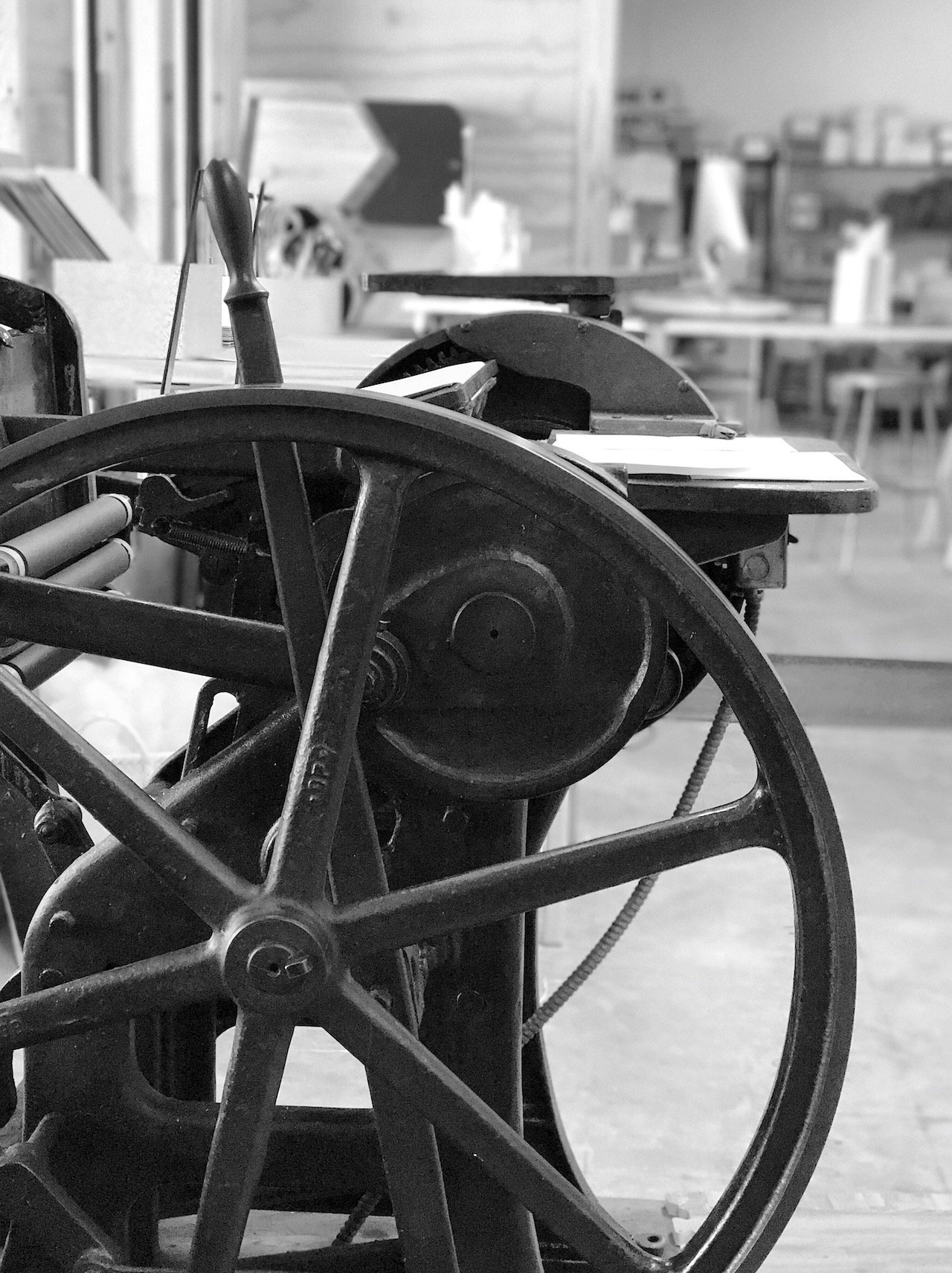
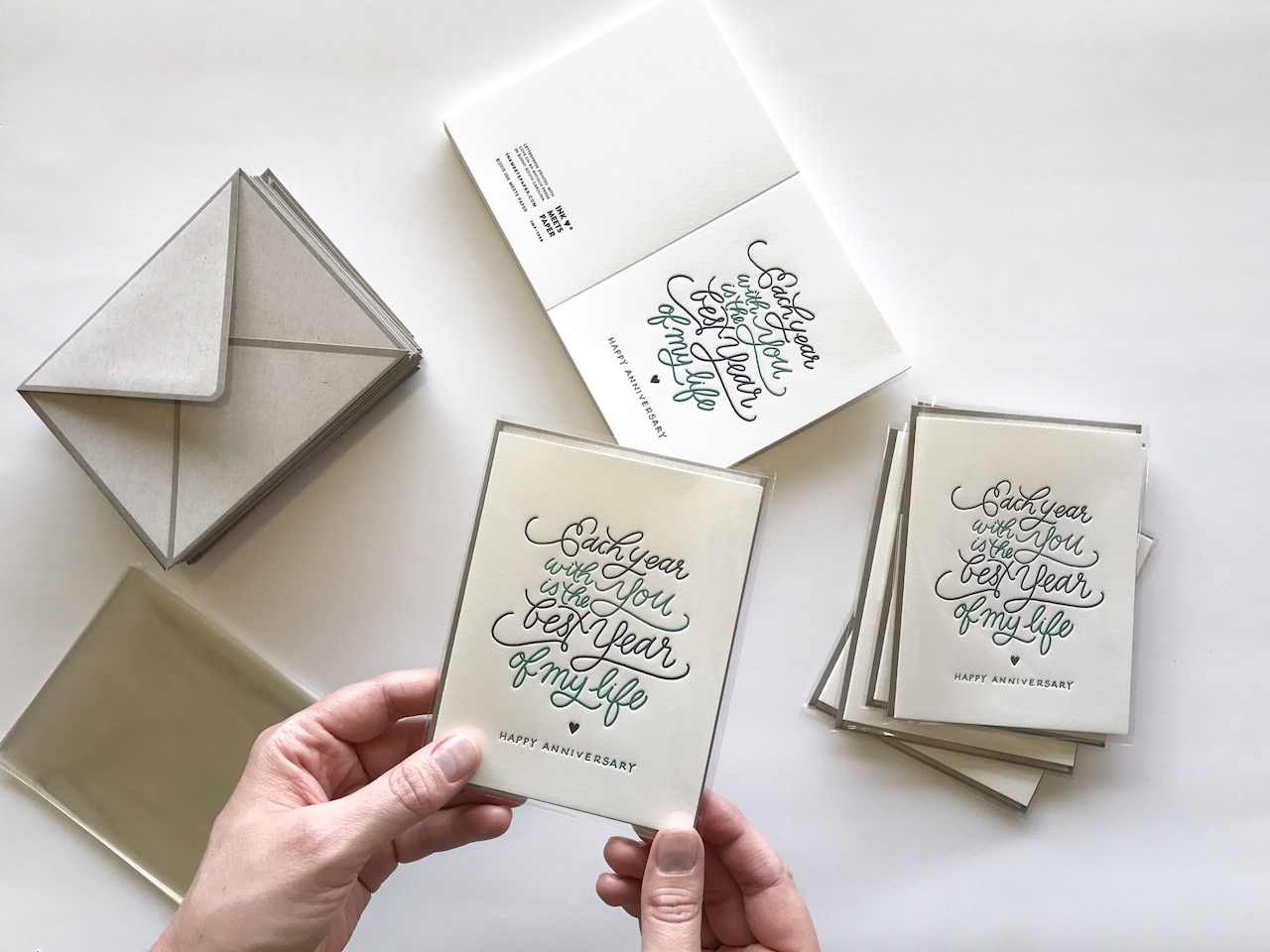
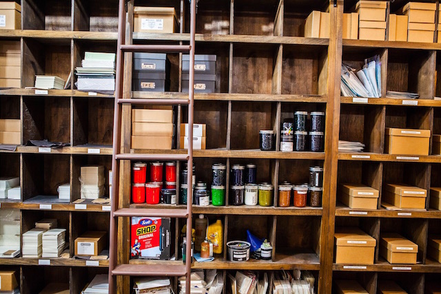
A few design options are presented to the client, then we get feedback and move to revisions before settling on a final design. Most of our designs mix lots of processes – letterpress, foil stamping, painted edges; really, whatever it takes to make the piece a stand-out while maintaining the budget we’ve been given. The final stop? Our production departments applies the finishing touches. We may be tying a booklet, lining an envelope, or placing the stamp just so. We delight in all the details.

Behind the Stationery: Cheree Berry

No one day is like another, but after coffee, I’m ready to check my email and see what happened after midnight. I make my to-do list for the day and the brainstorming, sketching and meetings begin. Lunch is usually at my desk, and when I need to fully focus, you might find me at a nearby coffee shop or bookstore. Four o’clock becomes six o’clock and then I’m rushing home to relieve my nanny. After dinner and a lengthy bedtime routine with my kids (that usually starts with a short dance party and ends with a Mo Willems book), I plug back into work once lights are out.

Behind the Stationery: Cheree Berry

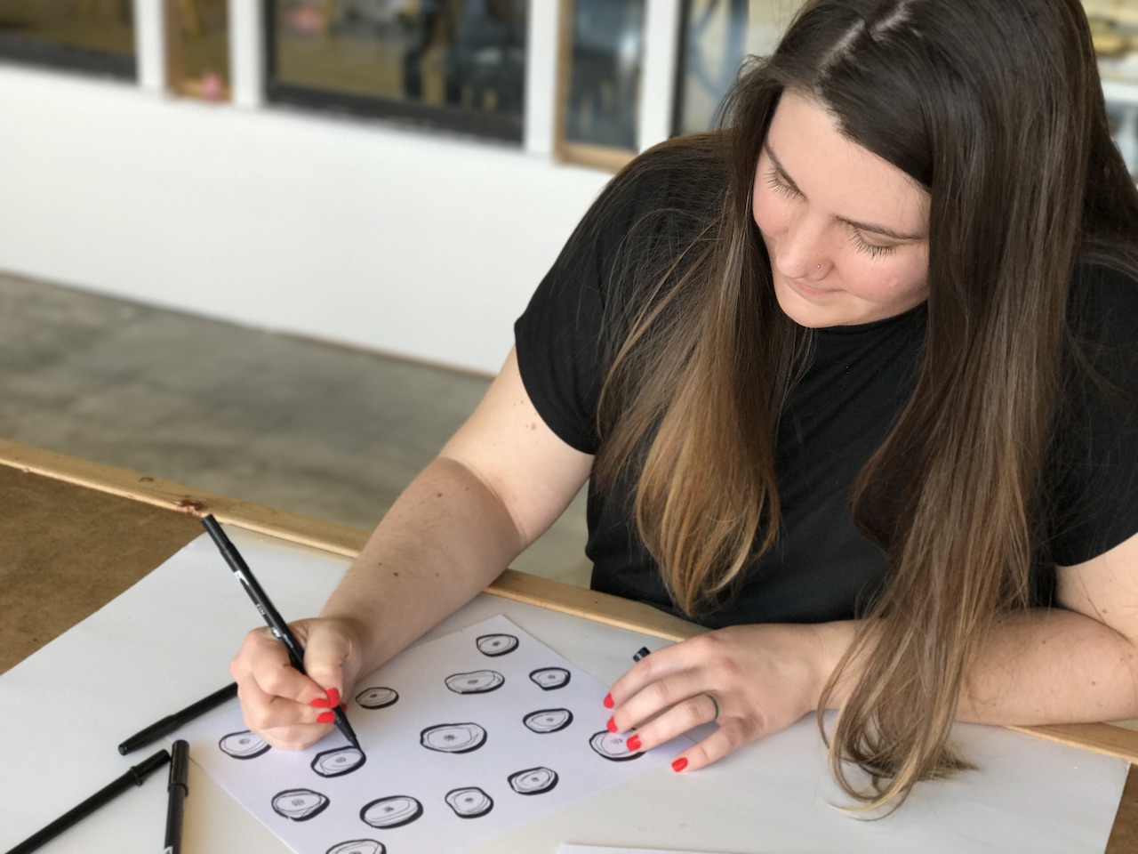
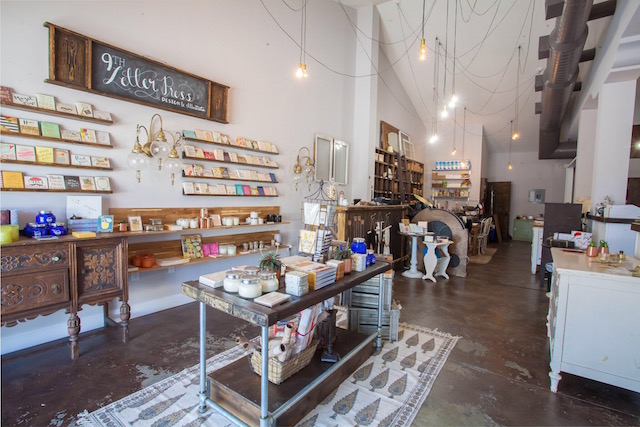
Our team consists of designers, project managers, and a full production staff. Every department touches each job throughout the design and printing processes – without one department, our job could not get done! Our design team has a range of talents, so projects are assigned according to the project style and content. For example, we match the designer to the project based on whether the client’s vision includes a custom hand-drawn illustration, more focus on typography, hand lettering, etc.

Behind the Stationery: Cheree Berry

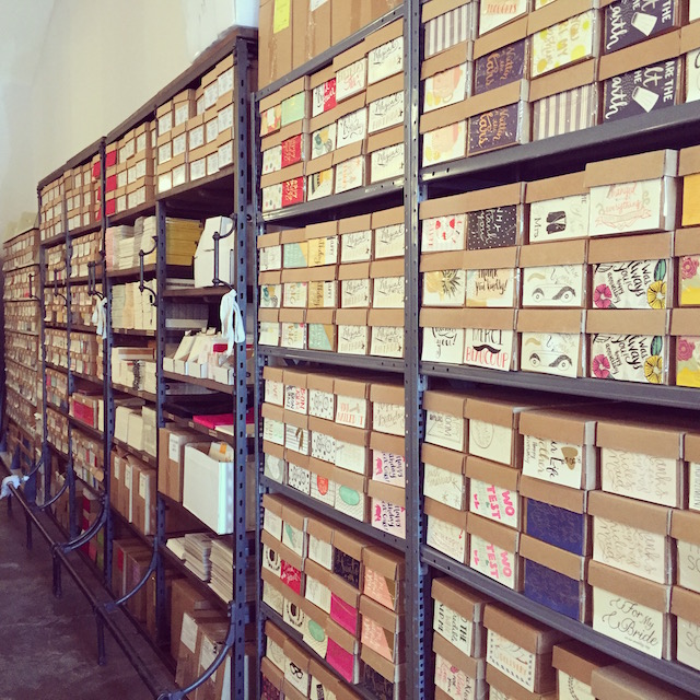
Our project managers work very closely with our clients to ensure great communication throughout the process. Once a job has gone to print, it moves through a very thorough production process. There is no piece of stationery that leaves Cheree Berry Paper without being quality checked. Our jobs must finish as strong as they started.

Behind the Stationery: Cheree Berry

The evolution for me is to focus on the big picture. I have a staff of fabulous designers and art directors so their talents allow me to think about vision, voice and concepts. I love connecting with them daily to see the brilliance brewing. Marketing is my big push right now. I am driven to get my Instagram message out there – a place where I showcase our work and occasionally my values.

Behind the Stationery: Cheree Berry

I’m hands-on when I need to be but really rely on my personal projects – holiday cards, kids birthday invites, etc. – to get me back to my love for design. And I don’t forget what 10 years ago looked like when I was designing invoices to look pretty and taking too long to send them out and working for what seemed like every minute of every day.

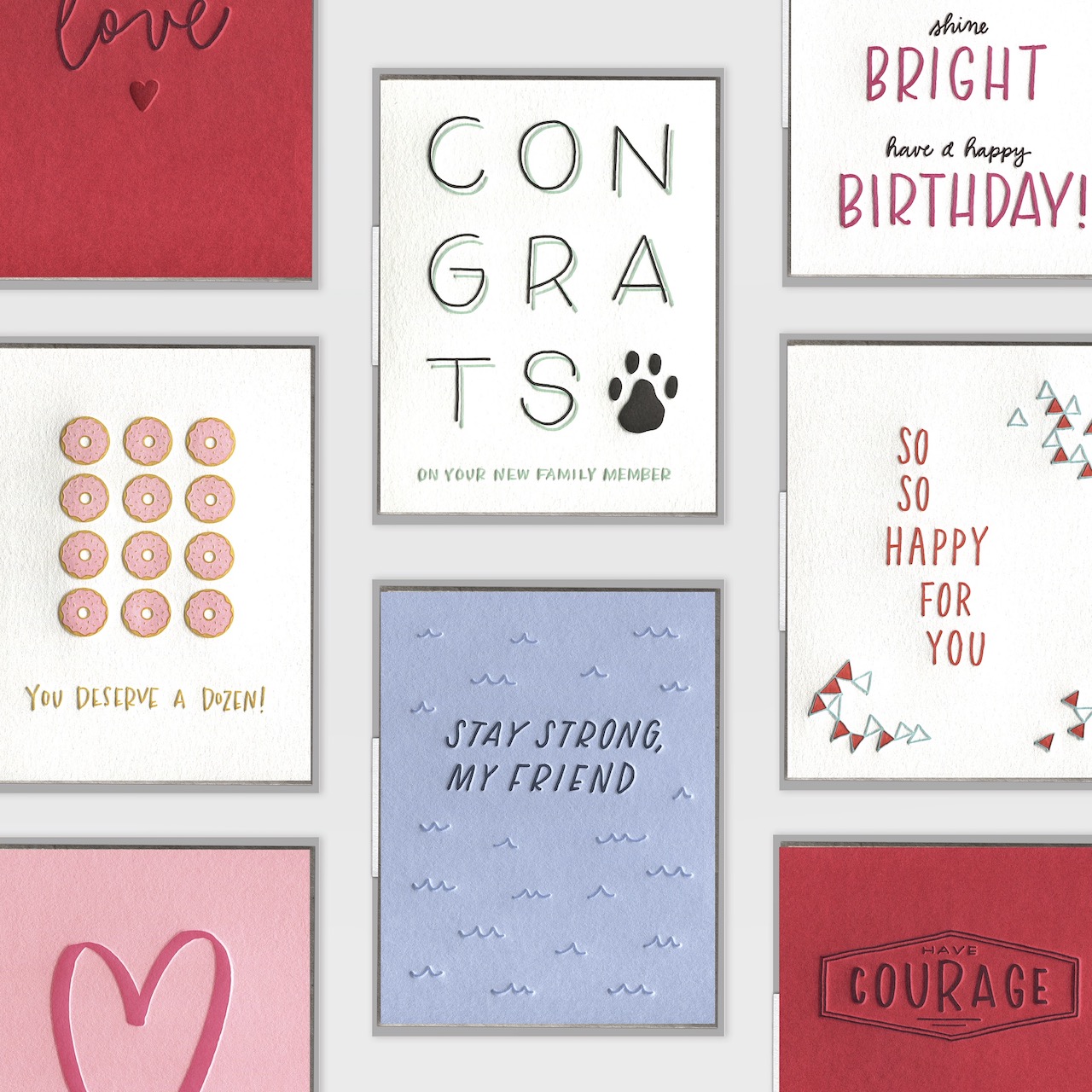
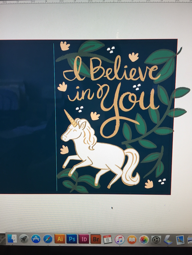
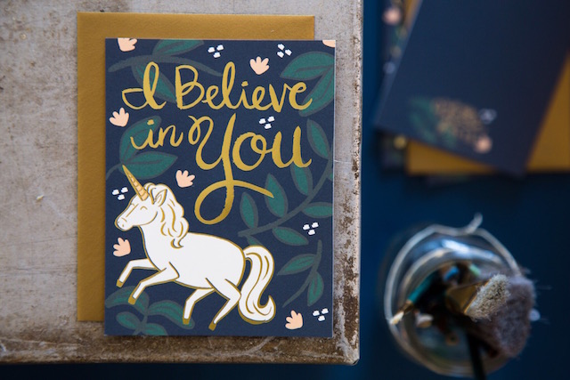
Here’s a very special sneak peek at a brand new line of all-occasion cards by Cheree Berry Paper, produced and distributed by Galison Gifts. The designs will debut at the National Stationery Show this month!

Cheree Berry Paper for Galison Gifts

Write-On Cards offer stickers and spaces to handwrite, so each card can be personalized.

Cheree Berry Paper for Galison Gifts

Expanding Cards unfold and expand to reveal the message.

All photos courtesy of Cheree Berry Paper

Behind the Stationery: INK MEETS PAPER

Today we’re highlighting the duo behind INK MEETS PAPER, Allison and Jamie Nadeau! Allison is here to share their story with us, including how they split work as a partners, their design process from developing concept sketches to getting ready for pre-press, and why they focus solely on letterpress printing. In line with their motto “Text less. Write more.” the INK MEETS PAPER studio serves as both a letterpress studio and also hosts calligraphy classes. Welcome, Allison! –Megan

Ink Meets Paper - Studio

From Allison: We’re Allison and Jamie Nadeau, co-owners of INK MEETS PAPER. Prior to running INK MEETS PAPER full time, I was a copy editor, and Jamie was an interaction designer at a software company. Our love of art and creative expression has always been a part of who we both are (and we’ve worked on various creative projects together). INK MEETS PAPER initially started as a side/hobby project back in 2006, when I designed and printed custom stationery and invitations for friends and family. The love for the craft of letterpress printing came in 2008 with a class at a local art gallery/studio in Charleston. After spending so much time behind the screen, we realized how refreshing it was to be so hands-on and involved in the physical process of creating a printed piece. That same year, we purchased a 1,000+ pound Chandler & Price platen press.

Ink Meets Paper - Jamie and Allison

As we became comfortable printing on antique equipment, we started to explore more segments of the paper industry (stationery/greeting cards, wedding invitations, custom printing for others). In particular, the idea of connecting people with handwritten correspondence really resonated with both of us, and we saw greeting cards as an accessible way of encouraging people to text less and write more. With that passion for the handcrafted and the handwritten, we launched the INK MEETS PAPER wholesale line in 2010.

Ink Meets Paper - Collection

Our studio is located in the Park Circle neighborhood of North Charleston, SC. Our building was a former convenience store, and it was just a big open space when we first signed our lease. Along with painting the exterior, we also added a glass-walled pressroom and a few other walls to further divide the space into different work areas (inventory/shipping, computer/desk area, retail/showroom, and a big flex space in the middle). One of my favorite parts to our studio is the enormous windows at the front—they let in so much natural light, and it does wonders for making the whole space feel bright and cheery.

Ink Meets Paper - Studio Windows

Letterpress printing is our only focus, and we’ve really been able to become comfortable with that process. I love the constraints it provides, and we’ve both grown stronger as designers since we started letterpress printing. Our greeting card line is known for hand-lettered and illustrated details paired with fresh and original sentiments. We’re decidedly not snarky, and lots of inspiration for our card sentiments comes from relationships (often our own), and the sweet or quirky phrases that come from those. Our company is a big proponent of the power of the handwritten note — we believe that with each card sent, the world gets a bit more love and humanity. Our motto is “Text less. Write more.”

Ink Meets Paper - Text Less Write More

Jamie and I are both full time at INK MEETS PAPER, and we also have a part-time employee. We’re a small, but mighty, team, and I’m consistency amazed by how much our team accomplishes. A typical day starts with coffee (of course!), and we’re usually all in the studio by 9 am. Our employee packages and ships any new orders, and then restocks inventory and works on other studio tasks. Each final card is assembled by hand — slipping it into the cellophane sleeve and affixing a product label.

Ink Meets Paper - Packaging Cards

I start most mornings by responding to emails before reviewing the print queue for the day or tracking the progress of other projects, whether internal (like a new greeting card release) or external (a custom wedding invitation suite). As both our creative director and printer, I have the opportunity to be involved in each of our projects through from start to finish. Balancing time between production and design can be a bit challenging at times, but it’s very rewarding to see a vision come to life when that first print comes off the press!

Ink Meets Paper - Printing

Jamie handles the operations and technology side of our business, as well as managing all of our branding. She reserves mornings for the most mentally taxing tasks of the day, which can range from long-term business planning and strategy to technical operations for our websites and spends afternoons on projects ranging from pre-press work to graphic layouts.

Ink Meets Paper - Jamie

We both agree that a big challenge is growing the business while also running the business. We wear so many different hats that maximizing efficiencies is super important, and we’re consistently trying to make our systems and processes better. And this is where we also rely on technology to keep everything running smoothly.

While I’m the creative director, our design process is very collaborative. After deciding what card categories (birthday, encouragement, etc.) we’re including in a release, we have a brainstorming session to come up with various sentiments. I keep a big folder of ongoing ideas, so we’ll also see if any of those really resonates. We work really hard to be both authentic and heartfelt (without being sappy). With greeting cards, people really gravitate towards what a card says. Even though all of our cards are a blank on the interior, the exterior message gives them a starting point for writing their own messages. From there, we pare down our favorites and look at how they feel for the collection as a whole.

Ink Meets Paper - Allison

Next, I start simple concept sketches — all of our cards start with actual physical artwork. We introduced colored paper stocks to our line last year, and I also reference those paper swatches when sketching. I want to make sure that the design not only works with the sentiment but also the paper stock it’s on. All of our designs are hand lettered and hand drawn. Lately, I’ve enjoyed pairing more abstract patterns with simple, understated lettering. We’ll review the sketches and slowly the new release begins to take shape. From there, I’ll begin producing the final artwork that we’ll scan into the computer for any clean-up and color work. Since letterpress printing is done one color at a time, I produce the final, scan-ready artwork in black ink but divided by color.

Ink Meets Paper - Sketching

Refining the color palette is probably the hardest part — there are so many beautiful colors! I typically gravitate towards blues and greens (probably the result of living on the coast). To make production run more efficiently, we have a master file for all the Pantone colors that we use in our line. This makes it easier to choose colors and reprint, since we reprint all cards that contain a certain Pantone color simultaneously. Any new ink colors are documented, and we’re constantly looking at our greeting card line as a whole to ensure it feels focused and cohesive.

We’ll hold another design review focusing on color and overall artwork. We also make a printed mockup of each card design. Even though it doesn’t remotely compare to seeing/feeling the actual letterpress-printed piece, seeing the design to scale is really important. Jamie and I are really comfortable giving and receiving feedback with one another, and we know the other person will offer a completely honest critique. Any changes are made, and we start the pre-press process in order to make a photopolymer plate for printing. This is also the time where we assign SKU numbers and item names, as well as document the ink and paper colors used.

Behind the Stationery: Ink Meets Paper

Production is the next step, and this is where it really starts coming together. I plan out our production schedule based on Pantone color (including any cards that we’ll also be reprinting). Big stacks of paper are trimmed down on our vintage paper cutter in preparation for print. Inks are mixed according to a formula specified in the Pantone guide. Color by color, each sheet of paper is hand-fed into the press. After everything is printed, I send each card through the press to be scored (which allows the paper to fold without cracking). Most of our cards are two colors, which means they go through the press three times before heading to assembly and inventory.

Behind the Stationery: Ink Meets Paper

Printing the finished cards aren’t the final job though. All new designs need consistent product photography for our wholesale website and soon-to-launch retail site. We also discuss an overall marketing plan for the new release and ensure we have styled photography shots to accompany the plan. Along with the digital updates, we also design printed supplements for the spring/winter releases and then produce a new print catalog each May.

All photos courtesy of INK MEETS PAPER.

Want to be featured? Reach out to Megan at megan[at]ohsobeautifulpaper.com for details.

Happy Weekend!

Happy St. Patrick’s Day everyone! We’re doing something a bit non-traditional today – we’ll be sharing a St. Patrick’s Day mocktail recipe a bit later today! It’s green, has lots of fizz, and I think you’ll really like it. Otherwise, I’m just hoping the sun decides to stick around – and keeping my fingers crossed that the recent snow and freezing temperatures haven’t damaged the cherry blossoms too much! But in the meantime…

A Beautiful Mess Happy Mail

…a few links for your weekend!

A Beautiful Mess sent me a couple boxes from their fun monthly Happy Mail subscription (pictured above) – who doesn’t love getting happy and colorful mail each month?? You can sign up for your own subscription right here!

A breakdown of the proposed funding cuts in the Administration’s proposed 2018 budget. These funding cuts will eliminate jobs, reduce the capacity for U.S. leadership around the world, and create instability both at home and abroad. If you disagree with these funding cuts, please call your Senators and Representatives to let them know.

Loving these DIY rainbow streamer curtains for any time of year!

I need this brass planter in my life

This tissue paper backdrop is so much fun – and I love that it’s reusable

Have you heard about Hasbrouck House in Upstate New York? I want to go to there.

YES to copper wall art ledges (and they’re on sale!) 

An alternative to Guiness and Irish Coffee: The Whiskey Smash!


This week on Oh So Beautiful Paper:

Absolutely stunning French Chateau-inspired calligraphy wedding invitations

Belated birthday cards!

Whimsical poppy and eucalyptus wedding invitations

A Bittersweet Coffee Mocktail

Garlands are such a fun way to add color and texture to your wedding!

Such cute illustrations from Tog & Pini


Have a wonderful weekend, and I’ll see you back here next week! xoxo

Behind the Stationery: 9th Letter Press

Welcome to Behind the Stationery! After a brief hiatus, we’re excited to jump back into this fan favorite series with behind the scenes peeks and advice from some of our favorite stationers. Today we’re joined by Isabel Davis, the designer and owner behind 9th Letter Press. Isabel is here to share her story with us, including how she decides which designs make it to print, how she ruthlessly edits her collection each quarter to keep inventory under control, and her design secret for making sure her collection stays true to brand. Welcome Isabel! â€“Megan

Behind the Stationery: 9th Letter Press

From Isabel: 9th Letter Press is in the heart of Winter Park, Florida. Our studio houses every part of our business — our letterpress, production and assembly, office area, and retail store. We moved in almost in five years ago and haven’t looked back since. We love our location, even if at times it does feel like we’re literally swimming in paper, envelopes, cardboard boxes, and tissue paper.

Behind the Stationery: 9th Letter Press

The stationery world is a saturated industry and I had to come to terms with the breadth of stationers out there — it’s grown tremendously since I first started! At first, I tried to offer so much and so many things to keep up. But after a while, I noticed our best sellers were the products I started the business with: charming and whimsical stationery with a blend of pretty and quirky lettering (bonus points if I could wrangle in an illustration).

Behind the Stationery: 9th Letter Press

Today, I’m still of the same mindset and happiest designing and selling letterpress and foil printed greeting cards. If I get a really great notepad idea, I’ll for sure do it if I just LOVE it. Our Grocery List and Meal Planner is the perfect example. It continues to be a bestseller, so I’ll be coming out with a new design for May. Basically, if I love it and if it’s true to us and our brand, we’ll run it. I only want to offer what I personally love, which might mean offering less. But learning that I didn’t have to do it all freed up space to concentrate on products that work well for us, and our assortment.

Behind the Stationery: 9th Letter Press

9th Letter Press Grocery Meal Planners

We’re a very flexibly run enterprise. Everyone knows their job and a typical day looks different for each position. Our Wholesale Coordinator is in every day, and hers looks like the typical 9-to-5. However, if we’re hosting workshops in the studio, or pop up shops around town, she’ll adjust her hours so her life isn’t 9th Letter Press, all day every day.

Our printer works to keep up with our ever changing inventory, and the season might demand she puts in more hours to make sure we have enough of everything we need. On our production and assembly end, there are days we have lots of orders to get out the door, and other days it’s slower. That’s been true for us since we’ve started. Whenever we go through a busier season, I’ll make sure to hire more part timers to package and ship orders.

9th Letter Press Ink + Paper

As for me, I’m the sole designer at 9th Letter Press, as well as the Instagram poster, buyer for our retail shop, and point person for any pop-ups or events. My to do list varies from day to day. Usually it means planning and coming up with new card ideas for the upcoming buying quarter, or keeping up with the website. I try to post on social media at least once a day, and once that’s done, I’m emailing potential custom design clients (anyone from brides to people needing birthday party invitations). Sometimes, I’ll reach out to prospective shop owners and send samples, too. It just depends on the needs of the day.

9th Letter Press Store + Production Side

As a night owl, my creativity comes roaring to life some point after 11PM. I keep a notebook with me at all times, and I’ll jot down phrases that might make great cards. Most of the time, I’m designing something because there’s a need for it. This year we’ll be coming out with new bachelorette cards, which is a first for us. There is always something new to try. A new angle. A new way of saying something. I get so excited when I’ve stumbled onto a fresh take on a birthday card.

9th Letter Press Isabel Sketching

Once I get my idea, I’ll start drawing and lettering. I really prefer to only start designing once I have an idea in my head. Sessions that begin that way always fare better than when I’m “forcing” something into creation. I always design in black ink to ensure our style stays true to 9th Letter Press. Once I’ve scanned in the sketch, I’ll add color. But I’ve found starting with the same color/ink ensures I’m staying under our umbrella brand. If I started using watercolor, or gouache paint, etc., it wouldn’t feel like 9th Letter Press.

9th Letter Press Card Sketching

It used to be only me that saw the new design before it went to print – not so anymore. Over three years ago we started having a “line review” where the team, plus friends who I trust, come to the studio to discuss each new card. Over lunch, we’ll vote on each one. (You can imagine how nerve-wracking this is!) Only the cards that score high for everyone make it into our new releases for that quarter and ensures that all new cards have a shot at becoming bestsellers.

9th Letter Press Computer Sketch

With each line review, we also ruthlessly discontinue cards. If we don’t, our inventory turns into a scary beast — unmanageable and too expensive to keep up with. I always look at a report that tells me what cards haven’t sold well in the last year, and no matter how much I personally love it, the card is transferred onto our discontinued list. I used to get sad about this, but in the end pruning our inventory has meant keeping only the cards that continue to pull in business.

9th Letter Press Card

Once we’ve landed on the winning designs, I’ll turn around and make sure the files for the letterpress cards are ready to be turned into plates. We locally outsource the foil printing, so that basically means the same thing except I’m doing press checks at their facility instead of in house.

My favorite day is seeing the finished card, all shiny and new, and come to life from my sketchbook. Then I usually say a prayer that it’s well-received and finds a home in a cute mom and pop shop somewhere in the country. 😉

9th Letter Press Isabel

All photos by Soo Peterson Photography and Isabel Davis.

Want to be featured? Reach out to Megan at megan[at]ohsobeautifulpaper.com for details.

Happy Weekend!

Happy Weekend everyone! The weather has been absolutely gorgeous in DC the last few days, so I’m doing my best to take advantage of it while it lasts. I chaperoned a field trip for my daughter’s preschool class on Thursday (which is when I took the photo below), and I’ve been spending a lot of time out in my front and backyard gardens soaking in the sunshine. It’s amazing what a little bit of sunshine can do for my overall mood, not to mention catching the first glimpses of daffodils, crocus, and magnolia blossoms around the neighborhood. I hope you all have a beautiful weekend! But in the meantime…

Washington, DC / Oh So Beautiful Paper

Photo by me via Instagram

…a few links for your weekend!

We shared our renovation experience and some of the lessons we learned during our bathroom renovation on the Wayfair blog!

Thanks to the Chronicle Herald for including our Apricot Tiki Mocktail in their article about Dryuary!

I can’t wait to go visit this exhibit at the Hirschorn Museum

Loving the glam metallic details in this pillow

The most beautiful new wedding agenda from the ladies of Sugar Paper

This copper pendant is so pretty – and it’s affordable!

The cutest clover pencils for St. Patrick’s Day

Such fun colors in this rug

The White Helmets has been nominated for an Academy Award – along with three other documentaries focused on the Syrian conflict. I highly recommend watching it, if you haven’t already. It’s tough to watch, but so important.


This week on Oh So Beautiful Paper:

Make it Pop! A delicious non-alcoholic winter citrus punch to enjoy at your next party

Sharing some inspiration for a kitchen renovation – and asking for your advice!

The cutest animal-themed birthday cards

A pretty new brush lettering script font

Illustrated farm-t0-table wedding invitations and save the dates

Fun black tie wedding invitations for a backyard wedding