How to Send Beautiful Mail

I’m all about sending beautiful mail. And this goes beyond the adorable card on the inside (which, ahem, I’m assuming you already found the perfect card right here on OSBP) to include the actual envelope as a way of brightening someone’s mailbox. With the holiday season – and holiday cards – right around the corner, I thought we could all use a few tips on how to send beautiful mail, from colorful envelopes and envelope liners to quirky off-center address alignments! Let’s all step up our envelope game this year!

How to Send Beautiful Mail / Oh So Beautiful Paper for eBay

Sugar Paper / Love You

Card by Sugar Paper

1. Colorful Envelopes

I’m going to assume that you already have a super cute card picked out – or that you made your own. But if you can, ditch the white envelope in favor of a bright colorful envelope. It becomes a literal bright spot in an otherwise dreary mailbox.

Rose Gold Foil Envelope Liner by Bella Figura / Photo Credit: Nole Garey for Oh So Beautiful Paper

Rose Gold Foil Envelope Liners by Bella Figura from Alice’s Birth Announcements


2. Envelope Liners

Envelope liners are a great way to signal that the contents of that envelope are particularly special. I like to use envelope liners for milestone stationery like birth announcements and wedding invitations – as well as our annual holiday cards. Vintage wallpaper and gift wrap sheets make fantastic DIY envelope liners!

Creative Envelope Address Ideas by Antiquaria for Oh So Beautiful Paper

Photo Credit: Antiquaria Design for Oh So Beautiful Paper

3. Creative Addresses

Now that you have the inside of the envelope sorted out it’s time to think about the outside of the envelope! It can be fun to think creatively when writing out the address – from asymmetrical alignments to incorporating brush pens (or even actual brushes!).

Brush Lettered Envelope Address by Anne Robin Calligraphy

Calligraphy by Anne Robin Calligraphy / Vintage Stamps by Underwood Letterpress / Photo Credit: Stephanie Collins Photography

This envelope features brush watercolor lettering for the name combined with a fine tip pen for the street address. Brush lettering requires a bit of practice to get a hang of the technique but isn’t as hard as you might think!

Hand Lettered Envelope Address Ideas by Ladyfingers Letterpress

Hand Lettered Envelope Address Ideas by Ladyfingers Letterpress

This envelope was addressed with paint pens – a wonderful way to add even more color to an envelope! A white paint pen is also the best way to address in white ink on a dark colored envelope.

DIY Colorful Rubber Stamped Envelopes by Oh So Beautiful Paper

DIY Colorful Rubber Stamped Envelopes

4. Adorn the Envelope

Add a bit of decoration to your addressed envelope! Playful polka dots. Bold lines. Even an illustration or two! Rubber stamps (and pencil erasers in a pinch) work well for adding a colorful pattern to any envelope.

Dip Dyed Envelopes by Oh So Beautiful Paper

Dip dyed envelopes by Oh So Beautiful Paper with gold address calligraphy by Meant to Be Calligraphy

If you are working with white envelopes, dip dyeing is a quick and easy way to add a pop of color to your envelopes! You can use anything from food coloring and Kool-Aid to Rit Dye, so the colors are completely customizable!

Calligraphy by Letter Love Studio / Photo Credit: Sarah Carpenter Photography

Calligraphy by Letter Love Studio / Photo Credit: Sarah Carpenter Photography

5. Pretty Stamps

The final step! Pretty postage stamps are a surefire way to elevate any envelope into a work of art. Vintage postage stamps are readily available in large quantities and look amazing when grouped together – but you can also find some really beautiful stamps from USPS these days.

Now stick your beautiful card in the mail and make someone’s day instantly brighter! Isn’t sending (and receiving) mail the absolute best?!?

This post was created in partnership with eBay. All content and opinions are my own. Thank you for supporting the sponsors that make Oh So Beautiful Paper possible!

Getting Started in Calligraphy

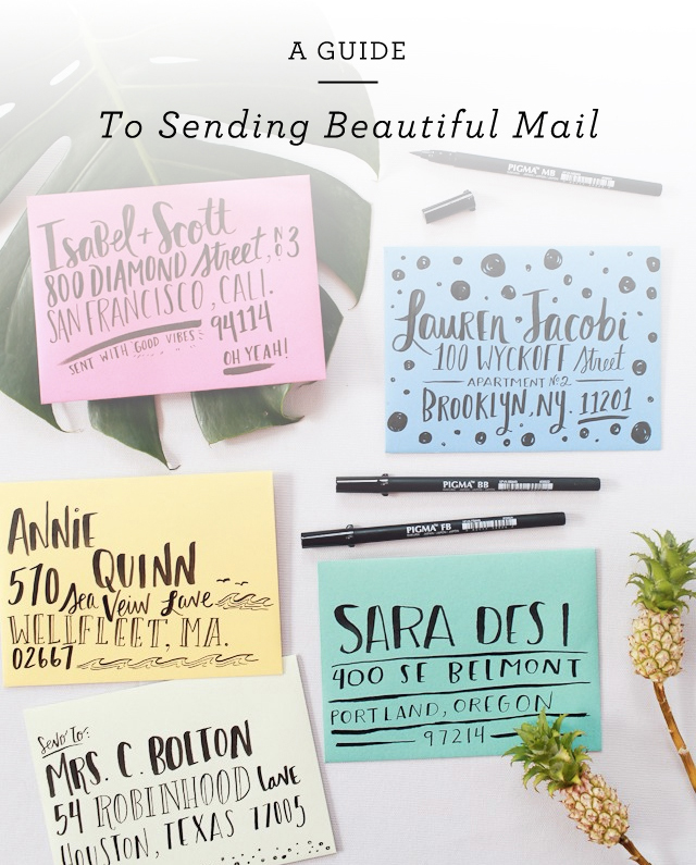
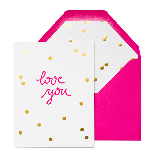
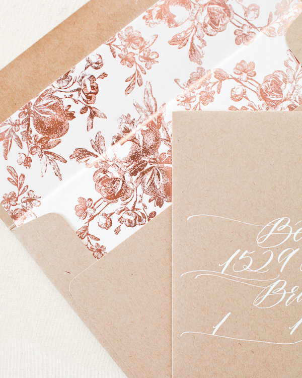
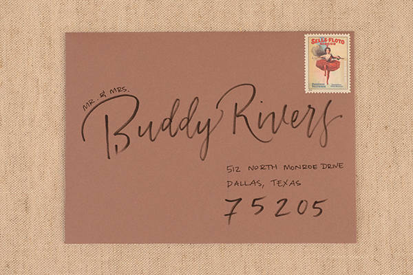
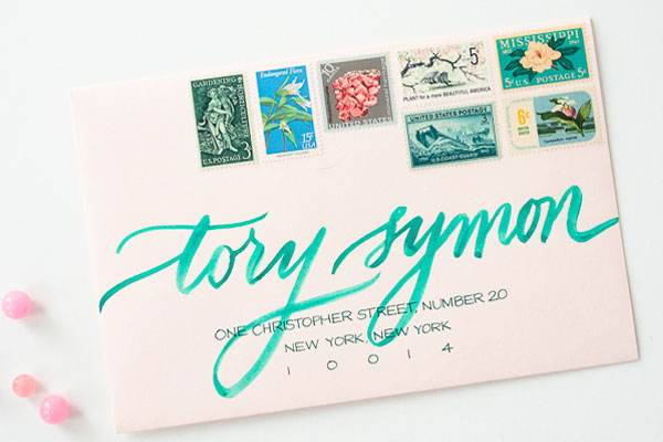
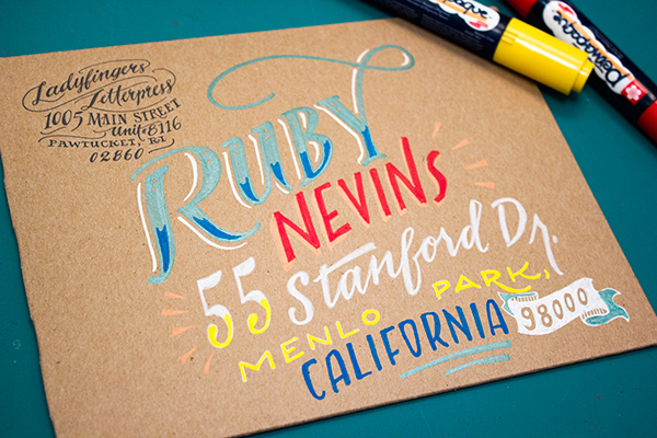
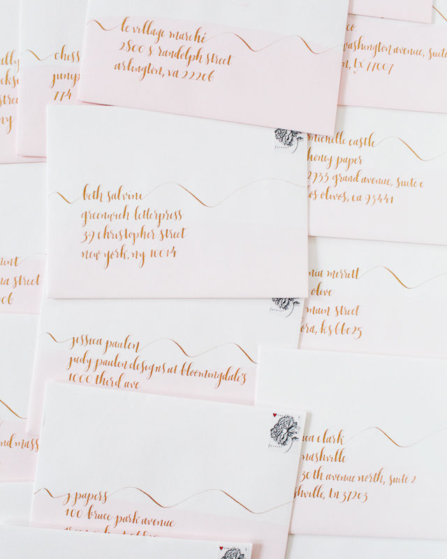
By now you all probably know that we do a lot of calligraphy and hand lettering in our studio at Antiquaria. Whether it’s for wedding clients, our rubber stamps, greeting cards or just to send snail mail to friends, we’ve got a pen in hand every day. In the spirit of back to school, we thought it would be really fun to give you a little jump-start into calligraphy in case you want to take on a little studious action of your own! This post has a trove of info about the tools, resources and basics you’ll need to get started in practicing calligraphy. We hope you have fun and use your newfound skill useful in your daily life too! –Bailey and Emma of Antiquaria

Getting Started in Calligraphy / Antiquaria for Oh So Beautiful Paper

If you’ve never done calligraphy before, you may find it all a little daunting. No lies…we did too. Simply speaking, calligraphy materials are not common anymore (because they are not at all necessary to daily life).  Most of the tools that are being made now are sub-par and you will never, EVER succeed with them, especially if you are a beginner.

Bailey learned this the hard way (even though she was told as much by her very first teacher). It was only a day after her first class when she sought out the nearest art shop and bought hundreds of dollars worth of “calligraphy” supplies. How much of that has she used over the years? Not a darn thing. What did she use? What her teacher gave her. Consider lesson learned. We’re here to set it all straight and hopefully get you started on the right path to calligraphy success!
Getting Started in Calligraphy / Antiquaria for Oh So Beautiful PaperThe basic supplies that you need to get started in calligraphy are pretty simple and inexpensive.

You’ll need:

  • a pen (otherwise called a pen holder); this is what you insert your nib into and hold while writing, we also have a whole blog post dedicated to picking a pen, here.
  • nibs those little pointy metal things that flex to create gorgeous letters (we like the Nikko G, Zebra G, Brause EF66 and Leonardt Principle)
  • paper the key is that it’s well sized (so that ink doesn’t bleed), arches, rhodia and canson make great papers. DO NOT BUY THAT ART-STORE CALLIGRAPHY PAPER. It’s bad news bears. Just because it says “calligraphy” on it does not mean it’s good for it.
  • sumi ink many things work for black ink and many don’t, we like sumi ink best for practice (and reproduction)
  • white ink it not necessary but it’s super fun to use, we like Dr. Martin’s Bleedproof white
  • ruler  for making straight lines to letter on
  • pencil great for practicing letter shapes, making lines, marking corrections, taking notes
  • storage box it’s not crucial but definitely helps keep your nibs together so they don’t get lost
  • writing surface writing with a dip pen is so different than normal writing – as anyone that’s practiced the art-form well knows. One thing that is very different is that you need to have a good writing surface so that the edges of the nib connect properly with the paper, giving you lovely letters.
    For beginners, we suggest writing on a stack of paper, so that you have a nice padded surface. Another option is using a craft foam pad, like this one. This is what we used for years…until discovering the awesome leather ones, made by Mr. M.G. Ward, shown below.

Resources

Books: Mastering Copperplate Calligraphy (still use this one ALL the time), by Eleanor Winters
Mastering Calligraphy: The Complete Guide to Hand Lettering (which features our very own, Bailey Rivera!!) by the lovely Gaye Godfrey-Nicholls
Our friend Molly Suber Thorpe of Plurabelle’s beauty, Modern Calligraphy

Online: The IAMPETH (or The International Association of Master Penman, Engrossers and Teachers of Handwriting) website is a trove of amazing resources from the best calligraphers in the world. This site could easily suck up days, even weeks of your life. They also have awesome teaching videos too! This one’s too good to miss.

The Flourish Forum has rapidly grown to be a massive community of calligraphers sharing resources, tips, and exemplars both new and old. It can be a little bit overwhelming since it has such an immense amount of material – but it’s a fabulous place to get involved. There are always snail mail exchanges to keep you practicing and connecting with other stationery and calligraphy enthusiasts. The mastermind behind the site, Erica McPhee, also publishes a calligraphy magazine that is wonderful, called Dasherie! It’s totally worth a read.

The Curious Calligrapher is a gorgeous site dedicated to ALL this calligraphy, servicing the calligraphy community. Here you’ll find more resources, forums and gorgeous eye candy!

Locally: You never know, you may just have a calligraphy mentor down the street! Google-ing “__your city__ calligraphy guild” is the best and fastest way to find local letter-lovers nearby. Plus, these non-profit organizations also offer workshops, get togethers and moral support (when you just can’t get your letters to look quite right).
Getting Started in Calligraphy / Antiquaria for Oh So Beautiful Paper

Warm Ups: Before diving into letterforms, it’s good to get familiar with your pen and ink. It will feel weird, really, really weird in your hand. That’s okay and totally normal.

1. Make thin lines (no pressure) and thick lines (full pressure) seeing just how thin and thick you can possibly flex your nib.

2. Next, make “waves” where on all of your upstrokes you have no pressure (a thin line) and on the down stroke you have a thick line (with pressure). The key to beautiful letters will be smoothly transitioning from thick to thin.

3. Lastly, we’ll make “loops” where again your upstrokes will be thin and the downstrokes will be thick. Pay attention to the transitions again and repeat these warm ups until the pen feels normal in your hand.

Getting Started in Calligraphy / Antiquaria for Oh So Beautiful Paper

Getting Started in Calligraphy / Antiquaria for Oh So Beautiful Paper

Getting Started in Calligraphy / Antiquaria for Oh So Beautiful Paper

Getting Started in Calligraphy / Antiquaria for Oh So Beautiful Paper

Getting Started in Calligraphy / Antiquaria for Oh So Beautiful Paper

Getting Started in Calligraphy / Antiquaria for Oh So Beautiful Paper

Getting Started in Calligraphy / Antiquaria for Oh So Beautiful Paper

This little exemplar is the “nuts and bolts” foundation to all pointed pen calligraphy. If you’ve never seen one before…you may be scratching your head thinking, “How does this differ from the cursive I learned in grade school?” 

Well, the main difference is the in the flexible nib pen. This awesome tool is what allows you get those desirable, lovable and gorgeous thick and thin lines we started playing with in the warm-ups. Without writing a book here, getting the thick and thin lines in your letters is both simple and difficult. It’s simple because all it takes is PRESSURE. It’s difficult because you have to learn how the pen behaves and make the pressure smooth. Only then will you have swoon-worthy letters.

To use the this exemplar, follow the directional arrows (from left to right), and press down on the pen when the line is thick and lift off of the pressure when it’s thin. Below, we show you how to “construct” the letters. There’s a lot of stopping and starting when doing calligraphy, which is certainly different from writing normally. Need more help? You can watch Bailey letter a-z in real-time in this video! Happy lettering folks! We’ll leave you with our favorite Calligraphy Truths…

Calligraphy Truths

Calligraphy takes Practice. And not just a little…but a whole lot.

You’ll know within a few hours of classes (or practice) whether or not calligraphy is for you.

It takes LASER-LIKE focus – especially if you want to spell things right.

Writing something meaningful is much more inspiring than the alphabet. Get the basics down and move onto “real” words. (Like a song, poem, recipe, ode to your cat…whatever speaks to you)

You’ll never, NEVER stop learning. Calligraphy is a vast and fascinating subject. Once you start…it’s like getting sucked into the rabbit hole with no turning back.

Buy quality supplies. It make all of the difference.

Calligraphers are the most friendly and awesome bunch of folks on the planet (kinda biased here) – but they’re truly the best resource out there. Find a mentor and ask questions!

Happy Weekend!

Happy Friday everyone! Today marks a big milestone – Sophie’s first day at preschool! Sophie has been in daycare since just after her first birthday, which after a rough transition period turned out to be an amazing experience for our entire family. She had some fantastic teachers and made her first real friends there, so we’re all feeling pretty emotional with this transition. But I keep telling myself that we’re not really saying goodbye since Alice will hopefully start at the same daycare soon. And we’re feeling good about Sophie’s preschool – we like her teachers and have already met some of the other kids in her class. My big girl is growing up so fast! Can we just ask the world to stop turning for a bit please? Well, in the meantime…

Autumn Clematis / Gossamer Vintage via Instagram

Photo by Gossamer Vintage via Instagram

…a few links for your weekend!

This week on Oh So Beautiful Paper:

Four Tips for Awesome Paper Styling

Last week I mentioned my new partnership with eBay. They asked me to curate some shopping collections around my favorite topics. And I’ve been having so much fun pulling them together! My first two collections featured home bar essentials and a fun group of cocktail picks, stir sticks, and paper straws! I also thought it would be fun to share a few of my favorite paper styling props and some tips for awesome paper styling! I know through experience that even the prettiest wedding invitations and birth announcements can be really hard to photograph. But with the right technique and a few styling props, you can take your paper photography and styling to the next level!

Tips for Paper Styling / Oh So Beautiful Paper + eBay

Start with the Right Conditions

A great photo starts with good lighting conditions and a few pieces of equipment. Always take photos using bright and even natural light, ideally on a table placed near or next to a large window. Buy the highest quality camera you can afford and invest in a great 35 mm or 50 mm lens. A few basic pieces of inexpensive equipment, like light diffusers, reflectors, and white foam core, can help you create a makeshift light box and avoid harsh shadows or bright spots.

Elegant Blind Emboss Calligraphy Wedding Invitation by Coral Pheasant and Brown Linen Design

Photo Credit: Coral Pheasant

Choose Your Backdrop

I always recommend styling and photographing paper against a flat surface placed on the floor or a table near a window. White or colorful foam board makes a fantastic neutral backdrop. You can also choose a neutral linen or fabric in a complementary color to elevate your photographs. If you’ll be taking lots of photos, consider investing in a styling surface – Erickson Surfaces, Woodville, and One Stone West are all great places to start.

Mint and Navy Calligraphy Wedding Invitations / Photo Credit: Mandy Busby Creative / Design by Holly Hollon

Photo Credit: Mandy Busby Creative / Design by Holly Hollon

Style it Up!

I always return to the same favorite props for my own styling needs. Choose items in a variety of shapes, sizes, and dimensions to direct the viewer’s eye and fill negative space. Vintage postage stamps, brass paperclips (especially in unique shapes!), twine, silk and cotton ribbon, washi tape, brass scissors or letter openers – anything with texture or that adds a vintage patina is perfect for adding character to photos! Natural elements like seashells and dried lavender also make fantastic styling props.

Gold Foil Polka Dot Birth Announcements by Lauren Chism Fine Papers

Photo Credit: Lauren Chism Fine Papers

Avoid a Grid

Paper styling and photography should be fun! Try to photograph everything straight on, with a few fun props scattered around to add visual interest. Have at least one thing (and maybe three) slightly off-kilter in each image. Square or rectangular paper pieces turned on a slight angle feel playful and whimsical. Have some elements touch or overlap in the photo to create depth and texture. Ribbon and washi tape can also run off the image to create movement and add visual interest.

Antiquaria Design

Photo Credit: Antiquaria Design Studio

Finally, don’t forget to take photos of the full paper suite, especially for wedding invitations and birth announcements, along with plenty of detail shots of individual pieces. And those detail shots are a great excuse to rotate and add in new props!

For any stationers out there, whether you have a wholesale stationery line or specialize in custom design, you’ve probably heard about the importance of styling a million times over. And to be honest, it’s a huge factor when I’m deciding which submissions to feature here on Oh So Beautiful Paper. Great styling can really help elevate a beautiful design and make it stand out from the crowd!

This post was created in partnership with eBay. All content and opinions are my own. Thank you for supporting the sponsors that make Oh So Beautiful Paper possible!

DIY “Happy Tears” Hand Painted Handkerchief

We’ve collected vintage handkerchiefs here at Antiquaria for years. There’s something so sweet and sentimental about the delicate fabric and pretty designs. For today’s DIY tutorial, we repurposed a few of them as gifts for some brides-to-be in our lives. This simple and fun project is the perfect thing to make for a loved one on their wedding day, or for you to give your mom or gals on your own wedding day. –Bailey and Emma of Antiquaria

DIY Happy Tears Hand Lettered Handkerchief / Antiquaria for Oh So Beautiful Paper

Materials

Vintage handkerchiefs

Printed “For Happy Tears” design (or a design of your choosing)

Vertex Screen printing Ink, we used black

High quality pointed paintbrush

Jar of water (for mixing and cleaning paint)

Iron and pressing cloth

DIY Happy Tears Hand Lettered Handkerchief / Antiquaria for Oh So Beautiful Paper

Step 1. Print out the “For Happy Tears” download (available here) or design your own to fit the handkerchief you’d like to letter. Lay the design underneath and set something heavy toward the top to weigh down the fabric. Luckily, most vintage handkerchiefs are made of pretty transparent fabric so seeing the design is very easy.

Step 2. Prep your paint. We used a water based screen printing ink that we had on hand and diluted it with water so that it would flow nicely through our brush. Test the ink consistency on a scrap piece of fabric. Too much water will make the paint spread and not give a crisp line.

Step 3. Carefully trace the design. It’s always best to write on the very (thin) tip of a paintbrush. For the thicker portions, come down a bit to give the line some weight. Want to see the lettering in action? There’s a video of Bailey lettering an entire handkerchief on our blog.

Step 4. Heat set the design to make it waterproof. Simply follow the manufacturers instructions using an iron and a pressing cloth.

DIY Happy Tears Hand Lettered Handkerchief / Antiquaria for Oh So Beautiful Paper

DIY Happy Tears Hand Lettered Handkerchief / Antiquaria for Oh So Beautiful Paper

DIY Happy Tears Hand Lettered Handkerchief / Antiquaria for Oh So Beautiful Paper

DIY Happy Tears Hand Lettered Handkerchief / Antiquaria for Oh So Beautiful Paper

DIY Happy Tears Hand Lettered Handkerchief / Antiquaria for Oh So Beautiful Paper

All artwork © 2015 Antiquaria and is made available for personal use only.

Photo Credits: Antiquaria for Oh So Beautiful Paper