{happy weekend!}

Happy Friday everyone!  This week practically flew by (as is often the case after a holiday weekend), but I’m looking forward to the weekend – even though painting my bedroom is the most exciting thing I have planned.  I’m trying to check some home projects off my to do list before my husband comes home in a couple of months, and although painting is tedious work I’m looking forward to a bit of change.  But in the meantime…

Summertime

…a few links for your weekend:

This week on Oh So Beautiful Paper:

That’s it for me this week!  I hope you all have a wonderful weekend, and I’ll see you back here on Monday! xoxo

Photo Credit: Simple Tess

Lindsay + Ben’s Modern Venn Diagram Wedding Invitations

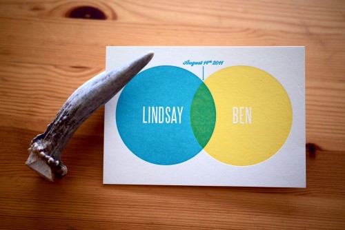
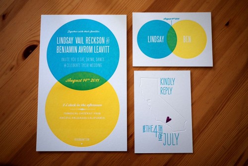
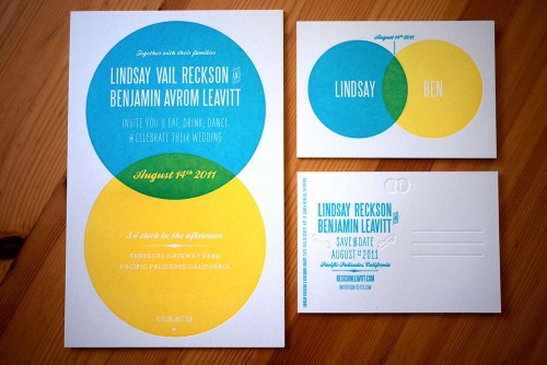
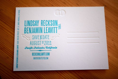
The concept behind this wedding invitation suite – a venn diagram – is just so completely perfect I can barely stand it.  Lindsay and Ben have been a couple for more than a decade, so when it came time to create their wedding invitations they couldn’t imagine a symbol that would better represent their relationship and upcoming nuptials.  From the bright color palette to the beautiful blind impression and overprinted letterpress elements, I’m loving every single detail from Lindsay and Ben’s invitations.

Modern-Blue-Yellow-Venn-Diagram-Letterpress-Wedding-Invitations

From Lindsay:  In February of this year, my fiancé Ben and I enlisted our close friend and Ben’s directing partner Nick Carbonaro to help us create an invitation suite that would capture our modern, upbeat aesthetic. The venn diagram became a way to mark our longtime union (we’ve been together for over ten years) and to celebrate the wonderful overlap that is our life together.  Another friend noted that our invitation color scheme mimics the ziplock seal: fittingly, as we like to keep things fresh (both relationship-wise and design-wise) and we love snacks.

Modern-Blue-Yellow-Venn-Diagram-Letterpress-Wedding-Invitations

Modern-Blue-Yellow-Venn-Diagram-Letterpress-Wedding-Invitations

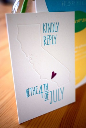
As our save-the-date postcard and invitation used the same venn diagram design, we wanted to do something a little different for our reply card.  Using a tiny, hand-carved stamp from etsy seller little t jane, we created a California-themed (and happily rhyming) postcard.

Modern-Blue-Yellow-Venn-Diagram-Letterpress-Wedding-Invitations-RSVP Modern-Blue-Yellow-Venn-Diagram-Letterpress-Wedding-Invitations

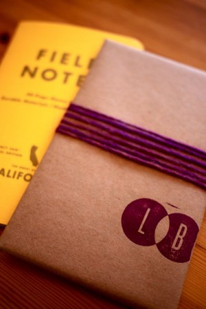
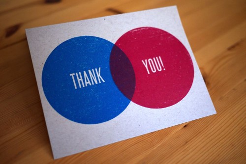
 We also carried the venn diagram into our wedding favors, wrapping small California state notebooks from Field Notes in butcher paper and stamping them with our initials.  And most recently, we used two enormous stamps and primary color inks to make our thank you cards.

Modern-Blue-Yellow-Venn-Diagram-Letterpress-Wedding-Invitations-Thank-You-Cards

Our good friend Laurie Smithwick of LEAP Design provided wonderful advice and guidance, and Studio on Fire printed the whole suite in gorgeous letterpress.

Modern-Blue-Yellow-Venn-Diagram-Letterpress-Wedding-Invitations-RSVP-Back

Just stunning Lindsay!  And totally pitch perfect from start to finish.  Congratulations!

Photo Credits: Lindsay + Ben

Blue + Copper Invitations for a Hindu Jewish Wedding

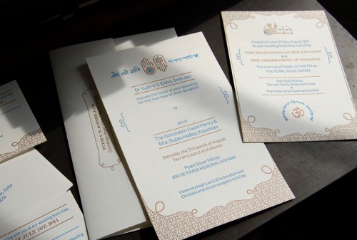
Pistachio Press recently printed these amazing wedding invitations for a Hindu/Jewish wedding, and I fell in love the minute I saw them.  The invitations were designed by the bride’s sister, seamlessly blending the cultures of the bride and groom into one complete design.  I love the blue and copper color palette and the use of complementary symbols and both hindu and hebrew text to bring the suite together!

Hindu-Jewish-Wedding-Invitations

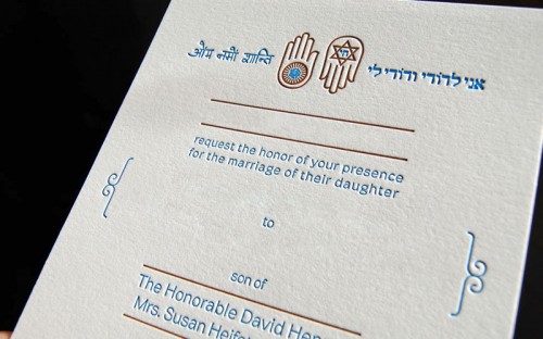
From the bride’s sister, Cheena: Our goal was to capture two religions and both the Indian and Jewish cultures in a single invitation.  Essentially, we wanted the invitation to reflect traditional Indian themes, but allow the Jewish cultures to also be reflected. It was a challenge to incorporate (evenly) two very different cultures, but by using similar symbols like the Hamsa Hand and the Jain Ahimsa hand, we were able to help develop a unified design sensibility.

Hindu-Jewish-Wedding-Invitations

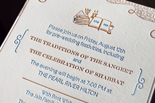
I incorporated a Hindi script (a blessing of peace) counter balanced with the Hebrew (a saying about love) as well as the image of the drum (dholak) and peacock feathers, which are traditional for a “Sangeet” invite.  The Shabbat/Shalom prayer as a symbol of the Shabbat service that will take place at the wedding also helped unite the theme.  Since it was hard to find usable Hindi, the text was handwritten and then vectorized so that we could have something to match with the Hebrew saying that we wanted to incorporate.

Hindu-Jewish-Wedding-Invitations

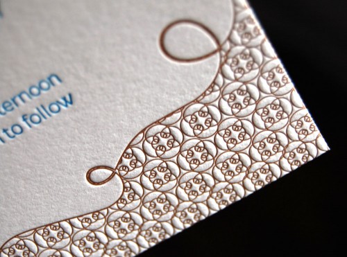
I wanted to incorporate a border that has some level of Western culture (the pattern was created from an ornament in the font Brownstone that pays homage to New York City, which has a deep meaning to the bride and groom), but also created a masking of this pattern in a way that made it very eastern and Indian in some ways.  The invitation is a symbol of the unitying of two cultures with this marriage.  It’s almost the first step the bride and groom have taken to do this aside from overall wedding planning.

Hindu-Jewish-Wedding-Invitations

So stunning!  A big congratulations to the bride and groom – and you can see more of Cheena’s design work right here and beautiful letterpress work from Pistachio Press right here!

*Pistachio Press is a spon­sor of Oh So Beau­ti­ful Paper.  For more on my editorial poli­cies, please click here.

Lauren + Joel’s Old Timey Letterpress Wedding Invitations

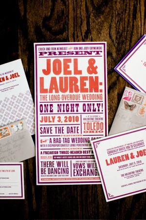
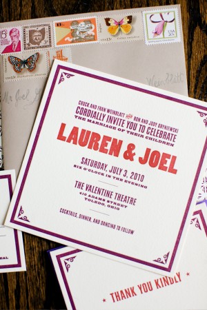
I love it when designers get married – I get practically giddy in anticipation of the awesome wedding stationery.  So when Lauren and Joel from Old Tom Foolery got married last summer, I couldn’t wait to see what they came up with for their invitations and save the dates.  The result is an old-timey-meets-classic wedding invitation suite that perfectly suits both Lauren and Joel’s personalities as well as the cool venue where they were married – all with a total sense of fun, fun, and fun.

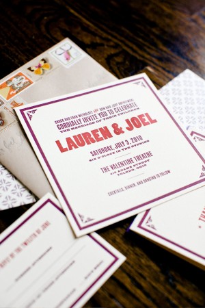
Old-Tom-Foolery-Red-Purple-Letterpress-Save-the-Dates Old-Tom-Foolery-Red-Purple-Letterpress-Wedding-Invitations

From Lauren and Joel: We wanted the event to feel fun, with a hint of old-timey-ness.  After all, we were trying to convince friends and family from around the country to come to Toledo, Ohio. (Not a destination on everyone’s ideal vacation list.)  We tried to get people excited with an oversized theater poster-type save the date.  This is really where we had our fun with the printed pieces.  The save the dates were then followed up with a more toned-down invitation that still retained the look and feel of the first piece.  We kept the look going with ceremony programs, thank you notes, place cards, and cookie jar labels for my mom’s famous homemade cookies.

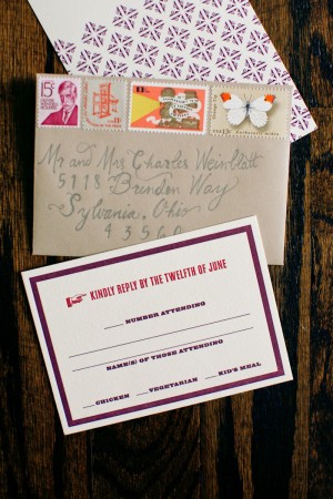
Old-Tom-Foolery-Red-Purple-Classic-Letterpress-Wedding-Invitations Old-Tom-Foolery-Purple-Red-RSVP-Envelope-Vintage-Stamps

The invites were printed by Norman Clayton of Classic Letterpress in Emeryville, CA on Crane’s Lettra and the envelopes were from Paper Source.  We also tried to find vintage stamps that fit our personality, like a funny guy with a mustache, a printing press, Ohio stamps, and a retro film stamp since we got married at an historic theater.  Tor Weeks did the hand lettering on the outside of our envelopes (she is also the designer of our Typestache poster).

Old-Tom-Foolery-Wedding-Lauren-Joel-Ceremony Old-Tom-Foolery-Wedding-Lauren-Joel

Old-Tom-Foolery-Wedding-Bouquet Old-Tom-Foolery-Red-Orange-Purple-Bouquet

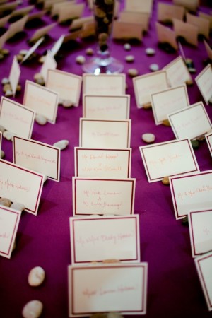
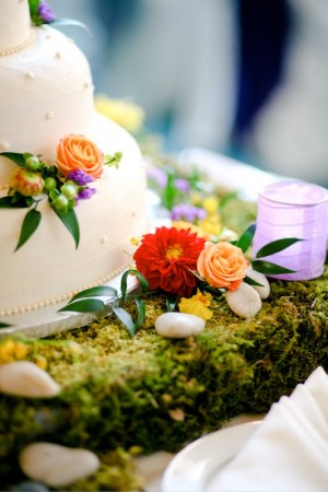
Old-Tom-Foolery-Wedding-Lauren-Joel-Seating-Cards Old-Tom-Foolery-Wedding-Lauren-Joel-Cake

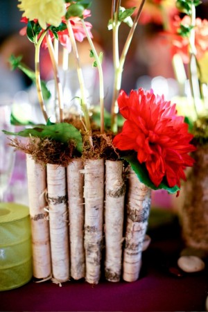
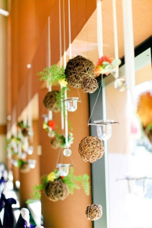
Old-Tom-Foolery-Wedding-Lauren-Joel-Birch-Centerpiece Old-Tom-Foolery-Wedding-Lauren-Joel-Reception-Decor

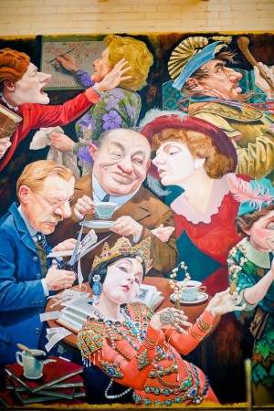
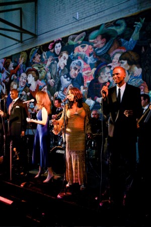
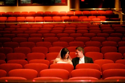
The whole look of our event was based on the colors and vibe of two things: The Dahlia Dell in Golden Gate Park, which we used to walk to when we lived in San Francisco, and the gigantic mural of historic performers at the Valentine Theatre, where we were married.  We pulled rich magenta and plum colors from the garden and mural and accented them with a variety of reds, oranges, greens, and neutral browns.  But the best part of the night was really the awesome Motown band we brought in from Detroit.

Old-Tom-Foolery-Lauren-Joel-Wedding-Venue Old-Tom-Foolery-Lauren-Joel-Wedding-Motown-Band

Old-Tom-Foolery-Lauren-Joel-Wedding

So cute!  Congratulations you guys!  For more awesomeness from Lauren and Joel, check out Old Tom Foolery right here!

Photo Credits: Aruna B. Photography


Sneak Peek – Martha Stewart Weddings Summer 2011

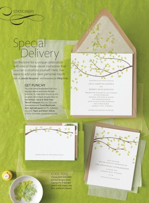
The newest issue of Martha Stewart Weddings hits newsstands soon – and this time it’s the DIY issue!  The Summer 2011 issue is full of beautiful inspiration, from flowers to music to fashion, but today we have a special sneak peek at the invitation inspiration!

There’s an amazing five-page story just on wedding invitations, with lots of creative ideas on how to personalize your wedding invitations and save the dates with crafty DIY touches – from rubber stamps to twine to wax seals.  My personal favorite involves dry-brushed (and super colorful) watercolor paint on a letterpress wedding invitation.  So, so pretty.

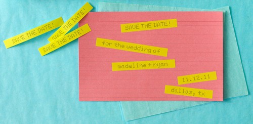
The editors even had some fun playing around with non-traditional DIY invitation ideas – like these invitations created using a P-touch label maker and colored index cards.  Such a great idea for a modern wedding, or even a school theme wedding!

Check out the rest of the story in the Summer 2011 issue!

Photo Credits: Cover by Patricia Heal; Invitation Photography by Philip Ficks, both for Martha Stewart Weddings, Summer 2011