Friday Happy Hour: The Jack Rose

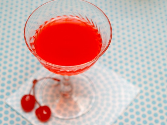
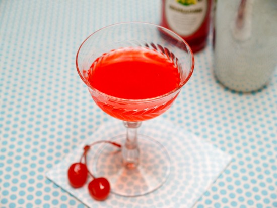
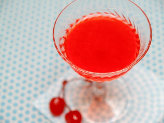
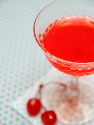
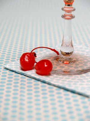
With its pink color and its half-ounce of grenadine, the Jack Rose might seem like a syrupy party drink.  It’s definitely not! The Jack Rose is sweet and tart, yes, but with a rich, complex flavor from its inspired pairing of apples and pomegranates.

Read below for the full recipe!

Jack Rose

2 oz Apple Brandy
1/2 oz Lemon or Lime Juice
1/2 oz Grenadine

Combine the ingredients, shake with ice, strain into a chilled cocktail glass, and enjoy.

Whoever mixed up the first Jack Rose, and complemented the smooth, oaky tartness of apple spirits with the sweet-tartness of pomegranate-based grenadine was really on to something. The grenadine is definitely not around just to make the drink sweeter or give it color (though those help too).


The Jack Rose was traditionally made with applejack, but stick with true aged apple brandy here.  There are some spirits that call themselves applejack around, but I don’t know of any that’s truly jacked, or freeze distilled.

Lemon or lime?  I don’t think it matters much, honestly.  The oldest recipe in print, from 1905, calls for lemon, but Jacques Straub’s 1914 Drinks calls for lime.  I don’t notice much of a difference, except that lemon maybe creates a slightly mellower cocktail.


Much more important is choice of spirits.  A mellow, delicate spirit, such as Laird’s 7 1/2 year apple brandy, will let the pomegranate stand out.  If you want the flavor of apples to really shine, like I do, try a really bold spirit, like Clear Creek’s 8 year eau de vie de pomme, which puckers with tart apple flavor.

The name?  Maybe from the applejack and its color (boring).  Maybe from the jacqueminot rose, which shares a remarkably similar dark pink color (boring).  Maybe from Frank May, a bartender to whom the drink was first attributed in 1905, who went by the nickname Jack Rose (probably true, but still boring).  Or maybe it was named after Baldy Jack Rose, the gambler and gangster whose gambling den, the Rosebud, had a bar where the Jack Rose may have been invented.  Unlikely, but exciting!

Photo Credits: Nole Garey for Oh So Beautiful Paper

{happy weekend!}

Happy almost weekend everyone!  Do you all have fun plans for the weekend?  My husband and I are looking forward to hanging out with some friends, attending one of our favorite antique fairs here in DC, and hopefully going to see a movie.  It’s been months since we last went out to the movies, which is really unusual for us!  But in the meantime…

…a few links for your weekend!

This week on Oh So Beautiful Paper:

We have another fun cocktail coming up for you this afternoon, so check back a bit later for the recipe!  I hope you all have a wonderful weekend, and I’ll see you back here on Monday! xoxo

Photo Credit: Scissor Variations

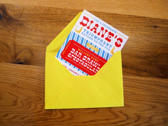
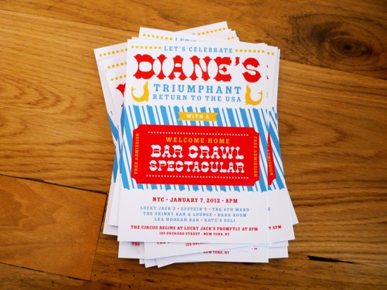
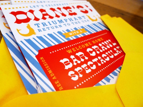
Diane’s Circus-Inspired Bar Crawl Party Invitations

Lindsay from McMillian + Furlow sent over these super fun bar crawl invitations that she designed to help celebrate a friend’s return to the United States from a teaching stint overseas.  Lindsay wanted the invitations to feel jubilant and playful, so she drew inspiration from vintage circus posters, incorporating a very American red and blue color palette along with fun wood type-inspired fonts.  So cool!

From Lindsay: I decided to go with a circus themed bar crawl, and found a ton of inspiration in vintage Barnum and Bailey posters, raffle tickets and the beloved classic popcorn bag.  Along with the red and blue, I love how the design feels very American, which is appropriate for this particular celebration.

I’m always trying to find any excuse to use some of my favorite wood type fonts, and this project was no exception.  The combination of bold color, playful typography and circus-inspired illustration all contribute to the success of this festive design.  The invitations were printed digitally on a thick glossy paper and mailed in bright yellow envelopes.  With all this hype it’s bound to be a exceptionally good time!

Thanks Lindsay!

Photo Credits: McMillian and Furlow

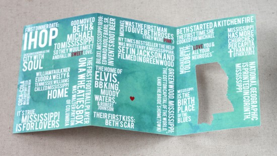
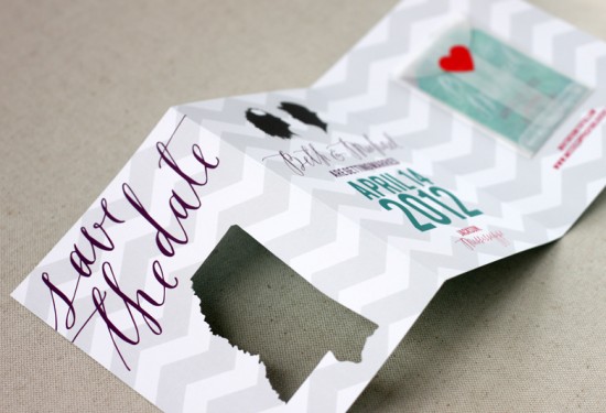
Beth + Michael’s Chevron Stripe Calligraphy Save the Dates

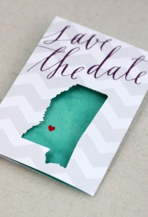
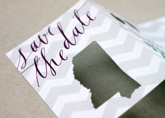
My oh my, I’m seriously in love with these save the dates. Created by Sarah of August Blume, Beth and Michael’s modern and whimsical save the dates combine beautiful lettering from Feast Calligraphy, chevron stripes, a fun interactive layout, and cut-out details. So cute!

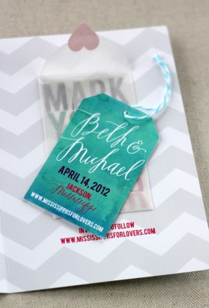
From Sarah: I had the pleasure of designing a save the date card (and getting extra creative) for photographer Beth Morgan and her beau, Michael, for their spring 2012 wedding.  With a palette of teal, plum, fuchsia & slate (and the occasional red heart), we mixed their “Mississippi is for Lovers” theme with custom silhouettes and a muted chevron pattern.

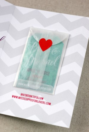
We wanted a unique, interactive save the date to set the tone for their April wedding and to get guests excited about traveling to the South.  The couple met and fell in love in Mississippi so we included little-known-facts about the couple and their state on the back of the trifold card with a teal watercolor background.


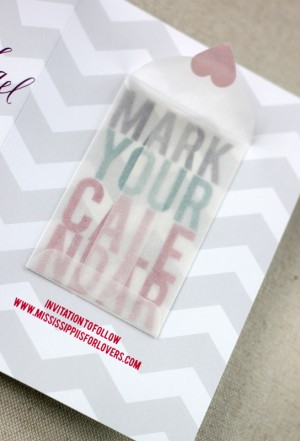
The last panel features a mini glassine envelope holding a hang tag so guests can mark their calendar!  The calligraphy was penned by the very talented Alissa of Feast Calligraphy.  The cards were digitally printed on solar white cover stock and each Mississippi was individually cut using my Silhouette Cameo.

I love it!  Thanks Sarah!

Check out the Designer Rolodex for more tal­ented wed­ding invi­ta­tion design­ers and the save the date gallery for more beau­ti­ful cus­tom save the dates!

Photo Credits: August Blume

Lauren + John’s Rustic Home Letterpress Wedding Invitations

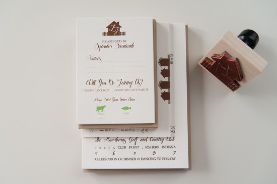
This set of beautiful and incredibly meaningful rustic wedding invitations comes to us from Ravyn of Three Fifteen Design.  Ravyn included illustrations of houses with picket fences to represent Lauren and John’s new home together, along with a lyric from one of their favorite songs.  Just perfect.

From Ravyn: John & Lauren are an awesome couple: They met in high school and have had a long distance relationship ever since.  John was deployed overseas as a lieutenant in the Army while Lauren was planning their Fall wedding back in Indiana.  Right before the wedding, John made it back to the U.S., and they bought their first home together.  They loved the idea of incorporating a rustic home theme into their suite, as they had never shared an actual house when we started the process… and they felt at home with each other.

We took the line, “Home Is Wherever I’m With You” from one of their favorite songs, and used it as the base for the entire suite.  We wanted everything to feel natural and comfortable.  We created a series of little houses with the picket fence as the common graphic element that was used throughout the set.  We modified a script font a bit and traced it by hand to give it a more handmade feel.

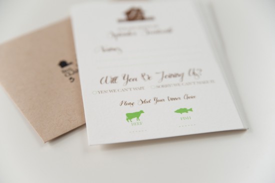
The suite was printed by our amazing letterpress printer, Czar Press.  The invitation was printed by letterpress on beautiful and thick cotton paper.  The response and accommodations cards were flat printed on the same paper, which allowed us to bring in the pop of apple green they wanted.

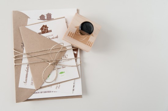
The entire suite was wrapped up with kraft paper envelopes and finished off with a custom return address stamp we created to match the stationery.  Lauren & John also had us create a little house stamp they could use for favor tags & bar napkins at the wedding.

Thank you so much Ravyn!

Design: Three Fifteen Design

Letterpress Printing: Czar Press

Check out the Designer Rolodex for more tal­ented wed­ding invi­ta­tion design­ers and the real invi­ta­tions gallery for more wedding invitation ideas!

Photo Credits: Three Fifteen Design

*Czar Press is a spon­sor of Oh So Beau­ti­ful Paper; for more on my edi­to­r­ial poli­cies please click here.