Inspired by: Metallics!

Everything still feels all shiny and new this early in the year, so I today thought it would be fun to continue my love for all things metallic.  We already know that I’m crazy for anything with gold foil, but my metallic affections extend way beyond gold.  Silver, copper, brass are just as beautiful – particularly when mixed together!

No. 1 Metallic wedding invitations from Bella Figura; No. 2 Sugar Paper; No. 3 Oh Joy! Petal Pusher wallpaper from Hygge & West; No. 4 Metallic escort cards via Martha Stewart Weddings; No. 5 Yellow Owl Workshop; No. 6 Knot & Bow; No. 7 Brides.com

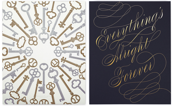
I also love these metallic prints from Enormous Champion – silver and gold letterpress printed skeleton keys and a beautiful gold foil print on dark navy paper.

Bella Figura is a mem­ber of the Designer Rolodex â€“ you can see more of their beau­ti­ful work here!

{images via their respective sources}

*Bella Figura is one of my fab­u­lous spon­sors; for more on my edi­to­r­ial poli­cies please click here.
 

Michele’s Hot Air Balloon Baby Shower Invitations

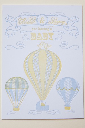
These adorable baby shower invitations come to us from Michele of Smitten Owl, a letterpress and design studio in New York City.  When it came time to the invitations for their baby shower, Michele and her husband Greg were inspired by their grand new adventure, incorporating hot air balloons into a two-color letterpress design.  So sweet!


From Michele: When my husband and I found out we were having a baby, among the many thoughts running through my head was “away we go!”  This inspired our hot air balloon and animal family design.  The two birds sitting on top of the center balloon were repurposed from our wedding invitations.  Our family was so excited to see the little “Greg and Michele” birds again!


The invitation includes a two-piece letterpress suite with a digital print registry card and custom envelope liners.  The announcement card and invitation are two-color letterpress printed on 220lb Reich Savoy.  In an effort to reduce the number of plates needed but still keep the design dynamic we added hash marks to the main balloons.  This also added a beautiful texture to the two color design.

Thanks Michele – and congratulations!

Photo Credits: Bia Sampaio

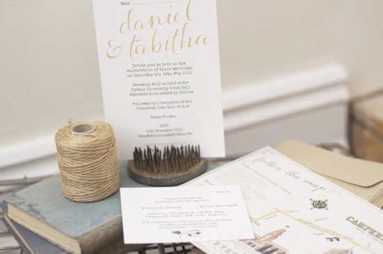
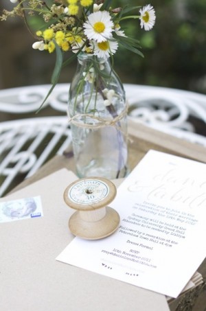
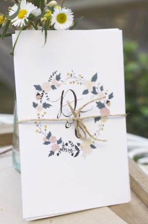
Tabitha + Daniel’s Whimsical Illustrated Wedding Invitations

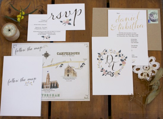
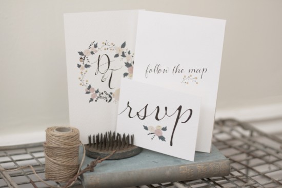
These wedding invitations from designer and illustrator Tabitha Emma are so incredibly sweet.  Tabitha created the invitations for her own wedding in Australia, incorporating her own hand lettering, illustrations of Australian flora and fauna, and vintage-inspired elements like a custom illustrated map.  The entire invitation suite was packaged in kraft paper envelopes and twine.  So pretty!

From Tabitha: Before designing the invitations, I wrote down a list of everything that was very ‘us’ to help create an invitation that reflected us as a couple.  We both love old things, vintage, brown paper, string, and nature.  My fiance grew up in the country and we will be moving out there for the first year or so of our marriage, and so I wanted the invitations to also have a natural country feel.

It also has a bit of an Australian bush influence, as we live in Australia, and the design features Australian fauna.  As we both love history and old things, I gave the map a very vintage feel.  The background was based on an old Sydney map.  And the suburb typography was also taken from old Sydney maps.  It is a combination of old and new.


Thanks Tabitha!

Design: Tabitha Emma
Printing: Satellite Digital

Check out the Designer Rolodex for more tal­ented wed­ding invi­ta­tion design­ers and the real invi­ta­tions gallery for more wedding invitation ideas!

Photo Credits: Tabitha Emma

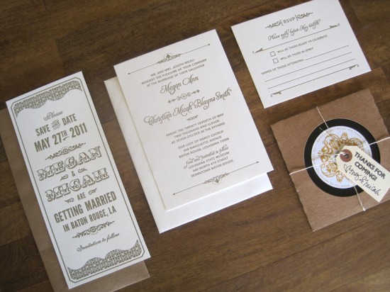
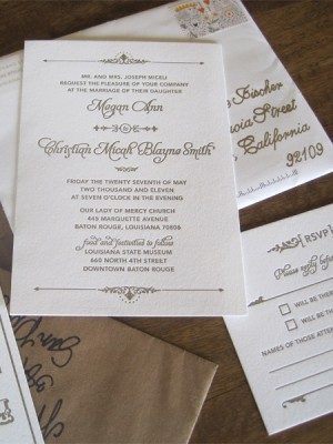
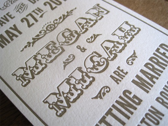
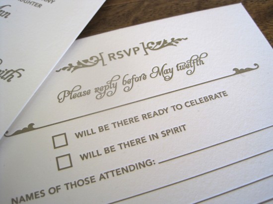
Megan + Micah’s Metallic Art Deco Letterpress Wedding Invitations

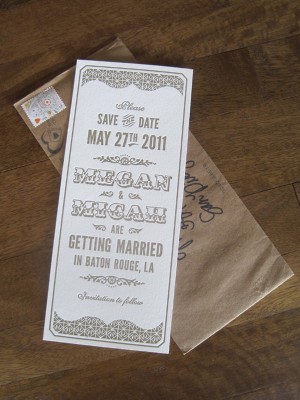
Brynne from Harken Press sent over these fun vintage-inspired save the dates and invitations that she created for a recent wedding, along with some of the fun day-of wedding stationery details.  Brynne started off with an Art Deco-inspired save the date, followed by a classic wedding invitation – all letterpress printed in a beautiful soft metallic gold ink by Quality Letterpress.

From Brynne: The bride and groom were initially inspired by vintage circus posters and the Art Deco movement for their wedding suite.  The one color design reflects the mood the couple wanted for the wedding; romantic, unique, vintage inspired, and a little nontraditional.


Each piece uses a gold (slightly metallic) ink and Crane Lettra cotton paper that compliments their neutral color palette of gold, white, and brown.  Letterpress printing was the perfect way to add that old world charm and elegance that suited this event.  Tim at Quality Letterpress did an amazing job with the printing.

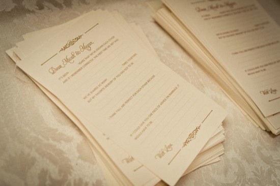
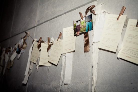
Megan and Micah also had a few extra finishing touches for the big day.  Guests were asked to fill out a card with funny memories, their thoughts on why they thought Megan and Micah were perfect for each other, and marriage advice.  The cards were hung on a line with clothespins, making it interactive and decorative at the reception.  All the guest cards were later compiled into a book to remember the festivities.

So fun!  Thanks Brynne!

Design: Brynne Fischer at Harken Press
Letterpress Printing: Quality Letterpress

Check out the Designer Rolodex for more tal­ented wed­ding invi­ta­tion design­ers and the real invi­ta­tions gallery for more wedding invitation ideas!

Photo Credits: Invitation photos by Harken Press; wedding photos by Sara Kelley Photography

Rachel + Josh’s Scrabble Letterpress Wedding Invitations

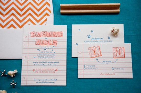
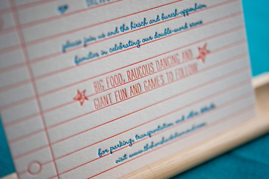
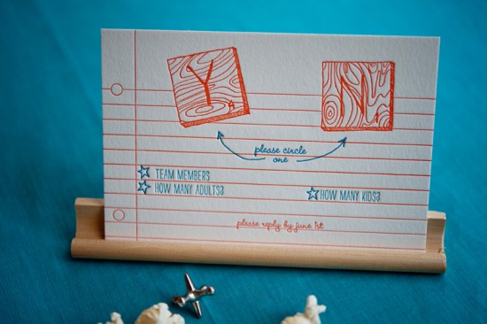
Happy Monday everyone!  We’re starting the week with fun and casual wedding invitations from Gus & Ruby Letterpress inspired by Scrabble tiles!  Samantha and Whitney created these playful invitations for a wedding this past summer, mixing bright colors with non-traditional wording and illustrations created by the bride – all letterpress printed on thick cotton paper.

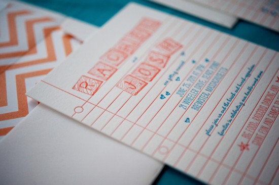
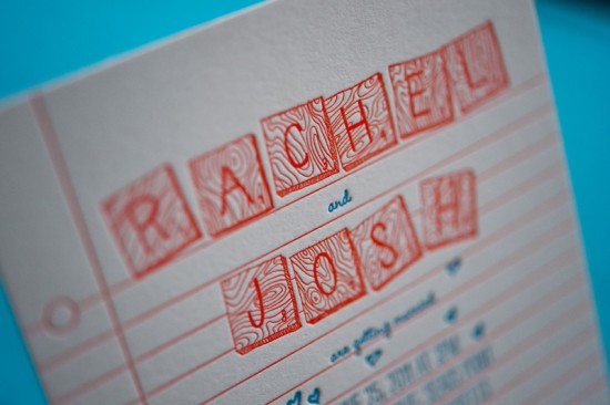
From Samantha and Whitney: We designed these wedding invitations for a super rad couple getting married in Brewster, Massachusetts.  Rachel and Josh wanted their stationery to reflect their fun-loving, casual, family-oriented personalities and the tone of their event.  For the entire suite, we played off illustrations that the bride created of Scrabble tiles spelling out their names.  

We then used bright colors, a mix of casual fonts and a ruled-paper background to give the pieces lots of personality and fun.  Personal and non-traditional wording played off the Scrabble theme and set the tone for a celebratory event.  Of course, all the pieces were lovingly letterpress printed by hand on our antique press (c. 1896) on beautiful, textural, super thick 220# 100% cotton.

Thanks Sam and Whit!

Gus & Ruby Letterpress is a member of the Designer Rolodex – check out more of their beautiful work right here or visit the real invi­ta­tions gallery for more wedding invitation ideas!

Photo Credits: Brea McDonald Photography for Gus & Ruby Letterpress