{happy weekend!}

Happy Friday everyone!  It’s been a long week for me, and I have mixed feelings heading into the weekend.  I’m looking forward to hanging out with friends and relaxing a bit, but still really missing my hubby overseas.  I’ve also been spending a lot of time listening to the band in the video below, Two Door Cinema Club – they’re from Ireland and it’s just what I need to keep my spirits up.  But in the meantime…

…a few links for your weekend:

This week on Oh So Beautiful Paper:

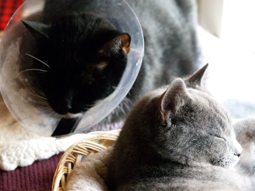
That’s it for me this week!  I hope you all have a lovely weekend!  I’ll be trying to stay warm with these two fuzzballs.  And yes, that’s our cat Leopold in the upper left, still in his cone of shame from his surgery back in November.  What an ordeal.  See you back here on Monday!

Leopold and Charlie

{photo by me}
More Paper-Inspired Pairings

It’s been such a pleasure to blog here for the last five days.  A huge thanks to Nole for letting me take over her blog this last week. I hope it’s been a fun and relaxing break for her.  I thought I would leave you with much as I began, with a few more pairings inspired by some of my favourite items from the Oh So Beautiful Paper archives.  Have a great weekend!

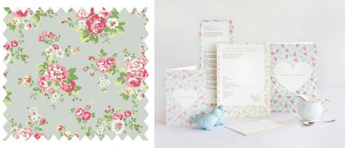
1. Oilcloth fabric by Cath Kidston
2. Invitations by Mitchell & Dent, originally blogged here

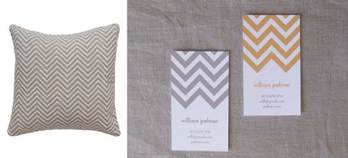
1. Chevron pillow by Madeline Weinrib
2. Calling cards by Sweetbeaker, originally blogged here

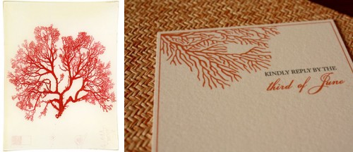
1. Coral decoupage by John Derian
2. Invitations by Zenadia Design, originally blogged here

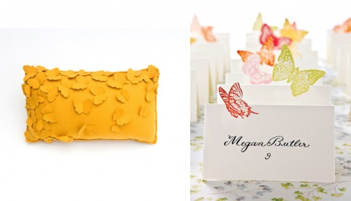
1. Butterfly cushion by Bev Hisey
2. Escort cards by Wren Handmade, originally blogged here

1. Tabletop linens by DwellStudio
2. Note cards by Satsuma Press, originally blogged here

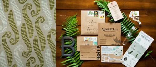
1. Aurora fabric from Rapture & Wright
2. Wedding invitations by Postal Press, originally blogged here

“More Paper-inspired Pairings” is a guest post by Jane Flanagan of Ill Seen, Ill Said.

Amy + Forrest’s Modern Illustrated Wedding Invitations

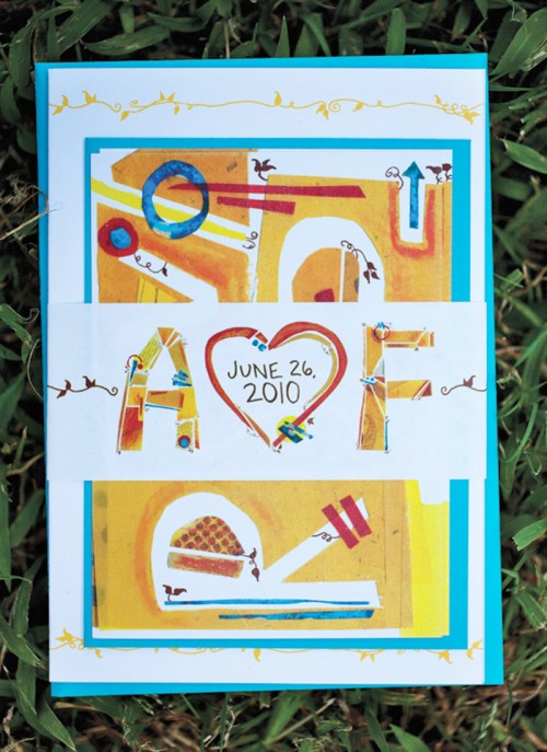
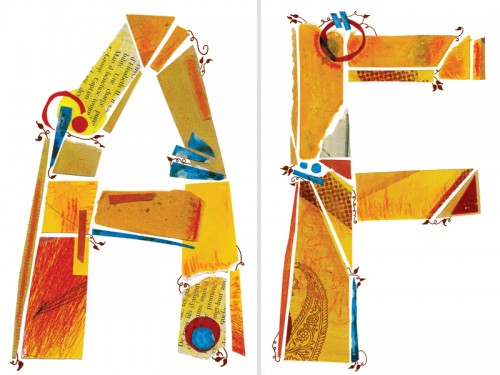
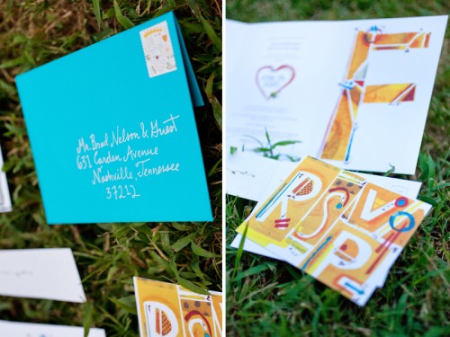
Today’s second set of real invitations comes from Amy Hardy, a freelance designer who was married in Nashville this past June!  Amy put together a fun, modern wedding invitation suite with hand lettering (and letters individually constructed from paper!) that also incorporates her husband’s background in landscape architecture.  So cool!

Modern-Illustrated-Wedding-Invitations

From Amy: I am an art director and graphic designer, and my husband Forrest is studying Landscape Architecture.  We met through a mutual friend in 2007 and got to know each other as running partners.  Once we finally started dating, our friendship quickly became romantic and real.  Within the first year of dating, we knew this was it.  On June 26, 2010 we made the promise of marriage to one another.  Our wedding was in Nashville, Tennessee.

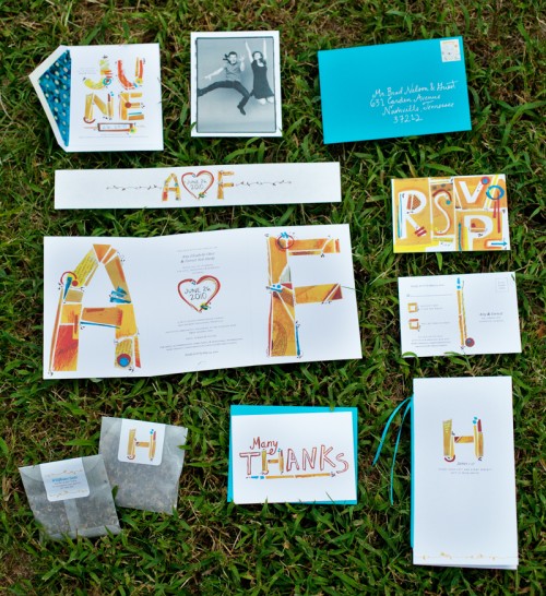
Modern-Illustrated-Wedding-Invitations-Full-Suite

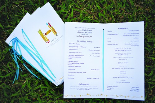
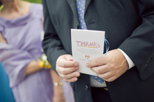
Our wedding stationery represented our creative and detail-oriented personalities, as well as our wedding’s charming Southern summer theme.  This included save-the-dates, invitations with a belly band and RSVP card, programs, favors, signage, and thank you cards.

Modern-Illustrated-Wedding-Invitations-Initials

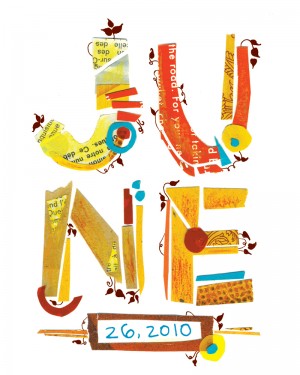
I considered every detail in the stationery, from the stamps to the envelope liners. After constructing individual letters out of paper, I added vine details and Delicato as a secondary typeface.

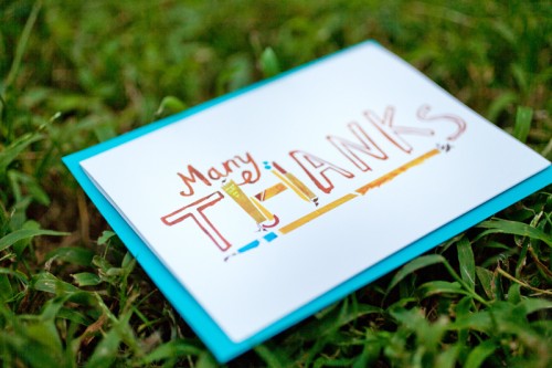
Modern-Illustrated-Wedding-Invitations-Thanks

Modern-Illustrated-Wedding-Invitations-Programs

Modern-Illustrated-Wedding-Invitations-Programs

I love bright colored accents (note my husband’s bright red hair!) and hand-rendered typography, so we knew our stationery had to be typographic and colorful. Because of his blue eyes, red hair, and fun personality, Forrest wanted to wear a bright blue bow tie. That led to a bright, jewel blue as our founding color, with yellow as the accent.

Modern-Illustrated-Wedding-Invitations-RSVP

Because printing was digital, we used Mohawk Via Vellum to slightly raise the type.  The paper’s subtle and soft texture also complimented the cut paper typography.

Modern-Illustrated-Wedding-Invitations-Favors-Table-Numbers

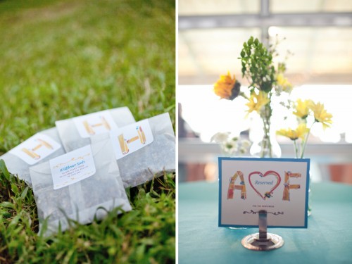
I was inspired by our unique obsessions and the details that define us as a couple.  For instance, Forrest has a plant background, so I detailed the typography with vines. For favors, we made packets of wildflower seeds.  Each packet read, “Wildflower Seeds: Please plant these to celebrate the beauty of this day.”

Modern-Illustrated-Wedding-Invitations-DrawingModern-Illustrated-Wedding-Invitations-Save-the-Date

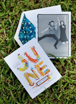
We had a blast at our Save the Date photo shoot, as seen in the photo we chose.

Beautiful Amy, thank you so much for sharing your wedding invitations and stationery!  For more from Amy and Forrest’s gorgeous wedding just click right here, and you can check out more of Amy’s design work right here!

{image credits: invitation photos by Amy | reception photos by Kristyn Hogan}

*Mohawk Paper is one of our fantastic sponsors; for more on our editorial policies, please click here.

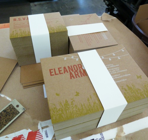
Eleanor + Armin’s Chipboard Wedding Invitations

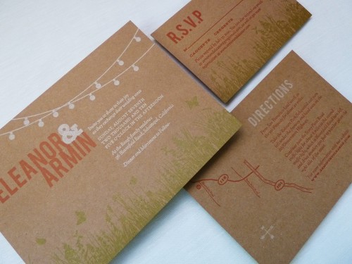
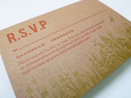
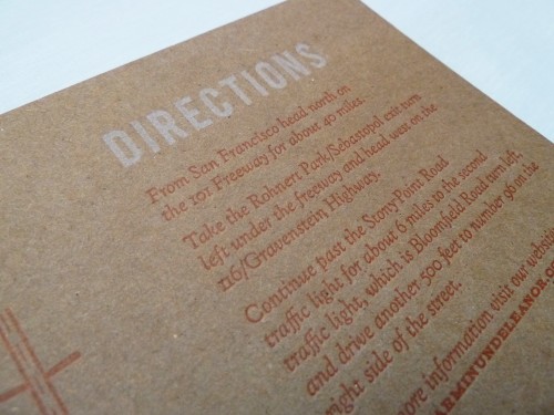
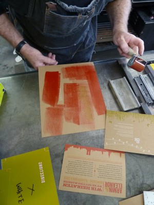
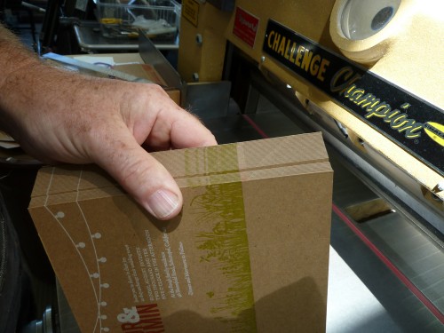
Today’s real invitations come to us from Eleanor, a graphic designer and recent bride whose father happens to be a letterpress printer (lucky girl!).  Eleanor knew that she wanted the invitations to reflect her wedding’s outdoor garden party theme, but chose to print on chipboard for a more relaxed feel.  Eleanor and her fiancé spent two days with her Dad in the print shop creating her three-color wedding invitation, and fortunately for us she documented the entire process!

Kraft-Chipboard-Wedding-Invitations

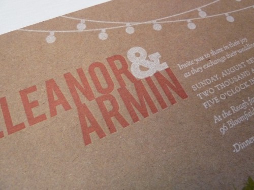
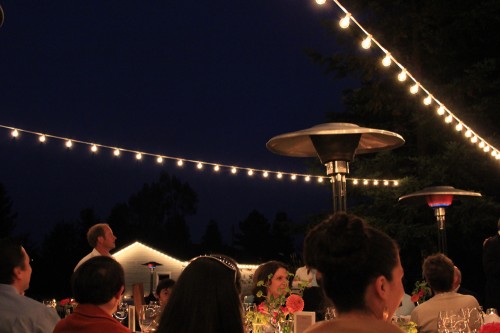
From Eleanor: My parents live on a 5 acre property in Sebastopol, which is not quite a backyard but not quite a farm, and I wanted the invitations to reflect the feeling of an outdoor, mid-summer, evening garden party.  I knew white string party lights would be a key element in our wedding reception décor and decided to make them a featured part of our invitation design.

Kraft-Chipboard-Wedding-Invitation-Detail

Outdoor-Wedding-Reception-Patio-String-Lights

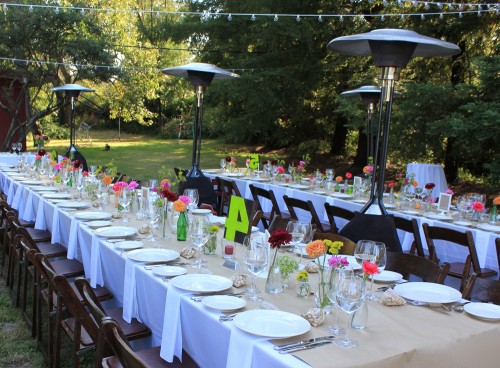
Outdoor-Wedding-Butcher-Paper-Table-Runner

The overall feel of the wedding was homemade and DIY with some of the print shop elements that I grew up with – butcher paper from my Dad’s shop for the table runners, chipboard for the invitations, and old wood type table numbers that we painted to go along with our color scheme.

Kraft-Chipboard-Wedding-Invitations-RSVP

Kraft-Chipboard-Wedding-Invitations-Enclosures

I intentionally did not try to match everything perfectly, there was an overall look that tied everything together.

Kraft-Chipboard-Wedding-Invitation

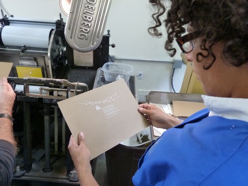
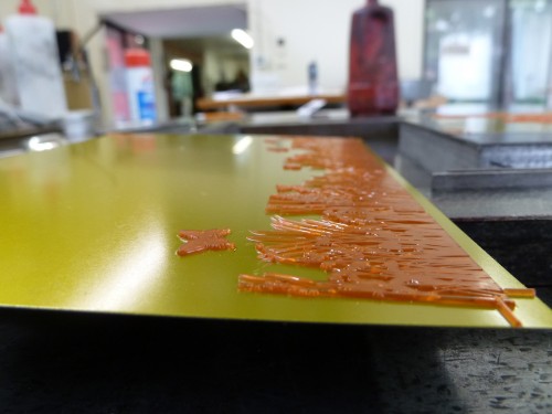
My dad is an longtime letterpress printer and is somewhat of a curmudgeon (he doesn’t even have a website!) – he makes a big point of refusing to print items such as wedding invitations.  He wanted me to see how much work goes into making the invitations I designed.

Letterpress-Wedding-Invitation-Making-Of1

Letterpress-Wedding-Invitation-Making-Of2

Letterpress-Wedding-Invitation-Making-Of3 Letterpress-Wedding-Invitation-Making-Of4

Letterpress-Wedding-Invitation-Making-Of5

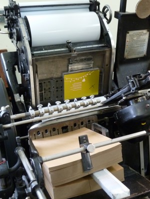
If I had known how difficult it is to get white to read on chip board I would have never designed them that way!  It was indeed a good education.  I’m  very happy with how the invitations came out, but mostly what makes them so special is they are infused with so much love – as my dad, my husband and I bonded over those two days while his Heidelberg press huffed, puffed and clanked away in his shop.

Letterpress-Wedding-Invitation-Making-Of6

Eleanor has a ton more photos from the printing process, which you can find on her flickr page, and you can see more from Eleanor’s wedding over on her blog.  Eleanor has also created a printable version of her wedding invitation suite, which you can find available for purchase on her website right here!  Thanks so much Eleanor!

{image credits: Eleanor | E.M. Papers}

{happy weekend!}

This weekend feels like the last weekend of summer – I know we still have a few weeks before Fall officially arrives, but the sun is setting earlier every evening and it’s definitely getting cooler.  Another sign that Fall is approaching?  2011 calendars.  They were everywhere at the Gift Fair and I’m starting to see some pop up online.  If you’ve been reading this blog for a while you know that I do big calendar round-ups each year, and I’m looking forward to continuing the tradition this September.  Designers, if you’d like to submit your calendar for this year’s round-ups, just shoot me an e-mail with photos right here!  But in the meantime…

…a few links for your weekend!

And in case you missed anything, a summary of this week’s posts:

That’s it for me this week – I hope you all have a wonderful weekend, and I’ll see you all back here on Monday!

{image credits: fadedfilmstrips via you are my fave}