Kathryn + Ryan’s Timeless Winter Wedding Invitations

You guys, if there’s anyone out there that loves paper as much as I do, it’s Kathryn from Snippet & Ink.  I’ve been poring over each and every detail from Kathryn and Ryan’s winter wedding (you can see the full series right here) and I’m honored that Kathryn decided to share the inspiration behind her gorgeous wedding invitations here today!  Kathryn partnered with Jill from PS Paper to create wedding invitations that truly represent her personal style – elegant, timeless, and totally stunning.

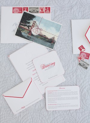
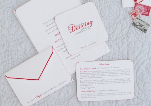
Classic-Elegant-Red-White-Gray-Letterpress-Wedding-Invitations Classic-Elegant-Red-White-Gray-Letterpress-Wedding-Invitations

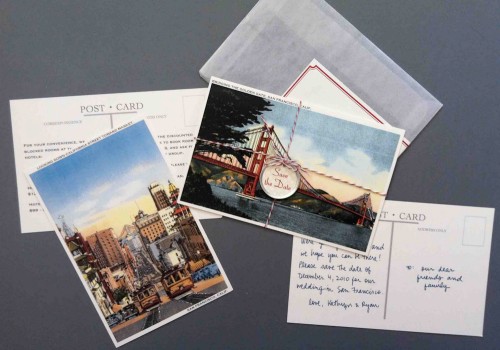
From Kathryn: Our save the date design was a collaboration between me and Jill Sassa at PS Paper – I liked the idea of a vintage San Francisco postcard, so that was what we started with.  We used two vintage postcards for the save the dates, one of the Golden Gate Bridge for a note to our guests and one of a cable car for hotel and travel information.

San-Francisco-Post-Card-Save-the-Date

Jill added the tiniest bit of glitter to the postcards, tied them together with bakers twine, finished them off with a little tag, and then mailed them in a glassine envelope with a wrap-around address label.

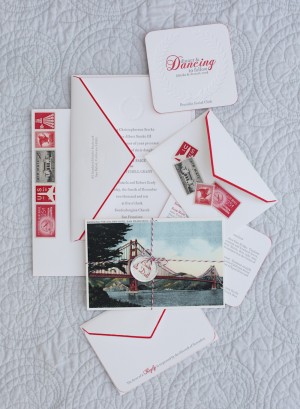
Classic-Elegant-Red-White-Gray-Letterpress-Wedding-Invitations Classic-Elegant-Red-White-Gray-Letterpress-Wedding-Invitation

For the invitation suite, I wanted something that was both elegant and playful.  After collecting inspiration and discussing the design with Jill and Laurie Arons (my planner), I played around in Photoshop with different fonts, motifs, colors until I got very close to the look that I wanted.

Classic-Elegant-Red-White-Gray-Letterpress-Wedding-Invitations-Reply

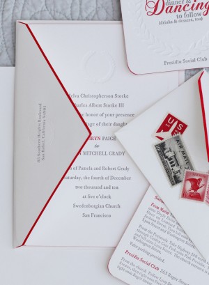
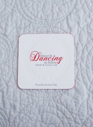
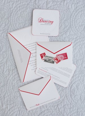
The final design, brought to life by Jill and letterpress artist Alan Hillesheim, used gray and red ink on thick 100% cotton paper from Crane’s in pearl white.  In addition to the red and gray letterpress, we incorporated a blind press wreath in each piece of the suite.

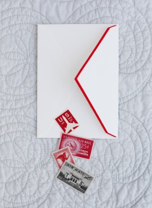
Classic-Elegant-Red-White-Gray-Letterpress-Wedding-Invitations-Reception-Card Classic-Elegant-Red-White-Gray-Letterpress-Wedding-Invitations-Envelope

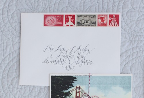
Red hand-painted edges on the invitations and envelope flaps were a simple touch that added a pop of color.  We wanted guests to receive something that they’d be excited to open, which I think we accomplished by using Betsy Dunlap‘s calligraphy and vintage stamps from The Paper Nickel.  Other playful details: on the invitations, our first names were the only thing printed in red; our reception cards were coasters, hinting at the supper club feel of our venue; and the RSVP cards gave guests room for personal responses (my favorite response was from my teenage cousin who wrote in gigantic capital letters: I WILL BE THERE. THAT’S A PROMISE.).

Classic-Elegant-Red-White-Gray-Letterpress-Wedding-Invitations-Envelope-Calligraphy

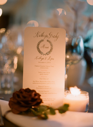
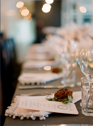
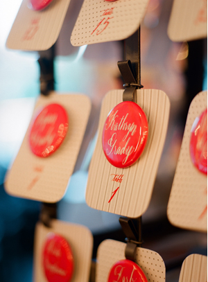
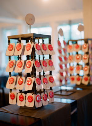
Can I just say how much I’m in love with this red, gray, and white color palette?  So perfect for a winter wedding – sophisticated and festive without being overly Christmas-y.  In addition to stunning wedding invitations and save the dates, Kathryn had some of the most adorable paper details at her wedding – from beautiful glittery menus to playful calligraphy button escort cards:

Winter-Wedding-Details-Silver-Wreath-Menu Winter-Wedding-Details-Menus-Napkins

Winter-Wedding-Details-Calligraphy-Button-Escort-Cards Winter-Wedding-Details-Red-Calligraphy-Button-Escort-Cards

Thank you Kathryn!  You can read more about Kathryn’s invitations (and the printing process) here and here, and see all of the amazing images and details from Kathryn’s wedding right here.

Invitations and Save the Dates: PS Paper

Wedding Invitation Calligraphy: Betsy Dunlap

Vintage Stamps: The Paper Nickel

Letterpress Printing: Alan Hillesheim

Escort Card Calligraphy: Maybelle Imasa-Stukuls

Photo Credits: Elizabeth Messina, with the exception of the save the date photo by PS Paper

p.s. If you haven’t seen Kathryn’s wedding video… it’s the most beautiful wedding video I’ve ever seen and I dare you not to tear up while you watch it.  Go. Now.

{happy weekend!}

Yeesh… this week went by in a complete flash, at least for me.  Which is good as I try to get through the remaining months until my husband comes home (in late summer, sigh), but also kind of scary when I think about the fact that the National Stationery Show is just over a month away.  Time is going by so fast!  I have a couple of fun things coming up soon that I can’t wait to tell you all about, but you’ll have to wait until next week for details.  But in the meantime…

small-flower-bouquet

Photo Credit: L’antipodeuse

…a few links for your weekend:

This week on Oh So Beautiful Paper:

That’s it for me this week!  I hope you all have a wonderful weekend, and I’ll see you back here on Monday! xoxo

Send More Mail

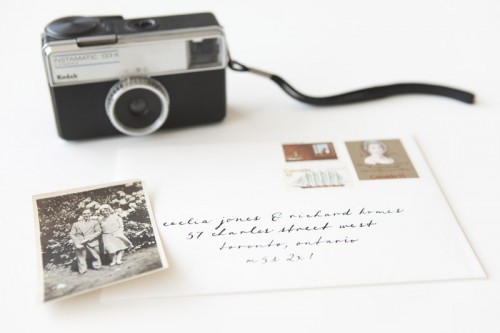
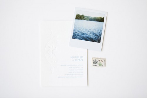
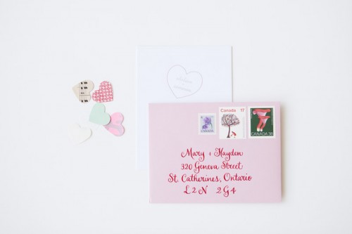
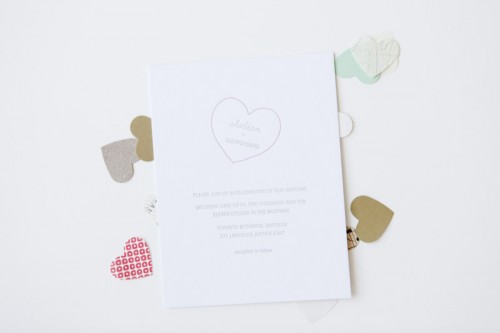
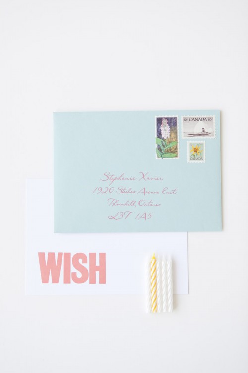
Chances are, if you’re reading this blog then you love to both send and receive mail (right??).  And if you’re a true correspondence connoisseur then you also appreciate beautiful stamps and a well-dressed envelope as part of a beautiful total package.  Well, Jaime from Joseph and Jaime Photography definitely falls into that category – and today she’s here to share a little project that she’s been working on showcasing the beauty of mailed paper correspondence.

Send-More-Mail-Vintage-Stamps

Send-More-Mail-Vintage-Stamps

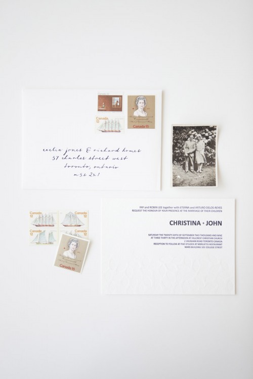
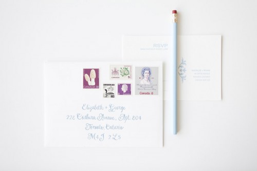
Jaime has a side project called Send More Mail, where she collects packs of vintage Canadian stamps, and she’s partnered up with a stationer (Snap and Tumble) and a calligrapher (Barbara Kua) for a beautiful stationery collaboration.  As Jaime puts it: “Our collaboration is about considering all of the aspects of sending out correspondence and invitations.  A gorgeous card, addressed beautifully, complete with stunning vintage stamps.

Send-More-Mail-Vintage-Stamps

Send-More-Mail-Vintage-Stamps

Send-More-Mail-Vintage-Stamps

Send-More-Mail-Vintage-Stamps

Send-More-Mail-Vintage-Stamps

Send-More-Mail-Vintage-Stamps

So pretty!  Stationery by Snap and Tumble.  Calligraphy by Barbara Kua.  Vintage Canadian stamps from Send More Mail.

Photo Credits: Joseph and Jaime Photography

Gradient Color Wedding Invitations

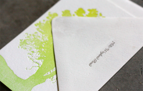
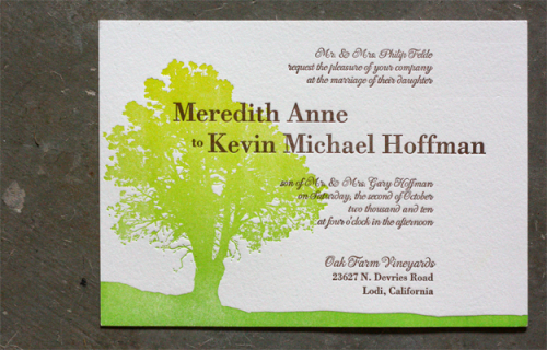
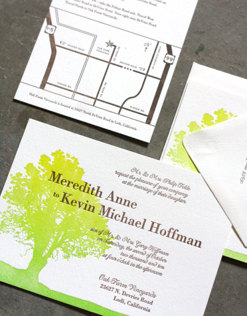
I’m loving the subtle gradient color shift in these invitations from Dingbat Press.  The invitations were printed using a letterpress technique called split fountain, in which two ink colors are distributed on the press at the same time so that they gradually blend together.  I’ve seen this done a few times before and I always think the results are stunning.  The gradient pattern reminds me a bit of watercolor, don’t you think?

Gradient-Color-Letterpress-Wedding-Invitations-Tree

Gradient-Color-Letterpress-Wedding-Invitations

Gradient-Color-Letterpress-Wedding-Invitations-Suite

You can see a few more images and read more about the split fountain technique over on the Dingbat Press blog right here.

Photo Credits: Dingbat Press

*Dingbat Press is a sponsor of Oh So Beautiful Paper; for more on my edi­to­r­ial poli­cies please click here.

Enrique + Annessa’s Creative Mexico Destination Wedding Invitations

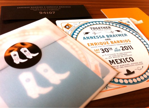
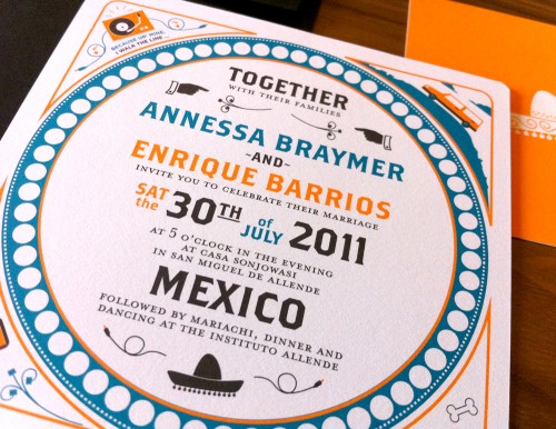
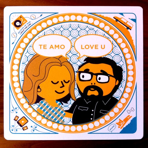
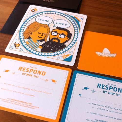
Enrique and Annessa are graphic designers getting married in Mexico this summer (congrats you two!) with a follow-on event a few weeks later in Pennsylvania.  When it came time to create their wedding invitations, Enrique and Annessa found themselves inspired by double-sided letterpress coasters and knew they wanted to share their fun sense of humor with their wedding guests.  They decided to go with a fresh blue and orange color palette to represent their sunny destination wedding location – and a totally adorable illustration of the happy couple!

Orange-Blue-Modern-Mexico-Wedding-Invitations-Suite

Orange-Blue-Modern-Mexico-Wedding-Invitations-Glassine-Envelope

From Enrique and Annessa:  The inspiration for the format came from letterpress coasters we had seen once.  We really liked how they showcased personal items that turned into short stories about the person(s) on the front of the coasters.

Orange-Blue-Modern-Mexico-Wedding-Invitation

Orange-Blue-Modern-Mexico-Wedding-Invitations-Bride-Groom-Illustration

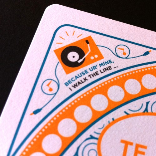
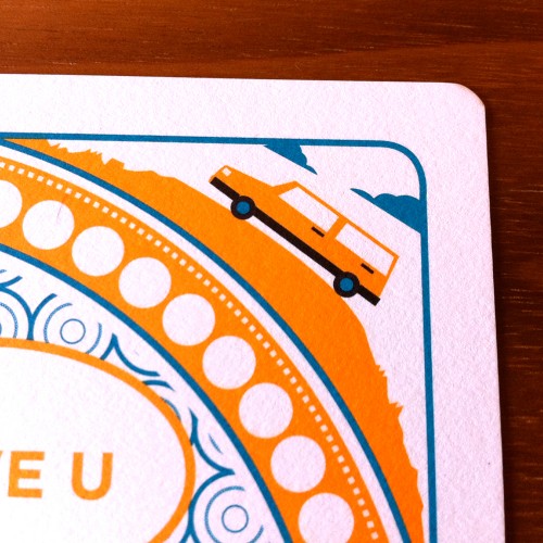
In this case, we included our French bulldog Mr. Wilson, my love for gadgets, Annessa’s old 87’ Volvo, and my love for Johnny Cash. We really wanted to play up the fun, intimate details we know about each other and share them with our guests.  Humor is the soul and foundation to our relationship, so we felt it appropriate to illustrate each other the way we see each other.

Orange-Blue-Modern-Mexico-Wedding-Invitations-Detail

Orange-Blue-Modern-Mexico-Wedding-Invitations-Detail

Since we are having two events, Mexico and Pennsylvania, we had to double up on invitations while hinting at the theme of each event.  Pennsylvania will be a more country feel, so we used iconography such as cowboy boots.  For Mexico, we used, of course, a very appropriate sombrero.

Orange-Blue-Modern-Mexico-Wedding-Invitations-Illustration

Over all, there were some ups and downs through the process of designing and coming up with a final solution, but it feels very rewarding to know that we designed them ourselves.  We hope our guests enjoy them as well.

Thank you so much Enrique and Annessa!

Photo Credits: Enrique Barrios and Annessa Braymer