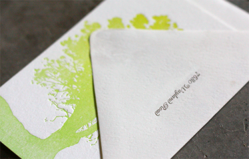
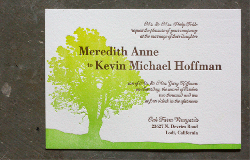
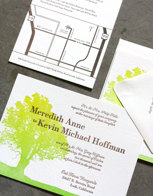
I’m loving the subtle gradient color shift in these invitations from Dingbat Press. Â The invitations were printed using a letterpress technique called split fountain, in which two ink colors are distributed on the press at the same time so that they gradually blend together. Â I’ve seen this done a few times before and I always think the results are stunning. Â The gradient pattern reminds me a bit of watercolor, don’t you think?
You can see a few more images and read more about the split fountain technique over on the Dingbat Press blog right here.
Photo Credits: Dingbat Press
*Dingbat Press is a sponsor of Oh So Beautiful Paper; for more on my ediÂtoÂrÂial poliÂcies please click here.


Split fountain is my favorite 🙂 These are beautiful.
nice use of this technique!
I would worry that I couldn’t keep it from melding by the end of the run. I guess if you’re willing to go with the flow and have variables it would be perfect!
Interesting technique. Two colors are very few though.
Oh, I’m a sucker for things with trees on them. Particularly bright things. These are gorgeous, and the technique certainly has a watercolour feeling to it!