Playful Floral Pinwheel Wedding Invitations

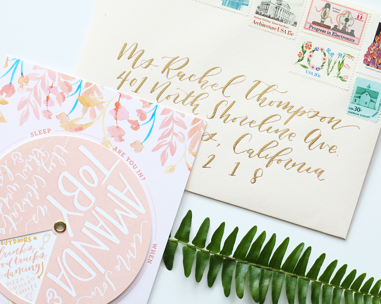
I’m a huge fan of interactive wedding invitations, and these playful floral pinwheel wedding invitations from Clara of Goldie Design Co. are SO much fun! With a hand painted floral motif, funky hand lettering, and blush pink color palette, what’s not to love? The die cut window rotated through different sections, sharing all the pertinent details in a unique and spirited way. So cute!

Playful Floral Pinwheel Wedding Invitations by Goldie Design Co.

From Clara: This wedding invitation was designed for a client that is having a spunky, outdoor, food-truck and dancing celebration! When she came to me to design her wedding invitations, the first thing she said is that she didn’t want it to be like a typical wedding invitation suite! She loved the idea of having an interactive wedding invitation that would get the guests really excited for this fun event, while still being beautiful and classy! I loved how this wedding wheel portrayed the fun and spirited nature of the couple, and was totally unique to them.

Playful Floral Pinwheel Wedding Invitations by Goldie Design Co.

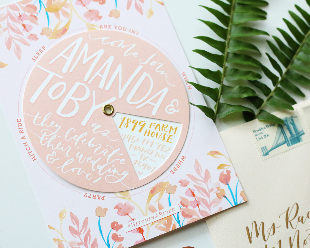
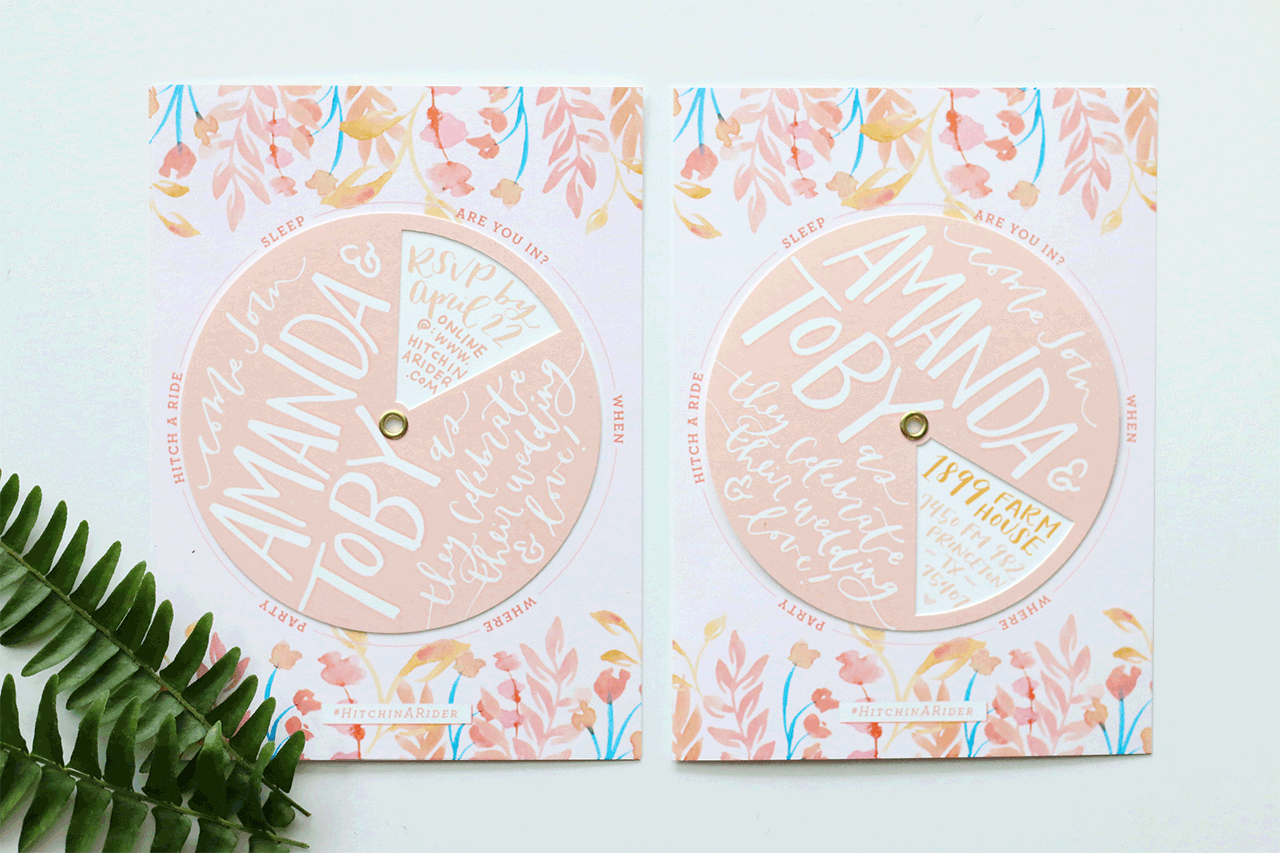
By incorporating a hand-painted watercolor floral look in the background of the wheel, although quite spunky in nature, the invitation still looks classy, traditional, and beautiful! The wheel itself features hand lettered text inviting guests to come celebrate the marriage of the bride and groom. The circular wheel portion of the invitation was custom die cut to have a window that could be rotated around to show all of the details about the wedding that the guests would typically find on an information or accommodations card in a wedding suite.

Playful Floral Pinwheel Wedding Invitations by Goldie Design Co.

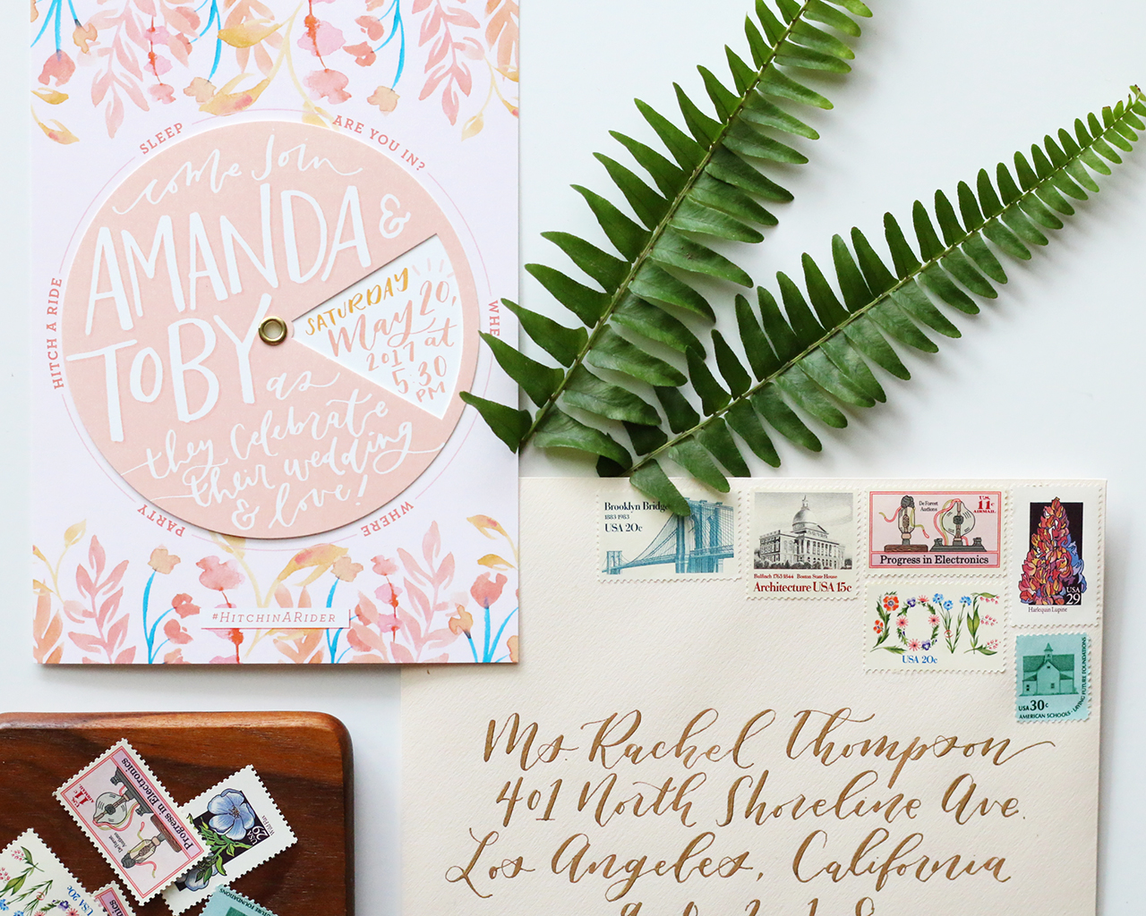
The die cut wheel was then assembled onto the watercolor backer card by a small gold brad that held the two pieces together, but allowed the wheel to still turn easily. I loved how this invitation was to the point and easy to understand, but was still so personal and unique to the bride and groom.

Playful Floral Pinwheel Wedding Invitations by Goldie Design Co.

This project shows couples that you don’t always have to follow the rule book when it comes to planning your wedding! If you have an idea that’s outside of the box and not spelled out in the wedding etiquette books, go for it! This is your special day, do it just how you want and have fun with it!

Playful Floral Pinwheel Wedding Invitations by Goldie Design Co.

Thanks Clara!

Design and Calligraphy: Goldie Design Co.

Printing/Custom Die Cut Printing: Jupiter and Juno

Check out the Designer Rolodex for more tal­ented wed­ding invi­ta­tion design­ers and the real invi­ta­tions gallery for more wedding invitation ideas!

Photo Credits: Goldie Design Co.

Happy Mother’s Day Weekend!

Happy Friday everyone! And Happy (almost) Mother’s Day to all the mamas and soon-to-be mamas out there! This week has been kind of intense for me: after four years of living in our home, we’re FINALLY having central air conditioning installed – which isn’t the easiest process in a narrow 1920s row house with brick and plaster walls. But we’re almost done and it’s going to be sooooooo worth it once the summer heat and humidity arrives. But after all the construction at home, I’m thinking we’ll just enjoy a low key weekend and Mother’s Day. It’ll be my last quiet weekend before the National Stationery Show kicks off next weekend! Aaaaah! But in the meantime…

Photo (and card) by Heartell Press via Instagram

…a few links for your weekend!

I’m on the hunt for a few lightweight midi skirts for summer. I have my eye on this lavender linen skirt (also comes in gingham!), this chambray skirt, this striped skirt, and this dotty gingham skirt.

Planning to make a ton of these mini cherry crisps this summer

Loving this sculptural lamp

Help buy 800 goats for Syrian refugees in Jordan

Also, how Syria changed the world

How cute are these hologram foil save the dates??

These gingham sneakers are so cute for little girls (and they’re 25% off with code SHOPNOW)

Crying all the tears after reading this story

Card of the week!


Recently on Oh So Beautiful Paper:

Enrollment for the Modern Calligraphy Summit 2.0 is back open! Read about it here, or just go ahead and sign up here.

Absolutely LOVE these colorful patterned wedding invitations!

New illustrated desktop wallpapers for May!

NSS 2017 Sneak Peeks from Richie Designs, Iron Curtain Press, and Ramona & Ruth

Ethereal vellum wedding invitations

Behind the Stationery with Cheree Berry Paper

Cards to send to your graduates: Part 1 and Part 2

Fun party supplies from Hip Hip Party Goods!

Pokemon birthday party invitations!

Understated calligraphy and green fern wedding invitations

Autumn ombré wedding invitations

Spring at the National Arboretum

A Passionfruit Mezcal Sling and a delicious Elderflower Tequila Rickey

Autumn Ombré Letterpress Wedding Invitations

I always love the colors of changing leaves in Autumn: crisp red, warm orange, and bright yellow. To create these autumn ombré letterpress wedding invitations, Alex of Al Stampa utilized one of my favorite letterpress printing techniques – the split fountain – to create a wonderful color gradient that evokes all those wonderful autumn colors. Can’t you just see everyone gathered around a fire drinking a cup of warm apple cider??

Autumn Ombré Letterpress Wedding Invitations by Al Stampa

From Alex: This wedding invitation was designed for a sweet couple, Colette and Petey. They wanted a colorful, fire crackling, leaf-turning, autumn wedding, and we wanted to inspire guests with the first piece everyone would receive… the wedding invitation!

Autumn Ombré Letterpress Wedding Invitations by Al Stampa

The wedding took place in Red Hook, Brooklyn at the Liberty Warehouse â€“ right on the water. Colette was the mastermind behind everything having to do with planning her wedding, and she took it all on her own shoulders. It was such a pleasure to be able to take this portion of the wedding planning away from her and ease her to-do list.

Autumn Ombré Letterpress Wedding Invitations by Al Stampa

Because coloring is so important with an autumn wedding, and the fact that it can become quite pricey to letterpress multiple colors, especially for a wedding of 200+ people, I suggested we treat the press, and how I print the colors, similarly to how nature treats the trees in October. We decided to use an ombré technique called a split fountain to make the amazing colors of the season the focus, by inking up the press with various yellows, oranges, and reds and letting it do its work on each invitation. In doing this, each invitation came out a bit different, but with the same amazing gradient effect.

Autumn Ombré Letterpress Wedding Invitations by Al Stampa

The illustration of the branches and leaves were meant to take over the invitation, and also create a large illustrated area that would absorb the ink’s changing of colors perfectly. We paired the branch illustrations with lovely calligraphy by Ashley Curry and a modern typeface to maintain the modernity of the wedding invitations and complement the wedding’s modern warehouse venue. Printed on 120 lb Reich Bright White paper, the invitation had a wonderful heaviness to it – and the beautiful ombré colors made these invitations something really special!

Autumn Ombré Letterpress Wedding Invitations by Al Stampa

Thanks Alex!

Design, printing, and styling: Al Stampa

Calligraphy: Ashley Curry

Paper: Reich Paper

Check out the Designer Rolodex for more tal­ented wed­ding invi­ta­tion design­ers and the real invi­ta­tions gallery for more wedding invitation ideas!

Photo Credits: Roland Kielman and Alex Labriola

Modern Calligraphy Summit 2.0 – Enrollment is Open!

Yay! I have good news for those of you who missed out on enrollment for the Modern Calligraphy Summit 2.0 back in February – enrollment has finally reopened! If you have no idea what I’m talking about, you can read the original post right here. The Modern Calligraphy Summit 2.0 offers two and a half weeks of online calligraphy classes with over 7 hours of video lessons from seven ridiculously talented calligraphers: Katherine Ross of Script Merchant, Lauren Saylor of A Fabulous Fete, Jenna Rainey of Mon Voir, Karla Lim of Written Word Calligraphy, Sharisse DeLeon of Pieces Calligraphy, Younghae Chung of Logos Calligraphy, and Molly Knabel of Poppy and Mint Design.

Modern Calligraphy Summit 2.0 / Written Word Calligraphy

Written Word Calligraphy

Summit topics include digitizing watercolor illustrations, invitation design, brush calligraphy, classic copperplate, writing on non-paper surfaces, and more! Basically all the things you need to create beautiful envelopes, place cards, or even write out party menus on tropical leaves, wood boards, or sheets of plexiglass. And all from the comfort of your own home! The Modern Calligraphy Summit 2.0 also includes handy templates and handouts, and a private Facebook community to support you as you learn.

Modern Calligraphy Summit 2.0 / A Fabulous Fete

A Fabulous Fete

Oh, and don’t forget that enrollment in the Modern Calligraphy Summit 2.o includes LIFETIME ACCESS to all the amazing content. Enroll, watch the webinars and videos, then go back as many times as you need to practice and get the hang of things! Don’t miss this chance to join in the fun – click here for more!

p.s. If you’re completely new to the Modern Calligraphy Summit – there’s still plenty of time to join in the fun. You can sign up for the Modern Calligraphy Summit 1.0, including lifetime access to all the original video instruction, worksheets, and templates, right here!

This post contains affiliate links. By clicking on these links, you’ll help support Oh So Beautiful Paper while also learning the beautiful art of calligraphy! I only recommend products that I truly love and trust that you’ll love, too. My full disclosure policy can be found here.

Understated Green Calligraphy and Fern Wedding Invitations

We loved sharing these minimalist black and white invitations from Grace of Grace Niu, and today we’re over the moon to share her personal wedding invitations with all of you! Grace clearly prefers a softer, more minimal design aesthetic – all of which definitely comes through in her own understated green calligraphy and fern wedding invitations. Hand painted greenery, delicate calligraphy and soft brush lettering, and the tiniest dose of gold ink. So pretty!

From Grace: Being a graphic designer and invitation designer, I obviously knew I would be designing my own wedding invitations when it came time. I had never given the invitation much thought before getting engaged, but it made it so much easier once I established my mood board and vision for the wedding in general.

A lot of graphic designers say that sometimes the hardest person to design for is yourself, but luckily I wasn’t too hard on myself and didn’t try to second guess myself too much. After looking at my Pinterest board, I curated a few select images and designed a mood board to serve as the aesthetic vision for the whole wedding. It was a modern organic feel, full of greenery, lots of white and light gray, and gold accents.

When it came time to design the invitations, I went for a minimalist design on the main invitation, keeping the color of the lettering and type to a very light gray. I wanted it to be beautiful, quiet and elegant. On the reply card, I added a small hand-painted fern to serve as a color accent, but otherwise kept everything else the same light gray. For the details card, I did something similar and used a hand-painted eucalyptus stem to break up the blocks of text a bit and to add a little color.

I completed the suite by choosing a light gray paper for the belly bands, and hand-painted our initials in gold ink on every belly band. I used the same light gray for the reply envelopes, which were individually hand-lettered with our first names and reply address. For the main envelope, I chose a sage envelope to coordinate with the hand-painted greenery elements, and calligraphed each one in black ink. To finish off the suite and tie everything together, I found the most perfect fern stamps to use on our envelopes. Looking back on these, I’m so glad to have had the chance to design these invitations for myself and to show our guests what I love doing.

Thanks Grace!

Design & Calligraphy: Grace Niu

Printer: Geographics Inc.

Gray paper and envelopes: Neenah Paper

Green envelopes: Carnival by Mohawk

Paper: Mohawk SuperFine Eggshell

Check out the Designer Rolodex for more tal­ented wed­ding invi­ta­tion design­ers and the real invi­ta­tions gallery for more wedding invitation ideas!

Photo Credits: Erika DenHoed of Mayden Photography