Modern Calligraphy Summit 2.0!

The original Modern Calligraphy Summit was easily one of the most exciting things to happen in 2016. Seven of the most respected calligraphers in the biz offering insider tips and tricks in an online calligraphy extravaganza? Yes, please! Well, the Modern Calligraphy Summit was such an awesome success that the organizers have been busy planning a second installment – called the Modern Calligraphy Summit 2.0!

Modern Calligraphy Summit 2.0 / Script Merchant

Image via Script Merchant

The Modern Calligraphy Summit 2.0 will take place February 20 – March 8, 2017 and will bring you a 2.5 week online calligraphy party with over 7 hours of video lessons from some super talented instructors (including more than a few familiar faces from here at OSBP), including Katherine Ross of Script Merchant, Lauren Saylor of A Fabulous Fete, Jenna Rainey of Mon Voir, Karla Lim of Written Word Calligraphy, Sharisse DeLeon of Pieces Calligraphy, Younghae Chung of Logos Calligraphy, and Molly Knabel of Poppy and Mint Design. Summit courses include Watercolor Illustration and Digitizing, Invitation Design, Brush Calligraphy, Classic Copperplate, Writing on Everything but Paper, and more! Oh, and there’s a bonus session on photography and styling! The Modern Calligraphy Summit 2.0 also includes live office hours for Q + A, handouts and templates, a private Facebook community to support you as you learn, and LIFETIME ACCESS to all the amazing content.

Modern Calligraphy Summit 2.0 / Oh So Beautiful Paper

Modern Calligraphy Summit 2.0 Instructors / Oh So Beautiful Paper

Early bird enrollment is currently open for the Modern Calligraphy Summit 2.0 for just a few days – you can sign up here at the special Early Bird rate through Tuesday (tomorrow!) August 30!

p.s. If you missed the original Modern Calligraphy Summit – don’t worry, you can still sign up for lifetime access to all the original video instruction, worksheets, and templates right here!

This post contains affiliate links. By clicking on these links, you’ll help support Oh So Beautiful Paper while also learning the beautiful art of calligraphy! I only recommend products that I truly love and trust that you’ll love, too. My full disclosure policy can be found here.

Happy Weekend!

Happy Friday everyone! A huge thanks to Nichole for her AMAZING guest posts on OSBP this week. Tomorrow I’m heading up to New York for the summer NYNOW market. I’m going to try to pop in here once or twice next week, but otherwise be sure to follow me on Instagram to see all my finds from the show.

The Indigo Bunting / Erin Jang via Instagram / Oh So Beautiful Paper

Image by Erin Jang / The Indigo Bunting via Instagram

On a much sadder note, I’ve spent quite a bit of time this week looking at the videos and images coming out of Aleppo, Syria and the situation is absolutely desperate right now. Aleppo is a city of 300,000 people, of which 120,000 are children, and they are suffering more than I can even begin to fathom at the hands of the Syrian government. Ten thousand children have already died in the conflict, from air strikes, starvation, and lack of medicine –4,500 of them from Aleppo alone. The Syrian government continues to drop bombs and chemical weapons on its own people every single day. As a mother, I’m heartbroken by the images of dead and wounded children coming out of Aleppo, but I’m also outraged that the international community has failed to intervene. I’m planning to say a bit more about this as soon as I can gather my thoughts, but in the meantime, please look at the hashtags (here, here, here, and here), read the media reports (the New York Times seems to have the best coverage at the moment), and, if you can, please donate to UNICEF.

On a lighter note, a few links for your weekend:

This week on Oh So Beautiful Paper:

That’s it for us this week! We’ll be back later this afternoon with this week’s cocktail recipe! xoxo

DIY Shibori-Inspired Watercolor Placemats

Hi Everyone! We have another fantastic guest post from Nichole of Coral Pheasant coming up in just a bit, but first I wanted to pop back in to share a quick DIY project that I’ve had brewing in my head for the past couple of months. I thought these DIY Shibori-inspired watercolor placemats might be fun for outdoor celebrations over the long Labor Day weekend – or even for the holidays once we’re forced to move things back indoors. I love Shibori patterns, and I also love dyeing fabric, but the fabric dyeing process can be kind of intense and I wanted a bit more control over the results. So! I decided to break out my 30-color Koi Watercolor Pocket Field Sketch Box and see what I could do with watercolor paint and placemat-sized watercolor paper. These placemats would be a fun and unfussy addition to an informal dinner party (when you don’t necessarily want to bust out the fancy linens) or put a few together to create a colorful table runner!

DIY Shibori-Inspired Watercolor Placemats / Oh So Beautiful Paper

DIY Shibori-Inspired Watercolor Placemats / Oh So Beautiful Paper

DIY Shibori-Inspired Watercolor Placemats / Oh So Beautiful Paper

I made two placemat designs: one inspired by the traditional Shibori triangle fold technique, and another striped design loosely inspired by the rubber band resist technique. The triangle fold pattern was actually inspired by my Shibori-inspired shower curtain that I picked up from Target a couple of years ago (of all things), and the striped pattern was inspired by the pattern on this chair. The two patterns work really well together, and I love the mix of cobalt and indigo blue. Also! This is a first for me, but I thought it might be easier for all of you to watch the actual painting process rather than try to photograph each and every step – so I made a video tutorial! Please forgive the video quality (it was just me and Hyperlapse on my phone), but it was so fun to put the whole process together, so hopefully I’ll be able to do more of these videos down the road!

DIY Shibori-Inspired Watercolor Placemats / Oh So Beautiful Paper

DIY Shibori-Inspired Watercolor Placemats / Oh So Beautiful Paper

DIY Shibori-Inspired Watercolor Placemats / Oh So Beautiful Paper

Supplies

12″ x 18″ watercolor paper

30-Color Koi Watercolor Pocket Field Sketch Box

Size 6 Round Brush (I used this one)

3/4″ or 1″ Flat Wash Brush (I used a 3/4″ flat brush from this set)

12″ Ruler

18″ Ruler

Pencil

DIY Shibori-Inspired Watercolor Placemats / Oh So Beautiful Paper

To Make the “Triangle Fold” Placemats

Step 1. Using a pencil and the 12″ ruler, draw very light straight vertical lines at 3″ intervals along your paper. Then, starting in the top left corner and continuing across the page, use the 18″ ruler to draw very light diagonal lines to connect the vertical lines. Once all of the lines have been drawn, the paper should look something like this (I highlighted my lines in lavender so you could see them more easily):

DIY Shibori-Inspired Watercolor Placemats / Oh So Beautiful Paper

Step 2. Using the brush provided in the Koi Watercolor Pocket Field Sketch Box or a Size 6 round brush, paint the lines a deep indigo color. Use a lot of the indigo pigment and very little water to achieve a deep, saturated watercolor paint color. I recommend working in small sections from left to right (or right to left if you’re left handed) – you’ll see why in the video, because I made a mistake and smudged the wet watercolor paint after painting too far down one of the diagonal lines! Apply different levels of pressure along each line to create wider and thinner sections of each line. Let everything dry completely, about 10 minutes. You can use the drying time to paint more placemats.

Step 3. Use the round brush to add a small amount of indigo pigment to a small cup of water. Once the placemat is fully dry, use the tinted water to go over each line to create a diffuse dye-like effect. Finally, add an extra dose of indigo pigment where the lines intersect. Let the placemats dry completely and they’ll be ready to use!

To Make the Striped Placemats:

Step 1. Using a pencil and a 12″ ruler, draw very light straight vertical lines at 3″ intervals along your paper.

Step 2. Using a 3/4″ flat wash brush, paint varying horizontal widths (mine were between 1/4″ wide and 1″ wide) along each vertical line and alternating between cobalt and indigo on every other line.

Step 3. Use the thin edge of the brush to connect the horizontal sections along each vertical line. Add a layer of tinted water over each horizontal width to blend and create a more diffuse dye-like effect. Let the placemats dry completely and they’ll be ready to use!

DIY Shibori-Inspired Watercolor Placemats / Oh So Beautiful Paper

DIY Shibori-Inspired Watercolor Placemats / Oh So Beautiful Paper

DIY Shibori-Inspired Watercolor Placemats / Oh So Beautiful Paper

DIY Shibori-Inspired Watercolor Placemats / Oh So Beautiful Paper

DIY Shibori-Inspired Watercolor Placemats / Oh So Beautiful Paper

These placemats could easily pull double duty as place cards by writing the name of each guest in a visible location. Or, if placemats just aren’t your vibe, put a few together to make them into a custom table runner! I could totally see them providing a much-needed pop of color between a wood table and a wood or slate cheese plate. Or on top of a console table serving as a temporary bar or dessert station! So many options!

Photo Credit: Nole Garey for Oh So Beautiful Paper

Happy Weekend!

Happy Friday everyone! I hope you all enjoyed Ashley’s wonderful guest posts this week! I absolutely loved all of her posts! Nichole from Coral Pheasant will be joining us next week, and she has some seriously beautiful posts planned that you won’t want to miss! But in the meantime…

Maybelle Imasa via Instagram / Oh So Beautiful Paper

Image by Maybelle Imasa via Instagram

…a few links for your weekend:

This week on Oh So Beautiful Paper:

That’s it for us this week! We’ll be back later this afternoon with this week’s cocktail recipe – so check back for that! Have a fantastic weekend, and we’ll see you back here next week! xoxo

Modern Brush Lettering Tips for Beginners

Modern Brush Lettering Tips for Beginners from Fine Day Press / Oh So Beautiful Paper

Hi there! Ashley from Fine Day Press here with another guest post – this time on one of my favorite topics, brush lettering. My background is in graphic design; I’ve been painting and lettering for as long as I can remember and  it’s something I’ve always been passionate about. Recently, I’ve been teaching Intro to Modern Brush Lettering workshops at The Paper+ Craft Pantry here in Austin. I’m excited to share some of my best modern brush lettering tips for beginners with you here, along with a downloadable Brush Lettered Alphabet I created that you can use as a practice guide!

I think it’s so great that there’s a big interest in hand lettering these days. We’ve been hearing about handwriting and lettering as potentially becoming a lost art as we all become more technology-dependent. And I’ll admit, after a day of working on the computer, it sometimes feels strange to hold a pen or brush until I get warmed up. But there are so many examples of beautiful hand-done type in the stationery and design world right now, so I personally hope this trend continues for a long time.

Brush lettering is the most painterly of all hand lettering styles – it can be spontaneous, free flowing, and a little messy (in a good way). One of the cool things about brush lettering is that, once you know the basics, you can loosen up and develop your own style with it.  The best way to find your style is to practice, practice, practice.

RECOMMENDED MATERIALS

• #6 pointed round brush
You can experiment with different sizes and shapes but this is a great all-purpose brush.

• India ink or watercolor paint
Both of the above work well for brush lettering. For beginners (and for those working only in black), I recomment giving India ink a try. It’s very fluid, and gives you a super-smooth medium for practicing with the brush. If you want a more textured look or want to experiment with colors, go for watercolor. A word of warning: because of its fluidity, india ink is highly spill-able, and it will stain, so be careful when using it and clean up any spills right away.

• Protected work surface (cutting board, vinyl tablecloth, or art table)
Brush lettering can be wet and messy, so protect your table with a large cutting board or vinyl tablecloth. I have a table cover from Party City that makes a great work surface.

• Small palette cup to hold paint or ink
I like this one from Michael’s. 

TIP: A LITTLE INK GOES A LONG WAY. Start with a small amount of paint or ink in your plastic palette dish. You can always add more!

• Jar of water

• Paper towels

• Pencil, ruler, eraser

• Scratch paper for preparatory sketching

• Card stock for practicing
Card stock is more economical than watercolor paper so it’s great for practicing! Save the watercolor paper for when you’re ready to make a more finished piece.

• Watercolor paper or Bristol board
Both of these thick surfaces will stand up well to a wet medium like brush lettering. Bristol board is very smooth, whereas watercolor paper will usually have a bit more toothiness and texture.

Modern Brush Lettering Tips for Beginners from Fine Day Press / Oh So Beautiful PaperModern Brush Lettering Tips for Beginners from Fine Day Press / Oh So Beautiful PaperAbove: Sample practice strokes, along with a practice session from our recent workshop (photo by Lucia Hua)

WARM UP

A lot of brush lettering is about movement. You want to keep it loose and try to make your motions smooth, so I like to be relaxed when I’m lettering! Beginning with several practice brush strokes will help get you in a relaxing frame of mind.

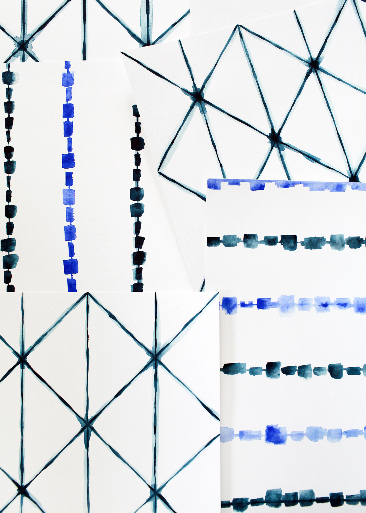
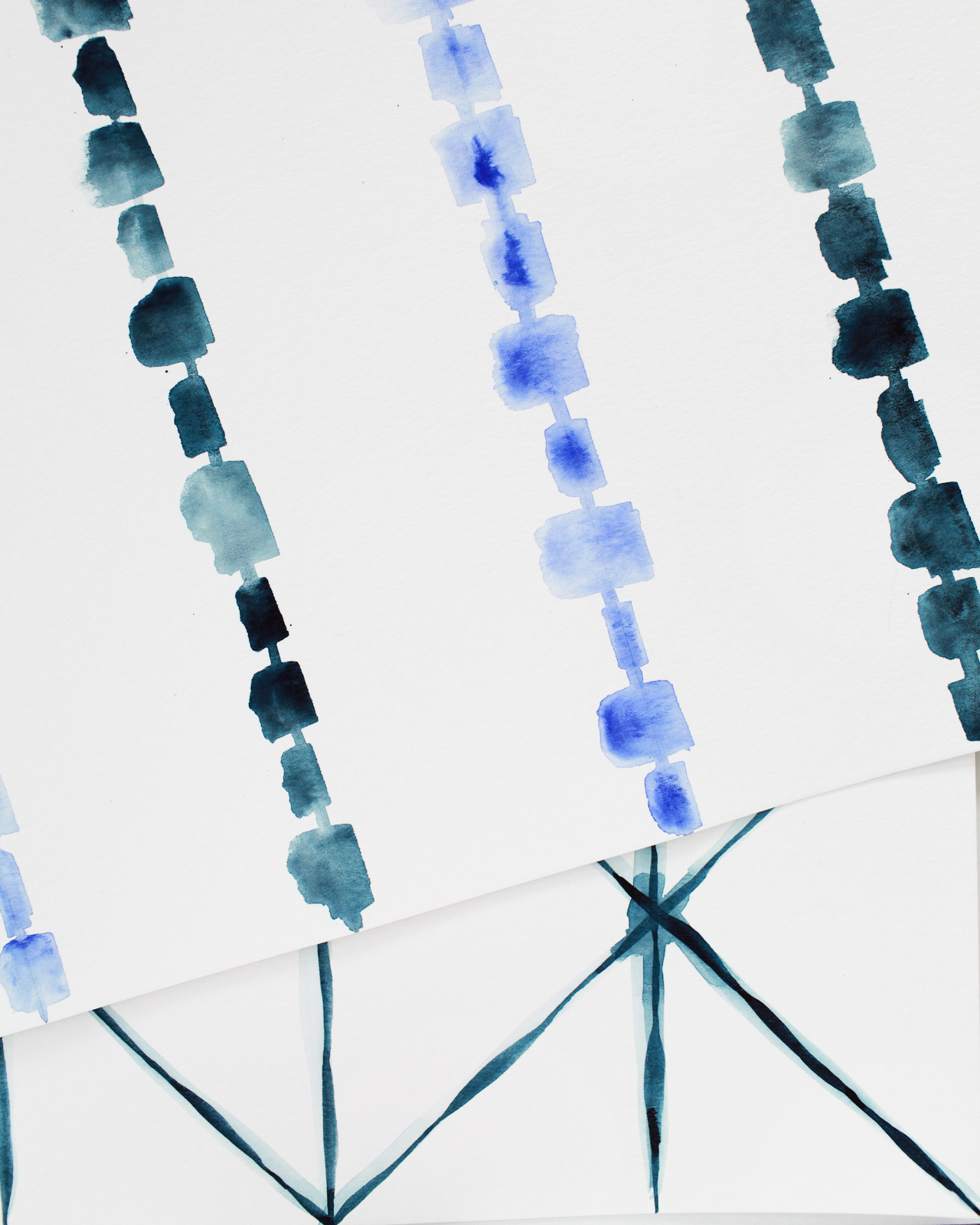
Start out with a small stack of cardstock and do some basic brush motions to get warmed up. Wet your brush in your water jar, then dip into your ink. Practice making very basic motions – vertical, diagonal, horizontal lines. Vary the pressure of your stroke and notice how this impacts your line – more pressure will give you a thicker line. Continue to load up your brush with ink between every few strokes. Practice making curves, o’s and loops. I like to fill 1 or 2 sheets of paper with these types of practice stokes before I start lettering.

Next, it’s time to practice the alphabet! This may take you back to your grade school days of practicing cursive. I recommend practicing two ways – first, lightly sketch the letter in pencil and trace it with your brush to get a feel for the letterform. Then try it freehand. Test out different angles with your brush as you practice and see how these affect your stroke. To download my sample alphabet, click here.

Modern Brush Lettering Tips for Beginners from Fine Day Press / Oh So Beautiful Paper

Modern Brush Lettering Tips for Beginners from Fine Day Press / Oh So Beautiful Paper

Above: Workshop photo by Lucia Hua; Sample alphabet by Fine Day Press

MAKING AN ART PIECE

When you’re ready to make an art print of your brush lettering, there are a few steps involved. You’ll want to have a few pieces of scratch paper and your pencil handy to create a few preparatory sketches. These sketches will give you an opportunity to think about the composition of your piece – how do you want the words arranged on the page? Will some words be bigger than others for emphasis? Will some of the type be on a curve? There are so many options here!

Once you have a sketch you like, do a practice version on cardstock – lightly sketch out the words in pencil. You don’t have to exactly trace over them, but you want to create a visual guideline for where your brushstrokes will go on the page. Use your brush and ink to go over the letters. After you’ve done this, you can see if you want to make any changes before moving on to your nice watercolor paper.

Modern Brush Lettering Tips for Beginners from Fine Day Press / Oh So Beautiful Paper

Modern Brush Lettering Tips for Beginners from Fine Day Press / Oh So Beautiful Paper

Above: My initial sketches for “To the moon & back”; the final art print

Next, you’re ready to start on your watercolor paper (or Bristol board). Again, I like to lightly sketch out my composition here just to make sure it’s fitting on the page how I want it. Leave some margins around your work and try to center your artwork on the page.

TIP: EXHALE AS YOU STROKE THE BRUSH

It helps to take a breathe and exhale as you start a new stroke – this will steady your brush and relax your hand.

Aim to find a smooth rhythmic movement with your brush. Don’t rush it – paint each letter one stroke at a time. Go back into your water and india ink as much as needed. Depending on how much ink you get on the brush, how absorbent the paper is, and what kind of letter you’re making,  you may need to “reload” after each letter or two.

I like to think of brush lettering as more like painting than writing – and most of all, I just enjoy the process! Don’t worry to much about results when you’re starting out. Just keep going until you get to where it feels natural, and have fun with it – that’s where the real creative magic happens!