Annette + Florian’s Illustrated Floral Wedding Invitations

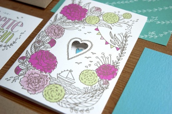
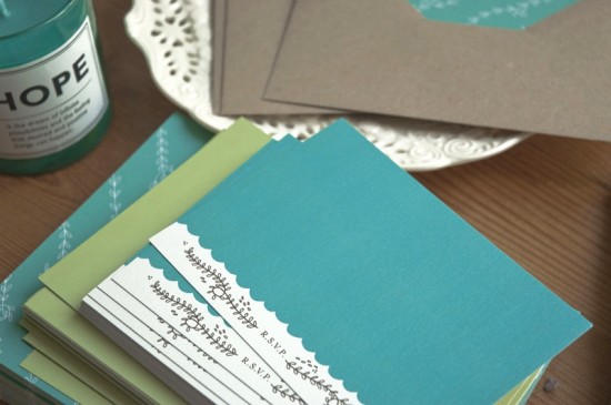
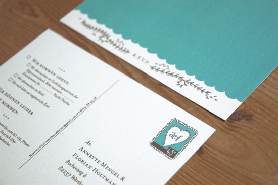
Happy Monday everyone!  I hope you had a great weekend!  We’re starting the week off with a gorgeous set of illustrated wedding invitations from German designer and illustrator Laura Rosendorfer.  Laura created these invitations for a nature-loving couple getting married a bit later this summer.  The groom hails from coastal northern Germany and the wedding will take place at a lake near the bride’s childhood home, so Laura filled the invitations with whimsical illustrations of boats, flowers, and hearts.  So sweet!

From Laura: Annette and Florian will be married at a lake, so we wanted there to be some elements of boats and water in the invitations.  Annette and Florian are very fond of nature and down to earth; they love clean lines, but also love cheerful colors.  When Annette told me she would have big arrangements of colorful fuchsia and pink peonies at the wedding, the whole invitation set came together quite easily.

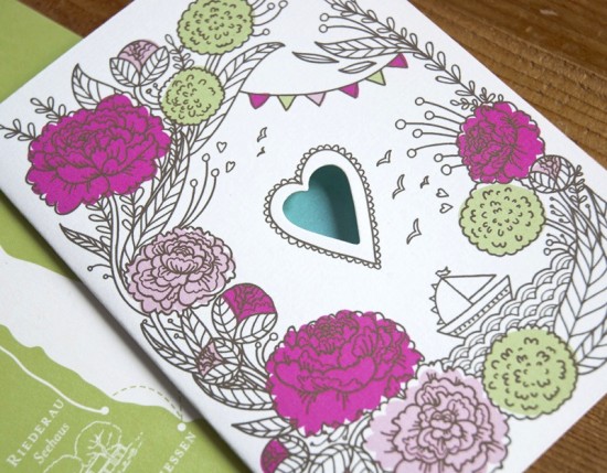
Annette had set her heart on having a whimsical illustration of flowers, so I paired the peonies and snowballs with a cute boat, cheerful bunting, and of course hearts.  We chose four vibrant colors – fuchsia and pink from the peonies along with green and blue – and paired it with a lot of white space and dark brown lines to contrast the whimsical illustrations and give it some elegance and softness.

A heart is also the focal point of the invitation – I die cut a heart in every invitation using a small machine at home.  The rsvp card is visible through the heart; if you take it out, there is another little heart to be seen.

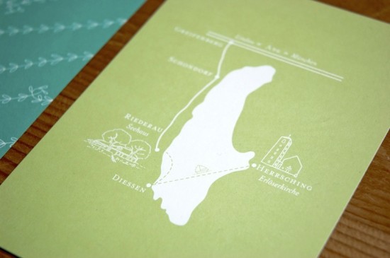
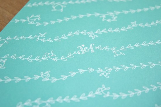
We chose mostly eco-friendly materials, like the beautiful brown recycled kraft paper for the envelopes and paper bands around the invitation set.  The invitations were printed using a combination of digital, offset, and screen printing methods.  The envelope liners and the map postcard with the detailed schedule on the back were offset printed on white paper.

I really loved all the small details, like the die cut hearts or the initials on the envelope liners – all of which makes a wedding invitation suite extra special.

Thanks Laura!

Check out the Designer Rolodex for more tal­ented wed­ding invi­ta­tion design­ers and the real invi­ta­tions gallery for more wedding invitation ideas!

Photo Credits: Laura Rosendorfer

Tara + Rich’s Colorful Palm Springs Wedding Invitations

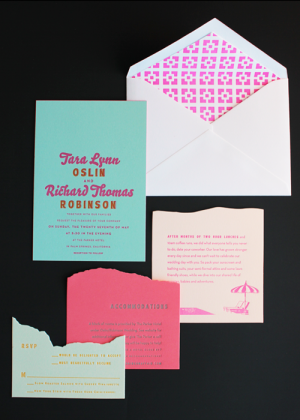
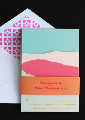
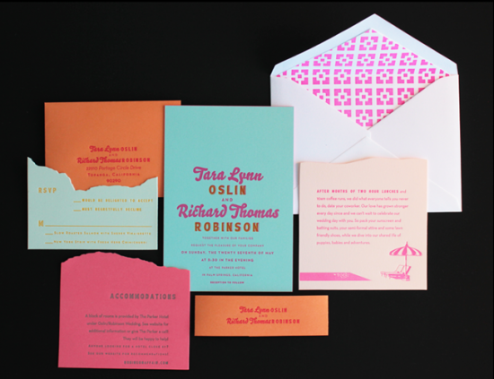
If you thought last week’s oversize map wedding invitations from Ladyfingers Letterpress were cool, wait until you see these Palm Springs invitations!  Inspired (naturally) by the wedding venue, the entire invitation suite is just bursting with color – from cool aqua to bright neon pink – and Arley-Rose and Morgan used color and die-cutting to create an awesome layered landscape effect.  Love!


From Arley-Rose and Morgan: We worked with Tara and Rich all winter on these super sunny and poolside-inspired invitations.  The couple sent over vintage postcards and designs from the ’50s that featured Palm Springs as inspiration.  Arley hand drew the pool lounge chairs and umbrellas from the wedding location.  The envelope liners feature the iconic brick work of the walls lining the hotel grounds.

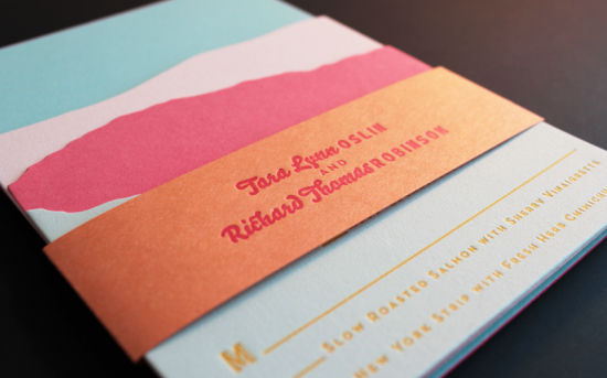
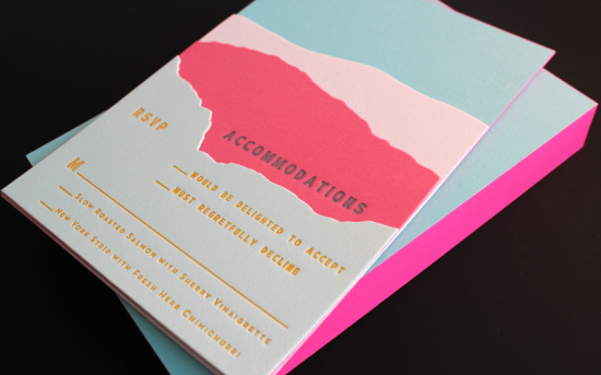
For the main invitation, we letterpress printed a two color design in neon pink and bright orange on Crane’s aqua 100% cotton 134 lb paper.  We then duplexed it (yes, we are a bit fanatical about details) to a second sheet of aqua paper, cut them down, and edge painted them in neon pink.

For the enclosures, we looked to the landscape of Palm Springs.  We were able to create a layered look using colorful 100% cotton paper and die cutting – incorporating all the information in a way that reflected the layers of foliage and mountains that are characteristic of the arid Palm Springs environment.

All of the pieces were stacked together and wrapped with a orange belly band, and we tucked the rsvp envelope in the back behind the invitation.  Palm Springs has been at the top of our vacation list since working on this project!

Thanks Arley-Rose and Morgan!

Ladyfingers Letterpress is a member of the Designer Rolodex – check out more of their beautiful work right here or visit the real invi­ta­tions gallery for more wedding invitation ideas!

Photo Credits: Ladyfingers Letterpress

Janie + David’s Oversize Map Destination Wedding Invitations

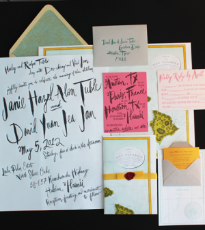
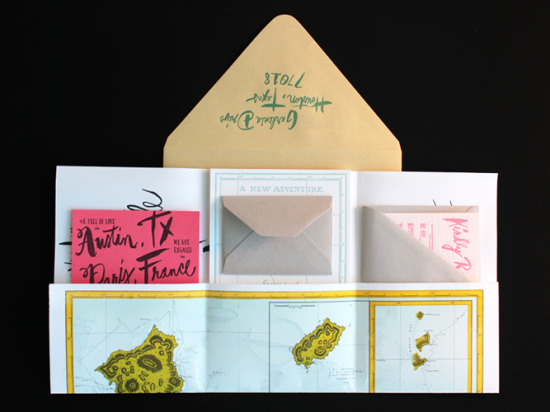
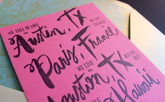
The ladies at Ladyfingers Letterpress make the coolest wedding invitations.  You (hopefully) remember Arley-Rose and Morgan’s awesome neon and hand lettered wedding invitations for their own wedding last September, and today they’re back with an equally fabulous invitation suite designed for a destination wedding in Hawaii.  I love the oversize invitation (printed on the reverse side of a vintage map!) and all the fun hand lettering elements!

From Morgan and Arley-Rose:  Janie and David have an amazing destination wedding planned for a small group of family and friends in Hawaii.  As a lover of paper and stationery, Janie wanted to incorporate the idea of a love letter into the design for the invitation.

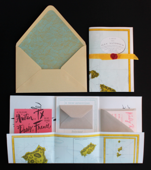
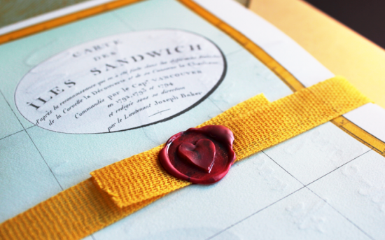
We started with a beautiful map from the year 1794.  We wanted to use something that was was historic and it turns out our printshop is down the street from a small map shop. We called and they had a map of Hawaii!  It was so breathtaking and since its design was within the public domain, all we had to do was some color separation and it was ready to be offset printed in four colors!

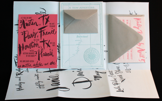
Almost all of the typography is hand drawn, written, or painted by Arley-Rose.  The actual invitation is printed on the back of the map, which is folded and serves as the vehicle for all of the other invitations pieces to travel within.  Morgan sourced the very last pallet of Crane’s 100% Cotton Coral Paper (sorry everyone) for the card detailing the story of Janie and David’s love.

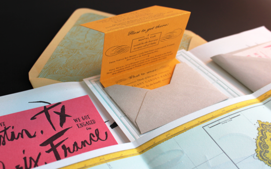
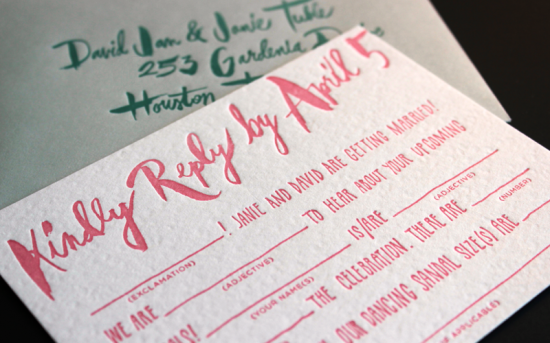
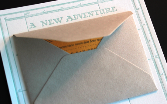
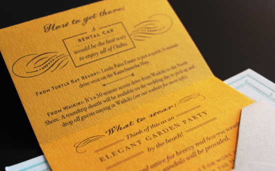
The response card is a Mad Lib for guests and includes questions such as “dancing sandal size.”  The travel details are printed on a tiny sunshine yellow card are tucked in a gray envelope mounted on a much larger card declaring “A New Adventure Starts Here.”

Each invitation was folded with its accompanying pieces and wrapped in ribbon from Carta Inc., wax sealed with a heart, and stuffed in a gold envelope lined with wave patterned liners.

So awesome!  Thanks Arley-Rose and Morgan!

Ladyfingers Letterpress is a member of the Designer Rolodex – check out more of their beautiful work right here or visit the real invi­ta­tions gallery for more wedding invitation ideas!

Photo Credits: Ladyfingers Letterpress

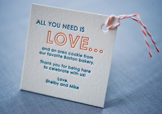
Shelby + Mike’s Modern Illustrated Boston Wedding Invitations

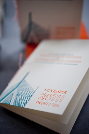
Today I’m thrilled to feature these wedding invitations by the talented ladies at Gus & Ruby Letterpress!  Samantha and Whitney worked with the bride and groom to create invitations and day-of wedding stationery inspired by one of my favorite cities, Boston!  I love the illustrations of local landmarks combined with fun details like subway map envelope liners.  So great!

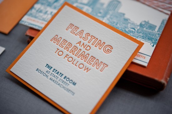
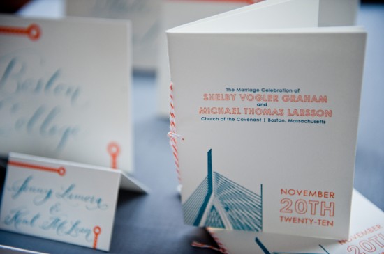
From Samantha and Whitney:  The suite was designed for a sweet couple getting married in downtown Boston.  They wanted their stationery to reflect their love of the city while combining both the contemporary, urban sides of Boston with the rich history of the city.  We played off photographs that Whitney turned into line-illustrations of the Boston Common and Zakim bridge (blending a Boston historical landmark with modern engineering).

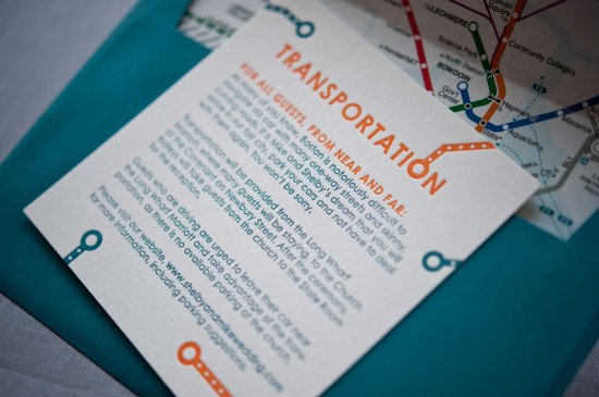
We then used bold jewel-tone and autumn colors, color backing papers, and contemporary fonts to punch up the look.  Each invitation had blind-printed cobblestone patterning on the back side, which paid homage to the city’s oldest streets, while a custom MBTA subway map envelope liner spoke to the modern transportation of Boston.

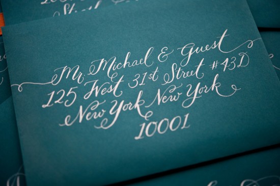
The beautiful envelopes were calligraphed by the uber-talented Jenna of Love, Jenna Calligraphy.  Of course, all the pieces were lovingly letterpress printed by hand on our antique press (c. 1896) on beautiful, textural, super thick 220# 100% cotton paper.


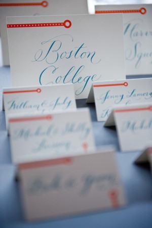
The couple named each table after a T stop, so day-of pieces featured MBTA sub-way stop inspired graphics, more cobblestone and the Zakim bridge graphic to tie it all together.

Thanks Sam and Whit!

Design and Letterpress Printing: Gus & Ruby Letterpress

Calligraphy: Love, Jenna Calligraphy

Gus & Ruby Letterpress is a member of the Designer Rolodex – check out more of their beautiful work right here or visit the real invi­ta­tions gallery for more wedding invitation ideas!

Photo Credits: Brea McDonald Photography for Gus & Ruby Letterpress

{happy weekend!}

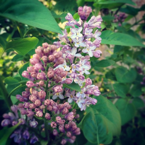
I apologize to those of you who might be tired of hearing me blather on about spring in DC, but it really is just so beautiful this time of year I can’t help it!  My husband and I went for a walk in our neighborhood yesterday evening and I spotted some lilacs just starting to bloom, and earlier in the day I spotted some wisteria!  It’s early in the season for a lot of these flowers, but apparently everything is going to be early this year due to the relatively mild winter and I’m not exactly complaining.  I’m just trying to soak as much of it in while it lasts.  One of my favorite things to do during lilac season is to visit the Mount Vernon estate; it’s covered in the gorgeous (and fragrant) blossoms!  I’ll have to plan a trip soon, but in the meantime…

…a few links for your weekend!

This week on Oh So Beautiful Paper:

A big welcome to the newest Designer Rolodex members!

As usual, we have a fun cocktail coming up for you this afternoon, so check back a bit later for the recipe!  Oh, and speaking of cocktails – one of our recipes, the Oaxacan Sunrise, is a competition finalist!  If you’re over 21 and have a moment, we’d love it if you could vote for us!  Voting ends later today, but you can vote right here.  Thank you so much!

I hope you all have a wonderful weekend, and I’ll see you back here on Monday!  xoxo

Photo by me (via Instagram), taken at the Congressional Cemetery yesterday evening