Anneke & Austin’s Nautical-Inspired Wedding Invitations

Good morning, paper lovers!  Samantha & Whitney here from Gus & Ruby Letterpress. We have the immense privilege of guest blogging on the Oh So Beautiful Paper blog this week and we are just delighted to be here. To start things off, today we’re thrilled to bring to you a chic, nautical invitation suite that we’ve been squirreling away for a few months. This custom suite was crafted for an absolutely too-cute-for-words couple, Anneke & Austin, in need of wedding stationery for their Maine-coast nuptials.

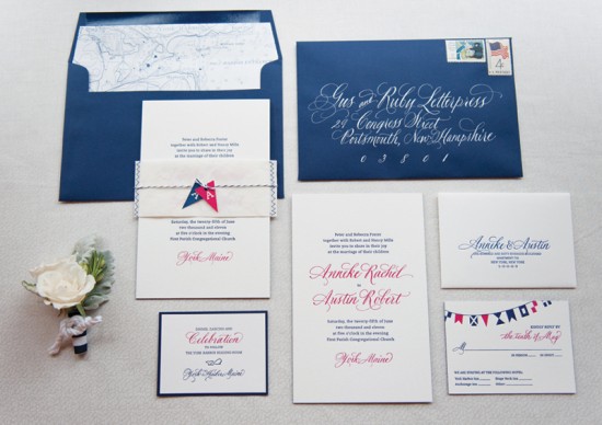
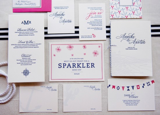
Knowing that A&A wanted to feature the seaside location of their wedding venue, we set about crafting a suite that was both nautical, personal and playful but still classic, elegant and timeless.

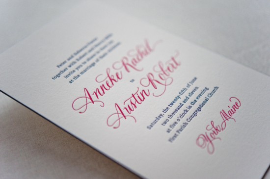
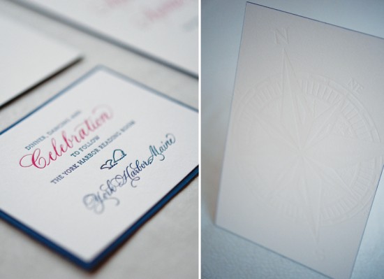
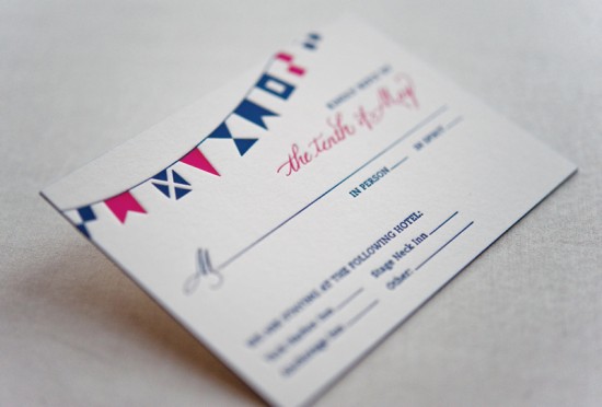
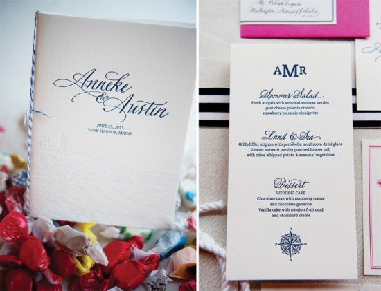
To set the tone on all pieces, we paired classic typesetting, stunning hand calligraphy by Elizabeth Porcher Jones and a preppy palette of navy and pink and letterpress printed everything on thick, textural cotton. Navy edge painting and a blind-printed compass on the back of the extra-thick invitation added subtle pops to the clean design. Nautical pennants (burgees), hand-illustration and color backing papers pulled even more nautical elements into the reply and reception cards.

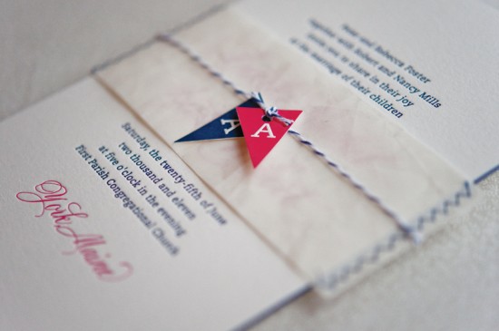
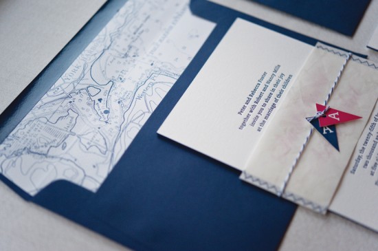
And, what really put the suite over the edge was the custom hand-sewn belly band made of recycled sail cloth that held all the pieces together. Each band was cut out of a piece of sail (previously used on a boat!) and sewn all by hand, and hand-cut monogram burgees were tied to striped twine around the band as a finishing touch.  The deep navy envelopes popped with stunning white calligraphy and featured custom nautical chart envelope liners as an added surprise for guests as they opened the suite.

The end result was an invitation suite (and then accompanying day-of pieces) that perfectly reflected the classic Maine wedding of this beautiful and lovely couple. See more photos of the Anneke & Austin suite (including the super fun poster-style save the date) HERE.

Design and Letterpress Printing: Gus & Ruby Letterpress

Calligraphy: Elizabeth Porcher Jones

Gus & Ruby Letterpress is a member of the Designer Rolodex – check out more of their beautiful work right here or visit the real invi­ta­tions gallery for more wedding invitation ideas!

Photo Credits: Brea McDonald Photography for Gus & Ruby Letterpress

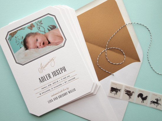
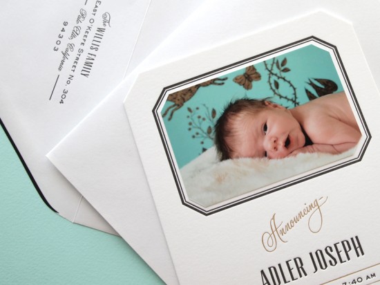
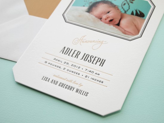
Sophisticated Letterpress Birth Announcements for Baby Adler
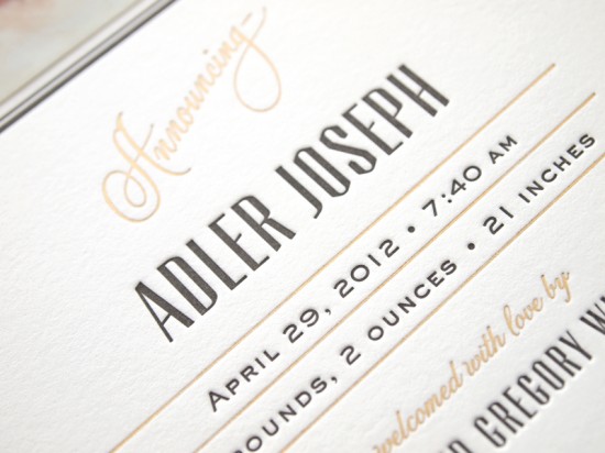
I’m absolutely in love with these sophisticated baby announcements from Lisa at Missive – from the 1950s-inspired typography and subtle touches of gold foil to the beveled edges and gold envelope liner.  Lisa was inspired by the turquoise and gold wallpaper that she chose for Adler’s bedroom, and the resulting design is an elegant way to announce the arrival of a little gentleman!

Sophisticated Letterpress Birth Announcements by Missive via Oh So Beautiful Paper
From Lisa: My son Adler’s announcements were inspired by the design of his nursery, in particular, the turquoise, black, and antique gold wallpaper that hangs on the wall behind his crib. I used this color palette as a starting point to create a sophisticated letterpress announcement for my little gentleman.

Sophisticated Letterpress Birth Announcements by Missive via Oh So Beautiful Paper

To infuse a little history and personal sentiment into the design, I scanned the text that reads “Announcing” from a vintage 1950s birth announcement — my own mother’s — and created a clean, deco style to complement it.

Sophisticated Letterpress Birth Announcements by Missive via Oh So Beautiful Paper

I added special touches like beveled corners on the card and photo, and with the help of our good friend and fellow printer Tim Butler of Quality Letterpress, added foil stamping in an antique gold color to match the envelope liners.

Sophisticated Letterpress Birth Announcements by Missive via Oh So Beautiful Paper

Thanks so much Lisa!  And congratulations on baby Adler!

Photo Credits: Missive

Elspet + Thomas’s Whimsical Hand Lettered Wedding Invitations

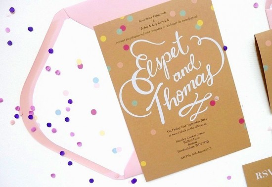
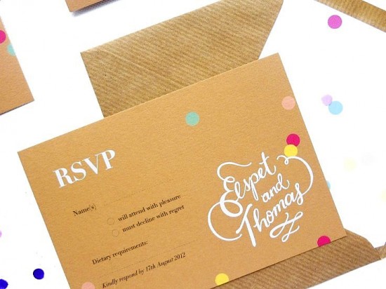
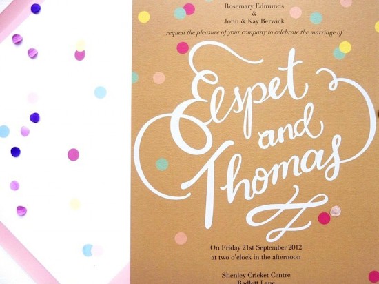
These whimsical hand lettered wedding invitations come to us from the London-based design studio BerinMade.  Erin from BerinMade was inspired by the bride’s vision of a wedding filled with confetti.  Erin created an invitation suite with a kraft paper and pink color palette with Erin’s beautiful hand lettering in white ink – and of course, lots of confetti hidden in the envelopes!

BerinMade Wedding Invitations via Oh So Beautiful Paper (7)

From Erin: When Elspet and I met up for a chat, we came up with a vision of a fun and confetti-filled wedding celebration.  This is exactly what we did for her three-piece wedding invitation suite.

BerinMade Wedding Invitations via Oh So Beautiful Paper (6)

We wanted to focus in on just a few elements: the quality of the card stock, which is a heavenly brown stock from the GFSmith range; my hand-lettering which was printed with white ink and run several times through the printer to get that lovely solid white; and a scatter of confetti across the invitation suite, on the back and also on the liners.

BerinMade Wedding Invitations via Oh So Beautiful Paper (3)

Then we matched the suite with candy pink and kraft envelopes.  The idea was for loose confetti would also fall out of the envelope as guests opened their invitations, giving a real sense of excitement and festivities.

BerinMade Wedding Invitations via Oh So Beautiful Paper (2)

BerinMade Wedding Invitations via Oh So Beautiful Paper (4)

Thanks Erin!

Check out the Designer Rolodex for more tal­ented wed­ding invi­ta­tion design­ers and the real invi­ta­tions gallery for more wedding invitation ideas!

Photo Credits: BerinMade

Anna + Mark’s Preppy Yellow and Green Wedding Invitations

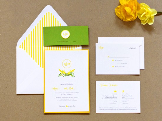
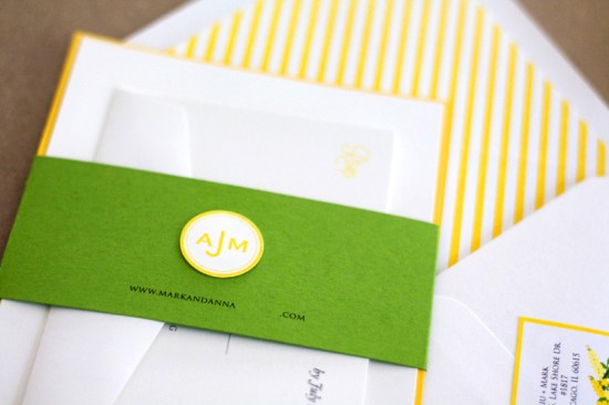
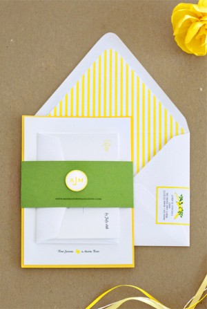
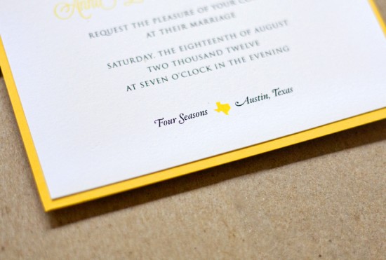
Becca from Lavender’s Blue sent over these colorful and preppy wedding invitations that she created for an upcoming summer wedding in Texas.  Becca drew her inspiration from the bride’s color palette and wedding flowers, with a few Texas icons thrown in for good measure.  I’m loving the striped envelope liners and bold belly band!

Wedding Invitations by Lavender Blue via Oh So Beautiful Paper (10)

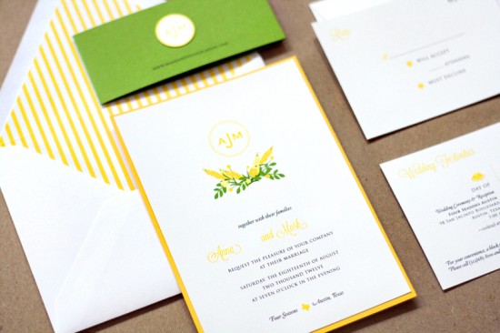
From Becca: Anna wanted something simple, elegant, and summery – with just a “hint of Texan” – and sunshine yellow and lush green for the colors.  She also had an idea of what flowers she wanted for the wedding, so I worked off of those images to create some summery florals to adorn the invitations.

Wedding Invitations by Lavender Blue via Oh So Beautiful Paper (7)

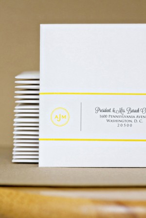
I created a logo using their initials to include in the invitation, which we ended up using in several elements of the suite, including the address labels, the belly band, and also as a sticker for the envelope flap.  For envelope liners, we went with a striped yellow lining to add elegance and playfulness to the entire suite.

Wedding Invitations by Lavender Blue via Oh So Beautiful Paper (8) Wedding Invitations by Lavender Blue via Oh So Beautiful Paper (9)

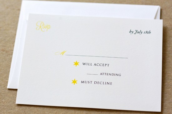
For Anna’s “hint of Texan,” I incorporated a small silhouette of the state of Texas on the main invitation, then used sheriff’s stars for the RSVP card, and a cowboy boot for the post-wedding brunch invitation.

Wedding Invitations by Lavender Blue via Oh So Beautiful Paper (6)

Wedding Invitations by Lavender Blue via Oh So Beautiful Paper (4)

Wedding Invitations by Lavender Blue via Oh So Beautiful Paper (2)

Thanks Becca!

Check out the Designer Rolodex for more tal­ented wed­ding invi­ta­tion design­ers and the real invi­ta­tions gallery for more wedding invitation ideas!

Photo Credits: Lavender’s Blue

Naomi’s Kraft Paper and Calligraphy Save the Dates

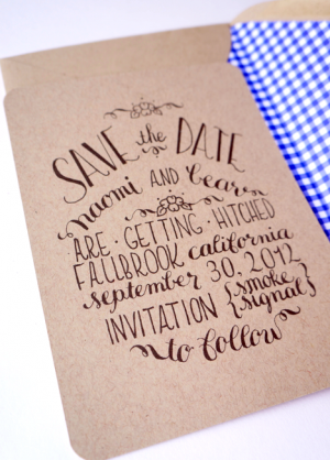
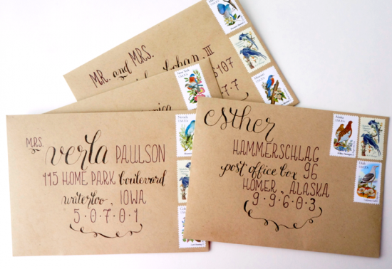
I have a confession: it’s enormously difficult for me to resist anything that combines kraft paper and calligraphy.  Calligrapher Tara of Tine and Thread sent over these save the dates that she created for an upcoming wedding, and the addition of gingham envelope liners just put me over the edge.  Too cute!

Calligraphy Save the Dates via Oh So Beautiful Paper (3)

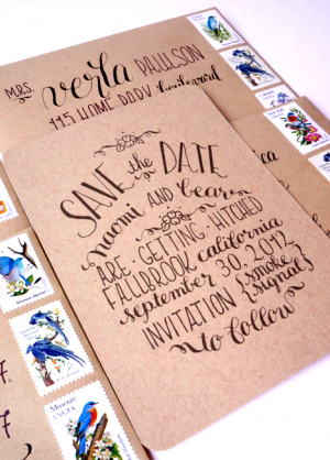
From Tara: I worked with the bride to create a save the date that complemented the overall vision of her wedding.  Her colors are very rustic, mostly earth tones with a touch of navy.  I chose to use kraft paper with navy blue gingham envelope liners and vintage stamps with blue accents.

Calligraphy Save the Dates via Oh So Beautiful Paper (6) Calligraphy Save the Dates via Oh So Beautiful Paper (4)

I then took her wedding information and went to work.  After two rounds of design, I came up with something that she loved.  My specialty is calligraphy in a circular design and I incorporate that into most of my work.

Calligraphy Save the Dates via Oh So Beautiful Paper (1)

Thanks Tara!

Check out the Designer Rolodex for more tal­ented wed­ding invi­ta­tion design­ers and the real save the dates gallery for more beau­ti­ful cus­tom save the dates!

Photo Credits: Tine and Thread