Happy Weekend!

Happy Friday everyone! I can’t believe it’s the last week of June already! This summer is flying by – but all I want to do is just slow things down and enjoy summer as much as possible. Sophie starts preschool at the end of this summer, so these weeks feel even more precious. I’m off to chase after an energetic toddler and a crawling infant, but in the meantime…

Mon Voir Calligraphy Watercolor Philodendron / Oh So Beautiful Paper

Photo Credit: Mon Voir Calligraphy via Instagram

…a few links for your weekend!

This week on Oh So Beautiful Paper:

Check back this afternoon for this week’s cocktail recipe! Have a wonderful weekend, and I’ll see you back here on Monday! xoxo

9th Letter Press Wedding Invitation Collection

The ladies of 9th Letter Press just came out with a  fun new wedding invitation collection – with printing options ranging from flat printing to letterpress (naturally) to foil! They’re all so pretty! Here are a few of my favorite designs:

9th-Letter-Press-Wedding-Invitations-OSBP-Austin

9th-Letter-Press-Wedding-Invitations-OSBP-Davis-Crest3

9th-Letter-Press-Wedding-Invitations-OSBP-Davis-Crest

9th-Letter-Press-Wedding-Invitations-OSBP-Elodie2

9th-Letter-Press-Wedding-Invitations-OSBP-Felicity

9th-Letter-Press-Wedding-Invitations-OSBP-Katherine

9th-Letter-Press-Wedding-Invitations-OSBP-Lola

9th-Letter-Press-Wedding-Invitations-OSBP-Lola3

9th-Letter-Press-Wedding-Invitations-OSBP-Sawyer

More on 9th Letter Press here!

9th Letter Press is also a member of the Designer Rolodex – you can see more of their beautiful work right here!

Photo Credits: 9th Letter Press

Anne + Casey’s Modern Fireworks Wedding Invitations

I love this modern approach to fireworks-inspired wedding invitations from Brooke at Paper & Parcel for a 4th of July weekend wedding! Brooke mixed classic colors (navy and red) and beautiful typography with a modern firework motif to get the light hearted vibe that the bride and groom wanted. And those vintage stamps?? Perfect for this holiday weekend wedding!

Modern-Fireworks-Wedding-Invitation-Paper-and-Parcel-OSBP5

From Brooke: Anne and Casey came to me with a very specific vision. They were married on July 3rd at 501 Union in Brooklyn, New York. Their wedding was fun, light-hearted and a true celebration of this special moment in their lives. They envisioned an urban rustic feel to their invitations with a nod to the holiday but without the flags and presidents. Together we came up with the idea of an abstract, modern firework motif with elegant typography.

Modern-Fireworks-Wedding-Invitation-Paper-and-Parcel-OSBP8

The invitation was letterpress printed on thick 220# Crane Lettra Ecru cotton paper in navy and red ink. We carried the firework motif and typography into the reply card which was flat printed on 110# Cane Lettra Ecru. A cross-hatch liner complimented the kraft paper envelopes. It was so much fun designing this simple, elegant but whimsical invitation suite for a fabulous couple!  

Modern-Fireworks-Wedding-Invitation-Paper-and-Parcel-OSBP4

Modern-Fireworks-Wedding-Invitation-Paper-and-Parcel-OSBP3

Modern-Fireworks-Wedding-Invitation-Paper-and-Parcel-OSBP2

Modern-Fireworks-Wedding-Invitation-Paper-and-Parcel-OSBP7

Thanks Brooke!

Check out the Designer Rolodex for more tal­ented wed­ding invi­ta­tion design­ers and the real invi­ta­tions gallery for more wedding invitation ideas!

Photo Credits: Paper & Parcel

Lucas + Judah’s Wild Kratts Birthday Party Invitations

I really don’t know how Lisa from Good on Paper does it. Every year she comes up with the best themes for her two boys’ birthday parties and then completely knocks it out of the park with the invitations! For her older son’s 5th birthday (BTW – how is Lucas FIVE already??? You can also check out birthday invitations 1, 2, 3, and 4), Lucas requested a Wild Kratt’s theme for a shared party with his friend Judah. The resulting invitations and party paper are all so much fun!

Wild Kratts Birthday Party Invitations / Good on Paper Design / Oh So Beautiful Paper

From Lisa: For Lucas’ 5th birthday party he asked for a “Wild Kratts” party. If you haven’t seen this show, it’s an educational animated series on PBS, created by and starring brothers Chris and Martin Kratt. The show is full of fun facts about animals, ranging from polar bears to geckos, and each episode features a particular critter’s unique “creature power.” Lucas gets really excited learning about animal powers and defenses, and I love when he enlightens me with new animal facts! This year we decided to throw a modern animal-themed birthday party together with Judah, Lucas’ good friend from school, who turned five the day before.

Wild Kratts Birthday Party Invitations / Good on Paper Design / Oh So Beautiful Paper

Starting with the invitation design, I painted abstract animal patterns using simple black watercolor paint, and hand wrote “Go Wild” which would later become a logo for the party. I took a cute photo of Lucas and Judah and used it as a custom envelope liner. The envelopes were finished with matching wrap-around address labels.

Wild Kratts Birthday Party Invitations / Good on Paper Design / Oh So Beautiful Paper

We originally scheduled the party for Saturday, and had all the invitations printed up. We later changed it to Sunday due to Little League conflicts. I didn’t want to waste the old invitations, so I cut off the old RSVP information, and used the top half to make “creature power” trading cards that accompanied each t-shirt. Each trading card had fun facts about different animals. Cute AND educational! The bottom of the invitations were used to create name tags and were handwritten with each kid’s name.

Wild Kratts Birthday Party Invitations / Good on Paper Design / Oh So Beautiful Paper

Wild-Kratts-Birthday-Party-Good-on-Paper-OSBP3

Wild-Kratts-Birthday-Party-Good-on-Paper-OSBP5

Wild-Kratts-Birthday-Party-Good-on-Paper-OSBP7

If you’ve seen our other birthday parties, you know that donut holes are a Jackson family tradition. This year’s donut cones were made with the animal printed recycled paper.

Wild-Kratts-Birthday-Party-Good-on-Paper-OSBP9

One of my favorite ideas for the party was to make “polar bear ice,” aka popsicles. There’s a Wild Kratts episode called “Polar Bears Don’t Dance,” and I wanted the “polar bear ice” to tie into that. The team at Whole Foods Market Gilman made custom paletas in three fruity flavors (blueberry cream, apple/pineapple and fresh strawberry). All were a huge hit on the warm day.

Wild Kratts Birthday Party Invitations / Good on Paper Design / Oh So Beautiful Paper

I designed some packaging for the pops using wax food bags, snipped at the bottom and  sealed on top with a hand lettered label. The package kept the pops from sticking together in the cooler, and also doubled as a place for the melty drips to fall. They were devoured in seconds!

Wild-Kratts-Birthday-Party-Good-on-Paper-OSBP16

Wild-Kratts-Birthday-Party-Good-on-Paper-OSBP17

Wild-Kratts-Birthday-Party-Good-on-Paper-OSBP19

Yay! Thanks Lisa! And happy 5th birthday to Lucas!

Photo Credits: Good on Paper

Behind the Stationery: Papillon Press

We’re going up north into Canada for today’s post from Chantal at Papillon Press! Transitioning their wedding line into something for everyone, this duo of illustrators started wholesaling their greeting cards a few years into their business. –Megan
chantal_papillon

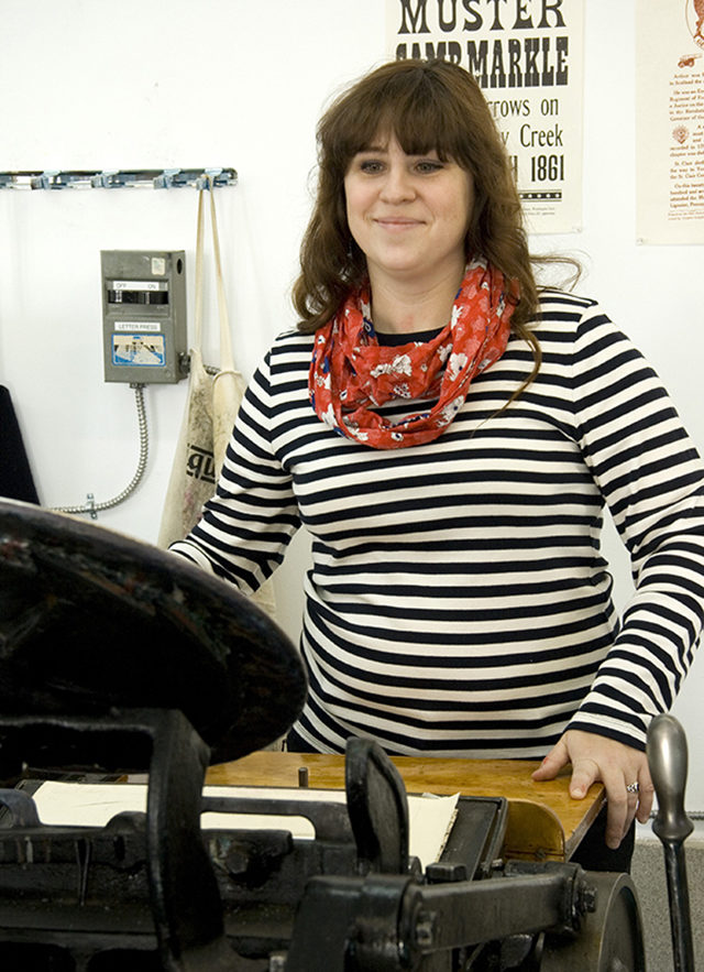
I’m Chantal Bennett, owner and founder behind Papillon Press, a letterpress stationery studio based out of the village of Westport, Ontario, Canada. Papillon Press began in 2009 when I saw an ad on Kijiji (the Canadian Craigslist) selling a 10×15 new style Chandler & Price letterpress, along with 110 typecases, cabinets, and shop supplies. My co-founder/husband Joel Kimmel and I picked it up and moved it 7 hours north to our first studio, which was then located in our home in Sudbury, Ontario. Papillon Press, the illustrated press, was born.

beagle_letterpress joeldesk

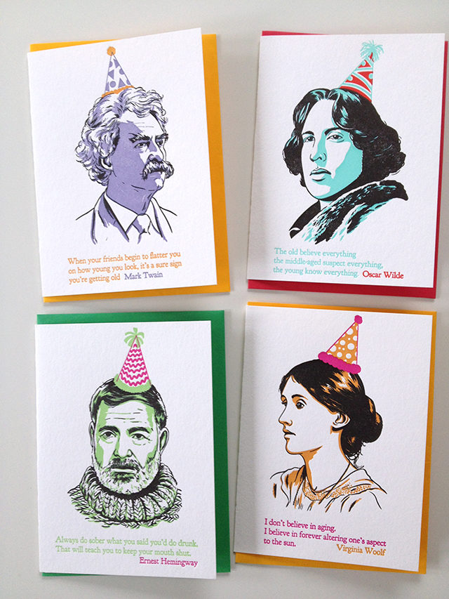
Joel and I both studied illustration in art school. I attended Parsons The New School for Design in New York while Joel attended Sheridan College in Oakville, Ontario. We use our drawing skills to create greeting cards with a sprightly sense of humour, told in an illustrative manner but without hitting you over the head with a punchline. We hope our approach to life, which is to not take ourselves too seriously, is reflected in our cards and passed on to the person who buys that card.

chantaldesk process_600px

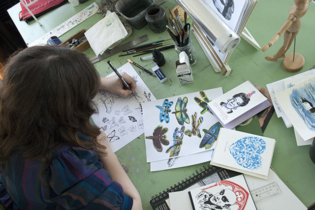
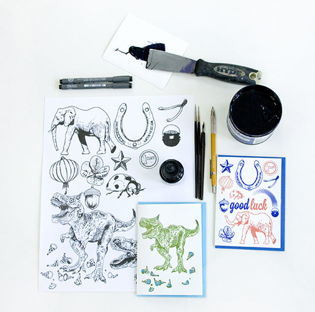
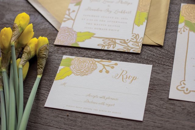
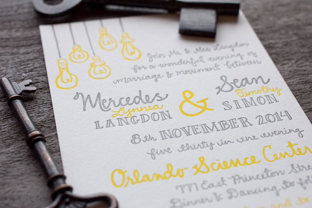
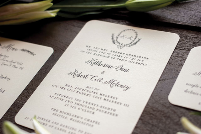
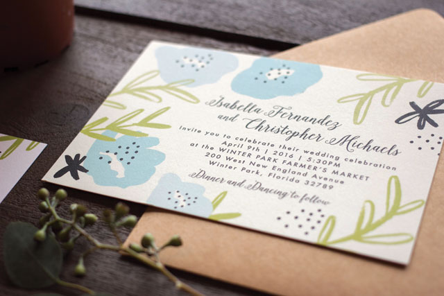
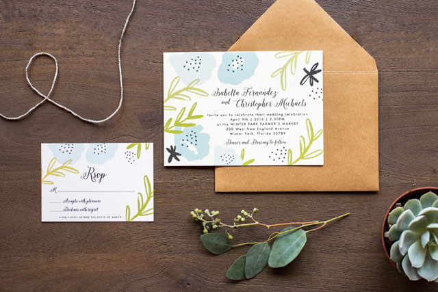
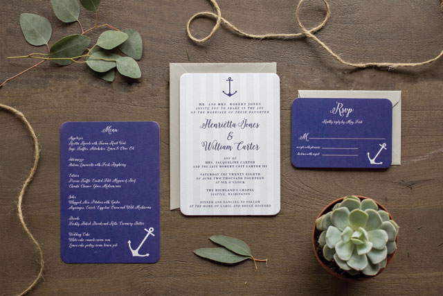
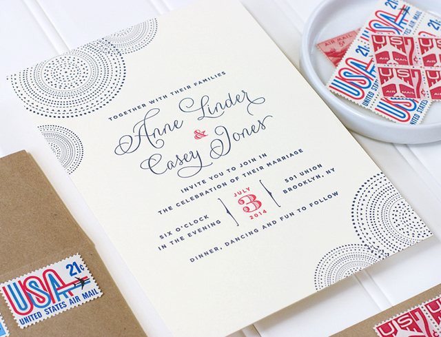
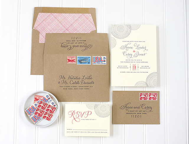
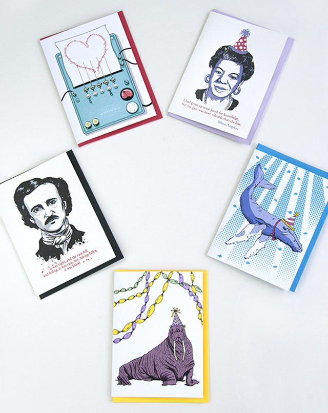
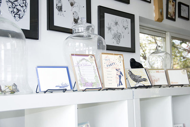
Letterpress printing was a natural extension of our drawing styles. Both Joel and I excel at pen and ink drawings, and we discovered that our line works and prints very well with letterpress. For the first few years of the business we focused mostly on wedding invitations, then we began focusing more on selling our collection of greeting cards in 2012. We felt that greeting cards afforded us more creative freedom to draw the things we wanted to draw, like a gorilla high-fiving a kitten, rather than just decorative borders.  Our cards often feature animals (including extinct ones like dinosaurs) in ridiculous situations – most often wearing party hats – and most of our wedding clients weren’t down with animals in party hats on their invitations (except for a select, awesome few).

new_cards2015_600px

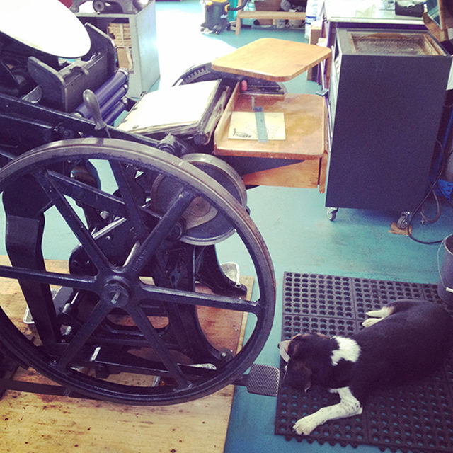
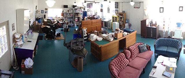
We moved our studio, home, and beagle to Westport in 2013. Our studio building is behind our circa 1877 house on our property, located in the village. I love being able to walk 50 feet from my house and I’m at work. I also love that our studio is two stories, 1000 square feet on each level (right?!) so I have room for all my printing equipment, inventory, drafting tables, and even a little showroom area with a sofa for all those much needed workday naps (ok, sometimes). My computer desk faces a window where I frequently get distracted watching birds land on the birdfeeder.

studio2_600px studioshowroom3_600px

Joel shared the Papillon Press workload for the first two years of the business, but now contributes only to the illustration portion of the design process because he’s too busy working for clients like TIME, Nike, and the Royal Canadian Mint (They pay better than I do. Shocker!). The majority of illustration & design duties, as well as the printing and managing of the business fall to me, which makes Papillion Press mostly a one-woman-show, save for the packaging and packing of orders which is the job of my studio assistant, Lynda. This year we introduced offset printed cards into our collection making use of the four-colour process to add more colours to our designs, but without adding to my workload.

authors_letterpress_cards

I always knew I would be an entrepreneur of some kind, whether it be an illustrator or something else involving drawing, so I’m very glad I’ve managed to make this my full-time job. Papillon Press has been steadily growing over the years and I hope to keep expanding our current list of 50+ retailers in Canada and the USA.

All photos by Papillon Press

Interested in participating in the Behind the Stationery column? Reach out to Megan at [email protected].