Happy Friday everyone! It’s a gorgeous Spring day here in DC and my three year-old has a day off from pre-school, since Emancipation Day is a holiday in DC. So I’m off to spend some time with my little and enjoy this gorgeous weather! But in the meantime…
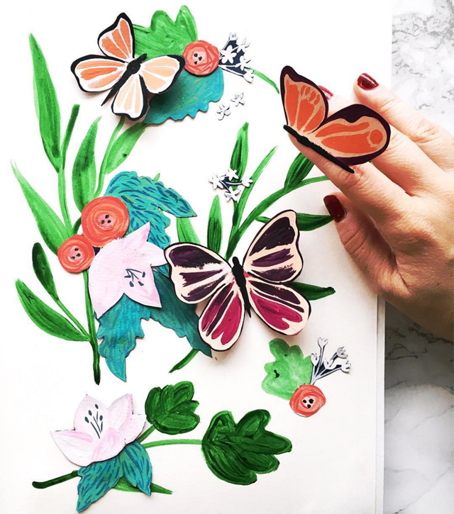
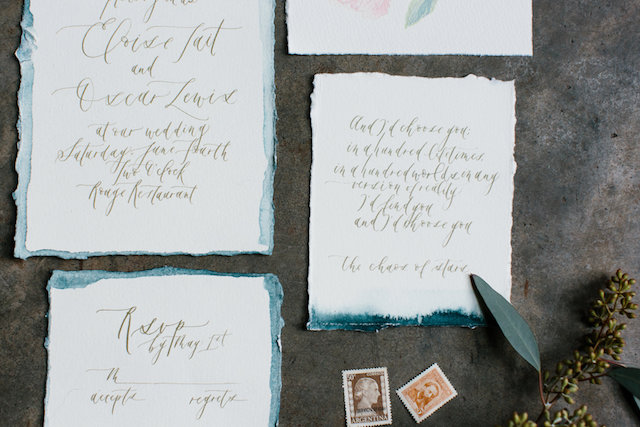
Image by BerinMade via Instagram (from the #dailydoseofpaper feed)
…a few links for your weekend!
- Announcing the Beyond Type 1 Snail Mail Club!
- I’m OBSESSED with this watercolor backdrop
- The sweetest pink gingham dress for girls (I also love this blue gingham dress)
- A day in the life of one of my favorite illustrators
- I just bought this holographic cuff and love it!
- The prettiest spring floral crown
- I’ve been thinking about getting a pair of black jeans. Maybe these?
- I love the rainbow floral pattern on this dress – and it’s on major sale!
The last two weeks on Oh So Beautiful Paper:
- We shared our first Mother’s Day card round up!
- Behind the Stationery with Constellation & Co.
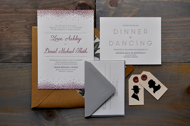
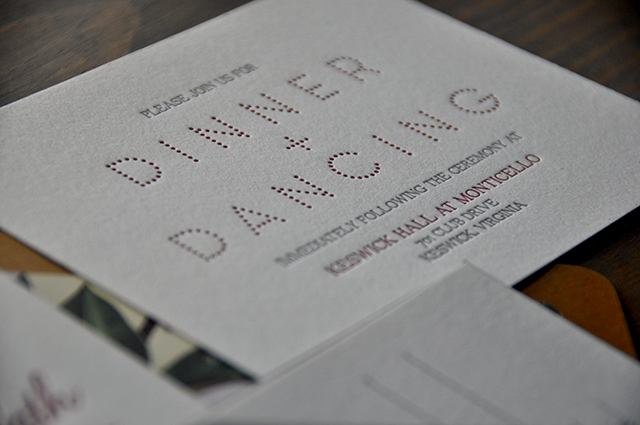
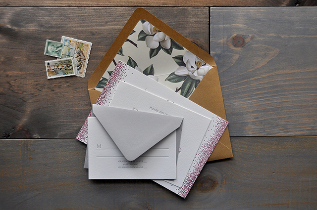
- Pretty invitations for a wedding in Virginia wine country
- Floral explosion!
- Well Said Type in Scrapbooker script
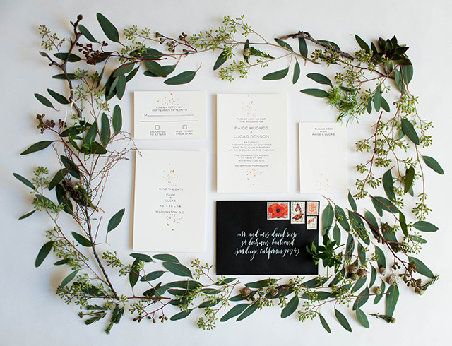
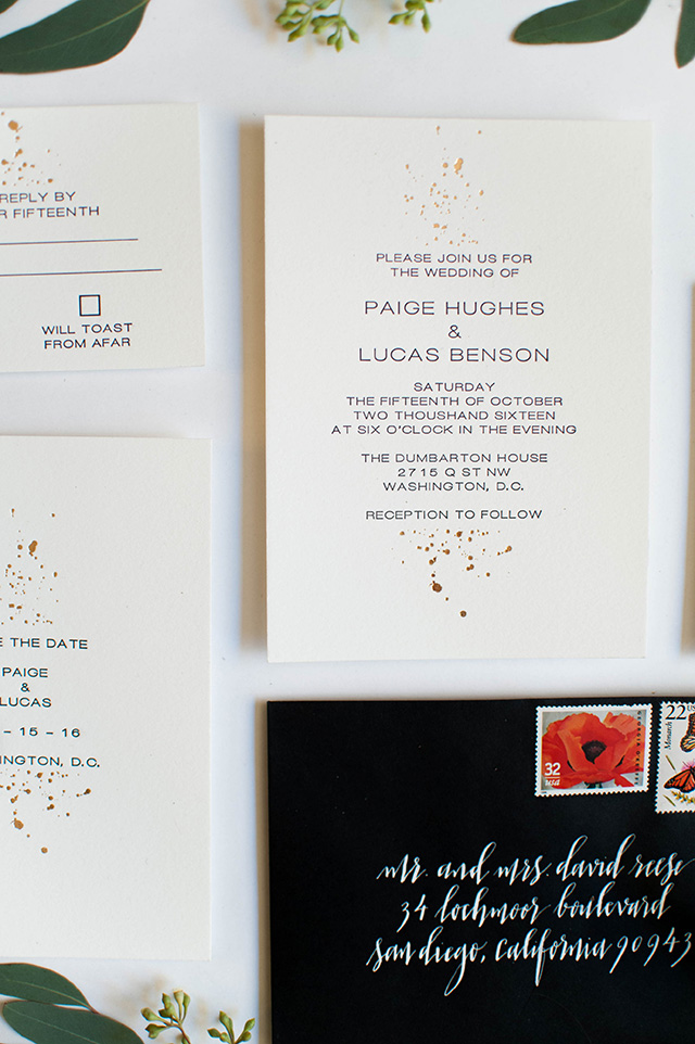
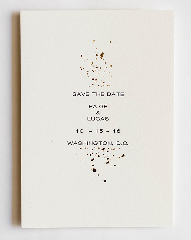
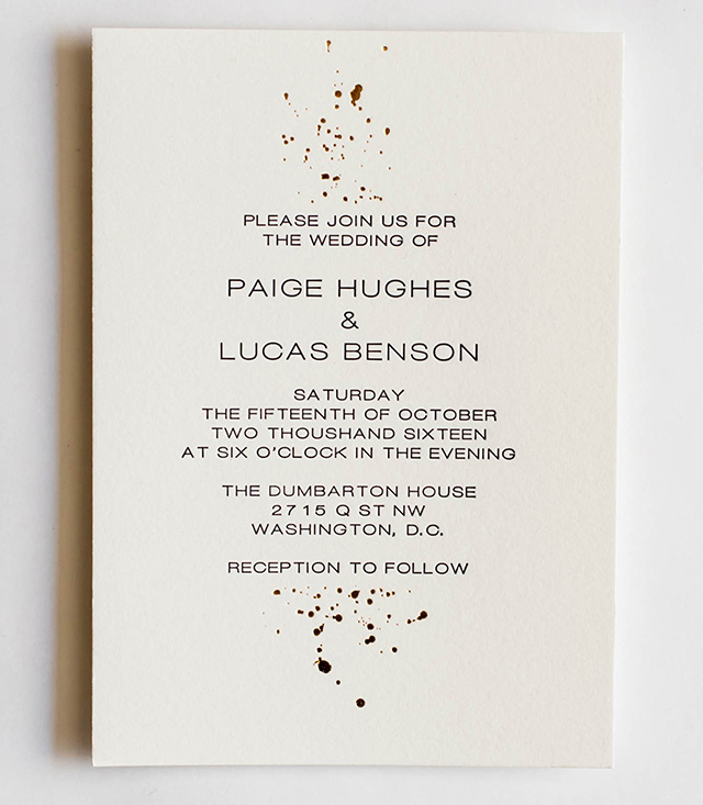
- Delicate and subtle gold foil splatter wedding invitations
- Absolutely gorgeous pink watercolor floral wedding invitations
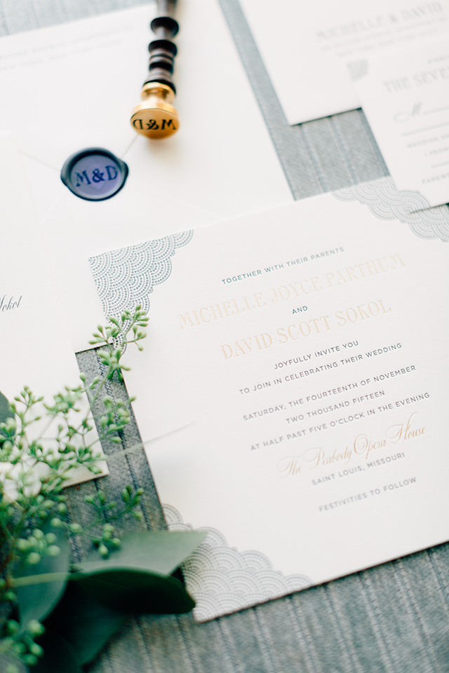
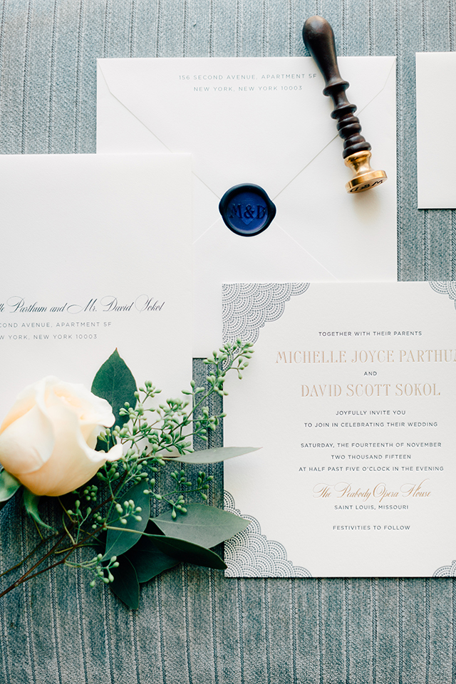
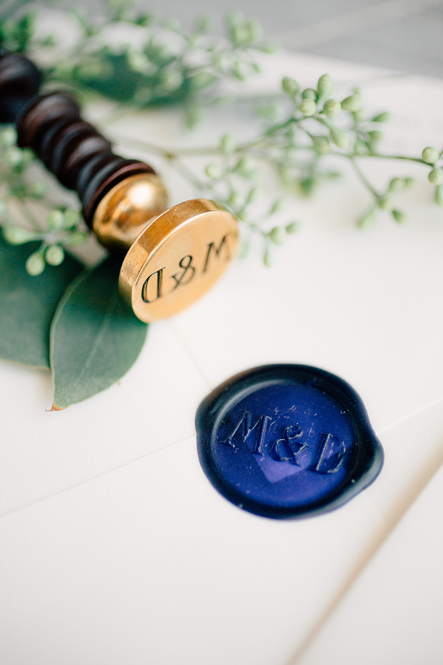
- Elegant and classic navy wedding invitations
- Well Said Type in the whimsical hand lettering Snow Cone font
- SO excited for the #fresh section of this year’s National Stationery Show!
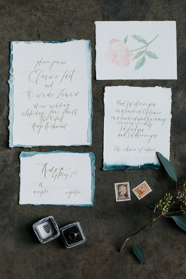
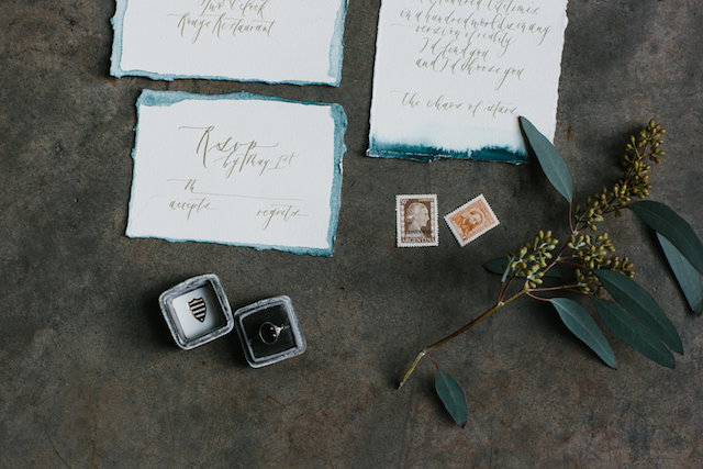
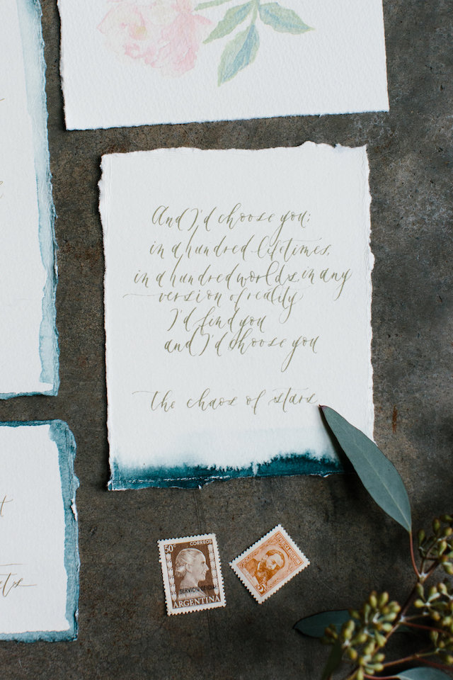
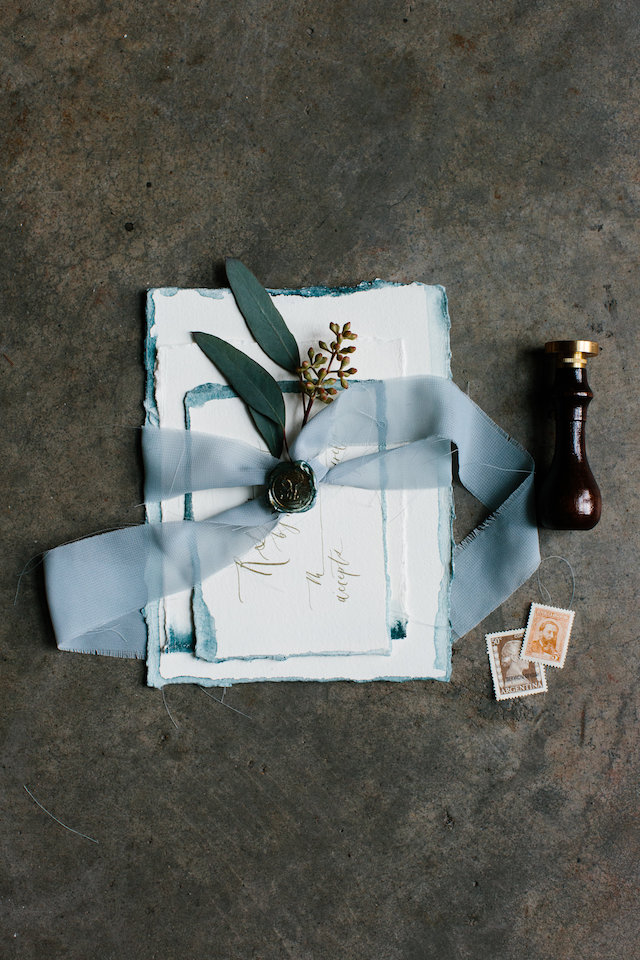
- Romantic dip dyed calligraphy wedding invitations
- Modern neon typography-driven wedding invitations
That’s it for me this week! Check back in just a bit for this week’s cocktail recipe! I hope you have a wonderful weekend, and I’ll see you back here on Monday! xoxo