Photo by Laura Metzler Photography
Here it is! Our fully renovated 1920s-inspired classic small bathroom! This was my first major home renovation, and it’s absolutely amazing to me how a room can go from being so dark and sad to bright and happy in such a short time. I know it sounds silly, but I’m just so happy to have a fresh space where I can  bathe my kids and brush my teeth every day. It went from being a constant source of stress to one of our favorite rooms in the house!
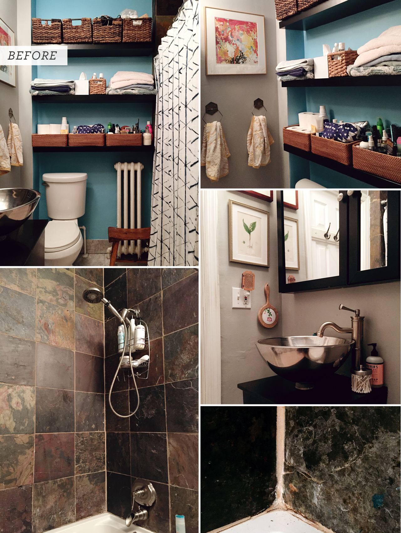
Oh man, it grosses me out just to look at those photos! When we bought the house, the entire bathroom was painted in the dark teal color behind the Ikea LACK shelves, but I had a fit a few months later and painted the other two walls a medium gray that I already had on hand.We sadly do not have any windows or skylights in our bathroom, and the whole space just felt SO DARK and really sad. We used a series of baskets that we brought over from our old apartment for bathroom storage, but it wasn’t really functional, especially since the top shelf could only be accessed by standing on top of the toilet and tinier things kept getting lost within the baskets. The medicine cabinet was super small and barely held our toothpaste and deodorant. The slate tile around the tub/shower was super dark and felt very claustrophobic, and it was literally crumbling away each time we took a bath or shower (bottom right). My kids loooooved poking the crumbly tile and making bits fall into the tub, which was the total opposite of awesome. You can’t see it in these photos, but the previous tub had water jets, which we never used because the jets scared the kids, and so the whole thing just seemed to breed mildew and was totally impossible to clean. And I know some folks really love a vessel sink, and I wouldn’t have minded it so much if it had been in a half bathroom or some other space not used by kids, but it just wasn’t practical for our only full bathroom. We knew that we wanted to make the bathroom a lighter, brighter, and happier place to be while also restoring some classic design details that felt more in keeping with with the era of our home.
Snow White 3 x 6 inch Ceramic Subway Tile / Grecian White Octagon 12 x 12 inch Polished Marble Mosaic Tile / Brass Tile Edging (just be sure to search for a size that matches the depth of your tile!)
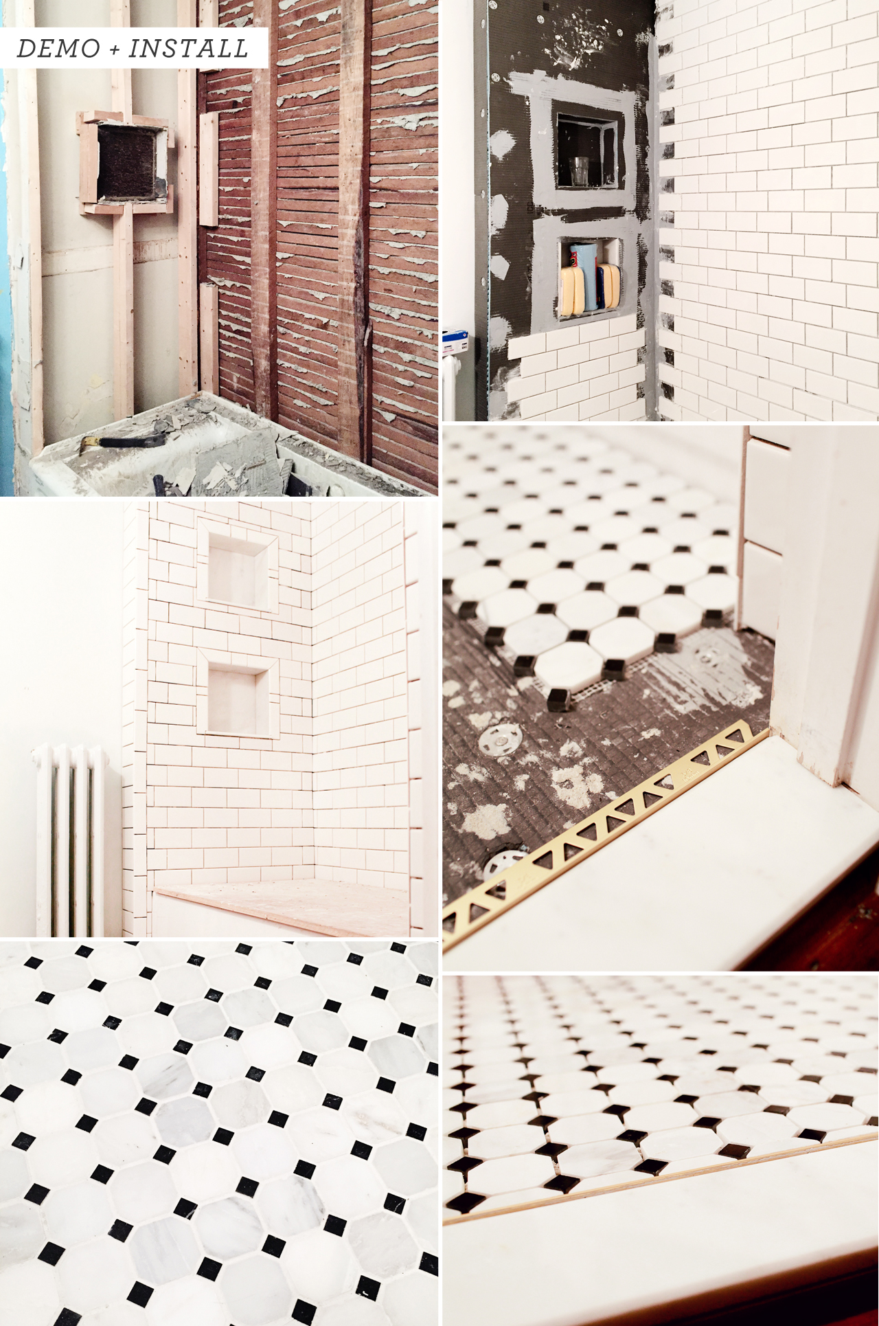
In mid-November, Home Depot approached us about working on a tile and grout campaign for our bathroom. The deadline was in early January, so it didn’t give us much time to get everything done, but we jumped at the opportunity to remodel our bathroom. So we demo’d the entire bathroom! We hired our favorite local contractor, Chris Forney, to handle demo of the original bathroom, Wedi board installation around the tub and shower, and the installation of the new tub, sink, and toilet. Chris and his team also removed part of the original paster walls behind the sink and installed new framing and drywall to make way for an inset medicine cabinet, although we left the plaster as-is everywhere else. We (well, my husband and my dad) did the tile and grout work over the Christmas holiday. You can read all about our tiling experience right here!
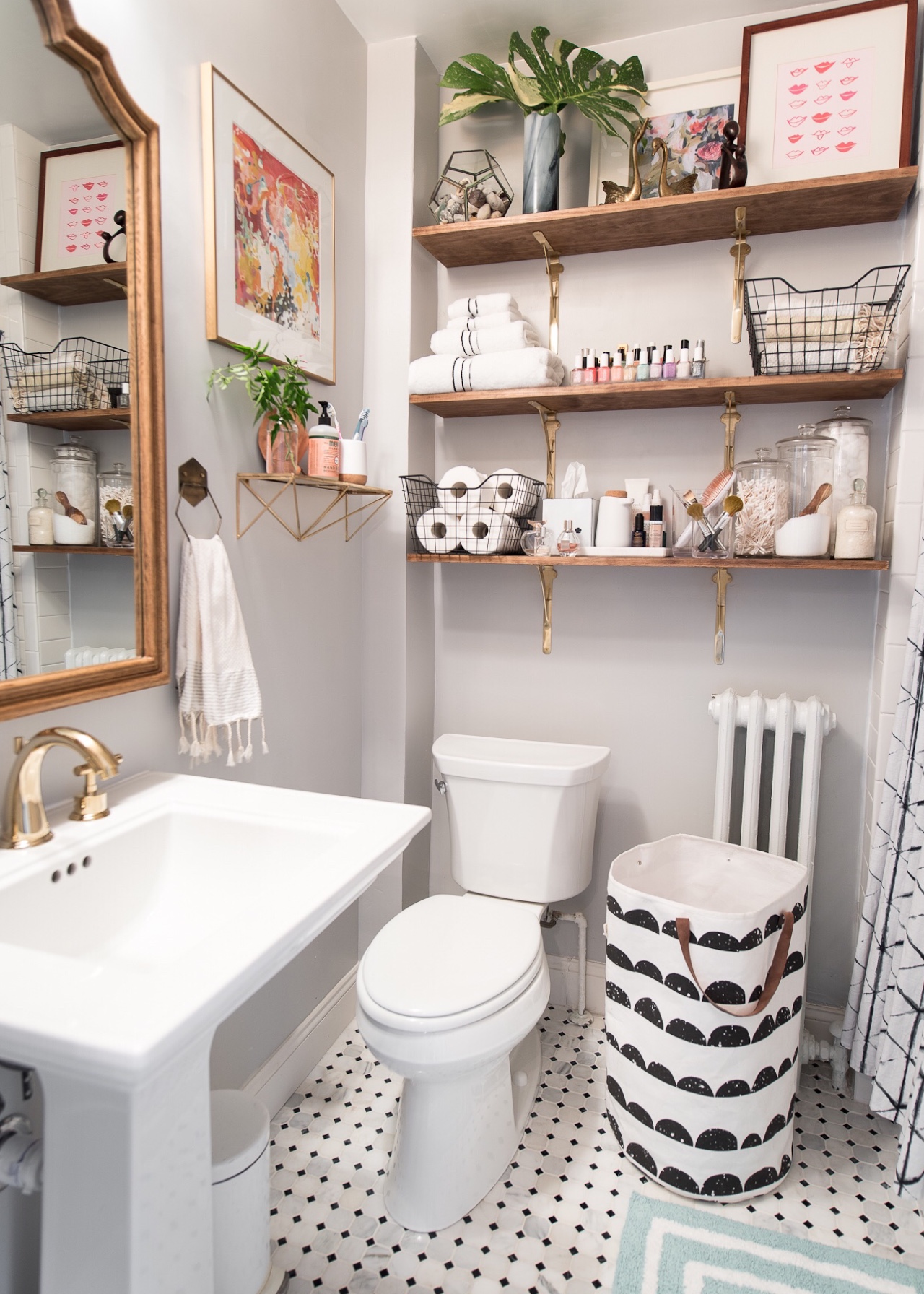
Aaaaahhhh, so much better! The bathroom is so tiny – only 36 square feet – so we didn’t change the layout of the bathroom, we just changed pretty much everything inside it. The walls were painted Sherwin-Williams Zircon, a warm light gray, with Sherwin-Williams Pure White on the ceiling.
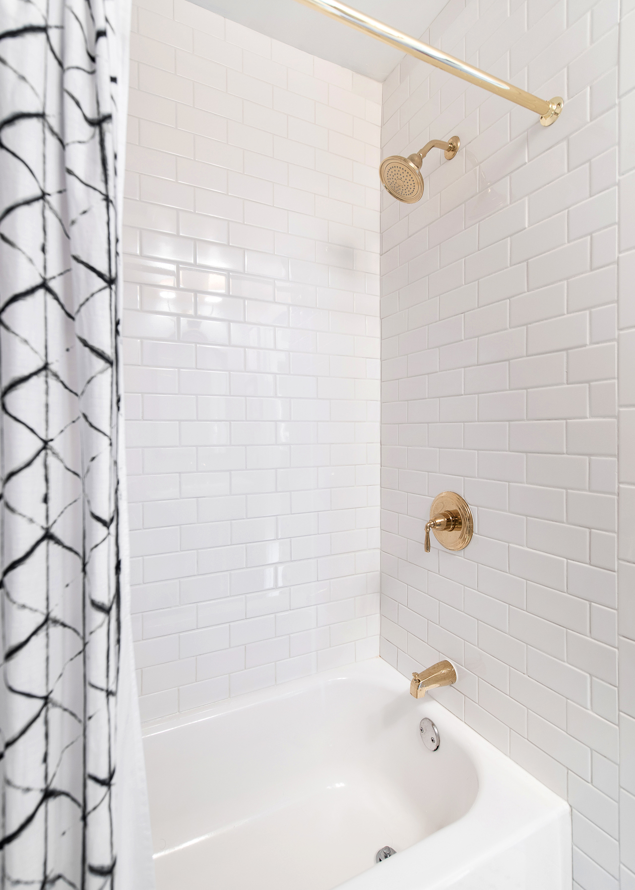
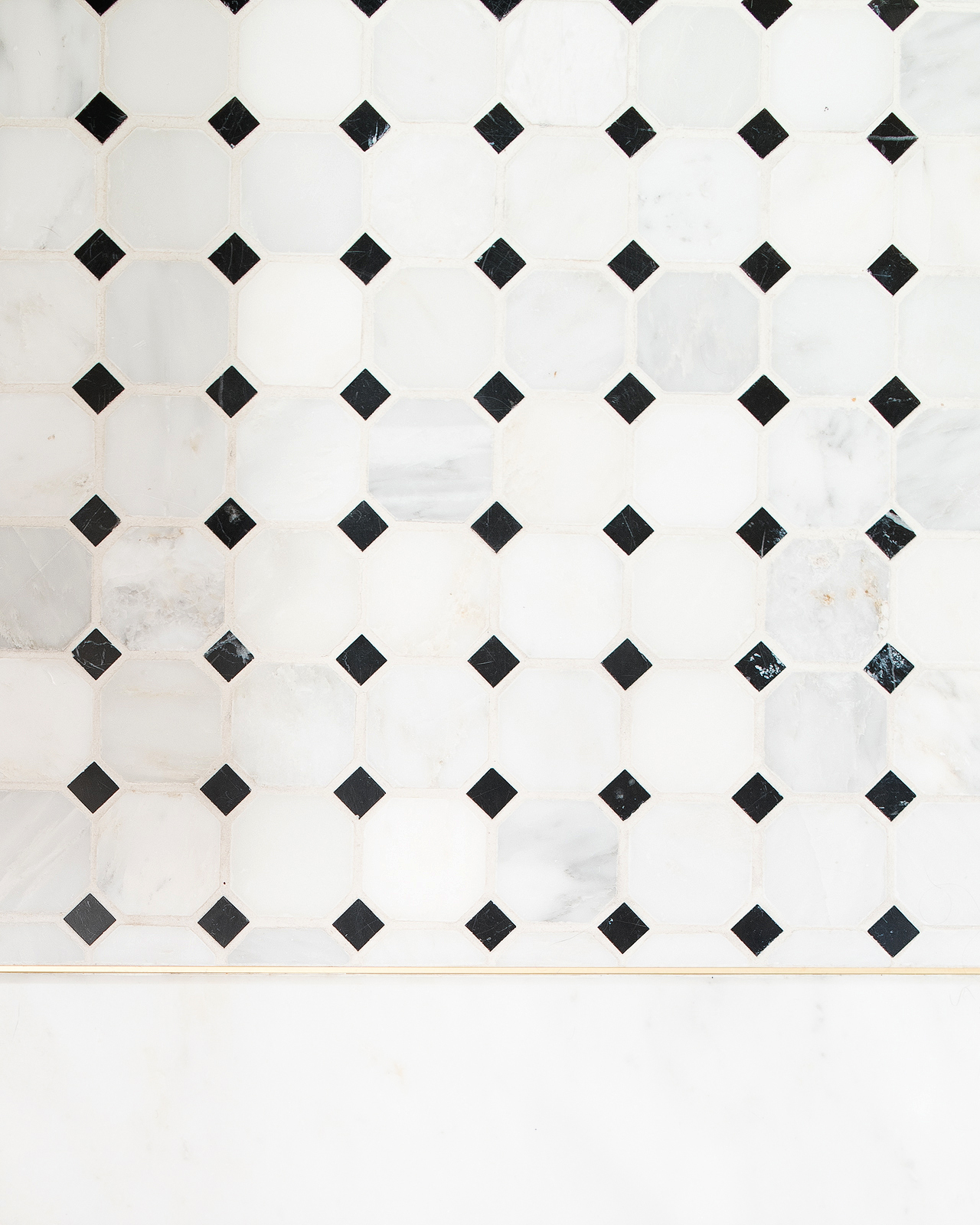
Photo by Laura Metzler Photography
We used white subway tile for the tub and shower niche and a gorgeous marble mosaic tile for the floor tile, both with bright white grout. We were originally going to use gray grout with the subway tile, but once the tile started to go up on the walls we worried that the dark gray grout might make the space feel smaller, so we switched to white. I still love the look of dark gray grout with white subway tile, so hopefully I’ll get the chance to use that combination in future bathrooms! And my absolute FAVORITE detail in the entire bathroom is the brass tile edging that we used between the mosaic floor tile and the marble threshold. I want to put it everywhere.
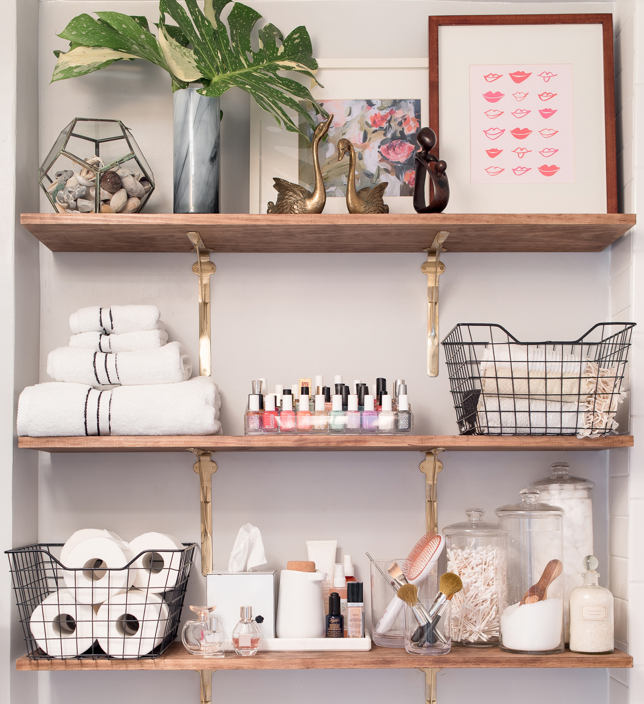
Photo by Laura Metzler Photography
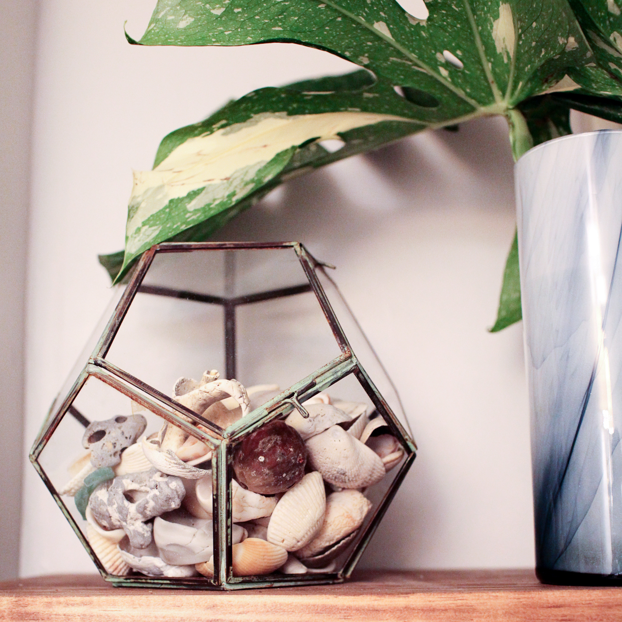
Top row: Geodesic terrarium (similar) /Â vintage brass swans / Jenny Vorwaller print / Thimblepress lips print
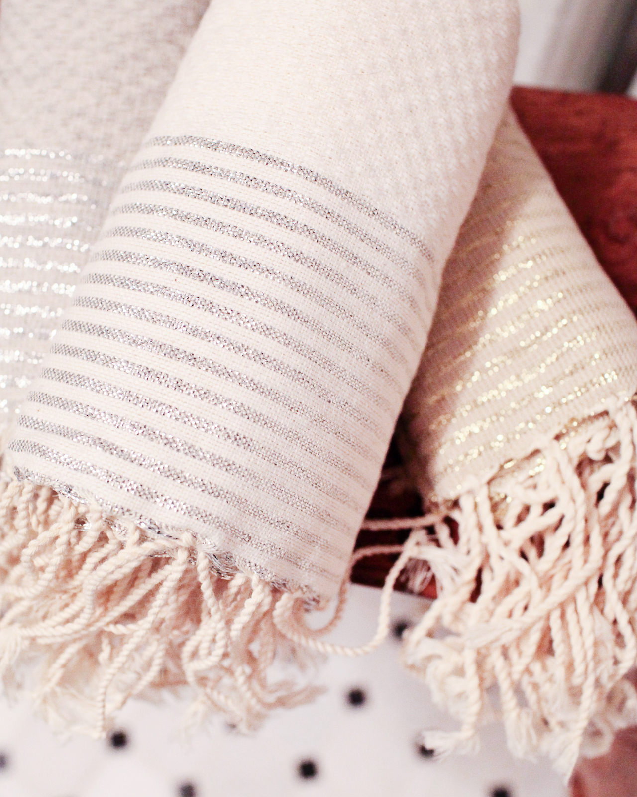
Middle row: Black and white hotel towel set / nail polish rack (similar) / Fouta hand towels with gold and silver stripes / Metal storage box
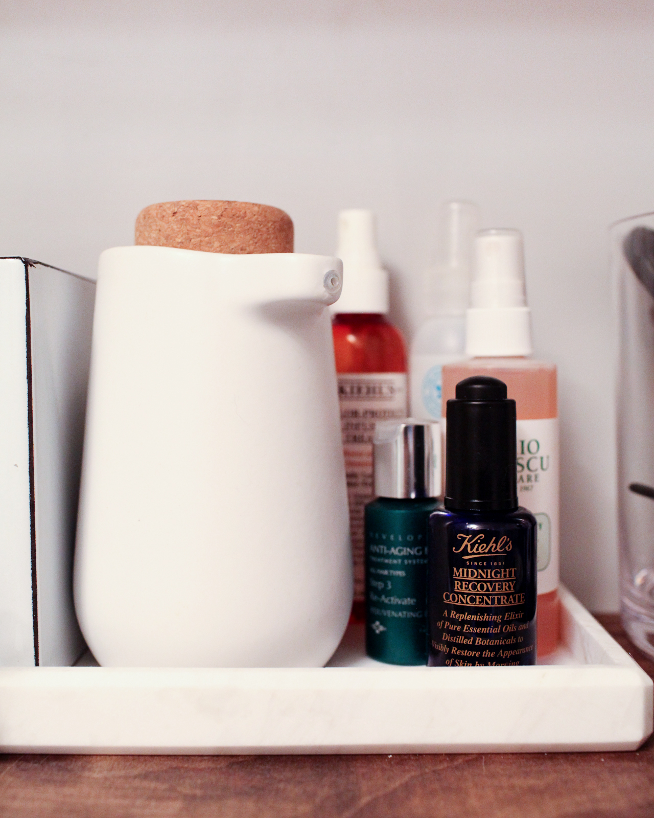
Bottom row:Â Metal storage box / Marble tray / Kera soap pump / Glass apothecary jar set
We worked with our partner Wayfair to make sure that we had the right combination of storage baskets, vessels, and trays to organize everything in the bathroom. I struggled a lot when it came to storage in our old bathroom, both because it is such a tiny room but also because it’s our only full bathroom and we have to pack a LOT of stuff in there. We decided against cabinets since we worried they would overwhelm the room, so we maintained the open shelving but switched to thin pine boards that I had cut down to size and stained myself. The brass shelf brackets are from Signature Hardware. The top shelf holds decorative accessories, including a geodesic terrarium full of seashells collected from my home state of Florida, a couple of favorite prints, vintage brass swans, and a trinket from my travels to Kenya when I worked at the State Department. The other shelves feature our most-used items and a few beauty items that are pretty enough to display – like my nail polish collection and perfumes. With the pedestal sink, we don’t really have a place to store extra toilet paper or things like q-tips and cotton balls (which always come in those giant bags or containers of 1,000), so I put everything into wire storage baskets or apothecary jars to make it look pretty. It’s actually a lesson that I picked up from Jordan at Alt Summit a few years ago: even basic things in the same color palette can look pretty if grouped together in large quantities!
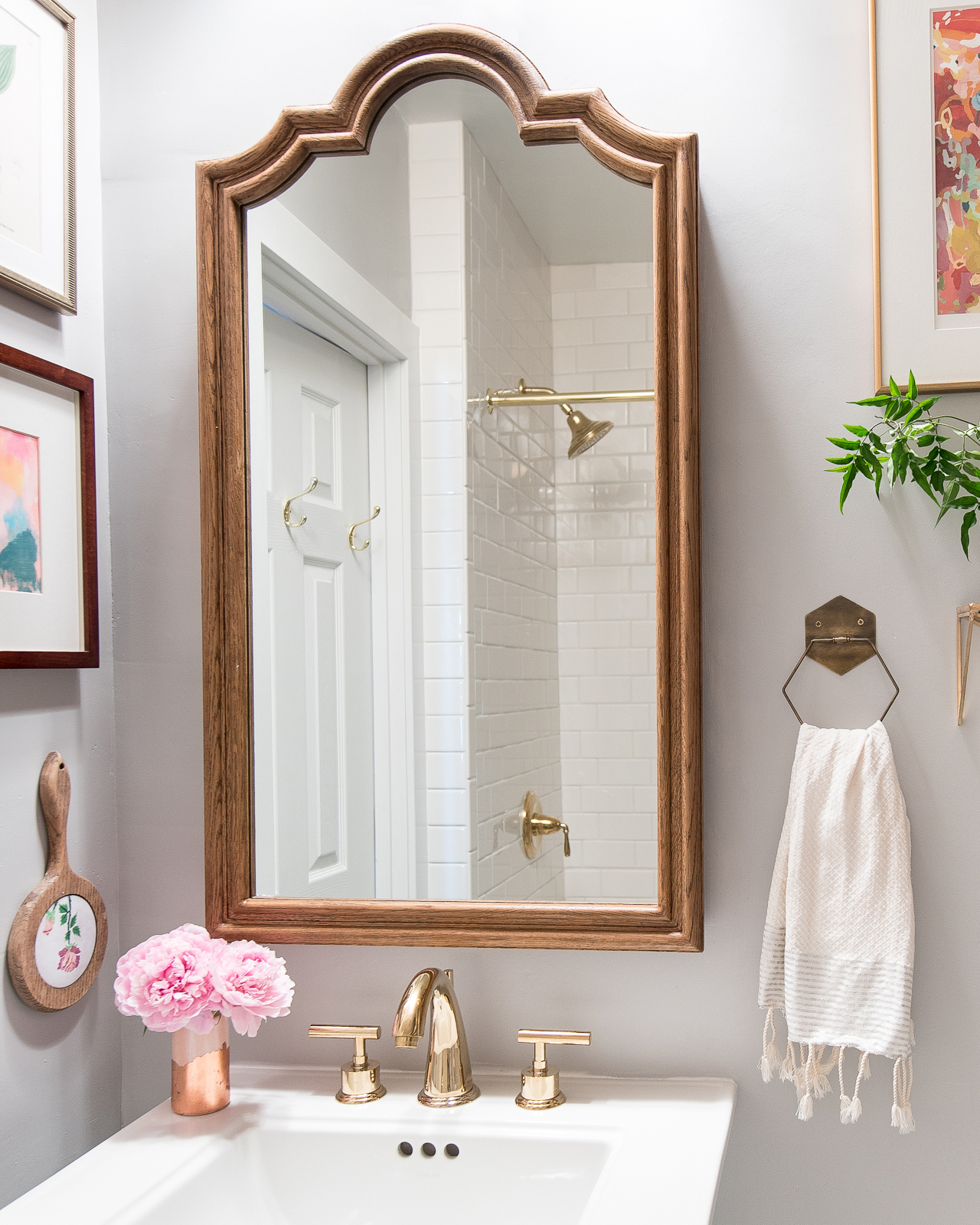
Photo by Laura Metzler Photography
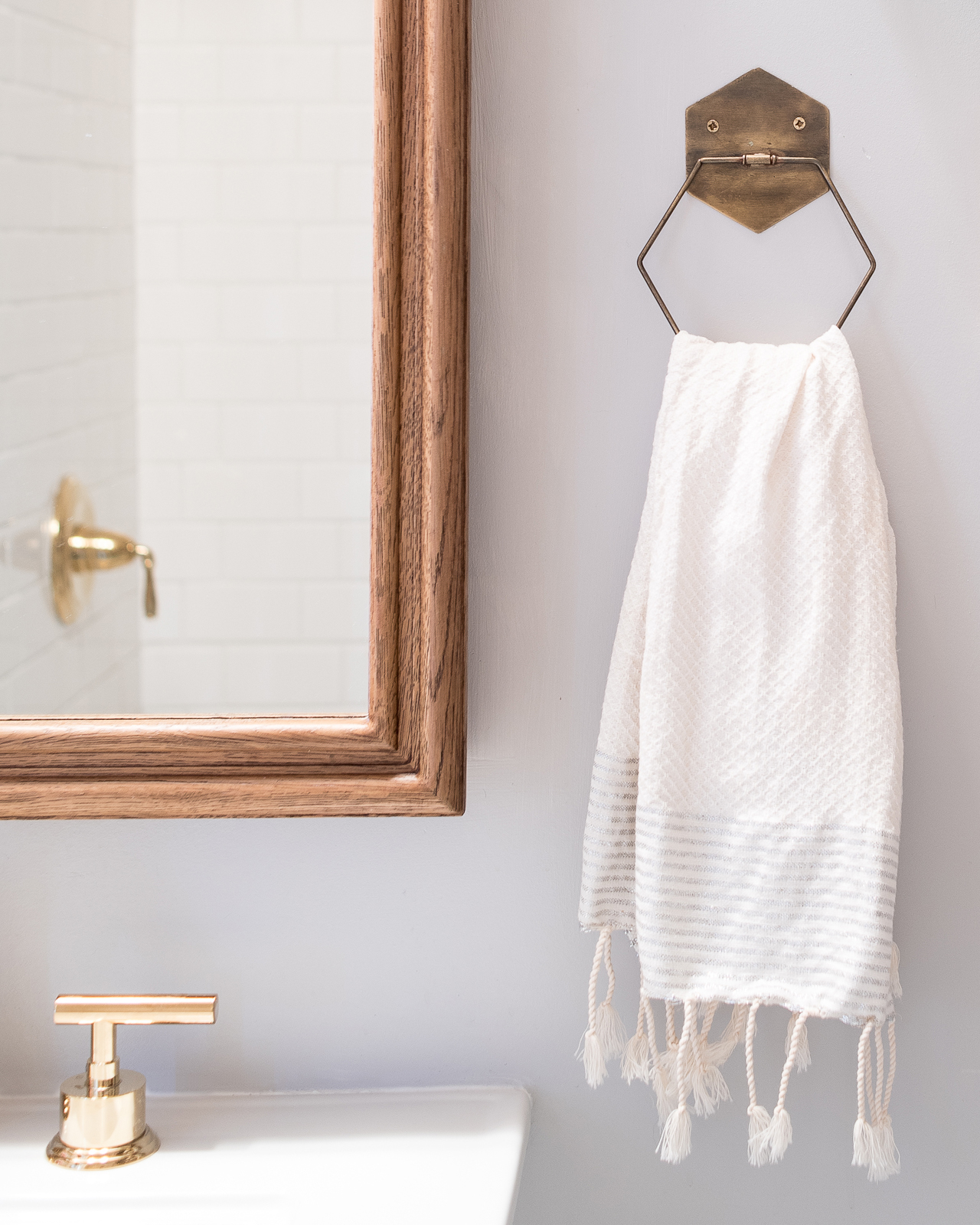
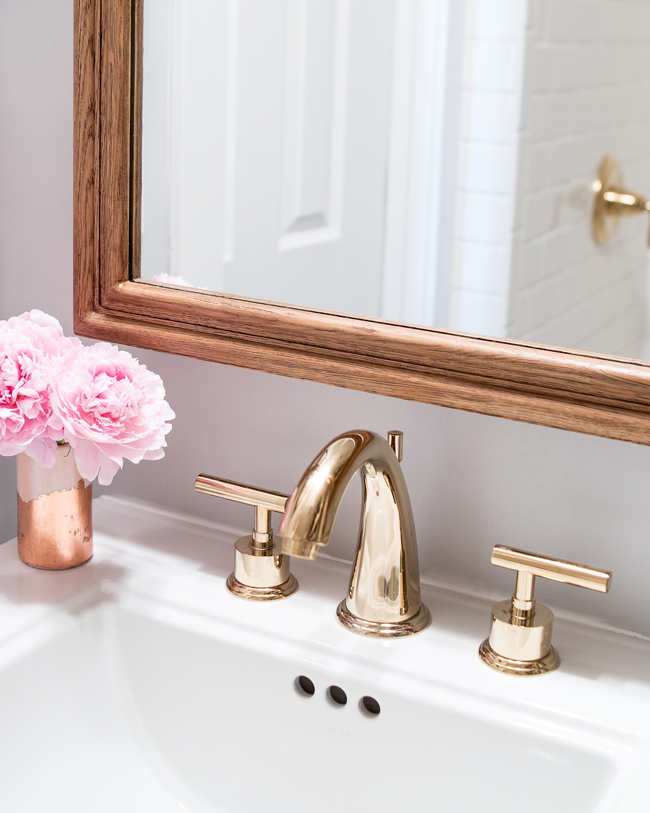
Whitby medicine cabinet / Kingston polished brass widespread faucet / The Object Enthusiast pink and copper vase / Fouta hand towel in silver and white / the brass hexagon towel ring is sadly no longer available
Our new medicine cabinet is our other storage secret weapon. I upgraded from a small wall-mounted medicine cabinet to the largest inset cabinet that I could possibly find, the Whitby cabinet from Restoration Hardware. This thing weighs a TON! And it made a huge difference in the bathroom – it seriously holds all the things that we previously stored in baskets or on shelves. If you live in a home with a small bathroom, I highly recommend upgrading to the largest possible medicine cabinet to help maximize your storage. I ordered the Whitby cabinet in the Weathered Oak finish, but when it arrived it looked way more yellow than I wanted, so I ended up sanding the whole thing down and going over it with several coats of Dark Walnut stain. I love how it turned out, so it was well worth the extra effort!
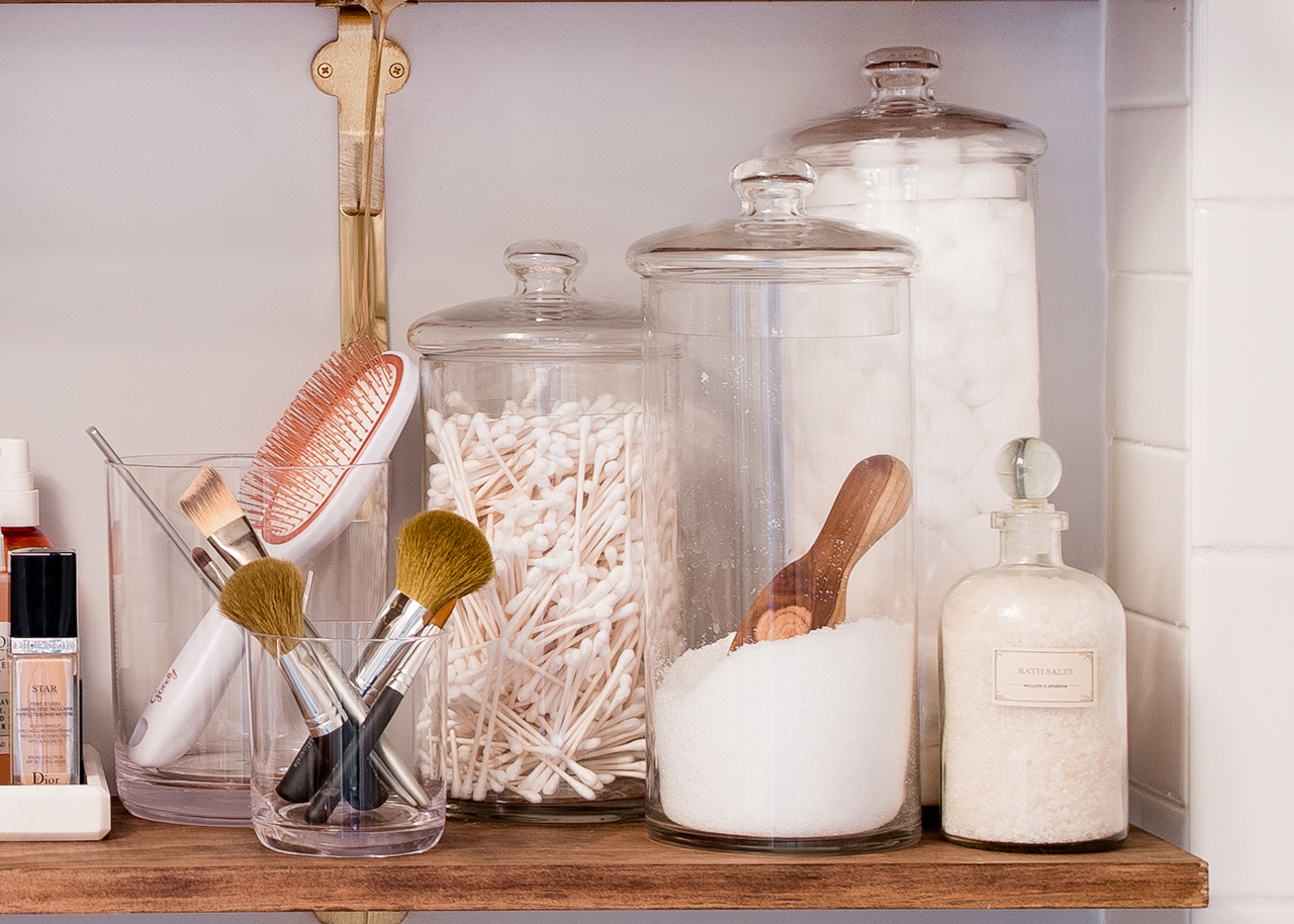
Photo by Laura Metzler Photography
Someone asked about this on Apartment Therapy, so it bears repeating here: we also purged a LOT of the stuff that previously lived on the shelves of the old bathroom. We probably could have gotten rid of half of all that clutter years ago, but with two small kids we just hadn’t gotten to it. I tossed or donated a bunch of old makeup that I’d been holding onto for some crazy reason, expired medicine that we just hadn’t bothered to go through before, and some hair accessories that I used back when I worked in an office but hadn’t touched in years. We also relocated a few things; my hair dryer moved to a new home in my bedroom closet, and there is a basket just underneath the pedestal sink that now holds our extra bathmats. We really wanted to keep the shelves just to the things that we either use every day or are pleasant to look at.
Bottom photos by Laura Metzler Photography
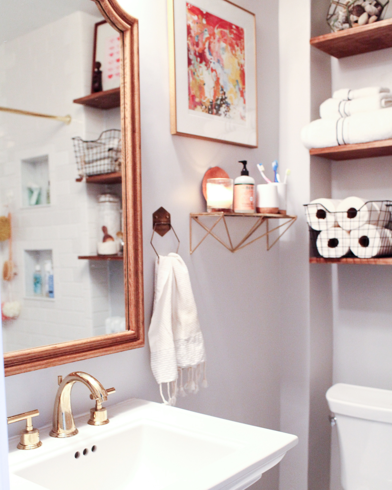
We replaced the vanity and vessel sink with a classic Kohler Memoirs pedestal sink from Wayfair (it’s seriously my dream sink), and we chose beautiful new brass fixtures for the entire bathroom, including the Kingston Brass widespread sink faucet, and a brass shower curtain rod. We selected the Kohler Devonshire tub and shower faucet in polished brass because the classic shape seemed to suit a bathroom built in the 1920s, and it really is the perfect fit. To keep the space from looking too retro, I incorporate a couple of modern accessories that we already had in the home, including brass towel rings and a small brass shelf on the wall next to the medicine cabinet holds a few things that don’t quite fit on the sink, including our tooth brushes, tumbler, hand soap, and a sea grape leaf that I brought back from our vacation in Puerto Rico a couple years ago – it reminds me of growing up in Florida!
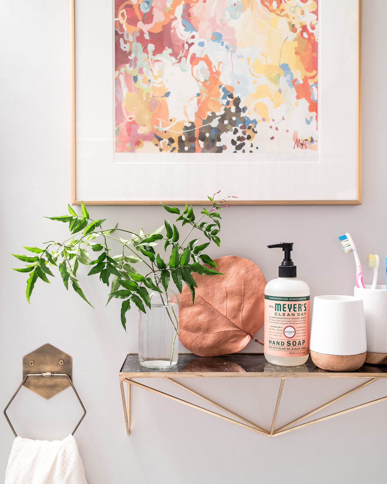
Photo by Laura Metzler Photography
Michelle Armas Michi print / brass hexagon towel ring sadly no longer available / Urban Outfitters peaks shelf / Kera tumbler
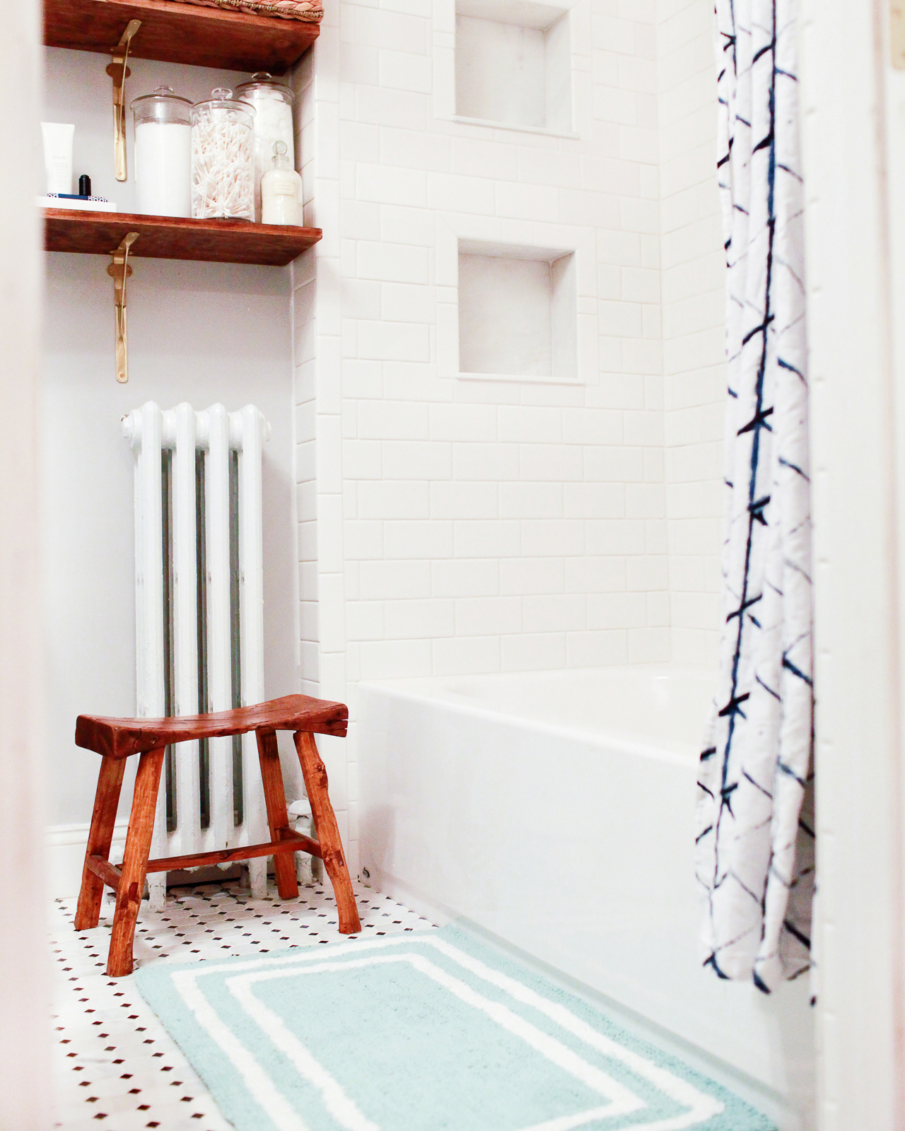
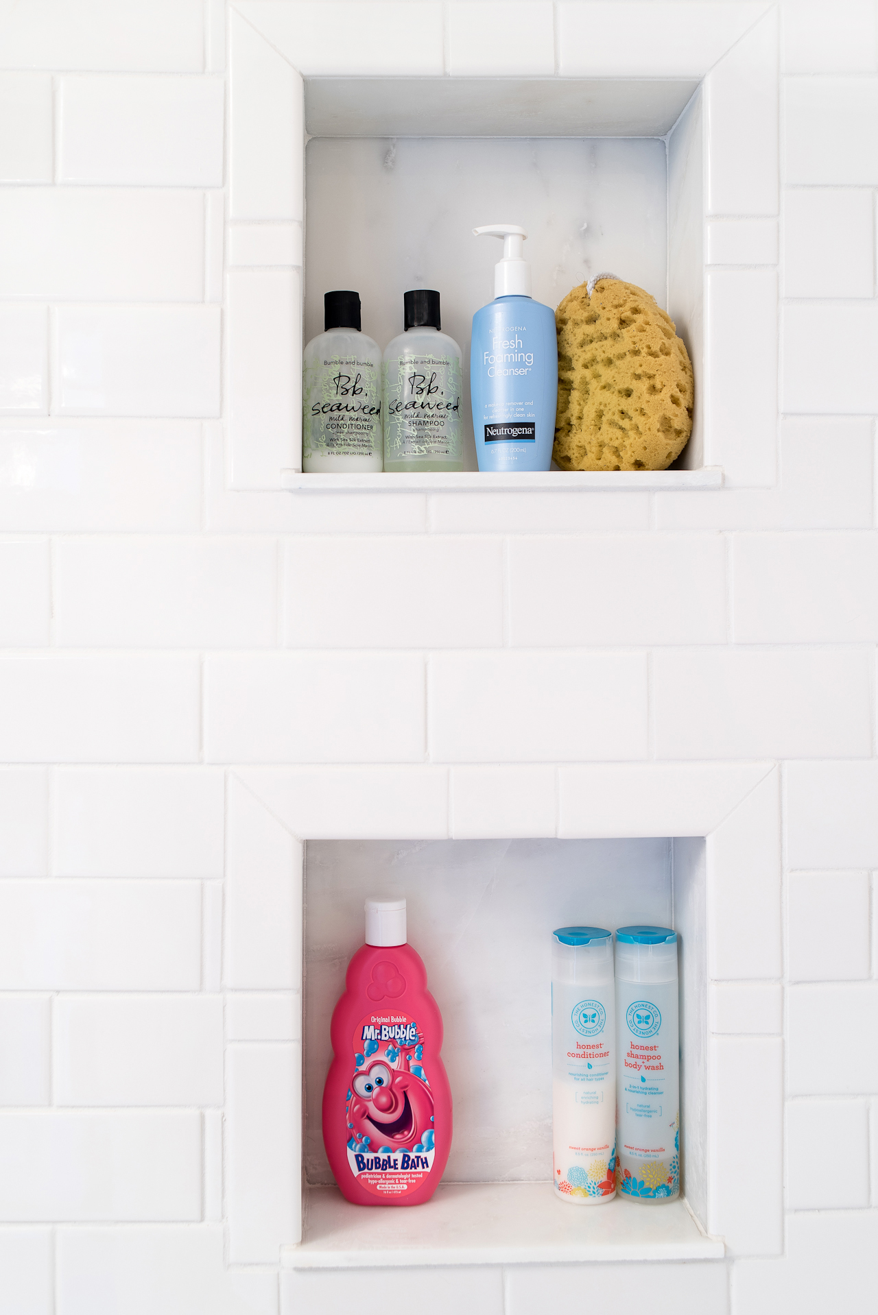
Photo by Laura Metzler Photography
These shower niches are another favorite from the new bathroom. One for the kids, and one for the parents! We constructed the niches using a combination of 6 x 12 inch Grecian white polished marble tiles and 12 inch square marble tiles for the backsplash.
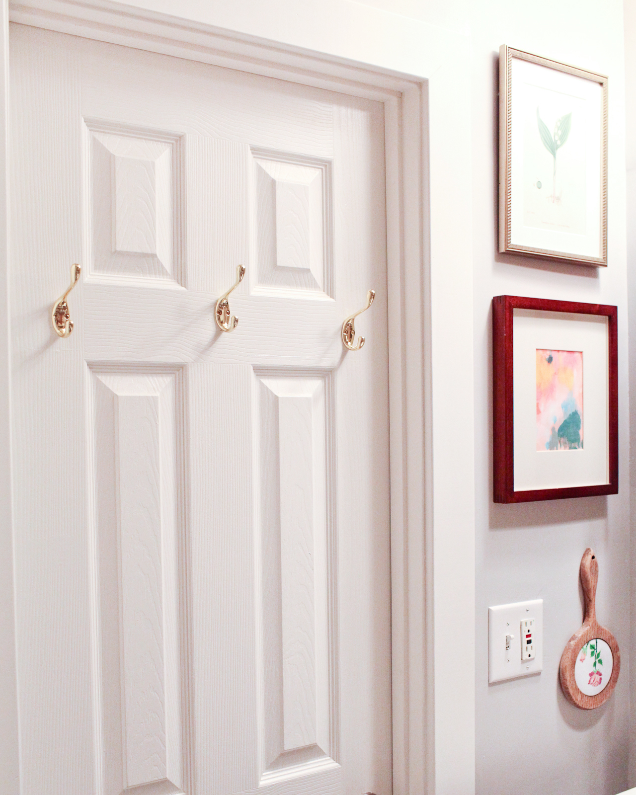
Brass Wall Hooks (similar) / Antique Botanical Lily of the Valley print (similar, top) / Belinda Marshall print (bottom)
Brass towel hooks on the back of the door, for those of you wondering where we put our damp towels. We debated doing a towel rod on the back of the door, but since this is our only full bathroom for our family of four it makes more sense for us  to have hooks instead. And, below, one more photo of the brass tile edging because I LOVE IT so. much., and the Surya Zahra Classic Iris Rug that lives in the hallway just outside the bathroom and adds a fun dose of color to the entire space.
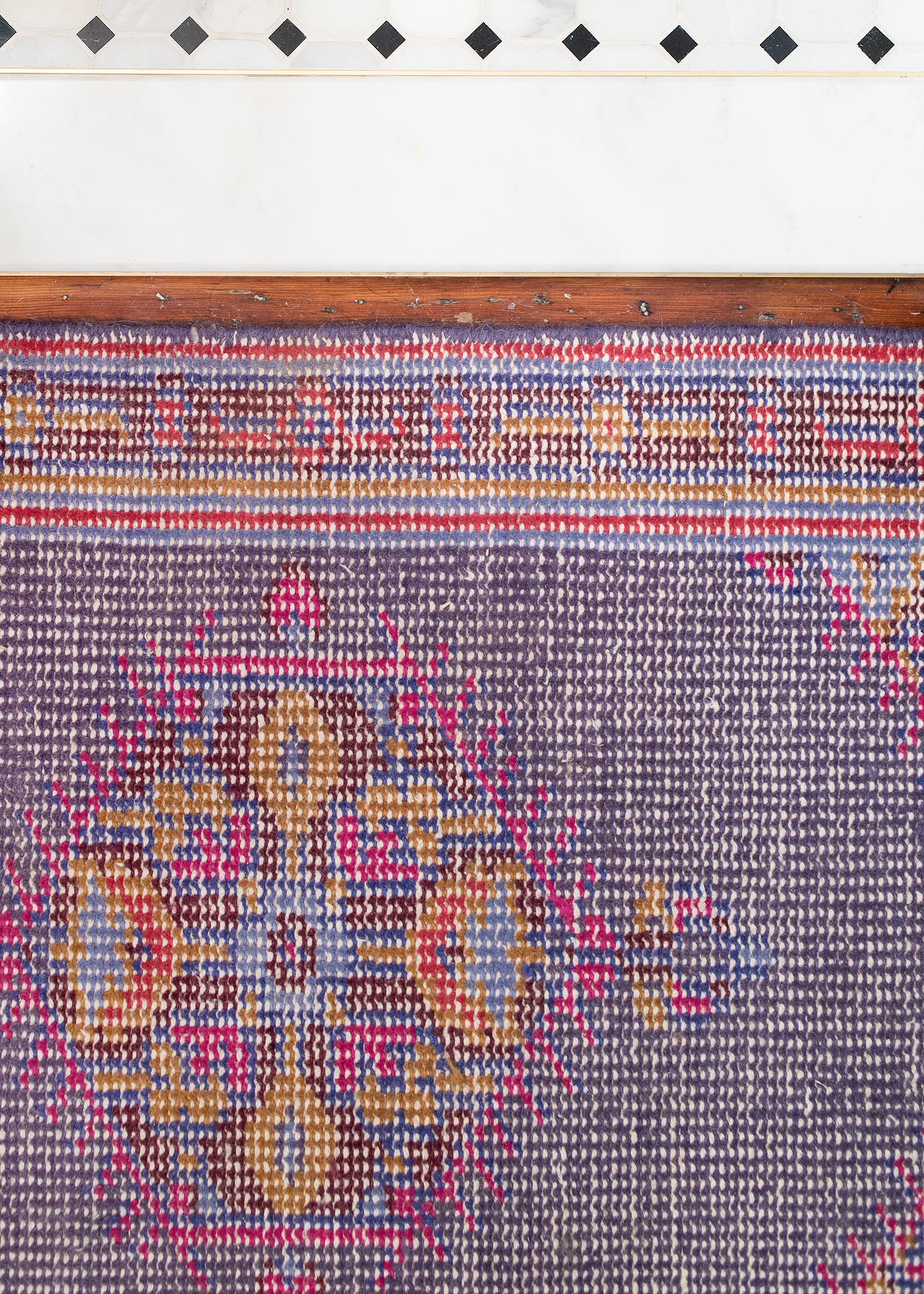
Photo by Laura Metzler Photography
There you have it – our 1920s-inspired small bathroom renovation! A huge thanks to Wayfair, the Home Depot, and Sherwin-Williams for being the most amazing partners and helping us create a bathroom that is both respectful of the age of our home and serves our needs as a family of four. I tried to list all of the sources below the photos above, but here are ALL the resources in case you want any of these items for yourself!
Whitby medicine cabinet / Kingston Polished Brass Manhattan Double Handle Widespread Faucet / Kohler Devonshire Vibrant Polished Brass Shower and Tub Faucet / Brass shower rod / Kohler Memoirs Stately 24″ Pedestal Sink with 8″ Widespread Faucet Holes / Umbra Kera Tumbler and Soap Pump / Kohler Highline Toilet / Square Metal Storage Box / Ferm Living Half Moon Laundry Basket / Silver and Gold Stripe Fouta Hand Towels / Black and White Hotel Bath Towels / Soraya Marble Serving Tray / Surya Zahra Classic Iris Rug / Birch Lane Barnett Jars / Birch Lane bath mat / Urban Outfitters peaks shelf / Brass towel hooks / Brass shelf brackets
Photos by Laura Metzler Photography where noted, all other photos by Nole Garey for Oh So Beautiful Paper