Gracie’s Colorful Bridal Luncheon Invitations

These adorable bridal luncheon invitations from Rafftruck Designs had me at the envelope liners: a swatch of vibrant Liberty of London fabric that the bride planned to use in her backyard wedding. Starting with the fabric as inspiration, Dara from Rafftruck Designs chose a bright summer color palette and sweet script font for the invitation design. Lovely!

Colorful-Floral-Bridal-Luncheon-Invitations-Rafftruck-Designs

From Dara: Rather than a traditional bridal shower, Gracie held a bridal luncheon the morning of her vintage chic backyard wedding. A beautiful floral Liberty of London fabric set the tone for the day’s festivities so I knew I should incorporate the vibrant pattern into the invitations.

Colorful-Floral-Bridal-Luncheon-Invitations-Rafftruck-Designs2

I started with bright, bold summer colors and selected a script font with lots of personality. The invitations were letterpress printed on 100% ecru cotton paper, which added the perfect amount of rustic romanticism to this bridal luncheon invitation. A kraft paper envelope lined with the amazing Liberty of London fabric completed the look.

Colorful-Floral-Bridal-Luncheon-Invitations-Rafftruck-Designs4Colorful-Floral-Bridal-Luncheon-Invitations-Rafftruck-Designs3

Colorful-Floral-Bridal-Luncheon-Invitations-Rafftruck-Designs6

Thanks Dara!

Design + Letterpress Printing: Rafftruck Designs

Photo Credits: Rafftruck Designs

Carly + David’s Glamorous Coral and Gold Foil Wedding Invitations

Designer Alisa Bobzien sent over these wedding invitations that she recently created using one of my favorite color palettes: coral, gray, and gold foil. So classic, right? Created for a glamorous wedding in Michigan, the invitation suite includes several complementary patterns, botanical details, and of course some shiny gold foil. So pretty!

Coral-Gold-Foil-Glam-Wedding-Invitations-Alisa-Bobzien4

From AlisaI created this custom invitation suite and day-of print material for a glam autumn Michigan wedding. The ingredients for this design were a range of coordinating custom patterns, a botanical element as a nod to their venue (the Planterra Conservatory), and a honeycomb pattern because the groom is a beekeeper and honey maker in Brooklyn.

Coral-Gold-Foil-Glam-Wedding-Invitations-Alisa-Bobzien

I worked closely with the event designer Viva La Diva Events, who provided art direction. The invitation suite was printed on double-thick luxe cotton savoy paper with gold foil stamping, and included printed envelope liners featuring a custom pattern that coordinated with the gold motif border of the dinnerware.

Coral-Gold-Foil-Glam-Wedding-Invitations-Alisa-Bobzien2

Coral-Gold-Foil-Glam-Wedding-Invitations-Alisa-Bobzien3

Coral-Gold-Foil-Glam-Wedding-Invitations-Alisa-Bobzien6Coral-Gold-Foil-Glam-Wedding-Invitations-Alisa-Bobzien10

Coral-Gold-Foil-Glam-Wedding-Invitations-Alisa-Bobzien7

Many of the guests were also from out of state so we highlighted the bride and groom’s favorite local destinations with a custom illustrated map that was included in the hotel welcome bags.

Coral-Gold-Foil-Glam-Wedding-Invitations-Alisa-Bobzien8

Coral-Gold-Foil-Glam-Wedding-Invitations-Alisa-Bobzien5

I also designed thank you notes, a welcome itinerary, signage, programs, dinner menus, cocktail menu, favor stickers, dessert signage, table numbers, escort cards and foil-stamped cocktail napkins.

Coral-Gold-Foil-Glam-Wedding-Invitations-Alisa-Bobzien9

Thanks Alisa!

Graphic Design: Alisa Bobzien

Event Design + Planning: Viva La Diva Events

Check out the Designer Rolodex for more tal­ented wed­ding invi­ta­tion design­ers and the real invi­ta­tions gallery for more wedding invitation ideas!

Photo Credits: Alisa Bobzien

DIY Tutorial: Travel-Inspired Save the Date

We’ve been having an unusually cold winter here in Texas and all of these winter storms have us dreaming of warmer places. With destination weddings more popular than ever, this travel inspired save the date is sure to excite your guests and have them booking their flights pronto. Our favorite part of this design? The one-of-a-kind vintage maps we used for the liners! – Bailey and Emma of Antiquaria

Step One: First of all, you’ll need to stamp your save the date on a kraft paper card cut to 3.75″ x 5.75″. For this design we used our Air Mail Save the Date stamp and a black stamp pad. For a step-by-step video tutorial about this printing process go here.

Step Two: To add a pop of color into the design, we mounted our kraft paper card onto a red-orange A6 backer. To do this, simply apply stick glue or double sided tape around the back edges of the kraft paper card. Center it over the A6 red card and press down. If you used glue, let it dry.

Step Three: We’re simply swooning over this gorgeous vintage map paper. Each sheet is different so the results are fun and varied. Trace an A6 envelope liner template with a pencil on the back of the map paper and cut out the pattern. Use double sided tape or stick glue to adhere the liner into the mint envelope just below the gumming.

Step Four: We just couldn’t stand to waste any little bits map paper so we used the leftovers from the liners in Step 3,  stamped a monogram (we used our Cross my Heart Initials monogram stamp) in black and then cut them out around the design, in a cute heart shape.

Step Five: The last step is to pull it all together! We punched holes on either side of the heart tag so that it would lay flat and straight when we threaded the twine around the save the date. Once that’s done, just address your envelopes and add postage so that you can mail them off!

Materials

Air Mail Save the Date Stamp

Cross my Heart Monogram Stamp

Stamp Pad in Black

Kraft Card Stock

A6 Cards in Persimmon

A6 Envelopes in Mint

Map Paper

Twine in Teal

Double Sided Tape or Stick Glue

Scissors

â…› inch Hole Punch

Anti­quaria is a mem­ber of the Designer Rolodex – you can see more of their beau­ti­ful work right here or visit the real save the dates gallery for more save the date ideas!

Photography: Antiquaria for Oh So Beautiful Paper

Michelle + Bernie’s Black and Gold Brooklyn Wedding Invitations

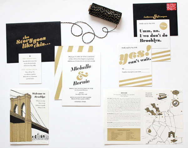
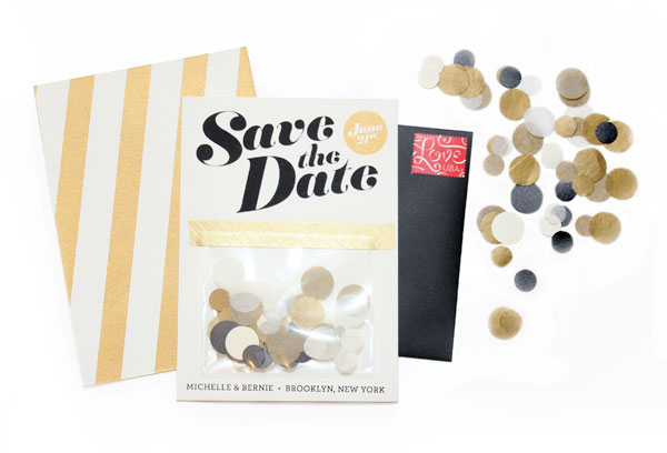
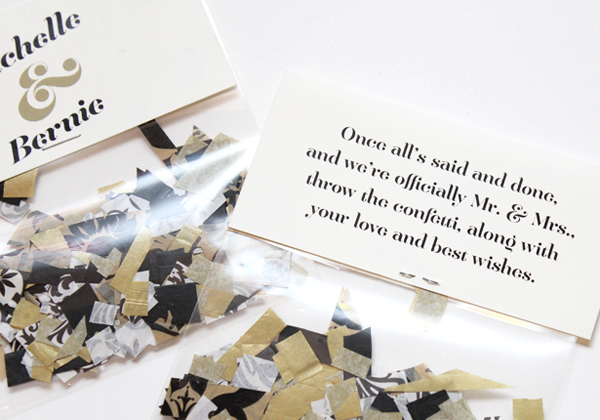
Michelle and Bernie wanted their wedding in Brooklyn’s DUMBO neighborhood to be a giant party celebrating their marriage. For their invitations and save the dates, Michelle (the designer behind Meesch) started with a black and gold color palette. Michelle also incorporated lots of fun celebratory details throughout the suite, like tissue paper confetti with the save the dates and a glittery gold envelope with the invitations. So fun!

Black-Gold-Brooklyn-Wedding-invitations-Meesch

From Michelle: Bernie and I got married at Rebar in DUMBO. It was the perfect venue for us. We wanted a party to celebrate our marriage and that’s exactly what we had. When deciding on the design, black and gold kept twirling around in my thoughts. The tone was set with the save the dates. I hole punched tissue paper, and put handfuls in cello bags and taped them to the announcement that I screen printed, with awesome washi tape.

Black-Gold-Brooklyn-Wedding-invitations-Meesch4

Black-Gold-Brooklyn-Wedding-invitations-Meesch3

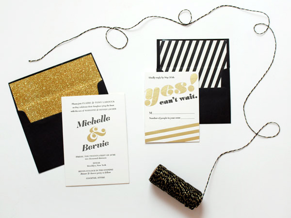
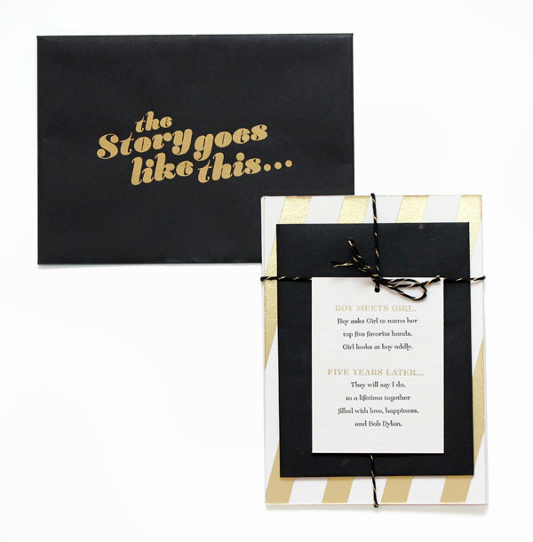
When creating the invitation suite, I wanted to to keep it fun. In the end, it was a little recap of or relationship. The invitations I letterpress printed on Crane’s Lettra and then had them foiled stamped and the edges painted in gold. For the black envelopes, I screen printed “The story goes like this…” and the return address. Once that was done, I took rolls of gold glitter wrapping paper and cut down smaller squares for the envelope liners, adding some extra flare.

Black-Gold-Brooklyn-Wedding-invitations-Meesch2

Black-Gold-Brooklyn-Wedding-invitations-Meesch10

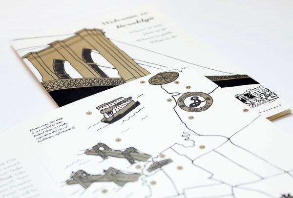
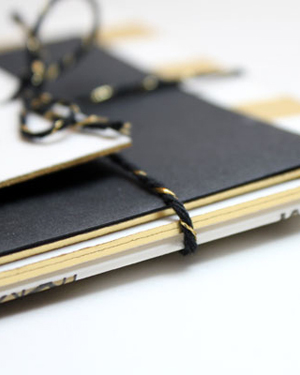
Instead of doing inserts for the directions and accommodations info, I decided to make a little info booklet. Inside was everything everyone needed to know; how to get there, where to stay, and then we highlighted some of our favorite spots. Since we would be taking pictures by the Brooklyn Bridge, I drew the illustration for the cover. Everything was tied up nicely with black and gold twine from Knot + Bow.

Black-Gold-Brooklyn-Wedding-invitations-Meesch6Black-Gold-Brooklyn-Wedding-invitations-Meesch5

Black-Gold-Brooklyn-Wedding-invitations-Meesch9

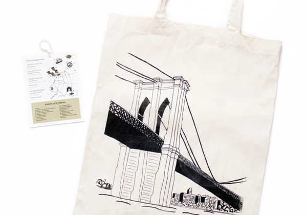
I screen printed the image of the Brooklyn Bridge onto welcome tote bags for the guests that were staying at the hotel. We tied a smaller version of the map around the handles, which also listed events going on that weekend in Brooklyn.

Black-Gold-Brooklyn-Wedding-invitations-Meesch11Black-Gold-Brooklyn-Wedding-invitations-Meesch8

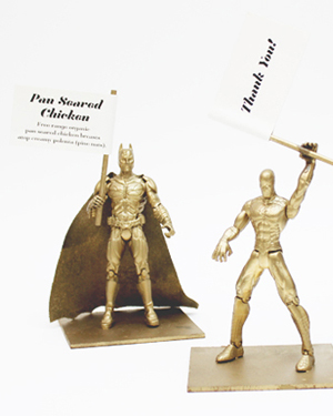
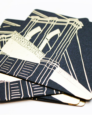
For our favors, we decided on coasters. Mama’s Sauce foil stamped the image of the Brooklyn Bridge, and we wrapped them up in some awesome bags from For Your Party, along with an insert that thanked everyone, and had a link to songs from our wedding playlist. I spray painted little action figures for the food cards, and made bags of confetti to be thrown for when we walked down the aisle.

Black-Gold-Brooklyn-Wedding-invitations-Meesch7

Thanks Michelle!

Design: Meesch

Foil Stamping: Mama’s Sauce
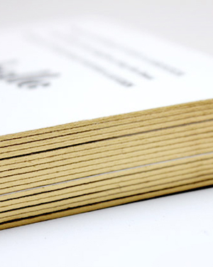
Twine: Knot + Bow

Check out the Designer Rolodex for more tal­ented wed­ding invi­ta­tion design­ers and the real invi­ta­tions gallery for more wedding invitation ideas!

Photo Credits: Meesch

Vivi Mae’s Peach + Gold Birth Announcements

Happy Monday everyone! For those of you not enjoying a long weekend, I thought I’d start the week with these beautiful peach and gold baby announcements from Val Marie Paper! After welcoming her first child – an adorable daughter named Vivienne Mae – Valerie drew inspiration from gold envelope liners for the birth announcements. Valerie made sure to include Vivi’s stats and a photo of the happy new family of three while also conveying Vivi’s nickname to friends and family. So sweet!

Peach-Gold-Girl-Baby-Announcements-Val-Marie-Paper

From Valerie: As a designer, I had been eyeing some beautiful envelope liners from Paper Source and knew they would be perfect for Vivi’s peach and gold color palette. From there, I teamed up with Katherine Holly to calligraph Vivi’s name. We wanted to incorporate a few fun aspects knowing many of our friends and family had met Vivi before they received the announcements. We included some of Vivi’s nicknames during the first few weeks. She has even more now!

Peach-Gold-Girl-Baby-Announcements-Val-Marie-Paper6

We also wanted to include a photo our new little family. I know when I see friends with new little ones, I always love to see photos of the parents too in their new element. And this being the year of Prince Edward, I thought it would be fun to add a little seal of Vivi’s initials that we can use on future designs. Not quite as fancy as the future king of England’s but fun nonetheless!

Peach-Gold-Girl-Baby-Announcements-Val-Marie-Paper2

Peach-Gold-Girl-Baby-Announcements-Val-Marie-Paper4

Peach-Gold-Girl-Baby-Announcements-Val-Marie-Paper3

Peach-Gold-Girl-Baby-Announcements-Val-Marie-Paper5

Part of our challenge was including her full name but letting people know what we would be calling her. Creating a two-sided card with her full name and info on the back seemed like the best solution for us!

Peach-Gold-Girl-Baby-Announcements-Val-Marie-Paper7Peach-Gold-Girl-Baby-Announcements-Val-Marie-Paper9

Peach-Gold-Girl-Baby-Announcements-Val-Marie-Paper8

Thanks Valerie!

Design: Val Marie Paper

Newborn Photo: Ell Photography

Calligraphy: Katherine Holly

Photo Credits: Val Marie Paper