James + Molly’s Cozy Woodland Toile Wedding Invitations

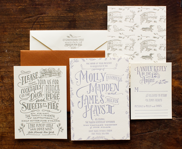
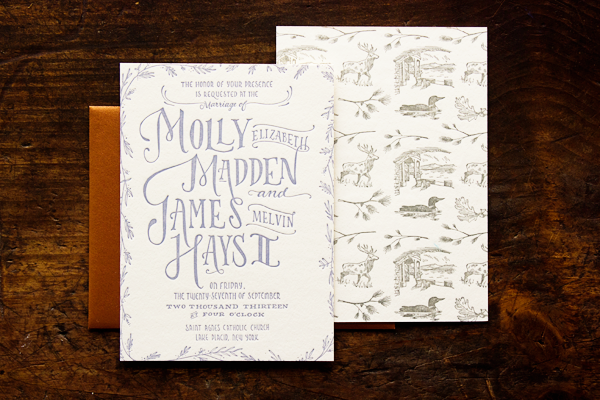
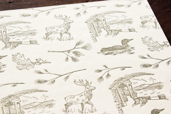
Last week I had the pleasure of featuring these awesome interactive invitations for a destination 40th birthday party, and today the ladies of Ladyfingers Letterpress are back with some equally stunning autumn wedding invitations! Inspired by the Lake Placid Lodge where the wedding took place, Arley-Rose and Morgan incorporated an illustrated woodland toile pattern into the design complete with a loon and an elk!

Woodland Toile Wedding Invitations by Ladyfingers Letterpress

From Arley-Rose and Morgan: When we were approached by Molly and James who were planning their autumnal wedding, they said they wanted their invitations to “feel like you’re wrapped in a cashmere blanket.” Little did we know that we would be incorporating cashmere into their suite!

Woodland-Toile-Wedding-Invitations-Ladyfingers-Letterpress2

Molly sent us some cashmere and wool samples which we individually cut and attached as envelope liners. Unfortunately, we didn’t have any leftovers for the photo shoot, but I can assure you, it was utterly luxurious!

Woodland-Toile-Wedding-Invitations-Ladyfingers-Letterpress4

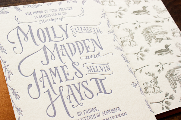
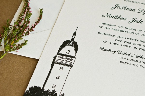
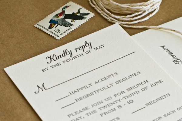
Molly sent us an incredible Pinterest board that painted a gorgeous picture of the feeling she and James wanted. They mentioned that they were in love with the idea of having a “woodland toile” somehow integrated into their suite, so we made drawings of a loon, an elk, and scenes from the Lake Placid Lodge where they tied the knot.

Woodland-Toile-Wedding-Invitations-Ladyfingers-Letterpress6

Woodland-Toile-Wedding-Invitations-Ladyfingers-Letterpress7

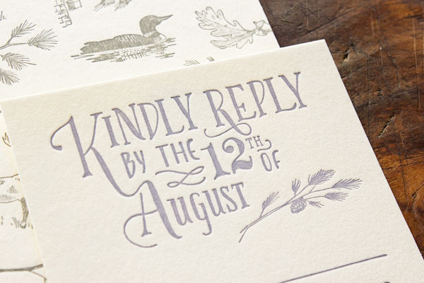
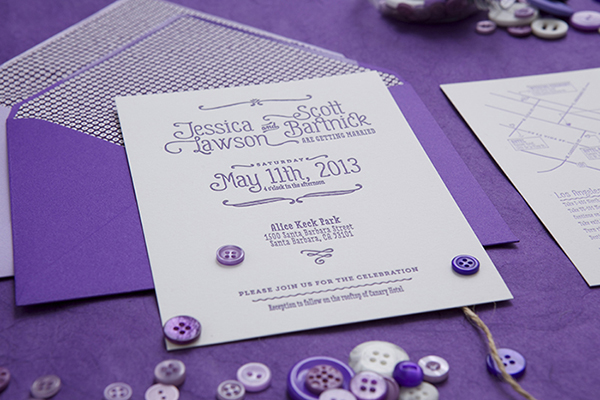
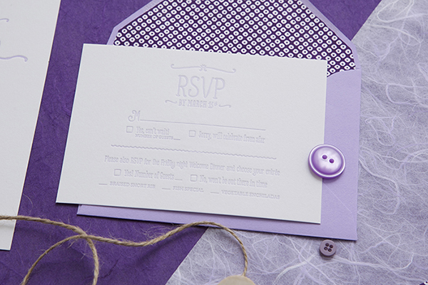
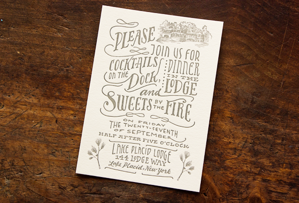
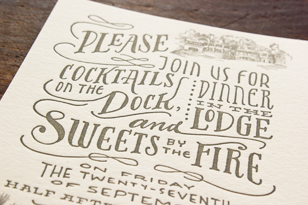
The suite was letterpress printed in two colors on thick, 220lb Crane’s Lettra; with a copper interior envelope (lined with cashmere which is not shown) and Crane’s outer envelope.

Woodland-Toile-Wedding-Invitations-Ladyfingers-Letterpress8

Woodland-Toile-Wedding-Invitations-Ladyfingers-Letterpress9

Thank you so much ladies!

Ladyfingers Letterpress is a member of the Designer Rolodex – check out more of their beautiful work right here or visit the real invi­ta­tions gallery for more wedding invitation ideas!

Photo Credits: Ladyfingers Letterpress

Jett’s Little Newsboy Birth Announcements

Okay, so these little newsboy birth announcements from Suzanne of SHE Paperie are pretty much the cutest thing ever! The headline format provides the perfect spot for baby Jett’s adorable newborn photograph, while all the important details are enclosed in the “article” text below. Beautiful letterpress printing on super-thick gray paper and newspaper envelope liners complete the design!

Little-Newsboy-Letterpress-Baby-Announcement-She-Paperie3

From Suzanne: The vision for this custom birth announcement was all about newspaper! Before her baby arrived, my client found a tiny newsboy cap for him to wear during his newborn photo session with with Natalie Ann Photography. I collected newspapers from the actual day of the baby’s birth and used them to line the inside of each envelope. We also used a stack of the same newspapers for the baby to lay on during his newborn session.

Little-Newsboy-Letterpress-Baby-Announcement-She-Paperie6

The featured photo was digitally printed then mounted onto 333 lb. Gmund gray cotton paper stock. The beautiful letterpress work was done by Somersault Letterpress. Together, the creative verbiage, luxe cotton paper, and special envelope liners created the perfect touch to what what I’d imagined this birth announcement to be. Announcing baby Jett’s arrival to the world was truly a newsworthy event!

Little-Newsboy-Letterpress-Baby-Announcement-She-Paperie Little-Newsboy-Letterpress-Baby-Announcement-She-Paperie2

Little-Newsboy-Letterpress-Baby-Announcement-She-Paperie9

Little-Newsboy-Letterpress-Baby-Announcement-She-Paperie8

Little-Newsboy-Letterpress-Baby-Announcement-She-Paperie4

Thanks Suzanne!

Design: SHE Paperie

Letterpress Printing: Somersault Letterpress

Newborn Photograph: Natalie Ann Photography

Photo Credits: SHE Paperie

Adrienne + Dillon’s 5th Anniversary BBQ Party Invitations

More than all the details and pretty invitations, the thing that I really love about parties is that they’re an excuse to get all of your favorite people together in one place. So naturally, I’m loving the spirit behind these 5th anniversary party invitations from Lisa at Good on Paper! Lisa incorporated gingham patterns and an icon of the Golden Gate bridge (which she originally used on their wedding invitations five years ago!), all letterpress printed by the talented team at Paper Monkey Press.

5th-Anniversary-BBQ-Party-Good-on-Paper

From Lisa: From their wedding invitation design to birth announcements for their second child, Adrienne and Dillon Rogers are the definition of repeat clients. For their 5th anniversary BBQ in Napa, I designed a modern rustic letterpress invitation set.

5th-Anniversary-BBQ-Party-Good-on-Paper15 5th-Anniversary-BBQ-Party-Good-on-Paper14

Graphic details included a pink and red gingham pattern, wood type fonts, and the San Francisco bridge + hearts icon originally used on their wedding invitations.

5th-Anniversary-BBQ-Party-Good-on-Paper13 5th-Anniversary-BBQ-Party-Good-on-Paper7

Guests were encouraged to write or draw a little inspiration on the RSVP postcard. I also designed gingham envelope liners, custom wraparound address labels, place cards, menus, and wood mounted party signs.

5th-Anniversary-BBQ-Party-Good-on-Paper4

Thanks so much Lisa!

Design: Good on Paper

Letterpress Printing: Paper Monkey Press

Good on Paper and Paper Monkey Press are members of the Designer Rolodex – you can see more of beautiful work from Good on Paper here and from Paper Monkey Press right here!

Photo Credits: Good on Paper

JoAnna + Matt’s Illustrated Black and White Wedding Invitations

Wedding invitations should always contain something personal and meaningful to the bride and groom, whether it’s a motif in the invitation design or the tradition of a classic engraved invitation. This couple chose to use their favorite place – a tower close to their home in Connecticut – as the central design element in their wedding invitations from Laura Macchia. The purple patterned envelope liner adds a perfect pop of color for this classic black and white invitation!

Lighthouse-Letterpress-Wedding-Invitations-Laura-Macchia6

From Laura: JoAnna and Matt’s invitations are inspired by their favorite place: the Heublein Tower on Talcott Mountain, close to their home in Connecticut. The architectural tower illustration paired with the organic pattern on the envelope liner gives it a formal yet elegant feel. The suite is letterpress printed in black on Ecru Lettra with lavender envelope liners to add a pop of color.

Lighthouse-Letterpress-Wedding-Invitations-Laura-Macchia5

Lighthouse-Letterpress-Wedding-Invitations-Laura-Macchia3

Lighthouse-Letterpress-Wedding-Invitations-Laura-Macchia2

Lighthouse-Letterpress-Wedding-Invitations-Laura-Macchia8

Lighthouse-Letterpress-Wedding-Invitations-Laura-Macchia4

Thanks Laura!

Design: Laura Macchia

Letterpress Printing: May Day Studio

Check out the Designer Rolodex for more tal­ented wed­ding invi­ta­tion design­ers and the real invi­ta­tions gallery for more wedding invitation ideas!

Photo Credits: Laura Macchia

Jessica + Scott’s Purple Ombre Letterpress Wedding Invitations

I’m loving this take on the ombre trend from designer Cristina Pandol: instead of a gradient on a single piece of the invitation, the entire suite progresses from dark to light purple! Cristina thought through every single detail of the suite, from the custom envelope liners to the purple calligraphy and vintage postage!

Purple Ombre Letterpress Wedding Invitations by Cristina Pandol via Oh So Beautiful Paper

From Cristina: I’ve been dying to apply the ombre concept to stationery, but was waiting for the right project to come along. When Jessica reach out to me for her wedding and stressed how much she loves all shades of purple, I knew that she would love the concept. The wedding suite progresses from dark purple to light purple, and everything from the calligraphy to the postage is purple.

Purple Ombre Letterpress Wedding Invitations by Cristina Pandol via Oh So Beautiful Paper

Purple Ombre Letterpress Wedding Invitations by Cristina Pandol via Oh So Beautiful Paper

Purple Ombre Letterpress Wedding Invitations by Cristina Pandol via Oh So Beautiful Paper

Purple Ombre Letterpress Wedding Invitations by Cristina Pandol via Oh So Beautiful Paper

Purple Ombre Letterpress Wedding Invitations by Cristina Pandol via Oh So Beautiful Paper

The design revolves around the pairing of three very different typefaces to show the couple’s playful and eclectic style. The primary type is Gulyesa, with Love Potion and Museo Slab used to compliment the primary type.

Purple Ombre Letterpress Wedding Invitations by Cristina Pandol via Oh So Beautiful Paper

Purple Ombre Letterpress Wedding Invitations by Cristina Pandol via Oh So Beautiful Paper

Every piece was letterpress printed with a fairly deep impression on a bright white French cotton paper. I wanted to make sure the pressing and ombre was done properly, so I rented a Vandercook machine and printed every piece myself. Jessica wanted to do some of the work herself and be part of the experience. I created a stencil for her to use to cut all of the envelope liners and Jessica secured all of the pieces together with string and buttons.

Purple Ombre Letterpress Wedding Invitations by Cristina Pandol via Oh So Beautiful Paper

Purple Ombre Letterpress Wedding Invitations by Cristina Pandol via Oh So Beautiful Paper

Thanks Cristina!

Design + Printing: Cristina Pandol via press rental at Lala Press

Calligraphy: Calligraphy Katrina

Check out the Designer Rolodex for more tal­ented wed­ding invi­ta­tion design­ers and the real invi­ta­tions gallery for more wedding invitation ideas!

Photo Credits: Garrett Shannon