Robin + Sergei’s Floral and Gold Foil Wedding Invitations

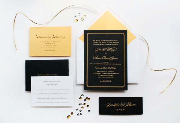
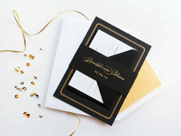
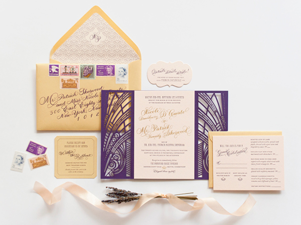
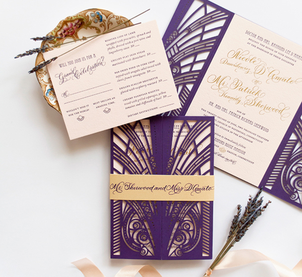
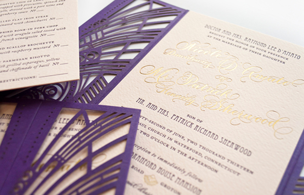
Maybe it’s the influence of summer, but I can’t get enough bright and bold color these days! Luckily, Nicole from Umama sent over these colorful wedding invitations. The invitations pair a deep vivid pink, marigold yellow, and graphic floral elements – along with some shiny metallic gold foil! So pretty!

Colorful-Floral-Gold-Foil-Wedding-Invitations-Umama-OSBP

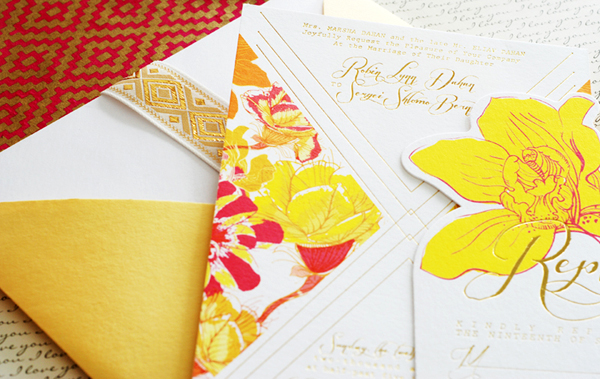
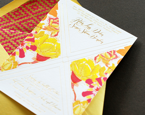
From Nicole: Robin was super excited and passionate about all the little design details in the invitation. The invitation combines a deep, vivid pink and a bright marigold yellow, along with gold foil to bring out the flowers.

Colorful-Floral-Gold-Foil-Wedding-Invitations-Umama-OSBP8

Colorful-Floral-Gold-Foil-Wedding-Invitations-Umama-OSBP4

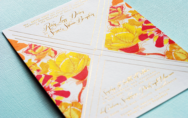
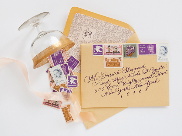
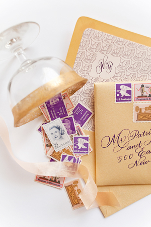
Robin took the time to learn the basics of Illustrator to create her own custom monogram. She also learned how to revise fonts in order to achieve just the right flourish. We explored paper options for the envelope liners until we truly captured the vivid vibe with a touch of gold to bring in that extra element. It was truly a melding of two minds that resulted in something we were both excited about.

Colorful-Floral-Gold-Foil-Wedding-Invitations-Umama-OSBP3

Colorful-Floral-Gold-Foil-Wedding-Invitations-Umama-OSBP9

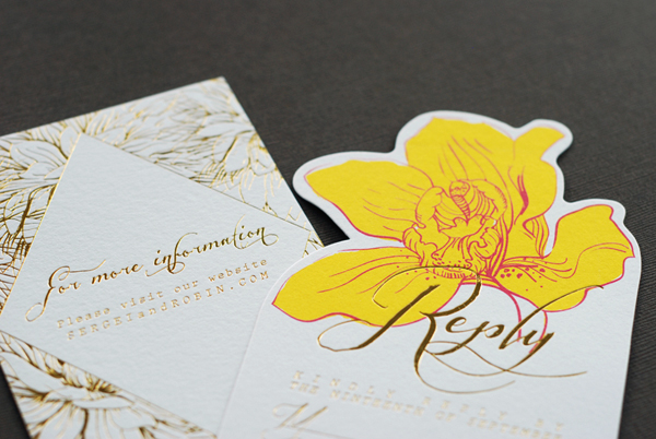
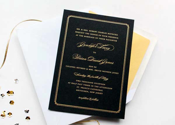
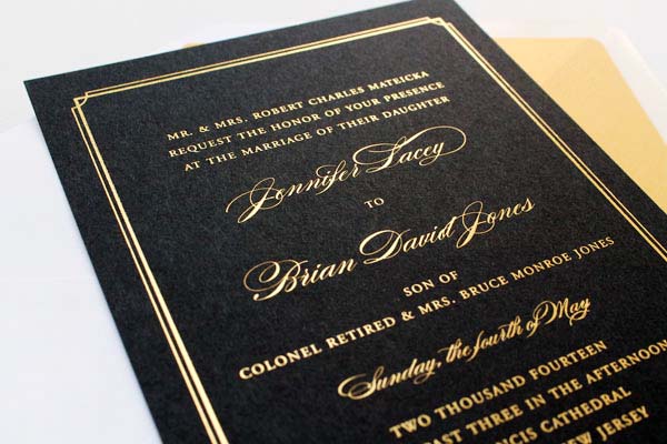
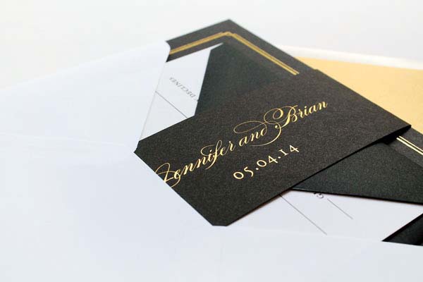
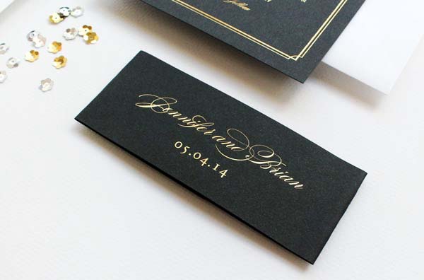
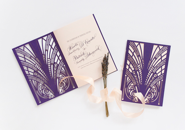
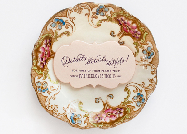
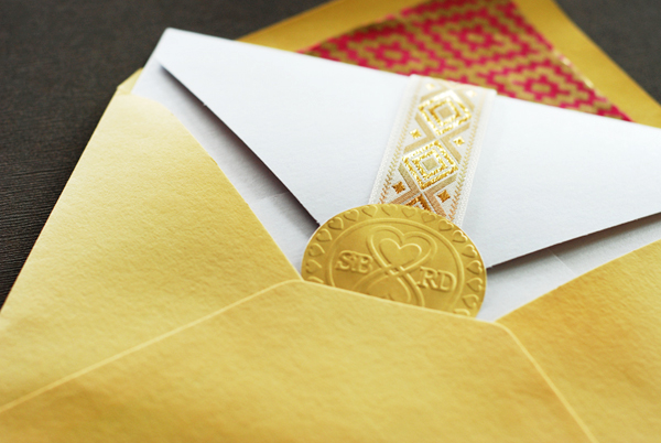
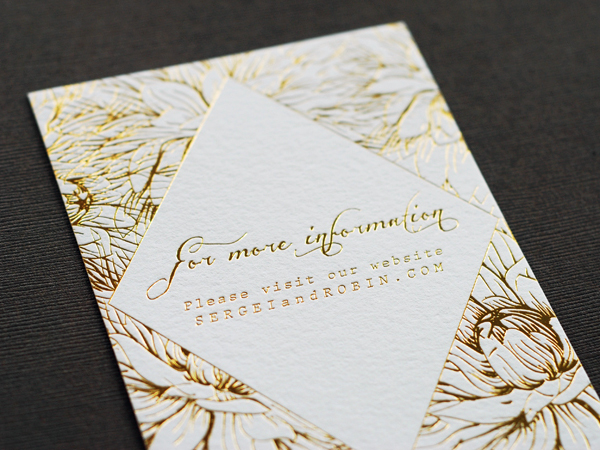
The end product is digitally printed on Crane cotton Lettra paper with a second printing of gold foil by Boxcar Press. The reply card was printed similarly, with a custom die cut around the floral design. The insert card was printed entirely in gold foil. The three pieces were wrapped in a gold patterned ribbon and sealed with the embossed monogram designed by Robin.

Colorful-Floral-Gold-Foil-Wedding-Invitations-Umama-OSBP7

Thanks Nicole!

Design: Umama

Digital + Gold Foil Printing: Boxcar Press

Check out the Designer Rolodex for more tal­ented wed­ding invi­ta­tion design­ers and the real invi­ta­tions gallery for more wedding invitation ideas!

Photo Credits: Umama

Penelope’s Floral Letterpress Baby Announcements

Aaaah! How cute are these red, white, and kraft paper floral birth announcements for a sweet baby girl?!? Created by designer Lauren Chism for her new niece Penelope, the beautiful announcements feature simple letterpress printed text paired with a matte black and white photograph and floral envelope liners. So pretty!

Floral-Letterpress-Baby-Announcements-Lauren-Chism-OSBP

From Lauren: My sister, Carley, and her husband John welcomed their adorable daughter, Penelope, at the end of April and we all couldn’t be more in love with her. As Carley’s ‘personal stationer’ I was dreaming up ideas for the announcements the moment we found out they were having a girl. They are my favorite gift to give friends and family – quite a bit more fun to give than diapers and wipes!

Floral-Letterpress-Baby-Announcements-Lauren-Chism-OSBP2

When it came to the design, Carley was drawn to the clean look and simplicity of letterpress, which is my personal favorite form of printing. Penelope’s nursery incorporated brighter colors of red, blue and yellow with floral details, and I wanted to incorporate those things without being too literal. We ended up going with red letterpress text with a black and white photo, paired with kraft envelopes. The announcements were printed on 118# cotton Savoy and the gorgeous matte photos were attached to each card.

Floral-Letterpress-Baby-Announcements-Lauren-Chism-OSBP4

To balance the minimalist design of the announcement, I created a floral pattern for the envelope liners to add a little playful, feminine element to the suite. When doing custom announcements, I love trying something new, so I decided to have the liners letterpress printed as well. I was so torn about which color way to print: the red and white backgrounds both offered a unique look. With the red background, I love the salty texture and mottled look that resulted from flooding the press with so much ink, but also loved the contrast of white against the kraft envelopes. Indecision won out and I ended up using a mix of both – I still can’t decide which one I like best!

Floral-Letterpress-Baby-Announcements-Lauren-Chism-OSBP6

For the envelopes, instead of my usual go-to washi tape, I closed each with little heart stickers from Thatch and Thistle. They were so cute and tiny – the perfect final touch to the announcements.

Floral-Letterpress-Baby-Announcements-Lauren-Chism-OSBP9

Thanks Lauren!

Design: Lauren Chism

Baby Photography: Photography by Brea

Letterpress Printing: Elefant Press

Lauren Chism Fine Papers is a member of the Designer Rolodex – you can check out more of Lauren’s work right here!

Photo Credits: Lauren Chism Fine Papers

Rachel + Jason’s Modern Nature-Inspired Wedding Invitations

These wedding invitations from Sarah at Studio SloMo offer a more modern approach to a nature-inspired design. Created for a wedding at the Wildflower Center in Texas, the bride and groom wanted to bring in a nature-inspired feel without any floral motifs. Sarah included simple leaf designs letterpress printed in shades of green. So pretty!

Minimalist-Nature-Inspired-Letterpress-Wedding-Invitations-Studio-SloMo

From Sarah: Rachel and Jason were married at the Wildflower Center in Austin, Texas: they wanted something natural and modern, but not floral. They planned to use lots of bright florals at the wedding and chose to complement that with more subtle neutrals and greens for the invitations.

Minimalist-Nature-Inspired-Letterpress-Wedding-Invitations-Studio-SloMo4

The letterpress wedding invitation suite includes a square invitation, RSVP, double belly band, envelope liners and thank you notes. The envelope liners were printed on a shimmer paper, which added a nice touch of elegance. Since they wanted to include their wedding website in the suite, but not on the invitation or RSVP, we thought it would be a nice idea to add a belly band directing guest where to find more detailed information. The result helped to literally tie the suite together!

Minimalist-Nature-Inspired-Letterpress-Wedding-Invitations-Studio-SloMo3

Minimalist-Nature-Inspired-Letterpress-Wedding-Invitations-Studio-SloMo5

Lastly, we chose to give a nod to the Wildflower Center with the blind embossed flowers lining the side of their thank you cards.

Minimalist-Nature-Inspired-Letterpress-Wedding-Invitations-Studio-SloMo2

Thanks Sarah!

Studio SloMo is a member of the Designer Rolodex – you can check out more of Sarah’s work right here or visit the real invi­ta­tions gallery for more wedding invitation ideas!

Photo Credits: Studio SloMo

Jennifer + Brian’s Gold Foil and Black Wedding Invitations

These gold foil and black wedding invitations from designer Sandra Picco are just so glamorous – and perfect for a black tie wedding reception! Sandra paired the gold foil invitations with complementing black and white accents and gold envelope liners. Totally classic, and absolutely stunning!

Gold-Foil-Black-Wedding-Invitations-Sandra-Picco-Design-OSBP10

From Sandra: Jennifer had been doing lots of pinning and inspiration-gathering her wedding: a traditional church ceremony followed by a black tie-optional ballroom reception. Their colors were pink and black with touches of gold, so of course, I immediately thought that we should incorporate gold foil somehow. Her preference was to not use pink for the stationery, so together we decided to go with gold foil on black paper.

Gold-Foil-Black-Wedding-Invitations-Sandra-Picco-Design-OSBP5

Jennifer and Brian were working within a budget for their paper goods and foil stamping the entire suite was a bit too expensive. Instead we used foil for the invitation and belly band and a coordinating gold stock for the reception card and envelope liners. White reply cards paired with black envelopes and white outer envelopes tied everything together nicely and kept us within budget. Happy budget, happy bride!

Gold-Foil-Black-Wedding-Invitations-Sandra-Picco-Design-OSBP

Gold-Foil-Black-Wedding-Invitations-Sandra-Picco-Design-OSBP3

Gold-Foil-Black-Wedding-Invitations-Sandra-Picco-Design-OSBP8

Gold-Foil-Black-Wedding-Invitations-Sandra-Picco-Design-OSBP7

Thanks Sandra!

Design: Sandra Picco Design

Foil Stamping: Norman’s Printery

Check out the Designer Rolodex for more tal­ented wed­ding invi­ta­tion design­ers and the real invi­ta­tions gallery for more wedding invitation ideas!

Photo Credits: Sandra Picco Design

Nicole + Patrick’s Vintage-Inspired Lasercut Wedding Invitations

Happy Monday everyone! How about some beautiful vintage-inspired wedding invitations to start off the week? This invitation suite from Nichole at Coral Pheas­ant features gold foil on pale pink paper, intricate lasercut details, and romantic calligraphy from MM Ink. What more could a girl possibly ask for??

Lasercut-Great-Gatsby-Wedding-Invitations-Coral-Pheasant-OSBP

From Nichole: The wedding celebration of Nicole and Patrick was held at Branford House, a turn-of-the-century mansion with carved Gothic paneling and grand Baroque fireplaces overlooking the Long Island Sound. The magnificent Gatsby-esque venue, combined with details from the bride’s stunning beaded gown and palette of purples, pinks and gold was all the inspiration needed to bring this stationery suite to life!

Lasercut-Great-Gatsby-Wedding-Invitations-Coral-Pheasant-OSBP4

Lasercut-Great-Gatsby-Wedding-Invitations-Coral-Pheasant-OSBP3

The invitations were gold foil stamped and letterpress printed on blush Arturo cotton stock – duplexed to make it extra thick. Deco-inspired fonts were paired with beautiful calligraphy by MM Ink. Each invitation was mounted into a custom designed laser cut violet folio. For a modern take on the inner envelope, the folios were wrapped with a gold shimmer belly band each bearing the guest’s name in calligraphy.

Lasercut-Great-Gatsby-Wedding-Invitations-Coral-Pheasant-OSBP5

Lasercut-Great-Gatsby-Wedding-Invitations-Coral-Pheasant-OSBP9

The entire package was slipped into a gold shimmer envelope lined in a scallop pattern that was inspired by the beading on the bride’s gown. The outside of the envelope was just as carefully considered as the invitation. A collection of vintage stamps in coordinating shades of pink and purple adorned the outside and further ornamentation was added by MM Ink‘s gorgeous penmanship.

Lasercut-Great-Gatsby-Wedding-Invitations-Coral-Pheasant-OSBP2

Lasercut-Great-Gatsby-Wedding-Invitations-Coral-Pheasant-OSBP6

Lasercut-Great-Gatsby-Wedding-Invitations-Coral-Pheasant-OSBP11Lasercut-Great-Gatsby-Wedding-Invitations-Coral-Pheasant-OSBP10

For the day-of stationery, the laser cut folio was re–imagined as the cover for the wedding programs and an enlarged version of the die cut details card became the dinner menu. The welcome box contained sweet and salty snacks with coordinating labels and the cover of welcome booklet featured the scallop pattern used on the envelope liners. Nicole embraced every opportunity to bring elements of her invitation design to her celebration – and I adored her for that level of detail!

Lasercut-Great-Gatsby-Wedding-Invitations-Coral-Pheasant-OSBP7

Lasercut-Great-Gatsby-Wedding-Invitations-Coral-Pheasant-OSBP12

Thanks Nichole!

Paper Design: Coral Pheas­ant

Calligraphy: MM Ink

Coral Pheasant is a member of the Designer Rolodex – you can see more of Nichole’s beautiful work right here or visit the real wedding invitations gallery for more invitation inspiration!

Photo Credits: Coral Pheas­ant