Neon Acrylic Birthday Party Invitations

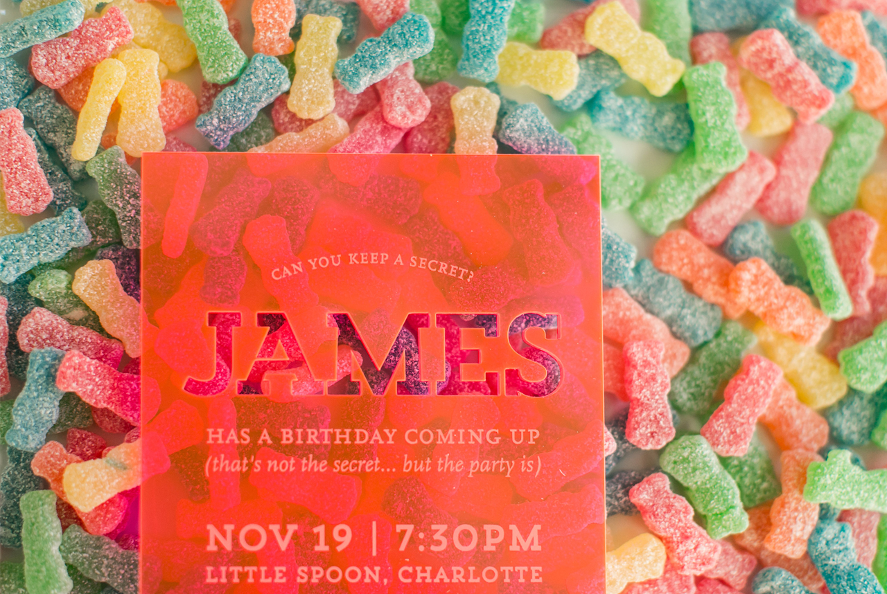
Um…. these neon acrylic birthday party invitations from Melissa of Atheneum Creative are SO much fun! And the best part? They were inspired by one of my favorites: Sour Patch Kids! Drawing from her candy inspiration, Melissa chose a bright neon pink acrylic to pack a punch with the overall design and feel of these invitations. So fun and sweet all the way through!

Neon Acrylic Birthday Party Invitations by Atheneum Creative

From Melissa: This was a fun one! James had a birthday coming up and his wife wanted to surprise him with a birthday party. She mentioned his love of Sour Patch Kids and before we knew it that was the inspiration for the party and the invitations. When you’re given Sour Patch Kids as inspiration for a birthday invitation, you simply can’t just print it on paper – it needs to be exciting and fun!

Neon Acrylic Birthday Party Invitations by Atheneum Creative

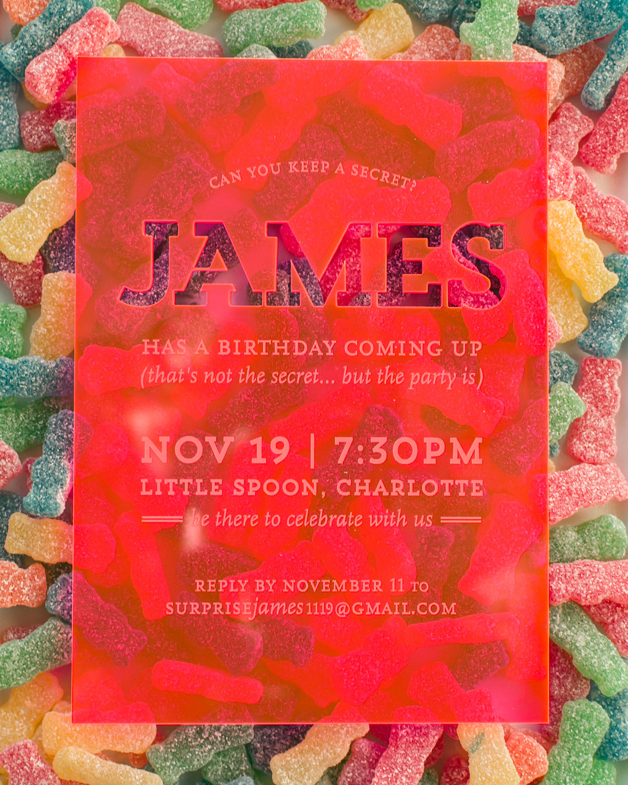
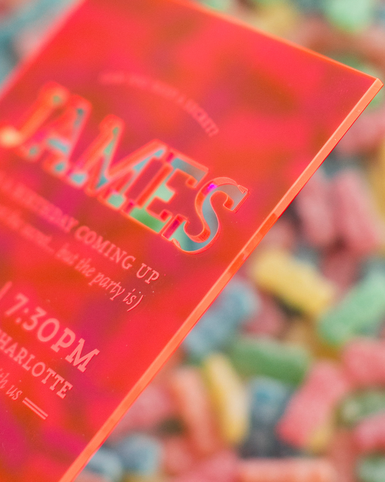
We presented some different design directions, but we all fell in love with this colored acrylic. The color we chose to work with is called Flamingo – I mean how fun is that? The one thing we love about this acrylic is the ability it has to change colors right in front you. Turn it one way and it looks orange, turn it another way and the acrylic turns pink. It also changes colors when placed on different surfaces. The draw to the acrylic was instant, but the fact that it changed colors only played to the sour patch kids even more with their tagline being, “first they’re sour, then they’re sweet.”

Neon Acrylic Birthday Party Invitations by Atheneum Creative

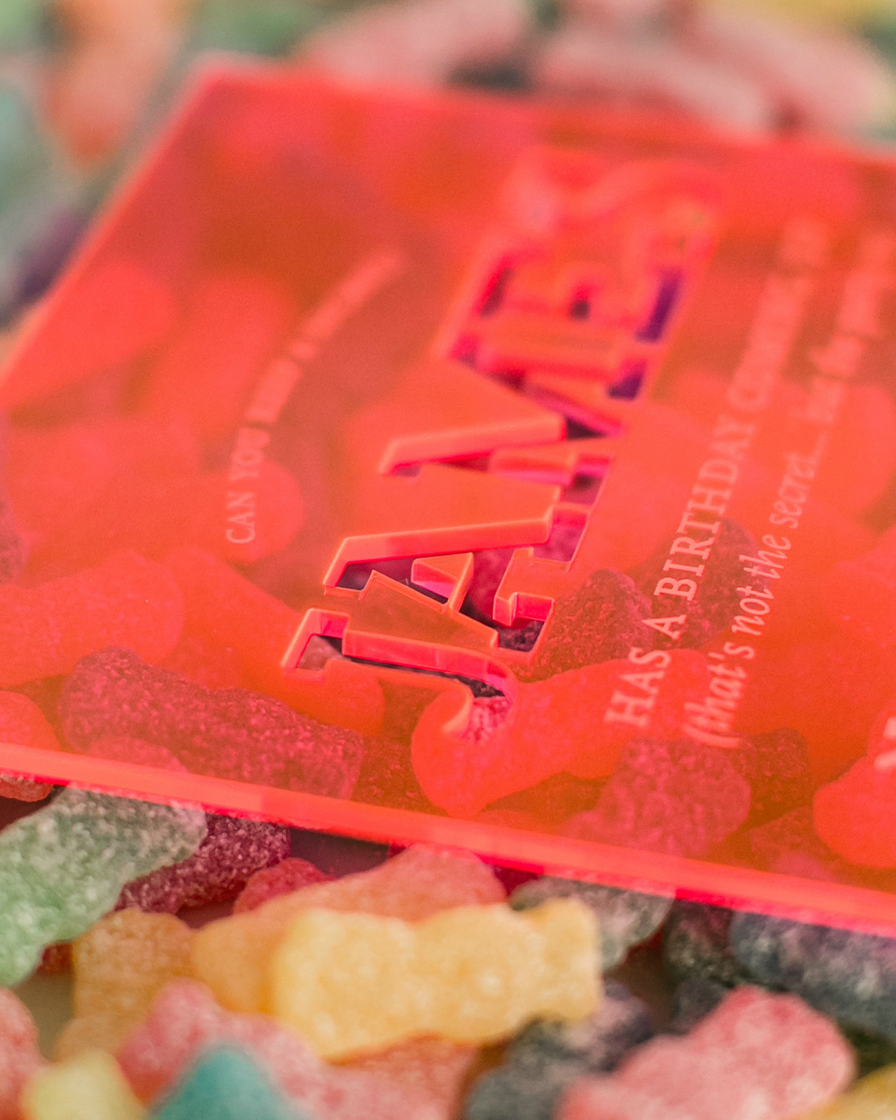
We wanted to add another layer of texture to the invitation by cutting his name out of the acrylic. We loved the way it was all packaged up with the filler paper showing through behind the acrylic invitations. The idea of seeing something different played well with the Sour Patch Kids theme. I loved the presentation as a whole, especially how his name stood out so boldly!

Neon Acrylic Birthday Party Invitations by Atheneum Creative

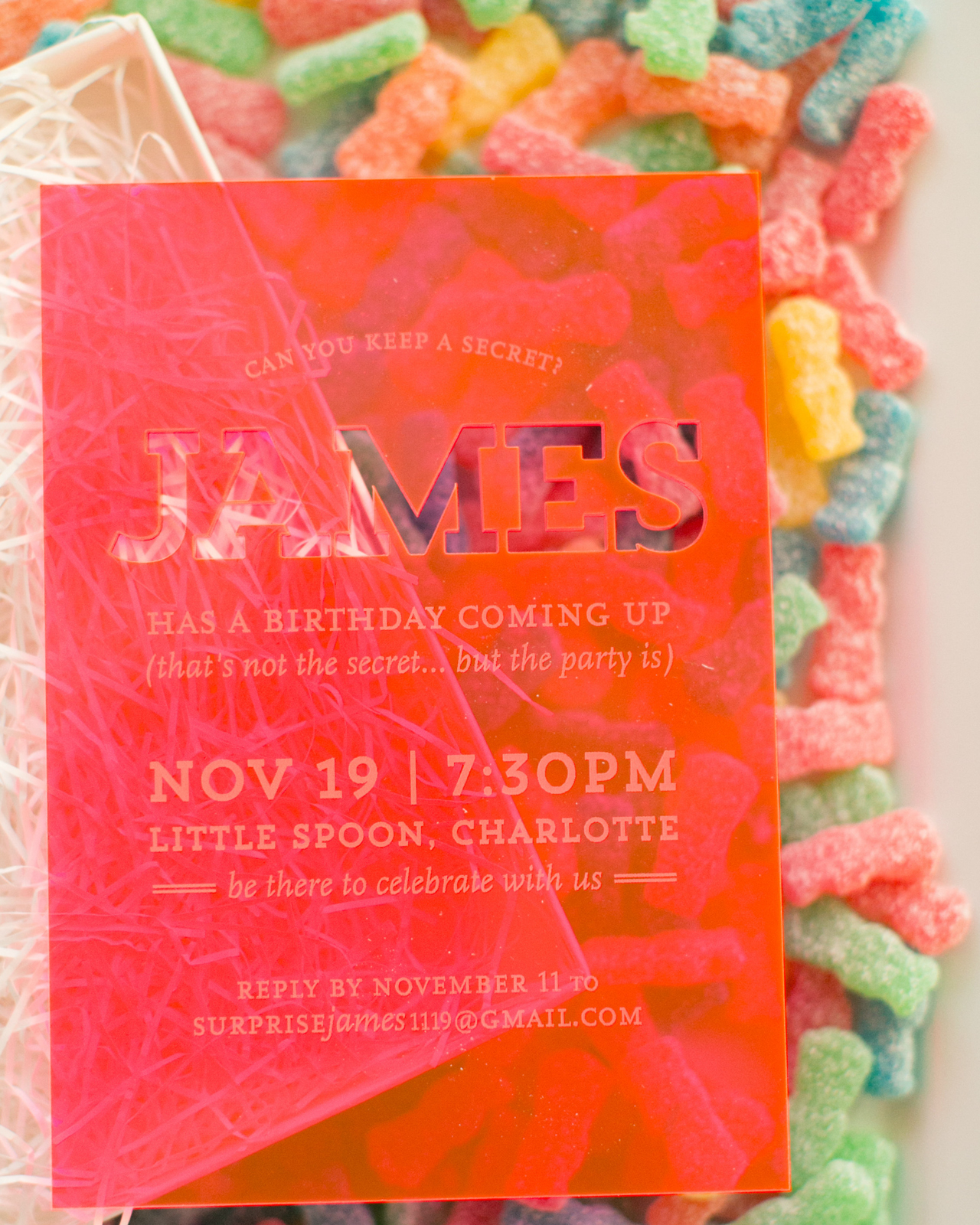
We mailed the invitation in a self-mailing white box with a wrap around label and white paper filler. This also highlighted the pink color when you opened the invitation and experienced the color changing acrylic as you took out the invitation. We loved the overall feel we created from such a fun piece of inspiration!

Neon Acrylic Birthday Party Invitations by Atheneum Creative

Thanks Melissa!

Design: Atheneum Creative

Atheneum Creative is a member of the Designer Rolodex – you can see more of their beautiful work right here or visit the real invi­ta­tions gallery for more wedding invitation ideas!

Photo Credits: Chelsea Davis Photography

Blue Agate-Inspired Watercolor Wedding Invitations

A bit of agate-inspired prettiness to brighten your Wednesday! Agate slices and jewel tones are having quite a moment these days, don’t you think? First these gorgeous purple-hued agate-inspired invitations a few weeks ago, and now these vibrant blue agate-inspired watercolor wedding invitations from Debbie Wong Design! The watercolor does a great job of mimicking the unique and varied nature of agate stones. And the hand painted watercolor is even more beautiful when paired with deckle edge paper and modern calligraphy in white ink!

Blue Agate-Inspired Watercolor Wedding Invitations by Debbie Wong Design

From Debbie: The aesthetic and rich jewel tones of agate were the main inspiration for this invitation suite. Blue is incredibly versatile and a beautiful color to use year-round, no matter how seasonal trends may change.

Blue Agate-Inspired Watercolor Wedding Invitations by Debbie Wong Design

Since agate stones come in so many different patterns, the background for the invitation and response card were also unique from one to another, due to the handmade nature of watercolors. Another unique element of agate slices that we wanted to highlight was the unique crystal design at the center of each stone.

Blue Agate-Inspired Watercolor Wedding Invitations by Debbie Wong Design

I decided modern calligraphy was an appropriate style to use for this fun invitation suite, and white ink was the perfect choice to stand out the most against the dark blue tones of the suite. The invitation suite was created on hand deckled cotton rag paper to get a gorgeous texture. Then, the invitation and the response card were tied together with a soft dusty blue silk ribbon from Silk and Willow, before inserting them into a light blue envelope.

Blue Agate-Inspired Watercolor Wedding Invitations by Debbie Wong Design

Vintage stamps were another fun detail we incorporated. Blue stamps fit the theme, but we added a couple of brightly colored stamps to make the envelopes stand out in a fun and vibrant. A blueberry stamp was also incorporated, and this motif tied in with the menu card.

Blue Agate-Inspired Watercolor Wedding Invitations by Debbie Wong Design

The reception was going to be a cocktail style affair, so the menu items were hors d’oeuvres instead of a full seated dinner. The menu was also made on the same hand deckled cotton paper, with a little blueberry painted on the top as the header. We used watercolor to write the appetizer names onto these cards. I knew using watercolor would give the menu cards an organic look with the colors varying slightly from word to word.

Blue Agate-Inspired Watercolor Wedding Invitations by Debbie Wong Design

We used actual agate slices as food labels for the stations at the reception. Brilliant white ink with modern calligraphy was used to match the invitation suite’s calligraphy. I purposely chose three distinctive looking agate stones for the appetizer cards, as no two agates are exact, just like a hand painting. This was such a fun project to orchestrate and I love how it came together!

Blue Agate-Inspired Watercolor Wedding Invitations by Debbie Wong Design

Thanks Debbie!

Design, calligraphy, & hand painting: Debbie Wong Design

Ribbon: Silk and Willow

Check out the Designer Rolodex for more tal­ented wed­ding invi­ta­tion design­ers and the real invi­ta­tions gallery for more wedding invitation ideas!

Photo Credits: Debbie Wong

Playful Floral Pinwheel Wedding Invitations

I’m a huge fan of interactive wedding invitations, and these playful floral pinwheel wedding invitations from Clara of Goldie Design Co. are SO much fun! With a hand painted floral motif, funky hand lettering, and blush pink color palette, what’s not to love? The die cut window rotated through different sections, sharing all the pertinent details in a unique and spirited way. So cute!

Playful Floral Pinwheel Wedding Invitations by Goldie Design Co.

From Clara: This wedding invitation was designed for a client that is having a spunky, outdoor, food-truck and dancing celebration! When she came to me to design her wedding invitations, the first thing she said is that she didn’t want it to be like a typical wedding invitation suite! She loved the idea of having an interactive wedding invitation that would get the guests really excited for this fun event, while still being beautiful and classy! I loved how this wedding wheel portrayed the fun and spirited nature of the couple, and was totally unique to them.

Playful Floral Pinwheel Wedding Invitations by Goldie Design Co.

By incorporating a hand-painted watercolor floral look in the background of the wheel, although quite spunky in nature, the invitation still looks classy, traditional, and beautiful! The wheel itself features hand lettered text inviting guests to come celebrate the marriage of the bride and groom. The circular wheel portion of the invitation was custom die cut to have a window that could be rotated around to show all of the details about the wedding that the guests would typically find on an information or accommodations card in a wedding suite.

Playful Floral Pinwheel Wedding Invitations by Goldie Design Co.

The die cut wheel was then assembled onto the watercolor backer card by a small gold brad that held the two pieces together, but allowed the wheel to still turn easily. I loved how this invitation was to the point and easy to understand, but was still so personal and unique to the bride and groom.

Playful Floral Pinwheel Wedding Invitations by Goldie Design Co.

This project shows couples that you don’t always have to follow the rule book when it comes to planning your wedding! If you have an idea that’s outside of the box and not spelled out in the wedding etiquette books, go for it! This is your special day, do it just how you want and have fun with it!

Playful Floral Pinwheel Wedding Invitations by Goldie Design Co.

Thanks Clara!

Design and Calligraphy: Goldie Design Co.

Printing/Custom Die Cut Printing: Jupiter and Juno

Check out the Designer Rolodex for more tal­ented wed­ding invi­ta­tion design­ers and the real invi­ta­tions gallery for more wedding invitation ideas!

Photo Credits: Goldie Design Co.

Happy Mother’s Day Weekend!

Happy Friday everyone! And Happy (almost) Mother’s Day to all the mamas and soon-to-be mamas out there! This week has been kind of intense for me: after four years of living in our home, we’re FINALLY having central air conditioning installed – which isn’t the easiest process in a narrow 1920s row house with brick and plaster walls. But we’re almost done and it’s going to be sooooooo worth it once the summer heat and humidity arrives. But after all the construction at home, I’m thinking we’ll just enjoy a low key weekend and Mother’s Day. It’ll be my last quiet weekend before the National Stationery Show kicks off next weekend! Aaaaah! But in the meantime…

Photo (and card) by Heartell Press via Instagram

…a few links for your weekend!

I’m on the hunt for a few lightweight midi skirts for summer. I have my eye on this lavender linen skirt (also comes in gingham!), this chambray skirt, this striped skirt, and this dotty gingham skirt.

Planning to make a ton of these mini cherry crisps this summer

Loving this sculptural lamp

Help buy 800 goats for Syrian refugees in Jordan

Also, how Syria changed the world

How cute are these hologram foil save the dates??

These gingham sneakers are so cute for little girls (and they’re 25% off with code SHOPNOW)

Crying all the tears after reading this story

Card of the week!


Recently on Oh So Beautiful Paper:

Enrollment for the Modern Calligraphy Summit 2.0 is back open! Read about it here, or just go ahead and sign up here.

Absolutely LOVE these colorful patterned wedding invitations!

New illustrated desktop wallpapers for May!

NSS 2017 Sneak Peeks from Richie Designs, Iron Curtain Press, and Ramona & Ruth

Ethereal vellum wedding invitations

Behind the Stationery with Cheree Berry Paper

Cards to send to your graduates: Part 1 and Part 2

Fun party supplies from Hip Hip Party Goods!

Pokemon birthday party invitations!

Understated calligraphy and green fern wedding invitations

Autumn ombré wedding invitations

Spring at the National Arboretum

A Passionfruit Mezcal Sling and a delicious Elderflower Tequila Rickey

Autumn Ombré Letterpress Wedding Invitations

I always love the colors of changing leaves in Autumn: crisp red, warm orange, and bright yellow. To create these autumn ombré letterpress wedding invitations, Alex of Al Stampa utilized one of my favorite letterpress printing techniques – the split fountain – to create a wonderful color gradient that evokes all those wonderful autumn colors. Can’t you just see everyone gathered around a fire drinking a cup of warm apple cider??

Autumn Ombré Letterpress Wedding Invitations by Al Stampa

From Alex: This wedding invitation was designed for a sweet couple, Colette and Petey. They wanted a colorful, fire crackling, leaf-turning, autumn wedding, and we wanted to inspire guests with the first piece everyone would receive… the wedding invitation!

Autumn Ombré Letterpress Wedding Invitations by Al Stampa

The wedding took place in Red Hook, Brooklyn at the Liberty Warehouse â€“ right on the water. Colette was the mastermind behind everything having to do with planning her wedding, and she took it all on her own shoulders. It was such a pleasure to be able to take this portion of the wedding planning away from her and ease her to-do list.

Autumn Ombré Letterpress Wedding Invitations by Al Stampa

Because coloring is so important with an autumn wedding, and the fact that it can become quite pricey to letterpress multiple colors, especially for a wedding of 200+ people, I suggested we treat the press, and how I print the colors, similarly to how nature treats the trees in October. We decided to use an ombré technique called a split fountain to make the amazing colors of the season the focus, by inking up the press with various yellows, oranges, and reds and letting it do its work on each invitation. In doing this, each invitation came out a bit different, but with the same amazing gradient effect.

Autumn Ombré Letterpress Wedding Invitations by Al Stampa

The illustration of the branches and leaves were meant to take over the invitation, and also create a large illustrated area that would absorb the ink’s changing of colors perfectly. We paired the branch illustrations with lovely calligraphy by Ashley Curry and a modern typeface to maintain the modernity of the wedding invitations and complement the wedding’s modern warehouse venue. Printed on 120 lb Reich Bright White paper, the invitation had a wonderful heaviness to it – and the beautiful ombré colors made these invitations something really special!

Autumn Ombré Letterpress Wedding Invitations by Al Stampa

Thanks Alex!

Design, printing, and styling: Al Stampa

Calligraphy: Ashley Curry

Paper: Reich Paper

Check out the Designer Rolodex for more tal­ented wed­ding invi­ta­tion design­ers and the real invi­ta­tions gallery for more wedding invitation ideas!

Photo Credits: Roland Kielman and Alex Labriola