
National Stationery Show 2016 #fresh
This year’s National Stationery Show is just a few weeks away! I seriously look forward to the National Stationery Show ALL year long! Even though this will be my 8th (!!) year attending the show I still get excited to wander the aisles, catching up with old friends and discovering new-to-me talent. I’ve been browsing the exhibitor list and the NSS Planner to prepare my walking list for this year’s show, and I’m particularly excited to see the exhibitors in a special juried section of the show called #fresh that features new and up-and-coming companies. Some of my favorite discoveries from the #fresh section in the 2015 National Stationery Show included Fox & Fallow, Katie Leamon, and Tack and Ward!
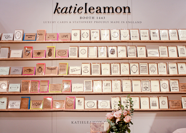
Katie Leamon (booth #1552)
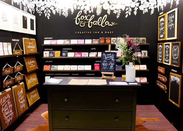
Fox & Fallow (booth #1545)
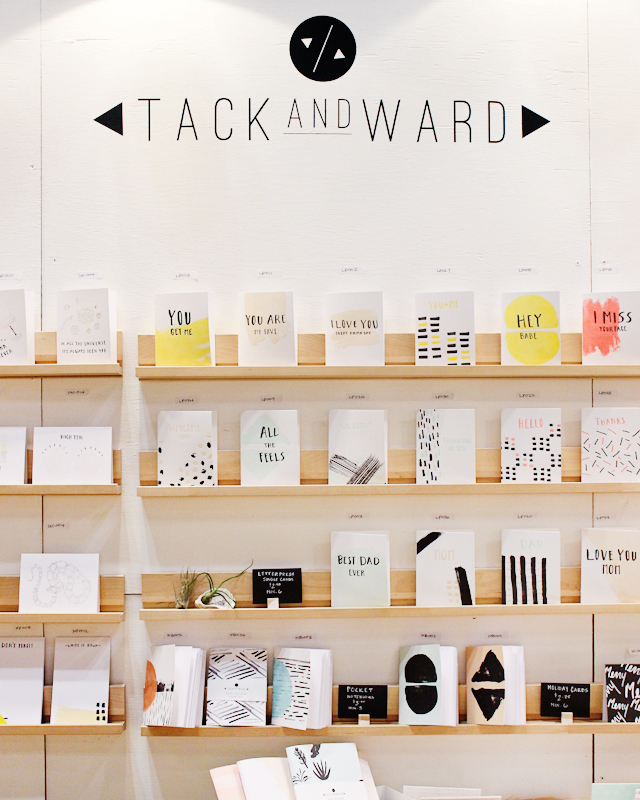
Tack and Ward, who “graduated” out of #fresh this year – they’ll be in booth #2270!
#fresh has been my first stop at the National Stationery Show since it made its debut two years ago. Now in its 3rd year, #fresh features approximately 100 emerging businesses in stationery and lifestyle gifts, with a focus on original and creative product design and packaging (so important!). Companies in #fresh can only have been in business for a maximum of five years and cannot have exhibited in the National Stationery Show for more than four years, which means it’s a great way for retailers and folks like me to discover new talent! Some #fresh exhibitors will already be familiar names to OSBP readers – like Ashkahn, AHeirloom, and Hartland Brooklyn – but others are still waiting to be discovered at the show!
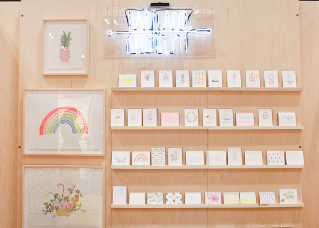
Hartland Brooklyn (booth #1556)
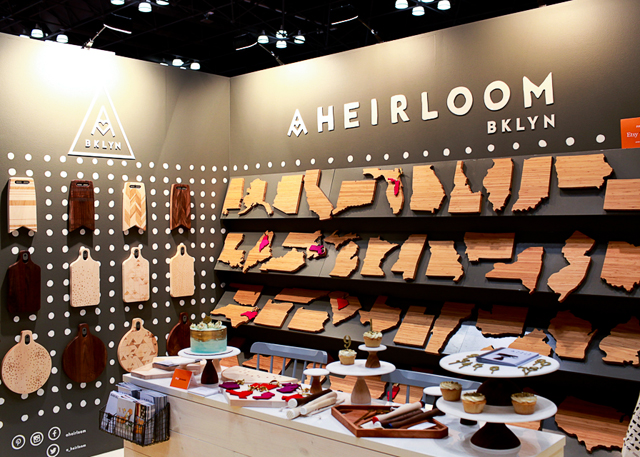
AHeirloom (booth #1259)
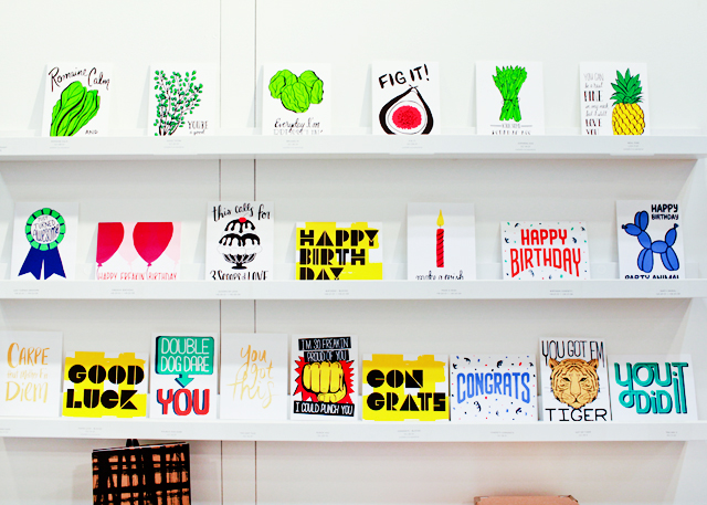
Meeschmosh (another #fresh graduate – they’ll be in booth #1854 this year!)
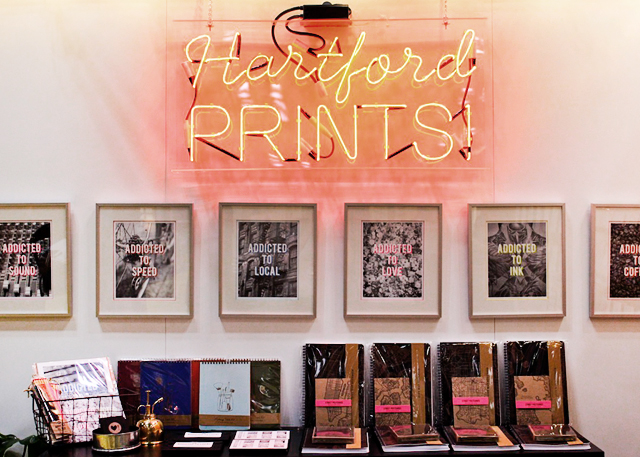
Hartford Prints! (booth #1346)
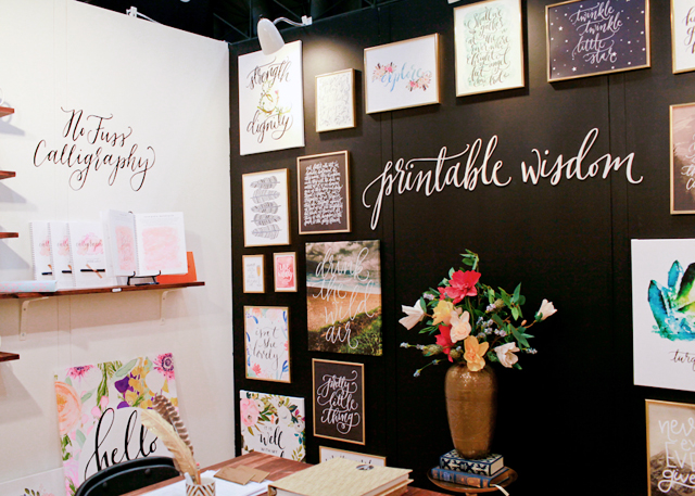
Printable Wisdom (booth #1356)
I think what I love most about #fresh (other than discovering awesome new stationers, of course!) is that it reminds me of the reason I started OSBP in the first place, all the way back in 2008: to connect people with a stationery community that was bursting with fresh energy and new ideas, and to make sure that all the new artists and designers I was discovering wouldn’t get lost in an already rich crowd. I can’t wait to see who will be there this year, and I’ll be sure to report back here in May!
The National Stationery Show is a once-a -year experience. Click here to register for your buyer badge or inquire about a booth.Â
This post is sponsored by The National Stationery Show. All content and opinions are my own. Follow The National Stationery Show on Twitter, Facebook, and Instagram. Thank you for supporting the sponsors that make Oh So Beautiful Paper possible!
Romantic Calligraphy Dip Dyed Wedding Invitations
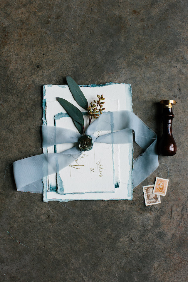
I’m a huge fan of the dip dyeing technique, and these romantic calligraphy dip dyed wedding invitations from Jill at Art + Alexander are no exception! The dark teal color is just absolutely stunning, and I love the way Jill continued the dip dye effect around all four edges of the invitation and some of the enclosures!
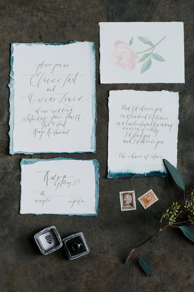
From Jill: The words I jotted down prior to designing this suite were: love letter, romance, simple, soft, and lovely. I love the colour that ink fades into, decades after being written – a brownish gold tone. I tried to recreate that ink colour for this invitation suite. I also tried to keep the calligraphy quite soft and loose, as if it had been written on some romantic whim.
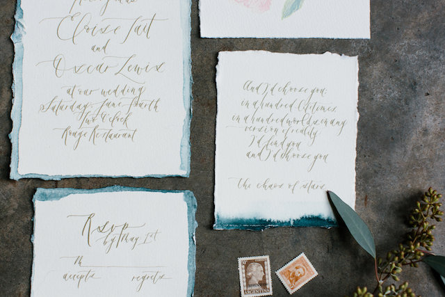
I opted for Cartiera Magnani paper for its rich texture and soft, organic look. I thought that the paper would behave similarly to a watercolour paper would, and absorb the watercolour paint well, which it did. I used the dark teal to add a pop of color, and wet the paper prior to dip dying so that it would bleed more and fade out more naturally, as well to give it a celestial look.
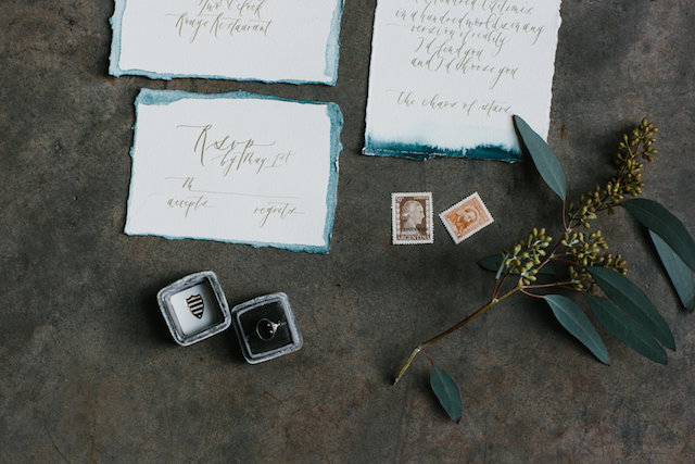
The invitation suite includes a beautiful quote from The Chaos of Stars: “And I’d choose you; in a hundred lifetimes, in a hundred worlds, in any version of reality, I’d find you and I’d choose you.â€
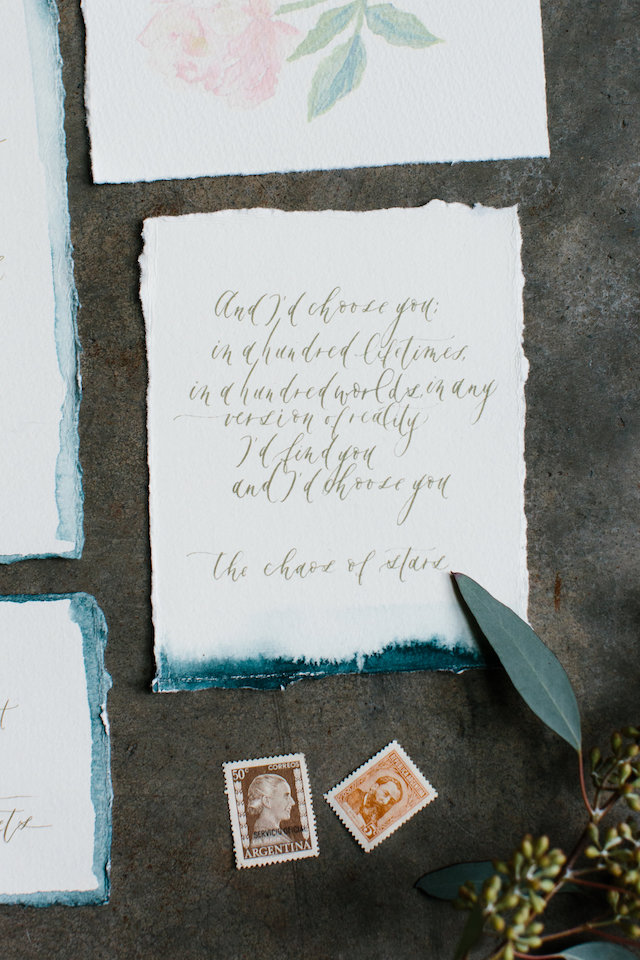
I just thought that it was the most beautiful quote and tied in so nicely with my original inspiration. I also included a watercolor illustration of a peony to add a touch of femininity. The suite was handwritten and the paper was hand torn. The stamps included in the photographs are from my Grandmother’s antique steamer trunk.
Thanks Jill!
Design and calligraphy: Art + Alexander
Check out the Designer Rolodex for more talÂented wedÂding inviÂtaÂtion designÂers and the real inviÂtaÂtions gallery for more wedding invitation ideas!
Photographed by: Shannon Yau
Modern Neon Typography Wedding Invitations
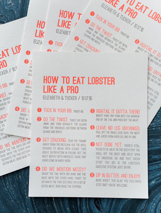
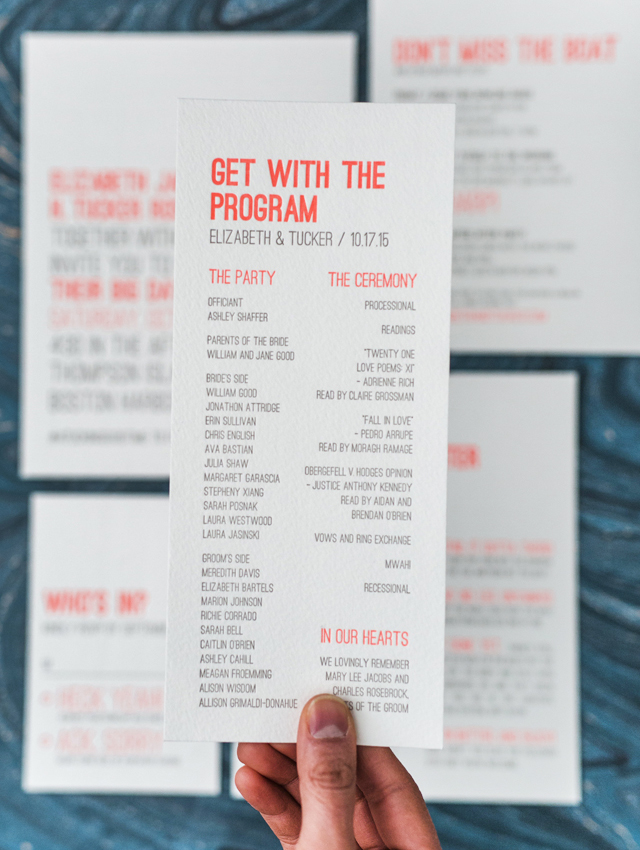
I’ll always have a soft place in my heart for typography-driven wedding invitations, especially when there’s a pop of neon involved! Sabrina from Smudge Ink sent over these bold and modern neon typography invitations for a wedding in Boston Harbor. I’m absolutely loving the playful wording throughout the invitation suite, from the RSVP cards to the adorable lobster eating guides!
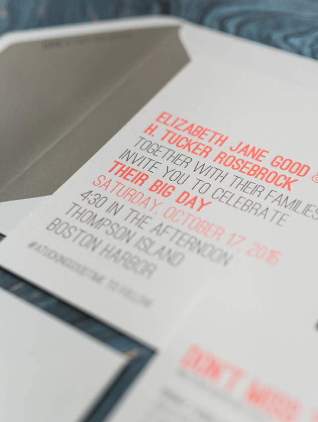
From Sabrina: Elizabeth and Tucker weren’t afraid to speak volumes when it came to their invitations. I knew it would be a fun suite to design as soon as I saw their wedding hashtag #atuckinggoodtime (a clever play on their names). And Alexis, their event designer and wondergal behind The Little Things, was already brimming with ideas for how to capture the couple’s vision for a lively celebration on the Boston Harbor Islands.
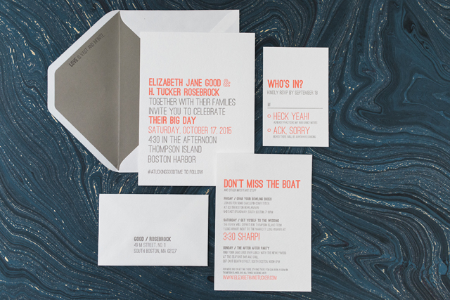
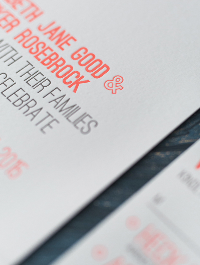
The natural elements provided by the rocky beaches and green landscape of Thompson Island would be a nice escape from the city. But for their stationery Elizabeth and Tucker wanted to offset the rustic feel of their venue with a more bold and modern aesthetic. We immediately decided to keep the look feeling clean cut and fresh with a typography-only design. To play up the couple’s big and bright personalities, we chose to letterpress print in neon coral and gray inks. A coordinating gray envelope liner with one of the couple’s favorite quotes brought everything together.
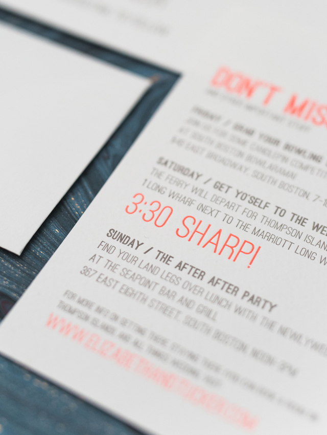
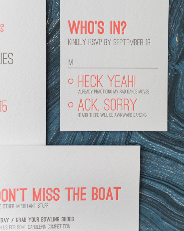
I love how we paired their affinity for clean typography with slightly cheeky copy that perfectly captured their fun-loving personalities. From the replies to the ferry schedule, coming up with just the right wording was probably my favorite part of their stationery. We carried this playfulness right up to the wedding day with letterpress printed programs and how-to-eat-lobster “menus.â€
Thanks Sabrina!
Design and Letterpress Printing: Smudge Ink
Styling: The Little Things
Smudge Ink is a member of the Designer Rolodex – you can see more of their beautiful work right here or visit the real inviÂtaÂtions gallery for more wedding invitation ideas!
Photo Credits: Sarah Jayne Photography
Pink Floral Watercolor Wedding Invitations
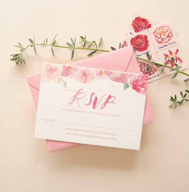
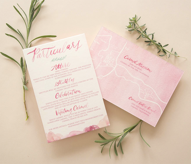
Um, how gorgeous are these pink floral watercolor wedding invitations from Kim of Bright Room Studio?? I just returned to DC from a week in the Catskills in Upstate New York, and while the cherry blossoms are mostly a thing of the past (sigh…), we came home to FULL FORCE SPRING and flowers galore. So what better way to start the week than with these pretty pink floral invitations?!

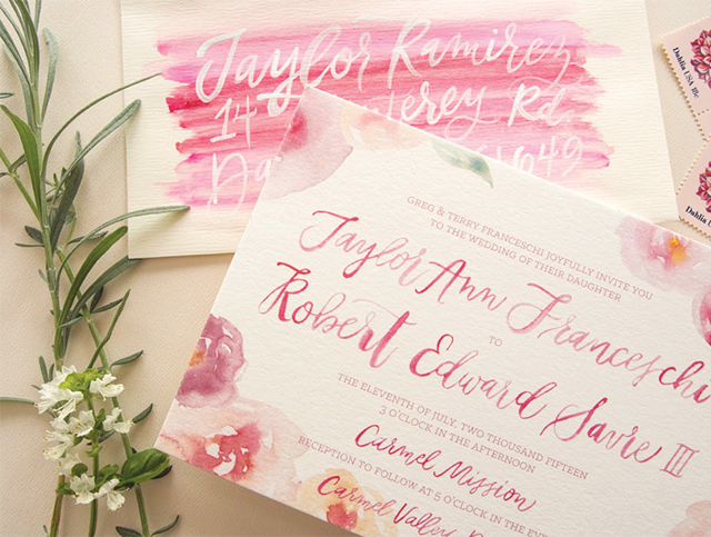
From Kim:Â I loved working with Taylor and Bobby and getting to go full on girly with their invitation suite. Their Carmel Valley wedding was going to be dripping with flowers and they wanted their invitations the same way. So we went for it with hand-painted watercolor flowers in shades of pink and peach with sweet leafy details. The florals paired perfectly with the hand-painted script names and the variation in the watercolor gave it so much life and personality.
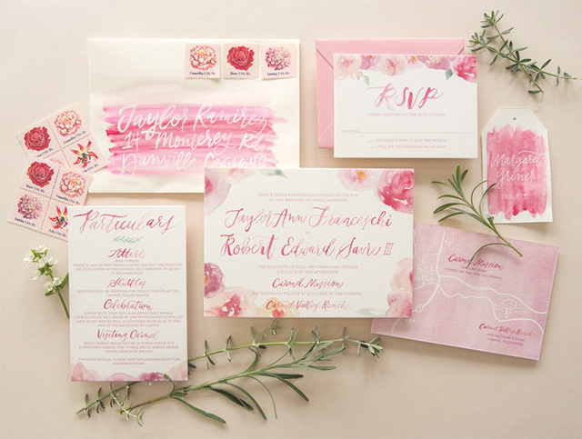
The map was a fun accent with the painted watercolor background. It gave the suite a little bit of contrast while still being feminine and perfect for their early summer wedding.
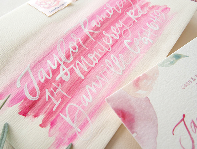
One of my favorite details was the envelope. I hand painted each envelope with a swash of pink and then addressed it on top with white hand lettering. They were so unique and gave the whole suite a little bit of edge. We then carried the swash of pink watercolor in to their day-of with fun place cards and other watercolor details. I had so much fun painting all the elements for their big day and love how this pretty-in-pink-flowers invitation came together.
Thanks Kim!
Design:Â Bright Room Studio
Bright Room Studio is a member of the Designer Rolodex  – you can see more of Kim’s beautiful work right here or visit the real inviÂtaÂtions gallery for more wedding invitation ideas!
Photo Credits:Â Bright Room Studio
