Amy + Mike’s Vintage-Inspired Gold Letterpress Wedding Invitations

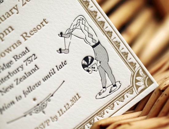
Happy Monday everyone!  I find myself gravitating to all things shiny and metallic as the days get shorter and colder, so I was thrilled when Vici-Jane and Richard from the UK-based Artcadia sent over these fun vintage-inspired gold wedding invitations for New Zealand couple Amy and Mike.  Vici-Jane and Richard previously worked with Amy and Mike on an acrobat-inspired save the dates and carried the theme through to the invitations.

From Vici-Jane: Six months ago, Amy and Mike contacted us to commission a design for acrobat themed save the date cards, in ticket style.  We’ve continued this fun theme throughout their 2 colour letterpress invitation suite.  We used gold and black ink, giving the suite a real luxury feel.  The resulting look is perfect for their New Zealand wedding where they’ll be having an acrobat to entertain their guests!


Thanks Vici-Jane and Richard!  Check out more from Artcadia right here!

Check out the Designer Rolodex for more tal­ented wed­ding invi­ta­tion design­ers and the real invi­ta­tions gallery for more wedding invitation ideas!

Photo Credits: Artcadia

{happy weekend!}

Happy Friday everyone!  This week was a lot of fun, from a date night with my husband to hanging out with Kyle from Power + Light Press in her Moveable Type Truck last night!  You might remember Kyle’s letterpress kickstarter project from last year, and she’s spending a few days in the DC area this week.  So if you want to see what this letterpress business is all about (and try out a couple of presses yourself), you can go visit Kyle near the Dupont Circle metro this afternoon from 4:30 – 7:30 p.m. or go see her in Baltimore this weekend!  For folks outside of the DC area, check out the rest of her tour dates right here.  But in the meantime…

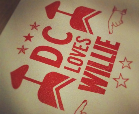
This is the print that I made last night with Kyle.  Willie Nelson was playing a concert across the street.  Ha!

…a few links for your weekend!

This week on Oh So Beautiful Paper:

A big welcome to the newest Designer Rolodex members!

  • Spark
  • The Pressroom & Co.

That’s it for me this week!  We’ve got a fun cocktail recipe coming up a bit later this afternoon – but here’s a hint: it’ll help keep you warm!  I hope you all have a wonderful weekend, and I’ll see you back here on Monday! xoxo

{photo by me}

Melissa + Francisco’s Spanish Calligraphy Wedding Invitations

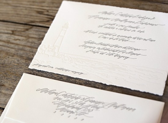
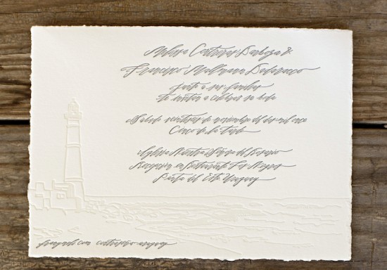
It’s always a good day when a wedding invitation from Kathryn at Black­bird Letterpress shows up in my inbox.  Kathryn created these gorgeous wedding invitations for an upcoming wedding in Uruguay; the invitation design was inspired by a lighthouse near the wedding venue.  The invitation features the beautiful hand lettering of Betsy Dun­lap (written in Spanish!), and I love that the bride and groom added a wax seal to the envelope prior to mailing the invitations out to their guests!

From Kathryn: The bride and groom are getting married in Uruguay.  Melissa, the bride, sent me a few photos of the shore and lighthouse where they were getting married and I designed from there.  The couple are originally from Argentina and Venezuela and live in Miami.  The invitation is written in Spanish in Betsy Dunlap’s beautiful calligraphy.  Melissa also wrote a sweet post about the invitations on her blog showing a beautiful wax seal detail they added to the envelope.

Thanks Kathryn!

Design and Print­ing: Black­bird Letterpress

Cal­lig­ra­phy: Betsy Dun­lap

Black­bird Let­ter­press is a mem­ber of the Designer Rolodex – you can see more of their beau­ti­ful work right here or visit the real invi­ta­tions gallery for more wedding invitation ideas!

Photo Credits: 1 – 3 by Ben Christensen Photography, Wax seal image by Melissa

Mary + Ben’s Elegant and Rustic Wood Veneer Save the Dates

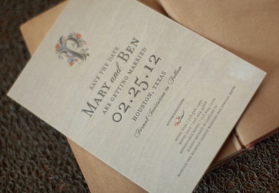
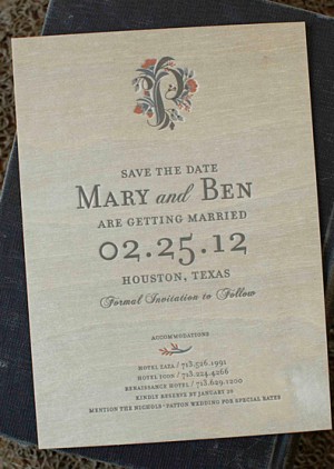
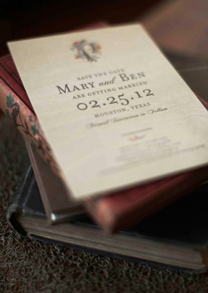
Mary and Ben’s save the dates are a wonderful mix of elegant and rustic, modern and classic.  Melissa and Amy from Atheneum Creative were inspired by Mary and Ben’s love of nature, pairing delicate blooms with simple and elegant text.  Once again, they partnered with Sideshow Press to letterpress print the save the dates on a thin sheet of wood veneer for a subtle rustic look.

From Melissa + Amy:  Mary and Ben love the outdoors and nature and the idea of bringing in natural textures, like wood and burlap, but did not want their wedding to come across as too earthy.  We developed a wedding logo that would really convey their love of nature while keeping it simple and personal, eventually deciding on a 4-color letter P (for the groom’s last name) intertwined with blooming flowers.  We kept the type very modern, giving us that subtle rustic look we wanted.


Thanks Melissa + Amy!

Design: Atheneum Creative

Letterpress Printing: Sideshow Press

Check out the Designer Rolodex for more tal­ented wed­ding invi­ta­tion design­ers and the real invi­ta­tions gallery for more beau­ti­ful cus­tom invitations!

Photo Credits: Chelsea Davis Photography

Caitlin + Andrew’s Historic Gettysburg Wedding Invitations

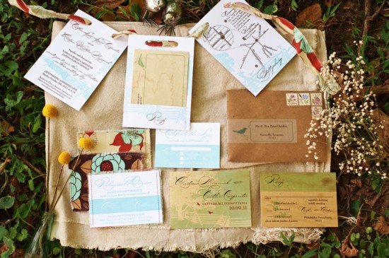
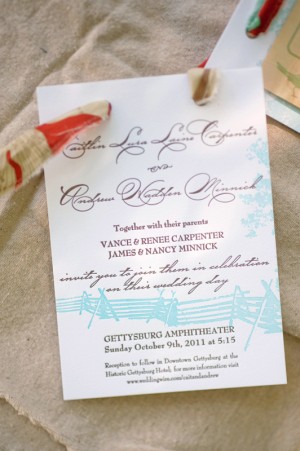
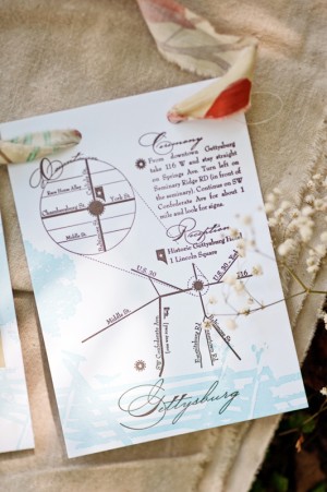
Happy Monday everyone!  My husband and I are back home after a quick weekend trip to upstate New York to visit family; it was a great trip, but I’m so happy to be back home with our cats!  We’re starting this week off with a suite of lovely invitations for a wedding in historic Gettysburg, Pennsylvania from Dianna and Emily at Fourth Year Studio.  Once Caitlin and Andrew settled on Gettysburg as their wedding location, Dianna and Emily set to work on the wedding invitations, save the dates, and rehearsal dinner invitations – drawing design inspiration from some of the unique historic features of the region.

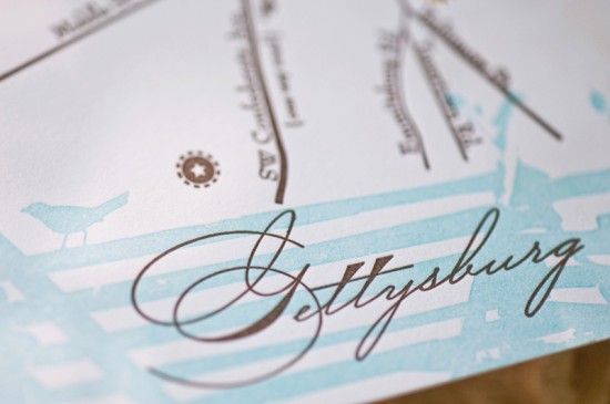
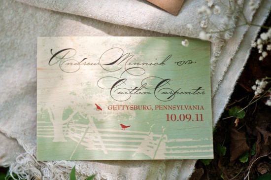
From Dianna: As history buffs, Caitlin and Andrew were traveling in Gettysburg for a weekend visit when they first realized they were in love.  After getting engaged, they knew it was the perfect place to tie the knot.  The invitation design stemmed from the historic relevance of Gettysburg.  The battlefields are lined with wood fences that are unique to the area and the tree graphic was actually derived from an image of a witness tree (a tree that was witness to the civil war battles and is still standing today).  Their October wedding took place at sunset overlooking the historic battlefields.


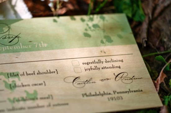
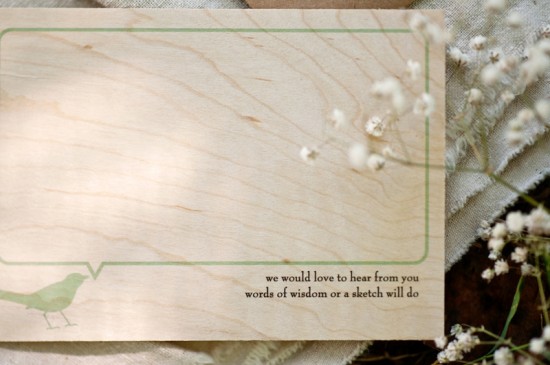
For the main invitation, we letterpress printed three pieces in turquoise and brown ink onto thick cotton paper.  Coordinating fabric strips strung the three pieces together.  RSVP postcards were flat printed on wood veneer and enclosed in a fabric pocket.  The final invitations were packaged in kraft paper envelopes with a matching address label.

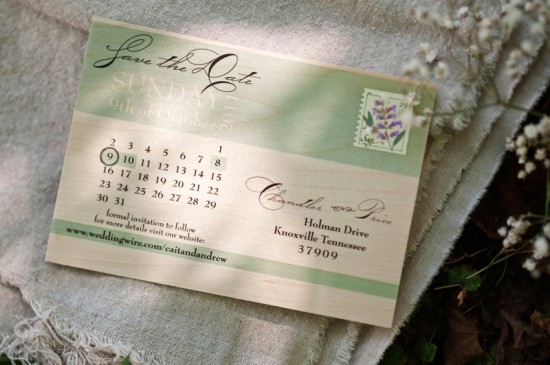
Like the RSVP postcard, the save the dates were also flat printed on wooden postcards.

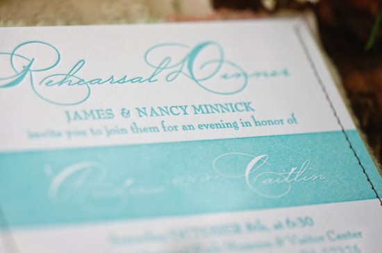
The rehearsal dinner invitation was letterpress printed and backed with fabric.  All the fabrics used for the rehearsal dinner invitations made a reappearance at the reception in the form of little love birds handmade by Caitlin’s sister.  The RSVP portion of the rehearsal dinner invitation was printed front and back on extra heavy cotton paper.

Thanks Dianna and Emily!

Check out the Designer Rolodex for more tal­ented wed­ding invi­ta­tion design­ers and the real invi­ta­tions gallery for more wedding invitation ideas!

Photo Credits: Dixie Pixel