Rachel + Nick’s Ombre Letterpress Wedding Invitations

How pretty are these wedding invitations from Lesley at Inclosed Studio? The invitation design was inspired by the bride and groom’s original wedding venue – a peach orchard – with a soft peach ombre on the main invitation and cute peach details throughout the suite. Beautiful!

Peach-Gray-Ombre-Wedding-Invitations-Inclosed-Studio

From Lesley: Rachel and Nick got married on a rooftop in downtown Omaha, Nebraska. Their original wedding location at a peach orchard had fallen through and they were hoping to still incorporate peaches into their new city vibe.

Peach-Gray-Ombre-Wedding-Invitations-Inclosed-Studio4

Peach-Gray-Ombre-Wedding-Invitations-Inclosed-Studio2

The invitation is letterpress printed on peach ombré paper with hints of peaches and gold throughout. For the finishing touch, their logo was foil stamped in gold on kraft paper tag … love!

Peach-Gray-Ombre-Wedding-Invitations-Inclosed-Studio3

Peach-Gray-Ombre-Wedding-Invitations-Inclosed-Studio5

Thanks Lesley and Lauren!

Invitation Design: Inclosed Studio

Envelope Calligraphy: Melissa at The Pretty Paperie

Inclosed Studio is a member of the Designer Rolodex – you can see more of their beautiful work right here and visit the real invi­ta­tions gallery for more wedding invitation ideas!

Photo Credits: Inclosed Studio

Krista + Josh’s Whimsical Woodland Wedding Invitations

High school sweethearts Krista and Josh love nature, so it made total sense for Krista to draw her inspiration from the great outdoors while designing the invitations for her wedding last summer. Krista incorporated a tree, clouds, and a whimsical script font into the design, which was enclosed in a woodgrain pocket folder. Ironically, Krista and Josh had to cancel their southern New Jersey reception at the last minute due to the derecho that pummeled the East Coast last summer – you’ll definitely want to click the link below for the incredible story!

Woodland-Fairy-Tale-Wedding-Invitations-Kake-Stationery

From Krista: My husband Josh and I love the great outdoors. We camp. We hike. We got engaged on a mountain. We basically grew up in the woods, in the same small square-mile town in New Jersey: Tree City USA aka Wenonah. So naturally, the first thing that came to mind was: a tree. Little did we know that our reception would be cancelled due to a power outage from downed trees of a high wind derecho storm the night before, but that’s a whole other story.

Woodland-Fairy-Tale-Wedding-Invitations-Kake-Stationery2 Woodland-Fairy-Tale-Wedding-Invitations-Kake-Stationery3

I started with the tree and then incorporated the butterflies, hearts, clouds, and little frog prince… and a lot of color. Next came the very important part of finding a hand-script font to match, which in the end, really made our little fairytale-land come to life. Once the actual invitation design was complete, I was able to carry the look and feel to the rest of the suite: the directions, accommodations, reception and reply cards, and envelopes.

Woodland-Fairy-Tale-Wedding-Invitations-Kake-Stationery4

Woodland-Fairy-Tale-Wedding-Invitations-Kake-Stationery5

I knew from the start that I would use a natural white linen card stock, since it’s my favorite paper and has that rustic vibe. But then, I had my O-M-G moment when I found the most perfect pocket fold card stock – textured woodgrain! The final touch was tying it off with a natural green raffia ribbon and a pink paper butterfly.

Woodland-Fairy-Tale-Wedding-Invitations-Kake-Stationery8

Beautiful! Thanks Krista!

Invitation Design: Kake Stationery

Script Font: Bookeyed Suzanne

Check out the Designer Rolodex for more tal­ented wed­ding invi­ta­tion design­ers and the real invi­ta­tions gallery for more wedding invitation ideas!

Photo Credits: Kake Stationery

Happy Weekend!

Happy Friday everyone! We’re looking forward to a beautiful fall weekend here in DC, which is a welcome change after what felt like an eternity of rain last weekend. My dad and step-mom are coming to visit this weekend, so we’re looking forward to taking them to pick pumpkins at our favorite farm and checking out the fall foliage at the National Arboretum (now that the ridiculous shutdown is finally, thankfully, over). Yay! But in the meantime…

Gray-Pumpkins-Doug-McMillen

Photo Credit: Doug McMillen

…a few links for your weekend!

This week on Oh So Beautiful Paper:

Check back soon for this week’s cocktail! I hope you all have a wonderful weekend, and I’ll see you back here next week! xoxo

Renee + Duncan’s Bold Floral Watercolor Wedding Invitations

I’m loving the bold contrast in these beautiful watercolor wedding invitations from Kacey at Hoopla Love. The design features a watercolor floral pattern with anemones, peonies, and tea roses paired with a striped rsvp card. Informal lettering, baker’s twine, and a glitter-dipped kraft paper tag serve as the finishing touches for this lovely suite!

Watercolor-Flower-Stripes-Wedding-Invitations-Hoopla-Love7

From Kacey: These invitations were designed for Renee’s Australian wedding. She contacted me to see if I could design an invitation set using the same design as a menu card that she saw on my Etsy shop, Hoopla Love. The watercolor floral menu card is inspired by a gorgeous bouquet of black and white poppies, pink peonies, and peach tea roses.

Watercolor-Flower-Stripes-Wedding-Invitations-Hoopla-Love2 Watercolor-Flower-Stripes-Wedding-Invitations-Hoopla-Love5

When Renee asked me to create a matching RSVP card for the invitation, I was a little hesitant at first. The floral design is rich and bold, I didn’t want the invitation set to be too busy. I love mixing whimsical designs with modern and geometric patterns, so I decided to keep with the watercolor motif, but painted stripes instead of flowers.

Watercolor-Flower-Stripes-Wedding-Invitations-Hoopla-Love3

The two cards coordinate nicely without feeling overly floral or matchy-matchy. Tied together with black and white baker’s twine, a pink glitter-dipped kraft tag, and a black envelope, the whole set is fresh, modern, fun, and pretty all at once.

Watercolor-Flower-Stripes-Wedding-Invitations-Hoopla-Love6 Watercolor-Flower-Stripes-Wedding-Invitations-Hoopla-Love

Watercolor-Flower-Stripes-Wedding-Invitations-Hoopla-Love8

Thanks Kacey!

Check out the Designer Rolodex for more tal­ented wed­ding invi­ta­tion design­ers and the real invi­ta­tions gallery for more wedding invitation ideas!

Photo Credits: Hoopla Love

Vivien + Jon’s Geometric Baby Shower Invitations

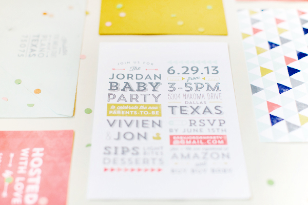
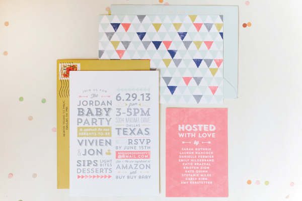
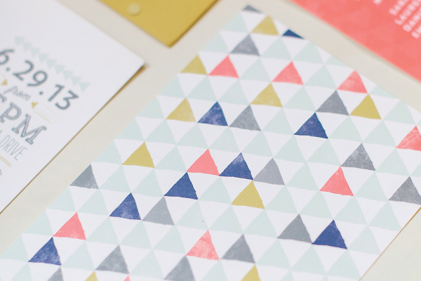
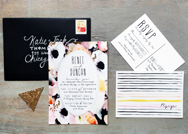
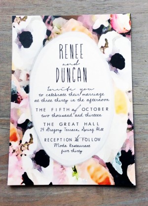
As you saw yesterday, I love informal co-ed baby showers – aka a last shindig with friends and family! When designing the invitations for her friends Vivien and Jon’s baby party, Lauren Chism drew inspiration from a geometric pillow in the nursery and a bright color palette that included coral, navy, mustard yellow, and mint green. The resulting design couldn’t be more perfect!

Geometric-Baby-Shower_Lauren-Chism3

From LaurenWhen my dear friend Vivien, who is a stationery designer herself, asked me to design her baby shower invitations, I was honored, excited and a little nervous: designing for a designer – that’s a tough job!

Geometric-Baby-Shower_Lauren-Chism1

Vivien and her husband Jon did not find out the sex of the baby, and the shower was co-ed, so I knew the most important task was making sure that the invitation wasn’t too feminine and that the guys wouldn’t feel like they were being dragged to a traditional baby shower. They had already dubbed it a ‘Baby Party’ – so with that tag line and a fun geometric pillow from the nursery as inspiration, I worked to create something that was fun, not girly, not too baby shower-y and most importantly, something that Vivien would love. Easy, right?!

Geometric-Baby-Shower_Lauren-Chism4

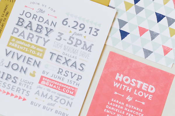
The final result was a fun mix of typography, geometric pattern, and color. I worked with a palette that coordinated with her nursery: coral, gold, mint, mustard, navy and gray. I couldn’t decide which envelopes to use, so I ended up sending a combination of mint and mustard envelopes.

Geometric-Baby-Shower_Lauren-Chism6

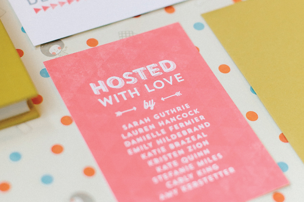
I didn’t want to crowd up the main invitation with the hosts’ names (there were several), so I created a little insert with a list of names. That or using the back is a great way to include everyone when you have lots of people or couples hosting, without having to fit them all on the main invitation. (Plus it added some fun color to whole package).

Geometric-Baby-Shower_Lauren-Chism8

Vivien loved how they turned out and I loved getting to play such a special part in their shower. Oh, and by the way, Vivien and Jon welcomed a little GIRL, Zoe, in August!

Geometric-Baby-Shower_Lauren-Chism7

Thanks Lauren!

Lauren Chism Fine Papers is a member of the Designer Rolodex â€“ you can check out more of Lauren’s work right here!

Photo Credits: Heather Hawkins