Wedding Invitation 101, Part 5: Invitation Addressing & Mailing

Wedding Invitation 101: Invitation Addressing and Mailing / Fine Day Press for Oh So Beautiful Paper

Hi guys, Ashley from Fine Day Press here. We’ve finally come to the last post in our Invitation 101 series. Thank you for reading and learning along with me! Today’s post covers the last steps in getting your invitations out the door: invitation addressing and mailing.

Be sure to check out our previous posts:
• Where to Start
• When to Send
• Printing Methods
• Wording & Etiquette

Addressing and Mailing

You’ve spent countless hours picking out just the right invitation suite, and possibly months agonizing over every little detail from the wording to the printing. Take a few moments to plan using our invitation addressing and mailing tips below; I promise it will be well worth the effort!

Plan Ahead

First, leave some time to gather and organize your address list. You’ll want to provide your stationer (or calligrapher, or printer) with a clear, detailed list of names and addresses that includes appropriate titles like “Mr. & Mrs.” or “Dr.”  It’s commonplace to spell out in full the address line and state, for example, “123 Smith Street; New York, New York 10010”.  Additionally, if children under 18 are invited to the wedding, list their names individually on the line following the parents’ names — unless you are using inner envelopes (increasingly rare these days), in which case the names of any children should be listed here and not on the outside. Adult children should receive their own invitation.

Secondly, make sure you have extra envelopes in case of any addressing errors. About 10% over is a good rule of thumb, and many stationers (including Fine Day Press) will automatically include some extras with your order. If using a calligrapher, be sure to ask if more than that are needed. You’ll also want a few extra invitations on hand for last-minute guests, and just in case one gets lost in the mail (it happens).

Methods of Addressing

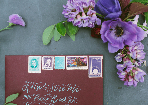
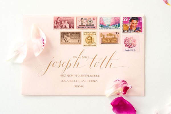
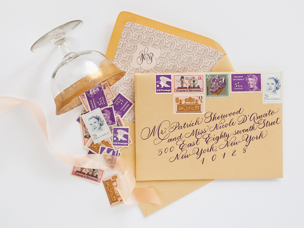
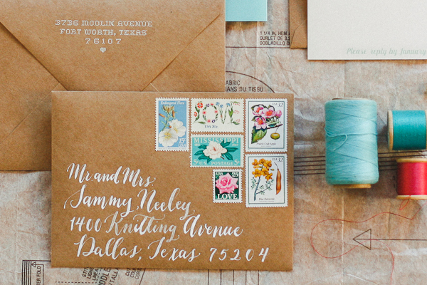
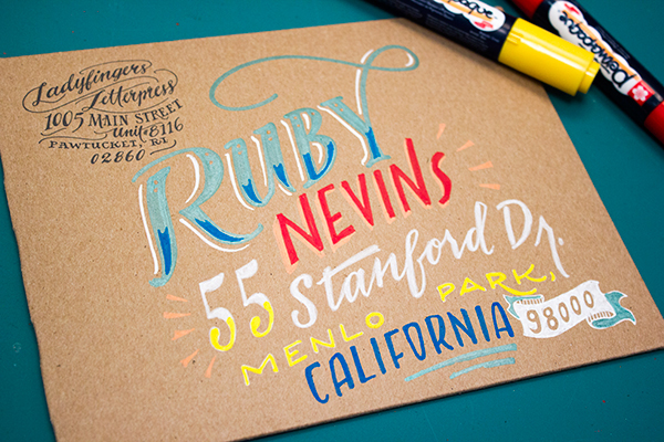
Traditionally, invitations are hand-addressed, usually by a professional calligrapher. There’s nothing quite like receiving a calligraphed envelope in your mailbox, and it’s most definitely high up on my happy list. And if it‘s in your budget, go for it! Check with your calligrapher to confirm how much time they’ll need to address your envelopes, but at minimum you’ll want to factor around 2-3 weeks for envelope calligraphy into your invitation mailing timeline.

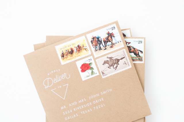
If you are hand-addressing the envelopes yourself, a great option for the return address is to have a custom stamp created. We‘ve created many of these for our clients over the years. Provided you aren’t moving right after the wedding, the stamp can be used again on thank you notes, holiday cards, and other future mailings. Alternately, with the convenience and quality of digital printing, many stationers will print guest addresses directly onto the envelopes. You can even choose a calligraphy-style font.

Wedding Invitation 101: Invitation Addressing and Mailing / Fine Day Press for Oh So Beautiful Paper

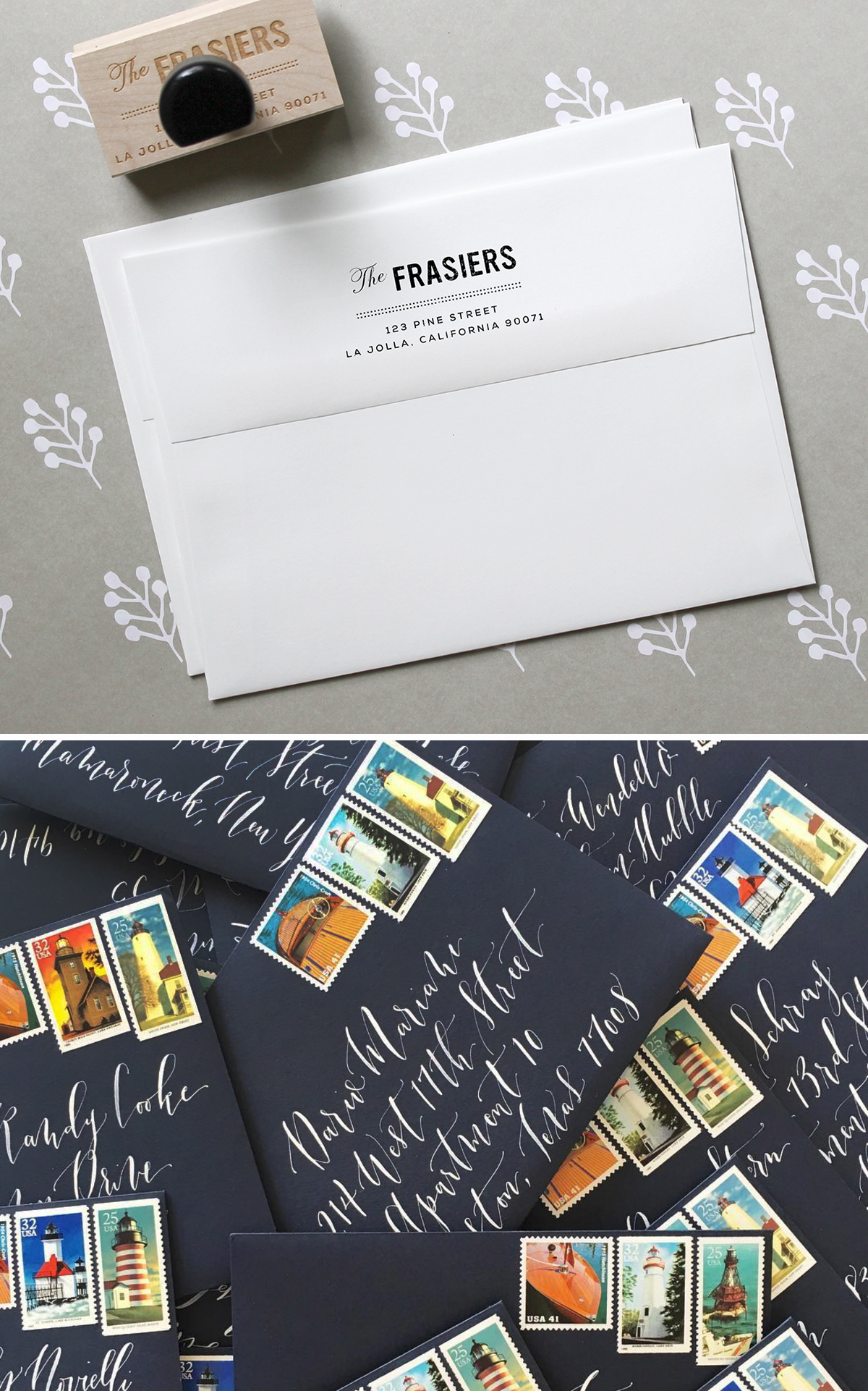
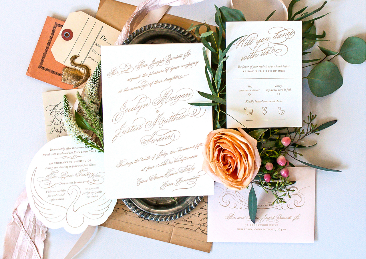
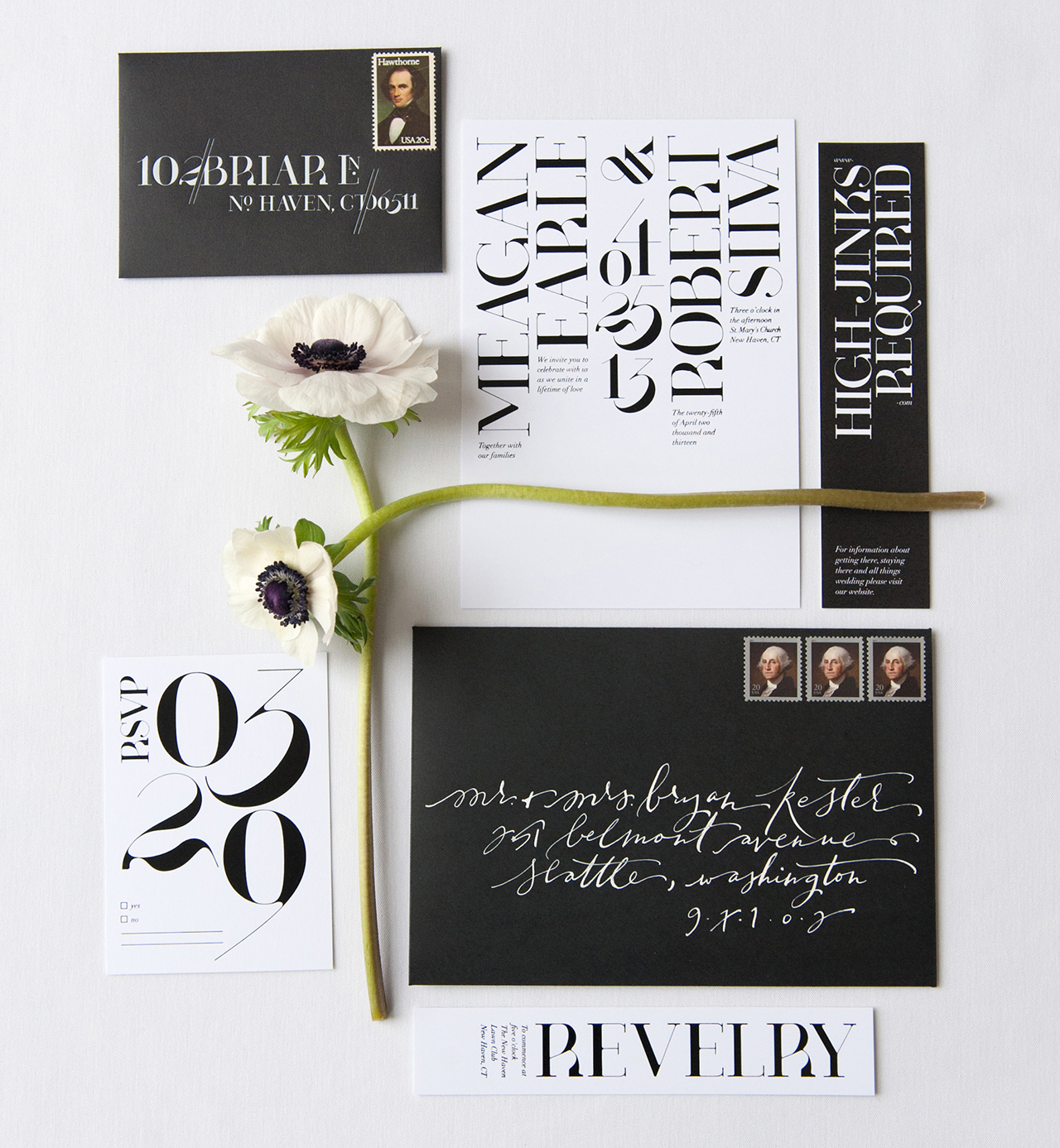
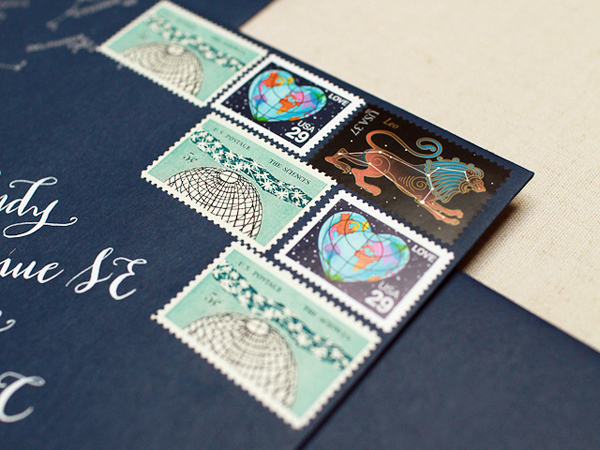
Above: Custom return address stamp by Fine Day Press; calligraphed envelopes by Blue Eye Brown Eye

Adding Postage

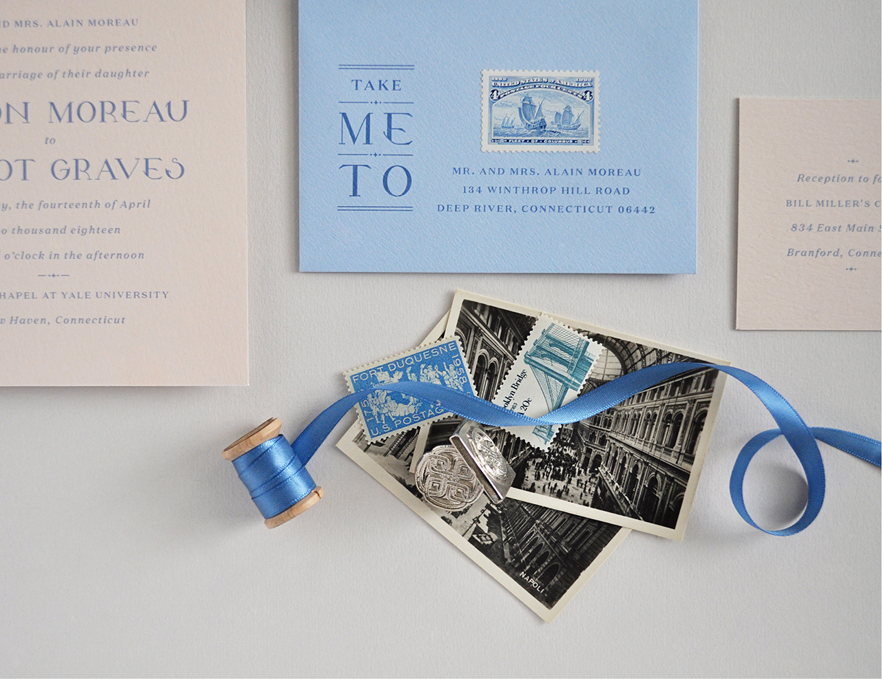
Note the size of your invitation and compare it to the post office standard sizes. Square invitations require extra postage; the same goes for double-thick stock. If you’ve got extras like a reception card, list of wedding events, map and directions card, ribbons, bows, bells or whistles, that can push your overall weight up beyond the first class stamp zone. You’ll want to take a complete envelope suite to the post office for weighing. They can tell you the exact postage amount you’ll need, and help you find a stamp (or stamps) to match. Don’t forget to take into account any international guests. When addressing, put these in a separate pile and have the post office determine the correct postage for each.

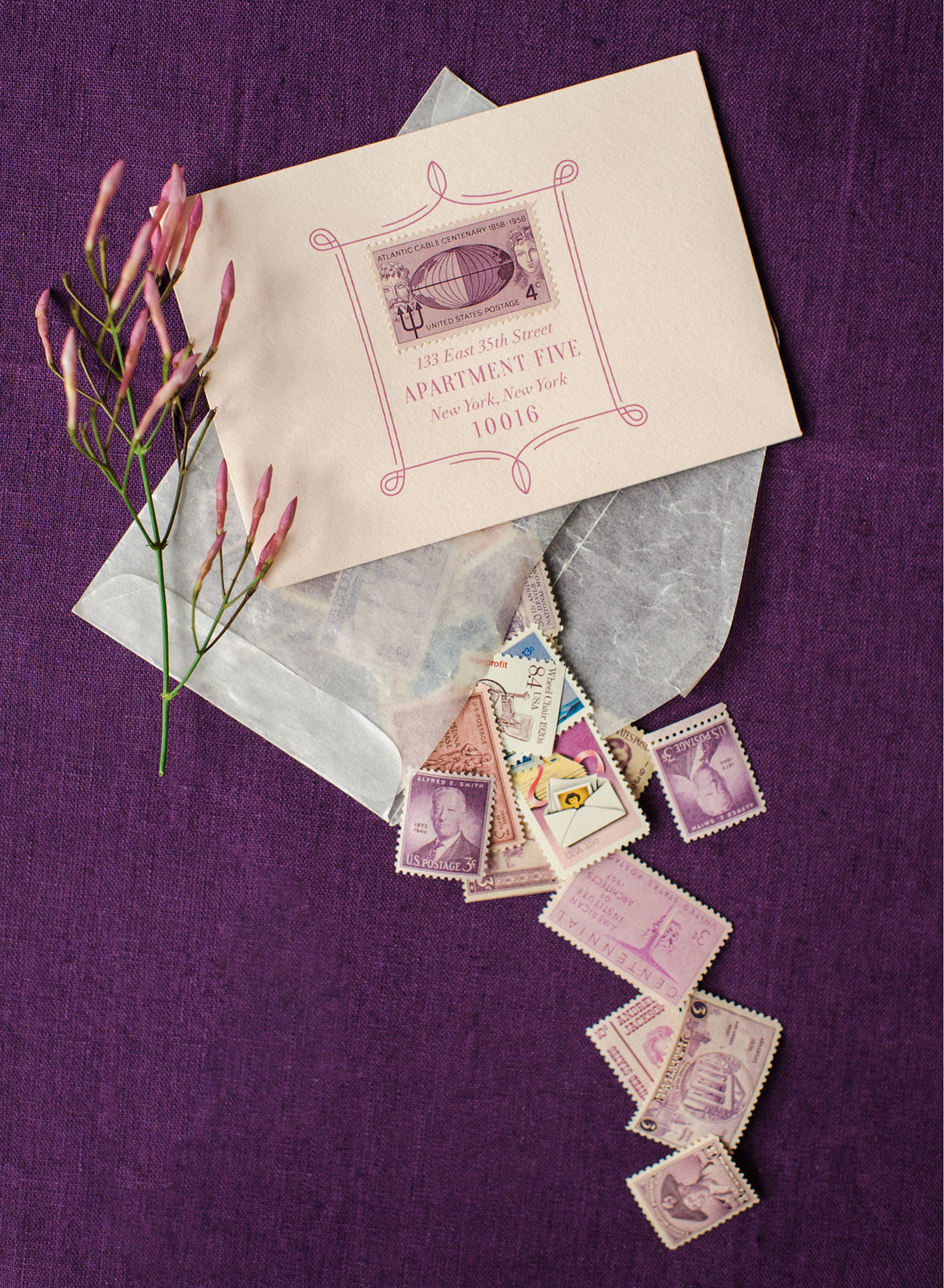
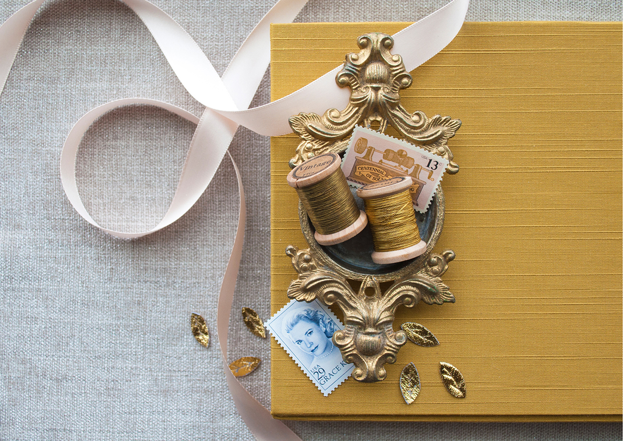
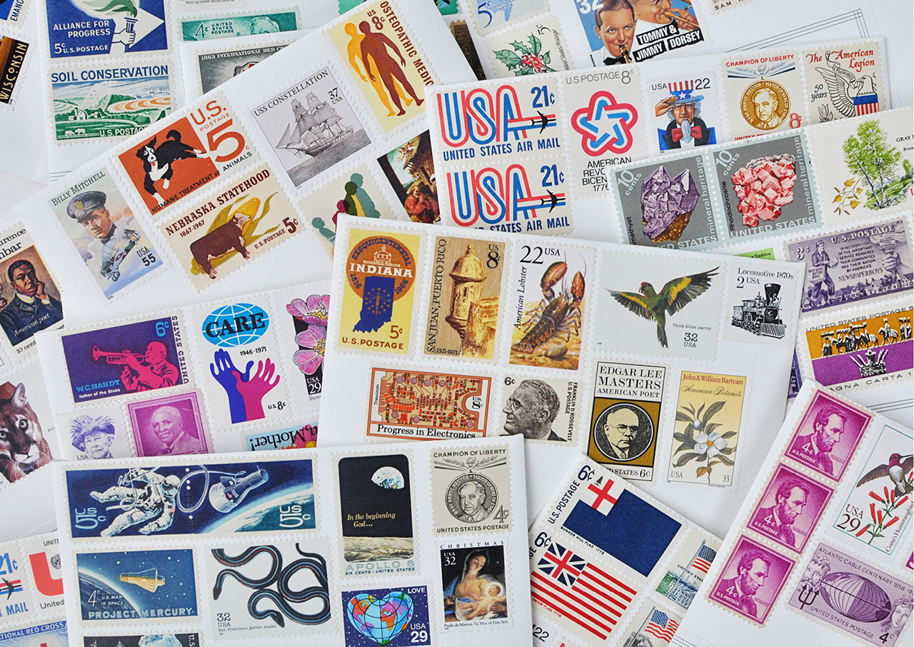
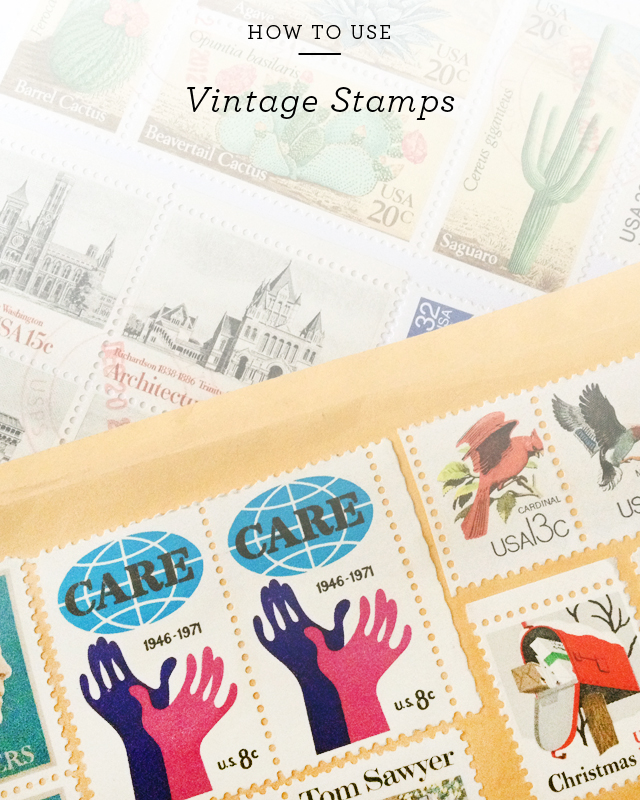
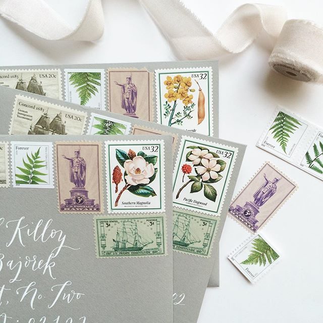
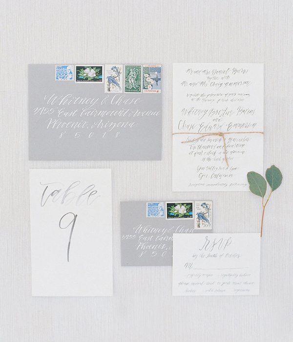
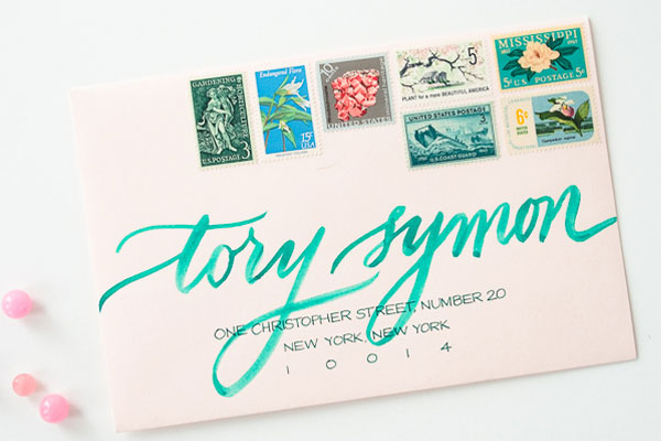
Beautiful postage is the last thoughtful touch to complete your invitation. USPS has definitely stepped up their stamp design game in the last few years, so you can easily achieve a beautiful envelope just by browsing the available stamp selections online. The post office also usually has a few different love-themed options, like these Louise Fili stunners. Custom stamps can be created to match your invitation design (for example, via zazzle.com), from personalized stamps with a custom monogram to vintage-inspired designs. Vintage postage is a beautiful detail for wedding invitation envelopes, but can be difficult to find and sometimes costs more than the face value of the stamp – you can read all about finding vintage postage here. And remember that your reply envelopes will also need a first class stamp – don’t leave your guests hunting for postage to send their reply.

Let ‘em fly

You’ve done your homework. Time to send those beautiful babies out into the world, and wait for the excitement that follows!

One last pro tip: Request hand-canceling. There can be an extra charge for this beyond 50 pieces, but it’s worth it to not have that bummer of a barcode printed along the bottom of all of your gorgeous envelopes.

Happy Mailing!

How to Style Stationery for Photography

Hi kids, it’s Nichole from Coral Pheasant bringing you some tips on how to style stationery like a boss. Beautifully styled stationery images are important details when telling the full wedding day story. And for submitting them for publication on sites like Oh So Beautiful Paper!

How to Style Stationery for Photography / Coral Pheasant for Oh So Beautiful Paper

Photo by Kat Harris Photography

The first, most essential tip is to plan. Planning is vital for the smooth running of a photo shoot – and will ensure that you have a road map in place to capture the most significant details. The day before the shoot, I gather all the invitation components (multiple sets are very helpful to have), a variety of backgrounds and styling props. I have a dedicated space in my studio where I keep most of my props so they are all within arm’s reach. Having them close by gives me lots of options. Options are major key!

With everything gathered, I start to lay out compositions. My goal is to tell the whole paper story through a series of images. I  start big picture, laying out the main pieces of the suite. This typically includes the invitation, reply card, coordinating envelopes and any enclosures. When you compose an image, consider why you are taking the photograph. What is the story? What are you trying to convey? Is the print method stunning? Maybe the colors are unique or the design is out-of-the-box.

I experiment adding and subtracting different props until I arrive at a configuration that I am happy with – both a vertical and a horizontal layout – and take quick pictures using my iPhone. I then move on to smaller vignettes where I highlight details of the suite. None of these arrangements are 100% perfect, they are simply there to reference for the actual photo shoot. Think of them as a rough draft. Once I’ve got all the compositions planned out, I upload the photos to my computer and create a visual shot list.

How to Style Stationery for Photography / Coral Pheasant for Oh So Beautiful Paper

I find this to be immensely helpful! I personally do not excel at doing multiple things at once – like talking and styling – and having a visual cheat sheet keeps me on track. I’ve already been super thoughtful about the arrangements in the quiet of my studio the day prior. This allows me to obsess over the details of spacing and alignment on the day of the shoot. And of course there is always room to free style because you’ve done your homework and you have a solid sense of what you want to accomplish that day.

On to the actual styling! Below are some essential “tools” for getting started.

How to Style Stationery for Photography / Coral Pheasant for Oh So Beautiful Paper

SUGGESTED TOOLS

• Erasers, staples, washi tape
Stationery photos are more interesting when items are on different levels. Flat cards on a flat background = boring. You need to vary the height of the cards to create depth. Items that vary in thickness and have large flat surfaces are what you’re looking for. Staples are great because they are cheap and can be broken into different lengths. Erasers and rolls of washi tape work well, too, and are taller than staples giving you a mix of heights.

• Poster tack
This pliable tack keeps round objects from rolling, helps envelope flaps lay flat and can be used to add additional height to lightweight items.

• Paint brushes
Paint brushes are great for wiping away rogue dust particles and pet hairs. (I should mention that I have 2 dogs. Pet hair is a constant at my studio!)

• Tweezers
You have everything laid out just so when you notice one card is not quite straight. Ugh! Tweezers (or the pointed end of your paint brush) can be used to delicately move that one card 1/36″ to get it perfect without disrupting the other pieces. Anal retentive, OCD who me??

• Backdrops
Get creative! I keep a mix of different colored, large sheet papers on hand. You could also get sheets of plywood and paint them to coordinate with your paper story. Or you could be baller and get yourself styling boards from Heirloom Bindery.

• Foam core
White foam core can be used as a reflector to bounce light onto your layout and to soften harsh shadows.

• Diffuser
Another way to soften strong shadows. I have one similar to this that can be used as a reflector and a diffuser.

How to Style Stationery for Photography / Coral Pheasant for Oh So Beautiful Paper

Photos by Charlotte Jenks Lewis

In the beginning I mentioned props – and how having them is major key when styling stationery photos. I am constantly collecting items to add to my prop closet. Having a variety of items on hand makes it so much easier to style. Some will work, some will be a flop, but it’s all good because you will have options! Look for items that are smaller in scale. You want a mix of sizes but you also want to mindful of how their proportions relate to the paper. Consider items with great color, patina and texture.

How to Style Stationery for Photography / Coral Pheasant for Oh So Beautiful Paper

How to Style Stationery for Photography / Coral Pheasant for Oh So Beautiful Paper

Having multiples of things, once again, gives you options. Are you noticing a constant here? Hint: OPTIONS.  A particular pair of scissors might be too small for your setup or not the right color, but you’re not stressed, you have OPTIONS!

How to Style Stationery for Photography / Coral Pheasant for Oh So Beautiful Paper

Petite dishes are great for corralling other smaller props. They help to give those small things a sense of place and also add dimension and texture to the overall image.How to Style Stationery for Photography / Coral Pheasant for Oh So Beautiful Paper How to Style Stationery for Photography / Coral Pheasant for Oh So Beautiful Paper

I use vintage postage a LOT when styling. As in Every. Single. Time. They’re mini pieces of art and bring delightful color to the composition. Nole did an awesome write-up about vintage postage and where to find it. I strongly encourage you to give that a read if you are on the hunt!

How to Style Stationery for Photography / Coral Pheasant for Oh So Beautiful Paper

I also like adding bits of vintage paper ephemera when styling. The dog-eared edges, interesting typography, and varying colors are yet another way to add interest to your composition.

How to Style Stationery for Photography / Coral Pheasant for Oh So Beautiful Paper

How to Style Stationery for Photography / Coral Pheasant for Oh So Beautiful Paper

I think it goes without saying that bringing natural elements to your styling sesh can be a real game changer. But I just said it. So there, take note.

You’re now equipped with the tools and the props and you’ve got your beautifully designed stationery. That doesn’t automatically spell success. You must also be thoughtful how you compose your image.

COMPOSITION TIPS

• Balance
Your image should be balanced. I don’t mean that the composition needs to be symmetrical, but the selection of props should relate to one another and not compete. And remember, your goal here is for your stationery shine!

• Negative space
Be mindful of the spacing between each element and how they relate to each other. Is it even? Is everything straight? It’s much harder to retouch these things in post-processing!

• Alignment
If there is too much going on, it will feel cluttered and your eye won’t know where to land. Consider carving out negative space.

How to Style Stationery for Photography / Coral Pheasant for Oh So Beautiful Paper

Photo by Carla Ten Eyck Photography

That’s a wrap! I would love to hear some of your tried and true tips for perfect paper pics!

Photo and Styling Credits: Coral Pheasant (except where noted)Save

How to Use Vintage Stamps

I love, love, LOVE using vintage postage stamps on envelopes. They add a little something special to everything from wedding invitations to dinner and cocktail party invitations to baby announcements. Vintage stamps offer a wonderful opportunity to represent your personal style, whether chosen thematically or by color palette. And since unused postage never expires, there are endless options to suit every type of occasion – from a formal black tie wedding to a casual backyard gathering. Here are a few of my tips for how to use vintage stamps – plus, I put a collection together with some of my favorite vintage stamps that you can use in your own projects!

How to Use Vintage Stamps / Oh So Beautiful Paper for eBay

How to Use Vintage Stamps / La Happy

Photo Credit: La Happy Design & Calligraphy

1. Add it Up

First things first: vintage postage must add up to current postage rates. While searching and shopping for stamps, make sure that you have one stamp worth at least 25¢ (or more!). Wedding invitations and birth announcements mailed in a larger envelope usually require a minimum of 71¢ postage. The 3¢ and 8¢ stamps are great for rounding out a color palette or subject theme, but you’ll need a 29¢ or 33¢ stamp in the mix to make up the difference in the total postage amount.

How to Use Vintage Stamps / Wondrous Whimsy

Photo Credit: Diana McGregor Photography / Calligraphy by Wondrous Whimsy

How to Use Vintage Stamps / Anne Robin Calligraphy and Underwood Letterpress

Photo Credit: Stephanie Collins Photography / Calligraphy by Anne Robin / Vintage Postage by Underwood Letterpress

2. Plan it Out

Plan your stamp arrangement ahead of time to make sure you leave room for an address – and to maximize visual impact. Some stamps look best in a straight row across the top of an envelope, while others look best in a puzzle piece arrangement in the corner. It all depends on the stamps you select!

How to Use Vintage Stamps

Calligraphy: The Weekend Type / Floral Styling: The Moss & Rose / Styling: Two Be Wed / Photo Credits: Korie Lynn Photography

How to Use Vintage Stamps / Anne Robin Calligraphy and Underwood Letterpress

Photo Credit: Stephanie Collins Photography / Calligraphy by Anne Robin / Vintage Postage by Underwood Letterpress

3. Color Theory

The easiest way to group vintage stamps together? By color! Let your wedding color palette guide your vintage stamp selections and your envelopes will shine! You can even address the envelopes using ink in a complementary color to make your envelopes even more special and complete the overall look.

How to Use Vintage Stamps / Antiquaria Design

Photo Credit: Antiquaria Design Studio

4. Personal Geography

I love it when couples share a glimpse of their personal history – and geography! – in their vintage stamp selections. It can be as simple as a stamp with the city or state where the couple met, along with stamps of their home state. Perhaps they grew up in Montana and Texas but met in college in DC. When placed together on an envelope, these stamps tell such a fun story!

How to Use Vintage Stamps / Coral Pheasant

Photo Credit: Coral Pheasant

How to Use Vintage Stamps / Lauren Chism Fine Papers

Photo Credit: Lauren Chism Fine Papers

5. Stick to a Theme

Love science? Have a passion for architecture? Maybe you’re both crazy for horses, or you met while working on a political campaign. Whatever your interests, let them shine in your envelope postage! You can find vintage postage stamps for practically any topic or theme, from travel to modern art.

How to Use Vintage Stamps / Blue Eye Brown Eye Calligraphy

Photo Credit: Blue Eye Brown Eye Calligraphy

6. Pretty Botanicals

If themes aren’t your thing, go with flowers! My favorite vintage stamps feature floral designs – and they look so incredibly beautiful when grouped together on a wedding invitation envelope! My favorite floral stamps are the Mississippi and Alabama statehood stamps, along with this love stamp.

p.s. Where to find (and buy) vintage stamps and more inspiration for mixing vintage stamps

This post was created in partnership with eBay. All content and opinions are my own. Thank you for supporting the sponsors that make Oh So Beautiful Paper possible!

Best of 2014: My Favorites!

I love doing these “best of” round up posts because they help me see just how much we really packed into a single year. When you’re publishing new content on a daily basis (10-15 times per week!) and you’re constantly focusing on what’s next, it can be easy to lose sight of the posts that made an impact in the previous months or weeks. So here are a few of my personal favorite posts – from guest posts to Emily’s Brick + Mortar column and a few others along the way.

Envelope Address and Hand Lettering Tutorial by Ladyfingers Letterpress for Oh So Beautiful Paper

Envelope Address and Hand Lettering Tutorial from Ladyfingers Letterpress

A Peek Into the Process of Swiss Cottage Designs

Caroline’s Strawberry First Birthday Party

A Day in the Life with Erin Austen Abbott of Amelia

Brick & Mortar: Raising Your Baby and Your Business

10 Tips on Opening a Retail Shop from Urbanic

Where to Find Vintage Stamps for Wedding Invitations

Paper Party 2014!

DC Guide: The National Postal Museum

Happy Weekend!

Happy Friday everyone! I’ve had a busy week behind the scenes both personally and professionally. My dad came to visit and helped us check a lot of things off our pre-baby to do list (yay!), and spent a lot of quality time with Sophie. She’s finally at the stage where she can remember and recognize relatives that she doesn’t see too often, and my heart pretty much burst every time she greeted my dad by exclaiming “Grandpa!” in her tiny little voice. We’ve also been busy preparing for the next installment in our summer cocktail series – coming next week! But in the meantime…

OSBP-Clematis-Flower-Instagram

Photo by me via Instagram

…a few links for your weekend:

This week on Oh So Beautiful Paper:

Check back soon for this week’s cocktail! I hope you all have a wonderful weekend, and I’ll see you back here next week! xoxo