Our next installment of Behind the Stationery features the husband and wife duo behind Old Tom Foolery! Their clever, humorous greeting cards are my favorite to read while browsing gift shop shelves and are truly equally catered to men and women (which seems rare these days). Here’s a bit of their story, highlighting their creative process and advice for new stationers. It’s all you, Lauren and Joel! –Megan

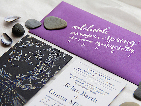
Photo by L&E Photography
Hi, it’s Lauren and Joel from Old Tom Foolery. (Thanks, Nole and Megan, for letting us hijack your oh-so-beautiful site for a guest post.) We’ve been asked to share our story and some wisdom we’ve picked up over the years. We can definitely share our story — not sure about the wisdom part though since we still feel like we’re learning new stuff every day, but we’ll give it a shot.
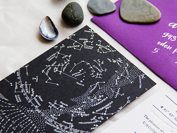
Photo by L&E Photography
We met in grad school for advertising in Richmond, Virginia in 2003. Lauren was studying art direction and Joel was studying copywriting. While we were dating, we shopped at a great independent card shop in Richmond called Mongrel which opened our eyes to the possibility of truly fun, original cards being created by small makers. Seeing their cards made us realize that making greeting cards was a lot like making ads and it planted the seed that, hey, maybe we could do this greeting card thing, too.
Once we graduated, we worked as a creative team together at an ad agency in Seattle and then eventually moved to San Francisco where we worked at separate agencies. Advertising was both fun and incredibly stressful, and we increasingly had the itch to work for ourselves. In 2007, just after Joel had quit his agency job, Lauren serendipitously found a letterpress on Craigslist. We figured it was a sign, so we bought it, took some letterpress classes at the San Francisco Center for the Book, and Old Tom Foolery was born.
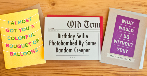
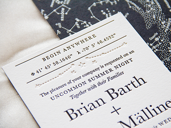
Photo by Old Tom Foolery
From the beginning, we knew we wanted our cards to have a unique look and funny tone using premium materials and printing techniques, and appeal to both men and women. So we came up with the tagline, “Unsappy, uncrappy cards and curiosities†to convey what Old Tom Foolery is all about. That line has guided every product we’ve made since.
We officially launched OTF at the National Stationery Show in May of 2008 with 52 Footnotes Collection cards that we printed in our kitchen. We got enough orders that first year at NSS to validate our efforts and our business just kind of snowballed from there.
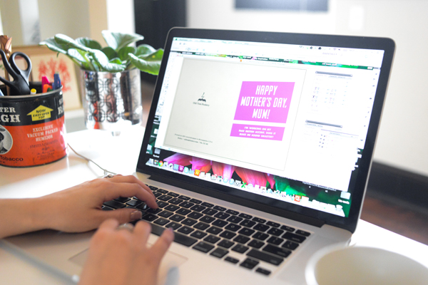
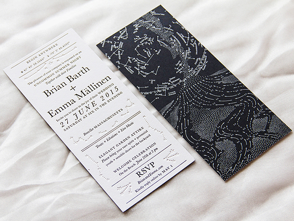
Photo by Old Tom Foolery
As we got into more and more stores, it didn’t take long for us to realize that printing was a huge time commitment and we should leave it to the pros so we could focus on writing, designing, and just generally running our business. We both gradually went from working part-time on OTF to full-time. (Lauren went full-time first in 2010 and Joel followed in 2012).
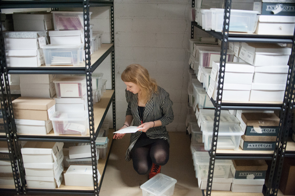
Photo by L&E Photography
We’ve also moved our office twice: first in 2010, from the kitchen of our San Francisco apartment to the basement of our Minneapolis house after we got married; and second in 2013, from our house to a shiny new office space in the fantastic Eat Street neighborhood in Minneapolis. This new space is perfect for our needs as we’re able to keep our inventory in the basement and still have office space and a retail shop on the main floor. Our team has grown from just the two of us to include a full-time accounts coordinator (Kelli), office/project coordinator (Melanie), shipping/assembly assistant (Emma), as well as three regular part-time employees (Tim, Liz, and Claire), and an official mascot (Ryder the dog). Pardon our French, but our employees effing rule. We couldn’t do it without them.
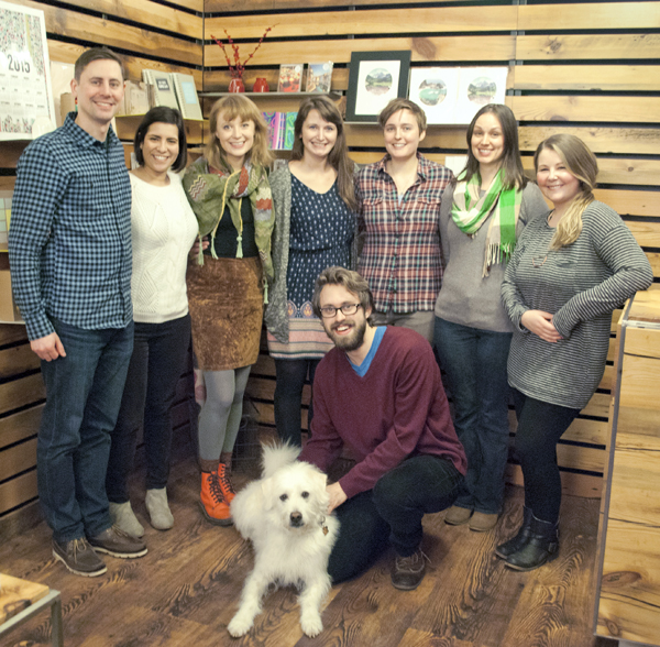
Photo by Old Tom Foolery
As far as our creative process goes, we’re always jotting down ideas on Post-it Notes, iPhones, or journals so when it’s time to do a new release, we can start by looking through those ideas to see of any of them hold up. If so, we’ll brainstorm separately about ways to develop the idea and then come together to talk about our favorites. Generally, Lauren will work on designs and Joel will work on writing lines, but there’s a lot of overlap in these roles. It’s funny—people always ask us, “Do you guys just sit around with a bottle of wine and think up funny stuff?”. That couldn’t be further from the truth, actually. It’s hard work. Fun, but hard. We really strive to create cards that other people haven’t already done, and it’s difficult because there’s a lot of great stuff out there. (I mean, really, how many different ways are there to say “Happy Birthday”?!) We’ll write hundreds of lines and come up with hundreds of different design variations before we land on 10-20 cards that we feel are worth printing.
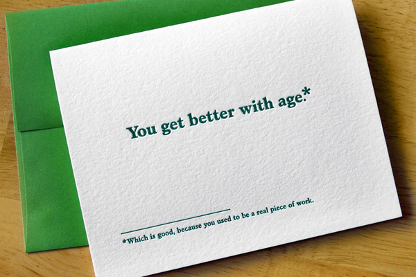
Photo by Old Tom Foolery
In summary, our advice for new stationers is:
1) Quit your job if you hate it, but be prepared to supplement the income from your new stationery business for at least a few years.
2) Start with a unique point of view and stay true to it.
3) Launch your stationery line at the NSS. It’s the best way to get noticed.
4) Marry your business partner.
5) Move to Minneapolis—it’s better than you think.
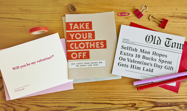
Photo by Old Tom Foolery
Interested in participating in the Behind the Stationery column? Reach out to Megan at [email protected].