Elegant Copper Foil Wedding Invitations on Handmade Paper

What better item to choose for your “something old and something new” than gorgeous invitations inspired by your own parents’ wedding invitations? These copper foil wedding invitations on handmade paper from Alex of Al Stampa are an homage to the bride’s mother’s invitation from the 1970s. With elegant copper foil text on handmade paper with delicate torn edges, not to mention STUNNING emerald green envelopes, these invitations are a fresh take on a vintage beauty!
Copper Foil Wedding Invitations on Handmade Paper by Al Stampa

From Alex: Janice and Spencer have one of those love stories that you only see in the movies. In love in high school, separated for almost 10 years, only to then fall in love again years later when a friend organized them to be at the same New Years party.

Copper Foil Wedding Invitations on Handmade Paper by Al Stampa

Their wedding was set in a lavender field in Wiscasset, Maine at the stunning Marianmade Farms. To say it was a beautiful wedding is an understatement. Janice put her vision into every aspect of the wedding, and they both created magical moments all throughout the evening. Some examples include handmade paper florals, a watercolor backdrop for a photo booth, all of which came back to the colors we used in the invitation; lavender, copper, and emerald.

Copper Foil Wedding Invitations on Handmade Paper by Al Stampa

The most spectacular part of this suite was the inspiration. The bride wanted to emulate her parent’s invitation from 1973. The simplicity of this invitation, with the handmade paper, copper text, and hand torn edges, is something you don’t see too often nowadays and was an honor to use as part of this couple’s story.

Copper Foil Wedding Invitations on Handmade Paper by Al StampaCopper Foil Wedding Invitations on Handmade Paper by Al StampaI worked with Signora e Mare and ordered their ecru handmade paper, which had a subtle lavender color to it and was the perfect choice for this suite. Because the couple loves a certain modernity to their life and their special day, I opted for a modern font and added an illustration of the camper van that is situated on Marianmade Farm, in front of which they took their wedding portraits.

Copper Foil Wedding Invitations on Handmade Paper by Al Stampa

I foil stamped the invitation in the copper color, which was a beautiful contrast to the lavender hued paper. The RSVP card was our all time favorite, a small, almost circular tearing of the paper, with a matching envelope.

Copper Foil Wedding Invitations on Handmade Paper by Al Stampa

Copper Foil Wedding Invitations on Handmade Paper by Al Stampa

For the envelope, I scoured the internet for the perfect emerald color that the bride had envisioned. I found the most beautiful soft-touch emerald envelopes called Plike, and foil printed their return address stamp on the back. The finishing touch? Sarah Vaughan Stamps to throw in another rich color to the mix, and to nod to the couple’s love of jazz music.

Copper Foil Wedding Invitations on Handmade Paper by Al Stampa

Thanks Alex!

Design, printing, and styling: Al Stampa

Handmade paper: Signora e Mare

Envelopes: Plike Envelopes

Check out the Designer Rolodex for more tal­ented wed­ding invi­ta­tion design­ers and the real invi­ta­tions gallery for more wedding invitation ideas!

Photo Credits: Roland Kielman and Alex Labriola

Calligraphy Inspiration: Ruth Jahja of Seniman Calligraphy

Hey everyone! I’m excited to share some pretty lettering work with you today. What I love in the paper world is when you spot wedding invitation suites that don’t look quite like everyone else’s. And I’m a big fan of seeing calligraphy in places beyond paper. Because why not dress up a celebration with pretty lettering in other places, too?! So here’s a look into the lettering work of Ruth Jahja of Seniman Calligraphy. Let’s hear what Ruth has to share about her experiences as a calligrapher! â€“ Jen

Calligraphy Inspiration: Ruth Jahja of Seniman Calligraphy

Calligraphy Inspiration: Ruth Jahja of Seniman Calligraphy

Photo Credits: Tenth and Grace

Ruth Jahja is Indonesian and she came to the United States for her bachelor’s degree in Interior Architecture. “Drawing and painting have been something I’ved loved to do since I was a kid but I decided to pursue something a bit more stable for my degree,” she shares. After working for a few years as an interior designer in Los Angeles, she stumbled on calligraphy while trying to find a new hobby. It turned out to be even more fun than she expected, and she wanted practice, so she decided to set up an Instagram account and Etsy shop to make a little extra pocket money. One thing led to another, and after a couple of photographers took a leap of faith and collaborated with her on some styled shoots, more work followed. “Almost a year since I posted my very first Instagram photo, I decided to do this full time and it’s been an adventure ever since,” shares Ruth.

Calligraphy Inspiration: Ruth Jahja of Seniman Calligraphy

Photo Credit: Tenth and Grace

Where does the name come from? Ruth shares: Seniman means artists and craftsmen in Indonesian, so it’s my little homage to my heritage and a commitment for what kind of work I want to produce.

Calligraphy Inspiration: Ruth Jahja of Seniman Calligraphy

Photo Credit: Diane McGregor Photography

What a wow statement this giant menu board makes in a reception!

Calligraphy Inspiration: Ruth Jahja of Seniman Calligraphy

Ruth shares that she prefers a strong contrast between the thick down-stroke and the delicate up-stroke, the bold lines and the bouncy flourishes. “I do notice my writing evolves as my ability to control the medium improves over time,” notes Ruth. “I’m able to work with strokes and curves that feel comfortable and natural to me instead of trying to copy others’ writing.”

Calligraphy Inspiration: Ruth Jahja of Seniman Calligraphy

“I’m a huge sucker for letterpress and handmade paper,” says Ruth. (Me too!)

Calligraphy Inspiration: Ruth Jahja of Seniman Calligraphy

Photo Credit: Tenth and Grace

“I love working on non-paper medium — from glass/mirror, tile, natural stone, ribbon, and wood,” says Ruth. This bottle of bubbly with her hand lettering is definitely my fave.

Calligraphy Inspiration: Ruth Jahja of Seniman Calligraphy

Photo Credit: Ether and Smith

Many thanks to Ruth for sharing a sweet peek into her lettering work and work process!

Photo Credits: Seniman Calligraphy except where noted

Wedding Stationery Inspiration: Creative Wedding Menu Ideas

Forget boring menus! The menu is a key element of any wedding reception, from informal picnic-inspired fêtes to formal black tie affairs. Today we’re rounding up a few creative wedding menu ideas, from glamorous mirrors to tropical leaves! – Annie

Wedding Stationery Inspiration: Creative Wedding Menu Ideas

White calligraphy on a mirror adds instant glamour. | Photography: Mi Belle Photographers, Event Planning: The Green Ribbon Party Planning Co. via Martha Stewart Weddings

Wedding Stationery Inspiration: Creative Wedding Menu Ideas

How amazing is this combination of acrylic and moss?! | Photography: Dani Stephenson, Floral & Event Design: Jennifer Joyce Design, Calligraphy: Saffron Avenue via Dani Stephenson

Wedding Stationery Inspiration: Creative Wedding Menu Ideas

Love these cheerful illustrations. | Photography: Ned Jackson Photography, Menus: Happy Menocal via The Knot

Wedding Stationery Inspiration: Creative Wedding Menu Ideas

Play with texture. | Photography: Erin McGinn, Floral & Event Design: Greenlion Design, Calligraphy: Heather Belle Ink via Style Me Pretty

Wedding Stationery Inspiration: Creative Wedding Menu Ideas

This wooden menu doubles as decor. | Photography: Onelove Photography, Floral & Event Design: JL Designs, Calligraphy: Tessa Shane via Hey Wedding Lady

Wedding Stationery Inspiration: Creative Wedding Menu Ideas

Draw inspiration from your surroundings. Gold calligraphy on tropical leaves, anyone? | Photography: Brandon Kidd Photography, Wedding Planner: LVL Weddings & Events, Floral Design: Wildheart, Calligraphy: Miss B Calligraphy via 100 Layer Cake

Wedding Stationery Inspiration: Creative Wedding Menu Ideas

Keep it classic with elegant calligraphy and textured paper. | Photography:Christina Lilly, Paper Goods: Claire Hudson with Pennys & Stamps via Green Wedding Shoes

Wedding Stationery Inspiration: Creative Wedding Menu Ideas

Love the mix of illustrations and calligraphy. | Photography: Sposto Photography,  Coordination: Green Apple Event Co, Calligraphy: Luminous Lines via Green Wedding Shoes

Wedding Stationery Inspiration: Creative Wedding Menu Ideas

Doing double duty as a menu and bread bag. | Photography:Pat Furey via Green Wedding Shoes

Wedding Stationery Inspiration: Creative Wedding Menu Ideas

Add color with watercolor frames. | Photography: Jen Huang, Florals & Styling: Poppies & Posies, Menus: Paperfinger via Paperfinger

Wedding Stationery Inspiration: Creative Wedding Menu Ideas

Who needs dozens of menus when you can have one giant menu (with gorgeous calligraphy, might I add)? | Photography: Katie Stoops Photography, Event Planning: Bash, Please, Calligraphy: A Fabulous Fete via Studio DIY

Wedding Stationery Inspiration: Creative Wedding Menu Ideas

No flying menus here! | Photography: Plum & Oak, Venue & Coordination: Quail Haven Farm, Calligraphy: Elli via Ruffled

p.s. More wedding menu inspiration right here!

Stationery A-Z: Father’s Day Cards

With the recent celebration of Mother’s Day (did you see our round ups here and here?), it’s high time to start planning Father’s Day. Whether you are celebrating your grandpa, the father of your children or your own dad, there is a bevy of options to honor their love and dedication. While everyone loves a homemade meal, the gift options for men are often limited to sports, business attire or drinking. If the men in your life aren’t golfers or whiskey drinkers, we’ve collected a range of Father’s Day greeting cards that don’t feature either – just thoughtful messages of appreciation. Add your own handwritten note of affection and it will surely be a day that dad won’t forget. – Shauna

Father's Day Cards

From top right:

1. Perfect for the father who loves puns, but hates that you never took your job of mowing the lawn quite as seriously as he would have liked. From Wild Hart Paper.

2. For the dad who can’t keep his wanted (and unwanted) advice to himself (see: ’emails yet another newspaper article’). From Egg Press .

3. For the rebel dad (and MJ fan) comes this sheep illustration from Lark & Raven.

4. For the pop you’ve always looked up to (this E. Frances Paper design is also a good choice for your husband or partner if your kids are too little to write their own greeting).

5. For the father who loved the 80’s (and still has the fanny pack to prove it) from Parrot Design Studio.

6. For any papa who deserves a little extra appreciation this father’s day. From Moglea.

7. For a brand new father who needs a little extra love to make up for those sleepless nights. From Smock Paper.

8. For your number one paternal figure (who appreciates the finer things). From Sugar Paper.

9. For your ever-youthful, cool pops who refuses to part with his leather jacket or combat boots. From Noteworthy Paper & Press.

10. For the master of #dadjokes. From Snow & Graham.

Behind the Stationery: Bunny Bear Press

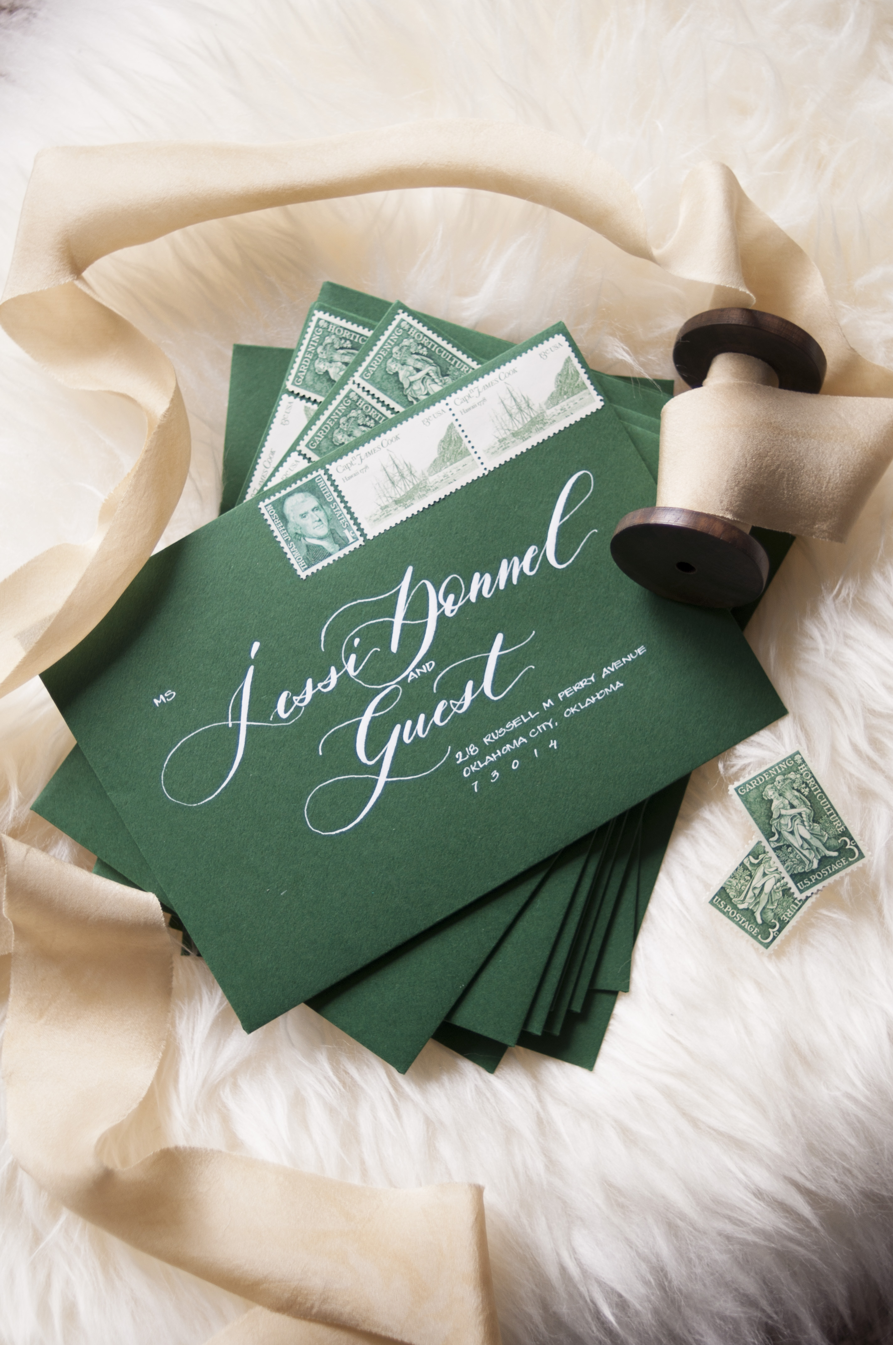
On our next installment of Behind the Stationery, we’re bringing you to Bunny Bear Press in the great state of Washington! For Adina, taking great strides to pivot her stationery business came from a rediscovery of herself and her business. From discontinuing her greeting card line to dyeing her hair purple, Adina divulges us in the ways she has changed her business perspective, time management, and even the way she decides what to design. Here to share about her journey, design process, and favorite resources, here’s Adina! –Megan Soh

Behind the Stationery: Bunny Bear Press

From Adina: Here is the long-short version of how my first line came to be and why I decided to kill it. I fell in love with letterpress printing back in college. After the job market crash in 2008 and the birth of my first daughter in 2009, I decided I wanted to work from home and become a letterpress printer. I bought a tiny toy press and did a ton of playing.

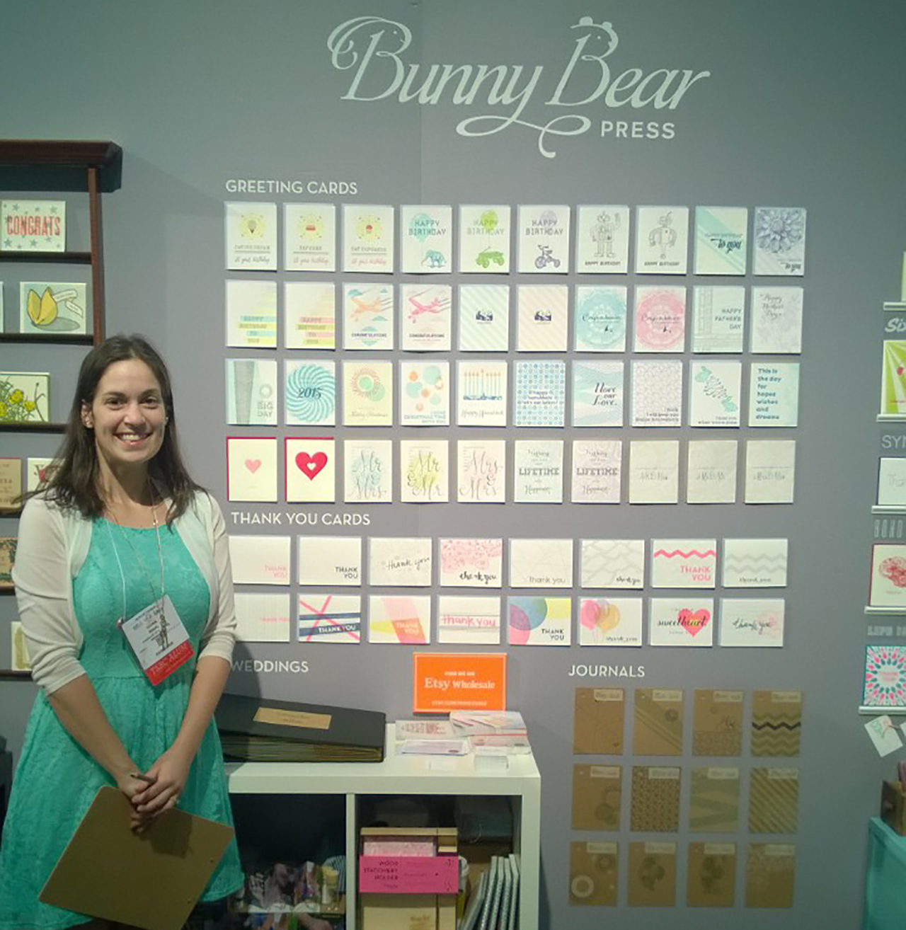
In 2013 my husband, my parents, and I drove my (then) 2 kids down to Portland to buy my first big ass letterpress machine. Six short months later, I had signed up to do the 2014 National Stationery Show in a HUGE group booth with the Ladies of Letterpress.

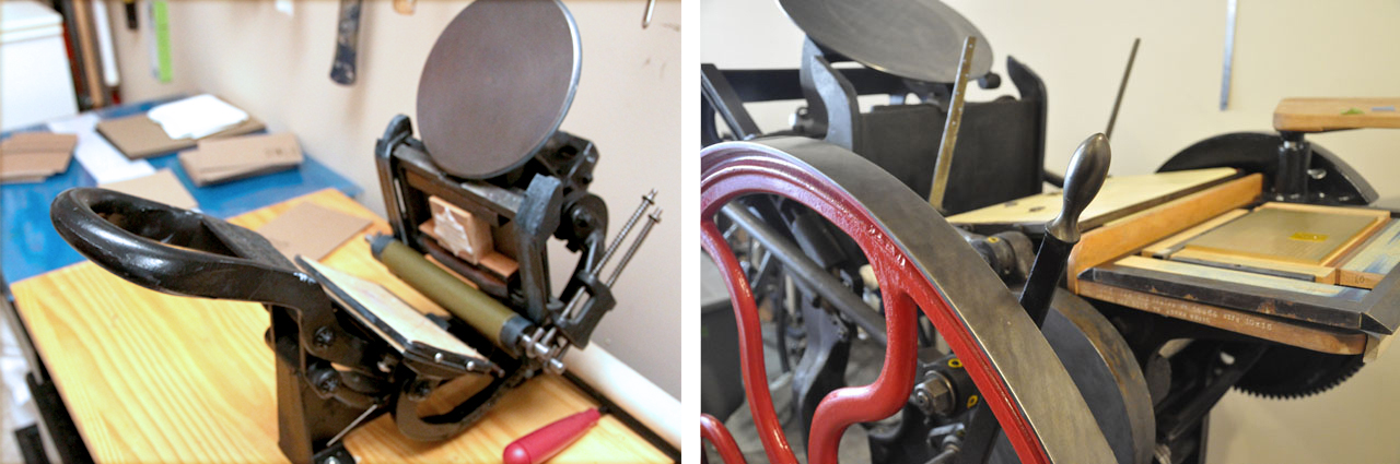
Left: Penny, my 45 pound Kelsey 3×5 printing press, Right: Ruby, my 1,800 pound Chandler & Price 10 x 15 printing press

My professional background had been in print design, but I had only ever worked for other brands. While creating work for my debut launch I was exploring and trying finding my style and visual voice for the first time. Looking back, I think I ultimately played it safe with generic wording on my cards, beautiful found clip artwork, mixed with some minimal original illustrations.

I had no idea what I was doing. I didn’t really know much about how to define my target market, or really which direction I wanted to take my brand in. It was very much a trial by fire and I dove in head first. I found Tradeshow Bootcamp, created a huge amount of work in 6 short months, and headed off to NYC for the first time to the National Stationery Show. I wrote some orders, made some contacts, learned a TON, went to the incredible OSBP Paper Party, and came home pregnant with baby #3.

During the next 2 years I went through a transformation. My business wasn’t growing, my son wasn’t sleeping, I was becoming more and more sleep deprived and feeling more and more lost about what to do about my business.

Everything changed for me when I found podcasts and rediscovered a desire to create hand lettering. I was big into the seanwes podcast, and Confessions of a Female Entrepreneur. I was introduced to marketing and business strategies, I learned about target markets, crafting stories, and finding my WHY. Through all the brand soul searching I found something I didn’t expect. I realized that not only was my brand middle of the road, so was I. I had played it safe (in life and in business) and in doing so, not only was I not turning people off, I wasn’t turning people on either. My few close true friends knew the real me, but to everyone else I felt as though I was a hollow facade.

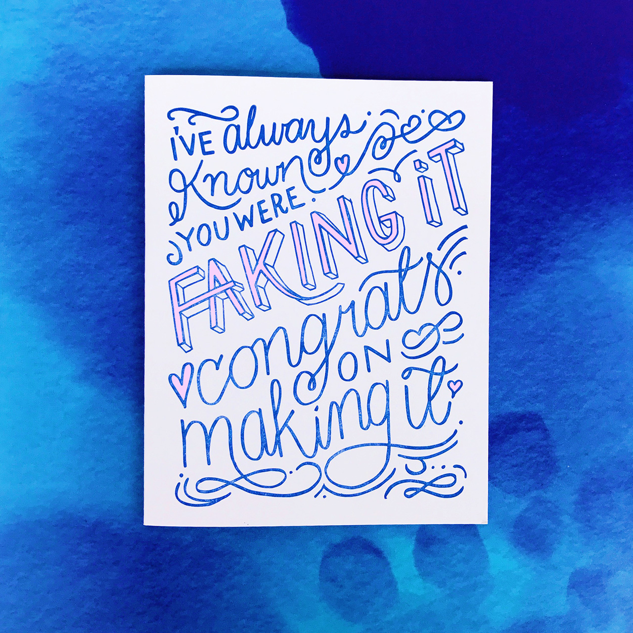
So I did what anyone would do while going through an existential crisis: I dyed my hair purple, pulled away the barriers between myself and the way I present myself to others, pursued my consuming desire to draw letters, and began to express my inner monologue through my card line and blog.
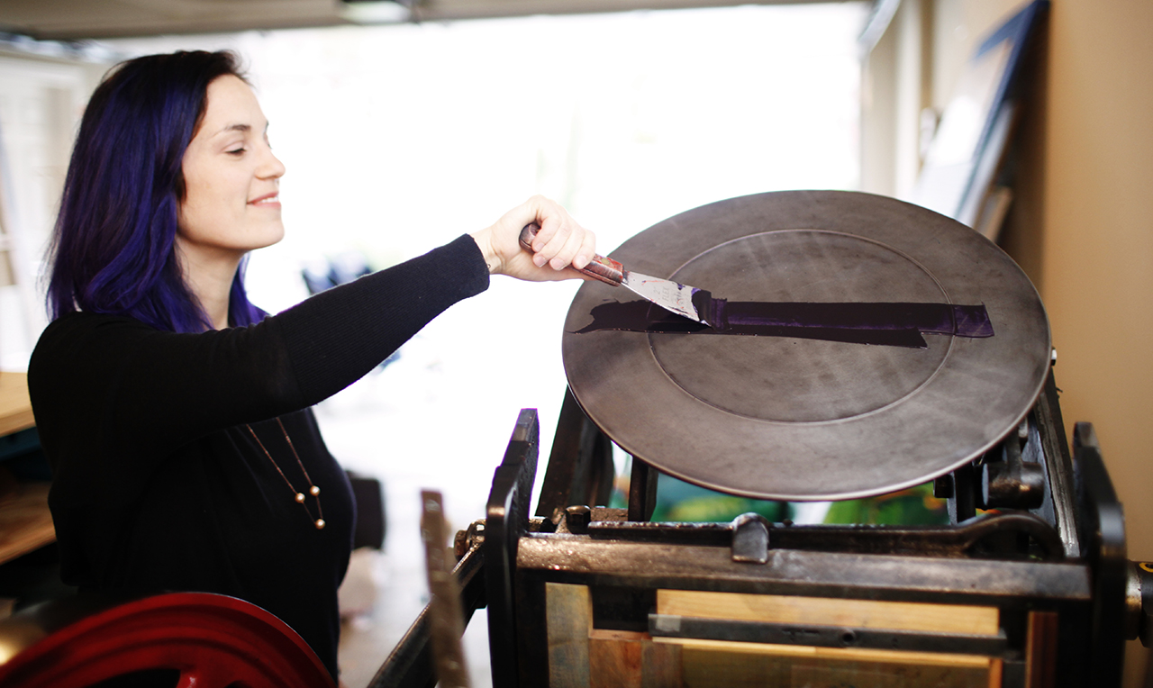
Photo by Belathée

It was during these 2 years that I determined that my “safe designs” weren’t serving me OR the people I was trying to help. So I killed them all.

I took on a 365 lettering challenge to force myself to create and not to become so attached to each of my drawings. In doing this I helped to push aside my perfectionism and instead focus on creating a large body of work. The natural result of doing so many was that I improved my technique. And in letting go of a little bit of my perfectionism, I had so many lettering pieces that I felt were good enough as opposed to 1 or 2 that I could never finish because they were never quite right. I know looking into the future I will be a better letterer for it, and with the work I am making now I can help my target audience today and not in some imaginary distant future.

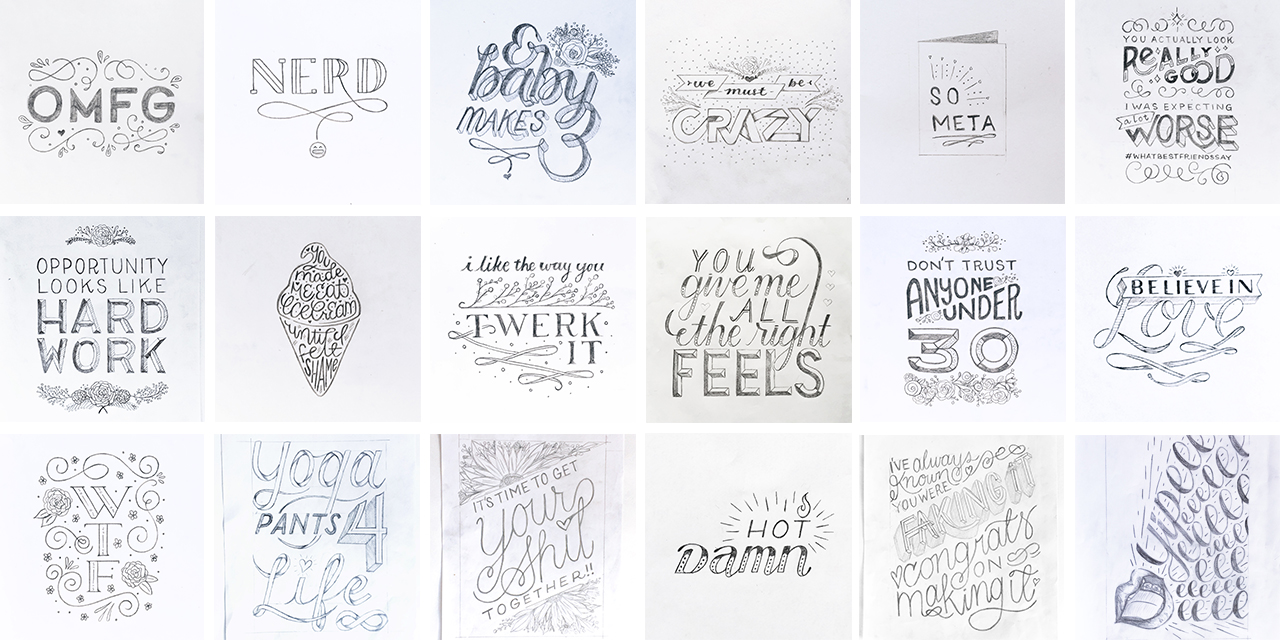
I didn’t make 365 lettering pieces but I did do well over 80 and that was 80 more than I had ever done before. I learned that, in the doing, my creation process is very cyclical. I work in batches like on a production line. So first I sketch a ton to pieces, then I ink them all, scan them into the computer and send away for a large volume of plates at once. (This also helps me save on shipping costs and I never sit on designs waiting to fill up an order.) Once my plates arrive I can now print them in batches.

In letterpress printing you can only print one color at a time so I will print all the cards with pink, for example, before moving on to the next. This allows me to maximize my press time and to minimize the number of times I switch colors.

My original line was a whopping 27 core colors and some cards were as many as 6 colors all on their own. I learned really fast that when you needed to print a ton of cards that were similar colors it is easier to get a large volume of them done, but when having to reprint just one card in those 6 colors suddenly you had a huge problem. The amount of labor required no longer justified the cost of that $5 card (retail and even less for wholesale).

Right now my typical day is all over the place, and I wouldn’t recommend my schedule to anyone. Once all of my 3 kids are old enough to be in all day school, I am hopeful things will get more consistent. I wake up between 5 and 6am before my kids get up to write for my blog. This is the time of day where I am my most focused. On the days I start with writing I find that I feel more productive overall than on the days that I don’t.

At 7 am, my husband and I work on getting my kids out the door and to their various schools and daycare. On the 3 days a week my son goes to daycare, I have 2 and a half hours to work before I need to pick my middle daughter up from preschool. It’s in these hours that I will draw, print, or send emails to my list of stores and buyers I would love to work with.

The end of my work day is after the kids go to bed around 8:30pm. During this time I try to finish up on the tasks that didn’t get done during the day. Like I said, I wouldn’t recommend this schedule to anyone. There is always too much to do and not enough time to do it.

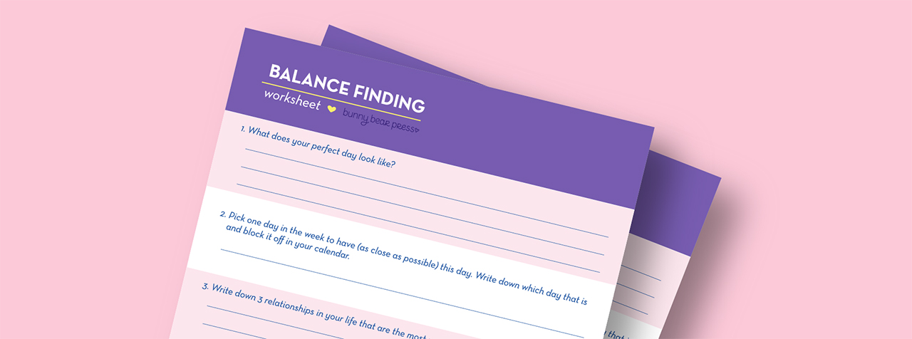
In order to figure out what to focus on in my limited hours, I look at my balance finding worksheet that I filled out for myself (you can read more about this worksheet here). I look at what I goals I set for myself and then try to only focus on the tasks that will get me there. This really helps me cut through the noise of ALL THE THINGS that are screaming for my attention. Right now my team consists of myself and a friend who occasionally helps me with packaging cards. Delegating the packaging production was a huge relief and I don’t know why I waited as long as I did to bring in help there.

If I had to give any advice to my younger self starting this company, it would be to focus on the people you are trying to help. Create something that they will love and be drawn to. In order to create that desire you are also going to turn other people off and that is OK. Don’t try to please everyone because in the end you please no one, not even yourself.

Have fun, be curious and let that curiosity and the fear you feel about doing something unknown be your guiding compass. Fear is something to be embraced because on the other side of that fear are your dreams and if you want them you need to go and get them.

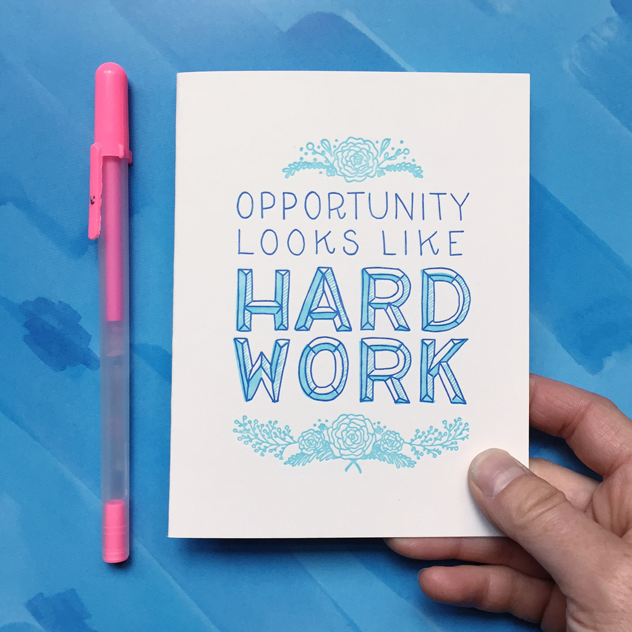
Pushing through my fear and following my curiosity has renewed my passion for paper and making greeting cards. I feel good when I am creating the designs and feel excited once I see them come out of my printing press. Before I began lettering my cards the task of design felt more like a chore, but now I have lists and lists of cards I want to create.

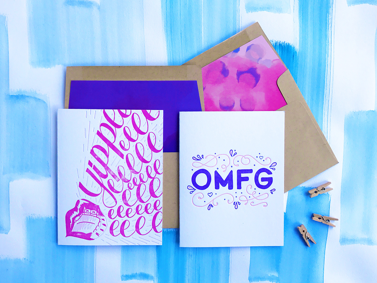
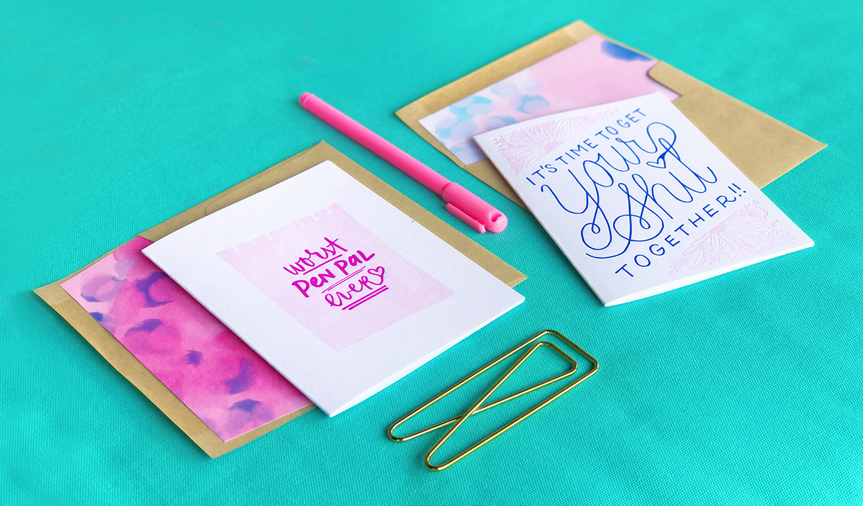
I am really excited about my newest release! Here are some photos from my newest release. The new cards are available wholesale now and will be shipping to my website customers starting June 15th.

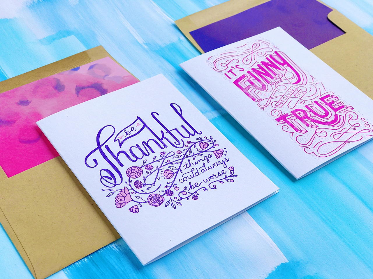
All photos courtesy of Bunny Bear Press except where noted.

Want to be featured? Reach out to Megan at megan[at]ohsobeautifulpaper.com for details.
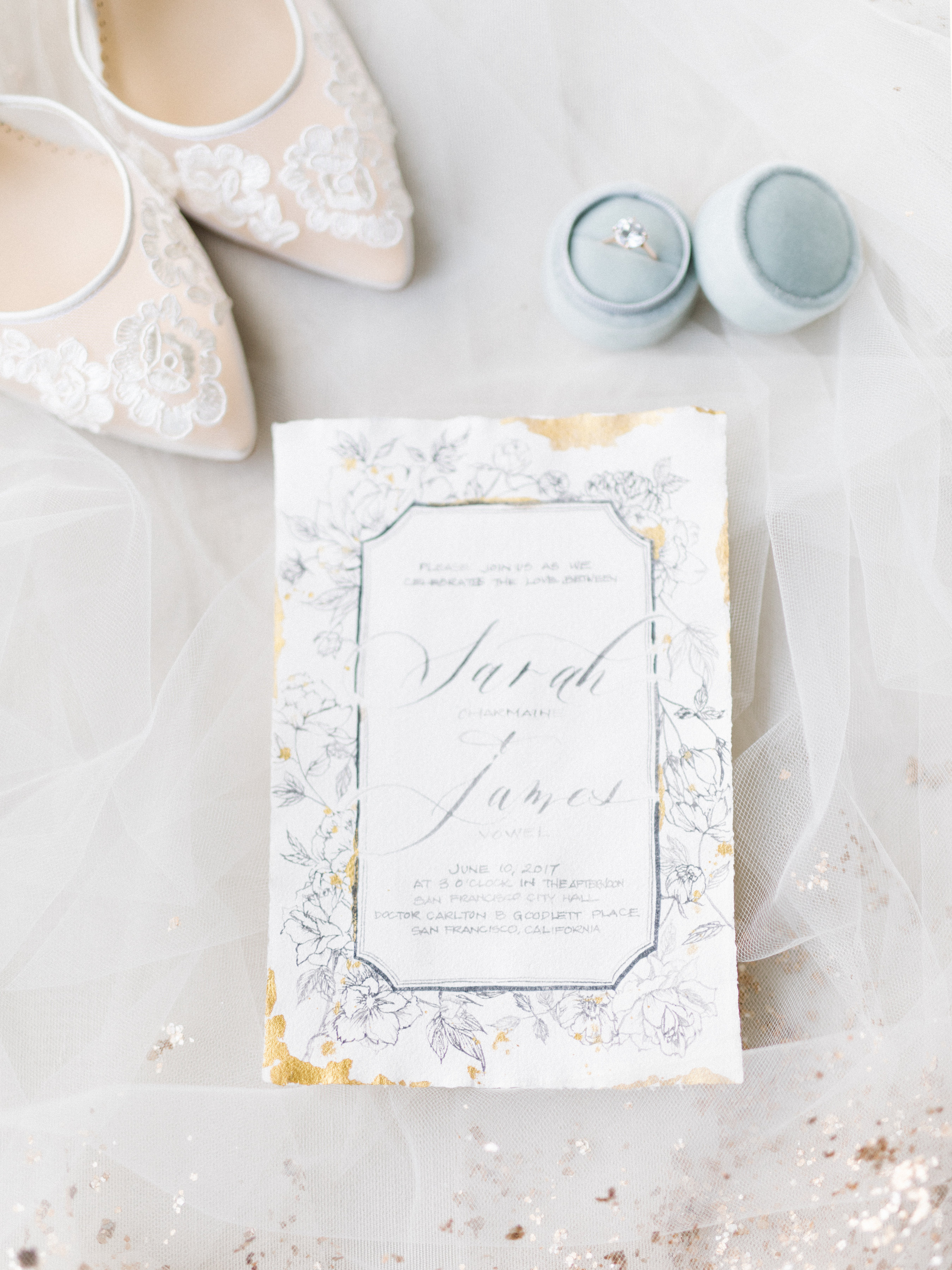
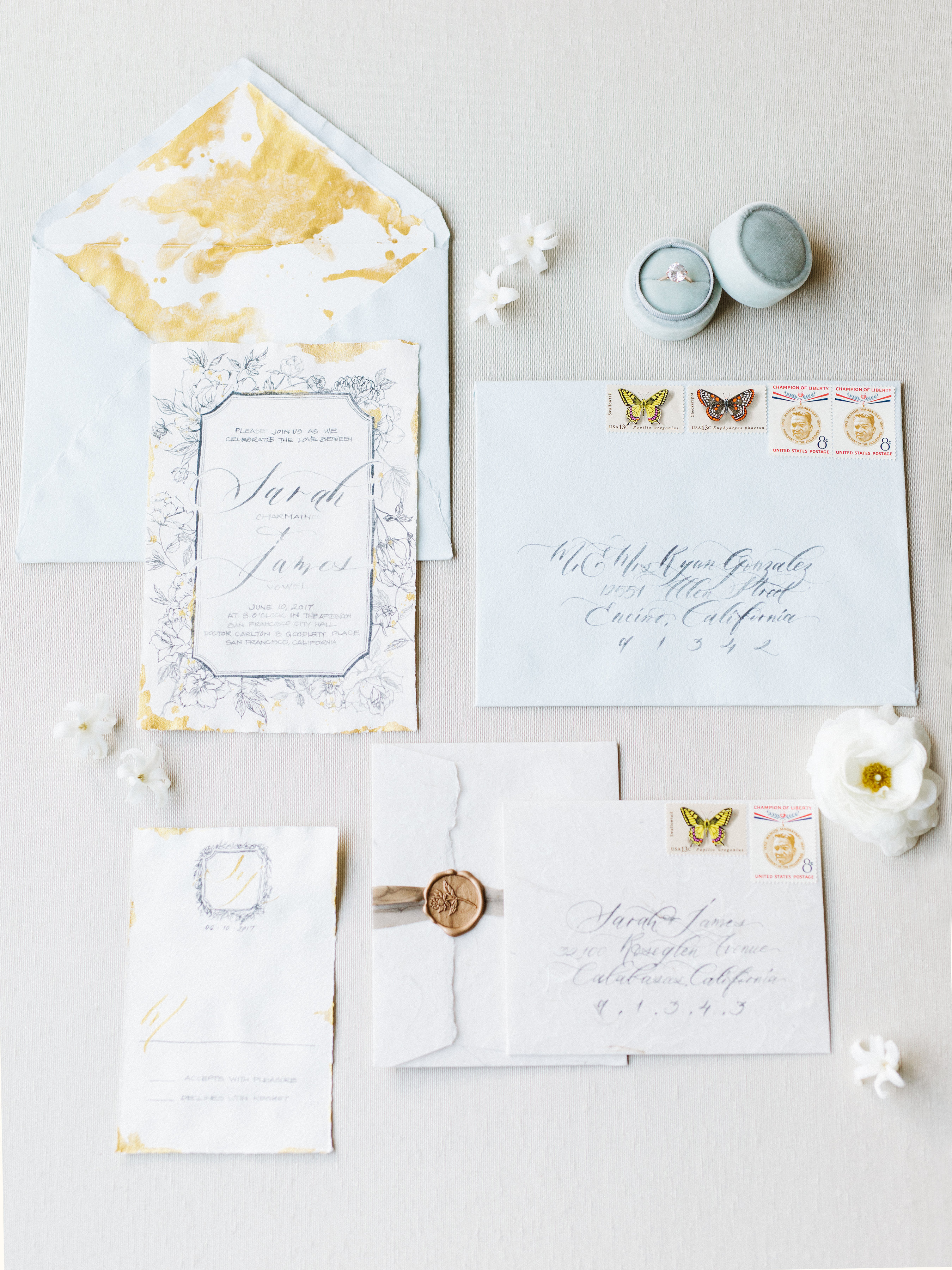