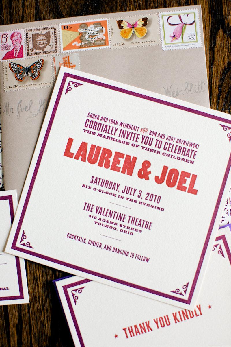
Botanical Prints and Hand Lettering from Karolin Schnoor

Artist Karolin Schnoor recently updated her shop with a bunch of beautiful new screen printed cards, post cards, and art prints.  As usual, I’m loving the combination of Karolin’s illustrations, hand lettering, and botanical design elements.  So pretty!

Karolin-Schnoor-Screenprint-Poster

Karolin-Schnoor-Botanical-Postcard-Set

Karolin-Schnoor-Dove-Postcard

Karolin-Schnoor-Screenprint-Moth-Poster

Karolin-Schnoor-Apple-Screenprinted-Card

You might recognize this set of letterpress note cards featuring Karolin’s illustrations and hand lettering – the cards were printed by Bison Bookbinding and Letterpress and made an appearance at the National Stationery Show!

Karolin-Schnoor-Hand-Lettering-Letterpress-Cards

Karolin-Schnoor-Hand-Lettering-Letterpress-Cards Karolin-Schnoor-Hand-Lettering-Letterpress-Cards

Karolin-Schnoor-Hand-Lettering-Letterpress-Cards

Karolin-Schnoor-Hand-Lettering-Letterpress-Cards Karolin-Schnoor-Hand-Lettering-Letterpress-Cards

Karolin-Schnoor-Hand-Lettering-Letterpress-Cards

So beautiful!  You can check out the full selection of prints and note cards in Karolin’s shop right here!

Photo Credits: Karolin Schnoor

Blue + Copper Invitations for a Hindu Jewish Wedding

Pistachio Press recently printed these amazing wedding invitations for a Hindu/Jewish wedding, and I fell in love the minute I saw them.  The invitations were designed by the bride’s sister, seamlessly blending the cultures of the bride and groom into one complete design.  I love the blue and copper color palette and the use of complementary symbols and both hindu and hebrew text to bring the suite together!

Hindu-Jewish-Wedding-Invitations

From the bride’s sister, Cheena: Our goal was to capture two religions and both the Indian and Jewish cultures in a single invitation.  Essentially, we wanted the invitation to reflect traditional Indian themes, but allow the Jewish cultures to also be reflected. It was a challenge to incorporate (evenly) two very different cultures, but by using similar symbols like the Hamsa Hand and the Jain Ahimsa hand, we were able to help develop a unified design sensibility.

Hindu-Jewish-Wedding-Invitations

I incorporated a Hindi script (a blessing of peace) counter balanced with the Hebrew (a saying about love) as well as the image of the drum (dholak) and peacock feathers, which are traditional for a “Sangeet” invite.  The Shabbat/Shalom prayer as a symbol of the Shabbat service that will take place at the wedding also helped unite the theme.  Since it was hard to find usable Hindi, the text was handwritten and then vectorized so that we could have something to match with the Hebrew saying that we wanted to incorporate.

Hindu-Jewish-Wedding-Invitations

I wanted to incorporate a border that has some level of Western culture (the pattern was created from an ornament in the font Brownstone that pays homage to New York City, which has a deep meaning to the bride and groom), but also created a masking of this pattern in a way that made it very eastern and Indian in some ways.  The invitation is a symbol of the unitying of two cultures with this marriage.  It’s almost the first step the bride and groom have taken to do this aside from overall wedding planning.

Hindu-Jewish-Wedding-Invitations

So stunning!  A big congratulations to the bride and groom – and you can see more of Cheena’s design work right here and beautiful letterpress work from Pistachio Press right here!

*Pistachio Press is a spon­sor of Oh So Beau­ti­ful Paper.  For more on my editorial poli­cies, please click here.

Lauren + Joel’s Old Timey Letterpress Wedding Invitations

I love it when designers get married – I get practically giddy in anticipation of the awesome wedding stationery.  So when Lauren and Joel from Old Tom Foolery got married last summer, I couldn’t wait to see what they came up with for their invitations and save the dates.  The result is an old-timey-meets-classic wedding invitation suite that perfectly suits both Lauren and Joel’s personalities as well as the cool venue where they were married – all with a total sense of fun, fun, and fun.

Old-Tom-Foolery-Red-Purple-Letterpress-Save-the-Dates Old-Tom-Foolery-Red-Purple-Letterpress-Wedding-Invitations

From Lauren and Joel: We wanted the event to feel fun, with a hint of old-timey-ness.  After all, we were trying to convince friends and family from around the country to come to Toledo, Ohio. (Not a destination on everyone’s ideal vacation list.)  We tried to get people excited with an oversized theater poster-type save the date.  This is really where we had our fun with the printed pieces.  The save the dates were then followed up with a more toned-down invitation that still retained the look and feel of the first piece.  We kept the look going with ceremony programs, thank you notes, place cards, and cookie jar labels for my mom’s famous homemade cookies.

Old-Tom-Foolery-Red-Purple-Classic-Letterpress-Wedding-Invitations Old-Tom-Foolery-Purple-Red-RSVP-Envelope-Vintage-Stamps

The invites were printed by Norman Clayton of Classic Letterpress in Emeryville, CA on Crane’s Lettra and the envelopes were from Paper Source.  We also tried to find vintage stamps that fit our personality, like a funny guy with a mustache, a printing press, Ohio stamps, and a retro film stamp since we got married at an historic theater.  Tor Weeks did the hand lettering on the outside of our envelopes (she is also the designer of our Typestache poster).

Old-Tom-Foolery-Wedding-Lauren-Joel-Ceremony Old-Tom-Foolery-Wedding-Lauren-Joel

Old-Tom-Foolery-Wedding-Bouquet Old-Tom-Foolery-Red-Orange-Purple-Bouquet

Old-Tom-Foolery-Wedding-Lauren-Joel-Seating-Cards Old-Tom-Foolery-Wedding-Lauren-Joel-Cake

Old-Tom-Foolery-Wedding-Lauren-Joel-Birch-Centerpiece Old-Tom-Foolery-Wedding-Lauren-Joel-Reception-Decor

The whole look of our event was based on the colors and vibe of two things: The Dahlia Dell in Golden Gate Park, which we used to walk to when we lived in San Francisco, and the gigantic mural of historic performers at the Valentine Theatre, where we were married.  We pulled rich magenta and plum colors from the garden and mural and accented them with a variety of reds, oranges, greens, and neutral browns.  But the best part of the night was really the awesome Motown band we brought in from Detroit.

Old-Tom-Foolery-Lauren-Joel-Wedding-Venue Old-Tom-Foolery-Lauren-Joel-Wedding-Motown-Band

Old-Tom-Foolery-Lauren-Joel-Wedding

So cute!  Congratulations you guys!  For more awesomeness from Lauren and Joel, check out Old Tom Foolery right here!

Photo Credits: Aruna B. Photography


National Stationery Show 2011 – Part 12

Whew!  With more than 90 booths covered from this year’s National Stationery Show, this is the final post for this year’s show!  I’m ready for a nice long nap at this point, but first let’s get to the good stuff.  First up, Portland-based Oblation Papers and Press, with an industrial-meets-vintage booth design and a collection of classic and clean letterpress cards, invitations, calendars and notebooks.

Letterpress advent calendars – such a cute idea!

My husband would looove these architecture cards…

Oblation Papers & Press

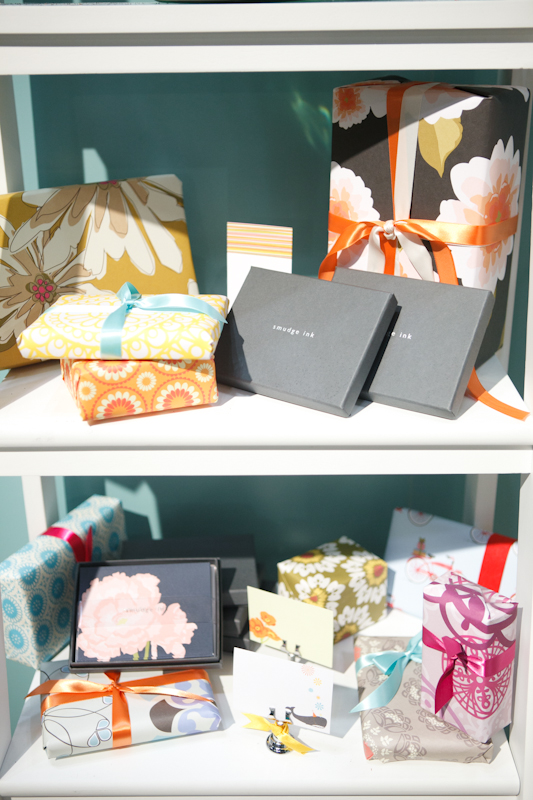
The collection over at Someday Designs is seriously amazing – not only are the letterpress cards seriously adorable, but they’re also hand watercolor painted one by one.  The result is a delicate card that is both completely unique and entirely hand crafted.

Someday Designs

Lots and lots of super colorful stationery over at the Kelp Designs booth – pretty and eco-friendly at the same time!  In my opinion, Katie from Kelp Designs is pretty much superwoman; not only did she put together a fabulous booth for the Stationery Show, but she also organized Tradeshow Bootcamp (to help new trade show exhibitors) and exhibited at 8 months pregnant.  Ah-mazing.

Love those cardboard clipboards!

Kelp Designs

Julie from Up Up Creative made her trade show debut this year, with a super colorful (hello orange!) booth and modern collection of note cards, calendars, gift wrap, and artwork.

Love this color wheel alphabet print!

Up Up Creative

Like the Ladies of Letterpress booth, the Let {Her} Press booth features multiple exhibitors – this year it was Paper Stories, Paper Parasol Press, Robin Beth, and Lucky Bee Press.

Paper Stories

Paper Parasol Press

Robin Beth

Lucky Bee Press

So much color and pretty paper at Envelopments – and a brand new lookbook showcasing some of Envelopments’ custom wedding, baby, and social stationery designs.


Envelopments

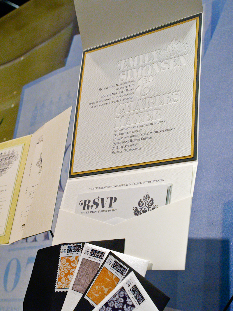
At Crane & Co. this year, I got to browse through the new wedding album, check out some of the new social stationery designs, and look at tons of new holiday cards and designs.

Loving the crisp and modern combination of red and white in these two sets of engraved social stationery…

And of course, lots and lots of holiday cards…

Crane & Co. usually offers a fun demonstration in its booth – this year it was the custom monogram process.  I chose a classic swirly monogram for myself…


For a little something special, this year the Crane & Co. booth had these stunning window displays – just like fancy New York department stores!  So stunning…

Crane & Co.

That’s it folks!  I hope you enjoyed the recaps from this year’s National Stationery Show!  If you missed any of the last eleven posts or want to check out the booths from last year, you can see all of my stationery show coverage from the last three years right here!

Photo Credits: Nole Garey for Oh So Beautiful Paper

*Envelopments is a spon­sor of Oh So Beau­ti­ful Paper.  For more on my edi­to­r­ial poli­cies, please click here.


National Stationery Show 2011 – Part 10

It’s time for another installment of our National Stationery Show coverage!  First up for today, Kathryn from Blackbird Letterpress, with more of her beautiful die cut greeting cards – including a new bee design for this year and a “missing u” note card that would be perfect for anyone with a far-away loved one.

Blackbird Letterpress

Allison from Igloo Letterpress is always coming up with new and creative applications for her designs – from pull out letterpress greeting cards to fun die cut cards.   This year Allison debuted a set of notebooks inspired by brownstone architecture – line up each design for your own little neighborhood!

Igloo Letterpress

So many pretty things over at the Wiley Valentine booth!  From new greeting card designs to wedding invitation albums and baby stationery, these ladies have been keeping busy!

Wiley Valentine

Tina from Joie Studio made her Stationery Show debut this year, with a booth full of letterpress greeting cards, wedding invitations, and pinwheel party accessories.  I’m loving the fruit note cards below – so cute!

Joie Studio

Brad from Maginating always has the best collection of greeting cards – the bacon and egg card below is still one of my all-time favorites, but I’m loving the new perfect match and cheer up cards, too.

Maginating

The ladies from Sugarcube Press had an adorable and ruffle-filled booth with tons of pretty stationery – calendars, greeting cards, coasters, bookplates, oh my!

Sugarcube Press

Color made a return to the Stationery Show in a big way this year and was very much in effect at the Smudge Ink booth, with bold patterned gift wrap and calendars, brightly colored note cards, and imprintable party invitations.

Smudge Ink

Speaking of color – the ladies of Two Trick Pony are known for their colorful screen printed note cards, wedding invitations, and calendars.  I love the deep, saturated color of screen printing!

Two Trick Pony

Of course, no trip to the Stationery Show would be complete without a trip to the Old Tom Foolery booth.  Lauren and Joel are guaranteed to put a smile on your face with these hilarious cards.

Old Tom Foolery

Only a couple more posts from the National Stationery Show to go!  I’ll be back tomorrow with more coverage from the show.

Photo Credits: Brian Tropiano Photography for Oh So Beautiful Paper; please ask permission before reposting.

*Wiley Valentine is a spon­sor of Oh So Beau­ti­ful Paper.  For more on my edi­to­r­ial poli­cies, please click here.