Circus Sideshow-Inspired Baby Shower Invitations

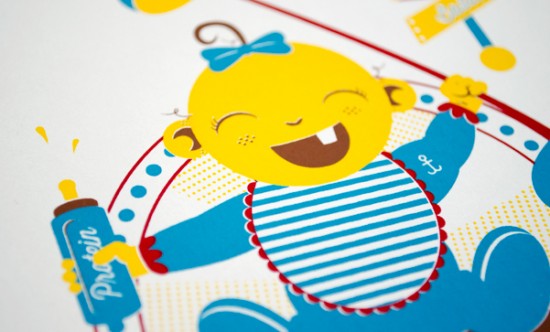
I definitely have babies on the brain these days, and it’s always nice to see parents do something a little unusual and fun for their baby-related stationery, from shower invitations to birth announcements.  We’ve seen plenty of circus-inspired baby shower invitations, but I love this non-traditional interpretation from designer Tommy Perez for his own baby shower invitations – sideshow babies!

Circus Sideshow Baby Shower Invitations by Tommy Perez via Oh So Beautiful Paper (15)

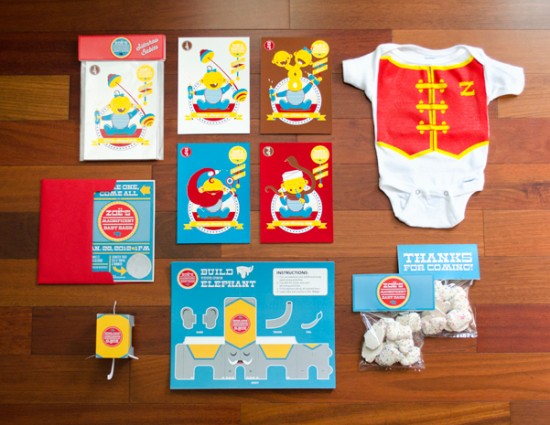
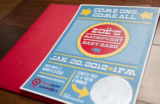
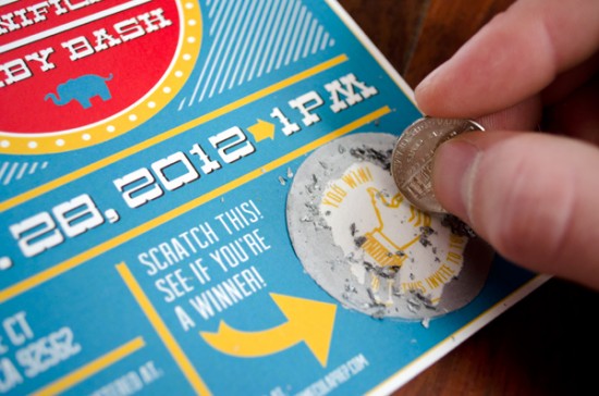
From Tommy: To celebrate our little Zoë’s arrival, my wife and I decided to have a circus-themed baby shower – Zoë’s Magnificent Baby Bash.  The invitations were designed with a scratch-off detail, giving the invitee a chance at winning a fun prize!  The invitations were digitally printed on French Poptone “Whip Cream” 65 lb cover weight paper.

Circus Sideshow Baby Shower Invitations by Tommy Perez via Oh So Beautiful Paper (5)

Circus Sideshow Baby Shower Invitations by Tommy Perez via Oh So Beautiful Paper (1)

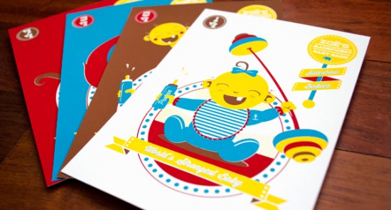
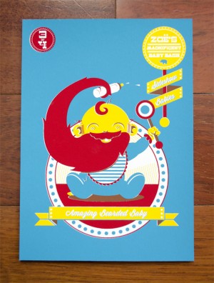
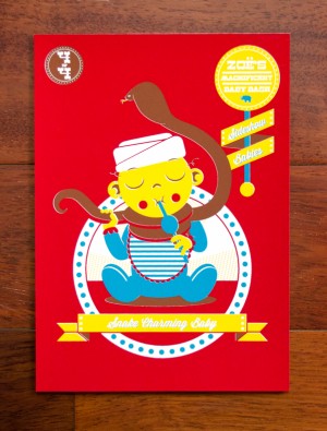
To break away from traditional baby shower paraphernalia, I created a set of “Sideshow Babies” print inspired by a circus sideshow.  The set of four prints included the World’s Strongest Baby, Two-Headed Baby, Amazing Bearded Baby, and Snake Charming Baby.  Each print was a four color silkscreen on French Poptone “Whip Cream” 100 lb cover weight pape.  We even made a “Ringmaster” onesie for Zoë to wear after she is born!

Circus Sideshow Baby Shower Invitations by Tommy Perez via Oh So Beautiful Paper (11)

Circus Sideshow Baby Shower Invitations by Tommy Perez via Oh So Beautiful Paper (8) Circus Sideshow Baby Shower Invitations by Tommy Perez via Oh So Beautiful Paper (12)

Circus Sideshow Baby Shower Invitations by Tommy Perez via Oh So Beautiful Paper (10)

Circus Sideshow Baby Shower Invitations by Tommy Perez via Oh So Beautiful Paper (2)

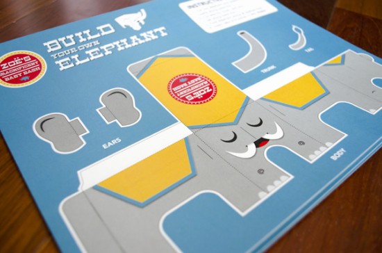
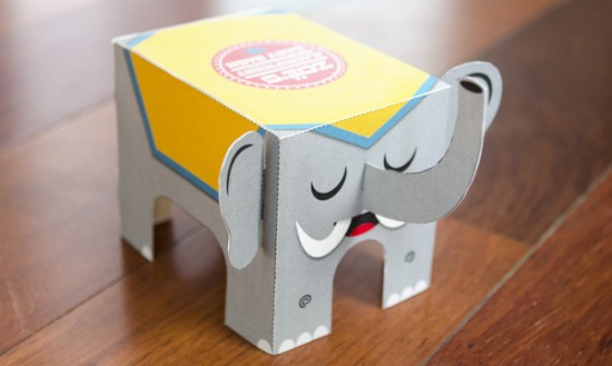
For one of the shower activities I created a “Build Your Own Elephant” paper craft project.

Circus Sideshow Baby Shower Invitations by Tommy Perez via Oh So Beautiful Paper (3)

So great!  You can see tons more photos on Tommy’s flickr page and even download the build-your-own-elephant template over on Tommy’s website right here!  Thanks Tommy!

Photo Credits: Tommy Perez

Wedding Stationery Inspiration: MidCentury Modern

Happy Wednesday everyone!  We’ve had the pleasure of featuring hundreds of amazing wedding invitations over the years, but wedding stationery doesn’t stop with the invitations.  Today I’m thrilled to introduce a new column written by my friend Kelly from Studio DIY that is devoted to day-of wedding stationery inspiration, starting with some fun midcentury modern ideas!

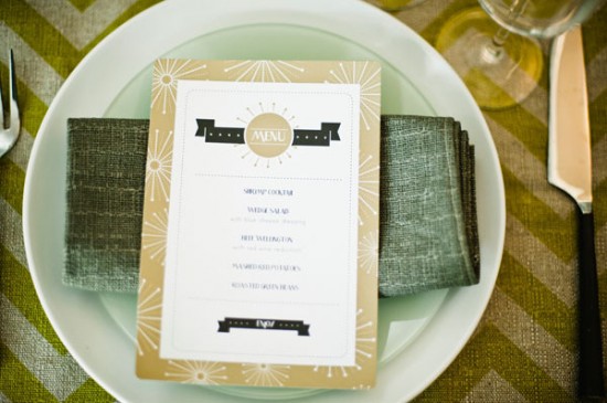
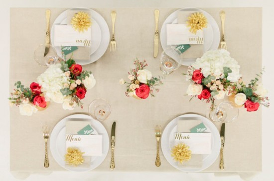
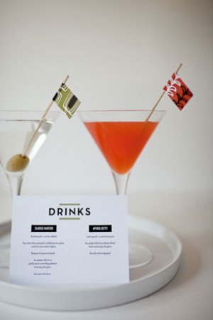
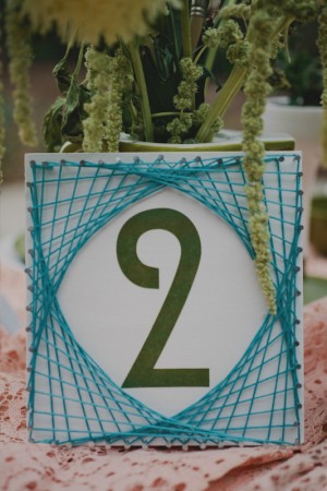
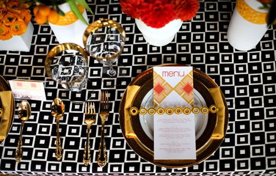
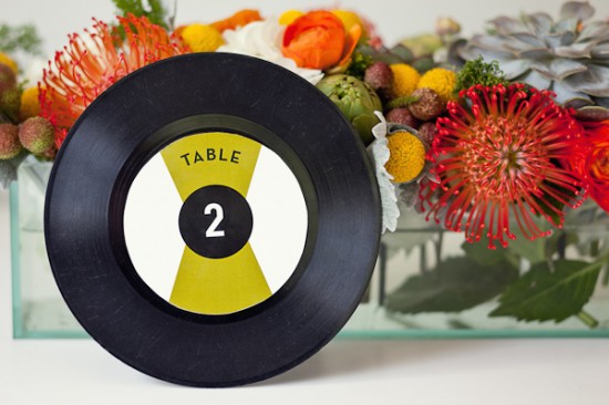
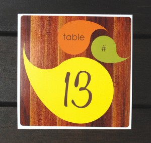
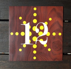
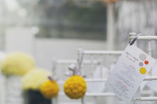
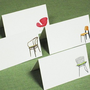
Midcentury Modern design spans several decades and multiple styles.  Clean fonts, bold silhouettes, graphic patterns and offbeat color pairings are a signifying characteristics that come to mind.  Luckily, these qualities all translate beautifully from architecture and interiors into stationery!  If you dream of Eames or you just can’t bear to let this season of Mad Men end on Sunday, take a little cue from this once again popular style for your day-of wedding items!  Menus, place cards, table numbers and more… they all wear the midcentury hat quite well. — Kelly

Wedding Day Of Stationery Ideas: Mid Century Modern via Oh So Beautiful Paper

Photo by B. Mo Foto, Menu by TULIP Design Studio via Style Me Pretty

Wedding Day Of Stationery Ideas: Mid Century Modern via Oh So Beautiful Paper

Photo and Menu by Brancoprata via Green Wedding Shoes

Wedding Day Of Stationery Ideas: Mid Century Modern via Oh So Beautiful Paper Wedding Day Of Stationery Ideas: Mid Century Modern via Oh So Beautiful Paper

Photo by Andrea Hubbell, Table Number by Rock Paper Scissors via The Sweetest Occasion (left); Photo by Red White and Green Photography via Ruffled (right)

Wedding Day Of Stationery Ideas: Mid Century Modern via Oh So Beautiful Paper

Photo by Jasmine Star, Menu by Wiley Valentine via Green Wedding Shoes

Wedding Day Of Stationery Ideas: Mid Century Modern via Oh So Beautiful Paper

Photo by Andrea Hubbell, Table Number by Rock Paper Scissors via The Sweetest Occasion

Wedding Day Of Stationery Ideas: Mid Century Modern via Oh So Beautiful Paper Wedding Day Of Stationery Ideas: Mid Century Modern via Oh So Beautiful Paper

Table Numbers by Aubrey Doodle

Wedding Day Of Stationery Ideas: Mid Century Modern via Oh So Beautiful Paper

Photo by Our Labor of Love, Program by Stelie Designs via Style Me Pretty

Wedding Day Of Stationery Ideas: Mid Century Modern via Oh So Beautiful Paper Wedding Day Of Stationery Ideas: Mid Century Modern via Oh So Beautiful Paper

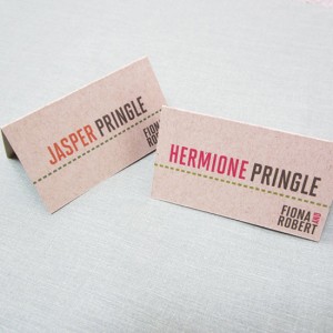
Place Cards by Nancy Nikko Design

Are any of you planning a midcentury modern-inspired wedding?  We’d love to hear what styles and themes are inspiring you these days!

{images via their respective sources}

The Queen’s Park Swizzle

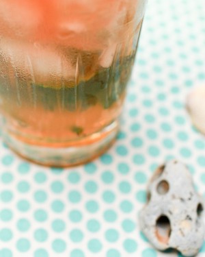
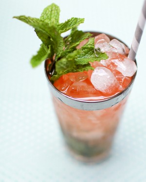
In the mood for something tropical?  Here’s one of Trinidad’s greatest exports, the Queen’s Park Swizzle – an enormously complex drink Trader Vic called “the most delightful form of anesthesia given out today.”  The Queen’s Park Swizzle is one of the most complex drinks – flavor-wise – I’ve ever tasted.  It’s sweet and sour, deliciously minty, earthy, and spicy all at the same time.  And wonderfully cold from a generous portion of crushed ice.  Even though its ingredients resemble those of many other drinks, especially the more effervescent Mojito, this Swizzle has a taste like nothing else, and it’s very, very good. – Andrew
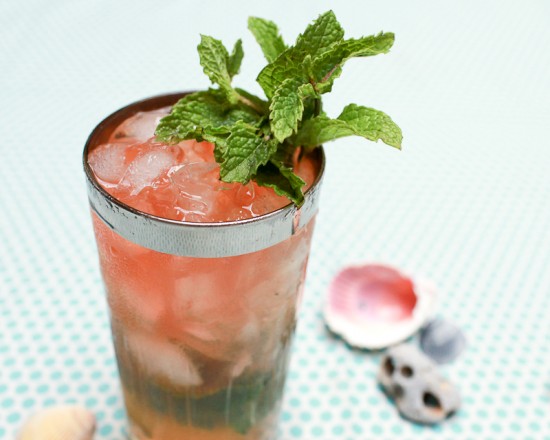
Cocktail Friday Recipe: The Queen's Park Swizzle via Oh So Beautiful Paper (13)

Read below for the full recipe!

Queen’s Park Swizzle

3 oz Clear Rum (Demerara Rum is best)
1 oz Lime Juice
1/2 oz Simple Syrup (again, Demerara sugar is best)
1/2 oz Velvet Falernum
Angostura Bitters
Mint Leaves
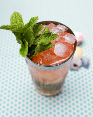
Cocktail Friday Recipe: The Queen's Park Swizzle via Oh So Beautiful Paper (27) Cocktail Friday Recipe: The Queen's Park Swizzle via Oh So Beautiful Paper (19)

Cover the bottom of a highball glass with mint leaves.  Don’t muddle: since the mint is staying in the glass, bruising it will turn the mint bitter, so just slap the leaves a few times in your palm.  Cover with lots of crushed ice.  Add the rum, lime juice, sugar, and falernum.  Cover with more crushed ice.  Swizzle (more on that in just a moment).  Add the bitters, and don’t skimp – a dozen dashes isn’t out of the question.  Top with more crushed ice, garnish with a bunch of mint, plunk in a straw, and enjoy!
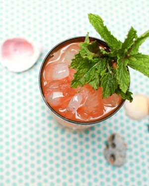
Cocktail Friday Recipe: The Queen's Park Swizzle via Oh So Beautiful Paper (16) Cocktail Friday Recipe: The Queen's Park Swizzle via Oh So Beautiful Paper (29)

Now: swizzling.  You’re not shaking this drink, and you’re not stirring it, you’re swizzling.  Take a bar spoon or, better yet, an actual swizzle stick, and insert it into the ice (not so far down that you disturb the mint).  Twirl the stick between your palms, back and forth, blending and cooling the drink until a nice film of ice forms on the outside of the glass.  Real swizzle sticks are made from actual sticks, stems from the quararibea turbinata, grown on Martinique and nearby islands and known to locals as the swizzle stick tree.  In some places, people make medicinal teas from the bark of the tree, so it’s not hard to imagine it making the leap to rustic blender.  It blends a Swizzle subtly but well and makes for quite a show.  If you use a real one, make sure to wash it and let it try after each use.
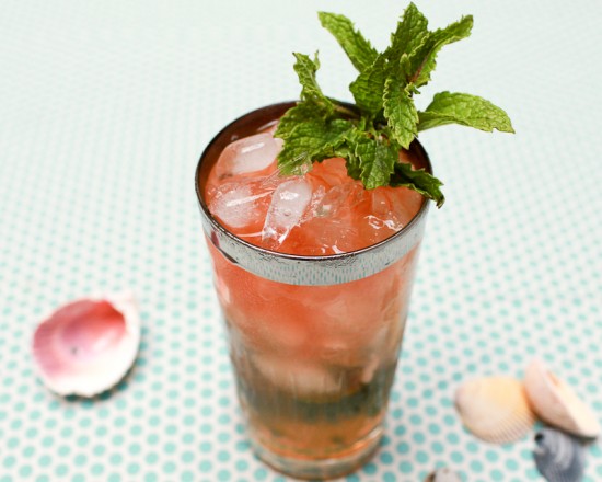
Cocktail Friday Recipe: The Queen's Park Swizzle via Oh So Beautiful Paper (24)

The Queen’s Park Swizzle was invented at the Queen’s Park Hotel in Trinidad’s capital, Port-of-Spain, in the 1920s.  Swizzles were around for over a century before that, and may descend from switchels – much older drinks, an early form of today’s energy drinks made from sweetened vinegar and water – but the Queen’s Park may be the first of the modern family of Swizzles.  (The oldest recipe in print, from 1788, lists spruce beer, rum, and sugar as its ingredients.)  Oh, and Velvet Falernum?  This isn’t part of the original recipe, but was included in the version I learned from Derek Brown, DC’s cocktail king, and trust me, it’s worth it.  Falernum is a sweet syrup from the Caribbean, somewhat like orgeat syrup.  Velvet Falernum is a liqueur version, imported from Barbados and made from rum, sugar cane syrup, lime juice, and plenty of spices – cloves, allspice, ginger, cinnamon, and maybe a hint of almond.  Yum.
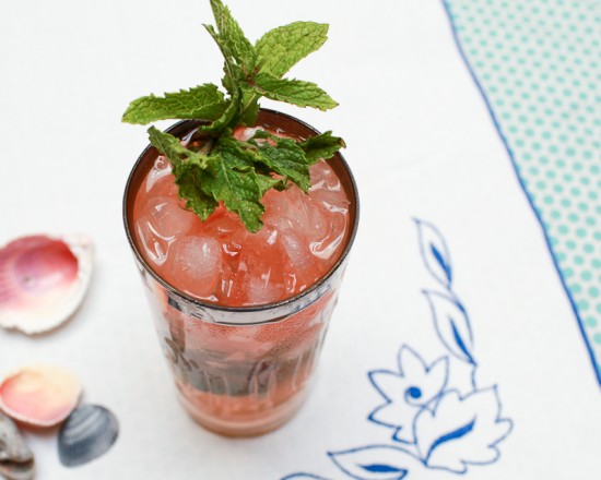
Cocktail Friday Recipe: The Queen's Park Swizzle via Oh So Beautiful Paper (8)

Oh, and be careful: that’s a lot of booze in one drink.  The Queen’s Park Swizzle’s saving grace is that it takes a long time to build one properly.  Take your time, sip slowly, and savor.

Photo Credits: Nole Garey for Oh So Beautiful Paper

{happy weekend!}

Happy Friday everyone!  I’ve had a wonderful time covering the 2012 National Stationery Show, but after spending much of the last two weeks going through more than 1,000 photos from the show I’m looking forward to turning my attention back to everyday things – like making progress on the nursery!  I’m also super excited about next week because I have a super awesome giveaway to share with you on Monday!  But in the meantime…

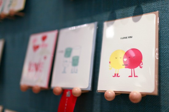
Photo by me, cute little venn diagram love card by Maginating

…a few links for your weekend!

This week on Oh So Beautiful Paper:

As usual, we have a fun cocktail coming up for you this afternoon, so check back a bit later for the recipe!  I hope you all have a wonderful weekend, and I’ll see you back here on Monday!  xoxo

National Stationery Show 2012, Part 12

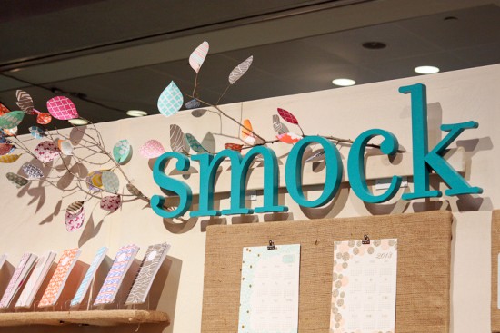
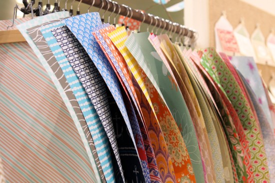
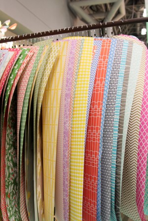
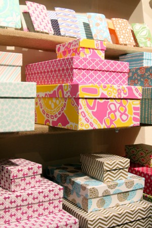
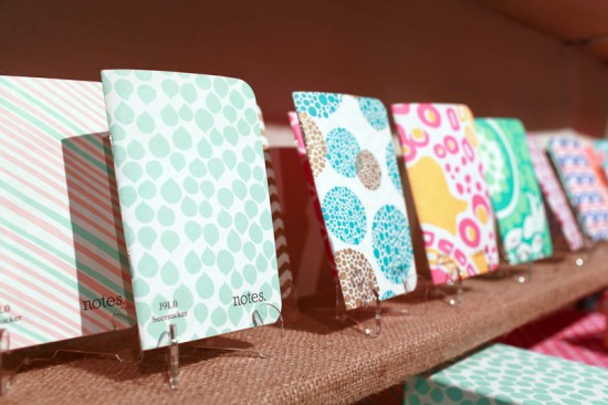
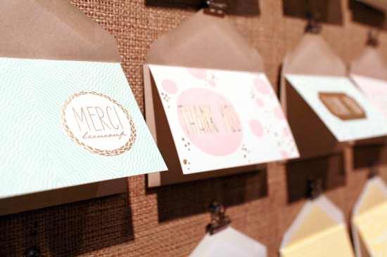
Aaaaand… with a dozen posts full of paper awesomeness, we’ve reached the final recap of exhibitor booths from this year’s National Stationery Show!  I’m ready for a super long nap as we head into the weekend, but first let’s take a look at some of the final stationery eye candy from the show!  First up, the Smock and Bella Figura booth.  I was super excited to check out the new gift wrap patterns and notebook collection, not to mention some of the new foil printed greeting card and wedding invitation designs!
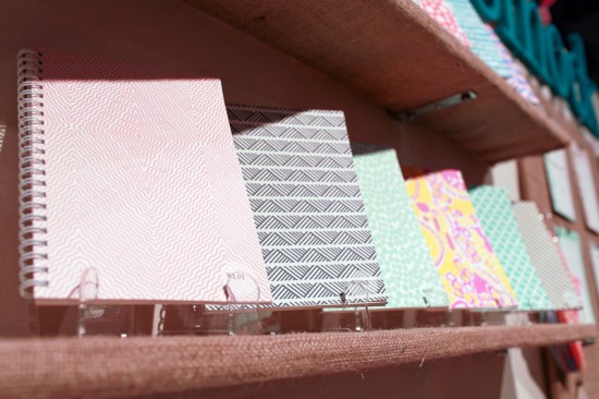
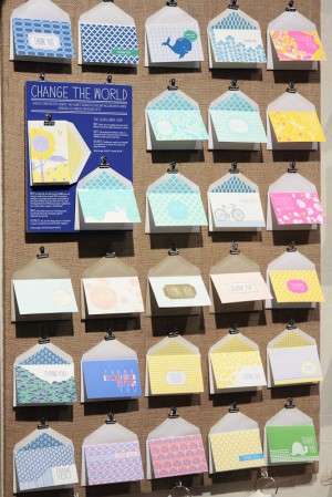
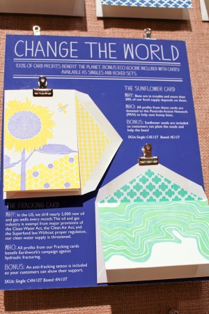


Smock + Bella Figura

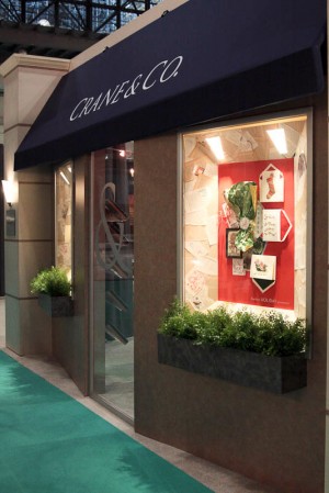
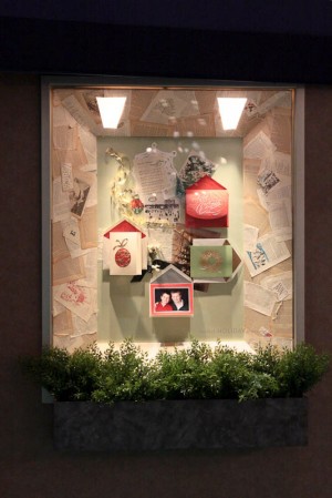
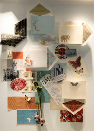
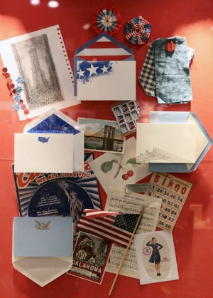
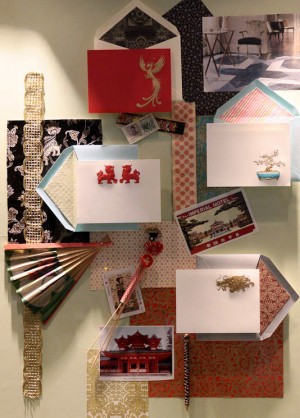
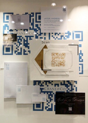
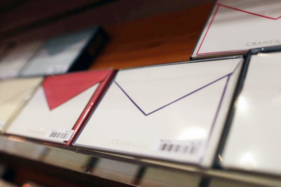
Every year, the Crane & Co. booth looks like a Fifth Avenue storefront – complete with gorgeous window displays inspired by Bergdorf Goodman and other classic department stores!  I always spend a few minutes gazing at the beautiful collection in each display…


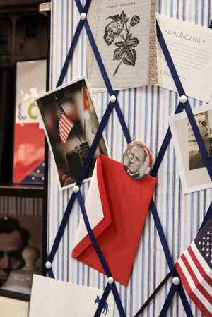
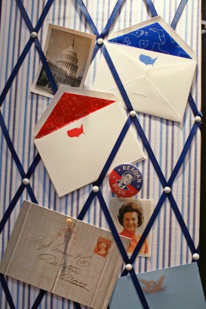
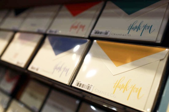
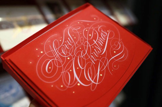
I’m so happy to see Crane & Co. embracing its extensive history with Americana-inspired stationery collections – they’ve been around since 1801 and have printed stationery for several presidents and even foreign kings and queens!  At the same time, they’re incorporating modern design with bright new color options for the classic Crane & Co. hand bordered correspondence cards.  And is there anything more classic and elegant than white engraved text on red paper?  Beautiful!

Crane & Co.

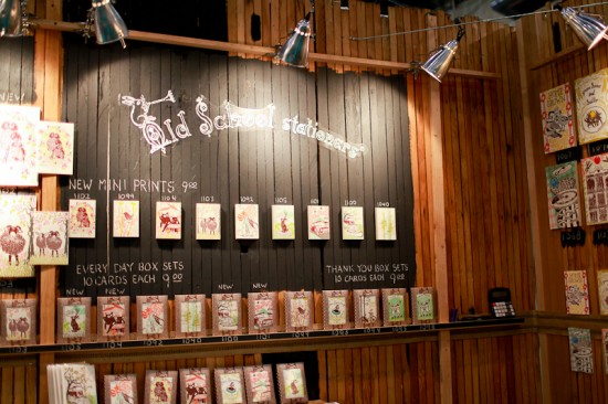
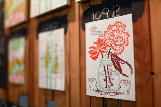
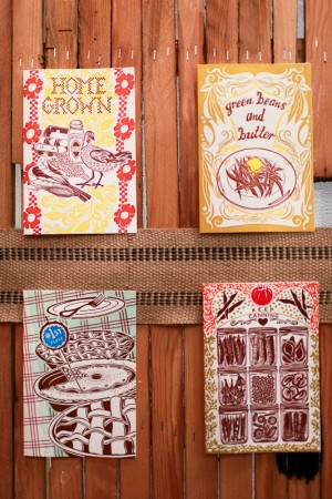
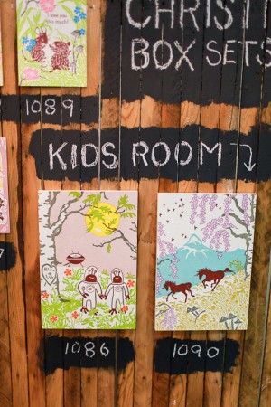
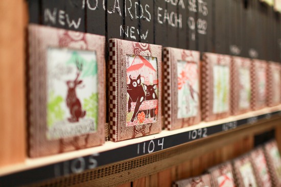
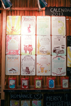
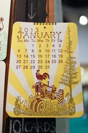
I’m a big fan of the rustic vibe over at Old School Stationers.  I always love their colorful letterpress art prints, greeting cards, and calendars featuring their signature hand-drawn illustrations!
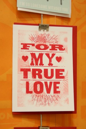
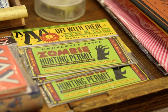


Old School Stationers

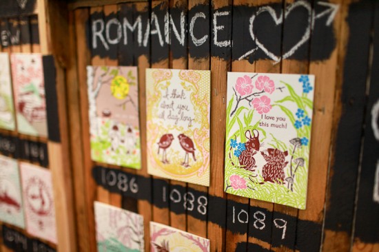
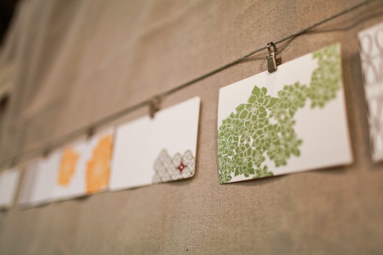
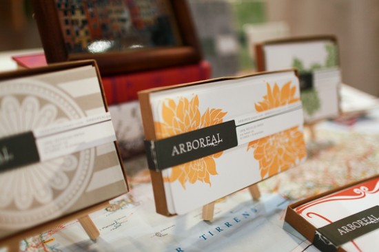
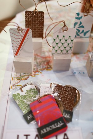
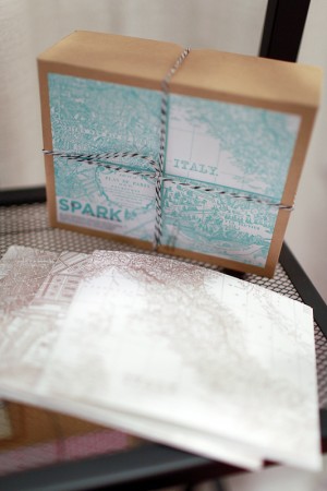
Nashville-based Erin from Arboreal also has somewhat of a rustic vibe going on, but with a stationery collection largely inspired by Erin’s travels to Italy.  The line includes gift wrap sheets, gift tags, and beautiful boxed note card sets.


Arboreal

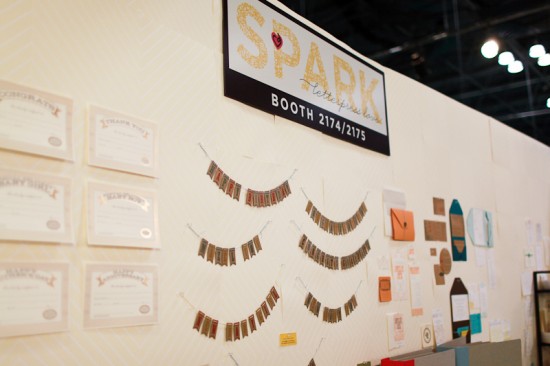
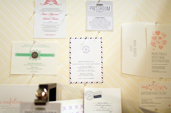
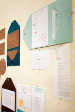
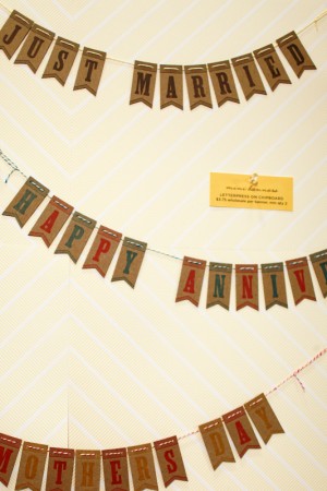
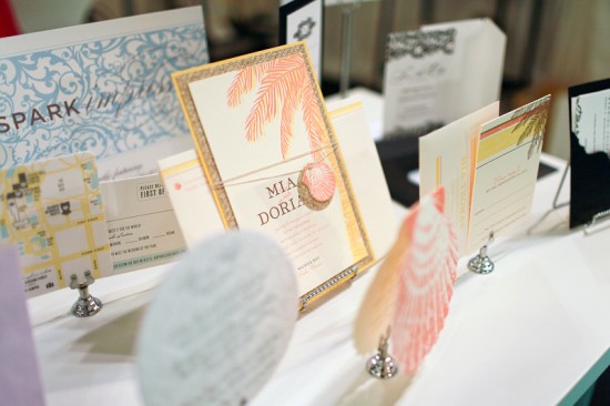
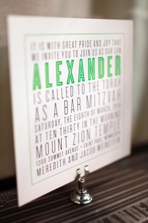
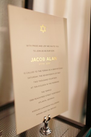
The talented sisters of Spark Letterpress made a return to the Stationery Show with a huge booth full of gorgeous invitations, fun party bunting, and beautiful foil printed certificates and greeting cards.  I’m a longtime fan of the Spark wedding invitation collection, but I’m so happy to see them branching out with more Bar and Bat Mitzvah invitations and other party invitation designs!


Spark Letterpress

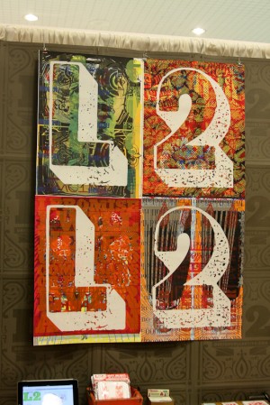
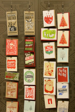
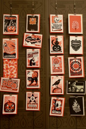
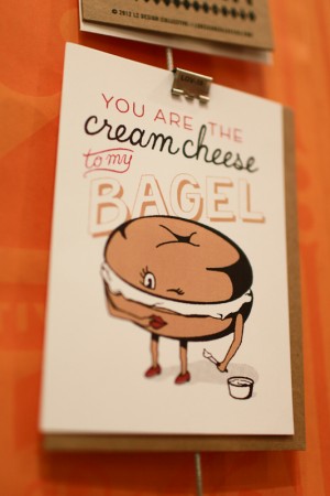
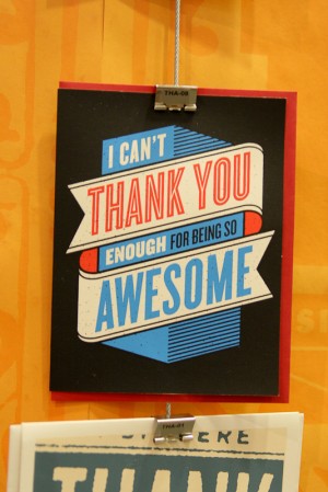
L2 Design Collective never fails to make me smile with their colorful screen printed cards and journals.  I’m seriously loving all the new holiday and Halloween card designs, and the bagel and cream cheese card below still makes me laugh!


L2 Design Collective

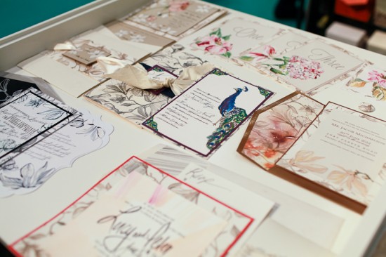
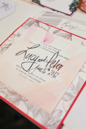
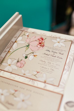
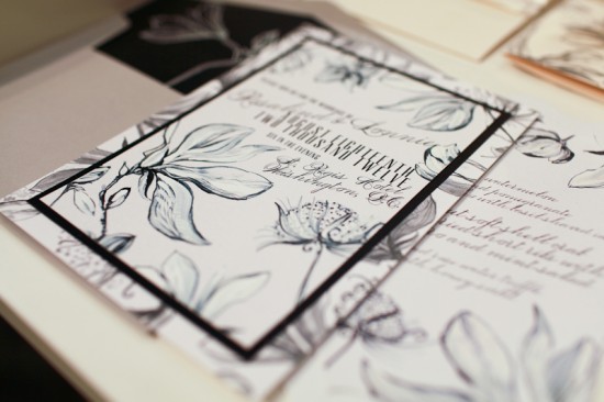
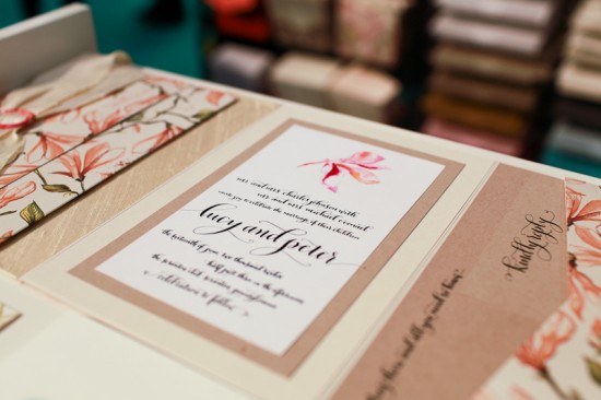
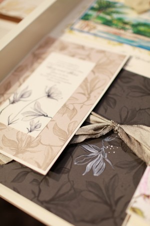
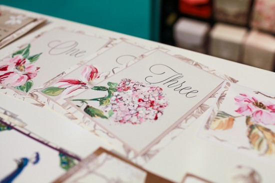
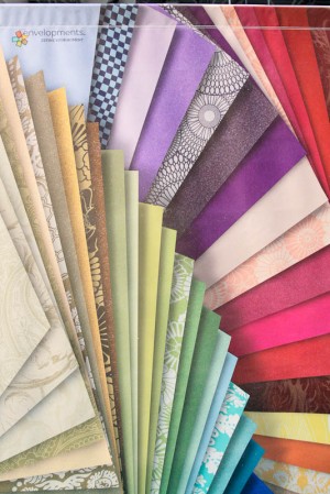
Envelopments recently collaborated with Kristy Rice of Momental Designs on an exclusive new wedding collection, called Trellis.  Kristy was on hand at the Envelopments booth to talk about the new designs in person.  Kristy creates the most amazing one of a kind hand painted wedding invitations  – and the Trellis collection captures her unique style in such a beautiful way.


Envelopments

That’s it folks!  I hope you enjoyed the recaps from this year’s National Stationery Show!  If you missed any of the last eleven posts or want to check out the booths from last year, you can see all of my stationery show coverage from the last four years right here!

Photo Credits: Stephen Michael Garey and Nole Garey for Oh So Beautiful Paper