Southwestern Mixed Media Wedding Invitations

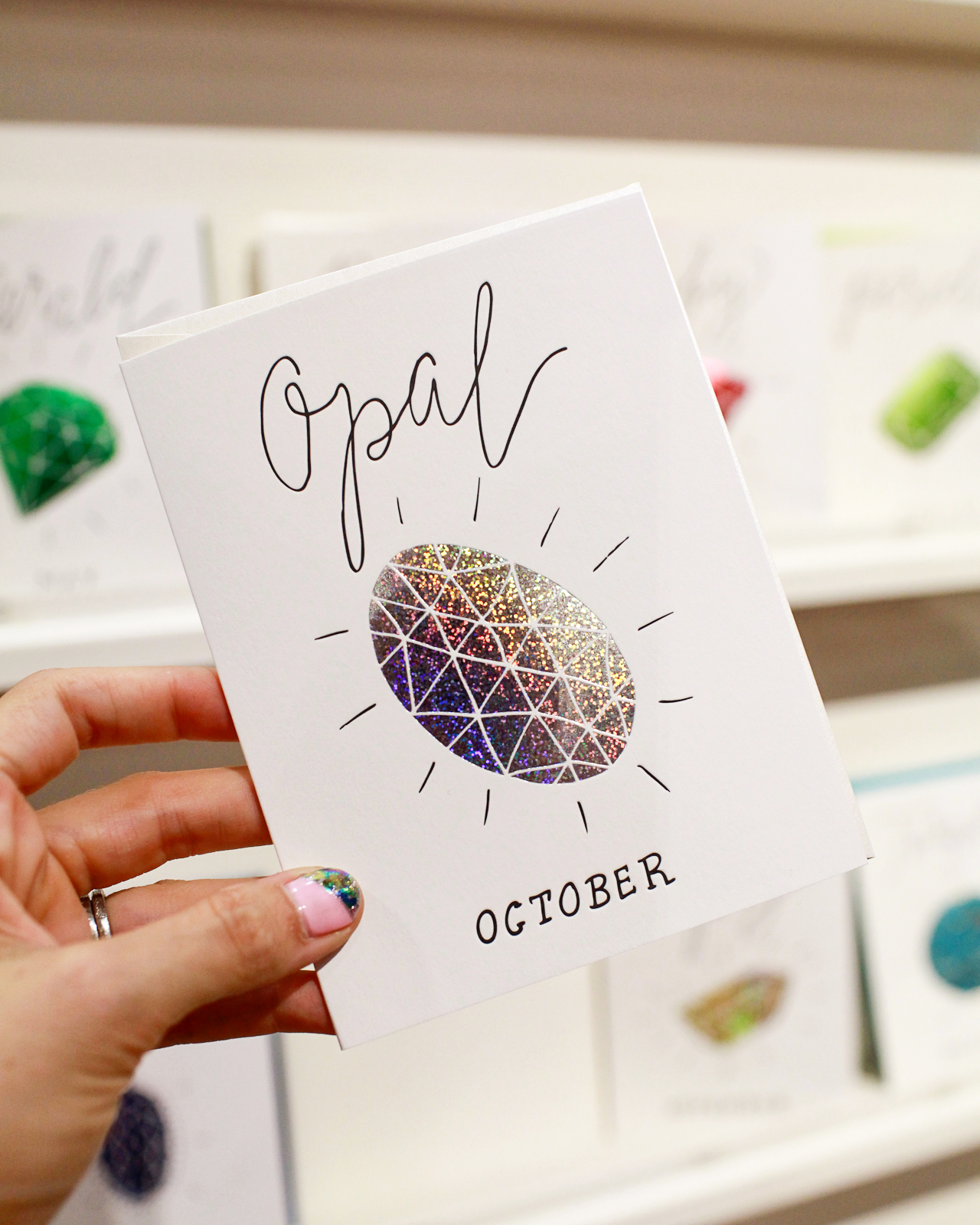
You guys, today is going to be a GREAT day: we have an invitation from Arley-Rose and Morgan of Ladyfingers Letterpress to share with you! If you’ve been reading OSBP for the last five or so years, you know that these ladies produce some of the most imaginative and beautiful custom stationery (including my first daughter’s baby announcement!). These stunning southwestern mixed media wedding invitations are no exception. Arley and Morgan incorporated non-traditional materials like mica, leather, sage, and wood to create a complete invitation experience. Amazing!
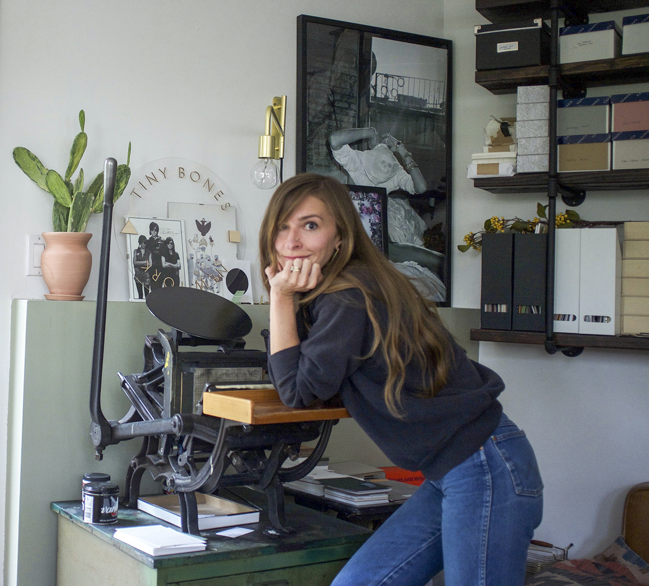
Southwestern Mixed Media Wedding Invitations by Ladyfingers Letterpress

From Arley-RoseIt’s safe to say that most of our clients these days have already experienced firsthand the quality and creativity of our work before they hire us. They likely have received an invitation of ours from a family or friend and intimately know the thrill of receiving a commissioned Ladyfingers Letterpress invitation in the mail and want their guests to feel the same way.

Southwestern Mixed Media Wedding Invitations by Ladyfingers Letterpress

A few years back, we had created pretty insane baby shower invitations for some close friends who are in the film industry in New York. A guest of that shower, Alex Bolotow, was dating the iconic fashion photographer Terry Richardson at the time, and when they became engaged, she called us up right away with tons of enthusiasm and ideas.

Southwestern Mixed Media Wedding Invitations by Ladyfingers Letterpress

Alex and Terry were planning an intimate gathering at a remote and serene southwestern desert location outside of Taos, New Mexico and wanted to give their guests a preview of the warmth, love, and realness that they would soon be experiencing on their wedding day. A gift of excitement, a collection of beautiful things both close to their hearts and to the heart of the place they wed.

Southwestern Mixed Media Wedding Invitations by Ladyfingers Letterpress

We worked together for ten months to create something that could hardly be deemed an invitation. A gift, maybe. More like a finely curated assemblage of meaningful things, like opening the lid of a close friend’s favorite collection of personal objects. Alex and Terry wanted the suite to be as personal, tactile and location-centric as possible. The concept took on a three-dimensional form, and the invitations were shipped in large hand-lettered kraft boxes that were carefully opened to uncover a sun-kissed wooden box overflowing with the invitation and supporting objects.

Southwestern Mixed Media Wedding Invitations by Ladyfingers Letterpress

Southwestern Mixed Media Wedding Invitations by Ladyfingers Letterpress

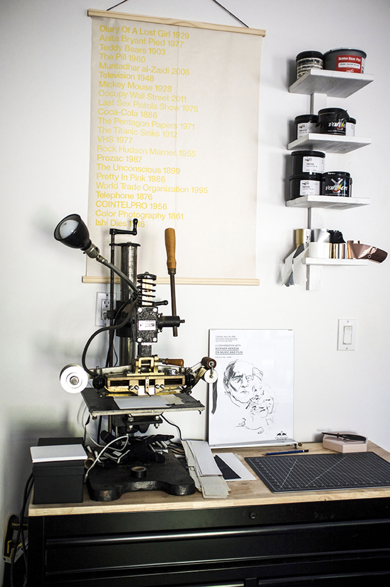
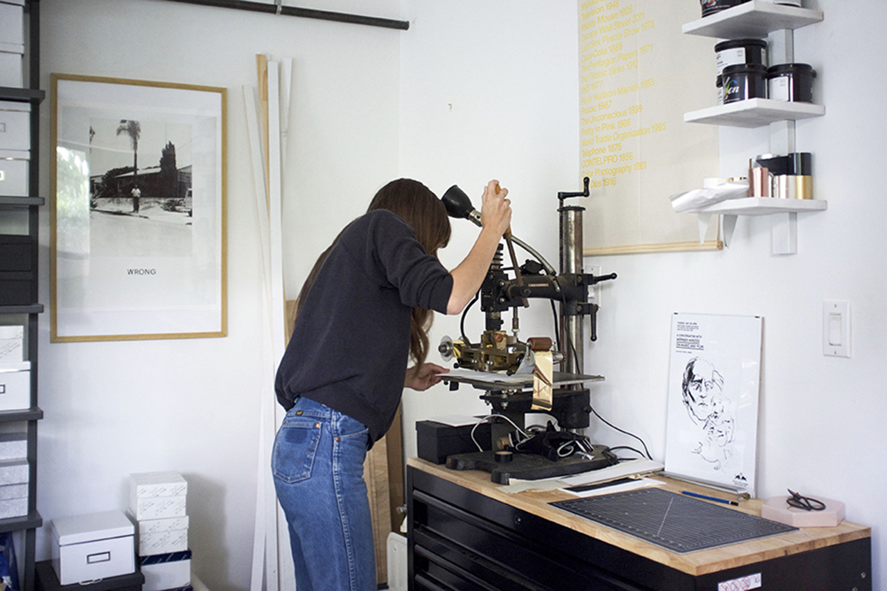
We hand lettered the invitation and foil printed it in gold foil onto sturdy and semi-translucent pieces of mica. Additional pieces such as their RSVP and Smudge Blessing Card were letterpress printed on thick cotton paper. We worked with local artist Pipilo Road to design and manufacture handmade wooden boxes out of reclaimed materials. The lids were hand painted and screen printed. We went through several iterations where we sent videos of different prototypes back and forth before a design was settled and the boxes were fabricated.

Southwestern Mixed Media Wedding Invitations by Ladyfingers Letterpress

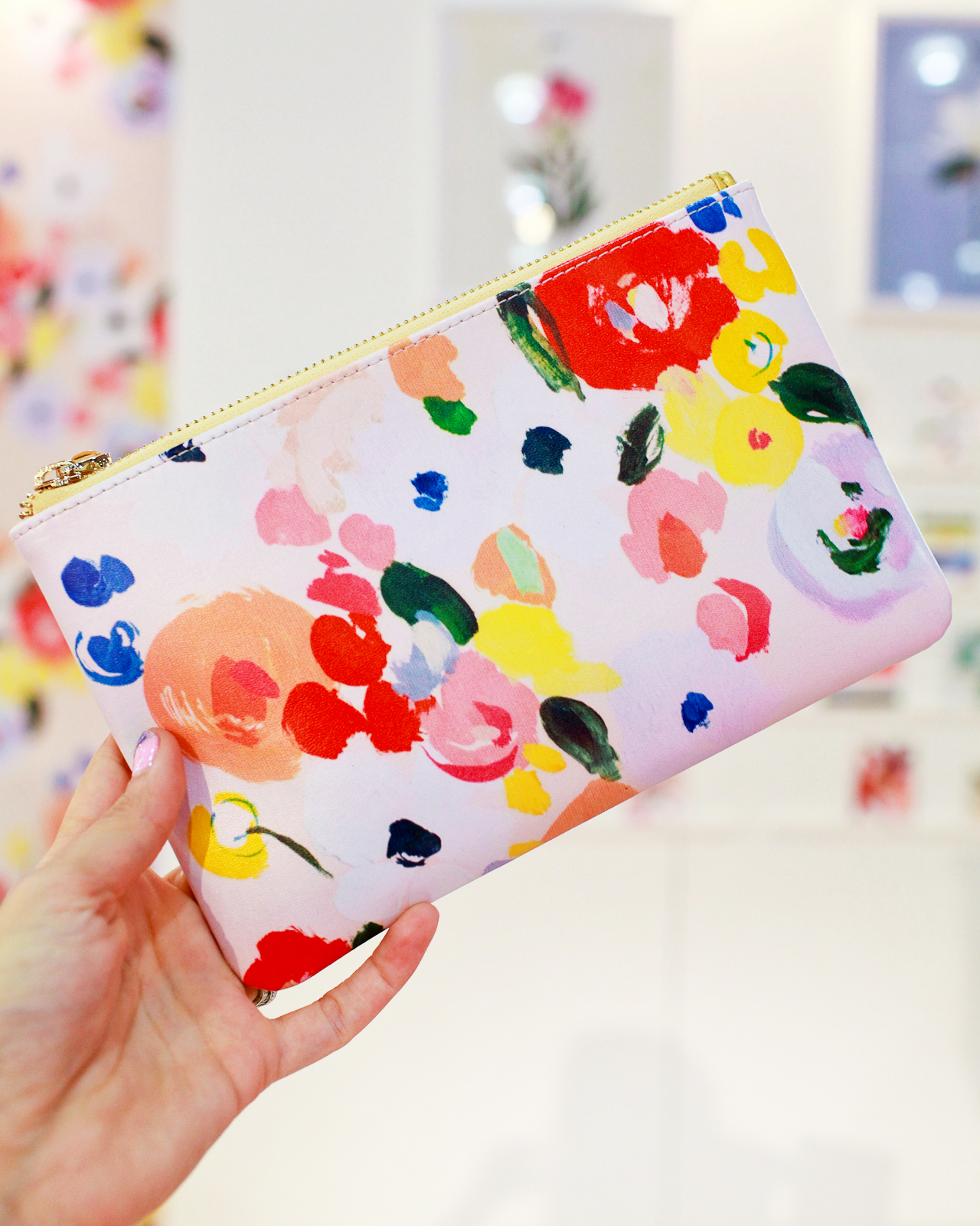
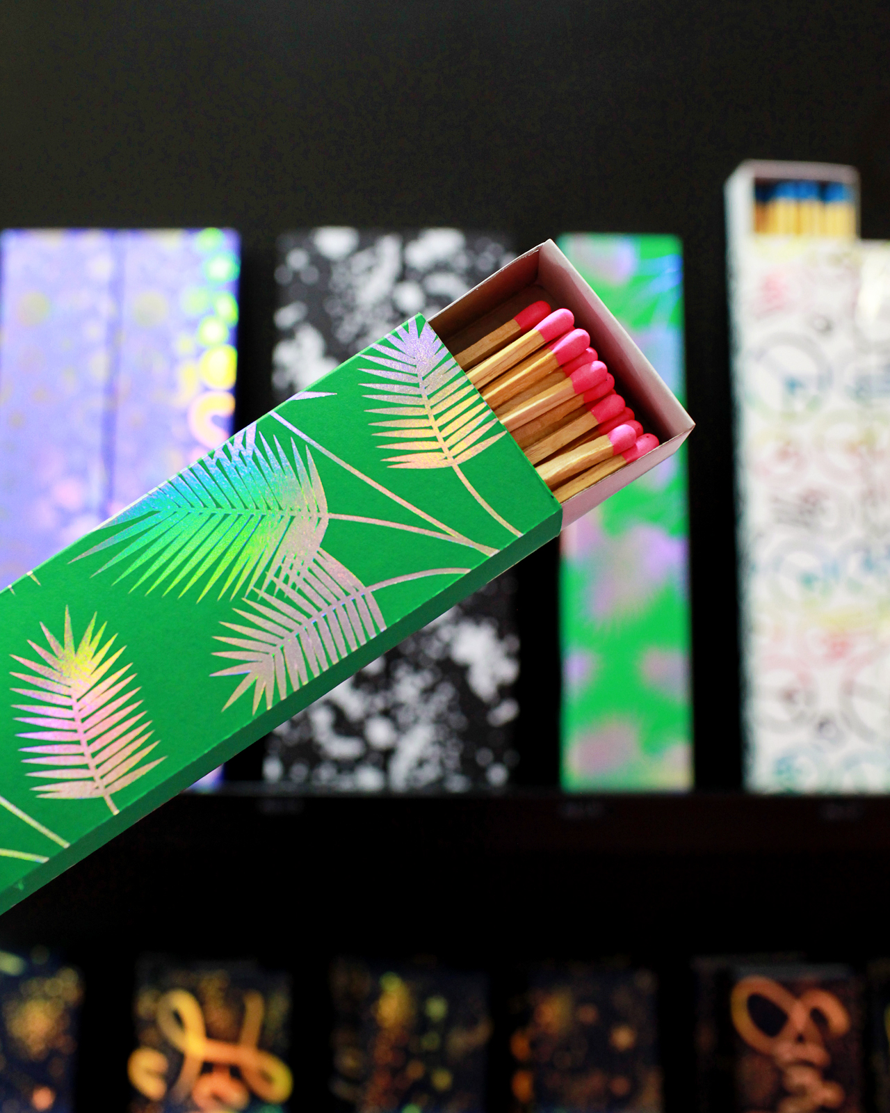
Soft, tobacco deerskin leather pouches were carefully designed, stitched and hand burned by Three Arrows Leather out of Taos. Alex helped us source sage bundles, quartz rocks, vintage matches from New Mexican locations and palo santo sticks to complete the suite and allow their guests to conduct a Smudge Blessing of their own. All of these items, plus a hand-drawn map of Taos and a celestial map of the night sky on the date of their wedding, were carefully tucked into the handmade wooden box which was designed to fit perfectly within an outer shipping box.

Southwestern Mixed Media Wedding Invitations by Ladyfingers LetterpressSouthwestern Mixed Media Wedding Invitations by Ladyfingers Letterpress

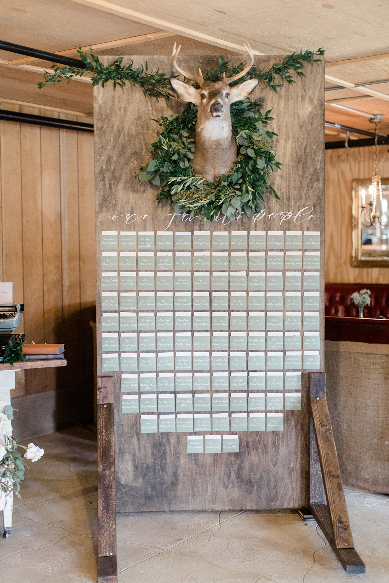
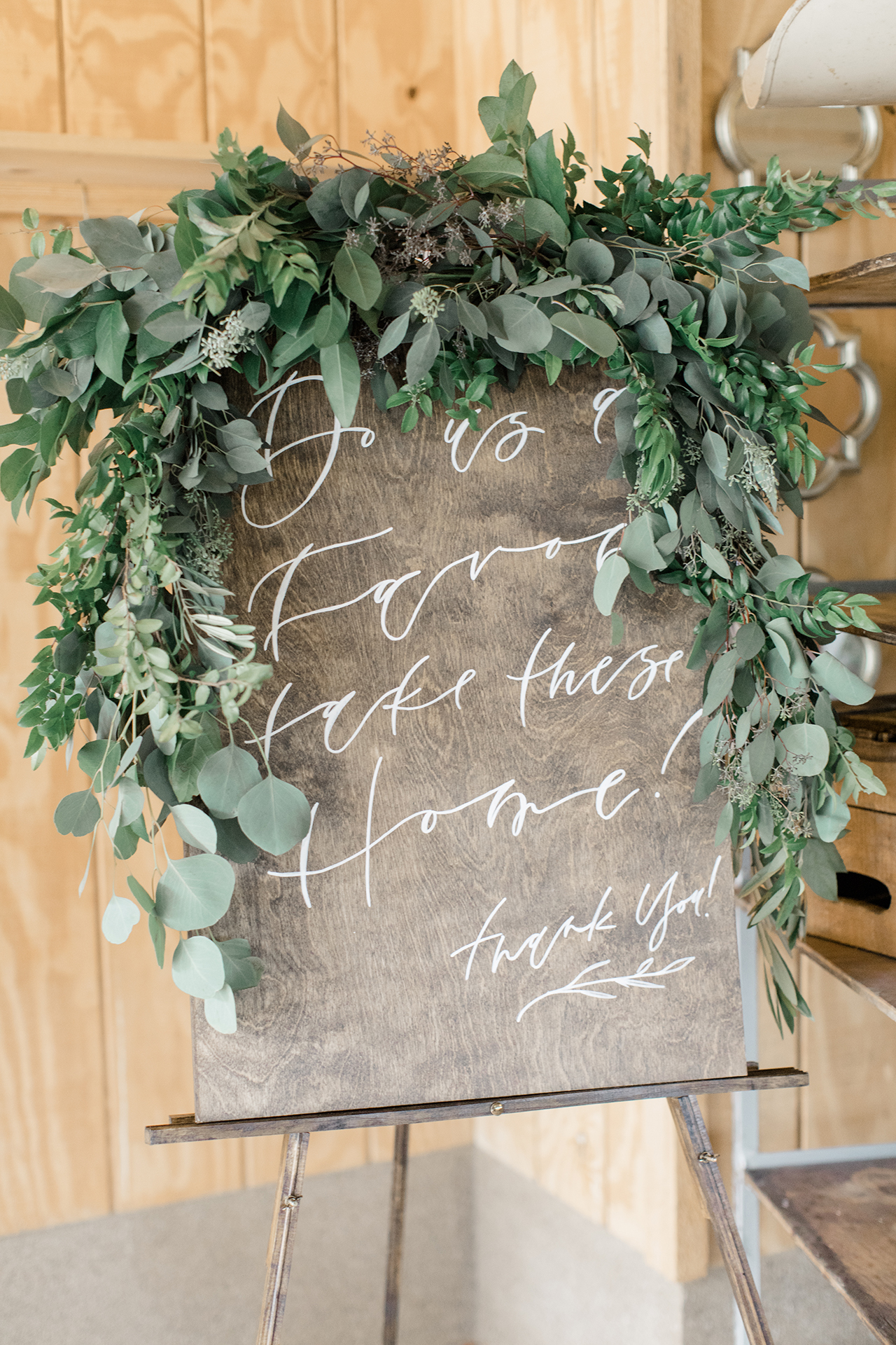
We got to know Alex over the time we spent working together, and now consider her a close friend. In fact, she and Terry surprised us with an invitation to their wedding, which we happily accepted. We’re still reeling from our time spent in Taos with this lovely couple and are happy to finally share these photos taken by Lauren Memarian with you! For more gorgeous photos of this suite, check out the Gallery of Commissioned Works at ladyfingersletterpress.com.

Southwestern Mixed Media Wedding Invitations by Ladyfingers Letterpress

Thanks Arley-Rose and Morgan!

Design: Ladyfingers Letterpress
Wooden Boxes: Pipilo Road
Leather Pouches: Three Arrows Leather

Ladyfingers Letterpress is a member of the Designer Rolodex â€“ check out more of their beautiful work right here or visit the real invi­ta­tions gallery for more wedding invitation ideas!

Photo Credits: Lauren Memarian

Romantic Gray Calligraphy Wedding Invitations with Deckled Edges

As much as I loooooooove color, there’s just nothing more classic than soft gray monochromatic letterpress. Combine that with whimsical calligraphy and romantic deckled edges and you’ve got the ingredients for a seriously beautiful wedding invitation suite. Meghan of 200 Spring designed these romantic gray calligraphy wedding invitations with deckled edges for her own wedding, and you’ll definitely want to read below to see the enormous DIY escort card display that she made for her reception!

Romantic Gray Calligraphy Wedding Invitations with Deckled Edges by 200 Spring


From MeghanIt was a dream in the making to actually be able to design my own wedding invitations and day of stationery! I am a huge fan of neutrals and greenery, which is what my wedding style was built around. So for the invitations I went with a really classic crisp white cotton paper with letterpress printing in a soft gray ink.

Romantic Gray Calligraphy Wedding Invitations with Deckled Edges by 200 Spring

While keeping our names as the focal point, I used a sans serif font to balance out the suite. My actual trifold invitation was quite large, so I had them printed on 100% cotton Crane Lettra paper and hand deckled the edges myself.

Romantic Gray Calligraphy Wedding Invitations with Deckled Edges by 200 Spring

I had this idea for a while that  I wanted my invitations to be more then a piece of paper – I wanted them to be an experience. From peeling off the wax seal, to opening up the trifold invitation wrapped in vellum, to the feel of the paper and the indent of the letterpress printing. I just think the details are what makes it so special.

Romantic Gray Calligraphy Wedding Invitations with Deckled Edges by 200 Spring

The day of details were also very important to me. As an artist I can definitely be a perfectionist. I had this idea in my mind that I wanted a large escort card display. It started at 8ft x 8ft display….but when  my now husband and I walked into Home Depot and pulled the wood from the stack….cue the blank stares. lol. Then there was my overly exaggerated “BUT I HAVE A VISION” speech. Lets just say I was talked down to an 8ft x 4ft escort card display.

Romantic Gray Calligraphy Wedding Invitations with Deckled Edges by 200 Spring

Romantic Gray Calligraphy Wedding Invitations with Deckled Edges by 200 Spring

I did some spot calligraphy for the words “our favorite people” and had that laser cut, leveled and hung all of the paper pockets, hung the deer head – and voila! Our wedding was in a barn and my husband is a big hunter, so the deer head was pretty important, and the pockets were something to make it a little more fun and interactive!

Romantic Gray Calligraphy Wedding Invitations with Deckled Edges by 200 Spring

Thanks Meghan!

Design and Calligraphy: Meghan Trimarco of 200 Spring

Paper: Crane Lettra with hand deckled edges

Ribbons: The Poetry of Silk

Check out the Designer Rolodex for more tal­ented wed­ding invi­ta­tion design­ers and the real invi­ta­tions gallery for more wedding invitation ideas!

Photo Credits: Lauren Fair Photography

Seasonal Stationery: Halloween Cards (part boo!)

Trick or treat! We found so many great Halloween cards, that it was worth doing a second round up (check out last weeks Halloween card round up here). We’ve got anthropomorphic candy and scary skulls, not to mention three different takes on animals using the tried and true sheet-as-a-ghost costume. No matter what your favorite part of Halloween is – getting scared out of your wits, dressing up as your favorite condiment, or chowing down on multiple forms of sugar – there’s bound to be something that satisfies your Halloween sweet tooth. Happy Halloween! – Shauna

Halloween Card Round Up

From top right:

1. Boo! This classy Sugar Paper design is elegantly printed with white foil on black paper and just the right amount of Halloween cheer.

2. This Blackbird Letterpress skull and bat combo go perfectly with haunted houses and scary stories. The die cut shape adds an extra spooky dimension.

3. This furry dog ghost from Los Angeles based Golden Fox Goods is reminiscent of my personal favorite Halloween activity – patronizing our local pet parade (Check out this dog dressed as Iris Apfel!!).

4. This Wild Hart Paper design trades the traditional orange and black color palette for an ombre rainbow yet keeps the witches and ghouls for just the right combination of a very modern Halloween.

5. More animals in costume, more opportunities to dress your pug like a fried chicken sandwich. From Clap Clap Design.

6. Jeepers Creepers! Keep those creepy crawlies at bay with this bug infested design from Hello!Lucky for Paperless Post.

7. What better use for orange foil than this seasonally appropriate term of endearment number from The Social Type?

8. Get those Halloween party vibes going with these dancing candy corn courtesy of Paula and Waffle. That bowler hat!

9. Where’s the treats? Ghost cat, I was just wondering the exact same thing. From Jamie Shelman, aka The Dancing Cat.

10. Bats and cats and witches hats! From One Canoe Two.

Behind the Stationery: Tiny Bones Press

Our next designer on Behind the Stationery is a new-to-me stationer that I discovered at NSS 2017. Megan’s delicate and minimalistic work at Tiny Bones Press caught my eye amongst the other booths with brighter hues and bold art. With a background in post and print production for fashion designers and photographers, Megan shares about her journey into the letterpress and stationery world as a solopreneur. —Megan Soh

Behind the Stationery: Tiny Bones Press

From Megan: I’ve always worked within the printing world in NYC and slowly started exploring practices on my own. I learned to letterpress about five years ago and really fell in love with the process. I love writing letters and notes and started to make stationery that I wanted to use myself.

Behind the Stationery: Tiny Bones Press

My husband and I bought a house on the north shore of Long Island. We were in Brooklyn for a decade and loved it but needed a bit more space and I really wanted to be by the water! We truly lucked out and now I have a lovely little studio that really has provided me the creative haven I was dreaming of.

Behind the Stationery: Tiny Bones Press

In house, I offer design services and letterpress and foil stamp printing. I frequently collaborate with trusted digital printers to add that process to my designs as well. People who are drawn to my work are people who love minimal design and also who love truly love paper and print. Having a minimal aesthetic — the feel of the paper, the tones, the delicate foiling and letterpress all add up to make the pieces special and unique. All Tiny Bones Press stationery is printed in my studio, by me, one by one, on vintage presses.

Behind the Stationery: Tiny Bones Press

Behind the Stationery: Tiny Bones Press

Right now, I am a one woman team! I typically start the day with a coffee and make my daily list. Usually I get to work on emails (I try to do this outside if I can) and then spend the afternoon in the studio printing. I’m trying to get better at balancing all aspects of the business – it can be hard to juggle everything solo.

Behind the Stationery: Tiny Bones Press

My design process is all about exploring – I’m very interested in the world around me and try to find inspiration by exposing myself to a number of different images throughout industries: from architecture to art to books and science, etc. I always make lists and keep a notebook handy and do feel that it’s important to explore things that you as a person are naturally drawn to – for me that is geometric linework and symbols. My sketches then turn into digital drawings, which then turn into plates, and then finished printed pieces – the evolution of a piece is really the most fun aspect (next to sending them off for others to enjoy).

Behind the Stationery: Tiny Bones Press

Behind the Stationery: Tiny Bones Press

All photos by Tiny Bones Press.

Want to be featured in the Behind the Stationery column? Reach out to Megan at megan [at] ohsobeautifulpaper [dot] com for more details.

NSS 2017: A Few Favorites

I’m like a kid in a candy store during the National Stationery Show each year. There’s so much to see! So many people I want to talk to, catch up with, new booths to see, and more! The only problem with being a stationery addict at a trade show dedicated to stationery and paper goods is that I genuinely love ALL OF IT and would take every single thing home with me if I could! Each year, there are a few extra special things that really stand out and make a connection with me, from greeting cards to gift items. So today I’m closing out our coverage from this year’s National Stationery Show with a few show favorites that, for whatever reason, didn’t fit into one of our other round ups. Let’s start with two of my favorite greeting cards from this year’s show from Dahlia Press and Smitten on Paper!

NSS 2017: Smitten on Paper

Smitten on Paper (check out the full booth here!)

NSS 2017: Dahlia Press

Dahlia Press (check out the full booth here!)

I’m seriously crazy about these letterpress printed baby milestone cards from Rachael of Pistachio Press – a new mom herself! In addition to number cards for monthly photos, there are milestone cards for when baby learns to roll over, crawl, smile, and more. SO CUTE!!

NSS 2017: Pistachio Press

Pistachio Press (check out the full booth here!)

I’ve made and broken a lot of resolutions over the years, but I think I might actually stick to a resolution with this kit from Baltic Club! It’s undated, so you can start a new resolution any time of year, and comes with cute gold stickers to help keep track of progress!

NSS 2017: Baltic Club

NSS 2017: Baltic Club

Baltic Club (check out the full booth here!)

So many gorgeous bags and pouches at this year’s show! These wine and booze bags from Dahlia Press are so cute, and I’m absolutely crazy about the new zipper pouches from Our Heiday and Parrott Design Studio!

NSS 2017: Dahlia Press

Dahlia Press (check out the full booth here!)

NSS 2017: Our Heiday

NSS 2017: Our Heiday

Our Heiday (check out the full booth here!)

NSS 2017: Parrott Design Studio

Parrott Design Studio (check out the full booth here!)

NSS 2017: Iron Curtain Press

Iron Curtain Press (check out the full booth here!)

NSS 2017: Emily McDowell

Emily McDowell (check out the full booth here!)

NSS 2017: Albertine Press

Cityscape totes (in all the major cities!) from Albertine Press (check out the full booth here!)

Notepads! I love, love, love the gorgeous color blocked notepads from Moglea and the genius notepads from Smudge Ink that fold up into paper boats, airplanes, and secret messages!

NSS 2017: Moglea

NSS 2017: Moglea

Moglea (check out the full booth here!)

NSS 2017: Smudge Ink

NSS 2017: Smudge Ink

Smudge Ink (check out the full booth here!)

Hologram foil was everywhere at this year’s show, much to my delight! The Social Type had TONS of hologram foil, including hologram foil matchboxes and envelope note sets. Wild Ink Press debuted a new birthday gemstone card collection with every type of shiny, iridescent, and metallic foil imaginable. So fun!

NSS 2017: The Social Type

NSS 2017: The Social Type

NSS 2017: The Social Type

NSS 2017: The Social Type

The Social Type (check out the full booth here!)

NSS 2017: Wild Ink Press

Wild Ink Press (check out the full booth here!)

NSS 2017: 417 Press

417 Press (check out the full booth here!)

NSS 2017: Ashkahn

Ashkahn (check out the full booth here!)

Alright, that’s it from this year’s show! I hope you enjoyed all of our round ups! In case you missed any of our previous recaps from the 2017 National Stationery Show you can find them all right here – and you can find photos from all the NSS 2017 exhibitors right here!

Photo Credits: Nole Garey and Hannah Nowack for Oh So Beautiful Paper