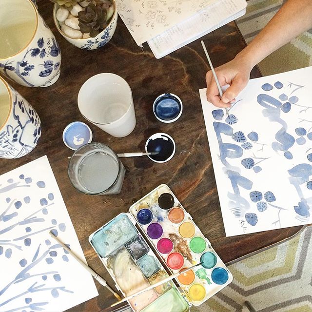
Image by Cast Calligraphy
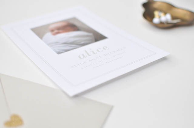
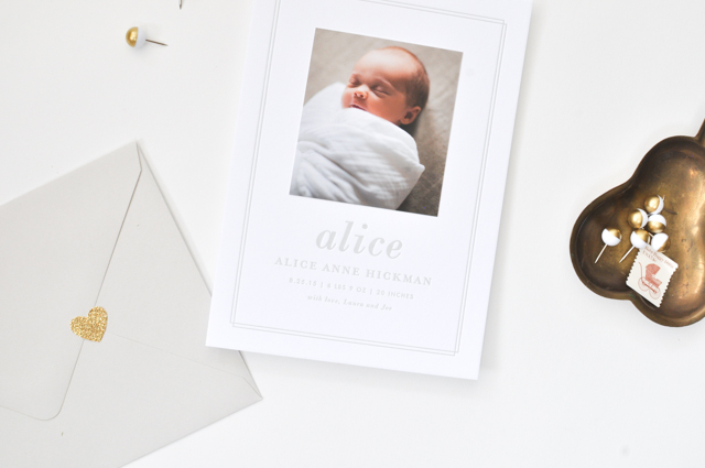
Before we jump into brand new posts for the new year, I always like to take a look back and revisit some of my favorite posts from the past year. Asking me to pick a favorite wedding invitation from the year is like asking me to pick a favorite child – I truly love them all! A round up of the best wedding invitations of 2015 could have easily included 20+ images, or basically every single invitation I had the pleasure of featuring in 2015. But don’t worry, I exercised a bit of restraint when pulling this recap together. 2015 definitely saw a continued focus on shiny metallic foil and whimsical watercolor washes, with plenty of calligraphy and hand lettering along the way. It’s fun to see similar techniques applied to different wedding invitation styles and aesthetics, from classic to rustic to modern. Here are a few wedding invitations from 2015 that stuck out from the crowd – I can’t wait to see what those talented stationers cook up in 2016! I’m personally hoping for (and looking forward to) lots more tropical-inspired invitation suites in 2016!
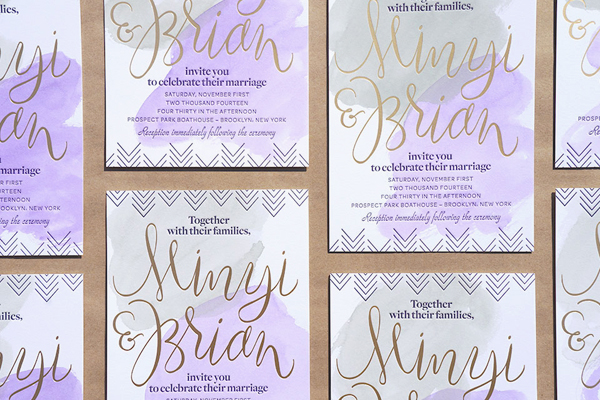
Modern Watercolor and Gold Foil Wedding Invitations by And Here We Are
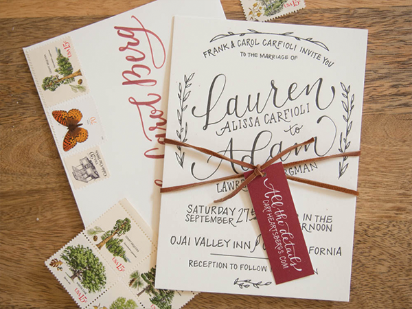
Rustic Hand Lettered Wedding Invitations by Bright Room Studio
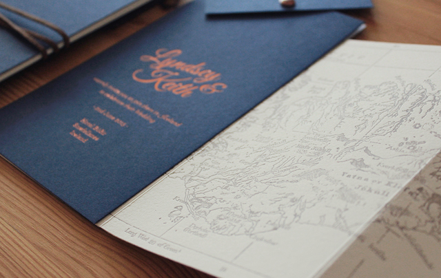
Navy and Copper Foil Iceland Wedding Invitations by The Hunter Press
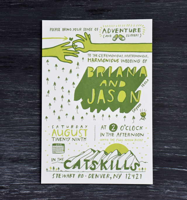
Illustrated Camp Wedding Invitations by Briana and Jason of Brainstorm
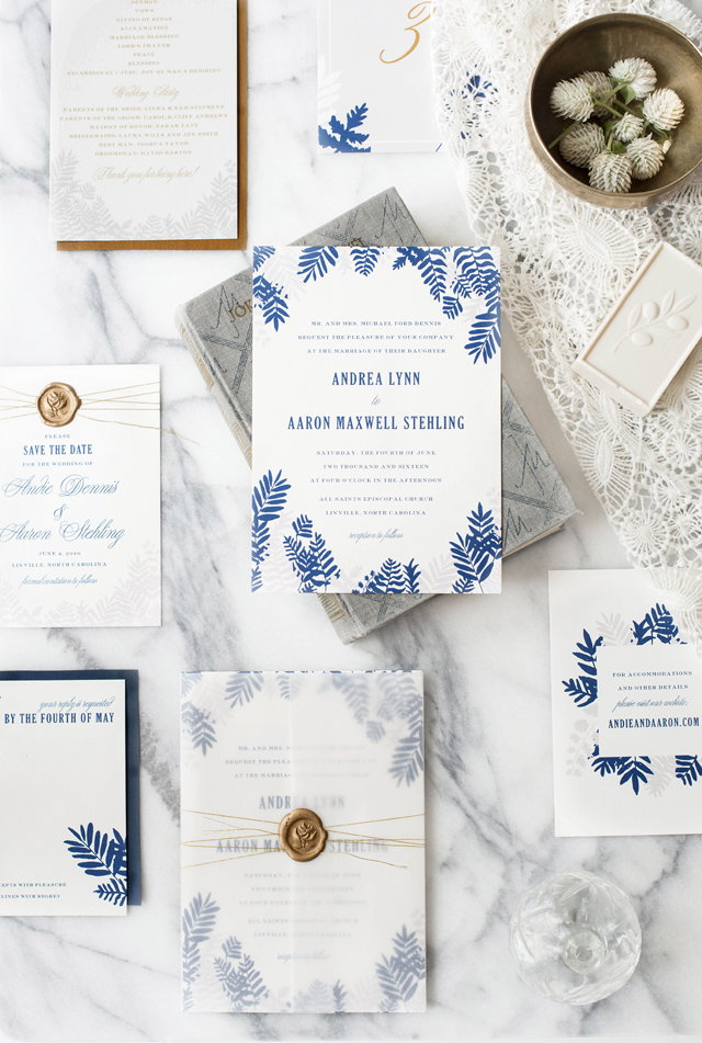
Modern Fern Wedding Invitations by Hello Tenfold
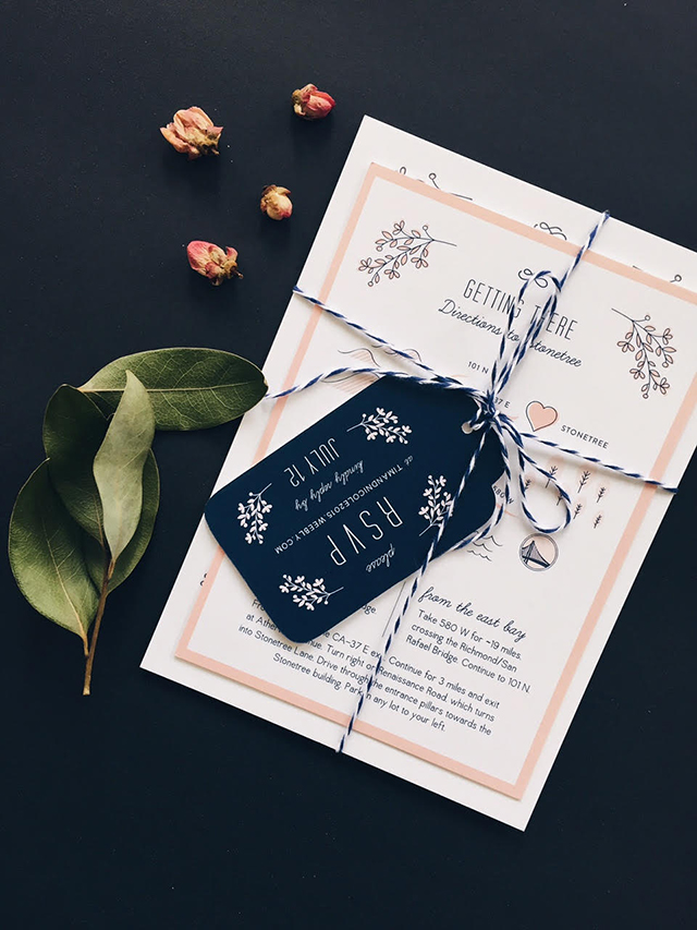
Whimsical Pink and Navy Illustrated Wedding Invitations by Designed by Jaclyn
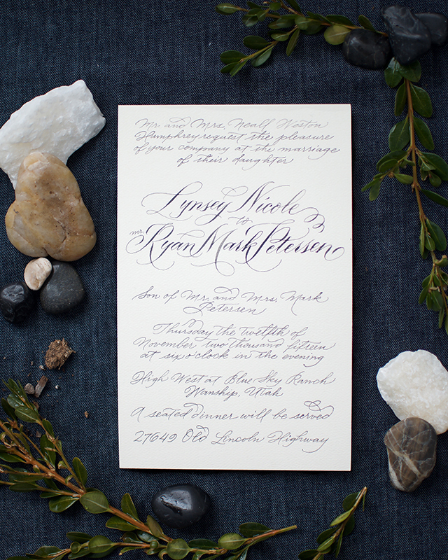
Classic Hand Calligraphed Wedding Invitations by Melissa Esplin
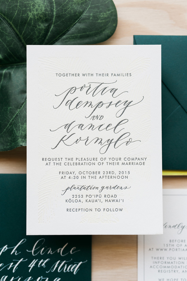
Tropical Calligraphy Wedding Invitations by Cast Calligraphy
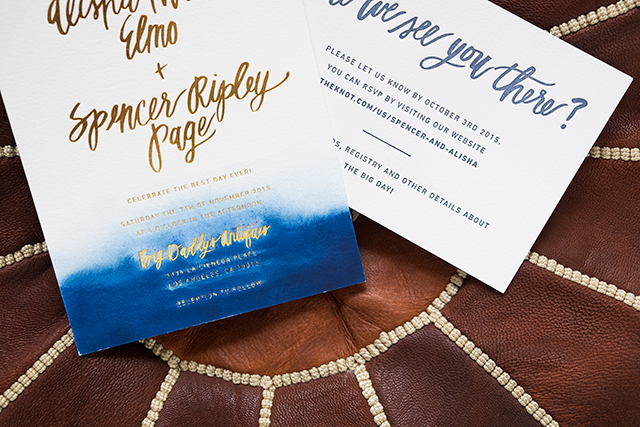
Indigo Watercolor and Gold Foil Dip Dyed Wedding Invitations by Goodheart Design
Looking for more wedding invitation inspiration? You can find even more beautiful wedding invitations from 2015 (and before) in the real wedding invitations gallery! Or check out the Designer Rolodex for more talÂented wedÂding inviÂtaÂtion designÂers!


 Â