Happy Weekend!

Happy Friday everyone! I’m super excited for this weekend – I’m heading up to New York to attend NYNOW! After skipping the summer show (I was 8 months pregnant with Alice at the time), I’m looking forward to saying hello to all my exhibitor friends in person and see all their new goodies! You can walk the show with me via Instagram (I’ll be walking Sunday and Monday), and of course I’ll be sure to share a few favorites here after I get back. But in the meantime…

Robert Frost Quote by Kal Barteski on Instagram

Photo + Hand Lettering by Kal Barteski via Instagram

…a few links for your weekend!

This week on Oh So Beautiful Paper:

Check back this afternoon for this week’s cocktail recipe! Have a wonderful weekend, and I’ll see you back here on Monday! xoxo

Hello Brick & Mortar: Daydreams + Unprompted Requests, Part 2

Customers often visit Clementine and tell me what I should sell. Their ideas are well intended but often there’s a good reason that I don’t take the suggestion. As small business owners, we know our business best. We know our capacities and our style. We know what we like and where we want to invest. I, for example, don’t want to sell soap dispensers or small ceramic cat sculptures (actual suggestions). But sometimes someone makes a perfect suggestion and I dive in to explore its potential. I offer the daydreams with the chance they might click as something you want to invest in and because I would sell each of them. (None of you should make soap dispensers.) ~ Emily of Clementine

Brick + Mortar by Emily Blistein of Clementine for Oh So Beautiful Paper / Illustration by Emily McDowell

Illustration by Emily McDowell for Oh So Beautiful Paper

Part 1 of this post was my daydream pairings between a few favorite stationery and non-paper lines. This half looks at products you already make and imagines them as a new product. It is born mostly from instagram perusing and your introduction mailers.  Thank you for sharing your work through the mail and on social media. It’s why I complain about never getting anything done, but it’s also my favorite part of the day.

Ok, on to PART 2. You’d make a great…

  • Birdwalk Press sent their beautiful holiday card – a snap from their wedding with gold foil embossed with the words THIS MUST BE THE PLACE. I pulled it out of the envelope and immediately said: I want this to be a print. Just the words (they’re a beautiful couple, but for marketability…). It would make a great card and an even better print (8″x10″ or larger). My imagination already has it framed over my bed.

Birdwalk Press Holiday Card

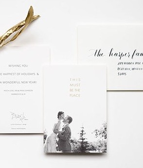
Birdwalk Press holiday mailer, photo by Lockie Photography

  • The Library Press. You know when an adult tells a kid “you’re so cute, I could eat you up,” and the kid looks back at the adult like they’re crazy? Well, picture the same exchange, but I’m the grown up and The Library Press’s tiny series of chairs is the kid. I mean, what don’t I want these little chairs on: cards, prints, wallpaper, stamps, some kind of custom candy? Yes, I could just eat them up.

The Library Press Perpetual Calendar

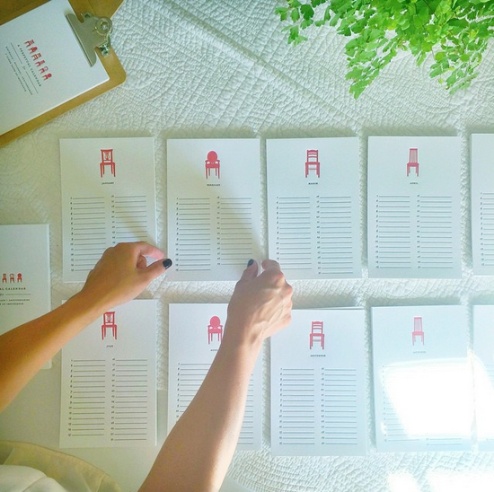
The Library Press, perpetual calendar

  • Shanna Murray’s illustrated decals. Shanna has hinted that her decals may be cards in the future. I’m happy to offer a little nudge. Recently she sent me a ‘You Are So Beautiful Decal’ affixed to a card. I happened to feature it in a store display and it gets more than a few requests (cough sneeze, hint nudge)…

Shanna Murray You Are So Beautiful Decal

Shanna Murray’s You Are So Beautiful Decal

  • Nottene. I met Kimberly briefly at a recent Renegade Craft Fair and was pretty smitten with her booth. Her illustrations translate beautifully between mediums: wrapping paper, textiles, print. I would love to see her design a wallpaper collection, but I’d settle first for having some of her recent playing card illustrations turned into greeting cards. Take the Queen, is it not the perfect Mother’s Day card?

Nottene Queen of Hearts Playing Card

Nottene Queen of Hearts

  • Leah Duncan, color trends: Leah Duncan is another whose work translates seamlessly from print to fabric to endless products, so what’s left for her to do? I’d settle for a bi-annual color chart where she tells me what colors to paint my house, or dress in, or simply sends a mailer of color chips to use as bookmarks.

LDflowercards

Leah Duncan ~ Desert Flowers

  • Sad Shop. Everybody loves an 8 x 10 print, but Katie’s cards, with their bold, clean, perfect sentiments should be bigger. I’d vote for 16 x 20+.  And, I know I’m already asking for something, but I’d love to have them letterpress printed too. Even though the space over my bed is getting crowded, I’d make room, because I like these cards, and naps.

SSblanketfort

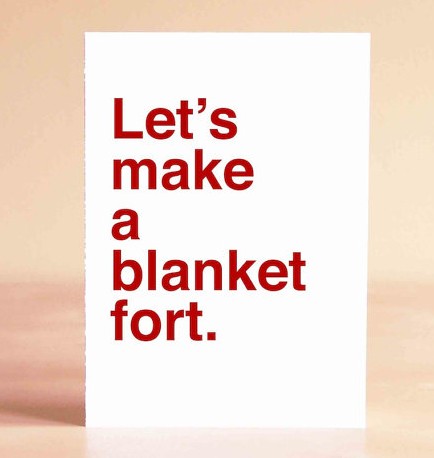
Sad Shop Let’s Make A Blanket Fort

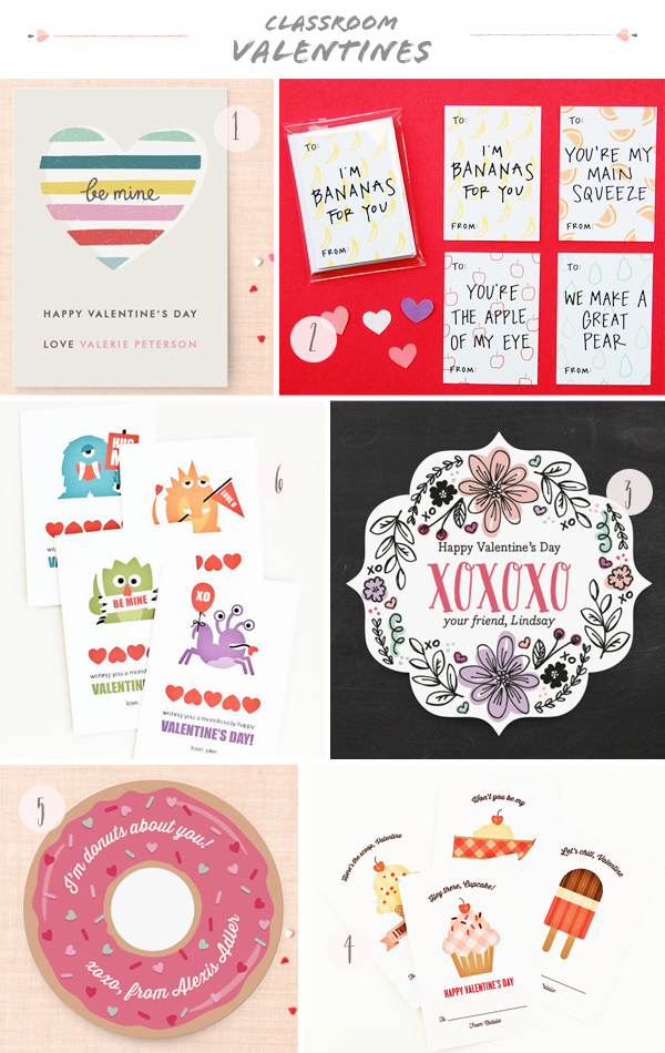
  • Wild Ink Press. Last year, I encouraged Happy Cactus Designs to make mini-Valentines (and she did, and they’re fantastic!). This year, I saw Wild Ink Press’s mini classroom notes and thought: ug, these are so good, make them full size cards! There are so few cards for young kids, especially boys (not that diggers and trucks are only for boys…) to give or receive. Each of Rebekah’s designs below would make a perfect birthday or hello card. I wheelie like them.

Screen Shot 2015-01-27 at 11.35.10 PM

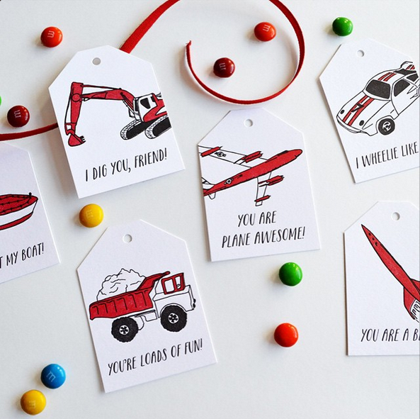
Wild Ink Press Classroom Valentines

  • 200 Lemons. Megan spends a bit of time each week at Clementine, arranging fresh and paper flowers and generally saving me from the chaos of my desk. Lately, watercolor pet portraits have appeared in her feed. I would love to see this series of sweet faces become card sets: dogs, sea creatures, wildlife, flora, fauna. But to be completely honest, my endgame is a storybook with her watercolors illustrating some lucky adventurer and their trusted animal friend. I think this guy agrees:

Screen Shot 2015-01-27 at 11.11.02 PM

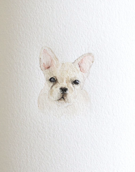
200 Lemons French Bulldog

Since social media is such a big part of where these daydreams arise, I linked to the artists above with their social handles and internet sites. Go follow them and tell me who your current favorites are below!

Yours in daydreams and adventures ~ xo Emily

Seasonal Stationery: Classroom Valentines

Well, it was just a matter of time – but as the parent of a toddler in daycare I now find myself in need of classroom valentines! Luckily, for those of us that don’t want to rely on drugstore options, Minted has a great line of personalized photo and non-photo classroom valentines (including some with metallic foil!), there are a bunch of great printable options on Etsy, and some of my favorite stationers have even begun releasing their designs in mini versions! Since I was on the hunt myself, I figured I’d share some of my favorites here with you – and there are a few more options right here!

2015 Classroom Valentines Round Up Curated by Oh So Beautiful Paper

1. Minted Layered Heart Classroom Valentine

2. Happy Cactus Fruity Mini Valentines

3. Minted Sweetest Doodle Classroom Valentine

4. Pera Press Personalized Dessert Valentines

5. Minted Donuts About You Classroom Valentine

6. Pera Press Personalized Monster Valentines

2015 Classroom Valentines Round Up Curated by Oh So Beautiful Paper

7. Ling’s Design Studio

8. Minted Sweet Heart Classroom Valentine (in mint + rose gold foil!)

9. Printable Wisdom Printable Animal Classroom Valentines

10. Prints for Events Printable Woodland Critter Valentines

11. Minted Love Makes the World Go Round Classroom Valentine

12. Minted Tons of Love Classroom Valentine

Watercolor and Gold Foil Ocean-Inspired Wedding Invitations

It’s usually right around this time of year that I begin wishing that I lived in a tropical climate – preferably right on the beach. For now I’ll just have to settle for these gorgeous watercolor and gold foil wedding invitations from Smitten on Paper inspired by the beaches in Miami!

Watercolor-Gold-Foil-Ocean-Wedding-Invitations-Smitten-on-Paper-OSBP2

From Amy and the Smitten on Paper team: Katie and Peter wanted the invitation suite for their New Year’s Eve wedding to reflect the surroundings and atmosphere of their amazing venue, a waterfront museum with beautiful gardens and views off the coast of Miami. We worked with Eileen from Beauty in the Making to create a suite that is elegant and breathtaking, combining watercolor, gold foil, and calligraphy.

Watercolor-Gold-Foil-Ocean-Wedding-Invitations-Smitten-on-Paper-OSBP3

An artist friend of the couple painted the background, which we scanned in and used in different ways throughout the suite. Each piece is duplexed with a pop of orange paper so they are double thick and then gold foil stamped with a mix of modern type and loose calligraphy.

Watercolor-Gold-Foil-Ocean-Wedding-Invitations-Smitten-on-Paper-OSBP9

Watercolor-Gold-Foil-Ocean-Wedding-Invitations-Smitten-on-Paper-OSBP5

Watercolor-Gold-Foil-Ocean-Wedding-Invitations-Smitten-on-Paper-OSBP8

Watercolor-Gold-Foil-Ocean-Wedding-Invitations-Smitten-on-Paper-OSBP6

We love how all of the pieces in the suite create their own sense of movement and really evoke the ocean’s rhythms. The whole project is finished with hand addressed calligraphy envelopes in watercolor hues.

Watercolor-Gold-Foil-Ocean-Wedding-Invitations-Smitten-on-Paper-OSBP7

Thanks ladies!

Design: Smitten on Paper

Check out the Designer Rolodex for more tal­ented wed­ding invi­ta­tion design­ers and the real invi­ta­tions gallery for more wedding invitation ideas!

Photo Credits: Smitten on Paper

Anna + Lanier’s Elegant Letterpress Calligraphy Wedding Invitations

I’m such a fan of the beautiful work of Sarah from August Blume – I even got the chance to work with her on my friend Maggie’s baby shower invitations a while back! So I was thrilled when Sarah sent over these elegant calligraphy wedding invitations with delicate blind letterpress printed details. So pretty!

View More: http://jackieo.pass.us/augustblume

From Sarah: This invitation suite was custom designed for a sweet, Southern couple who were married in their hometown of Jackson, Tennessee. The bride and groom wanted their invitation to reflect their elegant, textural, and romantic wedding day. The suite was letterpress printed on 220lb Crane Lettra and incorporated a delicate blind impression to reflect on the couple’s reception venue – a historic hotel in downtown Jackson.

View More: http://jackieo.pass.us/augustblume

The invitation and inserts featured beautiful calligraphy by Elizabeth Hardin and classic typography in warm gray. The stone colored reply envelope added another layer of color and texture. A custom die-cut quatrefoil monogram tag was slid on to a velvet ribbon wrap to tie it all together. Elizabeth’s calligraphy on both the inner and outer envelopes elevated the design and helped set the tone for such a special day.

View More: http://jackieo.pass.us/augustblume

View More: http://jackieo.pass.us/augustblume

View More: http://jackieo.pass.us/augustblume

View More: http://jackieo.pass.us/augustblume

Thanks Sarah!

Invitation Design: August Blume

Calligraphy: Elizabeth Hardin

Letterpress Printing: Studio on Fire

August Blume is a member of the Designer Rolodex – you can see more of Sarah’s beautiful work right here or visit the real invi­ta­tions gallery for more wedding invitation ideas!

Photo Credits: Jackie Osborne Photography