{happy weekend!}

The big weekend is finally here – the Stationery Show starts on Sunday!  I head up to New York tomorrow and can’t wait to catch up with everyone at the show.  Speaking of the Stationery Show (which as of the last few days has been all the time, I know), I’ll be participating in a panel about the importance of written correspondence in the digital age.  I’d love to be able to share a few anecdotes from my readers, particularly why you enjoy sending and receiving stationery.  So if you have a few moments, please share your thoughts and help answer a few short questions right here!  But in the meantime…

Sunshine-Samantha-Lamb

…a few links for your weekend!

This week on Oh So Beautiful Paper:

I’m planning a rare Saturday post so that I can share the photos from our trip to Italy, finally!  Have a wonderful weekend everyone! xoxo

Photo Credit: Samantha Lamb

Jackie + Tyler’s Gray and Gold Baby Shower Invitations

Okay, prepare yourself for some serious cuteness.  Jackie from 42 Pressed and her husband Tyler are expecting a baby girl in just a few weeks, and today Jackie is here to share her baby shower invitations!  Jackie was inspired by the gray and gold nursery color palette and crib bedding – resulting in a baby shower invitation that is both modern and super adorable.

Gray-Gold-Letterpress-Baby-Shower-Invitations-42Pressed

From Jackie:  At first we were going to wait to find out if it was going to be a boy or a girl but for obvious reasons we just couldn’t stand waiting, but before we knew it was a girl we basically chose to go with a grey and gold color palette, with pops of color and various other textures.

Gray-Gold-Baby-Nursery

I fell in love with Oh Joy’s Petal Pusher wallpaper from Hygge & West, so we put that up on the main wall.  We also put up all the wainscoting to break up the grey walls a bit and to give it a little bit more light.

Gray-Gold-Baby-Shower-Invitations-42Pressed-Monogram

For the shower invitations, we wanted them to be fun and playful, her name will be “Riley Magnolia Robinson” so my sister came up with the saying “Let’s shower our flower” and then I basically designed around that.  There are lots of giraffes in the nursery and I am so in love my crib bedding by Dwell Studio, we basically drew from that inspiration.

Gray-Gold-Baby-Shower-Invitations-42Pressed-Detail

I thought that it would be fun to incorporate our nursery colors within the belly band, that way people could buy décor if they wanted or make things, I have some pretty crafty friends so I was sure that would come in handy!

So cute Jackie!  Congratulations on your newest addition!  For more from 42 Pressed, check out their custom portfolio right here!

Photo Credits: 42 Pressed

*42 Pressed is a sponsor of Oh So Beautiful Paper; for more on my edi­to­r­ial poli­cies please click here.

First Birthday Party Invitations for Baby Lucas!

Hi again everyone!  I’m back!  I’m still trying to process the last couple of weeks in my head, much less go through all of the photos from the trip, so a trip recap will have to wait a few days.  Before I get to anything else, a huge thanks to Carina and Ellie for their fabulous guest posts while I was away – not to mention all of the fantastic printers who contributed posts for the printing process series.  The printing process series isn’t quite finished, so stay tuned for future posts on a few other printing methods a bit later this summer…

Circus-Boy-First-Birthday-Party-Invitation

First up this week – invitations for a first birthday party!  Lisa from Good on Paper created these adorable circus-inspired invitations for her son’s first birthday celebration last month.  You can also check out Lucas’s awesome birth announcements right here.  I love the way Lisa uses different typefaces in her designs, particularly the cool ligatures on Lucas’s name and party date.  So fun!

Circus-Boy-Birthday-Party-Invitation

Thanks Lisa!

Photo Credits: Good on Paper

The Printing Process: Foil Stamping

While I’m away on vacation I’m running a series of guest posts on the various printing processes, from digital printing to engraving. I’ve asked some designers and printers to share their expertise and lots of photos to fill you in on what you need to know about different stationery printing methods. Today we’re talking about one of my very favorite specialty printing methods – foil stamping!

The Printing Process: Foil Stamping / Elegant Gold Foil Wedding Invitations by Paper Bloom / Oh So Beautiful Paper

Invitations by Paper Bloom

What is Foil Stamping?

Foil stamping is a specialty printing process that uses heat, pressure, metal dies and foil film. The foil comes in rolls in a wide assortment of colors, finishes, and optical effects. Metallic foil is most commonly seen today – particularly gold foil, silver foil, copper foil, and holographic metallic foils – but foil rolls are also available in solid colors in both glossy and matte finishes.

Early foil stamping was done using hand-set lettering or custom engraved dies. Because foil stamping was so labor intensive, early foil stamping was primarily restricted to book covers and literary titles. To print gold text on a book cover, printers used separate fonts of lead or brass type, with text assembled by hand, one letter at a time, or a custom engraved die with a single image. Once the text or die was assembled, it was loaded into a press, which then pressed thin sheets of metallic foil into a book cover or other material.

The Printing Process: Foil Stamping / Gold Foil Baby Announcements by Lauren Chism / Oh So Beautiful Paper

Baby Announcements by Lauren Chism

The development of modern hot foil stamping took place in the late 1800s and early 1900s. Ernst Oeser, a master bookbinder in Berlin, is credited as a pioneer in the development of hot-stamping foils as early as 1880. In the 1930s, an English foil manufacturer, George M. Whiley, introduced atomized gold on thin sheets of polyester film. Hot foil stamping using these rolls of gold foil increased in popularity in the 1950s through the late 1960s.

The Printing Process: Foil Stamping / Gold Foil Art Deco Wedding Invitations by 4th Year Studio / Oh So Beautiful Paper

Wedding Invitations by 4th Year Studio

The Printing Process

Foil stamping is somewhat similar to letterpress and engraving, in that the color is applied to paper with pressure. Once the design is finalized, metal dies are created in the appropriate shape for each individual color foil to be applied for a particular design. The dies are heated and then stamped with enough pressure to seal a thin layer of foil to the paper, and each color is applied individually through multiple runs of the press to create the final design. A final die may also be created if an embossed (raised) image or effect is desired for the design.

The Printing Process: Foil Stamping / Thimblepress Gold Foil Embossed Cheers Card / Oh So Beautiful Paper

Cheers! Thimblepress Gold Foil Embossed Greeting Card

Crane-Stationery-Factory-Foil-Stamp-Printing-Process

Crane-Stationery-Factory-Foil-Stamp-Printing-ProcessCrane-Stationery-Factory-Foil-Stamp-Printing-Process

Crane-Stationery-Factory-Foil-Stamp-Printing-Process

Crane-Stationery-Foil-Materials

Photos from my tour of Crane & Co. in September 2011

Tips and Advice

As with any printing process, there are pros and cons.  Here are a few tips to keep in mind if you’re considering foil for your wedding invitations or personal stationery.

The Printing Process: Foil Stamping / Gold Foil Calligraphy Wedding Invitations by Lauren Chism / Oh So Beautiful Paper

Wedding Invitations by Lauren Chism

Pros

Foil is an opaque medium. Unlike thermography, lithography and letterpress, foil stamping does not use any ink. As a result, the foil color does not change based on the color of paper on which you are printing.  This makes metallic or lighter color foil great for darker or colored papers. Foil can be used for a variety of finishes, including metallic, matte, glossy, pearlescent, holographic, and patterns such as marbling. There are also semi-transparent tint foils, if you do want to allow the paper color to show through.

Metallic foils have a shiny, lustrous finish with a big visual impact. With thermography, lithography, and letterpress, metallics can fall flat and aren’t very shiny.

The Printing Process: Foil Stamping / Gold Foil Hand Lettered Wedding Invitations by Ladyfingers Letterpress / Oh So Beautiful Paper

Wedding Invitations by Ladyfingers Letterpress

Cons

Like letterpress, foil stamping is a labor-intensive printing method that requires multiple runs through the press to achieve multi-color designs. As a result, foil stamping can be expensive.

Because foil is applied by heat, it should not be applied near text or designs already applied by thermography.  The heat will melt the thermographic resins.

To see more of the foiling process, check out the video below of some foil stamping in action from the Crane & Co. production facility!


The Printing Process: Letterpress Printing with Antique Type

While I’m away on vacation I’m running a series of guest posts on the various printing processes, from digital printing to engraving.  I’ve asked some designers and printers to share their expertise and lots of photos to fill you in on what you need to know about different stationery printing methods.  This afternoon, we have Jen from Starshaped Press to talk about antique letterpress printing!

Hi everyone!  Jen here from Starshaped Press, and I’m here to talk about letterpress printing specifically using antique metal and wood type.

Starshaped-Press-Letterpress-Printing-Antique-Type

What is Antique Type Letterpress?

Letterpress printing was the standard method of printing for approximately 500 years prior to offset printing taking the reins in the twentieth century.  Letterpress printing is the ‘relief’ printing of text and images using a press with movable type or plates, in which a reversed, raised surface is inked and then pressed into a sheet of paper.  Invented by Johannes Gutenberg, it replaced handwritten calligraphy and was the popular form of printed text from the mid-15th century until the 19th century.

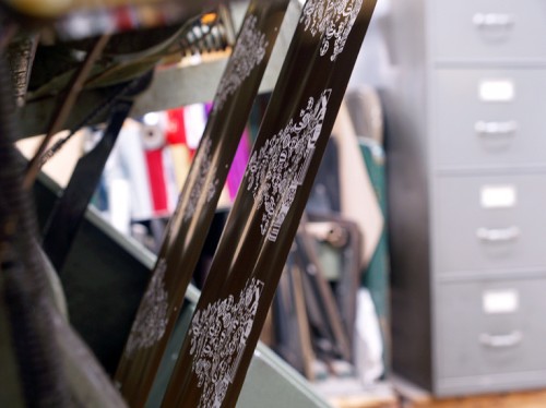
Until very recently, much of this letterpress printing was accomplished using both metal and wood type, literally individual letters arranged to form words.  The type could be reused over and over as long as it was cared for and well-maintained.  While metal type was ideal for commercial printing involving small type (like newspapers), wood type was the best option for larger projects, i.e. posters, broadsides and playbills, due to its lightweight nature.  Type often reflected the trends of the day, from Victorian to Art Nouveau to clean, contemporary stylings of post war design.

The Printing Process

The process of letterpress printing is virtually unchanged; type and cuts (ornamental or image plates) are arranged and locked in place into a ‘chase’ (a metal frame that is inserted into the press), and can be used on any press that will take materials that are ‘type high’ (this standard measurement is .918″).

letterpress-antique-type-in-chase

All type is relatively similar in that it is the same height and has markings that help the user determine what typeface it is and what foundry produced it.  Since letterpress is a relief printing process, the type is in reverse – hence the phrase “Mind your p’s and q’s.”

antique-wood-letterpress-type-in-chase

Thanks to the development of standards, type comes in common sizes ranging from 6 to 72 point in metal (give or take).  Wood type is measured by ‘line’, or pica, and comes in a large variety of sizes.

letterpress-antique-wood-type-in-chase

There are many interesting set up pieces (known as leads, slugs and quads) that help letterpress printers achieve really fantastic tricks, such as combining different point sizes of type together, setting type on curves and angles, and printing in multiple colors without altering the set up.

letterpress-antique-type-in-chase

Many small and intricate border and ornamental pieces are veritable designer candy; some are so detailed and miniscule that they cannot be replicated in a magnesium or polymer plate.  This is also true of many 19th century typefaces that are shaded, outlined or have lots of ornaments characters.

Letterpress printing with antique type has many distinct characteristics that may or may not be appealing to everyone.  It is not designed to produce a heavy impression in paper, as the type is soft and would be ruined.  In fact, the concept of a deep letterpress  impression is a very recent development.

letterpress-baby-announcement

letterpress-baby-announcement

It also does not produce perfectly crisp and even results, given that the type comes from a variety of backgrounds (some may be 100 years old, and some may be brand new from one of the few extant type foundries).  However, there are many wonderful qualities to hand set type, including an element of surprise that happens after the forme is locked up and the first print emerges from the press.

letterpress-wedding-invitations

letterpress-wedding-invitations

letterpress-wedding-invitations

Some letters are charmingly awkward in a way that digital type is not, and many wood letters have an incredible texture to them.  There are elements to working with metal and wood type that can be frustrating for the printer, as well as exhilarating, as one learns how previous craftsmen worked around the quirks of type.

Tips and Advice

When deciding on letterpress printing, if a deep impression is the one thing that you really want, working with an antiquated printer is not the direction to explore.  But if you’re seeking a vintage-inspired design that incorporates original Victorian, Art Deco, or other forms of antique type, then an old timey press is perfect for you!  Antique type is also perfect for couples seeking to model their wedding invitations after vintage show or concert posters, since the medium is particularly suited to text-focused designs.  It is also the most eco-friendly option for letterpress printing, as the type can be used and reused for centuries if it is maintained, eliminating the need to create new materials for every job.

Besides Starshaped Press, where we do all of our printing with handset metal and wood type, here are a few shops we admire for their commitment to antiquated type setting:

Hatch Show Print

Yee Haw Industries

Hammerpress

Thanks Jen!  You can check out more from Starshaped Press right here!

Photo Credits: Starshaped Press

Notes on our images:
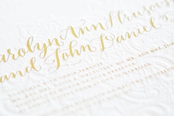
Grant’s Baby Announcement was printed in two colors on a platen press. The smaller type is all metal, while the name was set in wood. The close up shows the fun texture the wood type created (there’s also a close up of the type itself).  The pale green texture in the background was achieved by printing the back side of a large piece of wood type, combined with ornamental linotype slugs (patterned lines that were cast on a linotype machine).

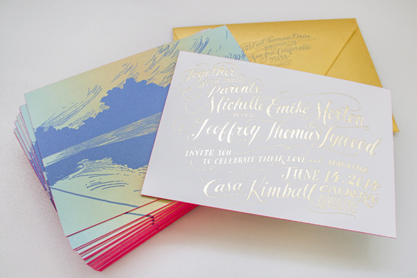
Abbey and Derek’s Wedding Invitation features a perforated reply card and folds to fit in a #10 envelope.  It is printed in two colors on kraft cover weight stock and combines both wood type and metal type. Because of the amount and variety of size of the type included, it was printed on a Vandercook proof press.  To justify the type, it has to be letterspaced extensively, as shown in the close ups.

*Starshaped Press is a spon­sor of Oh So Beau­ti­ful Paper; for more on my edi­to­r­ial poli­cies please click here.