Rainbow Watercolor Wedding Stationery Inspiration

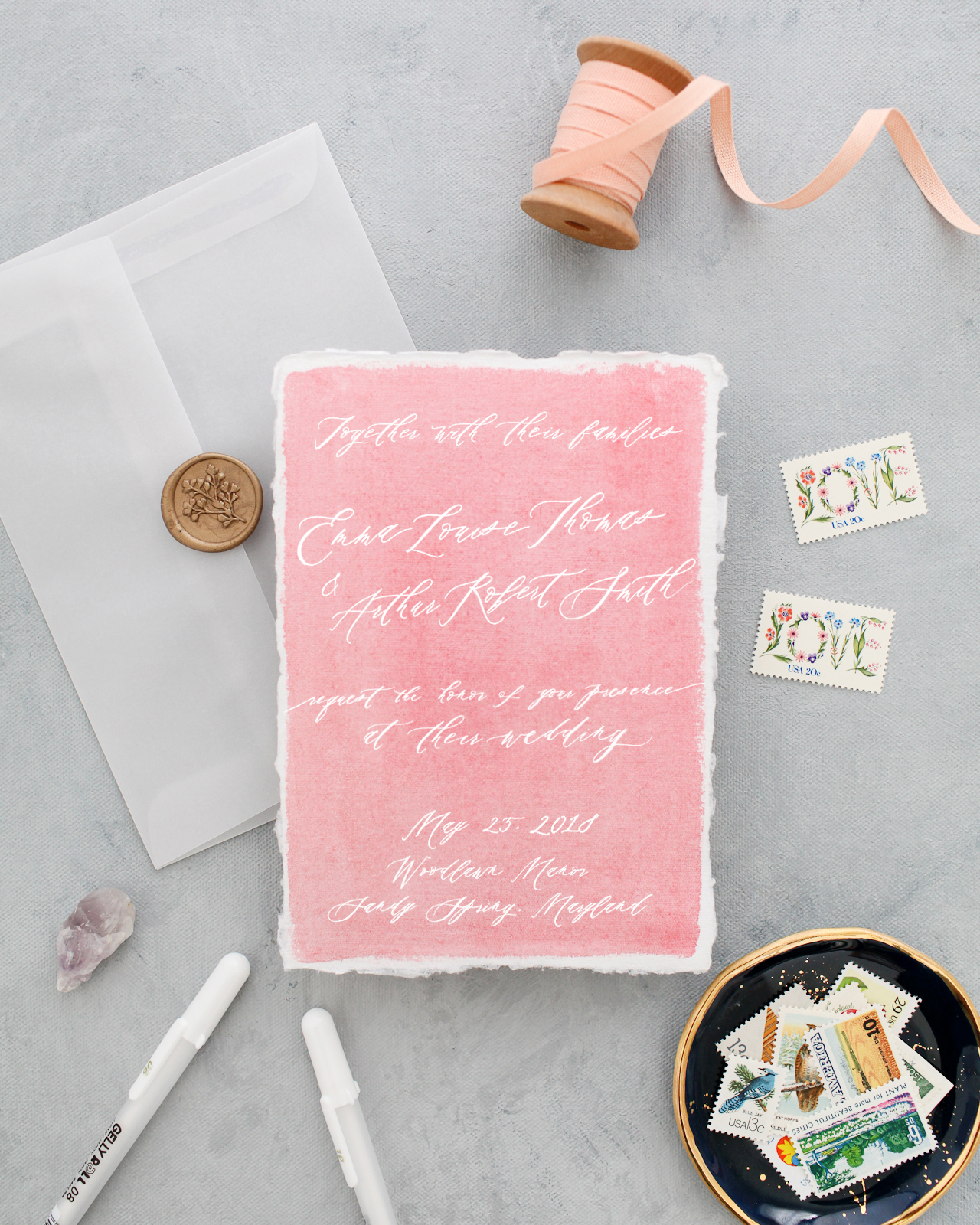
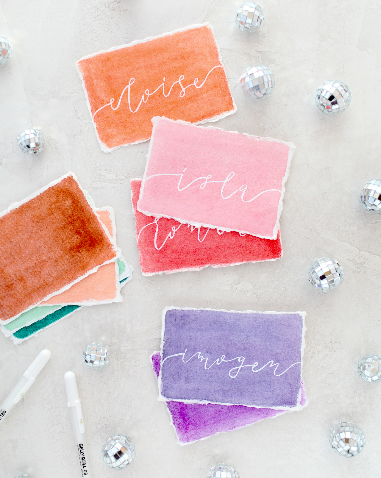
You guys, I am SO excited for today’s post! I’m a big fan of anything rainbow (who isn’t??) and I love the look of white ink on bright colors, and this idea brings those two favorite things together! This concept came out of these DIY colorful watercolor envelopes that we did two years ago (!!), and I’m so excited to partner with Sakura of America to bring this rainbow watercolor wedding stationery inspiration to life. I enlisted Molly from Alchemy Calligraphy to work her calligraphy magic using Sakura’s Gelly Roll® Classic™ White pens (now available in three different weights!) on pieces of handmade paper that I painted with Sakura’s Koi Water Color Field Sketch Travel Kit. I’m so excited to share the results with you, along with the how-to so you can create beautiful rainbow watercolor stationery at home!

Rainbow Watercolor Wedding Stationery Inspiration with Sakura Koi Watercolors and White Gelly Roll Pens

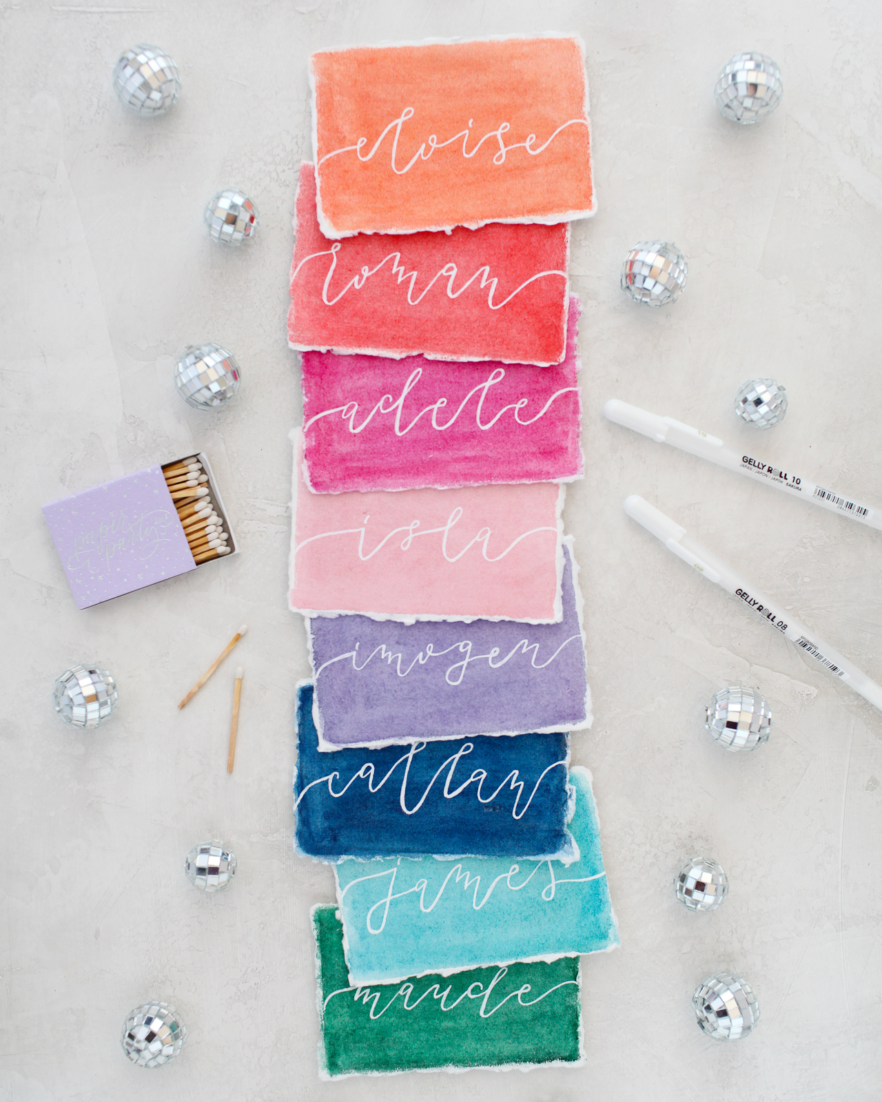
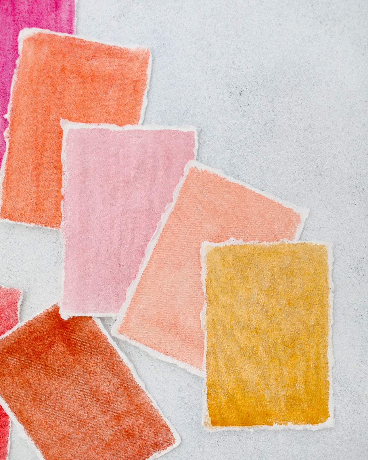
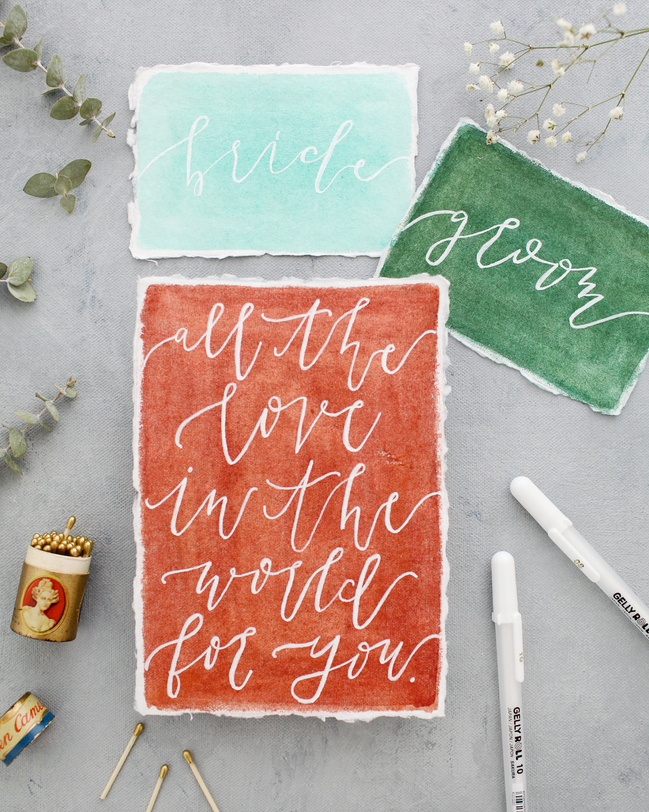
Okay, so there are two super exciting things happening here: first, the Sakura Koi Water Color Field Sketch Travel Kits allowed me to mix my ideal rainbow color palette. Since so many pieces of paper were involved, I wanted to translate my rainbow inspiration into several different hues of each color, from the palest pink to the deepest blue and plenty of non-traditional hues in between. I’m seriously loving the terra cotta color under the quote piece below, especially paired with shades of pale pink, peach, and deep blue. So good! And second, the different weights of the Gelly Roll Classic White pens are the perfect tool for creating different lettering styles and illustrations on the watercolor paper – and the white ink is totally opaque, so it’s super clear and crisp!

Rainbow Watercolor Wedding Stationery Inspiration with Sakura Koi Watercolors and White Gelly Roll Pens

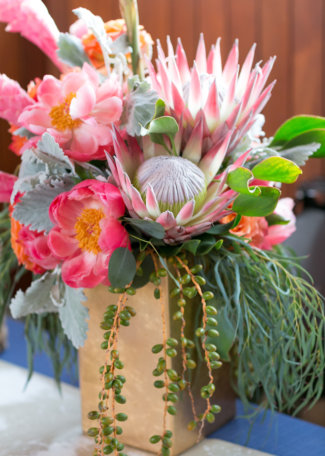
I mean, if you’re going to send out colorful watercolor envelopes, you probably want to incorporate some color into your wedding stationery, right? You can also totally use these ideas for baby showers, birthday parties, or any other event! Every party needs a bit of color and texture, no matter the size of the party! You can go full rainbow like I did, or focus on a few colors from your own color palette – with watercolor, you can easily mix your any color, so the sky is the limit! And the opaque white ink ties everything together so the entire look is cohesive.

Rainbow Watercolor Wedding Stationery Inspiration with Sakura Koi Watercolors and White Gelly Roll Pens

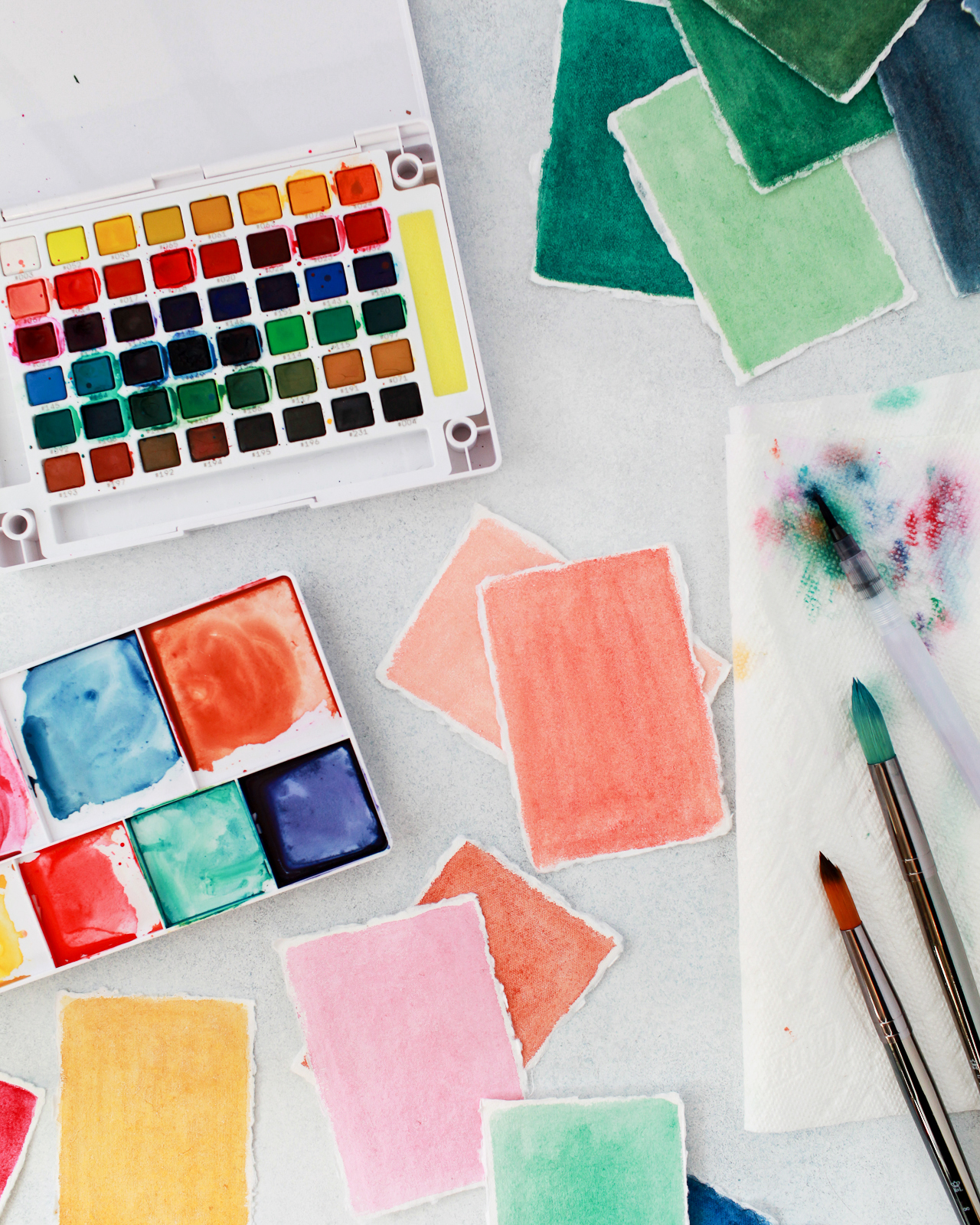
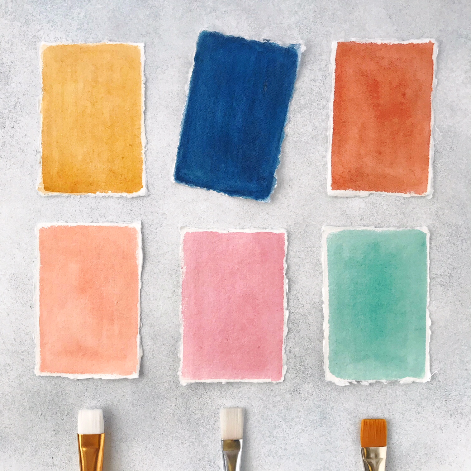
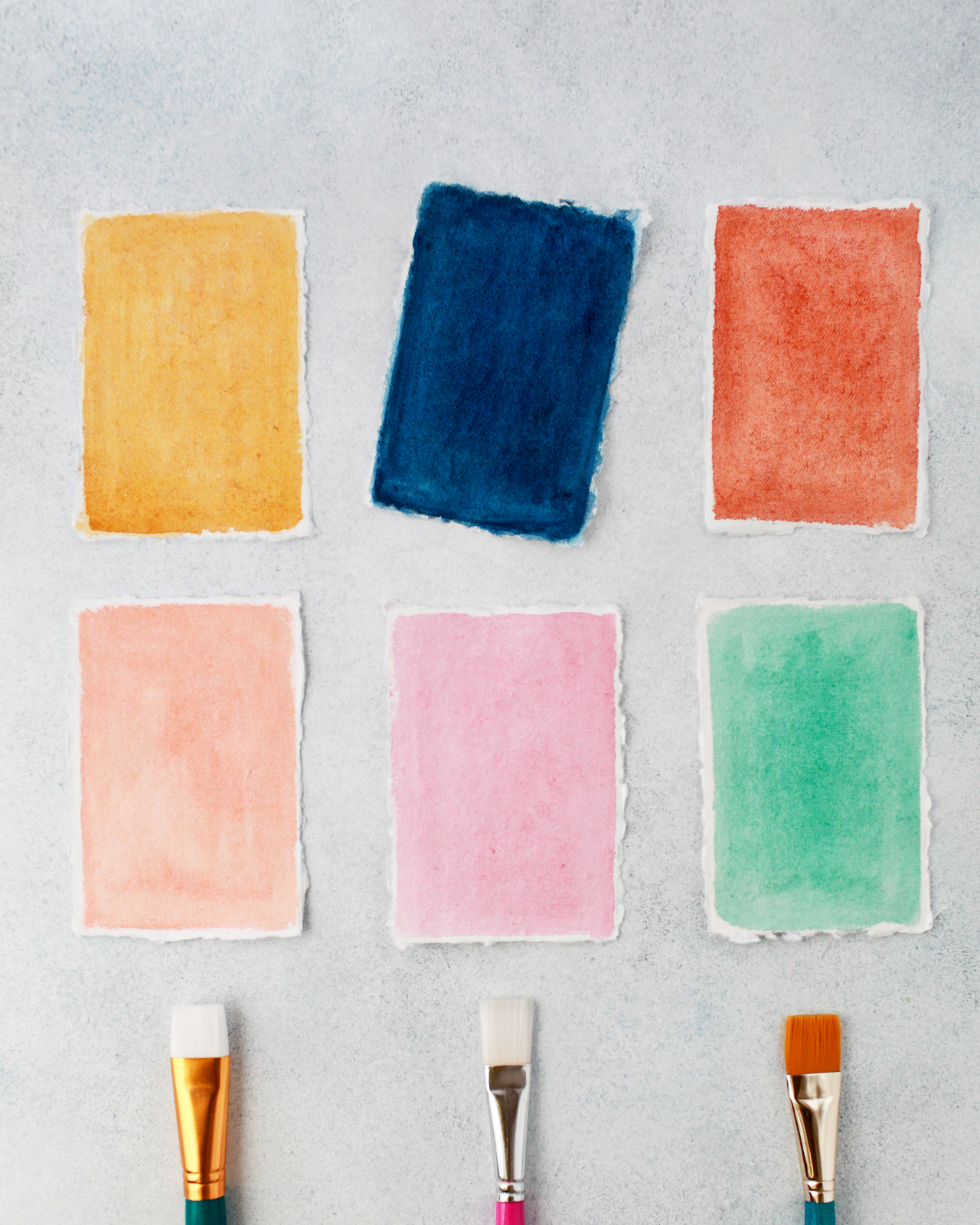
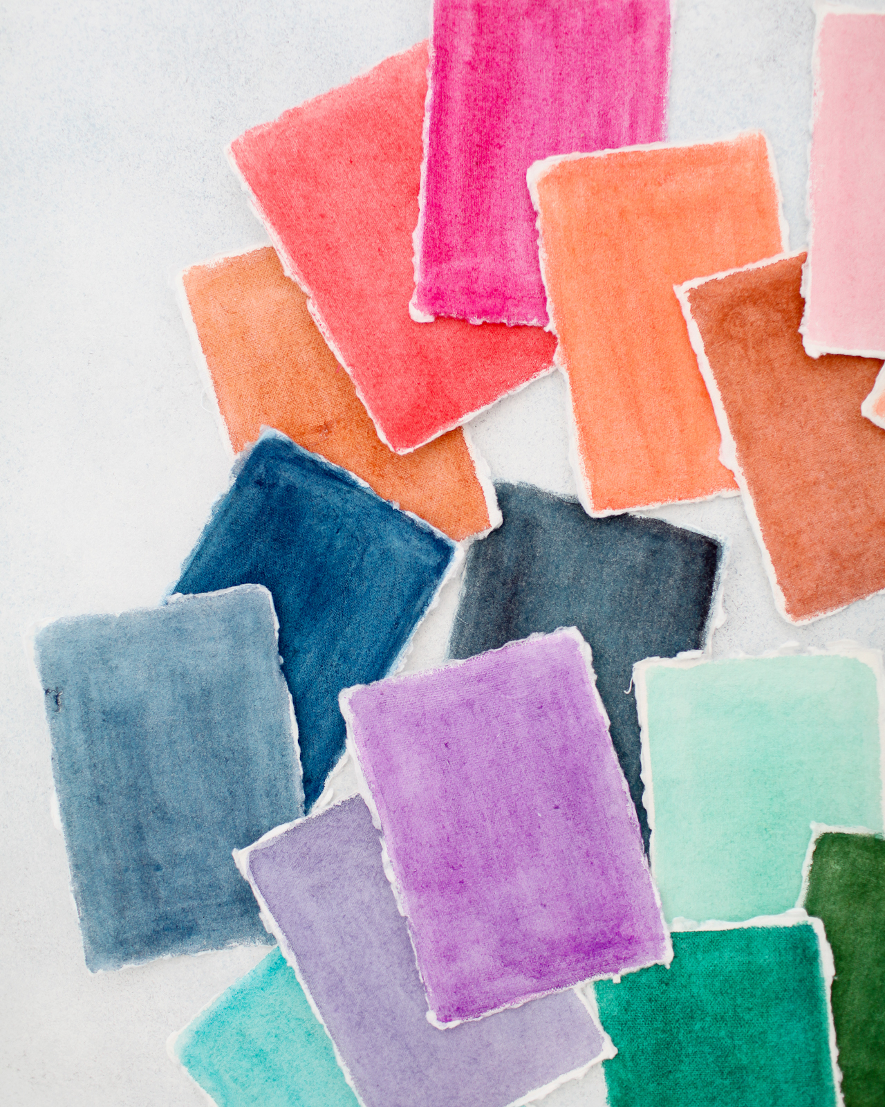
To create the rainbow watercolor wedding stationery, we used Sakura’s new 48-color Koi Watercolor Field Sketch Travel Kit to mix and paint dozens of different colors on handmade paper in varying sizes. I used Sakura’s refillable water brush to mix the paint colors in the detachable easel, then a larger, wider brush to paint the watercolor onto the paper in smooth strokes – leaving the tiniest white border around the edge. Also, the amount of water that you use helps determine the vibrancy of the colors. I used less water when I wanted really deep or bright colors, and more water when I wanted a lighter or more pastel color. Keep a test sheet of paper handy so you can test colors first before painting, since the colors can look different in the pan than on paper!

Rainbow Watercolor Wedding Stationery Inspiration with Sakura Koi Watercolors and White Gelly Roll Pens

Rainbow Watercolor Wedding Stationery Inspiration with Sakura Koi Watercolors and White Gelly Roll Pens

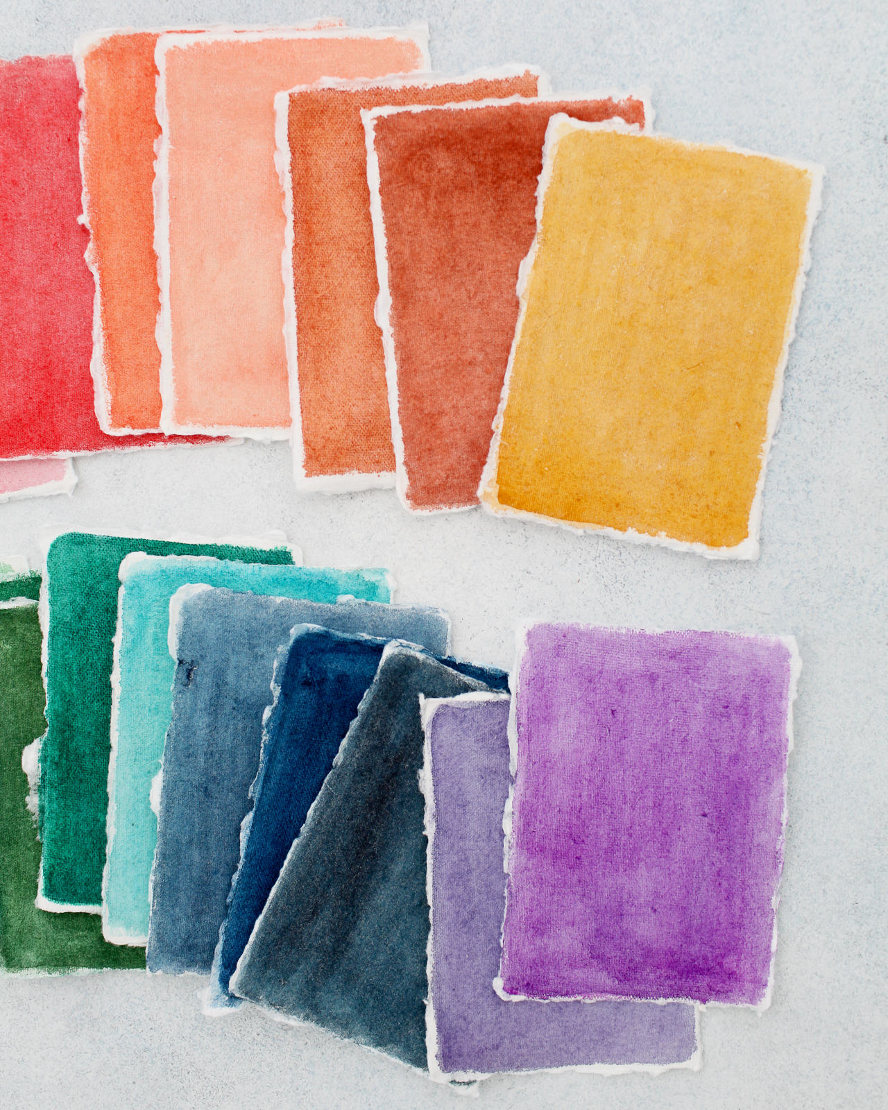
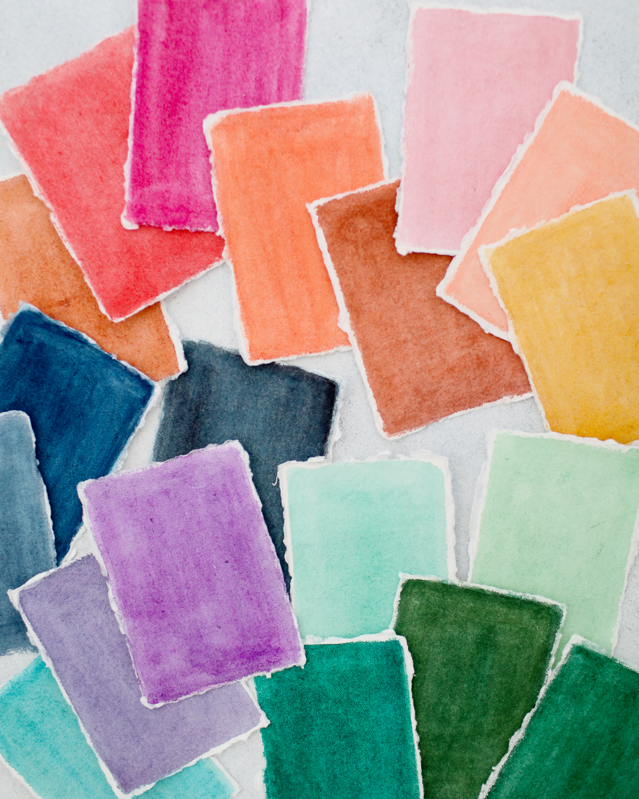
So much rainbow gorgeousness! I had place cards, menus, and table numbers in mind when choosing paper sizes, so we used mostly 2.5×3.5″ pieces and a few 5×7″ pieces. The key to achieving really bright and vibrant colors is to use handmade cotton rag paper – mine came from Fabulous Fancy Pants and Silk & Willow. I tried painting on store-bought watercolor paper but just really wasn’t able to get the colors that I wanted! The handmade paper totally did the trick.

Rainbow Watercolor Wedding Stationery Inspiration with Sakura Koi Watercolors and White Gelly Roll Pens

That mustard yellow right there is just singing to me! So good!

Rainbow Watercolor Wedding Stationery Inspiration with Sakura Koi Watercolors and White Gelly Roll Pens

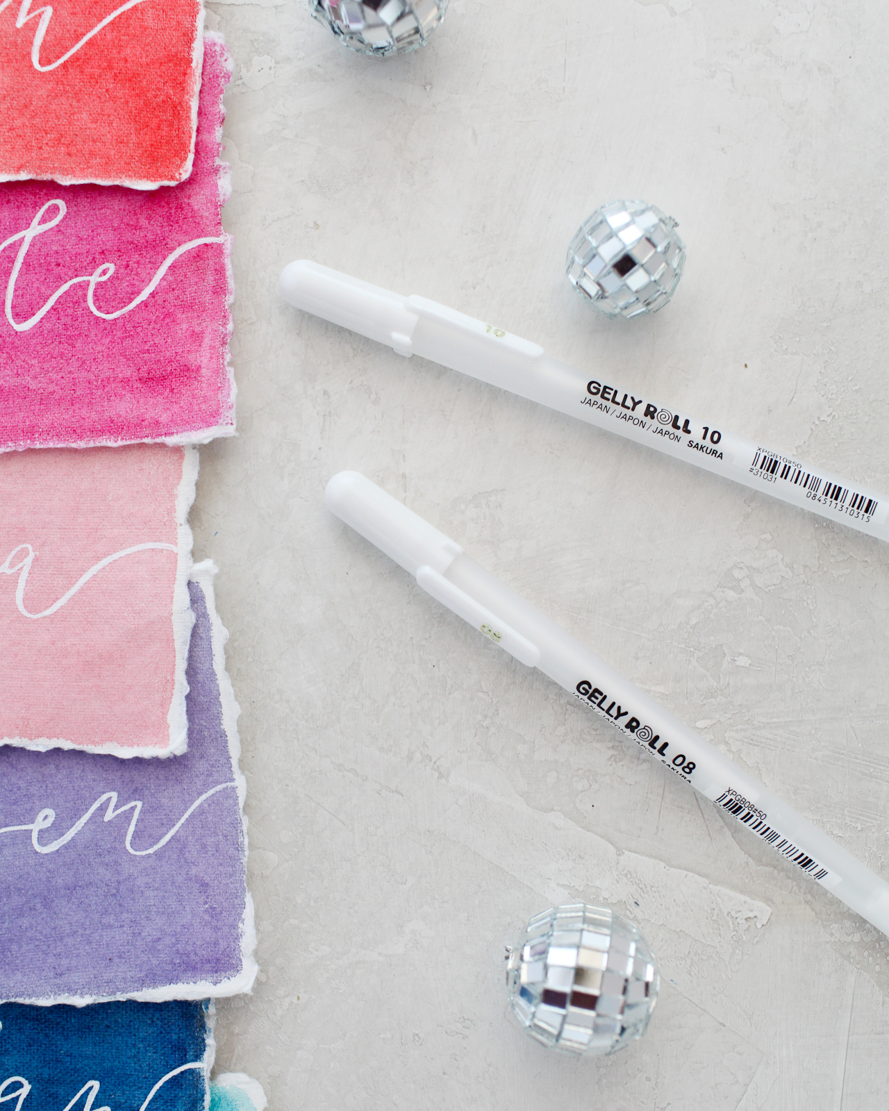
Once everything is fully dry, you can start lettering! The Gelly Roll® Classic™ White pens come in three different weights – 05 fine (0.5mm), 08 medium (0.8mm), and 10 bold (1.0mm) – so you can really have fun with different lettering styles and calligraphy. Fine lines are perfect for elegant calligraphy on a wedding invitation, while the medium and bold lines are fun for more non-traditional lettering on place cards and menus. You can also mix different lettering styles, from script to serif to all caps – the most important thing is to have fun with whatever styles you choose!

Rainbow Watercolor Wedding Stationery Inspiration with Sakura Koi Watercolors and White Gelly Roll Pens

Rainbow Watercolor Wedding Stationery Inspiration with Sakura Koi Watercolors and White Gelly Roll Pens

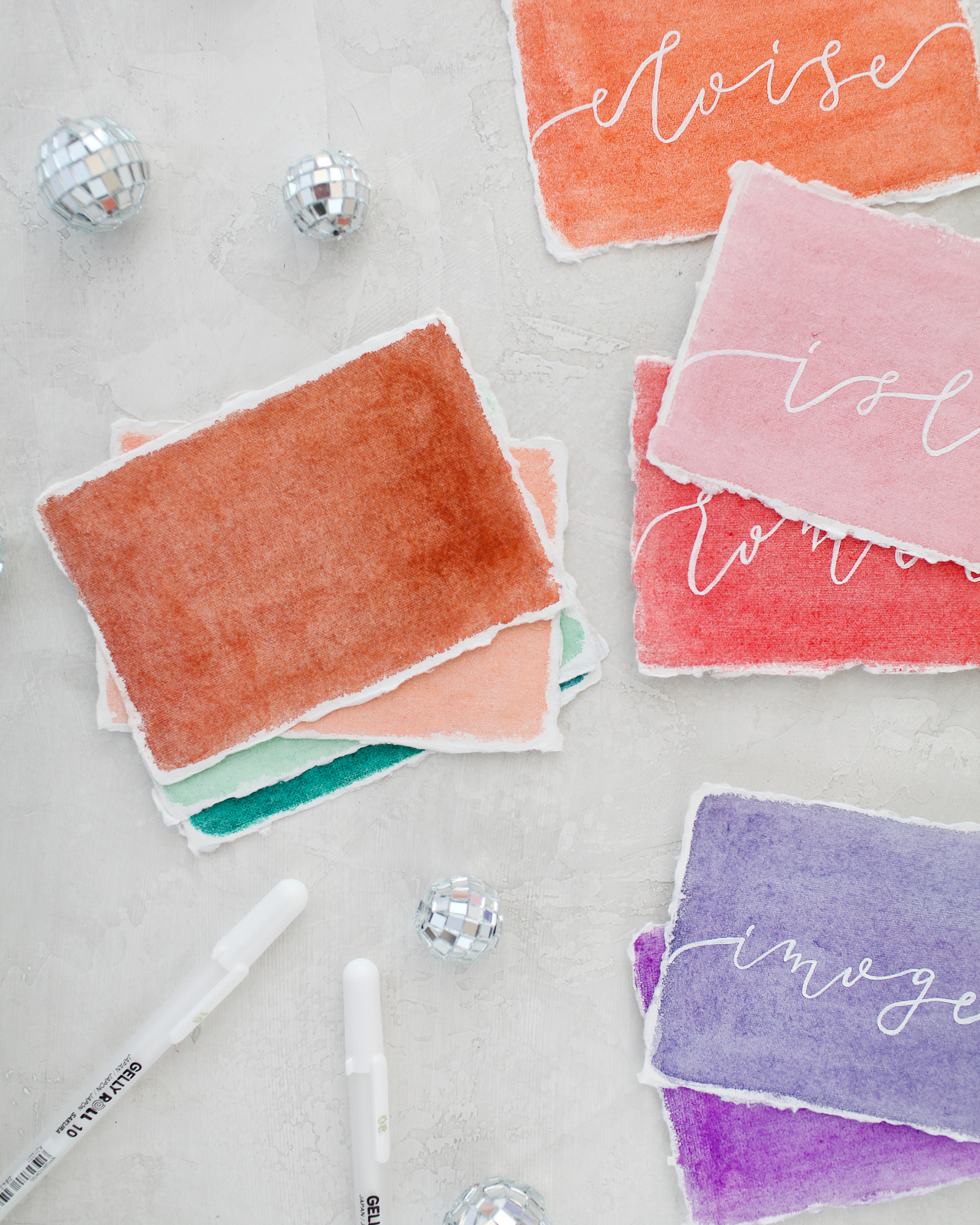
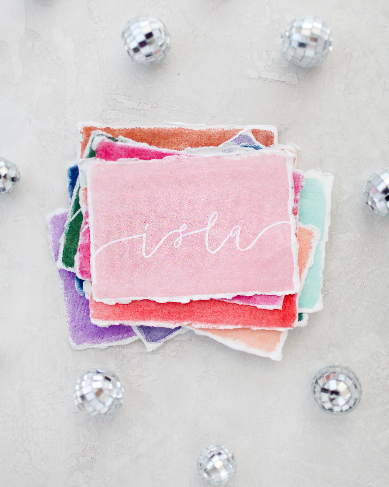
Is there anything better than beautiful watercolors combined with soft deckled edges? It’s just the perfect combination!

Rainbow Watercolor Wedding Stationery Inspiration with Sakura Koi Watercolors and White Gelly Roll Pens

Rainbow Watercolor Wedding Stationery Inspiration with Sakura Koi Watercolors and White Gelly Roll Pens

Rainbow Watercolor Wedding Stationery Inspiration with Sakura Koi Watercolors and White Gelly Roll Pens

Rainbow Watercolor Wedding Stationery Inspiration with Sakura Koi Watercolors and White Gelly Roll Pens

Rainbow Watercolor Wedding Stationery Inspiration with Sakura Koi Watercolors and White Gelly Roll Pens

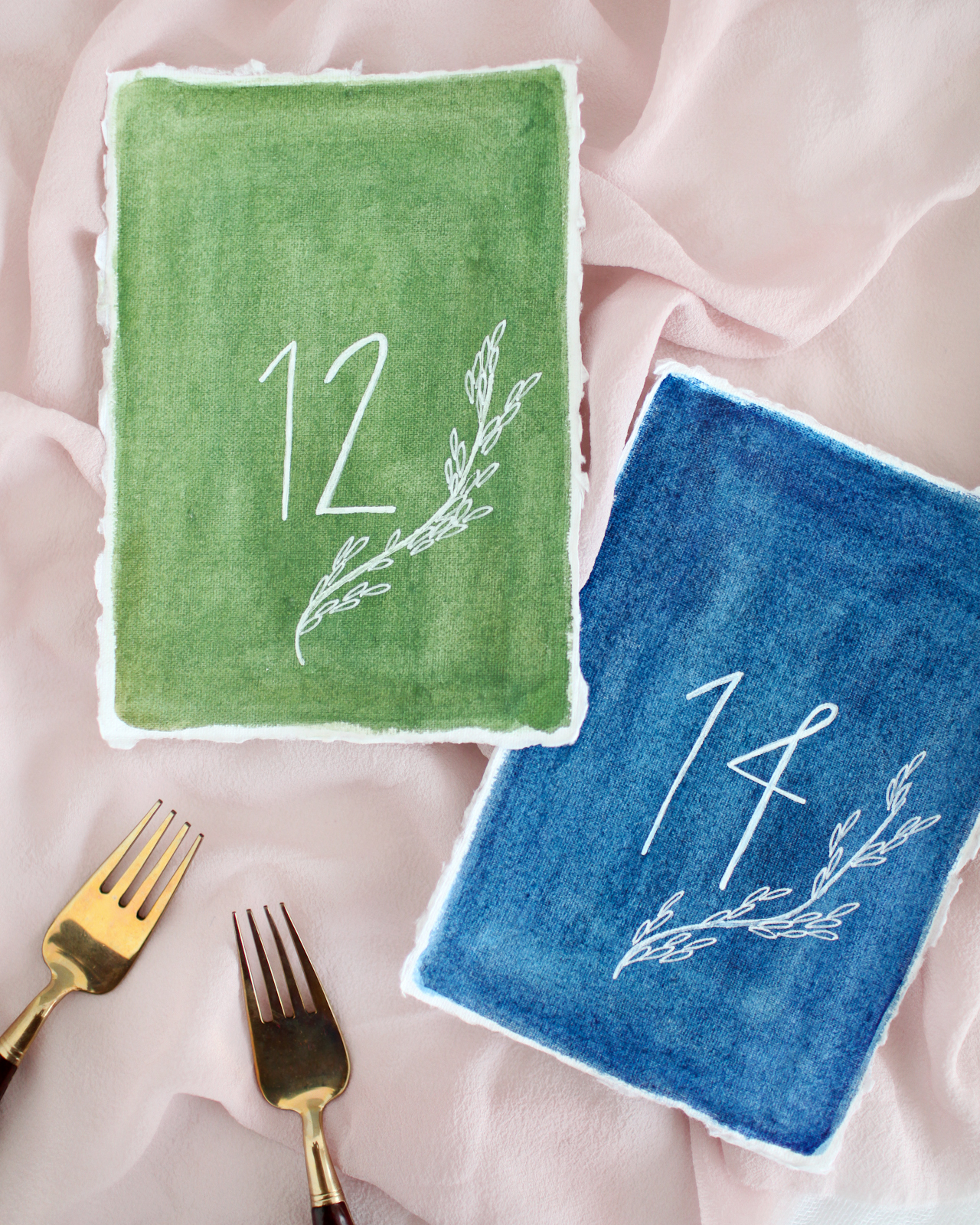
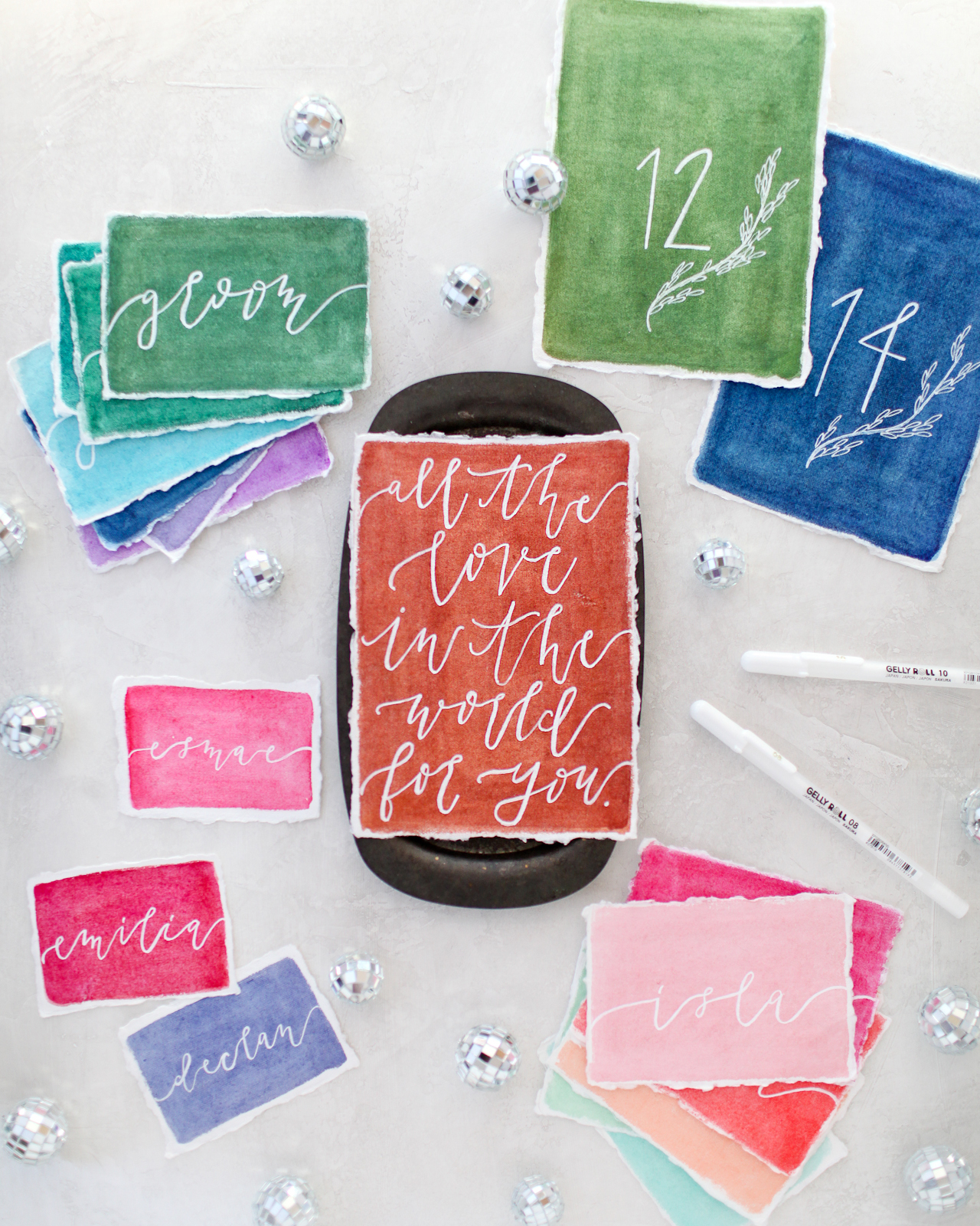
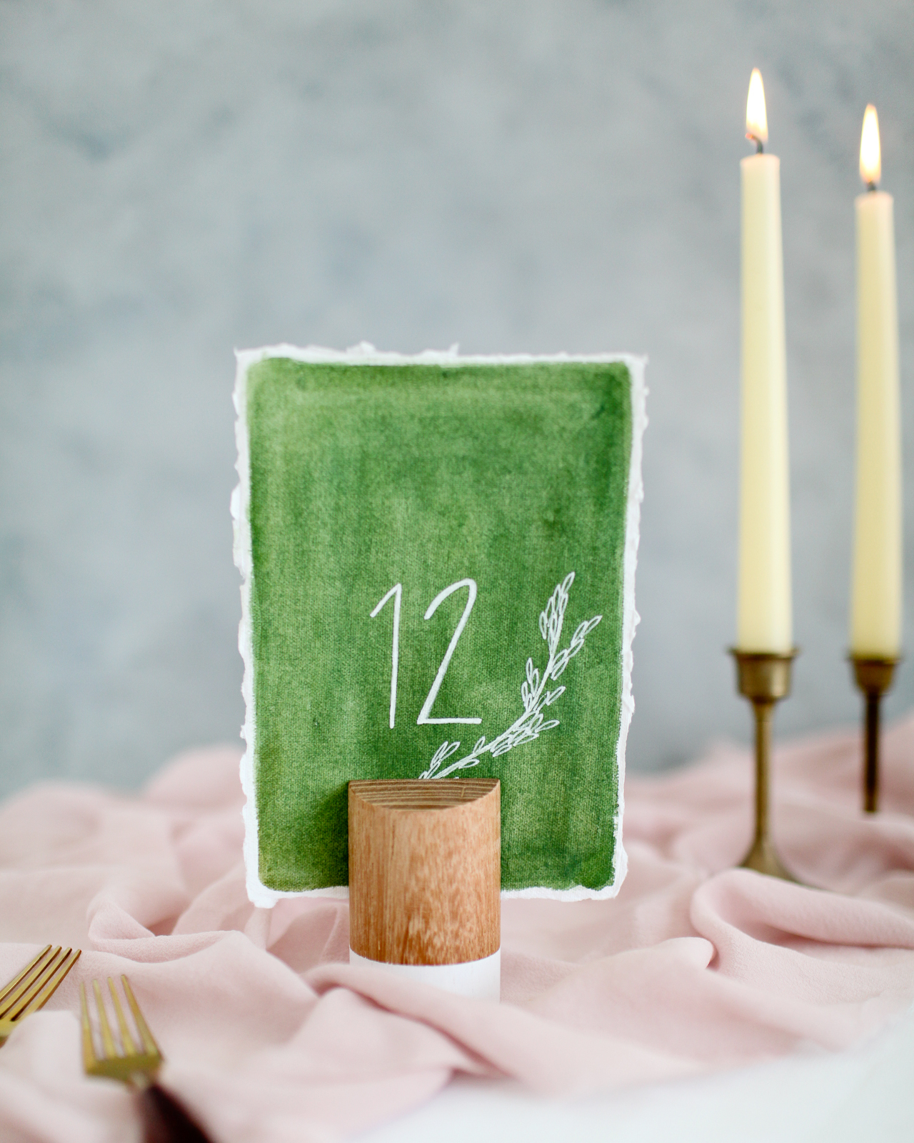
I love the way Molly from Alchemy Calligraphy added these sweet botanical illustrations to the table numbers! Such a fun way to dress up a simple table number design. I love the way the white ink pops against the watercolor, and the texture of the handmade paper also adds such a special and unique touch.

Rainbow Watercolor Wedding Stationery Inspiration with Sakura Koi Watercolors and White Gelly Roll Pens

Rainbow Watercolor Wedding Stationery Inspiration with Sakura Koi Watercolors and White Gelly Roll Pens

Rainbow Watercolor Wedding Stationery Inspiration with Sakura Koi Watercolors and White Gelly Roll Pens

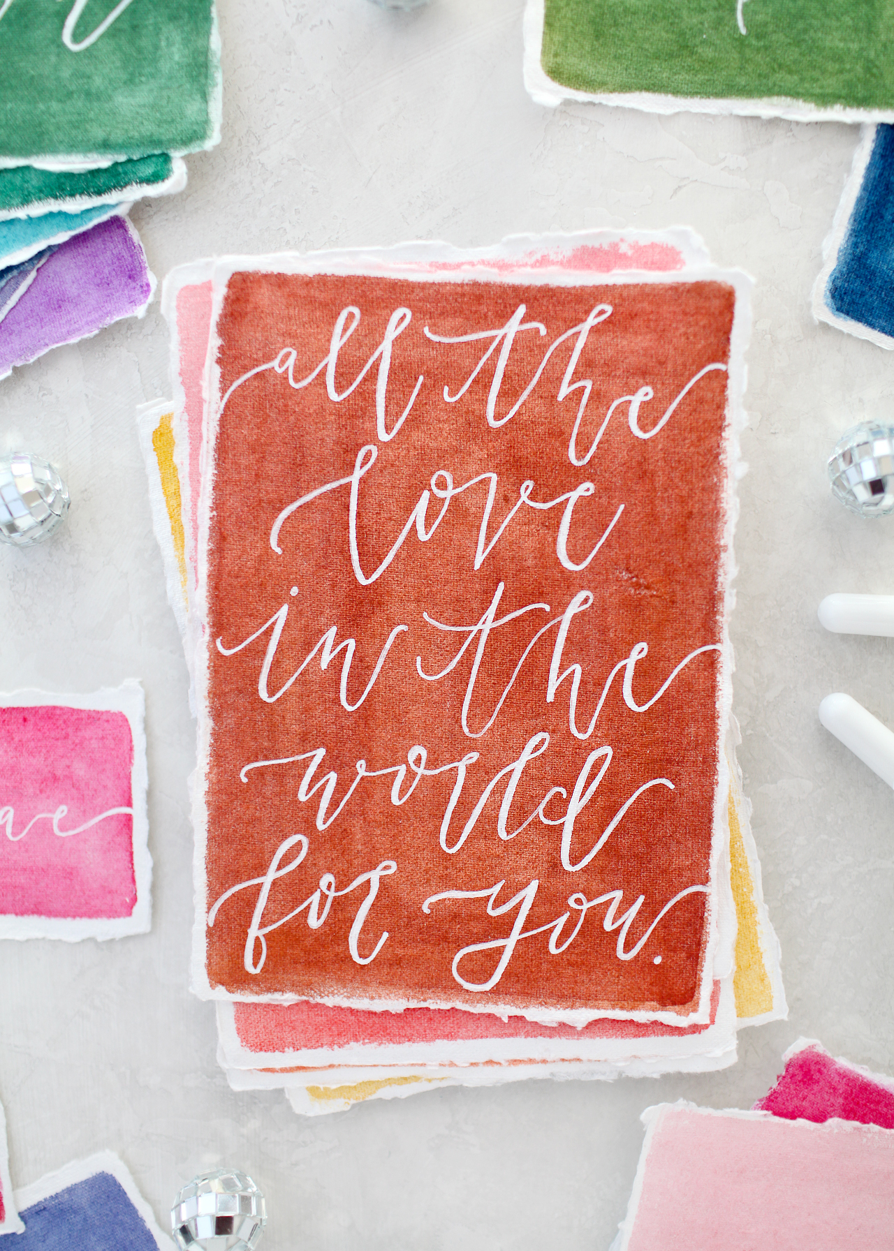
I feel like this quote would be perfect for a guest book, right? Ask guests to leave a note with their favorite marriage advice or even their own favorite quote about love!

Rainbow Watercolor Wedding Stationery Inspiration with Sakura Koi Watercolors and White Gelly Roll Pens

Rainbow Watercolor Wedding Stationery Inspiration with Sakura Koi Watercolors and White Gelly Roll Pens

So much fun rainbow watercolor wedding stationery inspiration, right??? You can pick up your own 48-color Koi Water Color Field Sketch Travel Kit here and Gelly Roll Classic White pens here – you’ll have so much fun creating beautiful and colorful stationery for your wedding or event!


Supplies: Sakura of America 48-color Koi Water Color Field Sketch Travel Kit and Gelly Roll Classic White pens

Calligraphy: Alchemy Calligraphy

Handmade Paper: Fabulous Fancy Pants and Silk & Willow


Photos by Nole Garey for Oh So Beautiful Paper

This post is sponsored by Sakura of America. All content and opinions are my own. Thank you for supporting the sponsors that make Oh So Beautiful Paper possible!

Ten Awesome Mother’s Day Cards

Mother’s Day is just a few weeks away – which means it’s time to pick out a card for all the wonderful moms in your life! I definitely have a new appreciation for Mother’s Day now that I’m a mom. What’s that saying? Motherhood is the best and hardest job? So much yes. I love being a mom, but being a mom also makes me want to send little notes of appreciation and encouragement to every mom I know! Here are ten awesome Mother’s Day cards to help share the love!

Ten Awesome Mother's Day Cards

1. A trip to Target without the kids sounds like heaven! Send fun Mother’s Day wishes with this Pinwheel Printshop card.

2. Why yes, E. Frances Paper, it SHOULD be mom day every day!

3. Loving this marbled Mother’s Day card from Antiquaria – the gold foil text is a lovely extra touch!

4. Such a sweet and sentimental Mother’s Day card from Our Heiday

5. Words that every single mom loves to hear from Worthwhile Paper

6. A sweet floral illustration and simple hand lettered message from Dahlia Press

7. Couldn’t resist this sweet mama and baby llama card from Ghost Academy

8. The perfect card from Heart Swell for those of you lucky enough to have a super close relationship with your mom

9. It wouldn’t be Mother’s Day without flowers! Loving this illustrated floral card from Lana’s Shop

10. Pretty pink text and sweet floral illustrations from The Whistling Fox


p.s. More Mother’s Day cards here, here, and here!

Spring Flower Arranging Tips

I love flowers. I just always have. As a little girl I would stop and literally smell all of the roses during walks around my neighborhood with my dad. As an adult, I try to always have a vase (or two!) of fresh flowers at home. Pretty flowers are the perfect addition to dinner parties and family gatherings – after delicious food and great cocktails, of course. And with Passover and Easter coming up this weekend, I thought I’d share a few of my favorite flower arranging tips for your next get together!

Flower Arranging Tips

1. Keep Things Simple

Flowers don’t need to be complicated. Stick to a single color (mono-chromatic) or a single type of flower (mono-botanical) – or both! My favorite floral arranging trick is to pick up a few bunches of the same in-season flower and drop them into a low vase. My favorite flowers for mono-botanical arrangements include anemones (pictured below), peonies, ranunculus, garden roses, and hellebores (pictured above).

Flower Arranging Tips

Similarly, a large quantity of a very small flower – like chamomile, wax flower, or baby’s breath – looks impressive without being visually cluttered. These smaller flowers also tend to be inexpensive, making them the perfect solution for a party on a budget.

2. Go Small

Huge floral centerpieces can look out of place at an intimate dinner party or cocktail party. Instead, try using several small arrangements with just 3-4 stems each. You’ll be surprised how a few small vases can brighten and transform a room!

Flower Arranging Tips

3. Mix and Match Vessels

I love using similar, but slightly mismatched vases and vessels to help elevate your floral arrangements and tie everything together. Vintage white milk glass vases are the perfect neutral backdrop for colorful flowers, while vintage glass jars collected over time are my preferred vessel for wildflower arrangements. You can even mix and match vase shapes and sizes if you stick to a common material (glass, ceramic, brass, copper, etc.) or a consistent color palette.

Flower Arranging Tips

4. Use a Statement Flower

Single stems of a large beautiful bloom look amazing in vintage bud vases or other vessels repurposed as vases – like the antique crystal perfume bottles seen here. Try placing individual blooms of a single variety, like peonies, dahlias, or even sunflowers, in groups of three for visual impact.

Flower Arranging Tips

5. Mix Things Up

Don’t be afraid to mix different flower varieties together. But try to stay within a specific color palette to make sure things look cohesive. Roses, peonies, dahlias, and ranunculus are all extremely versatile and look amazing mixed with tropical flowers (like the protea below) or combined with wildflower-style blooms like Queen Anne’s Lace, foxglove, scabiosa, or even fresh herbs and berries. Bottom line: if you think it’s pretty, go for it!

Flower Arranging Tips

6. Don’t Forget the Green!

Greens are an essential part of any floral arrangement – you could even create an entire arrangement with just a few greens from the flower market or grocery store! My favorite greens are seeded eucalyptus and silver dollar eucalyptus, maiden hair fern and ming fern, plumosa, geranium leaves, and dusty miller.

Flower Arranging Tips

7. One Big Statement Piece

Every party needs one big statement piece. For cocktail parties, place one large floral arrangement near the entrance or by the bar, with smaller arrangements of 3-4 stems scattered around the room. This is also a great opportunity to bring in a tall floral arrangement that might look out of place elsewhere in the room.

Flower Arranging Tips

Floral Design and Photo Credit: Sweet Root Village for Oh So Beautiful Paper

For dinner parties, keep things low and wide with a single large centerpiece at the center of the table. You could even try arranging in a vintage compote, using floral foam or a wire pillow to keep the flowers stable.

Flower Arranging Tips

Floral Design: Soirée Floral, Photo Credit: Charlie-Juliet Photography for Oh So Beautiful Paper

Those are my favorite flower arranging tips! If you have any tips to add, please share them in the comments!

Behind the Stationery: Heartell Press

I’m so excited to introduce our first hand-carved woodblock designer that we’re featuring on the Behind the Stationery column! Rachel from Heartell Press is here to take us through her processes – from the intricacies of designing and carving each block, to growing her business, to ensuring her team is self-sufficient enough for her to take some time to adjust to being a new mom. She started Heartell Press in Brooklyn, but has since moved to Indiana with her husband and into a beautiful spacious studio. Here’s Rachel! —Megan Soh

Behind the Stationery: Heartell Press

From Rachel: Heartell Press cards are printed from hand-carved woodblocks. Woodcut was always my favorite of the printmaking processes, and the folksy look of the carved images and the organic textures created by the woodgrain are a good fit for our warm, sincere designs and messages. There are great designers who use linoleum blocks (Katharine Watson, Ghost Academy, and Kaibelle Designs are my favorites), but as far as I know we are the only line printed from wood. It has taken lots of trial and error to learn to print our blocks consistently and at scale using letterpress equipment, but I think our customers appreciate that each card is truly handmade on every level.

Behind the Stationery: Heartell Press

The carving is time-consuming, especially because each color we add to a design means carving a separate block. I’m always working on ways to preserve the look and feel of what we make while streamlining the process for producing our products. For the new spring collection we’re working on now, I’m carving the key block — the part of the image that has the most detail and information — and experimenting with photopolymer plates to add lots of additional color. I’m excited because if it works we’ll be able to release new cards with lots of color and add new types of products to our line more frequently while still offering cards and prints that are true to the Heartell aesthetic and unique in our industry.

Behind the Stationery: Heartell Press

My path to stationery was long and winding. It took doing a lot of the wrong things to find the right thing. I went to grad school twice, first to earn an academic degree in religion and art history from Yale Divinity School and then an MFA in printmaking from the School of the Art Institute of Chicago. After I finished school in 2009, I moved to New York and cobbled together a living with multiple part-time jobs. I worked in a church, as a nanny, and eventually ran a non-profit. All the while I was renting a (super expensive and tiny) art studio in Gowanus, Brooklyn, and trying to squeeze in as many hours per week there as possible making paintings and prints. I had a few shows in Brooklyn and Manhattan, but it was tough trying to build an art career and pay rent in New York.

Behind the Stationery: Heartell Press

In 2012 my mom was diagnosed with cancer, and that experience made me question the chaotic existence I was living and inspired me to find a way to do the creative work I love full time. Since I was having a hard time finding sympathy cards that I liked enough to send to my mom between visits, I started having ideas for making my own cards. People in my life and my community in Brooklyn were responding to them in a way that made me think there might be something there.

Behind the Stationery: Heartell Press

I began to look more closely at the stationery industry, and when I discovered that there was a wholesale market for handmade stationery, especially at the National Stationery Show (through the OSBP blog!), the idea for Heartell Press was born. I did research and worked on developing my line and launched the website in 2014. I exhibited for the first time at NSS in 2016 and that is when the wholesale part of Heartell took off and I was able to leave my day jobs and focus on the business full time.

Behind the Stationery: Heartell Press

In 2016, my husband and I decided to leave Brooklyn and move to Fort Wayne, Indiana, where he grew up. The move has been great for us and for Heartell, giving me lots more time and space to devote to it. In November 2017, we moved the business into a new studio space here in Fort Wayne. It is two-thirds less expensive than the space I rented in Brooklyn and eight times bigger! We have room for our presses, including a new (to us) 10×15 Chandler and Price that we added to our shop when we moved, as well as inventory, a shipping and fulfillment space, office space for me to do my designing and carving, and plenty of storage. The building has a beautiful atrium full of tropical plants that is like a greenhouse, and I love being able to walk around it when I need to think or stretch after lots of drawing or carving.

Behind the Stationery: Heartell Press

Heartell designs start with bits of text or images that I collect in lists for each card and product category (I use Trello for organizing all my lists, plans and tasks). My best cards are inspired by experiences I’m having in my own life and relationships. The earliest Heartell cards are all sympathy, love, and encouragement cards that I made when my mom first got sick. It will be pretty obvious when the new collection comes out that many of the designs I’m working on now have been inspired by the experience of being pregnant (and also watching friends and family members who have had children).

Behind the Stationery: Heartell Press

I try to make cards that I would genuinely want to give or receive. There are lots of funny cards right now about all the (sometimes unwelcome) changes that come when you have a baby, like having to deal with tons of poo, and those definitely serve an important purpose in the process of preparing to be a parent. Funny isn’t really my forte though, and I tend to swing toward more sincere, emotional messages. When I do retail markets I almost always have a customer tear up at my booth at some point during the event. I’m not sure if making people cry is something I should be proud of but I’m glad that I’ve found a way to put all my feelings to good use!

Behind the Stationery: Heartell Press

When I’m ready to design a new collection, I go through our current catalog to see which parts of our line could use fleshing out or freshening up. Then I comb through my stockpile of ideas and draw thumbnails with colored pencils to begin mapping out new designs. Once I have an idea of the collection as a whole, I use my Wacom tablet and Photoshop and Illustrator to draw the full scale images and lay out the text. I used to do this with pencils and markers on vellum, doing lots of tracing and scanning to come up with the final designs, but the tablet has made the process much faster and more fun.

Behind the Stationery: Heartell Press

When the designs have been edited and vetted by as many people as I can get to look at them and I’m satisfied with my plans, I print guides using a laser printer and transfer them to blocks of Shina plywood (a wood that is both soft for easy carving and strong enough to hold detail that is harvested sustainably in Japan specifically for printmaking). I use Japanese carving tools to carve the blocks, and then we mount them in the presses for printing.

Behind the Stationery: Heartell Press

Since there is a separate block for each color, including the scoring run, some cards pass through the press up to four times! I love seeing the new designs printed for the first time. It is always a thrill to see something I’ve dreamed up become a finished product.

Behind the Stationery: Heartell Press

Behind the Stationery: Heartell Press

Like many of the business owners I’ve read about in this column, I spend a lot of my time these days running the business end of things. Fortunately I’ve discovered that I enjoy communicating with customers, managing cash flow, looking at numbers and planning for growth. But now that I have help with fulfillment and printing, I am finding lots more time for drawing and designing and carving blocks for new products, which are my favorite parts of my job. I love working on marketing projects too, and I do all our product photography, design our catalogs, and prepare for trade shows.

Behind the Stationery: Heartell Press

I set different goals for each year, and my big one for 2018 is to get Heartell ready to run without my constant attention for a few months while I take some time to welcome our new baby and adjust to being a parent. I feel grateful to have lots of inspiration from other business owners in our field (Nole included!) who have families, and while I’m sure it will be a big transition I feel confident that we’ll be able to find a good equilibrium over time.

Behind the Stationery: Heartell Press

I’ve come to find that stationery is a better fit for me than fine art for a lot of reasons, but one of the things I love most about this industry is how generous and open people are. The fine art world in New York has a deeply competitive culture, and it has been a gift for me to connect with other designers and retailers who are willing to share information, encouragement and support. The more variety there is in terms of design, the more letters people will write and the more connected they’ll be to each other. It feels like we are all part of something that is bigger than any one company or store individually and I love looking at things that way.

Behind the Stationery: Heartell Press

Photo Credits: Product photos by Heartell Press // Studio photos by Ruth Yaro.

Want to be featured in the Behind the Stationery column? Reach out to Megan at megan [at] ohsobeautifulpaper [dot] com for more details.

Happy Weekend!

Ugh. So as I write this, the government has shut down for the second time in less than a month. (Ed Note: Congress passed a spending bill and reopened the government this morning – but still!) My husband is a federal employee, and these repeated shutdowns are both financially scary and really demoralizing. And sadly, it looks like this might be our new normal for a while. So! If you’re interested in supporting Oh So Beautiful Paper and giving my family a boost during this uncertain time, please consider purchasing one of our limited edition art prints in collaboration with Mon Voir. Shipping is free! But in the meantime…

Watercolor Color Swatches / Oh So Beautiful Paper

…a few links for your weekend

OMG, I love the gingham skirt on this super cute dress for little girls!

Loving these cute (and candy free!) printable Valentines

Sending Valentine’s Day cards? Don’t forget your printable envelope liners!

I just bought this striped midi skirt and LOVE it

Need these blue velvet party heels

Give your socks a makeover!

A philanthropically funded Universal Basic Income experiment in California

This is heartbreaking and completely unacceptable: A mother of two young children (a 1 year old and 4 year old) has been detained by ICE since mid-January, when she went in to apply for citizenship. 

On immigration: “But if you get a specifically merit-based system… I wouldn’t be here, and chances are neither would you.”

Also, over the past decade, refugees have contributed $63 billion more in government revenues than they cost.


That’s it for me this week. Have a fantastic weekend and I’ll see you here on Monday! xoxo