Swiss Cottage Designs: A Peek at Our Process

image 2.1 - Post 2 Banner

Every designer has a unique method that works for them. With so many different ways to arrive at the final product, there is always room for experimenting with different styles, supplies and ideas; it’s all about trial and error. Illustration is a process that is near and dear to my heart. I studied illustration at Syracuse University and it’s been the consistent force in my life (sorry flair jeans). I thought I’d share our illustration process here and give you a few tips on how we go about our projects. â€“ Courtney of Swiss Cottage Designs

This one is a fun one: it was a crest for a client’s wedding invitation suite. Her last name is Buck and his last name is Scott, so they wanted to play off that and personify drawings of a deer and scottie dog to represent them. I was in love with this idea right from the get-got! Here is how we started Marie’s crest.

Tools

Every good project starts with your most tried and trusted tools. The ones shown here were not all used for this project but I thought I’d share a few of our favorites:
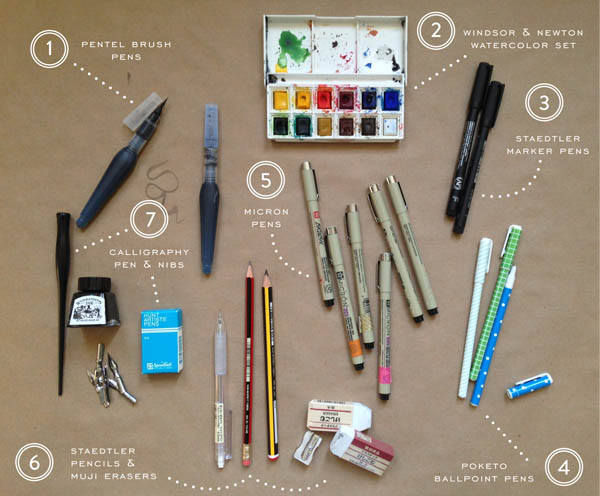
image 2.1 Favorite Tools

1. Pentel Brush Pens: I bought these while in London recently and they blew me away. They are amazing for loose sketches and lettering.

2. Poketo Ballpoint Pens: I couldn’t go a day without these guys. They have a fine point and make marking up proofs pretty neat and tidy.

3. Micron Pens: The amount of Micron pens I have is unhealthy. I color code them with Washi tape so I know which points work better than others.

Step 1: After I get my supplies sorted out, I like to start with sourcing a few inspiration images. While the internet can be both blessing and a curse (who hasn’t fallen down a Pinterest black hole before?), it’s a wonderful resource to get started! I always remind myself that I don’t have to create in a vacuum. If I’m struggling to draw a deer, a million source images are only a few clicks away. One of the lessons I’ve had burned in my mind from college was photographic reference. It helps bring a certain likeness to the drawings.
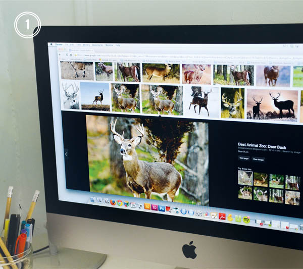
image 2.2 Sourcing Inspiration

Step 2: Next, I sketch out a few options in my sketch book. I love using Straedtler pencils, I find they erase nice and clean so I don’t end up with a muddy mess before it’s all over. If you find yourself at an art supply shop, there are loads of options for leads, colors, weights, etc. so you can find what works best for you and your drawing style.
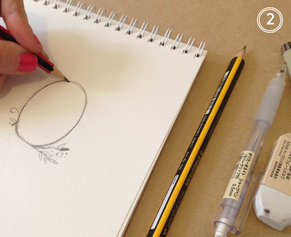
image 2.3 Process Sketch

Step 3: Once I’m happy with the sketches, I’ll redraw them on vellum tracing paper using micron pens. Micron pens come in every thickness and weight under the sun, so I never have trouble creating the line style I’m after. Line weight change is key! The beauty of this step is that is allows me to add or subtract anything I wasn’t wild about from the original sketch.
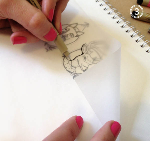
image 2.4 Process Tracing

Step 4: Next I head over to my trust scanner! This little guy is key in the whole process. While I love digital illustration, nothing beats drawing by hand. Without my scanner, I wouldn’t be able to translate anything to digital. I scan in each image at a high resolution and always in black and white as I find it maintains the line integrity better.

image 2.5 Process Scanning

Step 5: Now that everything has been scanned, I can start working with color and placement. When I draw, I tend to illustrate everything in smaller pieces. This provides more flexibility in terms of adding, subtracting, or moving elements around. If I drew everything in one large image, it’d be more difficult to edit it down the road. Photoshop brushes are my best friend! It’s astounding how many textures and styles you can achieve using them. For this particular project, I’m looking for a softer, watercolor wash effect. This is the really fun part as it allows for experimentation. If I don’t like it, I can always undo or delete the layer.
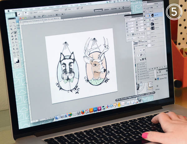
image 2.6 Process Coloring

And finally (drum roll!) I’m all done and ready for the client to have a look.
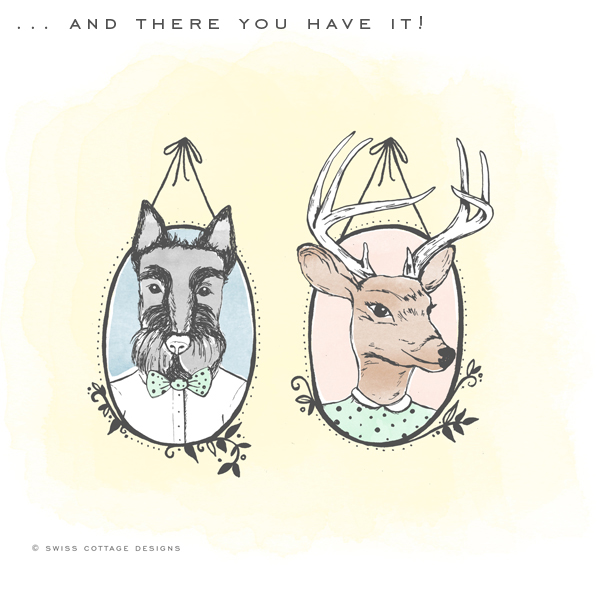
image 2.7 Final Illustration Buck + Scotty… an illustration from start to finish! Some days I might bust out the watercolors or my trusty brush pens depending on the project, but it’s always great to experiment with what works best for you and refine your process as you learn. It’s always a lot of fun and very exciting to see the end result.

Photo/Image Credits: Swiss Cottage Designs

Happy Weekend!

So… you may remember that I booked my family a little beach vacation a couple of weeks ago. Well, we’re off to warmer weather next week! We’ll be visiting Puerto Rico for the very first time and we’re all very excited. Luckily, the wonderful Courtney from Swiss Cottage Designs has agreed to help hold down the fort here next week, along with a few regularly scheduled posts – so you’ll be in great hands! But in the meantime…
OSBP-St-Lucia

Photo by me (via Instagram) from a trip to St. Lucia two years ago

…a few links for your weekend!

This week on Oh So Beautiful Paper:

That’s it for me this week! I hope you all have a wonderful weekend, and don’t forget to check back next week for some fantastic guest posts from Courtney! xoxo

DIY Tutorial: Spring Watercolor Wedding Invitation Suite

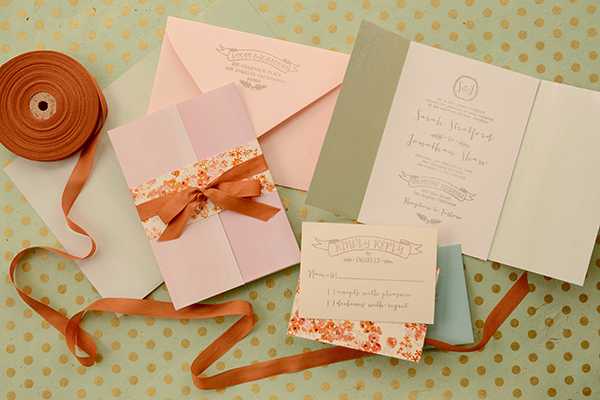
Spring is finally here and we couldn’t be more excited! When we stumbled across this gorgeous double sided watercolor paper by Rifle Paper Co., we just knew that it would be making a starring appearance in a future DIY tutorial. To kick off the season, we’ve designed a gorgeous, pastel invitation suite that would be perfect for any spring or summer event. The decorative watercolor paper trifold is just icing on the cake! We absolutely love it  this season as an alternative to the envelope liner! – Bailey and Emma of Antiquaria

DIY Tutorial: Watercolor Trifold Wedding Invitation by Antiquaria for Oh So Beautiful Paper

DIY Tutorial: Watercolor Trifold Wedding Invitation by Antiquaria for Oh So Beautiful Paper

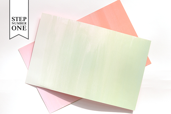
Step One: Gather and cut the decorative paper that is destined to be your trifold wrap around your invitation. To fit an A7 (5″ x 7″) card cut the paper into rectangles measuring 7″ tall by 11″ long. This will allow for an inch of overlap around your invitation card. The decorative paper that you choose doesn’t have to be double sided like ours is but we would recommend selecting a paper with a pretty back, either clean white or a color or pattern. Remember that the back will be seen when your guests view the invitation!

DIY Tutorial: Watercolor Trifold Wedding Invitation by Antiquaria for Oh So Beautiful Paper

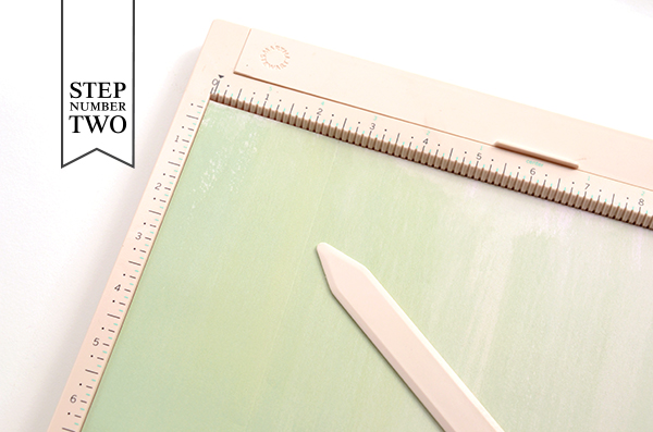
Step Two: For ease of folding and to make sure the line was straight, we scored one side of our decorative paper at the 2.5″ mark. Fold along the line and set the paper aside.

DIY Tutorial: Watercolor Trifold Wedding Invitation by Antiquaria for Oh So Beautiful Paper

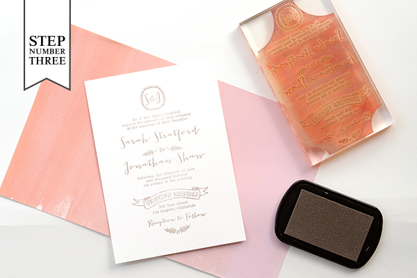
Step Three: Next we stamped our invitation piece on an A7 card. For this design we used our Mod Invitation Stamp and an antique pewter stamp pad. For a step-by-step video tutorial about this printing process go here.

DIY Tutorial: Watercolor Trifold Wedding Invitation by Antiquaria for Oh So Beautiful Paper

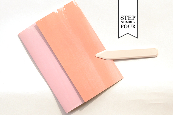
Step Four: Next, we folded the other side of our decorative paper trifold around the A7 card, making sure it was a snug fit. We used a bone folder to make a crisp, folded edge.

DIY Tutorial: Watercolor Trifold Wedding Invitation by Antiquaria for Oh So Beautiful Paper

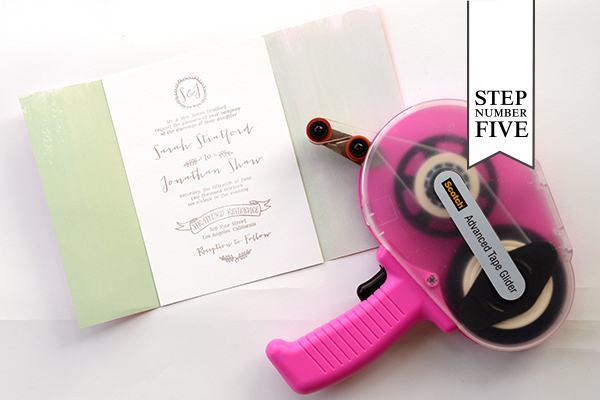
Step Five: Insert the A7 invitation card into the trifold decorative paper with double sided tape or stick glue. Put the tape on all four corners of the back of your card. Carefully place it over the center of the trifold and press it down to adhere it to the decorative paper.

DIY Tutorial: Watercolor Trifold Wedding Invitation by Antiquaria for Oh So Beautiful Paper

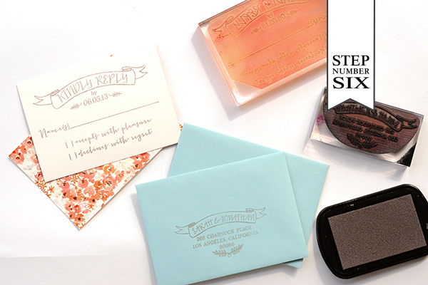
Step Six: For the reply card, we wanted to add some pattern and color to tie together the coral and turquoise sides of our decorative paper. For the reply card itself, we cut 4bar cards (3 1/2″ x 4 7/8″) out of our Paloma Patterned Coral Cover Paper and stamped our Mod  Reply Card Stamp on the blank, non-patterned side. We used a turquoise colored 4bar envelope stamped with our Mod Banner Return Address Stamp to coordinate. You will get four 4bar cards out of one sheet of card stock.

DIY Tutorial: Watercolor Trifold Wedding Invitation by Antiquaria for Oh So Beautiful Paper

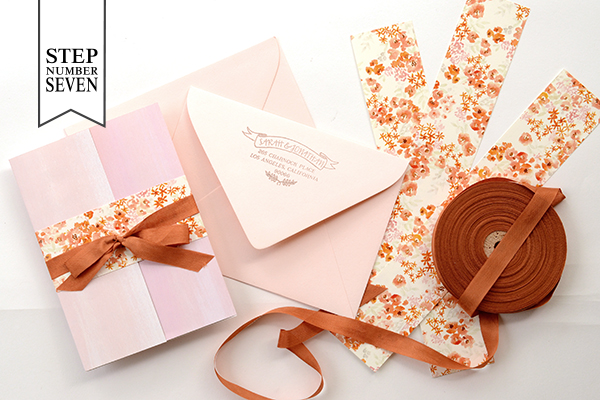
Step Seven: The last step puts all of the gorgeous finishing touches on the suite. We used the Paloma Coral Paper again, except in text weight, to make the belly bands wrapped around the suite. We cut them into strips of 2″ x 11″ – meaning you will get four belly bands per sheet of paper. After taping the belly band, we tied a piece of ribbon around the band to soften the look and add a bit of texture to the design.

We stamped the same return address (Mod Banner Return Address Stamp) on the back flap of a blush envelope before addressing them and sending them on their merry way! We promise that each guest will be truly delighted to receive such a present in their mailbox!

Materials

Mod  Invitation Stamp

Mod  Reply Card Stamp

Mod Banner Return Address Stamp

Stamp Pad in Antique Pewter

Decorative Paper (we used these ombré gift wrap sheets from Rifle Paper Co.) cut to 7″ x 11″

A7 Cards in Superfine White

A7 Envelopes in Luxe Blush

Paloma Coral Patterned Paper in Cover and Text weight

4bar Envelopes in Pool

Double sided tape or stick glue

Scoring Board

Ribbon

Anti­quaria is a mem­ber of the Designer Rolodex – you can see more of their beau­ti­ful work right here or visit the real wedding invitations gallery for more wedding invitation ideas!

Photo Credits: Antiquaria for Oh So Beautiful Paper

Happy Weekend!

Happy Friday everyone – and Happy Spring! Thankfully it actually feels like Spring today in DC, even if it doesn’t quite look like Spring just yet. Hopefully soon! But in the meantime…

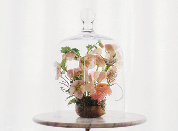
 Pink-Hellebore-Floral-Arrangement-sarah-winward-kate-osborne-snippet-and-ink

Pink Hellebore Floral Arrangement by Sarah Winward / Photo by Kate Osborne via Snippet & Ink

…a few links for your weekend!

This week on Oh So Beautiful Paper:

Check back soon for this week’s cocktail! I hope you all have a wonderful weekend, and I’ll see you back here next week! xoxo

Cinderella-Inspired Theatre Gala Invitations

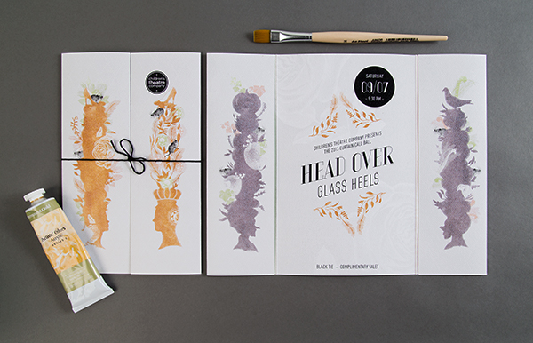
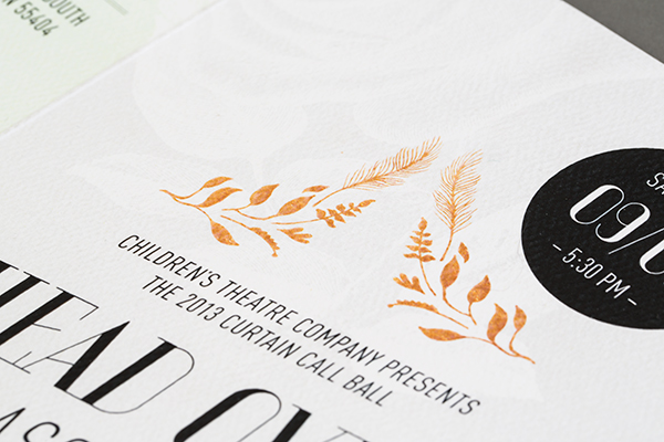
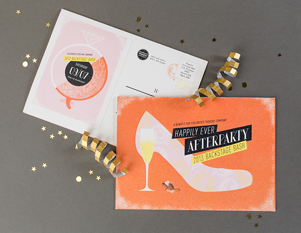
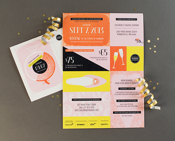
It’s not too often that I have the opportunity to share invitations for a theatre gala! Meenal and the team at Minneapolis-based agency KNOCK created the invitations for two parties held by the Children’s Theatre Company: a formal ball and a more relaxed “afterparty” a bit later in the evening. Both invitations were inspired by the theatre’s production of Cinderella. So fun!

Cinderella-Theater-Gala-Invitations-KNOCK

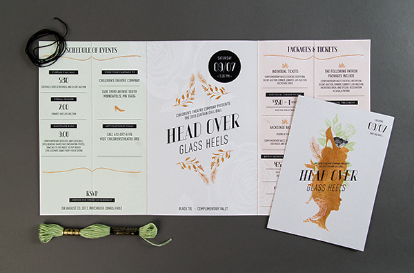
From Meenal: The nationally renowned Children’s Theatre Company in Minneapolis, Minnesota holds an annual fundraising gala with two phases: The formal Curtain Call Ball, and the unplugged Backstage Bash a little later in the evening. The challenge with designing for these events: developing distinct yet complementary themes, and designing event invitations that convince a very hard-to-impress audience to join the fun.

Cinderella-Theater-Gala-Invitations-KNOCK2

Cinderella-Theater-Gala-Invitations-KNOCK3

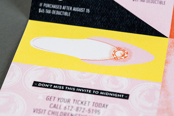
Both events were planned around the theatre’s production of Cinderella, so two themes needed to come to life. For the formal Curtain Call Ball, a Head Over Glass Heels theme incorporated ornate pouf hairstyles from 18th-century royalty; a modern twist came from unexpected surprises poking out of the exaggerated profiles.

Cinderella-Theater-Gala-Invitations-KNOCK4

Cinderella-Theater-Gala-Invitations-KNOCK6

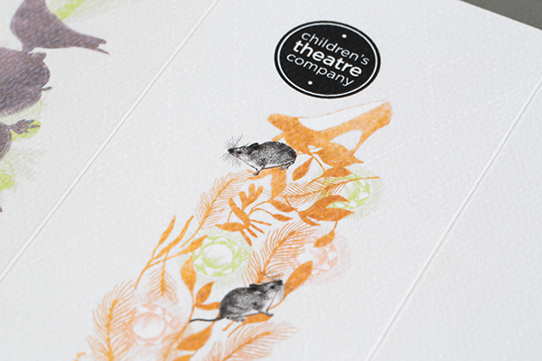
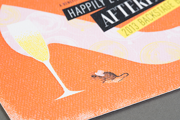
The grittier, wilder nature of the Backstage Bash came through in artwork for a Happily Every Afterparty invitation, tucking a glass of bubbly where a glass slipper heel would go. Typography and cute little mouse ensured consistency between the two invitations, while pumped-up color distinguished the bolder, younger Bash from the formal Ball.

Cinderella-Theater-Gala-Invitations-KNOCK7

Digital printing was the best solution for the budget and quantity, so we used an uncoated, textured stock (Mohawk Via Felt, Pure White, 110#C) to elevate the look and create a customized sensibility. The paper was reminiscent of watercolor paper to give a tactile quality, plus it ensured the ink looked like it was sinking into the paper (as opposed to the shiny effect that digital printing can sometimes create).

Cinderella-Theater-Gala-Invitations-KNOCK8

Cinderella-Theater-Gala-Invitations-KNOCK9

Thanks Meenal!

Photo Credits: KNOCK