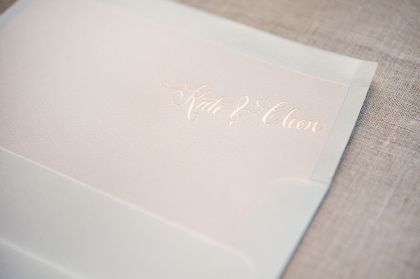
First things first: 1. I’m going to need more adjectives to effectively re-cap the 2014 National Stationery Show and 2. You are all even nicer/prettier in person. Ok, let’s begin:

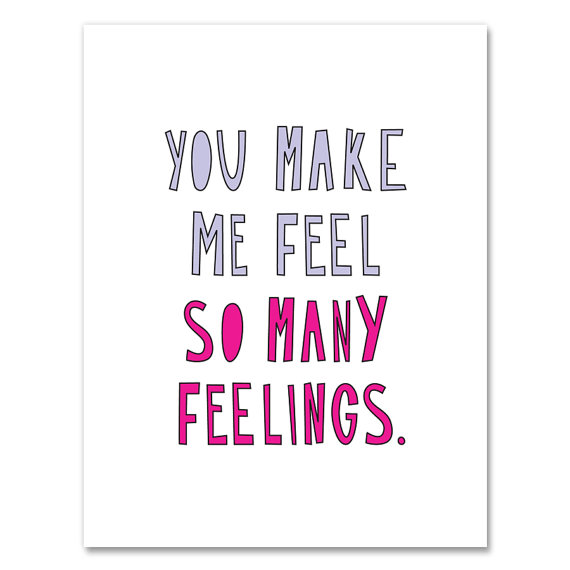
Illustration by Emily McDowell for Oh So Beautiful Paper
A few point-of-view factors for this re-cap: I based my NSS plan of attack without factoring in several-dozen people I just wanted say hello to (thanks, this column!), I came for two days (not enough time), and, I am a talker (surprise!). These forces combined to make the show a true whirlwind of incredible moments. I missed booths and didn’t get to say hello everyone. Still, the whole experience was the icing on stationery cake.
Trends I loved:

Ashkahn
- Cards +plus. I’m so impressed with the crafty way cards are evolving to give customers more excitement for their buck(s). I loved the little surprise of glassine envelopes and confetti in the new line from Ink Meets Paper, the 3D DIY vehicles from Blackbird Letterpress are so much fun, and the honeycomb cards by Ladyfingers Letterpress are totally wow-worthy. From the customer’s point of view, this helps a card evolve into a gift.
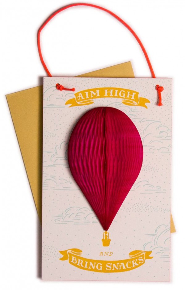
Ladyfingers Letterpress
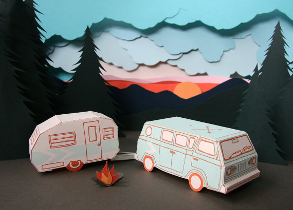
Blackbird Letterpress
- (really good) Sympathy Cards. Sympathy cards are hard. I often find them too distant and oddly condescending, two things I really don’t want in a sympathy card. But this year I was impressed with the breath of real, heartfelt, and sometimes appropriately funny offerings.
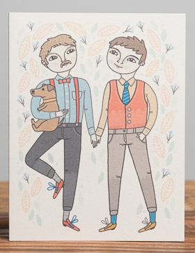
- Better Wedding + Love Cards. Are you married? Is it all doves and roses? Exactly. Thankfully cards are starting to reflect the realness of relationships. I love that same-sex wedding cards are becoming regular parts of your wedding lines and that love and wedding cards are increasingly interchangeable. Ideally, at Clementine, I have cards that could be given for wedding/valentine/anniversary/love all-year-round.
Anke Weckmann of Red Cap Cards
Near Modern Disaster
- Party Accessories. The cake toppers from Parrott Design Studio, Matches from The Social Type, and the confetti push pops by Thimblepress top my list, and I loved seeing the buntings, garland, and napkins that keep me out of the sad drugstore isles the night before a party I just made up.
- Tape & Mail Accessories. Beve‘s gold glitter tape was magic, Oh, Hello Friend‘s masking tape is brilliant (especially for small retailers who want their online orders to have a little message!)

Oh Hello Friend
- Ready to Mail. I’m excited to see postcards infiltrating the show. Life Is Funny LA’s booth had the super-smart giveaway of his own postcards for us to mail back home. And I think Moglea‘s letterquette set is in a league of its own.
- Americana. There were some really great America and state based cards and prints this year. Creating a state series is a smart way to snag a retailer’s attention for their home state. I’m not big on stocking items just for tourists, but a beautiful print of Vermont (even if based on a souvenir) is something I would stock for local and visiting customers. I was sad to miss Power & Light’s booth and had a rushed hello at Idlewild Co. but both had beautiful Vermont prints that caught my eye and remain in my future order plans.
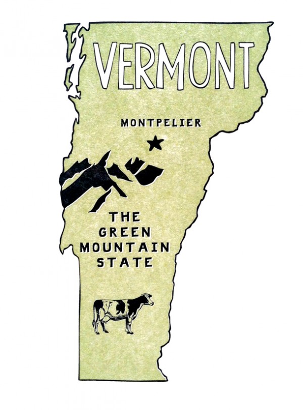
Power & Light Press
- Saturated Color Wash Cards. I like the watercolor trend and I like dip dye, but I really like these bold, abstract color wash cards. It probably goes along with my card-to-art print fixation. Standouts included Moglea, Thimblepress, and An Open Sketchbook, who sat this show out, but (smartly) sent me an email a few days prior with a link to online ordering.
- The flat note. The new indigo wash friendship collection from Sycamore Street Press is bold and brilliant and so refreshing. I am excited by the flat note and its potential to reposition stationery as affordable art.
Booths I loved:
Nole’s recaps have been pretty stellar so I thought I’d tell you why some booths stuck in my mind. Though time was not on my side, there were booths that stood out even though I only saw them in quick passing:
Betsy Ann Paper’s fluttery yellow envelopes were beautiful and immediately ushered in romantic letter-writing dreams. Liz’s drawings are small scale and the booth layout and solid colors complemented her work well. Hartland Brooklyn’s pineapple wallpaper was just a total treat. Emily’s drawings are alsodelicate, so blowing one of them up for a wallpaper display was a brilliant way to entice retailers with her own work. Ashkahn’s booth was refreshingly minimal, but the combination of random bits of funny and neon made me re-live my favorite parts of lying around in a dorm room with hilarious friends. The combination of neon and paper planes against a minimal booth at Idlewild Co. perfectly reflected Katie’s playful, strong aesthetic. The Iron Curtain Press booth was streamlined, yet cheerful with a bold stripe of yellow. I also loved how Rosanna’s prints were on one wall and cards (a full, but not overwhelming collection) on the other. This set up made it easy to step back, asses and dive into an order. Think & Ink’s colors were coordinated to cozy, modern perfection. Bambs created a home around her cards and really I just can’t stop thinking about those throw blankets.
{phew! Break. Ok, back at it}
The wallpaper in the Rifle Paper Co. booth was obviously something I would have stuffed in my suitcase had time/subtlety allowed. Meg’s paintings in the Moglea booth were fine art quality. I loved it alone (i.e., I asked her to please reproduce and sell the small stretched canvases as prints) and for the way it situated and elevated her saturated, colorful, edge painted work. I would pay cash money for someone to give me adjectives to define my personal style, so the Sycamore Street Press booth won me over before I saw it. In person it was straight out of a design magazine and blended effortlessly with Eva’s cards. Betsywhite Stationery’s clean and crisp booth was perfection. Ferme à Papier took moody travel to beautiful depths, while Yellow Owl Workshop is always a mind-bending visual delight. Banquet Atelier & Workshop has mastered the mix of prints and cards. If their booth is in sight, it’s hard not to walk right in (plus, I loved the oriental rug on the true Javitz floor, it was grounding and refreshing). Linda & Harriett was a clear standout for me. The black and white was a visual relief from all of the color at the show, and the small and large scale of her work made her identity absolutely clear, which helped me envision exactly how it would fit at Clementine. In contrast, Sue Jean Ko was such a lightening bolt of neon, it was like sitting in a sunlamp in winter. Angela Liguori’s wall of ribbon is just plain covetous. I loved the Belle & Union booth for being a relaxed, welcoming retreat that was truly the personification of Meg’s cards. Finally, let’s all let Sarah of Parrott Design Studio choose a paint color for our houses: her bold blue wall was spot on and she.had.cake.in.her.booth. Sold.
Ok, I see why Nole did 14 of these. You all put so much effort into your booths and there are many more that I loved, but I just have to stop. One little booth hint: The one universal wish I had for booths this year was to do away with the cellophane sleeves. You’ll notice I’m not using pictures from the show. I wanted to, but so many were so washed out and reflective. It’s hard enough to get a decent picture with those NSS lights, cellophane makes it almost impossible. (Ed Note: Nole echoes this request.)
The Nitty-Gritty of Show Orders:
- Plans vs Reality. I had two unplanned order snafus this year. First, I really didn’t have enough time to wander and ruminate. Second, my new point-of-sale system, wasn’t accessible from my phone. So I made far fewer orders from existing lines than expected. I stuck pretty much to my pre-determined must-order from list and had a few surprise orders. The big surprise for me this year is that catalogs, which I normally loathe (for their weight, not for their beauty!) have been so helpful post-show (so have your follow up notes and emails! Just do be patient, I’m still a bit under water).
- An extra set of cards. I love ordering online because I like to visualize my order as I’m making it. At the show, I especially loved booths that kept an extra full set of cards, soI could pull them out and arrange them together.
- The Emotional-Mathematical equation of an order. I touched on this in a prior post, but the show brought up a few extra thoughts. In addition to the “do I love it?/will it sell?” equation, I’m also assessing whether a designer offers a full line of cards that I love and other products I could expand into in future orders. I’m thinking about who will buy each card as I order it – this is often where the “I love it! But I don’t know if it will sell.” comes into play.
- Show Specials. I was literally racing for parts of the show and if there was no benefit to making an order at the show, I did a lot of hugging and catalog grabbing. My favorite show special is free shipping or free product, because…
- Low/no order minimums may motivate some retailers, but if I wouldn’t spend your minimum on my first order, it’s unlikely that your line has have enough products that fit at Clementine to build a strong relationship. I have a lot of companies that I really like one or two products from, but ideally, I’m struggling to whittle my first order, not to find an additional item I may like.
A few moments from the highlight reel of my #NSS2014:
- You! For real, I could write another post on how great you all are, but I was especially struck by how welcoming and curious you all were to ask questions to grow and expand your lines. I love this kind of discussion. It’s undoubtedly why I love writing this column and why I didn’t get through the whole show.
- Your community. The generosity of the stationery community is a force to be reckoned with. I’m excited about this, because I believe that the more we share information, the more people will rise to the top because of talent, rather than insider knowledge. For that reason, it was especially nice to give a real life squeeze to Amber, Katie and Rachel, who I think are killing it in this area. Also, the Ladies of Letterpress booth (and the fact that so many alums have gone on to their own booths) is a testament of how much is right with your world.
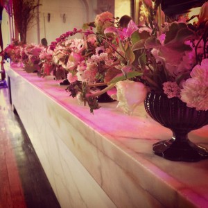
- The Paper Party flowers I rescued, carted through the city to my hotel room, wrapped in Banquet Workshop’s catalog and Beve’s gold tape, checked at the coat check, carried on the train, and arranged on my mantel once home.
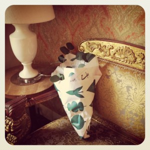
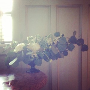
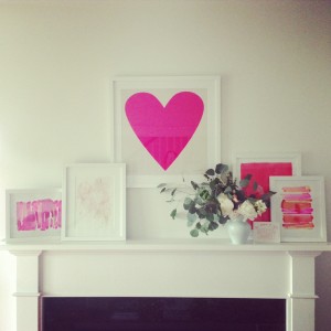
Instagram photos by me from my ‘save the flowers’ campaign
- Hugs + friendships. I’ve been waiting months to hug some of you. I had several friends and family comment on how happy I looked in all of my photos, which I really, really was. I was lucky enough to convince Annemarie to join me for part of the show, which was a win for me, because she’s whip smart and hilarious and seeing the show though her eyes (as a vendor walking the show) helped me articulate what I was drawn to. We had breakfast with Erin who I’m sure you already know, but I have to note how lovely her friendship has been to me and how wonderful it was to sit down in person to share stories of shop ownership, vendor relationships and this life. And of course, meeting Nole in person was sugar coated flower on top of the icing on top of the cupcake.
Having a horrible time with E. Frances Paper & Scout’s Honor Paper I’m the one not wearing stripes, whose tonsils you can see.
In conclusion, my new dream job is just to be the Tim Gun of NSS. In this daydream NSS would last for 6 weeks (I know. But this is my fantasy, not yours). Someone would give me $100,000 to make orders and I would just walk around telling you all everything you’re doing right. Let’s make that work.