DIY Autumn Floral Wedding Invitations

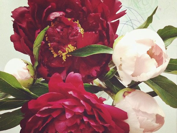
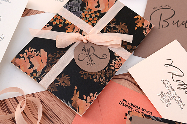
Summer may just have arrived, but in the world of wedding invitations, we’re already looking forward toward the autumn and winter seasons. We love this fresh take on an autumn color palette – mixing a dark watercolor pattern with lovely shades of peach, coral, and blush – for a beautiful suite of autumn floral wedding invitations and save the dates. It has romance written all over it! – Bailey and Emma of Antiquaria

DIY Tutorial: Autumn Floral Wedding Invitations by Antiquaria for Oh So Beautiful Paper

Autumn Floral-DIY-Final2

DIY Tutorial: Autumn Floral Wedding Invitations by Antiquaria for Oh So Beautiful Paper

Step One: For this design, we’re making a save the date and wedding invitation suite together. None of the paper came cut to size, so we had to cut the paper and cards ourselves. You can manually cut them with a self healing mat, kraft knife, and metal ruler or you can take everything to be cut at a local printer (the best idea for precision).

You’ll need these final paper sizes:

Save the Date – Java, 3.75″ x 5″

Save the Date Backer – “Zoe” Floral Patterned Cover, 4.25″ x 5.5″

Invitation – Milkweed, 5″ x 7″

Invitation Folder – “Zoe” Floral Patterned Text Weight, 10″ x 7″

Reply Card – Milkweed, 3.5″  x 4.875″

Reception Card – Old Lace, 3.5″ x 4.875″

DIY Tutorial: Autumn Floral Wedding Invitations by Antiquaria for Oh So Beautiful Paper

Step Two: Create your save the date. We embossed our Floral Calligraphy Save the Date design onto a Java card with black embossing powder for a great opaque look (see steps below). We also embossed our return address stamp on the back flap of our envelope. You will mount the Java card onto the patterned backer, using double sided tape or stick glue, making certain that the margins are equal on all sides.

DIY Tutorial: Autumn Floral Wedding Invitations by Antiquaria for Oh So Beautiful Paper

Stamp the save the date onto your card using black ink.

DIY Tutorial: Autumn Floral Wedding Invitations by Antiquaria for Oh So Beautiful Paper

Immediately cover the printed image with black embossing powder (best to do this step over scrap paper). Shift it around to cover the entire image and tap off  the excess.

DIY Tutorial: Autumn Floral Wedding Invitations by Antiquaria for Oh So Beautiful Paper

Heat set the design with an embossing heat tool.  For more information about this process, please watch our video tutorial found here.

DIY Tutorial: Autumn Floral Wedding Invitations by Antiquaria for Oh So Beautiful Paper

Step Three: Stamp all of your invitation suite cards. We used designs from our Floral Calligraphy Collection for this suite, including the Floral Calligraphy Invitation Stamp, Floral Calligraphy Reply Card Stamp and Floral Calligraphy Reception Stamp. We used black ink with the designs to tie everything together with the floral watercolor paper!

DIY Tutorial: Autumn Floral Wedding Invitations by Antiquaria for Oh So Beautiful Paper

Step Four: We love coming up with new ways to incorporate pattern and color into our designs. This patterned invitation “folder” is one fun way! Fold your 10″ x 7″ patterned text weight paper in half. Apply double sided tape or stick glue to the back of your invitation card. Stick it into the right hand side of the “folder” and press to adhere. The invitation card and right hand side of the folder should be the same size, 5″ x 7.”

DIY Tutorial: Autumn Floral Wedding Invitations by Antiquaria for Oh So Beautiful Paper

Step Five: Next, we’ll make our reply envelopes. Our return address stamp design didn’t include a name – but that’s okay! We’ll simply add one! With a black brush pen, we wrote the last name across the envelope, a little higher than center. Then we stamped our return address design in black right below it. Mission accomplished!

DIY Tutorial: Autumn Floral Wedding Invitations by Antiquaria for Oh So Beautiful Paper

Step Six: A monogram tag is a really great way to tie the suite together. And you can also use it at your reception and on personal stationery after the wedding! We cut out 2″ circle tags using a circle making tool (or using a circle punch). Then, we stamped our Floral Calligraphy Monogram Initial Stamp in black in the center. Finally, we punched a small hole in the top center so that we have something to thread our ribbon through!

DIY Tutorial: Autumn Floral Wedding Invitations by Antiquaria for Oh So Beautiful Paper

Step Seven: A big consideration for any invitation suite is how your are going to address them. We decided that a modern brush style in black would be fun with this design. After stamping our return address on the back flap, we addressed them using this calligraphy addressing tutorial.

DIY Tutorial: Autumn Floral Wedding Invitations by Antiquaria for Oh So Beautiful Paper

The Final Touches: To finish off the suite, we tucked all of the cards inside our “folder” and then tied it all up with some gorgeous blush colored tailors ribbon. Guests will feel like they’re opening a gift when they receive it in the post and get a small glimpse of the fun to come!

Materials

Stamps

Floral Calligraphy Save the Date Stamp

Floral Calligraphy Return Address Stamp, No.2

Floral Calligraphy Invitation Stamp

Floral Calligraphy Reply Card Stamp

Floral Calligraphy Reception Stamp

Floral Calligraphy Initial Monogram Stamp

Paper

“Zoe” Floral Patterned Paper-in Cover weight and Text weight

Java Cover Stock

Milkweed Cover Stock

Old Lace Cover Stock

Papaya A2 Envelopes

Java A7 Envelopes

Old Lace 4bar Envelopes

Other Items

Self Healing Mat, Kraft Knife and Metal Ruler

Double sided tape or stick glue

Circle Cutter or Circle Punch

Stamp Pad in Black

Embossing Powder and Heat Tool

Brush Pen

Hole Punch

Tailors Ribbon in Grecian Pink

Anti­quaria is a mem­ber of the Designer Rolodex – you can see more of their beau­ti­ful work right here or visit the real wedding invitations gallery for more wedding invitation ideas!

Photo Credits: Antiquaria for Oh So Beautiful Paper

Happy Weekend!

Happy Friday everyone! Are you all caught up in World Cup fever? It’s a pretty big deal here in the internationally-minded city of DC, so I’m definitely excited to watch the tournament progress. Mostly I’m excited for a quiet weekend celebrating Father’s Day with my little family. Best wishes to those of you celebrating Father’s Day this weekend, too! But in the meantime…

OSBP-Peony-Bouquet-Instagram

Photo by me via Instagram

…a few links for your weekend!

This week on Oh So Beautiful Paper:

Check back soon for this week’s cocktail! I hope you all have a wonderful weekend, and I’ll see you back here next week! xoxo

Hello Brick & Mortar: NSS Through a Retailer’s Eyes

First things first: 1. I’m going to need more adjectives to effectively re-cap the 2014 National Stationery Show and 2. You are all even nicer/prettier in person. Ok, let’s begin:

Hello Brick & Mortar by Emily McDowell for Oh So Beautiful Paper

Illustration by Emily McDowell for Oh So Beautiful Paper

A few point-of-view factors for this re-cap: I based my NSS plan of attack without factoring in several-dozen people I just wanted say hello to (thanks, this column!), I came for two days (not enough time), and, I am a talker (surprise!). These forces combined to make the show a true whirlwind of incredible moments. I missed booths and didn’t get to say hello everyone. Still, the whole experience was the icing on stationery cake.

Trends I loved:

  • Tiny Cards. I have been coveting Ashkahn‘s You’re Cute cards since Carina sent me one several months back. Now they will be all be mine (or yours, dear customers). As written correspondence continues to make a comeback, customers are willing to try new ways to reach out. The tiny card is quick, cute and can be tucked. I also thought ThimblepressConstellation & Co.E. Frances Paper, Emily McDowelland Nightingale Projects had some standouts in this area.

Ashkahn via Oh So Beautiful Paper

Ashkahn

  • Cards +plus. I’m so impressed with the crafty way cards are evolving to give customers more excitement for their buck(s). I loved the little surprise of glassine envelopes and confetti in the new line from Ink Meets Paper, the 3D DIY vehicles from Blackbird Letterpress are so much fun, and the honeycomb cards by Ladyfingers Letterpress are totally wow-worthy. From the customer’s point of view, this helps a card evolve into a gift.

LFLaimhigh

Ladyfingers Letterpress

BBLcamper

Blackbird Letterpress

  • (really good) Sympathy Cards. Sympathy cards are hard. I often find them too distant and oddly condescending, two things I really don’t want in a sympathy card. But this year I was impressed with the breath of real, heartfelt, and sometimes appropriately funny offerings.
  • Better Wedding + Love Cards. Are you married? Is it all doves and roses? Exactly. Thankfully cards are starting to reflect the realness of relationships. I love that same-sex wedding cards are becoming regular parts of your wedding lines and that love and wedding cards are increasingly interchangeable. Ideally, at Clementine, I have cards that could be given for wedding/valentine/anniversary/love all-year-round.

RCCboywedding

Anke Weckmann of Red Cap Cards

NMDfeelings

Near Modern Disaster

  • Party Accessories. The cake toppers from Parrott Design Studio, Matches from The Social Type, and the confetti push pops by Thimblepress top my list, and I loved seeing the buntings, garland, and napkins that keep me out of the sad drugstore isles the night before a party I just made up.
  • Tape & Mail AccessoriesBeve‘s gold glitter tape was magic, Oh, Hello Friend‘s masking tape is brilliant (especially for small retailers who want their online orders to have a little message!)

OHFhellotape

Oh Hello Friend

  • Ready to Mail. I’m excited to see postcards infiltrating the show. Life Is Funny LA’s booth had the super-smart giveaway of his own postcards for us to mail back home. And I  think Moglea‘s letterquette set is in a league of its own.
  • Americana. There were some really great America and state based cards and prints this year. Creating a state series is a smart way to snag a retailer’s attention for their home state. I’m not big on stocking items just for tourists, but a beautiful print of Vermont (even if based on a souvenir) is something I would stock for local and visiting customers. I was sad to miss Power & Light’s booth and had a rushed hello at Idlewild Co. but both had beautiful Vermont prints that caught my eye and remain in my future order plans.

PLPvermont

Power & Light Press

  • Saturated Color Wash Cards. I like the watercolor trend and I like dip dye, but I really like these bold, abstract color wash cards. It probably goes along with my card-to-art print fixation. Standouts included MogleaThimblepress, and An Open Sketchbook, who sat this show out, but (smartly) sent me an email a few days prior with a link to online ordering.
  • The flat note. The new indigo wash friendship collection from Sycamore Street Press is bold and brilliant and so refreshing. I am excited by the flat note and its potential to reposition stationery as affordable art.

Booths I loved:

Nole’s recaps have been pretty stellar so I thought I’d tell you why some booths stuck in my mind. Though time was not on my side, there were booths that stood out even though I only saw them in quick passing:

Betsy Ann Paper’s fluttery yellow envelopes were beautiful and immediately ushered in romantic letter-writing dreams. Liz’s drawings are small scale and the booth layout and solid colors complemented her work well. Hartland Brooklyn’s pineapple wallpaper was just a total treat. Emily’s drawings are alsodelicate, so blowing one of them up for a wallpaper display was a brilliant way to entice retailers with her own work. Ashkahn’s booth was refreshingly minimal, but the combination of random bits of funny and neon made me re-live my favorite parts of lying around in a dorm room with hilarious friends. The combination of neon and paper planes against a minimal booth at Idlewild Co. perfectly reflected Katie’s playful, strong aesthetic. The Iron Curtain Press booth was streamlined, yet cheerful with a bold stripe of yellow. I also loved how Rosanna’s prints were on one wall and cards (a full, but not overwhelming collection) on the other. This set up made it easy to step back, asses and dive into an order. Think & Ink’s colors were coordinated to cozy, modern perfection. Bambs created a home around her cards and really I just can’t stop thinking about those throw blankets.

{phew! Break. Ok, back at it}

The wallpaper in the Rifle Paper Co. booth was obviously something I would have stuffed in my suitcase had time/subtlety allowed. Meg’s paintings in the Moglea booth were fine art quality. I loved it alone (i.e., I asked her to please reproduce and sell the small stretched canvases as prints) and for the way it situated and elevated her saturated, colorful, edge painted work. I would pay cash money for someone to give me adjectives to define my personal style, so the Sycamore Street Press booth won me over before I saw it. In person it was straight out of a design magazine and blended effortlessly with Eva’s cards. Betsywhite Stationery’s clean and crisp booth was perfection. Ferme à Papier took moody travel to beautiful depths, while Yellow Owl Workshop is always a mind-bending visual delight. Banquet Atelier & Workshop has mastered the mix of prints and cards. If their booth is in sight, it’s hard not to walk right in (plus, I loved the oriental rug on the true Javitz floor, it was grounding and refreshing). Linda & Harriett was a clear standout for me. The black and white was a visual relief from all of the color at the show, and the small and large scale of her work made her identity absolutely clear, which helped me envision exactly how it would fit at Clementine. In contrast, Sue Jean Ko was such a lightening bolt of neon, it was like sitting in a sunlamp in winter. Angela Liguori’s wall of ribbon is just plain covetous. I loved the Belle & Union booth for being a relaxed, welcoming retreat that was truly the personification of Meg’s cards. Finally, let’s all let Sarah of Parrott Design Studio choose a paint color for our houses: her bold blue wall was spot on and she.had.cake.in.her.booth. Sold.

Ok, I see why Nole did 14 of these. You all put so much effort into your booths and there are many more that I loved, but I just have to stop. One little booth hint: The one universal wish I had for booths this year was to do away with the cellophane sleeves. You’ll notice I’m not using pictures from the show. I wanted to, but so many were so washed out and reflective. It’s hard enough to get a decent picture with those NSS lights, cellophane makes it almost impossible. (Ed Note: Nole echoes this request.)

The Nitty-Gritty of Show Orders:

  • Plans vs Reality. I had two unplanned order snafus this year. First, I really didn’t have enough time to wander and ruminate. Second, my new point-of-sale system, wasn’t accessible from my phone. So I made far fewer orders from existing lines than expected. I stuck pretty much to my pre-determined must-order from list and had a few surprise orders. The big surprise for me this year is that catalogs, which I normally loathe (for their weight, not for their beauty!) have been so helpful post-show (so have your follow up notes and emails! Just do be patient, I’m still a bit under water).
  • An extra set of cards. I love ordering online because I like to visualize my order as I’m making it. At the show, I especially loved booths that kept an extra full set of cards, soI could pull them out and arrange them together.
  • The Emotional-Mathematical equation of an order. I touched on this in a prior post, but the show brought up a few extra thoughts. In addition to the “do I love it?/will it sell?” equation, I’m also assessing whether a designer offers a full line of cards that I love and other products I could expand into in future orders. I’m thinking about who will buy each card as I order it – this is often where the “I love it! But I don’t know if it will sell.” comes into play.
  • Show Specials. I was literally racing for parts of the show and if there was no benefit to making an order at the show, I did a lot of hugging and catalog grabbing. My favorite show special is free shipping or free product, because…
  • Low/no order minimums may motivate some retailers, but if I wouldn’t spend your minimum on my first order, it’s unlikely that your line has have enough products that fit at Clementine to build a strong relationship. I have a lot of companies that I really like one or two products from, but ideally, I’m struggling to whittle my first order, not to find an additional item I may like.

A few moments from the highlight reel of my #NSS2014:

  • You! For real, I could write another post on how great you all are, but I was especially struck by how welcoming and curious you all were to ask questions to grow and expand your lines. I love this kind of discussion. It’s undoubtedly why I love writing this column and why I didn’t get through the whole show.
  • Your community. The generosity of the stationery community is a force to be reckoned with. I’m excited about this, because I believe that the more we share information, the more people will rise to the top because of talent, rather than insider knowledge. For that reason, it was especially nice to give a real life squeeze to AmberKatie and Rachel, who I think are killing it in this area. Also, the Ladies of Letterpress booth (and the fact that so many alums have gone on to their own booths) is a testament of how much is right with your world.
  • The Paper Party flowers I rescued, carted through the city to my hotel room, wrapped in Banquet Workshop’s catalog and Beve’s gold tape, checked at the coat check, carried on the train, and arranged on my mantel once home.

paperpartyflowers1paperpartyflowers3paperpartyflowers2paperpartyflowers4

Instagram photos by me from my ‘save the flowers’ campaign

  • Hugs + friendships. I’ve been waiting months to hug some of you. I had several friends and family comment on how happy I looked in all of my photos, which I really, really was. I was lucky enough to convince Annemarie to join me for part of the show, which was a win for me, because she’s whip smart and hilarious and seeing the show though her eyes (as a vendor walking the show) helped me articulate what I was drawn to. We had breakfast with Erin who I’m sure you already know, but I have to note how lovely her friendship has been to me and how wonderful it was to sit down in person to share stories of shop ownership, vendor relationships and this life. And of course, meeting Nole in person was sugar coated flower on top of the icing on top of the cupcake.

paperparty0184paperparty0182

Having a horrible time with E. Frances Paper & Scout’s Honor Paper I’m the one not wearing stripes, whose tonsils you can see.

In conclusion, my new dream job is just to be the Tim Gun of NSS. In this daydream NSS would last for 6 weeks (I know. But this is my fantasy, not yours). Someone would give me $100,000 to make orders and I would just walk around telling you all everything you’re doing right. Let’s make that work.

Quick Pick: Courtney Khail Watercolor Stationery

I’ve long admired the work of watercolor artist Courtney Khail – and I was excited to hear that she just released a new line of notecards! Each card is printed on thick 100% cotton paper, comes with a cotton paper envelope, and Courtney took care to make sure that the printed cards are as close to the original watercolor paintings as possible. Each card is printed twice: once to capture the watercolor, and a second time to capture the black line work. These cards would be great to have on hand for sending impromptu notes, or even to give as hostess gifts!

Courtney-Khail-Watercolor-Stationery-OSBP-Floral

Courtney-Khail-Watercolor-Stationery-OSBP-Notecards

Courtney-Khail-Watercolor-Stationery-OSBP-Garden-Rose

Courtney-Khail-Watercolor-Stationery-OSBPCourtney-Khail-Watercolor-Stationery-OSBP-Honeycomb

Courtney-Khail-Watercolor-Stationery-OSBP-Peony

Her original watercolor paintings are pretty great, too – I love all the citrus paintings for summer!

Courtney-Khail-Watercolor-Painting-OSBP-PineappleCourtney-Khail-Watercolor-Painting-OSBP-Orange-Slice

Courtney-Khail-Watercolor-Painting-OSBP-LimesCourtney-Khail-Watercolor-Painting-OSBP-Citrus

Lots more over at Courtney’s etsy shop!

Photo Credits: Courtney Khail

How to Create Unique Personal Stationery with Rubber Stamps

Wedding season is officially here and events of all kinds are in full swing. And with that… of course comes thank you notes! We’ve been designing lots of personal stationery as thank you notes for our clients recently so we put together some DIY versions to show how fun it can be to craft your own personal stationery. We used the same monogram rubber stamp for all three designs and the results couldn’t be more different! – Bailey and Emma of Antiquaria

DIY Tutorial: Rubber Stamp Personal Stationery by Antiquaria via Oh So Beautiful Paper

It’s always good to have some monogrammed stationery on hand for when a last minute occasion arrises. Make a bunch at one time and store them in a pretty box with pens and postage. Monogrammed stationery also makes for a really great handmade gift!

DIY Tutorial: How to Create Unique Personal Stationery with Rubber Stamps by Antiquaria for Oh So Beautiful Paper

 Option One: Blue and white is such a classic color combination. We put a painterly spin on it with this gorgeous watercolor card. Adding white embossing on top of the paint really elevates the design and makes the monogram pop off of the card, literally!

DIY Tutorial: How to Create Unique Personal Stationery with Rubber Stamps by Antiquaria for Oh So Beautiful Paper

Step One: On the front of the card, in the center, paint a loose oval with indigo colored watercolor paint. Add multiple layers so that parts of the circle are darker than others. After the circle is complete, splash a little extra paint around the circle for a splattered effect. To do this we simply flicked the tip of the brush with our fingertip over the card. Set aside to dry completely.

DIY Tutorial: How to Create Unique Personal Stationery with Rubber Stamps by Antiquaria for Oh So Beautiful Paper

Step Two: Stamp your monogram in the center of the watercolor oval using a white ink pad. Quickly sprinkle embossing powder over the stamped image. Shift it around until the monogram is completely covered with powder. Tip the excess off onto a scrap piece of paper.

DIY Tutorial: How to Create Unique Personal Stationery with Rubber Stamps by Antiquaria for Oh So Beautiful Paper

Step Three: Using a embossing heat tool, melt the powder. You can watch our video tutorial of the process here.

DIY Tutorial: How to Create Unique Personal Stationery with Rubber Stamps by Antiquaria for Oh So Beautiful Paper

DIY Tutorial: How to Create Unique Personal Stationery with Rubber Stamps by Antiquaria for Oh So Beautiful Paper

Option Two: Wreaths have been a popular design element in stationery for a while now. We just can’t get enough of them – especially when they’re hand painted in shades of green!

DIY Tutorial: How to Create Unique Personal Stationery with Rubber Stamps by Antiquaria for Oh So Beautiful Paper

Step One: After stamping your monogram in the center of the front of your card, paint a little vine circle around it, leaving the bottom open (as shown above). Don’t try to make the oval perfect, a meandering vine will be more natural once the leaves are painted around it!

DIY Tutorial: How to Create Unique Personal Stationery with Rubber Stamps by Antiquaria for Oh So Beautiful Paper

Step Two: Add your leaves to the oval. The technique is simple: just load your brush with watercolor paint, lay it down flat, and then pick it up, dragging up to the point as you lift it off. This will give you the shape of the leaf with very little effort! Practice first before starting on the final cards until you get it down. Varying the size and color of the leaves will help give a more natural look to the card. Paint the leaves starting at the bottom and finishing at the top. Where they meet, leave a little space and paint a small dot in the top center to finish it off.

DIY Tutorial: How to Create Unique Personal Stationery with Rubber Stamps by Antiquaria for Oh So Beautiful Paper

Step Three: We also added little leaf adornments to each corner, using the same technique to finish off the card design.

DIY Tutorial: How to Create Unique Personal Stationery with Rubber Stamps by Antiquaria for Oh So Beautiful Paper

Option Three: This stunning, black and white design is both modern and whimsical at the same time. Plus, you don’t even have to pull out the paint for this one!

DIY Tutorial: How to Create Unique Personal Stationery with Rubber Stamps by Antiquaria for Oh So Beautiful Paper

Step One: Stamp your monogram in the front center of the card in black ink. Set it aside to dry.

DIY Tutorial: How to Create Unique Personal Stationery with Rubber Stamps by Antiquaria for Oh So Beautiful Paper

Step Two: Find a circle on your template that is â…›” to ¼” larger than the design, and trace it using a black felt tipped pen.

DIY Tutorial: How to Create Unique Personal Stationery with Rubber Stamps by Antiquaria for Oh So Beautiful Paper

Step Three: With a brush pen, add little black polka dots around the circle – but make sure not to put any inside. We didn’t make the size or pattern of the dots even for this design, so it has a lovely organic irregularity… plus it’s easier to do!

DIY Tutorial: How to Create Unique Personal Stationery with Rubber Stamps by Antiquaria for Oh So Beautiful PaperP-Stationery-final2

Step Four: Add little bitty dots around your polka dots to fill in the white spaces of your design by touching only the very tip of the pen to the paper.

DIY Tutorial: How to Create Unique Personal Stationery with Rubber Stamps by Antiquaria for Oh So Beautiful Paper

Materials

Antique Monogram Stamp

A2 Folded Card, preferably made of Watercolor Paper (90lb hot press). We cut an art sheet down into rectangles (5.5″ x 8.5″) and scored them down the middle to make our own cards.

Envelope liner templates

Double Sided Tape or Stick Glue (to adhere liners into envelopes)

Option One:

Watercolor Paint

Paint Brushes

Frost White Stamp Pad

White Embossing Powder

Envelope Liner Watercolor Stripe Ocean Text Patterned Paper

A2 Envelope in night

Option Two:

Watercolor Paint

Paint Brushes

Stamp Pad in Olive

Envelope Liner Natalia Floral Text Patterned Paper

A2 Envelope in Sage

Option Three:

Circle Stencil Template

Black Brush Pen

Black Felt Tip Pen

Stamp Pad in Black

Envelope Liner Brushed Floral No.1  Text Patterned paper

A2 Envelope in Black

Photography by Antiquaria for Oh So Beautiful Paper