Seasonal Stationery: Mother’s Day Cards

Mother’s Day is just a few weeks away! Today I’m kicking off a series of Mother’s Day card round ups with ten gorgeous cards to help send your love to Mom. This year I’m really finding myself drawn towards sweet and simple cards – here are a few favorites!

2016 Mother's Day Card Round Up / Oh So Beautiful Paper

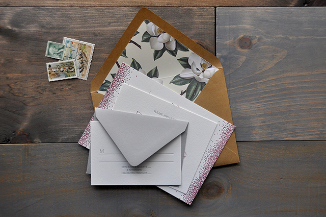
1. A beautiful gold foil Mother’s Day card on speckled gray paper from Moglea – with an equally beautiful abstract envelope!

2. Sweet floral sentiments for your sweet mum by In the Daylight

3. Neon pink Mother’s Day wishes by Wayfare Press

4. A vintage-inspired card from Maple and Belmont

5. Beautiful sky blue letterpress printed calligraphy by Parrott Design Studio

6. Sweet and simple from Sugar Paper

7. A pretty papercut Mother’s Day card from Evermore Paper Co.

8. I love this Ramona & Ruth card for fashionable moms

9. Giving mom flowers? Include this card from Worthwhile Paper!

10. For the superhero mom by Ink Meets Paper

p.s. You can find a TON more Mother’s Day cards in the Market List right here!

Virginia Countryside Wedding Invitations

While we’re on the subject of flowers today, how pretty are these Virginia countryside wedding invitations from Lauren at Darling + Pearl? The invitation suite was inspired by the wedding venue in the heart of Virginia wine country. I’m loving the whimsical letterpress printed confetti pattern paired with vintage-inspired magnolia envelope liners. And the bride even did her own calligraphy for some of the invitation text and addressed her own envelopes!

Letterpress Printed Virginia Countryside Wedding Invitations by Darling + Pearl / Oh So Beautiful Paper

From Lauren: The wedding invitations for Loren and Daniel’s wedding were a true collaborative effort. The inspiration was drawn mainly by the location of their wedding and the venue: Keswick Hall at Monticello in the Virginia countryside. Loren and Daniel’s entire suite was letterpress printed in burgundy and silver and was presented with mixed color envelopes (which has become somewhat of a Darling + Pearl signature).

Letterpress Printed Virginia Countryside Wedding Invitations by Darling + Pearl / Oh So Beautiful Paper

Loren practices calligraphy and was really interested in using her own handwriting for her invitations. Loren provided me with the artwork for their names which was then processed into a printing plate along with the rest of the design. After the invitations were delivered, Loren also addressed each envelope by hand in calligraphy.

Letterpress Printed Virginia Countryside Wedding Invitations by Darling + Pearl / Oh So Beautiful Paper

I wanted to create an invitation suite where each piece was different and exciting and walked the line of both traditional and unique. The envelope liners really pulled the suite together and added even more flavor – with the added bonus of Magnolia trees being a significant detail in the couple’s life. This was the first project that really had me stepping outside of my comfort zone as far as choosing less expected colors and patterns to line the sending envelopes.

Letterpress Printed Virginia Countryside Wedding Invitations by Darling + Pearl / Oh So Beautiful Paper

Letterpress Printed Virginia Countryside Wedding Invitations by Darling + Pearl / Oh So Beautiful Paper

Thanks Lauren!

Design and Letterpress Printing: Darling + Pearl

Darling + Pearl is a member of the Designer Rolodex – you can see more of Lauren’s beautiful work right here or visit the real invi­ta­tions gallery for more wedding invitation ideas!

Photo Credits: Darling + Pearl

Romantic Calligraphy Dip Dyed Wedding Invitations

I’m a huge fan of the dip dyeing technique, and these romantic calligraphy dip dyed wedding invitations from Jill at Art + Alexander are no exception! The dark teal color is just absolutely stunning, and I love the way Jill continued the dip dye effect around all four edges of the invitation and some of the enclosures!

Romantic Calligraphy Dip Dyed Wedding Invitations Art + Alexander / Oh So Beautiful Paper

From Jill: The words I jotted down prior to designing this suite were: love letter, romance, simple, soft, and lovely. I love the colour that ink fades into, decades after being written – a brownish gold tone. I tried to recreate that ink colour for this invitation suite. I also tried to keep the calligraphy quite soft and loose, as if it had been written on some romantic whim.

Romantic Calligraphy Dip Dyed Wedding Invitations Art + Alexander / Oh So Beautiful Paper

I opted for Cartiera Magnani paper for its rich texture and soft, organic look. I thought that the paper would behave similarly to a watercolour paper would, and absorb the watercolour paint well, which it did. I used the dark teal to add a pop of color, and wet the paper prior to dip dying so that it would bleed more and fade out more naturally, as well to give it a celestial look.

Romantic Calligraphy Dip Dyed Wedding Invitations Art + Alexander / Oh So Beautiful Paper

The invitation suite includes a beautiful quote from The Chaos of Stars: “And I’d choose you; in a hundred lifetimes, in a hundred worlds, in any version of reality, I’d find you and I’d choose you.”

Romantic Calligraphy Dip Dyed Wedding Invitations Art + Alexander / Oh So Beautiful Paper

I just thought that it was the most beautiful quote and tied in so nicely with my original inspiration. I also included a watercolor illustration of a peony to add a touch of femininity. The suite was handwritten and the paper was hand torn. The stamps included in the photographs are from my Grandmother’s antique steamer trunk.

Romantic Calligraphy Dip Dyed Wedding Invitations Art + Alexander / Oh So Beautiful Paper

Thanks Jill!

Design and calligraphy: Art + Alexander

Check out the Designer Rolodex for more tal­ented wed­ding invi­ta­tion design­ers and the real invi­ta­tions gallery for more wedding invitation ideas!

Photographed by: Shannon Yau

Happy Weekend!

Happy Friday everyone – and Happy April Fool’s Day! It’s also my husband’s birthday today! We’ve actually been in the Catskills in Upstate New York this week for some family R&R, since it’s our daughter’s Spring Break back in DC. We didn’t really have an agenda for this week, but we’re having fun exploring the area and relaxing at our temporary home in the mountains. We’ll miss these mountain views when we head back to DC this weekend! But in the meantime…

Three Potato Four Letter Board / Oh So Beautiful Paper

Three Potato Four Letter Board (via Instagram)

…a few links for your weekend!

This week on Oh So Beautiful Paper:

That’s it for me this week! Check back in just a bit for this week’s cocktail recipe! I hope you have a wonderful weekend, and I’ll see you back here on Monday! xoxo

Calligraphy Inspiration: Post Calligraphy

It’s always interesting in seeing how self taught calligraphers develop their styles. It’s an opportunity to let a little personality shine through with a line quality based on each individual hand, rather than simply replicating a sequence of strokes; that’s just a part of the charm of modern calligraphy! I came across the gorgeous work of Lisa Mavian, the artist/designer/calligrapher behind Toronto based Post Calligraphy a while ago and have been thoroughly enjoying digging through her portfolio and feed. Take a look and I’m sure you will too! – Julie

Calligraphy Inspiration: Post Calligraphy / Oh So Beautiful Paper

Calligraphy Inspiration: Post Calligraphy / Oh So Beautiful Paper

Calligraphy Inspiration: Post Calligraphy / Oh So Beautiful Paper

Calligraphy Inspiration: Post Calligraphy / Oh So Beautiful Paper

Calligraphy Inspiration: Post Calligraphy / Oh So Beautiful Paper

Calligraphy Inspiration: Post Calligraphy / Oh So Beautiful Paper

For more of Lisa’s work, follow her on Instagram or try your hand at calligraphy at one of Post Calligraphy’s workshops!

Photo credits: 1, 2, 5, 6 l+r Lisa Mavian; 3 left ARTIESE Studios, right The Love Studio; 4 Sally Pinera