Friday Happy Hour: Strawberry Tequila Daisy

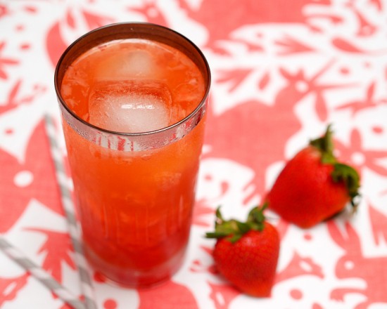
Tomorrow is Cinco de Mayo!  We’ve previously featured two drinks that would be great tomorrow, the Margarita and the Oaxacan Sunrise, but here’s a new drink to help you celebrate properly: the Strawberry Tequila Daisy.

Read below for the full recipe!

Strawberry Tequila Daisy

2 oz Tequila
1/2 oz Triple Sec
1/2 oz Lemon Juice
1/2 oz Lime Juice
1/2 oz Simple Syrup
Soda Water
2-3 Strawberries

Rinse and hull the strawberries.  Add them to a highball glass and combine with the Triple Sec, both juices, and syrup.  Muddle well.  Add the Tequila (make sure you use 100% agave!) and add a few ice cubes.  Top with soda water and enjoy.

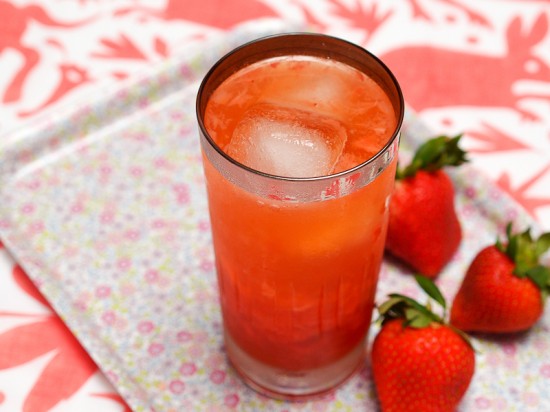
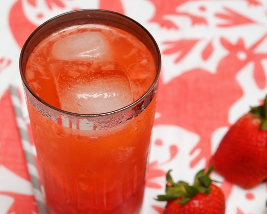
This is a wonderfully light, fruity drink in which the Tequila is balanced really well.  The soda water gives it a nice zing that a regular Sour or Margarita can lack.  You can leave the pulp in and get more strawberry flavor, or you can filter before adding the Tequila and get a much cleaner drink (and no pulp when you sip – but don’t forget to garnish with a strawberry).


Americans have been using soda water to charge up their drinks since the 1850s, but the Daisy and its close relative the Fizz became really popular after the Civil War.  The original 1870s recipe involved spirits, sugar, lemon juice, orange liqueur, and some fizz.  Forty years later, a new-fangled recipe came along with lemon and lime juice, and grenadine in place of triple sec.  As I’ve noted before, the word for “daisy” in Spanish is, conveniently enough, margarita.  This, plus the taste of today’s drink, strongly suggest the origins of the Margarita lay with the Daisy.

Last – but definitely not least – Cinco de Mayo!  150 years ago tomorrow, a French army was marching on the Mexican town of Pueblo.  Why?  Because France’s ruler at the time was Louis-Napoléon Bonaparte, nephew of the Napoleon and better known to history as Napoleon III.  Napoleon III, who was not a very good emperor, had grandiose plans to build a new French Empire to rival his uncle’s and invaded Mexico in 1861.  On May 5th, 1862, Mexican soldiers defending Pueblo defeated a much larger force of crack French troops, giving a much-needed boost of morale to Mexico’s armies.  The French went on to take over the country, but, after years of struggle, Mexico won its freedom again and drove the French out in 1866.  So, tomorrow, while you’re enjoying your Tequila Daisy, raise a glass to the brave Mexicans who fought for their country’s independence that Cinco de Mayo.

Photo Credits: Nole Garey for Oh So Beautiful Paper

{happy weekend!}

Ah… the first week back after vacation is always a doozy, isn’t it?  But even after racing to catch up from a week away, I’m so very glad to be back home.  This weekend we’ll be watching the Stanley Cup playoffs and starting to make plans for the future nursery room.  Yay!  But in the meantime…

Photo Credit: Scout’s Honor Co.

…a few links for your weekend!

This week on Oh So Beautiful Paper:

That’s it for me this week!  Cocktail Fridays will be back this afternoon – and we have a special cocktail just in time for Cinco de Mayo, so check back a bit later for the recipe!  I hope you all have a wonderful weekend, and I’ll see you back here on Monday!  xoxo

Pretty Paper in the Office: Mouse Pads

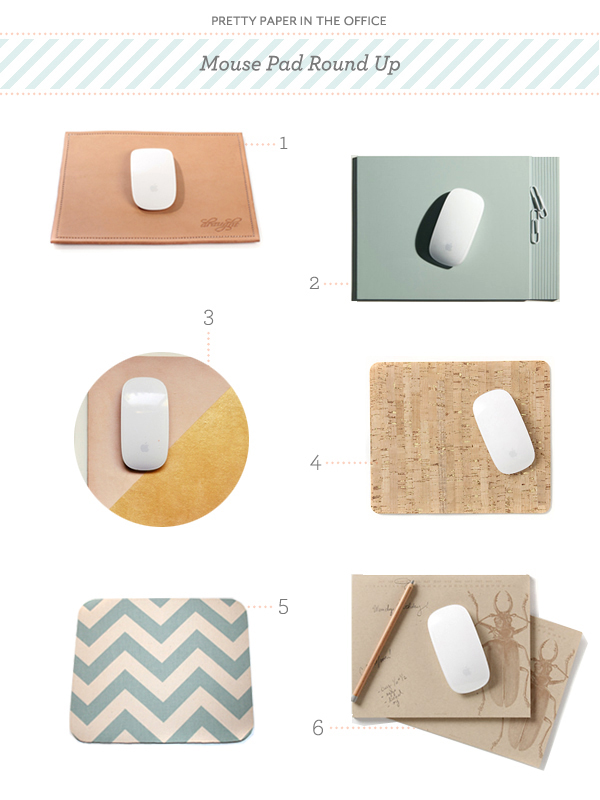
Maybe it’s from all my trackpad use, but when I sit down at the computer and my mouse doesn’t function smoothly, I find it a bit disruptive.  Which is why I still use a mouse pad. (The bit of padding for my wrist is a plus, too!)  Though it can be tricky to find one with a little personality for your workspace.  So I’ve put together a round up of some of best mouse pads out there that are both functional and fun. – Julie

Pretty Paper in the Office: Mouse Pads

No. 1 Leather mouse pad by Draught Dry Goods; No. 2 A4 mouse pad by Kitmen Keung; No. 3 Leather and gold mouse pad by Freshly Picked; No. 4 Bulletin mouse pad from Anthropologie; No. 5 Blue chevron mouse pad by In His Name; No. 6 Beetle paper mouse pad from Anthropologie

{images via their respective sources}

DIY Western Reception Wedding Details, Part I

The details are part of the fun of creating an event – be it a wedding, dinner party or bridal shower.  Those details make the event special, unique, and totally you!  Remember the Western Save the Date & Invitation DIY we did a few months ago?  It was one of our favorite tutorials… so we decided to expand on the theme and offer up some ideas for how to embellish a Western reception. – Bailey and Emma of Antiquaria

Western Wedding Detail Ideas and Inspiration

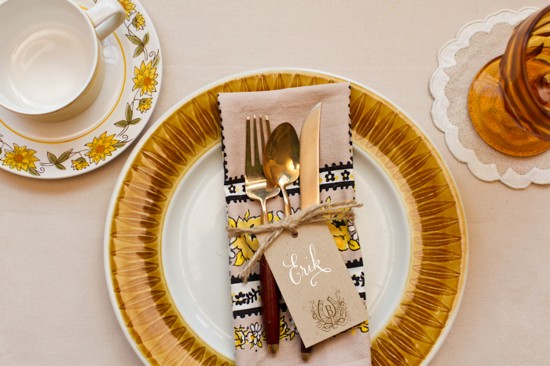
A simply set, color appropriate place setting is ready for your guest as they approach the table.  Kraft tags tied around the napkin, are embellished with a monogram and serve as place cards for this casual, fun fete.

Western Wedding Detail Ideas and Inspiration - Place Cards

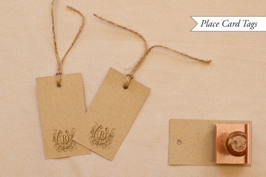
To make the place card yags: Ink your monogram stamp (we used our Vintage Horseshoe Initial Monogram) and center it on the bottom of a kraft paper gift tag (or manilla shipping tag).  Press stamp down moderately and remove from surface.  Set aside to dry.  Once dry, write your guests’ names on the tag.  We love the way that the opaque white calligraphy ink looks on kraft paper.  Next, cut about 2 feet of rustic twine and wrap it around a pressed napkin.  Tie in a knot, thread the tag on to one loose in, and then tie the twine in a bow.

Western Wedding Detail Ideas and Inspiration

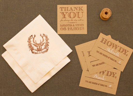
A collection of goodies for the reception.  They all look so cute together!

Western Wedding Detail Ideas and Inspiration

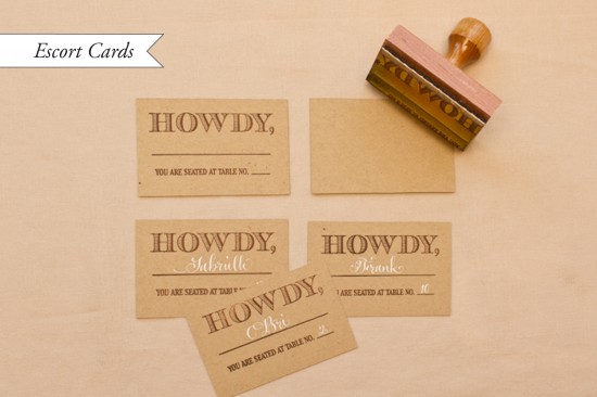
How to make the stamped escort cards: Our escort card stamps are some of our new faves in the shop.  For this western themed card, cut kraft paper into 3.75″ x 2.5″ inch rectangles.  Ink your stamp (we used our Howdy Escort Card Stamp) and center over the card.  Press down moderately, using the handle as the main point of pressure.  Remove stamp and let dry.  Once you have your final seating arrangement, fill in the cards accordingly.  We repeated the white ink for the names to have continuity throughout the event.

p.s.  Ed Note: Confused by the difference between escort cards and place cards?  Escort cards are typically displayed together at a central location near the reception entrance and include the guest’s name and table number, guiding your guest to the appropriate table where they can then find their seat.  A place card with the guest name then sits at the individual table place setting, indicating an assigned seat where a guest should sit at their table.

Western Wedding Detail Ideas and Inspiration

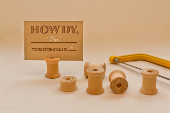
We racked our brains to figure out a cute and unique way to display all those howdy escort cards to no avail… until we stumbled across Emma’s mother’s vintage wooden spool and bobbin collection.  Perfect!

Western Wedding Detail Ideas and Inspiration - Wood Spool Escort Card Display

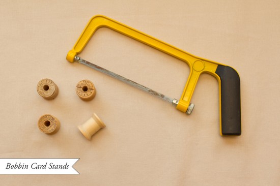
Bobbin Card Stands: Troll the internet or thrift stores for vintage wooden spools or bobbins (bobbins will be smaller).  Once you acquire the number that you need, you’re ready to start converting them into escort card holders.  Lightly draw a pencil line across the diameter of the top of the spool. With a small hand saw, saw down about an eighth to a quarter inch (so that the card can slide in).  Now your ready to set them all up and put them to work directing your guests to their tables!

We’ll be back with more Western wedding detail ideas in our next post!

Materials:

Vintage Horseshoe Initial Monogram Stamp

Howdy Escort Card Stamp

Stamp Pad (in Chestnut)

Metal Eyelet Gift Tags in Kraft

Rustic Twine

White Calligraphy Ink

Kraft Card Stock

Ruler and x-acto blade

Wooden Spools and Bobbins

Hand Saw

Photo Credits: Intertwyned for Antiquaria

Erin + Blake’s Gold Foil and Letterpress Wedding Invitations

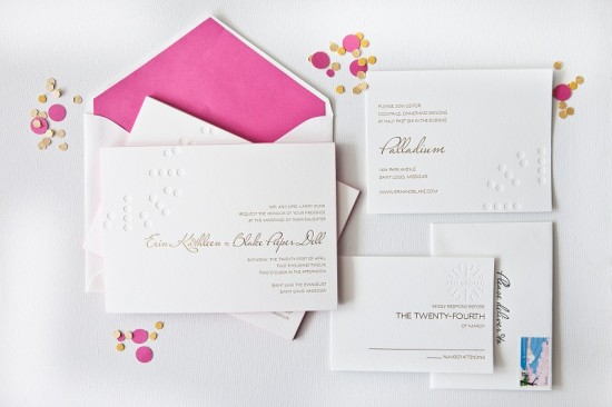
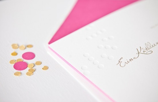
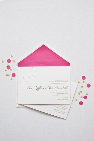
The resurgence of metallics – and gold foil in particular – has been one of my favorite design trends over the last couple of years.  I love the subtle way gold foil text is paired with a letterpress blind impression (no ink) pattern in these wedding invitations from Courtney Callahan Paper.  Modern, fresh, and sophisticated all at the same time!

Gold-Foil-Blind-Impression-Letterpress-Wedding-Invitations-Courtney-Callahan-Paper (9)

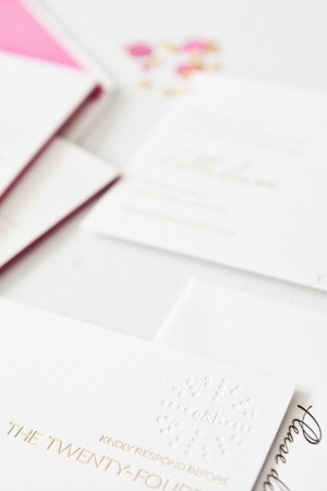
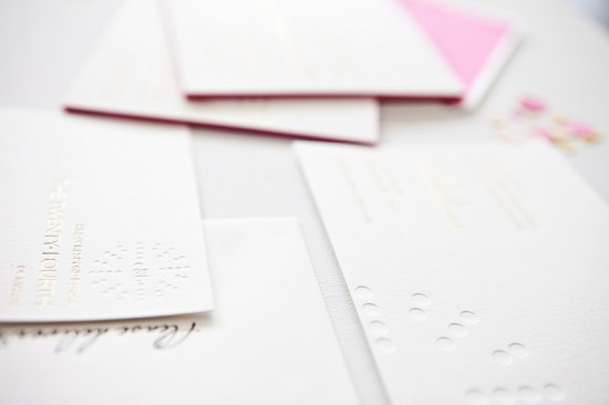
From Courtney:  Erin and Blake are a modern couple with a keen sense of style, and they each had opinions on how they wanted their invitation suite to look.  For the blind impression pattern, we decided to mimic the circles used in the logo of their wedding venue, the Palladium; this element was carried throughout each piece of the suite and the materials used on their wedding day.

Gold-Foil-Blind-Impression-Letterpress-Wedding-Invitations-Courtney-Callahan-Paper (6)

Printed on Crane’s Lettra in pearl, the invitation suite was produced using metallic gold foil stamping and a letterpress blind emboss.  The suite included an invitation with hot pink edge painting, along with a reception card and response card with a custom monogram detail.  Inner envelopes were lined in hot pink to match the edge painting on the invitation.

Gold-Foil-Blind-Impression-Letterpress-Wedding-Invitations-Courtney-Callahan-Paper (2) Gold-Foil-Blind-Impression-Letterpress-Wedding-Invitations-Courtney-Callahan-Paper (3)

Gold-Foil-Blind-Impression-Letterpress-Wedding-Invitations-Courtney-Callahan-Paper (1)

Gold-Foil-Blind-Impression-Letterpress-Wedding-Invitations-Courtney-Callahan-Paper (7)

Thanks Courtney!

Design: Courtney Callahan Paper

Letterpress Printing: Accucolor

Check out the Designer Rolodex for more tal­ented wed­ding invi­ta­tion design­ers and the real invi­ta­tions gallery for more wedding invitation ideas!

Photo Credits: Jennifer Kathryn Photography