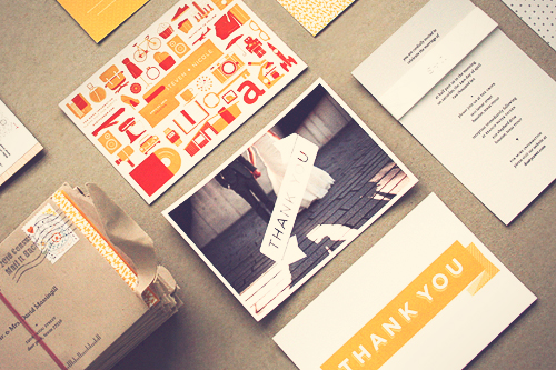
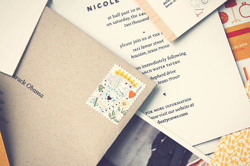
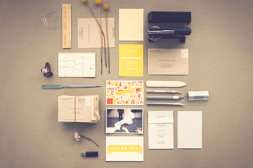
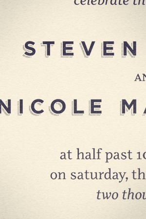
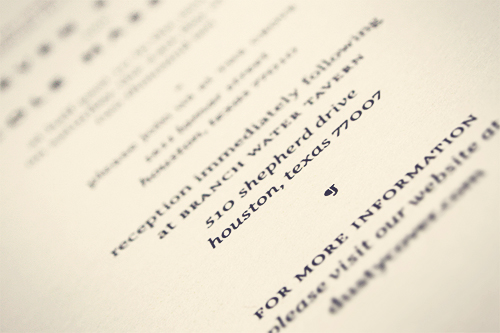
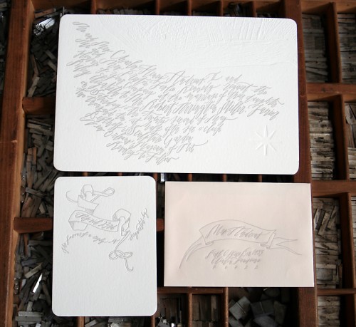
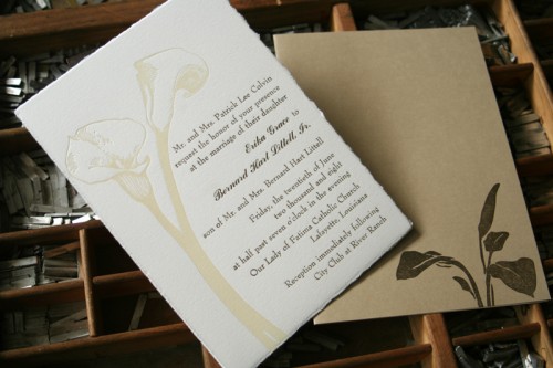
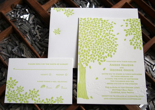
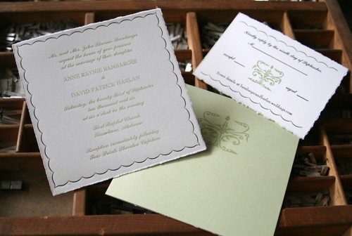
Nicole and Steven had an incredibly cool concept for their save the dates (a personal scavenger hunt!), so when Nicole sent over the invitations for their wedding this past April, I knew they would be fantastic.  These invitations were  a collaborative DIY effort, as Nicole and Steven designed, printed, cut, folded, embossed, glued, and even sanded their entire invitation suite together – check out a photo below for some of the many tools involved with the project!
From Nicole: Â The first step in deciding what our invitations were going to look like was deciding what we didn’t want them to look like. Â For us, that meant throwing out a lot of those invitation standards that scream “wedding.”
The invitations were a definite blending of two very different design styles. Â Steven usually has a very sterile and rigid way of designing, while I am drawn to strong patterns and bolder colors.
Each piece had a unique texture and feeling. Â The invitation itself was very understated, composed of only typographic elements and printed on the same light gray stock as our save the dates.
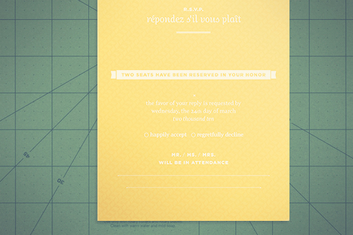
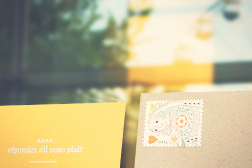
The RSVP card was the polar opposite. Â We chose a bright yellow color and complementary patterns on the front and back.
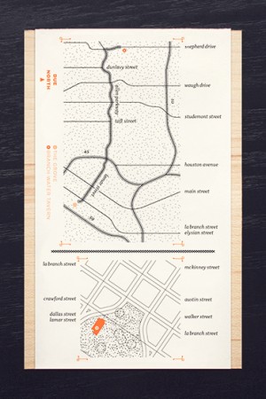
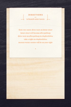
We mimicked the ribbon from the RSVP on the map card by wrapping a sheet of paper around wood veneer and notching the end. The flourishes that we used on the map enclosures were a more current take on the classic book ornament.
I’ve got more paper details from Nicole and Steven’s wedding coming up, so check back soon!
{image credits: nicole | design curiosities}

