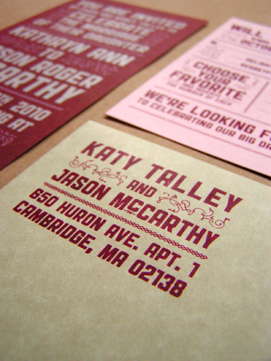
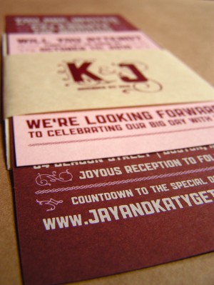
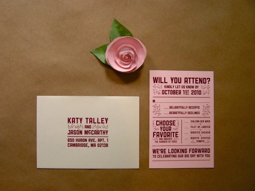
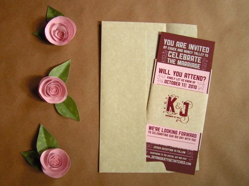
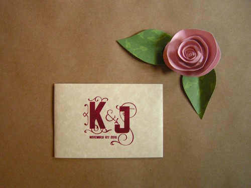
Earlier this year, Derek and Kim, the husband and wife designers behind RageHaus, sent over a set of vintage-inspired Save the Dates that they printed for friends Katy and Jason. Â Well, after recently relocating to Brooklyn, Kim and Derek are back with Katy and Jason’s wedding invitations! Â For the follow-on invitations, Kim and Derek continued with the color palette and vintage typography-inspired design elements from the Save the Dates.
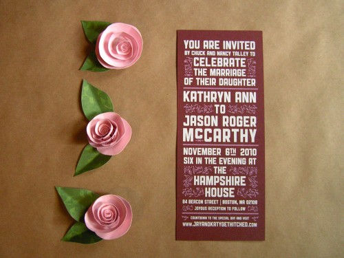
From Kim: Katy and Jason wanted a modern wedding invitation with a major emphasis on strong typography. Â The wedding will take place in Boston, so we drew a majority of our inspiration from old Boston signage.
With the ceremony being held at The Hampshire House, an historic Boston mansion, we decided to pull in some luxurious elements to the design.
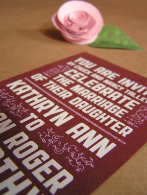
Between the strong typography and the delicate ornaments and flourishes, we were able to create a modern, yet elegant, wedding invitation.
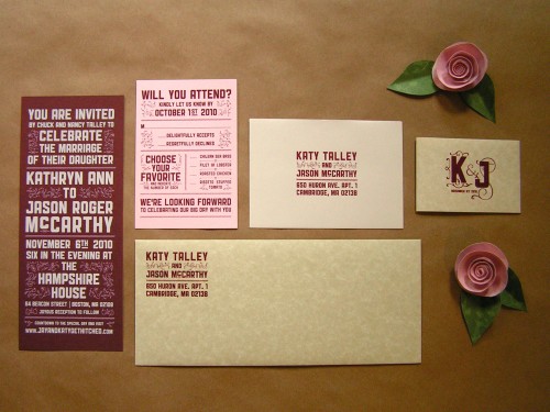
The entire set was screen printed by hand.  For the the invitation, white and light pink ink was printed on French Paper‘s Wine Speckletone.
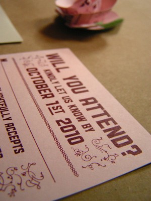
For the reply card, we brought in Pink Lemonade Pop Tone to accentuate the light pink ink on the invitation. Â Maroon ink was matched to the wine color of the invitation and printed on both the reply card and envelope.
The entire invitation set was finished with a French Paper’s Aged Parchtone belly band. Â The monogram printed on the belly band was from their save the date.
Thanks so much Kim and Derek! Â You can also check out more from Kim and Derek over on their website and flickr page, and you can see Katy and Jason’s Save the Dates (along with a bunch of others) over in the Save the Date gallery!
{image credits: RageHaus}

