{happy weekend!}

After spending the early part of this week in New York for Bridal Market, this week practically flew by for me!  It’s been a chilly and windy couple of days back here in DC and I’m hoping that the beautiful fall weather will hold out for a few more weeks before winter starts to roll in.  I’m looking forward to spending a quiet weekend bundling up and staying warm.  I hope you all have fun plans for the weekend!  But in the meantime…

Photo Credit: Let’s Taste Autumn by Crushed Silence

…a few links for your weekend!

This week on Oh So Beautiful Paper:

Welcome to the newest members of the Designer Rolodex!

I’ve got a cocktail recipe coming up for you a bit later this afternoon, and this week it’s one of my favorites!  I hope you all have a wonderful weekend, and I’ll see you back here on Monday! xoxo

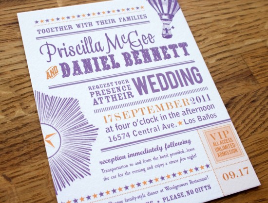
Priscilla + Daniel’s Rock n’ Roll Vintage-Inspired Wedding Invitations

I’ve heard of some interesting sources of inspiration, but until today I don’t think I’ve ever heard of someone being inspired by a FedEx form for their wedding invitations!  Priscilla and Daniel worked with Elise from Sweet Penelope to create a vintage-inspired invitation suite with a slight rock n’ roll vibe, all based around a purple and orange color palette – and yes, inspired in part by a FedEx form!

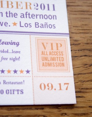
From Elise: Priscilla wanted something vintage, playful, and bold, while using her colors, purple and rusty orange.  She sent me a link to a FedEx invitation template to show me the direction she had in mind.  She also wanted to avoid anything frilly or cutesy, so I chose elements like the hissing lion’s head, sunburst, and hot air balloon, that were dynamic and strong.  Priscilla and Daniel volunteer together at rock concerts, so I tried to capture the spirit of a music festival (without being rock’n’roll specific, as requested by Priscilla) and incorporated the VIP/all access stub in the corner.


I designed each piece differently to avoid being matchy-matchy, but the palette and retro vibe are consistent throughout and help pull the suite together.  The invitations were digitally printed in my studio on 100% cotton 300 gsm paper.

Thanks Elise!

Check out the Designer Rolodex for more tal­ented wed­ding invi­ta­tion design­ers and the real invi­ta­tions gallery for more wedding invitation ideas!

Photo Credits: Sweet Penelope

Calligraphy Inspiration: Emilie Friday

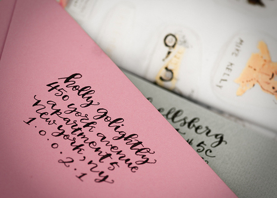
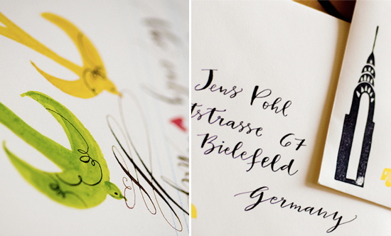
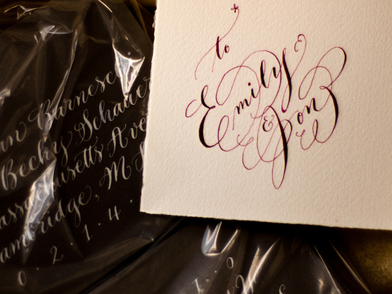
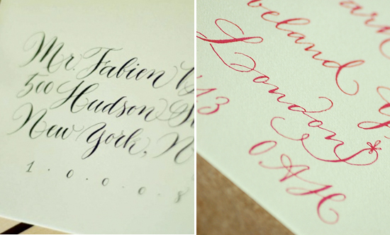
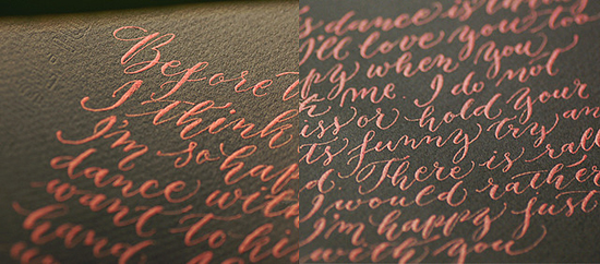
When first I began looking into the art of calligraphy, you can imagine all the sorts of goodies I found.  Calligrapher Emilie Friday definitely comes to mind when I think of not only the art, but also the practice of calligraphy.  Emilie offers gorgeous envelope addressing, invitation design, address stamps and even calligraphy starter kits for those of you looking to try your own hand.  Perusing her website, shop and Flickr photostream, you’ll find elegant examples of her work, glimpses at her practice pieces, and the details that make her calligraphy so special.  – Julie

Emilie Friday Holly Golightly address

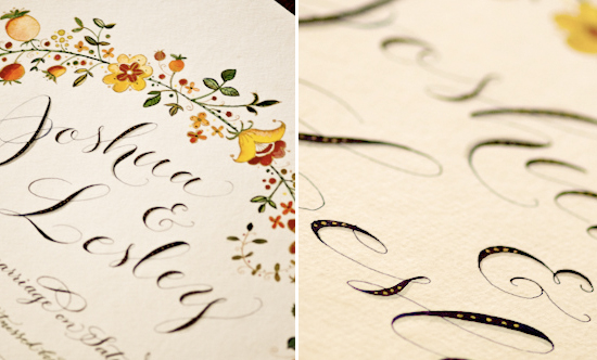
Emilie Friday calligraphy gold detail

Details of a wedding scroll to be signed by guests.  Note the delicate lines, fine touches and her beautiful watercolor illustrations.  Imagine how lovely a wedding certificate would look with these kinds of romantic flourishes!

Emilie Friday ornamentation and style

Emilie Friday card and addressed package

Emilie’s work can be very whimsical for a perfect touch to brighten up everyday correspondence.  She also does amazing intricate work, with use of some of the loveliest calligraphy swashes I’ve seen.

Emilie Friday calligraphy detail swashes

Emilie Friday full text metallic ink detail

Details like these really let you appreciate the work that goes into calligraphy.  Thanks Emilie!

Photo credits: Emilie Friday

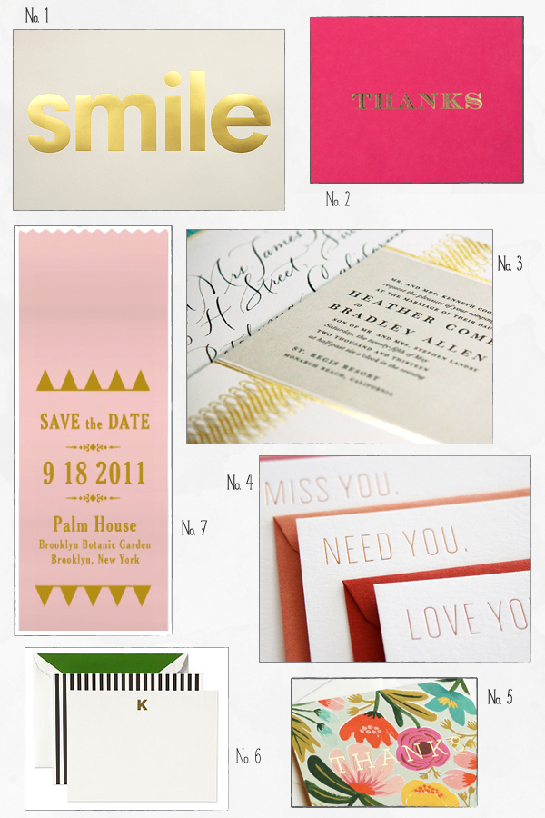
Inspired By: Gold Foil

The resurgence of gold foil is hands down one of my favorite design trends this year.  Foil comes in a myriad of colors (as you saw from Fig. 2 Design Studio on Monday), but gold foil will always have a special place in my heart.  Gold foil can be a big and bold statement or a subtle detail depending on the project and design, but it looks great on everything from wedding invitations to baby announcements to business cards and everything in between.  Gold foil also looks fantastic whether on its own, paired with a classic black and white design, or combined with lots of bright color!

No. 1 Hayley & Lucas via the Keep Calm Gallery; No. 2 Sugar Paper; No. 3 Dauphine Press; No. 4 SeeSaw; No. 5 Rifle Paper Co.; No. 6 Kate Spade; No. 7 Earmark Social Paper Goods

If you’re curious, you can learn more about the foil printing process right here!

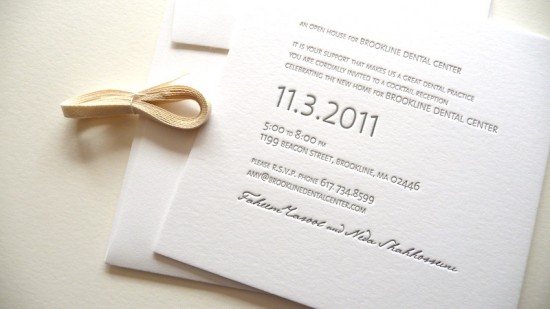
Modern Open House Invitations by Studio Carta + Albertine Press

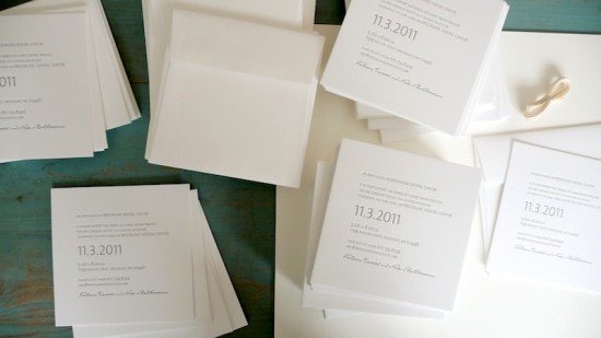
If only all office party invitations were this pretty!  Angela from Studio Carta created these beautiful letterpress invitations for a corporate cocktail reception – with only a week of turnaround time!  Angela partnered up with Shelley from Albertine Press for the letterpress printing, creating an elegant and modern design that suited the client without being overly formal.

From Angela: I was commissioned to design an Open House invitation for a new Dental Center, with only one week of time to complete the project!  When you factor in all the elements of letterpress printing, beyond the design, including ordering the polymer plates, shipping them to the printer, time for the actual printing, and then finally shipping everything back to my studio for the delivery – I was left with only one day to design receive final approval from my client!

The client was looking for elegant, modern invitations, and a dark gray color to match their logo.  I chose 100% cotton Lettra paper and square envelopes for its elegant and soft texture.  The 2-ply paper add a lovely tactile quality to the overall design, and the deep letterpress impression was very visible.  For the typography, I chose a contemporary sans-serif typeface designed by Dutch Lucas de Groot, paired with a calligraphic font that I used for the owners’ names to make the design a bit less formal.

Thanks Angela!

Design: Studio Carta

Letterpress Printing: Albertine Press

Photo Credits: Angela Liguori | Studio Carta