Mauro + Emmy’s Travel-Inspired Destination Wedding Invitations

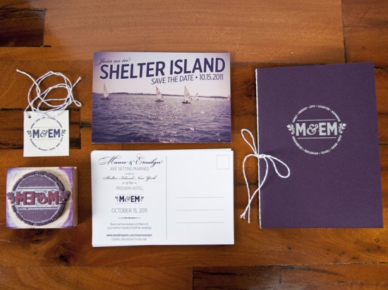
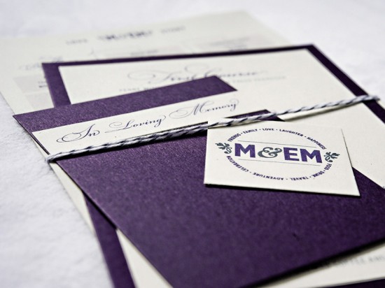
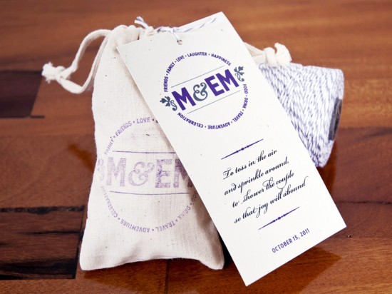
Lindsay from McMillian + Furlow sent over the beautiful wedding invitations and save the dates that she created for her brother’s wedding last fall.  Lindsay was inspired to create a destination-inspired suite, from postcard save the dates to passport-style invitations.  Lindsay also created a beautiful wedding logo based on the bride and groom’s initials; the logo was incorporated on nearly every detail, from the invitations to lavender sachet ceremony programs, and even the groom’s suit!

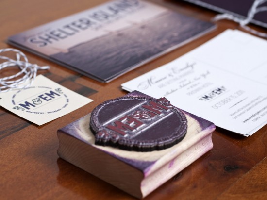
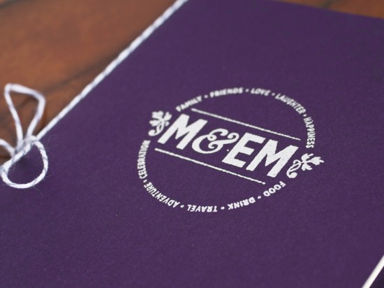
From Lindsay: We were inspired by the idea of having a mini destination wedding on Shelter Island, and by the rich history of the Pridwin Hotel.  I also developed the M&EM logo – a play on their initials – to use on all the materials, either printed or stamped on with the custom rubber stamp.  Mauro even had it embroidered into his suit jacket!

Working with the color palette that Mauro and Emmy had chosen, I designed the save the dates to be a sophisticated play on the classic “Greetings From…” postcards.

Traveling has been a way of life for them ever since they began dating, so it was natural that this passion would be incorporated into the wedding.  The invitations were designed as passports, issued on the day of Mauro and Emmy’s engagement.

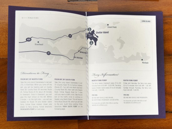
They included all the information guests would need to know – from ferry schedules to and from Shelter Island, historic facts and maps, to ceremony information, lodging, and activities.  This proved to be very useful for all the guests that would be traveling from out of state (and Italy!)

Photo Credit: Joe Sanfilippo

The menus were tied together with a family remembrance card and a timeline of all their travels together.  The string was carefully chosen for it’s reference to the classic Italian pastry boxes.

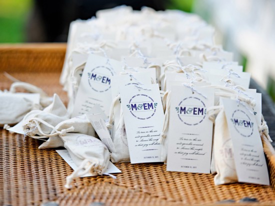
Bags of lavender were stamped and tied with all the ceremony information on the back.  This was our clever way of avoiding the use of a standard wedding program.

Photo Credit: Joe Sanfilippo

Thanks Lindsay!

Check out the Designer Rolodex for more tal­ented wed­ding invi­ta­tion design­ers and the real invi­ta­tions gallery for more wedding invitation ideas!

Photo Credits: Except where noted, all images by McMillian and Furlow

Calligraphy Inspiration: Fat Orange Cat Studio

Ed Note: Happy Monday everyone!  This calligraphy post would normally have run last Thursday, but I couldn’t fit it in with my travel to Alt.  So instead we get to start the week off with some absolutely gorgeous calligraphy courtesy of Li from Fat Orange Cat Studio!

As Nole has recently shared some great posts about various printing processes, I thought it would be fun to see some of what goes into calligraphy.  And I couldn’t think of anyone better than Li Ward of Fat Orange Cat Studio to show us.  Li regularly shares her many calligraphy drafts with the readers of her blog.  I enjoy seeing the final product so much more when I know how many ways it could have turned out.  Li has many wonderful styles of writing and it’s lovely to see the nuances of each letter and how they can so easily change.  I was definitely not surprised to find that even her drafts are written beautifully! Julie

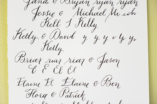
Fat Orange Cat Studio chalk menu draft

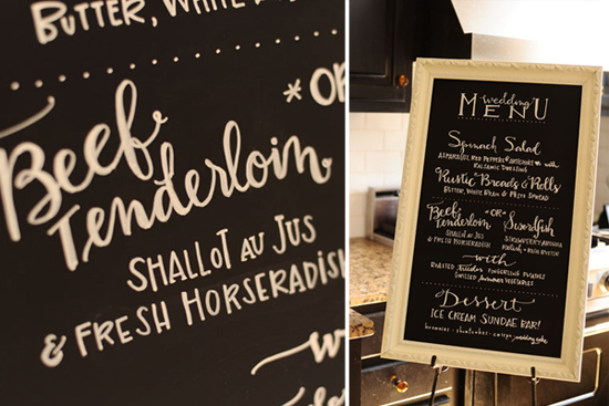
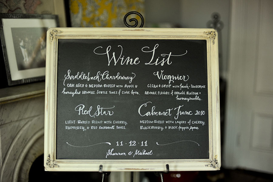
Fat Orange Cat Studio chalk menu

From Li: “I wrote this with Chalk Pen on a foam board that was spray-painted with chalkboard paint.  I did a rough draft of it with pen on a piece of paper that was roughly the same dimension as the board to determine text placement.”

Fat Orange Cat Studios couple's stamp draft

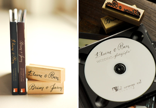
Fat Orange Cat Studios couples stamp final

From Li: “For each of my wedding photography clients, I calligraph their names, scan them, and use the high-resolution scans to make rubber stamps.  I also use their scanned names on their customizable CD covers.”

Fat Orange Cat Studio wine list draft

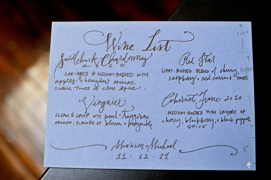
Fat Orange Cat Studio wine list finished

“This wine list was done in the same fashion as the chalk menu, using Chalk Pen on some vinyl-covered board which was then framed.”

Fat Orange Cat Studio Logo draft

Fat Orange Cat Studio finished logo

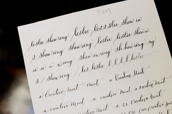
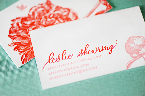
From Li: “As you can see I letter quite a bit.  It’s a form of warm-up.”  A glimpse at the various approaches to a business card for A Creative Mint‘s Leslie Shewring. (Letterpress printing by Parrott Design Studio.)

Make sure you look through more of Fat Orange Cat Studio’s gorgeous calligraphy work, as well as her beautiful wedding and pet photography.

Thank you so much Li for sharing your work and process with us!

Photo Credits: Fat Orange Cat Studio

Friday Happy Hour: The Lavender Ghost

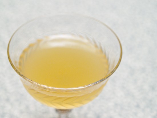
Today’s cocktail recipe is a fancy version of a gin sour, but with the botanical addition of lavender.  Lavender can be a great addition to a cocktail; it’s flowery but also has an earthy flavor that can nicely complement gin or other spirits.  This cocktail is something of a specialty drink, one that demands a pretty specific ingredient, but if you can track some down (or make your own), it’s worth it: the Lavender Ghost.

Read below for the full recipe!

Lavender Ghost

2 oz Dry Gin (we like Plymouth)
1/2 oz Lavender Syrup
1/2 oz Lemon Juice

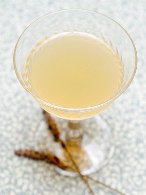
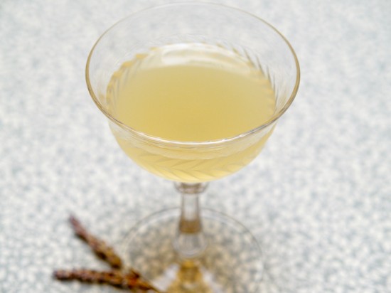
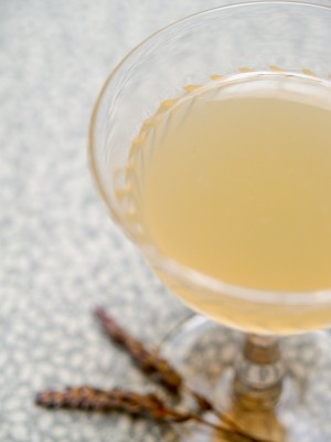
Combine the ingredients, shake with ice, strain into a chilled cocktail glass and enjoy!

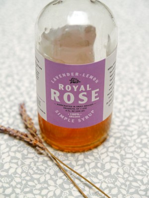
Nole surprised me one day with a wonderful gift of some Royal Rose syrups, including their lavender-lemon syrup.  I gave their suggested cocktail recipes a try and found this one, the Lavender Ghost, was a real stand-out.


Royal Rose Lavender-Lemon syrup is sweet, flowery, and citrusy, but also has a botanical complexity to it that makes this more than just a sweetener and makes it pair well with dry gin.  The resulting drink is sweet, tart, flowery, botanical, and delicious.

The Lavender Ghost is basically a fancied-up gin sour.  Sours belong to one of the oldest, simplest, biggest, and best families of cocktail.  Each sour at its heart combines a spirit with a citrus and a sweetener.  Tweak any one of those ingredients and you basically get a new drink, whether it’s the Sidecar, or the Margarita, or the Daiquiri.  The gin sour is properly known as the White Lady, which is also a mythical name for a type of female ghost, making the Lavender Ghost a very clever name from the people at Royal Rose.


Photo Credits: Nole Garey for Oh So Beautiful Paper

{happy weekend!}

Woah, this was quite a week.  The end of the weekend saw me completely flattened by a terrible 24-hour virus, which left me unable to do anything but sleep during the early part of the week.  Ugh.  Thankfully I recovered in time for my flight out to Salt Lake City for Alt Summit – which is where I am right now!  I’m enjoying the beautiful mountains and catching up with friends before heading back home to DC at the end of the weekend.  But in the meantime…

Photo Credit: Aaron Huey

…a few links for your weekend!

This week on Oh So Beautiful Paper:

Finally, don’t forget to enter the Valentine’s Day giveaway from One Plus One – the contest ends Sunday!  And as an added bonus, One Plus One is offering free shipping from their Etsy shop from now until Friday, January 27!  Yay!  Just use the code LOVEISINTHEAIR at checkout!

Check back soon for today’s cocktail recipe!  I’ll see you back here on Monday! xoxo

The Printing Process: Edge Painting

Every morning this week, I’m running a series of guests posts about different printing methods â€“ so if you’ve ever wondered why certain printing methods are best for certain kinds of designs (or cost more than others), this is for you!  You can read the previous installments covering digital printingengravingscreen printingletterpress printing with antique type, and foil stamping all right here.  Today Michael from Czar Press is here to walk us through edge painting!

What is Edge Painting?

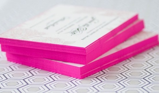
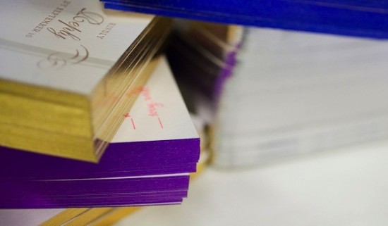
Edge painting at its surface sounds pretty simple – it’s a process by which color is applied to the edges of cards, invitations, even books or journals.  Edge painting can be done in any color, including metallics and foils (!), and is usually mixed by hand to be matched to a specific Pantone color.

I’m a huge fan of edge painting for a bold pop of color on business cards and wedding invitations, like the new invitation collections from Bella Figura, Dauphine Press, and many others.  While edge painting is a commonly used technique, there is a whole lot of mystery surrounding the process – and printers seem to have different methods or processes for applying edge paint.  Today we have Michael from Czar Press walking us through his edge painting process and removing some of the mystery from this popular technique!

The Process

The edge painting process takes place after all graphics and text have been printed and all paper materials cut down to size.  For this example, we’re focusing in on a recent business card project.  I like to make sure my blade is especially nice and sharp when trimming out cards that are going to be edge painted.

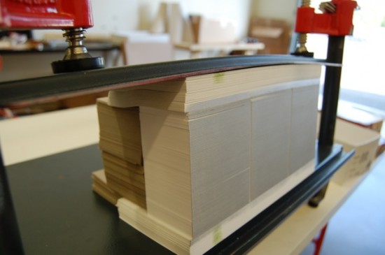
Edge painting involves a padding press (pictured above), ink, and a brayer.  The cards should be stacked on the padding press, making sure that the cards are pressed against one wall of the padding press as evenly as possible.  Crank down the vice(s) on the press, applying pressure to the cards, making them nice and snug.  Remove the outer wall off the padding press, leaving one side exposed.  This the side that will receive the ink.


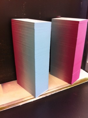
Then using just a little bit of ink, ink up your brayer.  Roll the brayer around and around on a piece of glass if possible in attempt to make the ink spread even across the brayer roller.  Then I apply the ink to the exposed side of the card, applying as little pressure as possible with the brayer to get good ink coverage on the cards.  Once the ink has been applied, I like to gently wipe down the inked side of the cards with a cotton cloth to remove any excess ink.


Let them dry for a while – maybe an hour, depending on conditions – until they are dry to the touch.  Put the outer wall back on the padding press, spin the cards around to the next side and repeat until all sides are complete.

Tips and Advice

Most printers recommend thicker papers – usually 160 lb and up – for maximum results with edge painting.  Edge painting can be done on thinner paper, but heavier (thicker) paper weights will better show the color and saturation of the ink color.

Similarly, most letterpress printers recommend darker or more saturated colors for edge painting.  Think bright red, cobalt blue, or even bright neon or metallic foils!  As with any custom process, most printers hand mix inks to match a specific Pantone color, so keep in mind that there may be slight variations in tone and saturation depending on the number of cards being painted.

Thanks Michael!  Check out more of Michael’s letterpress work right here!

Photo Credits: Example images via Bella Figura, process photos by Czar Press