Lorie + David’s Gold Steampunk Letterpress Wedding Invitations

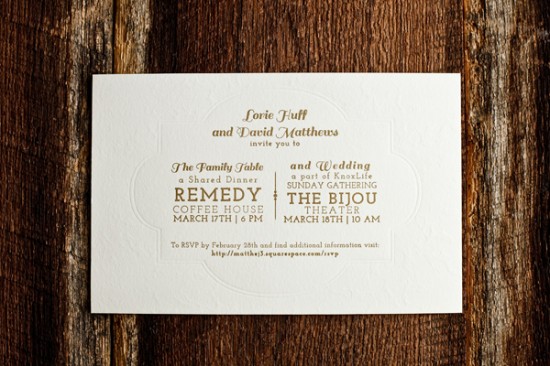
I love it when wedding invitation suites combine mixed materials!  Emily and Dianna from Fourth Year Studio created these invitations for a couple planning a wedding at an historic theatre followed by a coffee house reception.  The gold ink and subtle lace blind impression letterpress pattern are perfect for a vintage-inspired wedding, while the brown paper outer envelopes help the overall suite from being too formal.

Gold-Steam-Punk-Letterpress-Wedding-Invitations-4th-Year-Studio (4)

From Emily and Dianna: David and Lorie were married at the Bijou Theatre and held their wedding reception at a local coffee shop.  The rich colors and textures of the theater lead to a steampunk theme that carried its way through the wedding and reception.

Gold-Steam-Punk-Letterpress-Wedding-Invitations-4th-Year-Studio (2) Gold-Steam-Punk-Letterpress-Wedding-Invitations-4th-Year-Studio (1)

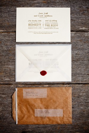
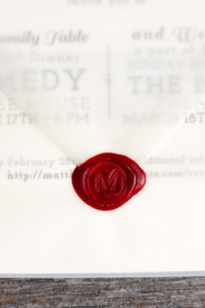
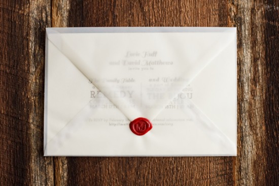
It was important that the invitations be rich and intriguing without being overly fussy.  A vellum inner envelope was sealed with red wax to introduce another layer of texture and depth.  A subtle lace pattern was pressed into the creamy cotton stock framing the gold letterpress printed text.

Gold-Steam-Punk-Letterpress-Wedding-Invitations-4th-Year-Studio (5)

Gold-Steam-Punk-Letterpress-Wedding-Invitations-4th-Year-Studio (6)

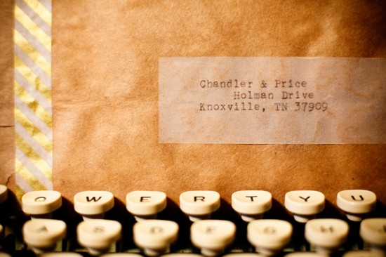
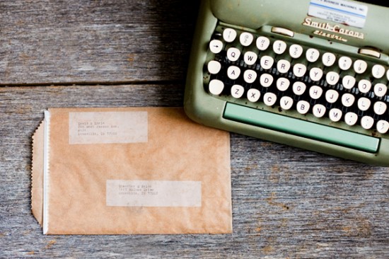
A brown paper bag served as the outer envelope and was sealed with gold striped washi tape.  Each address was typed using a vintage typewriter.

Gold-Steam-Punk-Letterpress-Wedding-Invitations-4th-Year-Studio (8)

Thanks Emily and Dianna!

Check out the Designer Rolodex for more tal­ented wed­ding invi­ta­tion design­ers and the real invi­ta­tions gallery for more wedding invitation ideas!

Photo Credits: 5 Rings Photography

Stationery Show Sneak Peek: Fine Day Press

Happy Monday everyone!  We’re starting the week off with another Stationery Show sneak peek, this time from Ashley at Fine Day Press!  I love the way Ashley mixes color and pattern in her work, and the new collection debuting this weekend is no exception.  The new collection includes some fun letterpress printed birthday and thank you cards that combine gold foil with bright pink and yellow hues, pocket journals with gold foil pattern covers, and patterned coaster sets.

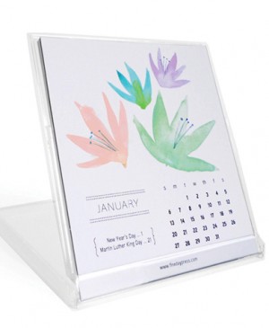
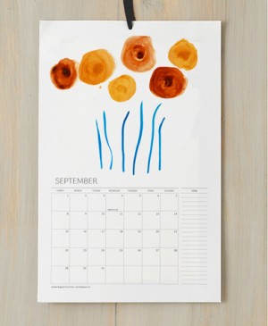
Fine Day Press debuted a gorgeous watercolor calendar at last year’s Stationery Show, so I’m thrilled to see the calendar make a return this year!  This year’s calendar features abstract botanical patterns in both wall and desk format.  So pretty!


Thanks Ashley – I can’t wait to see everything at the show!

Photo Credits: Fine Day Press

Friday Happy Hour: The Pisco Sour

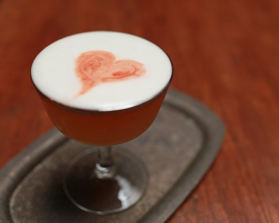
In keeping with last week’s drink, here’s another fantastic Latin American cocktail, this one from South America’s cuisine capital, Peru: the Pisco Sour.  The Pisco Sour is sweet and tart, like a Sour should be, with a complexly herbal aroma from the bitters, but should showcase the Pisco: fruity and vegetal, like fresh grass, smooth but with a citrusy finish.  This drink incorporates raw egg white, and that’s not for everyone.  You can make a Pisco Sour without the egg, and it will still be a tasty Sour.  But a true Pisco Sour with the egg is silky and rich, with a gorgeous head of foam that you’d miss out on.

Read below for the full recipe!

Pisco Sour

2 oz Pisco
3/4 oz Lime Juice
3/4 oz Simple Syrup
1 Egg White (you can probably get by with 1/2 per drink)
Angostura Bitters

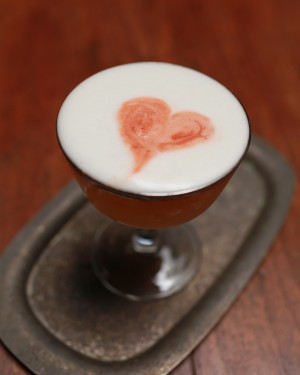
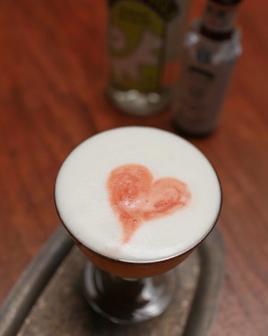
Combine the Pisco (a clear Peruvian or Chilean grape Brandy), juice, syrup, and egg white in a shaker with a flat top (that is, a Boston or Parisian Shaker).  Add one or two big ice cubes.  Cocktail Kingdom sells a tray for making 2 inch cubes that are perfect for many cocktails like this.  Shake hard – the idea is to use the ice cubes as a piston to give this drink its great froth.  Strain well, making sure to shake out all the froth.  Top with the bitters and, if you’re feeling artistic, use a toothpick to draw a shape or pattern in the froth, then enjoy!


Peru’s grape and Pisco industries, introduced by the Spanish at least by the 16th century, are centered around the fertile river valleys that make life possible along the country’s desert coast, towns like Ica and, of course, Pisco.  Pisco is distilled from the first pressing of grapes and aged only in non-reactive vessels, such as glass or the more traditional botijas – giant clay pots – which leaves the spirit clear but mellow.  Americans began drinking lots of Pisco in the 1850s, when it was easy to import the spirit to Gold Rush California (a hot bed of cocktail innovation).  It largely disappeared from the U.S. during Prohibition, but was reintroduced after Victor Morris, an American bartender living in Peru, invented the Pisco Sour around 1920; the drink eventually made its way back here.  A good thing it did!

Photo Credits: Nole Garey for Oh So Beautiful Paper

{happy weekend!}

It’s Mother’s Day weekend!  Do any of you have fun plans to celebrate – either with your moms or your own children?  Between preparations for the Stationery Show and baby-related projects our to do list is a mile long (and growing…), so I’m looking forward to having some time this weekend to catch up on everything.  But in the meantime…

…a few links for your weekend!

This week on Oh So Beautiful Paper:

I hope you all have a wonderful weekend, and I’ll see you back here on Monday!  xoxo

Photo Credit: Staci Kennelly

Stationery Show Sneak Peek: Kate & Birdie

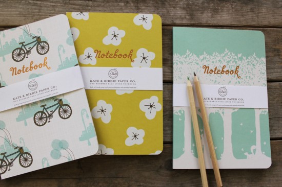
I have one more National Stationery Show sneak peek before we all go running off for the weekend!  I firmly believe that you can never have too many notebooks around and, between to do lists and general note jotting, we tend to go through notebooks pretty fast in my household.  So I’m definitely looking forward to checking out the new notebook collection from Kate & Birdie launching at this year’s show (in just one more week)!

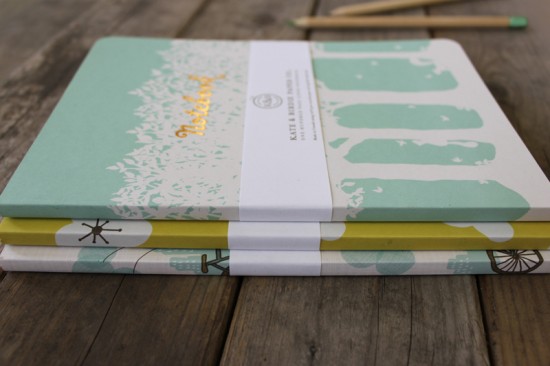
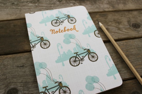
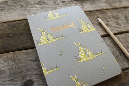
The collection consists of six different notebook styles – each with a coordinating inside cover pattern.  The perfect-bound notebooks have 100 lined pages and are printed on 100% post consumer recycled paper using vegetable-based ink.  Each notebook measures 5.5” x 8” and features copper foil text on the cover (such a nice touch!).

I can’t wait to see more from Kate & Birdie at the Stationery Show in a few more days!

Photo Credits: Kate & Birdie