Karie + Ryan’s Gold Foil Rock n’ Roll Wedding Invitations

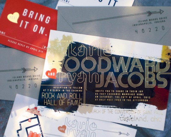
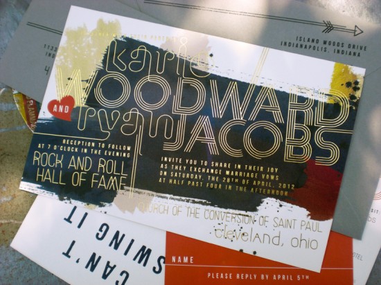
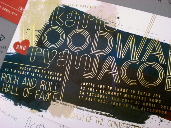
The ladies of Primele are known for their beautiful hand lettering, but these invitations prove that they also create some really amazing custom designs!  Patricia from Primele sent over these fabulous custom invitations that she created for a wedding at the Rock n’ Roll Hall of Fame in Cleveland.  I love the way she incorporated gold foil text over an abstract painting for a modern-meets-glam design!

Gold Foil Wedding Invitations by Primele via Oh So Beautiful Paper (1)

From Patricia:  I loved, loved this creating this invitation suite.  I knew I was interested when the bride mentioned she was getting married at the Rock and Roll Hall of Fame, but I was completely sold when she sent over her selection for bridesmaids dresses.  In the end the bridesmaid’s painterly Andrew Marc dresses played a significant inspirational role in the design of Karie and Ryan’s invitation suite.

Gold Foil Wedding Invitations by Primele via Oh So Beautiful Paper (7)

For the invitation, we went with an artful grunge look and dressed it up with gold foil text over the offset printed painting.

Gold Foil Wedding Invitations by Primele via Oh So Beautiful Paper (5)

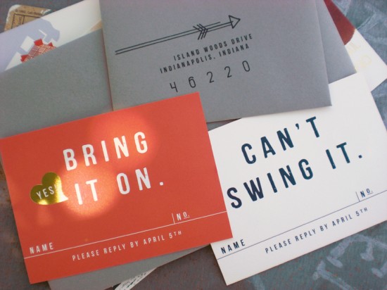
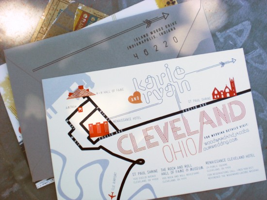
We created double-sided reply cards, and for an element of fun we played up the wording and added a coordinating spot of gold foil.  We also included a map for guests with icons of key destinations.

Gold Foil Wedding Invitations by Primele via Oh So Beautiful Paper (3)

Gold Foil Wedding Invitations by Primele via Oh So Beautiful Paper (4)

Thanks Patricia!

Check out the Designer Rolodex for more tal­ented wed­ding invi­ta­tion design­ers and the real invi­ta­tions gallery for more wedding invitation ideas!

Photo Credits: Primele

Friday Happy Hour: Sangre y Arena

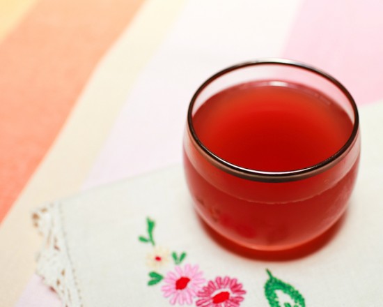
At one of DC’s best cocktail bars, The Passenger, I recently enjoyed my first Blood and Sand, a delicious Scotch (yes, Scotch!) cocktail from the 1920s. I wanted to try it for myself when I got home, but the closest I had to Scotch in my bar was Mezcal, the smoky Mexican spirit I used in our Oaxacan Sunrise drink.  So, I mixed up a somewhat Latin version of the Blood and Sand, the delicious and complex Sangre y Arena.  – Andrew

Sangre y Arena Cocktail Recipe via Oh So Beautiful Paper (4)

Read below for the full recipe!

Sangre y Arena

3/4 oz Mezcal
3/4 oz Cherry Liqueur
3/4 oz Sweet Vermouth
3/4 oz Blood Orange Juice
2 Dashes Chocolate Mole Bitters

Combine all the ingredients, shake well with ice, and strain into a chilled cocktail glass.  A cherry or orange twist garnish is optional.  Enjoy!

Sangre y Arena Cocktail Recipe via Oh So Beautiful Paper (6) Sangre y Arena Cocktail Recipe via Oh So Beautiful Paper (11)

(For the original Blood and Sand, mix equal parts Scotch, Cherry Liqueur, Sweet Vermouth, and Blood Orange Juice.  Shake, strain, and enjoy.)

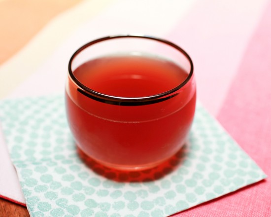
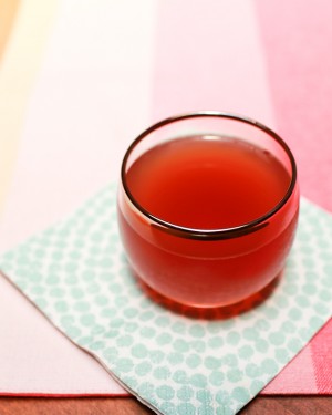
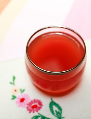
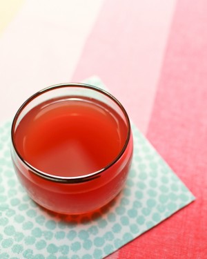
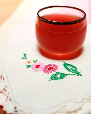
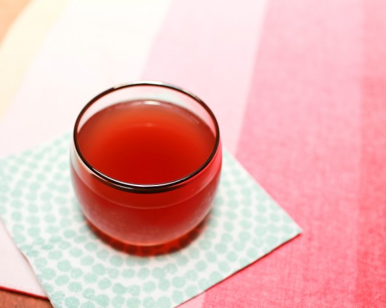
This is a fantastic cocktail, rich and complex, unusual but completely delicious, with a beautiful deep red color.  The ingredients might not sound like they work well together, but trust me, they do.  The smokiness of the Mezcal, rounded out by the richness of the chocolate mole bitters, leads but doesn’t dominate this drink.  The cherry and orange lend some sweet fruitiness that pairs really well with the savoriness of the Mezcal.  It’s a totally unexpected combination, and it will look great in your glass.

Sangre y Arena Cocktail Recipe via Oh So Beautiful Paper (12)

For my Sangre y Arena, I used an aged Añejo Mezcal.  The original recipe called for a Cherry Brandy; I used Rothman & Winter Orchard Cherry Liqueur, which combines bittersweet cherry juice with cherry brandy for a crisp but not-too-sweet taste.  Don’t use Kirsch!  Kirsch is too dry and will throw off the drink.  If the Sangre y Arena is too sweet for you, you can try bumping the Mezcal and orange juice up to an ounce each for a drier drink.

Sangre y Arena Cocktail Recipe via Oh So Beautiful Paper (5) Sangre y Arena Cocktail Recipe via Oh So Beautiful Paper (10)

The Sangre y Arena – and the Blood and Sand before it – gets its name from a 1922 Rudolph Valentino film about a bullfighter who is ruined by his own success, falls into drink and with ill-reputed women, and is eventually gored to death in the arena, Blood and Sand.  Despite the film’s message of temperance, some brilliant mixologist honored the movie with this drink, which first appears in print (as far as I know) in the 1930 Savoy Cocktail Book.

Sangre y Arena Cocktail Recipe via Oh So Beautiful Paper (8)

Finally, a word of thanks to everyone who has commented and let us know how much you like our drink recipes, and a question: is anyone out there trying these at home?  Let us know if you are, how your drinks are turning out, and any of your favorites and experiments!

Photo Credits: Nole Garey for Oh So Beautiful Paper

{happy weekend!}

Woah.  How is it the last week of June already??  Slow down summer!  We’re preparing for another scorcher of a weekend here in DC, but I’m planning to spend most of the weekend indoors with nursery projects – from painting to putting the crib together!  After thinking about the layout for weeks, I’m so excited to see the room finally come together.  But in the meantime…

…a few links for your weekend!

This week on Oh So Beautiful Paper:

As usual, we have a fun cocktail coming up for you this afternoon, so check back a bit later for the recipe!  I hope you all have a wonderful weekend, and I’ll see you back here on Monday!  xoxo

Photo Credit: Still An Oldie

Ligature Wedding Invitation Collection by Paperfinger

You guys, today is such a happy day – I’m absolutely thrilled to help one of my very favorite calligraphers, Bryn from Paperfinger, launch her brand new wedding invitation collection!  Bryn is such a talented and kind lady; she created my beautiful logo that you all see at the top of the page and it’s always a treat to feature her beautiful calligraphy.  The new collection is called Ligature, and it’s absolutely gorgeous!

Ligature Collection Wedding Invitations by Paperfinger via Oh So Beautiful Paper (13)

From Bryn: We created a collection so that we could create invitations for more clients, build on new designs and offer our clients quicker turnarounds without sacrificing the significance or quality of hand-drawn calligraphy.  The word “ligature” is a great metaphor for marriage.  In type design and lettering, a ligature is the unique letterform created by the combination of two alphabet characters that are connected by a linking stroke or flourish.  The ligature itself becomes a unique and distinct character of its own, made up of the two.

Ligature Collection Wedding Invitations by Paperfinger via Oh So Beautiful Paper (12)

Within the collection, each invitation and individual piece is hand-lettered to order (no digital typefaces!), then expertly produced with letterpress printing or engraving.  The collection will also offer edge painting and original patterned backing featuring hand painted patterns created by Bryn.  For those of you who prefer a more custom approach, Bryn tells me that she plans to continue to offer bespoke design services in addition to the Ligature collection.

Ligature Collection Wedding Invitations by Paperfinger via Oh So Beautiful Paper (8)

Ligature Collection Wedding Invitations by Paperfinger via Oh So Beautiful Paper (9)

Ligature Collection Wedding Invitations by Paperfinger via Oh So Beautiful Paper (7)

Ligature Collection Wedding Invitations by Paperfinger via Oh So Beautiful Paper (6)

Ligature Collection Wedding Invitations by Paperfinger via Oh So Beautiful Paper (2)

Ligature Collection Wedding Invitations by Paperfinger via Oh So Beautiful Paper (1)

Ligature Collection Wedding Invitations by Paperfinger via Oh So Beautiful Paper (4)

Ligature Collection Wedding Invitations by Paperfinger via Oh So Beautiful Paper (16)

Ligature Collection Wedding Invitations by Paperfinger via Oh So Beautiful Paper (14)

Yay!  Congrats Bryn!

I’m absolutely thrilled to welcome Paperfinger as a member of the Designer Rolodex – you can check out the full ligature collection in the Rolodex right here or over on Paperfinger!

Photo Credits: Dan Eckstein

Summer Crawfish Boil Invitations

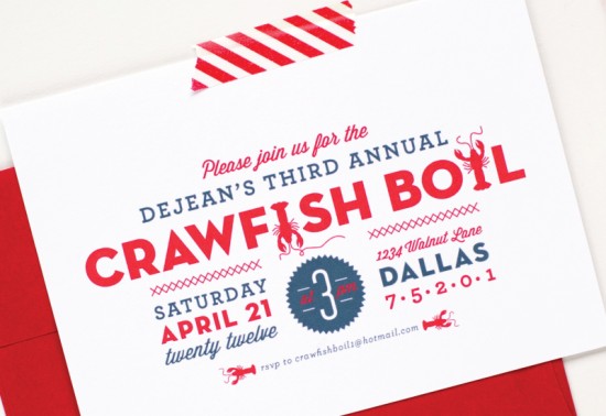
With the 4th of July coming up next week (!!), summer is definitely in full effect.  Lauren Chism Fine Papers created these festive invitations for an annual crawfish boil down in Dallas – the combination of modern typography and the red, white, and blue color palette seems perfect for any summer fête.  So fun!

Summer Crawfish Boil Invitations by Palm Papers via Oh So Beautiful Paper (5)

From Lauren:  Bailey and her husband throw a crawfish boil each year and she came to me looking for a fun and festive invitation.  I incorporated custom crawfish illustrations into a modern typography layout to create a clean but playful look.  The invitations were flat printed on cotton card stock and paired with bright red envelopes.  I love how the color scheme reminds me of a backyard party – perfect for summer celebrations!

Summer Crawfish Boil Invitations by Palm Papers via Oh So Beautiful Paper

Thanks Lauren!

Lauren Chism Fine Papers is a member of the Designer Rolodex â€“ you can check out more of Lauren’s work right here!

Photo Credits: Lauren Chism Fine Papers