Well, I meant to write my usual weekly round up last Friday, but we decided to take advantage of the Veterans Day weekend and escape DC for a few days at my dad’s house in New Jersey (boy, did we need it!). But honestly, despite my intentions I’m not sure I actually could have written my usual post last week. I try to keep a positive tone here, and I think I needed more time to wrap my head around everything that has happened in our country in the last couple of weeks. I rarely discuss political issues here, but I couldn’t move forward without acknowledging that this has been a very difficult time for many of us, myself included. I posted this on Instagram the day after the election, when I felt the need to be quiet, to listen and process. Two weeks later, I’m still feeling pretty unsettled, and I want to send a giant virtual hug to everyone out there who might be feeling the same way. But life moves forward and this too shall pass, and in the meantime I’ll do my best to bring a smile to your face by sharing beautiful stationery that helps celebrate life’s special occasions and encourages us to connect with each other in a meaningful way.
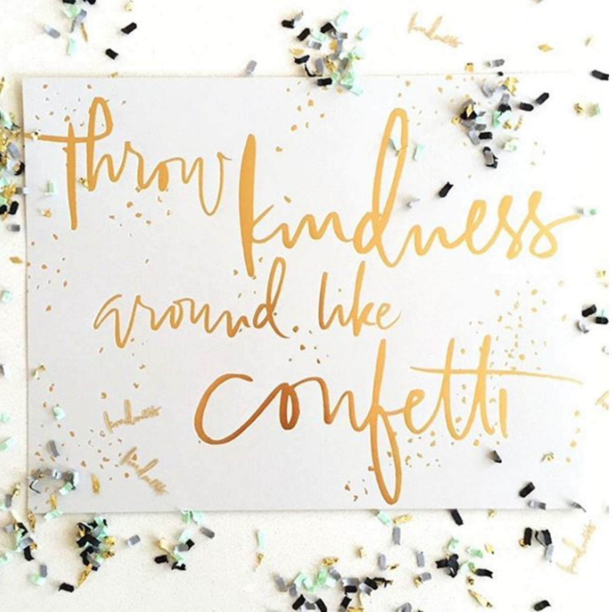
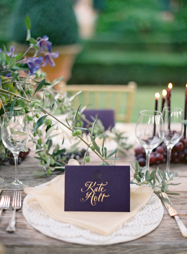
Image (and print) by Anne Robin Calligraphy via Instagram
A few links for your weekend:
- A few political links: a long read on how the Democratic party lost the working class, six women who made history on election day, and a list of pro-women, pro-immigrant, and anti-bigotry organizations that need your support
- Sign up for the 2016 Antiquaria Holiday Card Exchange!
- Did you see the balloon installation that Geronimo Balloons made for Oh Happy Day’s 10th anniversary? Beyond amazing. The party itself looked pretty rad, too.
- This copper tray is perfect for holiday entertaining
- The importance of recess
- Loving this idea for pressed flower ornaments
- Say it isn’t so: a world coffee shortage may be coming
- MAKE: Apple cake with chai spiced buttercream
Recently on Oh So Beautiful Paper:
- Romantic blush and gray wedding invitations with the most beautiful marbled envelope liner
- Modern tropical wedding invitations for a destination wedding in Barbados
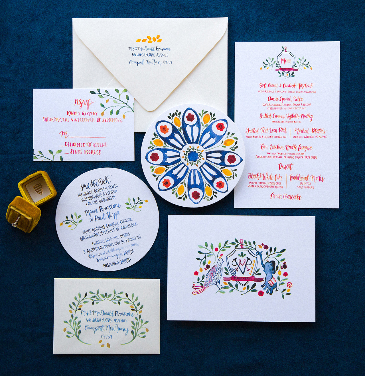
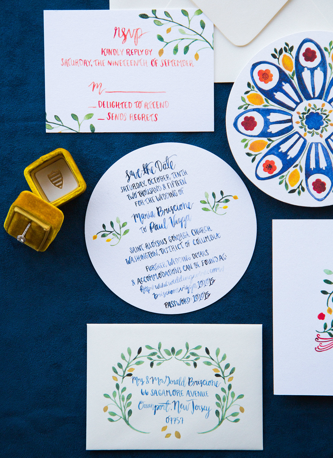
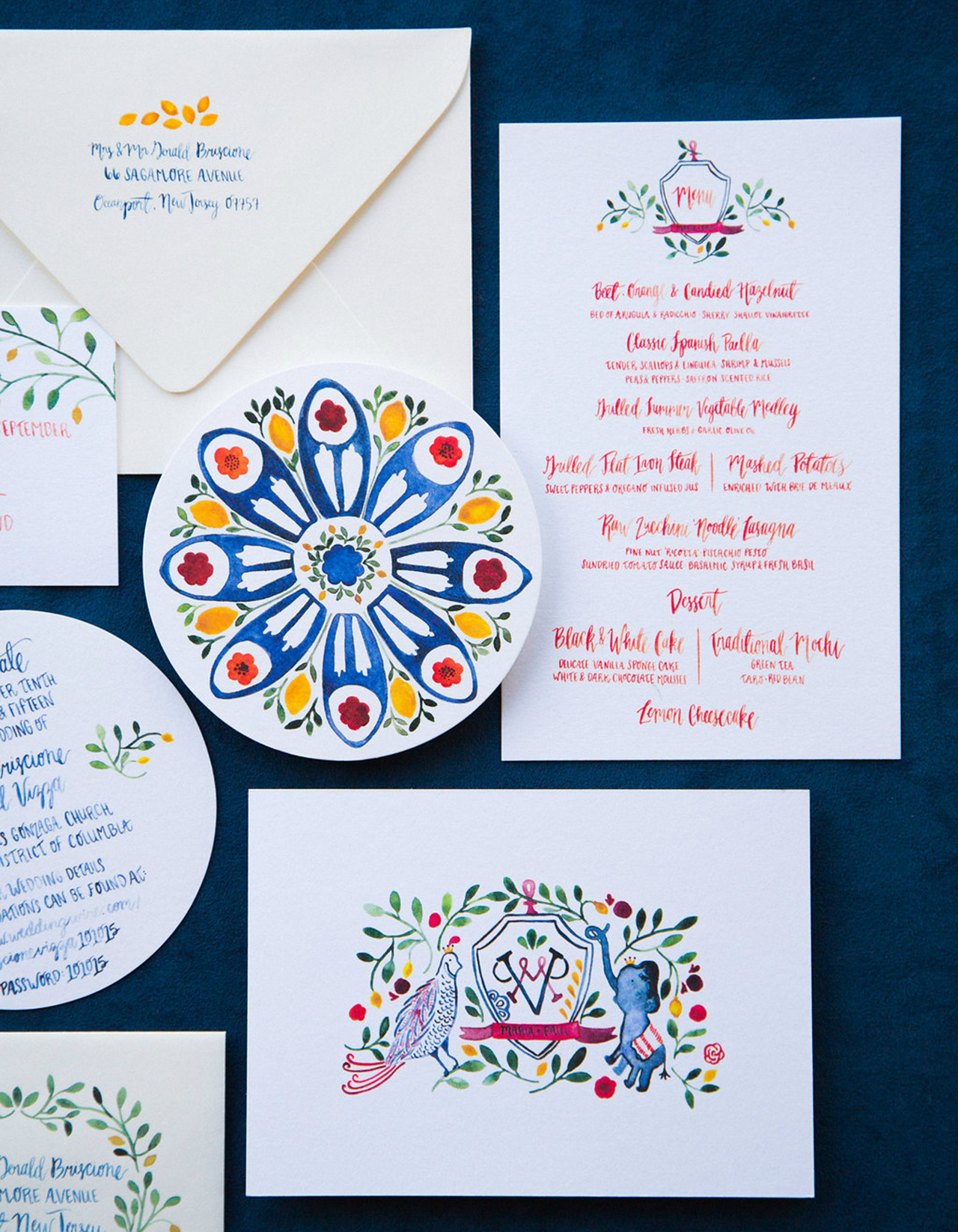
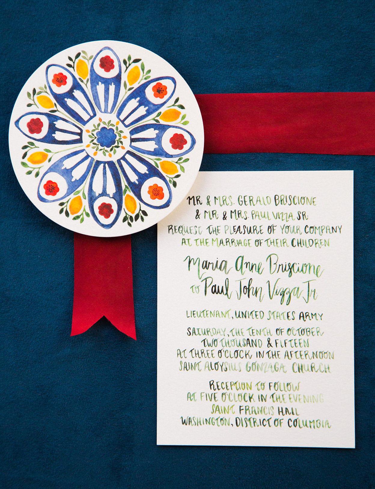
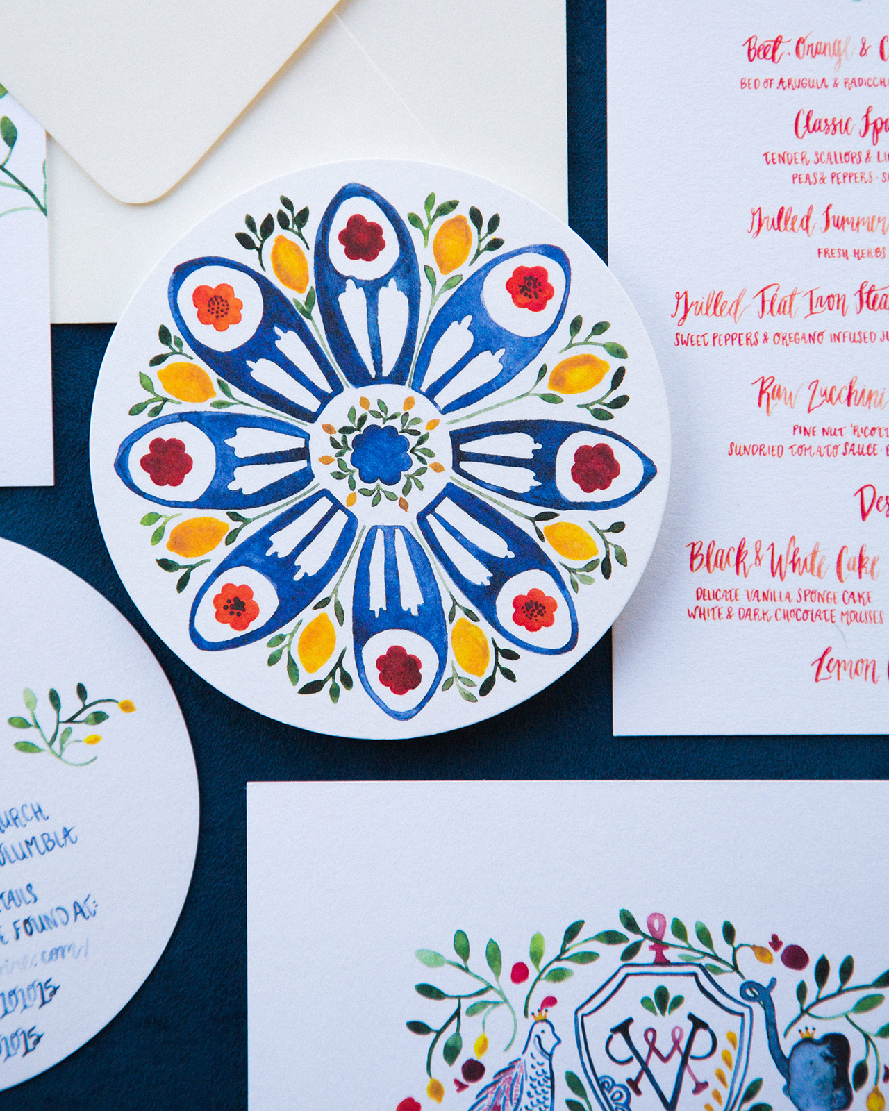
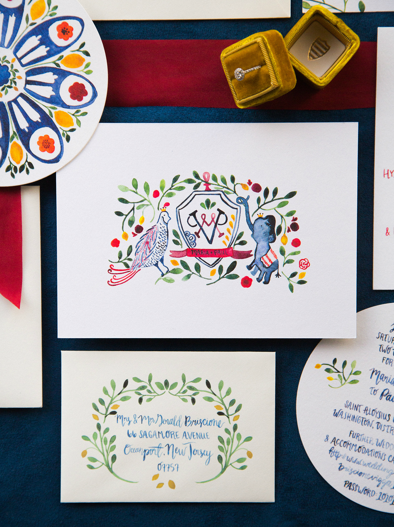
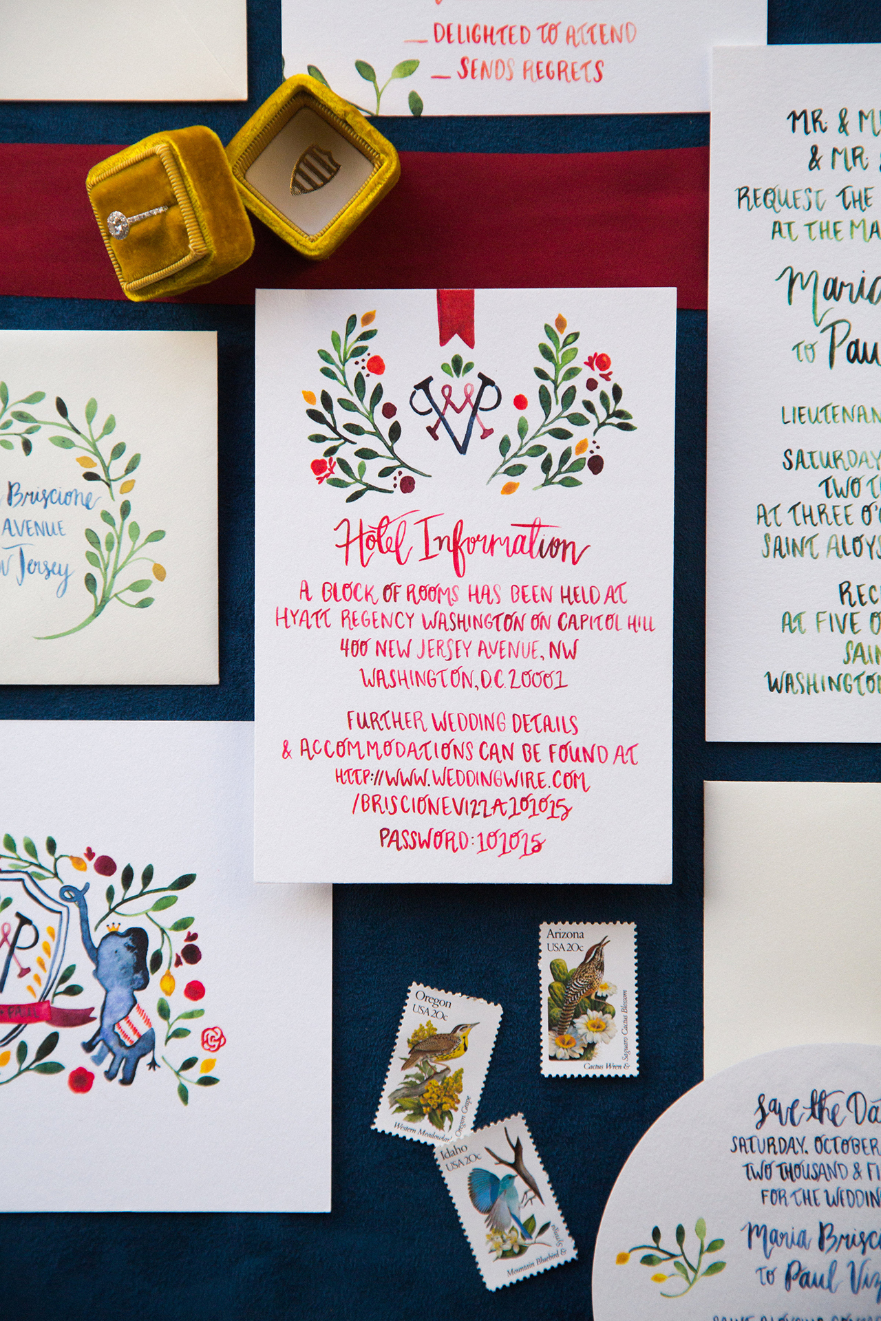
- Vibrant blue and red watercolor wedding invitations
- Behind the Stationery with Idlewild Co.
- Organic calligraphy inspiration from Ettie Kim Calligraphy and Design
- Well Said Type in the modern brush lettering font Zooja
- I shared three of my favorite DC-area destinations for gorgeous fall foliage!
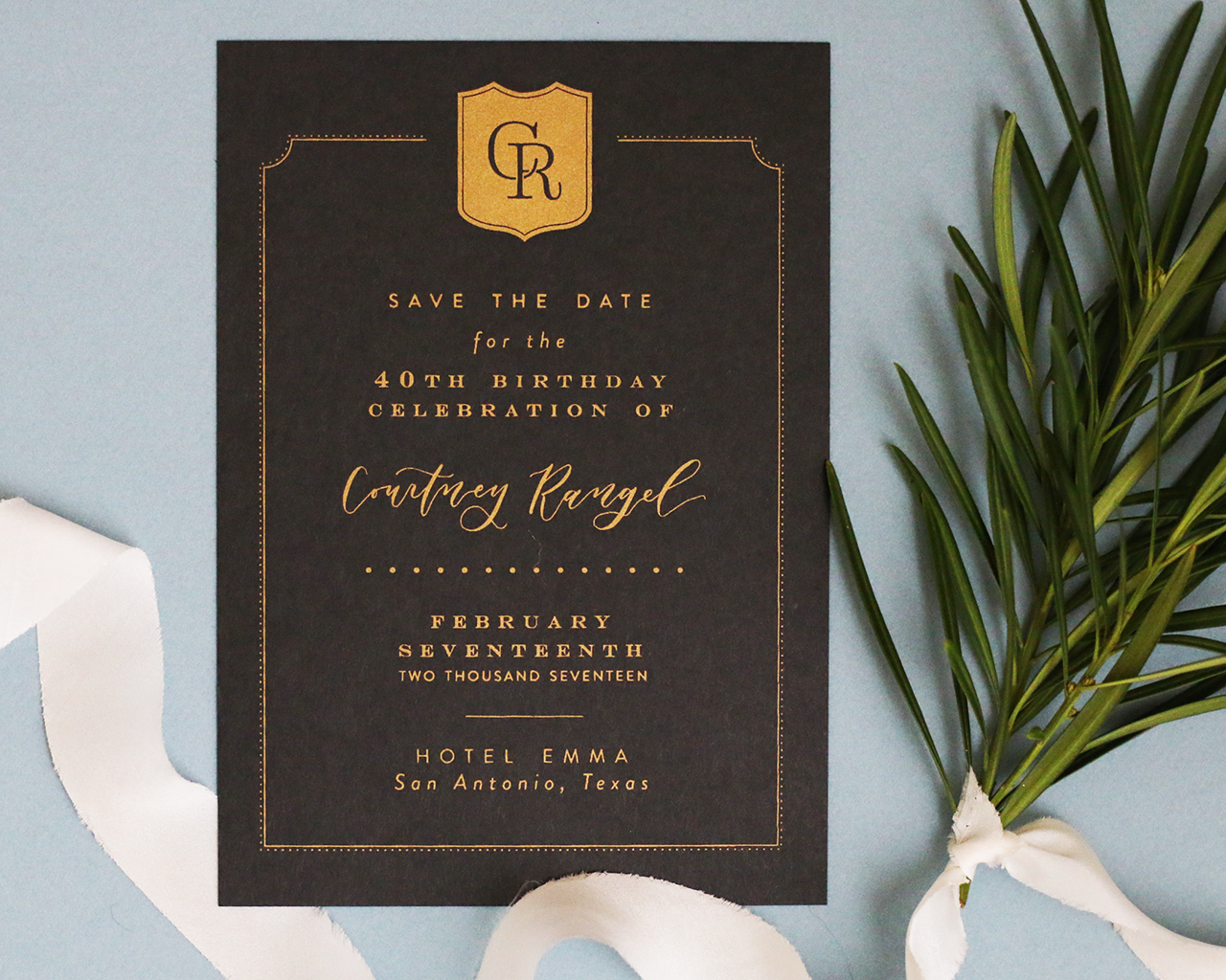
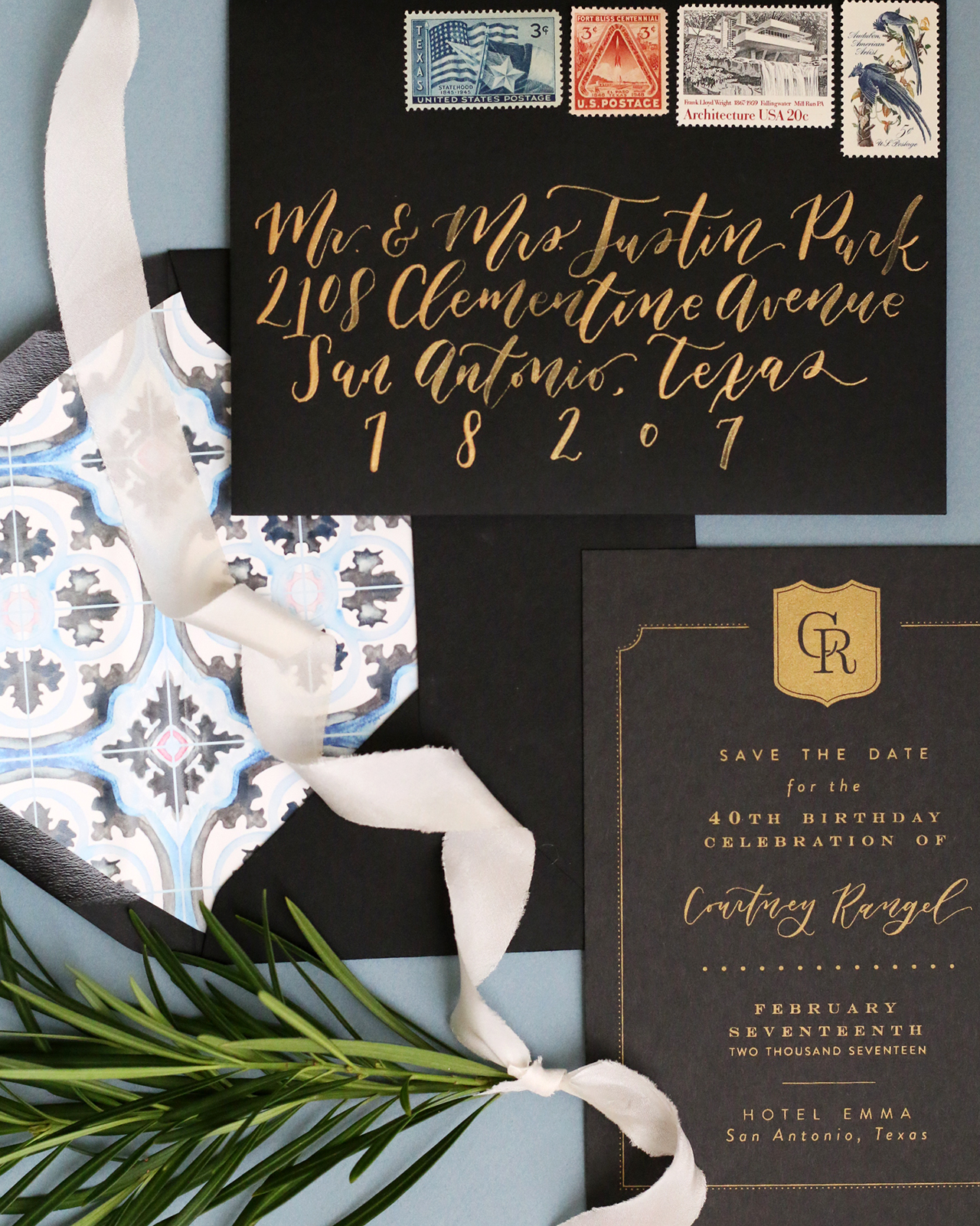
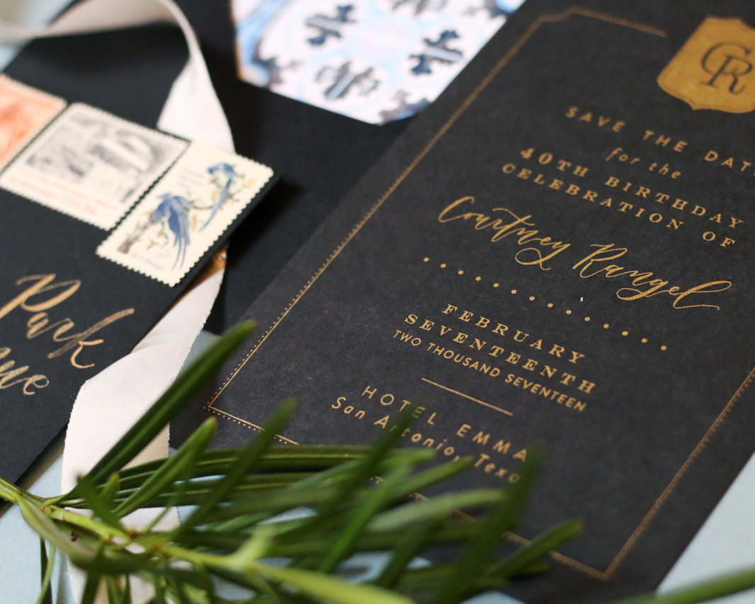
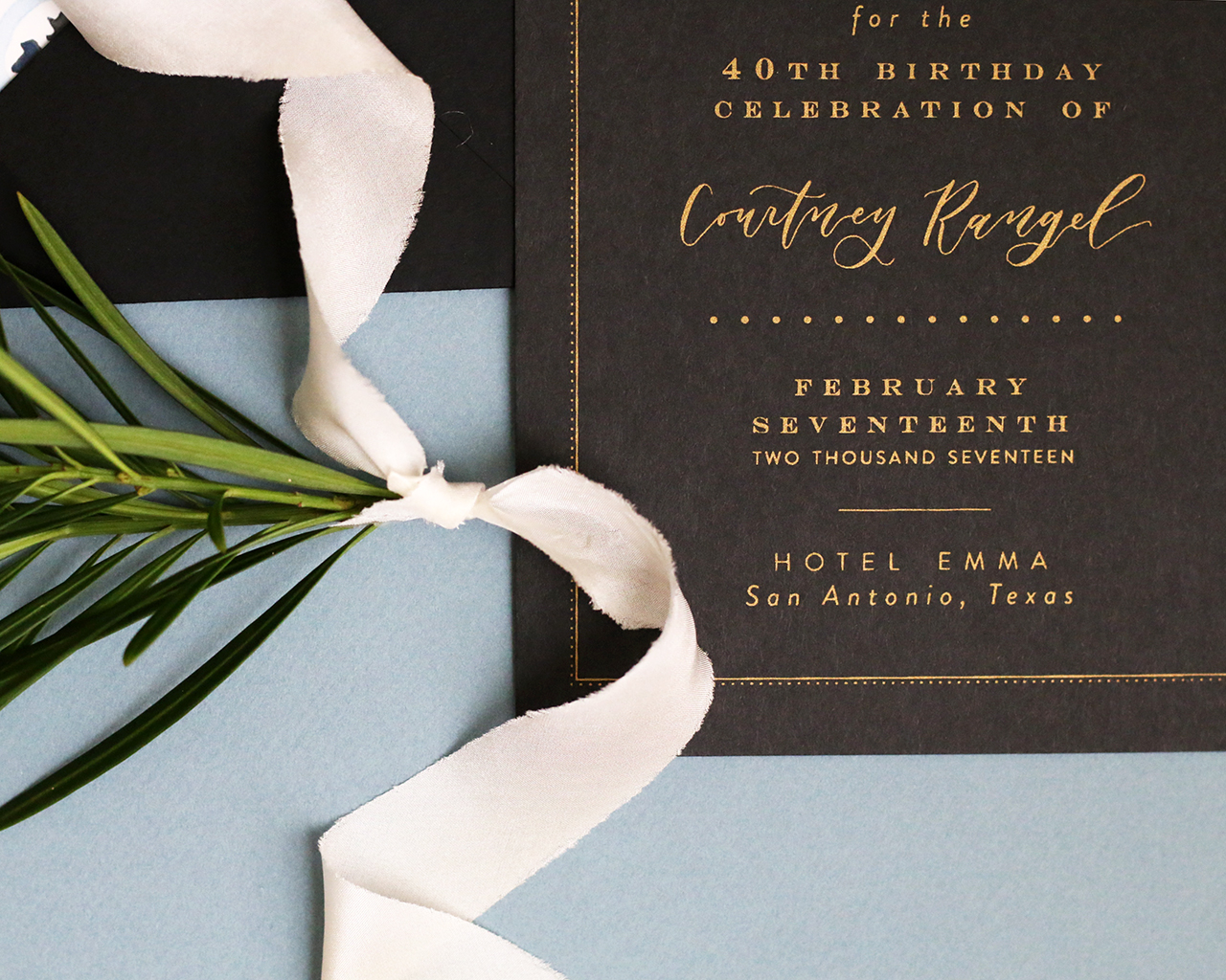
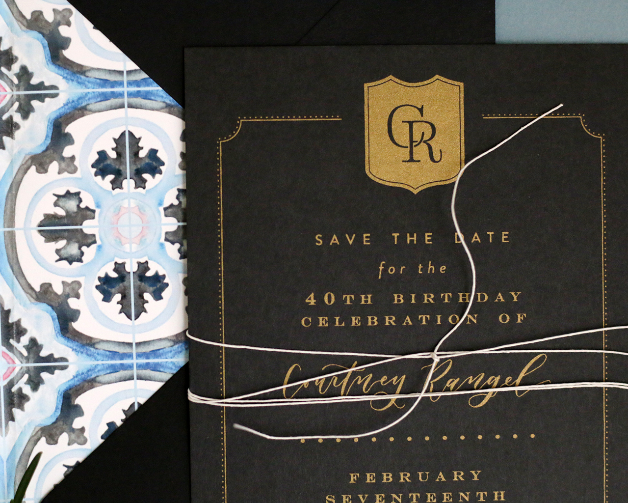
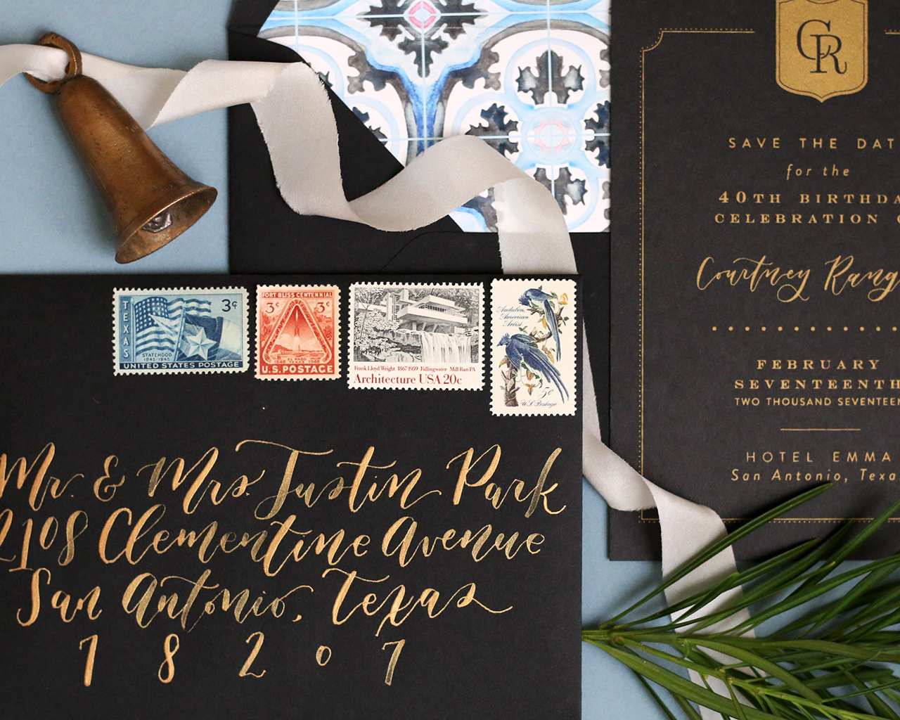
- Traditional black and gold screen printed 40th birthday party invitations
- The new Sugar Paper for Target 2016 collection is SO good!
- Modern gold and black geometric wedding invitations
- Beautiful botanical illustrations by Katie Daisy
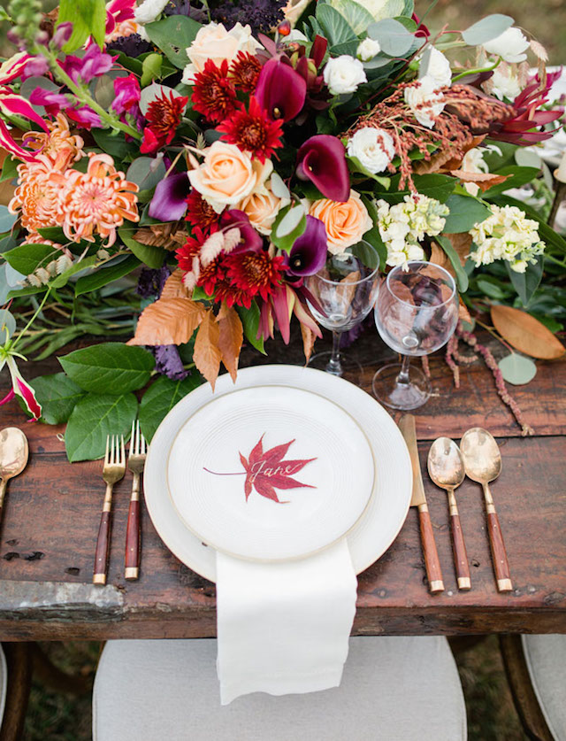
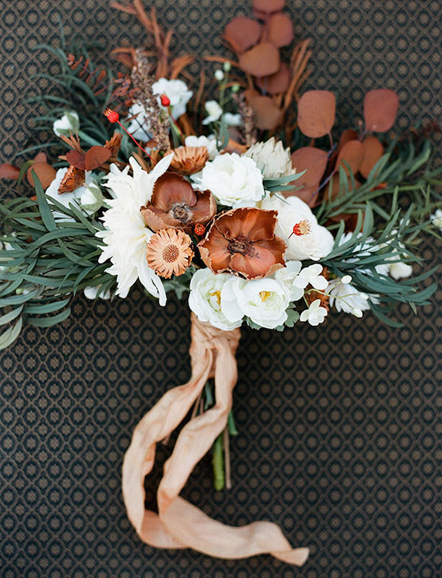
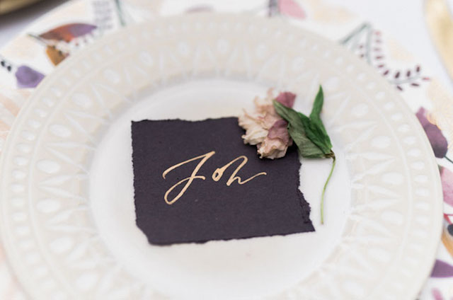
- A little fall inspiration for your wedding color palette
That’s it for us this week! I’ll see you back here next week! xoxo