Tiger Theme Baby Shower Invitations

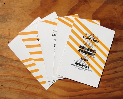
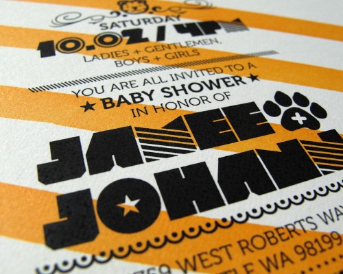
With quirky font choices and a bold color palette, these tiger-themed baby shower invitations are seriously cool.  Designed by Jason Gomez from Turnstyle Studio for his brother and sister-in-law, Jason drew inspiration from the nursery theme while also keeping in mind that both men and women would attend the baby shower (and taking it easy on the cuteness factor).  The result?  Crisp, modern, and totally fabulous!

From Jason: This was an a unique baby shower invitation as it was purely inspired by the baby’s nursery, which was itself designed and put together by my brother (who is also a graphic designer).

Baby-Shower-Invitation-Inspiration

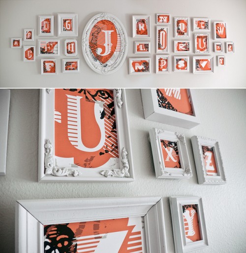
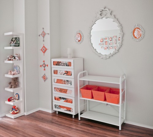
A lot of the character, color, and playfulness from the invitation was pulled from the tiger themed nursery that was created for the baby.

Baby-Shower-Invitation-Inspiration

“Why the tiger?” you may wonder?  Well, the baby is going to be born during the year of the Tiger!

Tiger-Stripe-Orange-Black-Stripe-Baby-Shower-Invitation

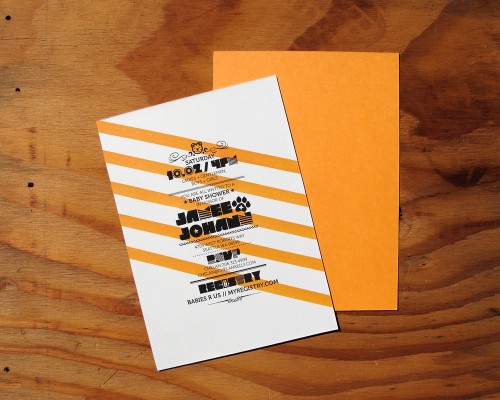
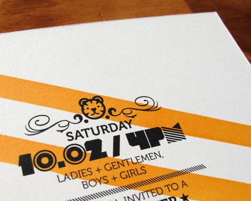
Since the baby shower was going to be a co-ed event, I wanted to keep a good balance of cuteness while also maintaining somewhat of a masculine feel to the invitation.

Tiger-Stripe-Orange-Black-Stripe-Baby-Shower-Invitation

Tiger-Stripe-Orange-Black-Stripe-Baby-Shower-Invitation

The invitation came together nicely, infusing a simple palette , a pop of color, and playful type selections.  It really conveyed the theme and overall aesthetic my brother Johann and his wife Jamee have set for the baby’s room.

Tiger-Stripe-Orange-Black-Stripe-Baby-Shower-Invitation

Thanks so much Jason!  And a big congratulations to Johann and Jamee on the new baby!

{image credits: invitation photography by jason gomez, room photography by johann gomez}

{happy weekend!}

Happy Friday everyone!  I’m still on my blog field trip that I mentioned at the beginning of the week – and while I’ll have full details next week, I’m seriously excited because today we’re heading to Brimfield!  It’s my first time at the show and I have a long list of things I’m hoping to find and bring back home.  I’m afraid I don’t have my usual Friday round-up post for you today, so instead I’ll leave you with a few photos from our trip so far…

mountains

mountains mountains

mountains

mountains mountains

mountains

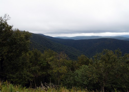
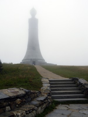
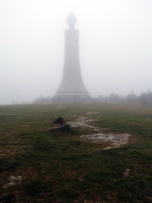
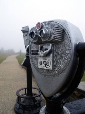
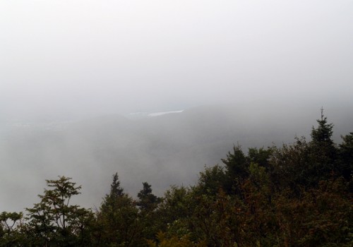
…we’ve been up in the mountains, and today the cooler fall weather brought clouds, a bit of rain, and LOTS of mist.  For someone who isn’t used to spending a lot of time this far up above sea level, it was pretty cool and more than a little surreal.  I can only imagine how beautiful these mountains must be once the leaves start to turn!

So that’s it for me until Monday – oh, and don’t forget to enter for a chance to win 100 letterpress Save the Dates from 42 Pressed – the contest closes Monday at midnight!  But just in case you missed it this week…

See you all next week!

{all photos by me}

Eleanor + Armin’s Chipboard Wedding Invitations

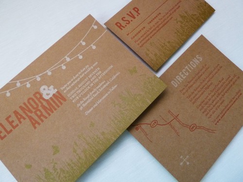
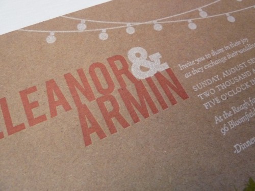
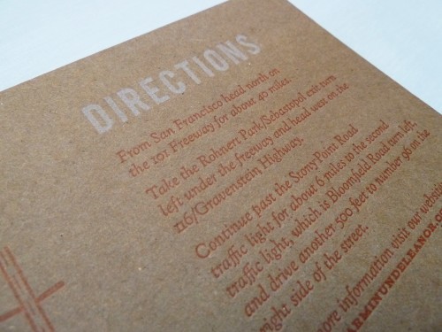
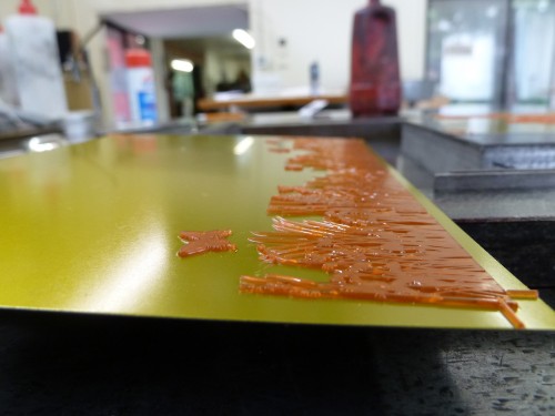
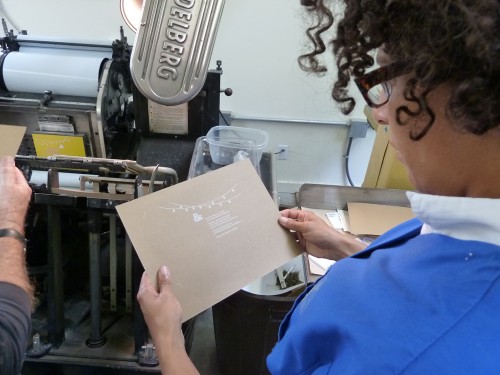
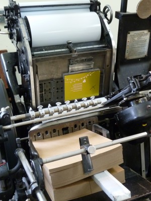
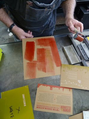
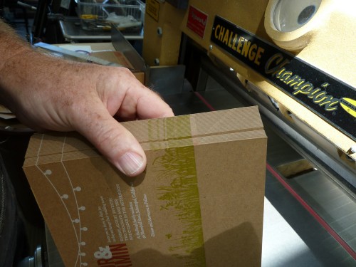
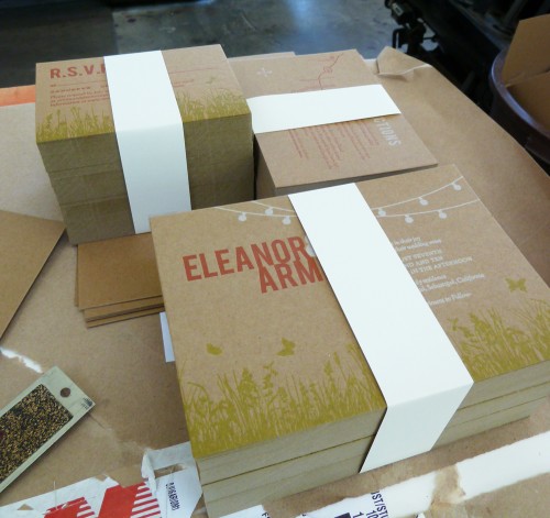
Today’s real invitations come to us from Eleanor, a graphic designer and recent bride whose father happens to be a letterpress printer (lucky girl!).  Eleanor knew that she wanted the invitations to reflect her wedding’s outdoor garden party theme, but chose to print on chipboard for a more relaxed feel.  Eleanor and her fiancé spent two days with her Dad in the print shop creating her three-color wedding invitation, and fortunately for us she documented the entire process!

Kraft-Chipboard-Wedding-Invitations

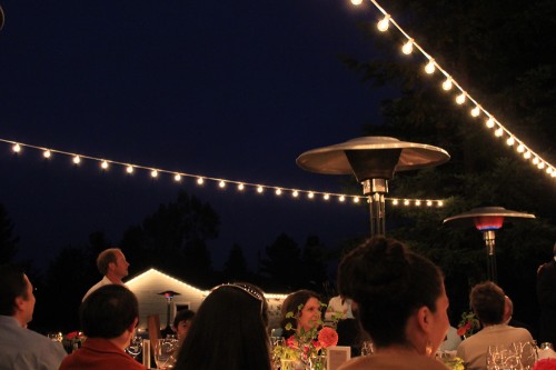
From Eleanor: My parents live on a 5 acre property in Sebastopol, which is not quite a backyard but not quite a farm, and I wanted the invitations to reflect the feeling of an outdoor, mid-summer, evening garden party.  I knew white string party lights would be a key element in our wedding reception décor and decided to make them a featured part of our invitation design.

Kraft-Chipboard-Wedding-Invitation-Detail

Outdoor-Wedding-Reception-Patio-String-Lights

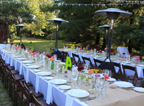
Outdoor-Wedding-Butcher-Paper-Table-Runner

The overall feel of the wedding was homemade and DIY with some of the print shop elements that I grew up with – butcher paper from my Dad’s shop for the table runners, chipboard for the invitations, and old wood type table numbers that we painted to go along with our color scheme.

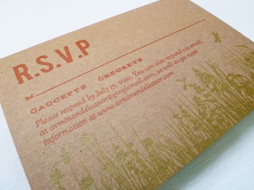
Kraft-Chipboard-Wedding-Invitations-RSVP

Kraft-Chipboard-Wedding-Invitations-Enclosures

I intentionally did not try to match everything perfectly, there was an overall look that tied everything together.

Kraft-Chipboard-Wedding-Invitation

My dad is an longtime letterpress printer and is somewhat of a curmudgeon (he doesn’t even have a website!) – he makes a big point of refusing to print items such as wedding invitations.  He wanted me to see how much work goes into making the invitations I designed.

Letterpress-Wedding-Invitation-Making-Of1

Letterpress-Wedding-Invitation-Making-Of2

Letterpress-Wedding-Invitation-Making-Of3 Letterpress-Wedding-Invitation-Making-Of4

Letterpress-Wedding-Invitation-Making-Of5

If I had known how difficult it is to get white to read on chip board I would have never designed them that way!  It was indeed a good education.  I’m  very happy with how the invitations came out, but mostly what makes them so special is they are infused with so much love – as my dad, my husband and I bonded over those two days while his Heidelberg press huffed, puffed and clanked away in his shop.

Letterpress-Wedding-Invitation-Making-Of6

Eleanor has a ton more photos from the printing process, which you can find on her flickr page, and you can see more from Eleanor’s wedding over on her blog.  Eleanor has also created a printable version of her wedding invitation suite, which you can find available for purchase on her website right here!  Thanks so much Eleanor!

{image credits: Eleanor | E.M. Papers}

Frederick + Ana’s Grammercy Park Wedding Invitations

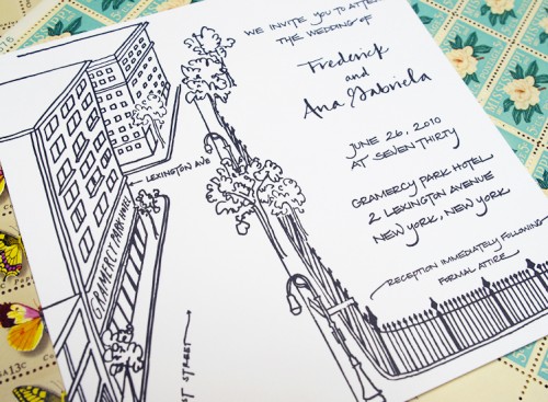
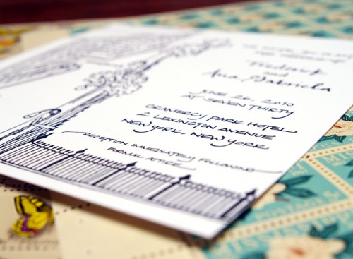
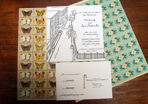
Happy Tuesday everyone!  This week I’m out of town on a blog field trip, which I can’t wait to tell you all about next week!  While I’m on the road I’ve got lots of fun things lined up for you, including a bunch of gorgeous real wedding invitations and a fabulous giveaway!  First up this week, a beautiful wedding invitation from Bryn at Paperfinger.  The invitation suite was letterpress printed in elegant black and white, with Bryn’s lovely calligraphy and illustrations:

New-York-Black-White-Calligraphy-Wedding-Invitation

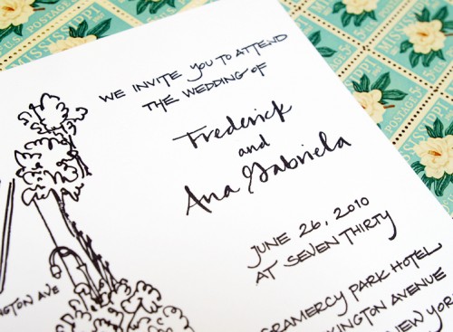
From Bryn: Ana wanted something that felt metropolitan and contemporary – nothing too frilly.  We decided that focusing on the reception site, none other than the Gramercy Park Hotel, would be a great approach.  I love drawing street scenes and neighborhood views and have been incorporating that perspective in a lot of invitations.

New-York-Black-White-Calligraphy-Wedding-Invitation-Detail

The wedding location is often a great way to capture the style and spirit of the couple.  This hotel is situated on a beautiful block facing Gramercy Park, so we made that view the focus of the invitation while using a clean, modern calligraphy style that was a perfect match for Ana and Frederick.

New-York-Black-White-Calligraphy-Wedding-Invitation

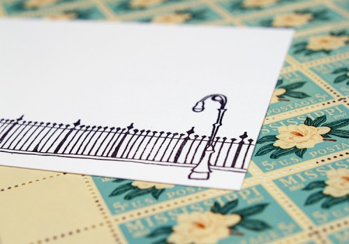
I had a lot of fun zooming into Google Maps street-level view to find details for the drawing.  The technology is amazing and makes this kind of illustration so much easier.  From the comfort of my studio, I can get just the right angle on the street or zoom in to see what the park fence is actually like up close.

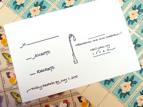
New-York-Black-White-Calligraphy-Wedding-Invitation-RSVP

New-York-Black-White-Calligraphy-Wedding-Invitation-RSVP

The fence itself was so appealing a graphic that I decided to tie it together with the reply postcard so that the two pieces could actually fit together as a diptych.

New-York-Black-White-Calligraphy-Wedding-Invitation

Ana was a self-proclaimed non-fussy, “no hearts” kind of girl, but we were both so excited after the invitations were printed (letterpress, black ink) that we couldn’t help but hug!

New-York-Black-White-Calligraphy-Wedding-Invitation-Back

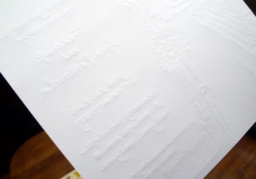
The invitation was printed on super-thick and luxurious cotton paper – I love Bryn’s crisp black and white illustrations and the texture of the letterpress impression on the back of the invitation.  Gorgeous work as always Bryn!

{all photos by me}

{happy weekend!}

Happy Friday everyone!  Are you all looking forward to the long holiday weekend?  I definitely am – it’ll be nice to have an extra day to catch up on things and it also happens to be my birthday this weekend!  I don’t usually make a big fuss over my birthday, but since I’ll be entering the last year of my twenties I’m paying a bit more attention this time around.  In other news, I haven’t been able to stop listening to the new Wolf Parade album – it’s so good!  The song below is my favorite (sorry, there’s no video, just the audio track) and I can’t wait until they come to the area on tour in a couple of months.  But in the meantime…

…a few links for your weekend!

And in case you missed it, a quick summary of this week’s posts:

That’s it for me this week!  Monday is a holiday here in the United States (and Canada), so I’ll be back on Tuesday – I hope you all have a wonderful weekend!