Amanda + David’s Whimsical Accordion Fold Wedding Invitations

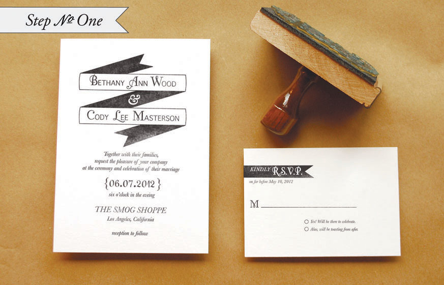
Amanda sent over the invitations from her wedding in Minnesota last summer – I absolutely adore the whimsical calligraphy and accordion fold layout!  Amanda worked with local stationers Watermark Stationery to create an invitation that was elegant yet non-traditional, ultimately settling on a sophisticated design with a playful pop-out for the main invitation.  The entire suite was letterpress printed in a single color and embellished with gorgeous calligraphy from Crystal Kluge.  So pretty!


From Amanda: The invitation sets the tone for a wedding, so we wanted to show our invited guests what type of event we had planned: formal, fun, glamorous and somewhat whimsical.  I worked with Gretchen Berry of Watermark Stationery in Excelsior, Minnesota to come up with a fun, unique way to present our wedding invitation.  We knew we didn’t want a traditional invitation; we wanted something unique, different and fun.  


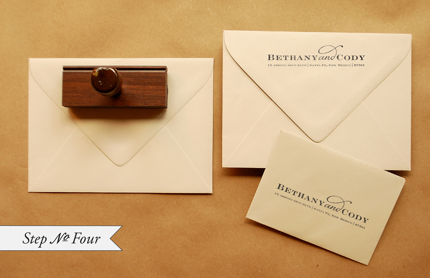
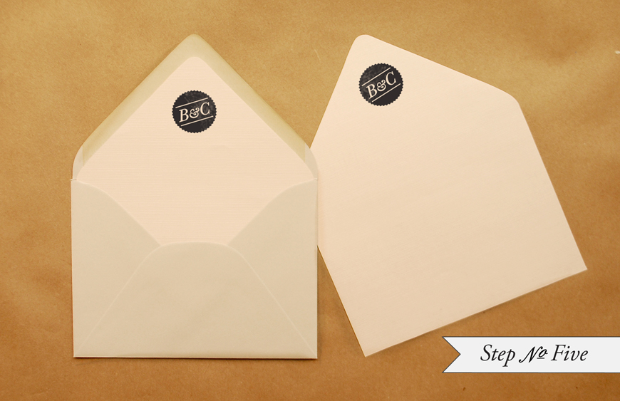
Once we came up with a design that we loved, we had some of the text elements custom done by local calligrapher, Crystal Kluge.  We loved the combination of the whimsical, yet formal letterpress calligraphy paired with our over-sized main invitation.  The invitation was paired with a mini envelope and fold-out accordion invitation, reply and direction cards, and a dark gray outer envelope with white ink calligraphy – all tied together with a white silk ribbon.  It was truly our dream wedding invitation.

Thanks Amanda!

Design and Letterpress Printing: Gretchen Berry, Watermark Stationery
Calligraphy: Crystal Kluge

Check out the Designer Rolodex for more tal­ented wed­ding invi­ta­tion design­ers and the real invi­ta­tions gallery for more wedding invitation ideas!

Photo Credits: Matt Blum Photography

Inspired by: Metallics!

Everything still feels all shiny and new this early in the year, so I today thought it would be fun to continue my love for all things metallic.  We already know that I’m crazy for anything with gold foil, but my metallic affections extend way beyond gold.  Silver, copper, brass are just as beautiful – particularly when mixed together!

No. 1 Metallic wedding invitations from Bella Figura; No. 2 Sugar Paper; No. 3 Oh Joy! Petal Pusher wallpaper from Hygge & West; No. 4 Metallic escort cards via Martha Stewart Weddings; No. 5 Yellow Owl Workshop; No. 6 Knot & Bow; No. 7 Brides.com

I also love these metallic prints from Enormous Champion – silver and gold letterpress printed skeleton keys and a beautiful gold foil print on dark navy paper.

Bella Figura is a mem­ber of the Designer Rolodex â€“ you can see more of their beau­ti­ful work here!

{images via their respective sources}

*Bella Figura is one of my fab­u­lous spon­sors; for more on my edi­to­r­ial poli­cies please click here.


DIY Rubber Stamp “Banner” Wedding Invitations

It’s the ladies of Anti­quaria, back with another fab­u­lous and cre­ative DIY project for you!  This week they’re here with some awe­some DIY rubber stamp wedding invitations!

This invitation suite is simple, but it packs a graphic punch!  We wanted to design a suite that looked modern and was easy to execute.  There aren’t any fancy techniques or tools needed for this one, but when all the pieces come together, it looks very high end and custom!  There are so many color options for this invitation suite.  In addition to black and white, think about navy and gray or eggplant and kraft!

Step One: Stamp the invitation cards.  For the invitation, you will use an A7 card; for the reply, you will use a 4bar card.  When making a print, ink the stamp throughly and apply even pressure for the best results.  On the large stamps, such as the“Modern Banner” invitation and “Modern Banner” reply, cover stamp with both palms and press, focusing on the center (near the handle).  Moderate pressure is required but too much can make for a muddy print.

Step 2: Stamp the website cards.  We used our small “Modern Banner” Website stamp.  Follow the directions above for making a good print.

Step 3: Cut your envelope liners.  We used tan text weight paper for a monochromatic neutral look.  To make the liner, trace a template and cut on the traced line.  Be sure to stamp your monogram (we used our “Seal Initial” monogram) on the liner so that when your guests open the envelope there is a lovely surprise!

Step 4: Stamp return and reply addresses on the envelopes.  We used our “Sophisticate” Return Address stamp for this suite.  It’s a great money saving tool to be able to use one stamp for both your return and reply address.

Step 5: To install the liner into the envelope, apply double sided tape (or use a glue stick) around the top triangle of the liner (on the back).  Slide the liner into the envelope, holding the taped edge away from the envelope.  Once the liner is positioned correctly, press down on the tape to adhere.

Finishing touches: Tie the whole suite up with twine, address, and add postage!

Materials:

“Modern Banner” Invitation Stamp from Antiquaria 

“Modern Banner” Reply Card Stamp from Antiquaria

“Modern Banner” Website Card Stamp-Large  from Antiquaria

“Seal Initial” Monogram Stamp from Antiquaria

“Sophisticate” Return Address Stamp from Antiquaria

Color Box Stamp Pad in Black

Metal Eyelet Tags for website card

A7 Cardstock,

4Bar Cardstock

A7 Envelopes

4 bar Envelopes

Envelope liner templates

81/2″ x 11″ text paper, for liners

Twine

Postage (we used the Jazz Forever Stamps mixed with vintage stamps)

Photo Credits: Antiquaria

Miranda + Matt’s Travel-Inspired Save the Dates

These save the dates are cute, quirky, and completely delightful.  Leslie from Lilly & Louise worked with bride and groom Miranda and Matt to create a unique and interactive save the date.  They paired a vintage map of California, where the wedding will take place, with baker’s twine and a bold striped envelope liner for a whimsical travel-inspired design.

From Leslie: Miranda and Matt wanted to excite guests with a unique and unexpected save the date… something tactile and textural that would leave an impression.  Both Miranda and Matt are from the East coast and their wedding will be in California, so it will be a destination wedding for many of their family and friends and they wanted to incorporate the idea of travel into the design.  With a palette of peach, navy, gray and cream, we mixed organic elements of a vintage map of Southern California and geometric elements of bold, thick stripes.

Because good mail is even better with an interactive element, we chose to include the actual save the date information inside a mini envelope.  Upon opening the envelope, guests find a classic quote from When Harry Met Sally, then unfold more details.  The entire save the date is bound by navy and white twine and two small tags.

Thanks Leslie!

Check out the Designer Rolodex for more tal­ented wed­ding invi­ta­tion design­ers and the real invi­ta­tions gallery for more beau­ti­ful cus­tom wed­ding invitations!

Photo Credits: Leslie Lewis Sigler of Lilly & Louise

{happy weekend!}

Happy Friday everyone!  I’m super excited for this weekend – tomorrow is Crafty Bastards, the DC area’s biggest craft fair!  Is anyone going?  I go every year and always have the best time wandering all the different booths at the show.  I can’t wait!  But in the meantime…


Photo by me.  A few fall flowers and some fresh basil that I picked up at the farmer’s market yesterday. The basil is such a lovely addition to the bouquet!

…a few links for your weekend!

I’m also super excited to announce that the lovely Jackie of 42 Pressed is celebrating her return from maternity leave (you might remember their adorable baby shower invitations) with a fun promotion!  Jackie is offering free save the dates to couples who order their wedding invitation suite from 42 Pressed.  Just enter code RILEYKICKOFF when ordering!

This week on Oh So Beautiful Paper:

Welcome to the newest members of the Designer Rolodex!

That’s it for me this week!  I hope you all have a wonderful weekend, and I’ll see you back here on Monday! xoxo