Nikki’s Navy + White Dessert Bar

Back in April, I featured Nikki’s awesome navy and white wedding invitations.  Well, Nikki’s wedding took place over Memorial Day weekend (Congrats Nikki!) and she’s back with a few of the lovely details from her wedding!  Nikki decided to incorporate a dessert bar into her wedding reception, so she created a tiny cookbook full of family recipes to give out as favors as well as corresponding signs and labels for each dessert.

wedding dessert bar ideas cookbook

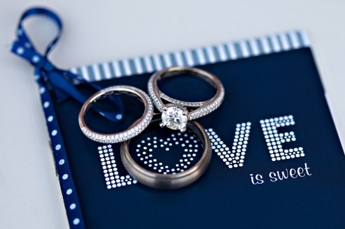
From Nikki:  I designed these cute little 3″ x 4″ 12-page cookbooks as wedding favors, which were placed at the seat for each guest at our reception.

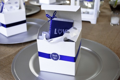
wedding dessert bar ideas favor box

Along with the cookbook each guest received an empty box that had a small note telling them to go to the dessert bar to try any of the recipes out of the book.

wedding dessert bar ideas jar and container label

wedding dessert bar ideas container labels

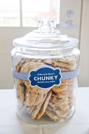
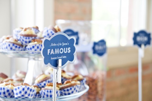
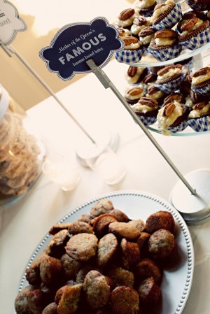
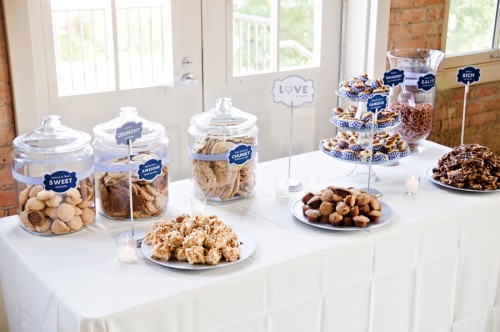
On the dessert bar itself, I designed tags to go on each jar or to stand as signs.  Each dessert was given a clever name, like “Mother of the Groom Chunky Chocolate Chip Cookies.”

wedding dessert bar ideas signs and labels

wedding dessert bar ideas signs

There was a big sign placed in the middle of the table that tied it all together with the cookbook that also read “Love is Sweet”.

wedding dessert bar and buffet ideas 

wedding dessert bar ideas

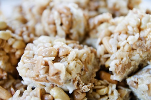
We made TONS of desserts for everyone to try, but people loved the concept so much that we were out of everything two hours before the end of the reception!  Everyone was talking about how cute it was and asking if we had extra cookbooks for them to take home.

Don’t forget to check out Nikki’s blog for a full list of desserts (and recipes!) as well as some additional how-to info.  Thanks Nikki!

{image credits: 1 + 6 by jimmages photography, all others by amy barry photography}

Aleksandra + Scott’s Antique Wood Type Poster Wedding Invitations

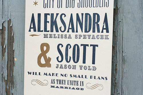
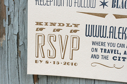
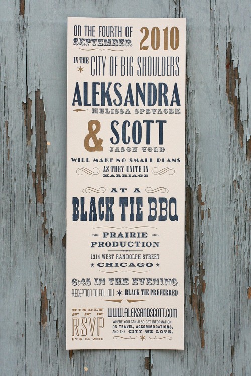
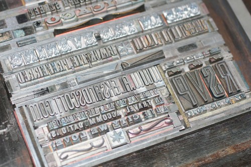
Today’s real invitations come to us from Jen and Starshaped Press, one of my fantastic sponsors, and were printed using antique wood and metal type and ornaments – each of which are 50-100 years old!  In order to preserve these delicate materials Jen creates a gentle impression (known as a “kiss”) on each invitation, with a result that feels timeless and elegant.  For these invitations, Jen used antique type and ornaments for a poster-style invitation that evokes old-school Chicago.  Oh, and since today is Jen’s birthday (Happy Birthday Jen!), make sure you read all the way through for a special promotion that Jen is offering to Oh So Beautiful Paper readers!

From Jen: The bride, Aleks, really wanted an invite that felt old-school Chicago, but from more of a working class, insider’s perspective.

They definitely wanted to use the quote from architect and urban planner Daniel Burnham on the front panel, as it felt appropriate to their marriage (make no small plans!).  The front panel was the visible element when the invitations were folded and inserted into the envelope.

Since this was a Black Tie affair, we wanted to keep some formality to the invitation.  The colors were a more muted navy and gold with corresponding navy envelopes, while the antique typography kept the invitations grounded.

What I love about these invitations is that they really showcase a great mix of wood and metal type, and make the invitation more of a poster than a traditional invitation, even though we are still able to fold and mail it at the first class rate.  This particular style (from our Wanted! collection) can be customized through different colors and formats to resemble anything from a wild west poster to a carnival broadside. And much of the type we use probably printed both of those items 100 years ago!

You can check out additional wedding invitation styles from Starshaped Press right here, as well as on their flickr page.  And as I mentioned above, to help celebrate her birthday, Jen is offering 10% off the Starshaped Press Wanted! wedding invitation collection to OSBP readers!  Just be sure to mention the code “Beautiful Paper” when you contact Jen to receive the discount.  Thanks Jen!

{image credits: starshaped press}

Melissa + George’s Vibrant Folk Art Wedding Invitations

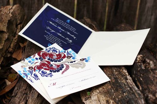
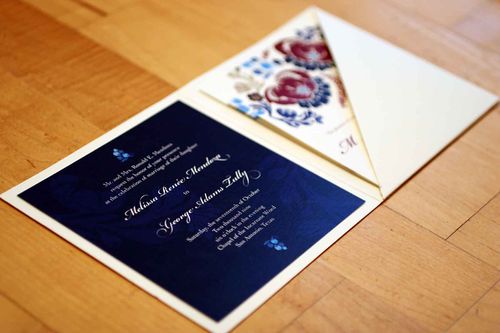
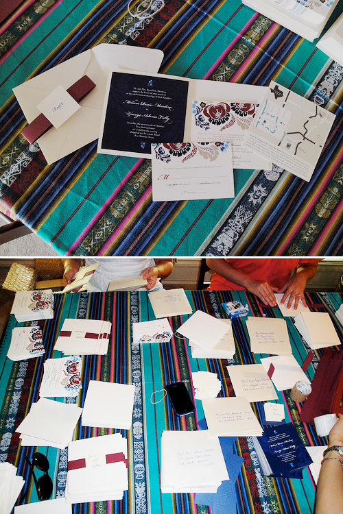
Melissa and George were married last October in San Antonio, Texas.  Melissa works as a graphic designer, so naturally she decided to take on the task of designing her own wedding invitations.  With her bold pattern selections and color palette, Melissa infused her invitations with a folk art-inspired feel, while still maintaining a traditional layout that suited her semi-formal wedding:

Folk-Art-Floral-Wedding-Invitations-Suite

From Melissa: I loved the idea of a square format invitation and a full-bleed (no white border) design, but knew I needed to include a lot of information and wanted a more formal look-and-feel, since our church wedding and reception was more on the traditional side.

Folk-Art-Floral-Wedding-Invitations
Folk-Art-Floral-Wedding-Invitations-Detail

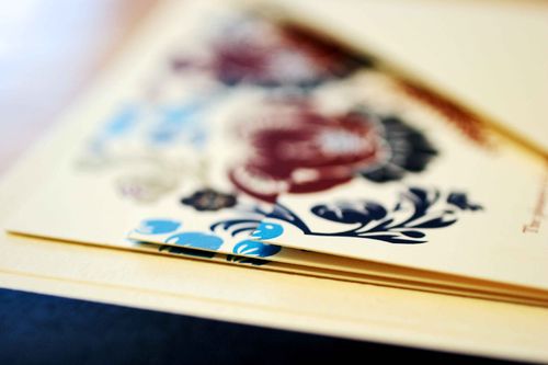
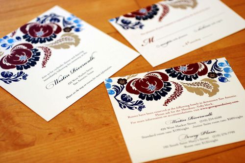
I sourced vector artwork from Shutterstock and colored and rearranged the pattern until I found one I liked. Our wedding colors were navy, cranberry and cream with a hint of turquoise, which I think was fully reflected in the final design.

Folk-Art-Floral-Wedding-Invitations-Enclosures

Folk-Art-Floral-Wedding-Invitations-Directions

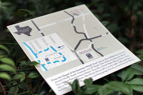
We had more than half of our guests traveling from out of town, so I needed to include hotel and transportation information and a map of the area, along with our web site url and RSVP postcard.  The three stacked cards were designed to look like one cohesive image, but staggered to fit all the necessary details.  The diagonal pocket folder and envelopes were from Paper Source.

Folk-Art-Floral-Wedding-Invitations-Assembly

The invitations were digitally printed by Ginny’s Printing in Austin, Texas on 100# Classic Crest natural cover.  My mom, sisters, grandmother and bridesmaids helped assemble more than 200 invitations by affixing glue dots to the back of the navy blue card and attaching the cranberry belly bands.

Folk-Art-Floral-Wedding-Invitations-RSVP
Folk-Art-Floral-Wedding-Invitations-Envelope
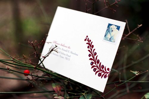
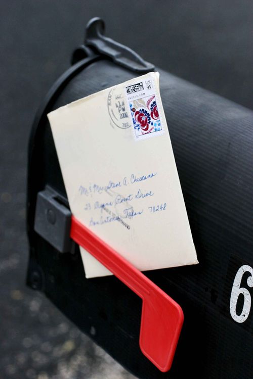
My mom hand-addressed each envelope — and she also calligraphed the guests’ names on small square cards attached to the belly band around the invitation.  She’s a champ!

Melissa is now offering her wedding invitation design and several other designs as printable invitations in her etsy shop — check out the full selection right here!

{image credits: invitation photos by Katie Shagman, assembly photos by Melissa}

Programs for Natalie

A few months ago, my very first client for custom wedding programs was Natalie.  She'd seen pictures from our wedding and loved our programs, so she sent me an e-mail to ask if I could do something similar for her wedding.  

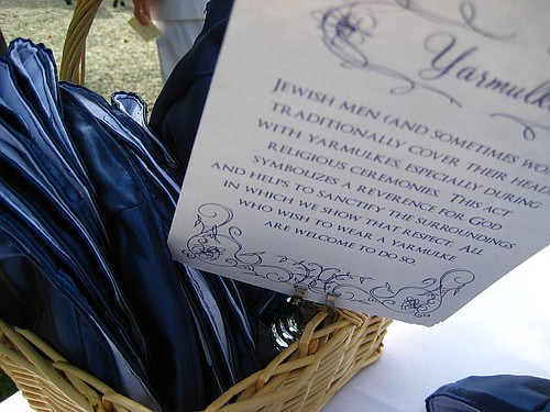
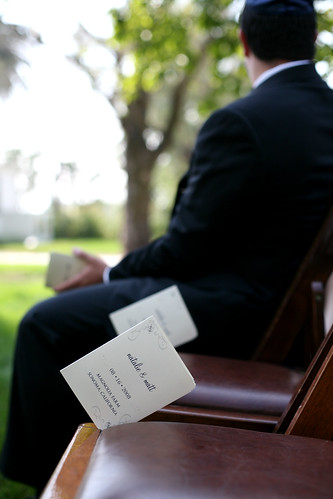
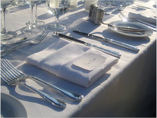
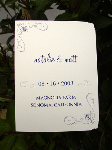
Of course I was happy to oblige, and our little custom project eventually came to include "reserved" cards for the ceremony, table numbers, a few signs, and place cards in addition to the programs.  I had so much fun working on this project, and the best part was getting to know Natalie during the process!  Natalie and Matt had an absolutely beautiful wedding in California, and here are a few shots of my work in action at her wedding:


{signs explaning the Jewish tradition of yarmulkes}


{the ceremony programs, placed in each guest chair for the ceremony}


{place cards ready for the reception}

And here are a few pictures that I took on my own:


{the front cover of the programs}


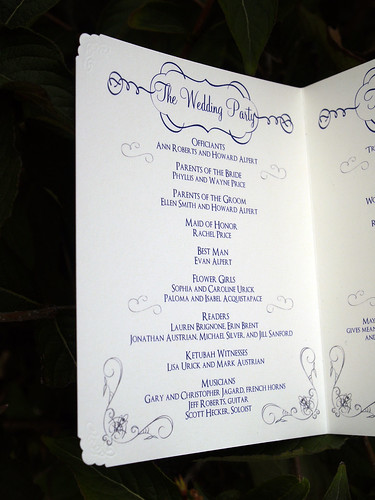
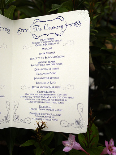
{the inside of the first page}


{the inside of the second page}


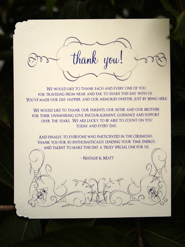
{the back cover}


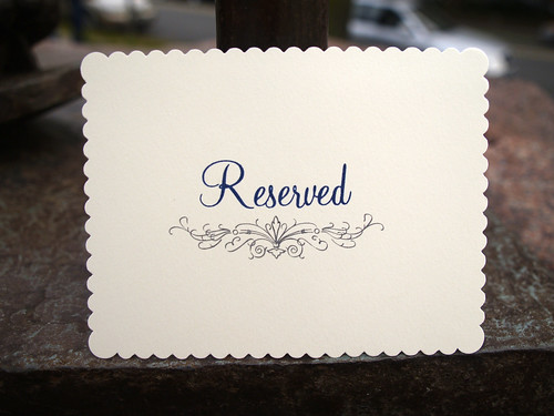
{the "reserved" seating card for the ceremony}


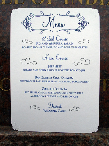
{the menus for the reception}

The programs and reserved cards were printed on cream card stock with navy and charcoal gray ink, while the menus, place cards, table numbers, and signs (like the one for the yarmulkes) were printed on white card stock. Check out my flickr site for more detail shots of the programs and menus – and definitely head on over to Natalie's lovely wedding recap for more gorgeous photos from her wedding!

{top photos via Natalie's wedding recap, all other photos by me}